18 August 2015
Adaptive vs. Responsive design?

How do you set up a site for a mobile view? What approach to choose? What are the pros and cons of adaptive vs responsive design?
These questions are stuck in heads of website owners, marketing stuff and clients who understand that the choice between adaptive and responsive design had to be made yesterday.
In this post, we will try to share AGENTE experience that we've been gathering for years. Yet there's one thing we want to warn you about - there's no universal solution no matter how many times you heard about it at different conferences and workshops.
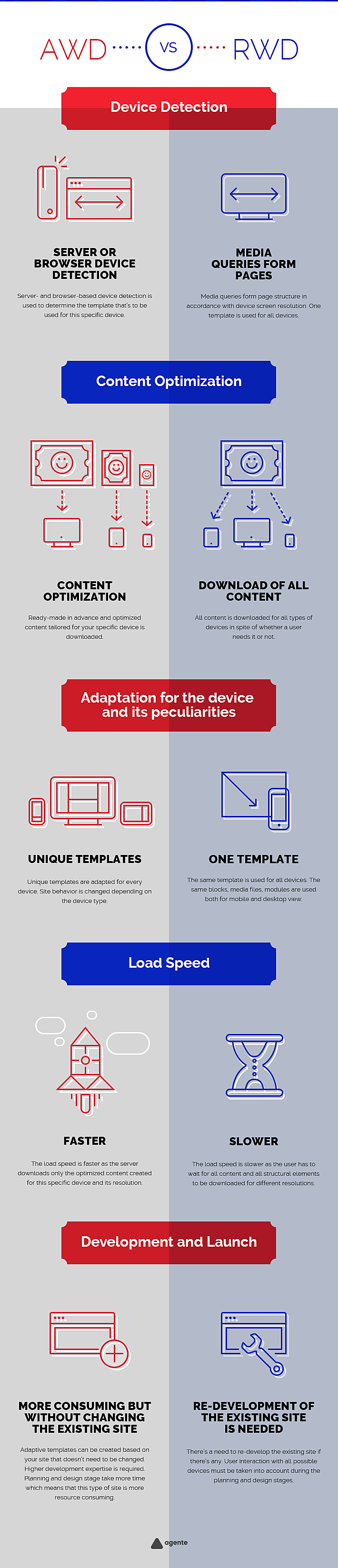
Terminology and approach differences
The difference lies in the definition itself.
- Responsive Web Design (RWD) is a design that kinda responds to users' needs.
- Adaptive Web Design (ADW) is the one that adapts.
Each term means a specific approach for your site development and is used to describe the development process of a website that will be mobile-friendly. In this article, we're going to explain the difference between responsive vs adaptive design in practice without going much into technical detail.
Modern approach tendencies of website development are dictated by an exponentially growing tempo of mobile devices evolution and an increase in their screen size. Developers are gradually leaving the practice of developing mobile versions of the site and one universal version that works perfectly well on all types of devices: PCs, notebooks, tablets and smartphones.
In fact, ADW (adaptive web design) and RWD (responsive web design) solve one and the same problem but in different ways.
What's the difference?
When creating a "Responsive" website a flexible site structure is used. This structure is called a fluid grid and element proportions and sizes are expressed in percent. Fluid images and fluid text blocks are also used along with the fluid grid. By reducing a page width all the content will be gently shrunk too. Thus if your site has a 3 column structure then the minimized version of your website is likely to have only 1 or 2 columns of text.
Media queries are used for responsive site development. Those are code blocks that indicate output device parameters. Media queries allow applying certain rules (styles) to display various content boxes in a different order or proportions depending on screen size and device characteristics on which the website is accessed.
Below is an excellent animated example of "fluid" (responsive) site.

You can visit www.bostonglobe.com or www.disney.com to see responsive sites in action. Reduce the browser window and see the content (pics and text) getting changed in response to window size changes. Alternatively, you can go to www.liquidapsive.com powered by a menu that enables you to choose between different variants of page display.
Adaptive websites (ADV) can seem pretty like responsive sites at first sight but the core difference is hidden from the eyes of ordinary users. There is a number of things that are created for adaptive sites in advance like a kit of various templates (layout) for devices with different dimensions and certain functionality available in this or that version.
For example, there are several typical resolution versions that are created for different devices during the e-commerce website redesign. 320 px width template is developed for smartphones, 760 px, 1024 px for tablets and 1600 px for desktop browsers. When a new user comes to an adaptive site server defines the device type that’s used for website view and shows the necessary content and template to the user.
This approach enables us to receive significantly deeper and full cooperation between a user and a site.
Thus by defining that a visitor’s using an iPad to view your site, we can leverage touch-screen navigation capabilities (swipes) that are missing in the browser version and on the contrary turn on or replace undesirable blocks with flash banners or flash elements that cannot be reproduced on iOS devices. Moreover, we can make use of other typical capabilities of the devices used when viewing a site.
Except for differences between an interface and the way the user interacts with a website adaptive sites are also characterized by a higher load speed as a server shows optimized content (pics and various files in necessary sizes) tailored specifically for your smartphone or tablet as soon as it has recognized the device type. Responsive version utilizes one and the same HTML template and a mobile user downloads the content that he would normally download from their PC.
In order to see and understand adaptive site principles, we encourage you to visit www.lufthansa.com both from your PC and your smartphone. Another great example is www.colly.com. By dragging the browser window and making it smaller you can see the site content getting adapted in accordance with width changes.
What approach do I choose?
Let’s imagine that you need to choose the approach for your site development.
Responsive sites are suitable when there’s no difference in viewing and using the website on mobile or desktop devices and if there budget and time constraints.
Adaptive sites work fine for the majority of situations but are extremely important if the load speed is a key factor and if user interaction with a mobile version differs greatly from the one with a desktop version.
Unfortunately, there’s no universal solution and each case should be considered individually. We have created a simple infographic that will help you to compare AWD (adaptive web design) and RWD (responsive web design).
Learn more about us as an e-learning development company.


Rate this post!
820 ratings, average ratings is 4.3 out of 5

Related Posts

04 December 2017
How to Make Your Website Mobile Friendly?
For a long time, web design has been focusing on desktop devices. Today the web is going mobile, and businesses take advantage of communicating with clients via their mobile devices. Our team has prepared some pieces of advice to give you an idea what a mobile friendly design is, and which you things you should consider to succeed in making a website mobile friendly.
21 June 2017
Pros and Cons of Creating a Mobile-Friendly Website
The Internet has become an essential part of our lives. The advent of smartphones and tablets gave people an excellent opportunity to access it any time through cellular networks or Wi-Fi.

19 January 2024
AI Model Fine-Tuning: How to Use Your Organization's Data?
Organizations are transitioning from generic solutions to hyper-customized intelligence, seeking AI models designed to address their unique challenges and propel them toward strategic objectives.
This demand has propelled fine-tuning to the forefront of AI development.

16 January 2024
ChatGPT Plugin Development: Features and Benefits for Business
Explore the process of crafting a ChatGPT plugin tailored precisely to meet your unique business requirements.
Develop Custom Corporate Microlearning Platform
Custom microlearning solutions for corporate training: Discover how to develop a tailored platform for efficient and engaging employee learning

24 January 2024
Employee Training Management Software Development in 2024: Features and Cost
Streamline your employee training with cutting-edge software solutions. Explore the features and costs of employee training management software.
Let's talk
Is there a challenge your organization or company needs help solving? We’d love to discuss it.

Managing Director, Partner
Andrew Terehin

Thank You!
Your message has been successfully sent.
We will contact you very soon.