CHS — High School Website
Our new client – Citizen High School – wanted a modern design and feel of the website similar to popular e-learning platforms. They asked us to rebuild the layout and information architecture so that it looks clean and intuitive for inexperienced users.
The main focus of this project was on Information Architecture, so we broke the process into several parts to evaluate and redesign the IA of the CHS website: User Research, Heuristic Evaluation, Content Audit, Wireframing, Prototyping, Responsive UI design.
What is CHS?
Citizens' High School is an accredited high school providing an opportunity to earn a diploma. Citizens' 9th-12th grade curriculum is designed to give each student enrolled in either the general studies or the advanced/academic program of study a solid foundation in the basic academic areas of English, math, science, and social studies.
Information Architecture
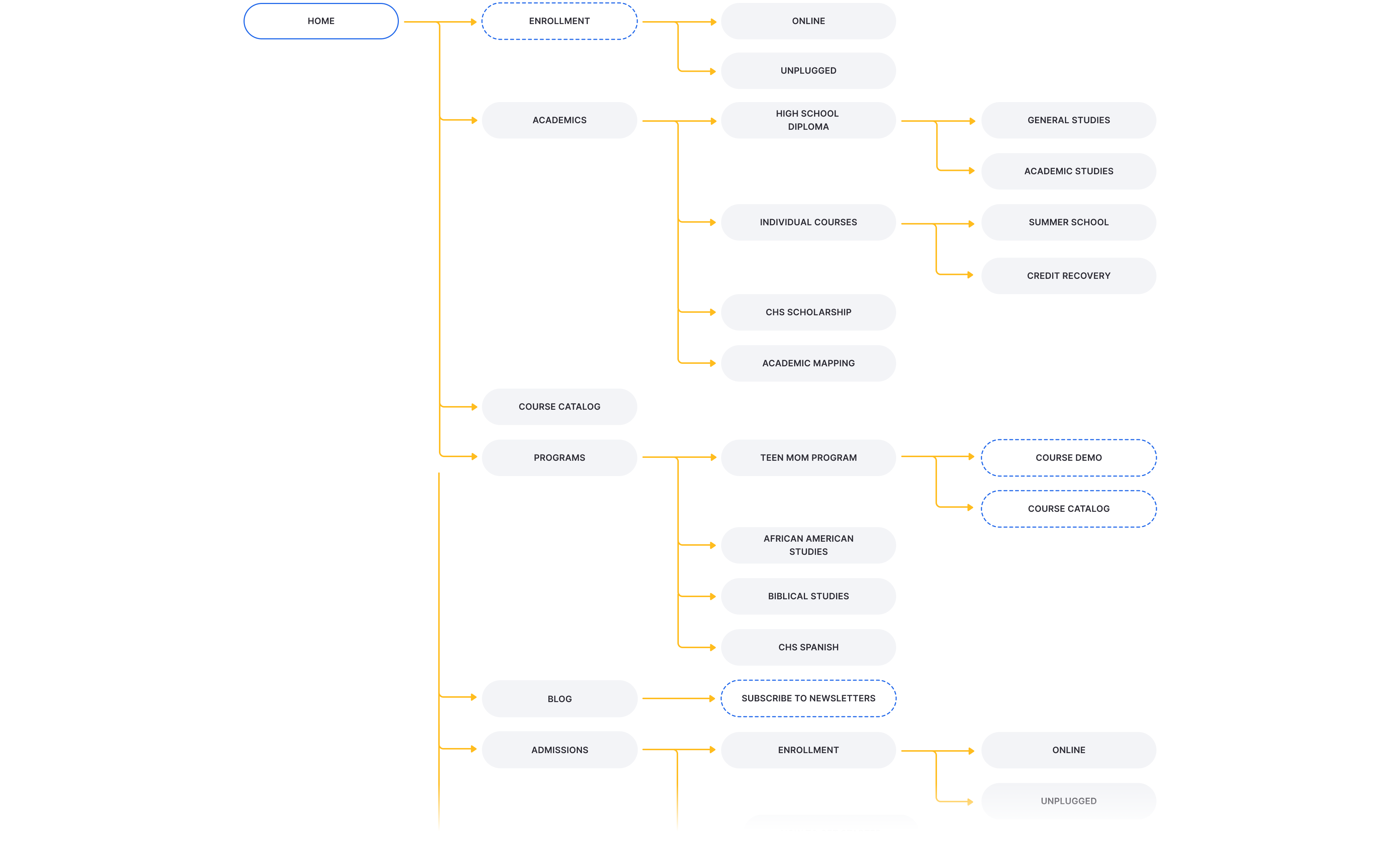
The client wanted the navigation to be clear and concise so that users can find anything they are looking for within no more than 2 clicks. That’s why we started re-building information architecture from scratch and arranged the existing website sections into a cleaner, intuitive structure.
User Flows Mapping
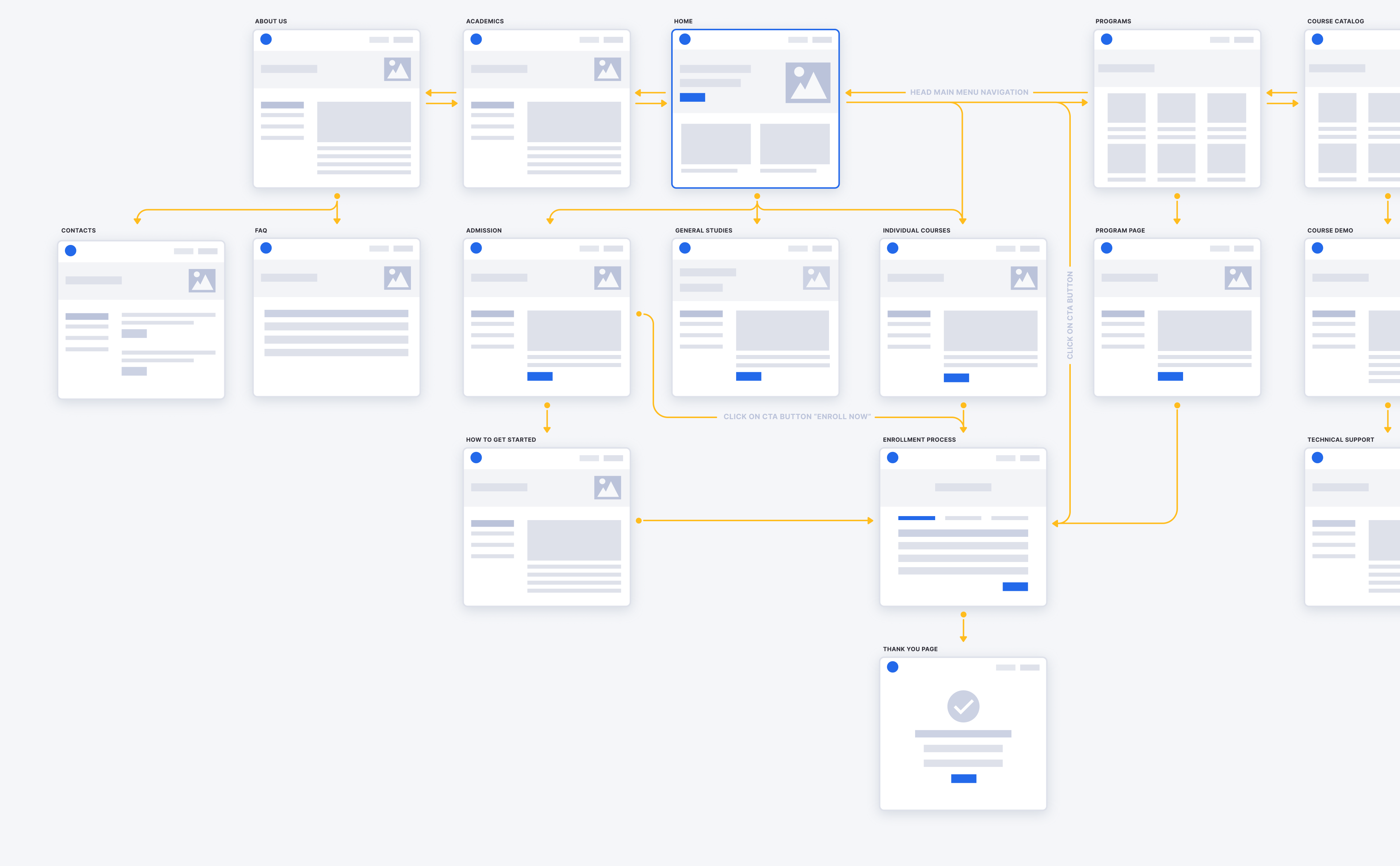
In the process of scenario mapping, we outlined all the steps a user will take to complete a task. Then we made up basic user scenarios and created a user flow map for the main of them. The result of this step was an interactive prototype of the new website structure.
Clickable Interactive Prototype
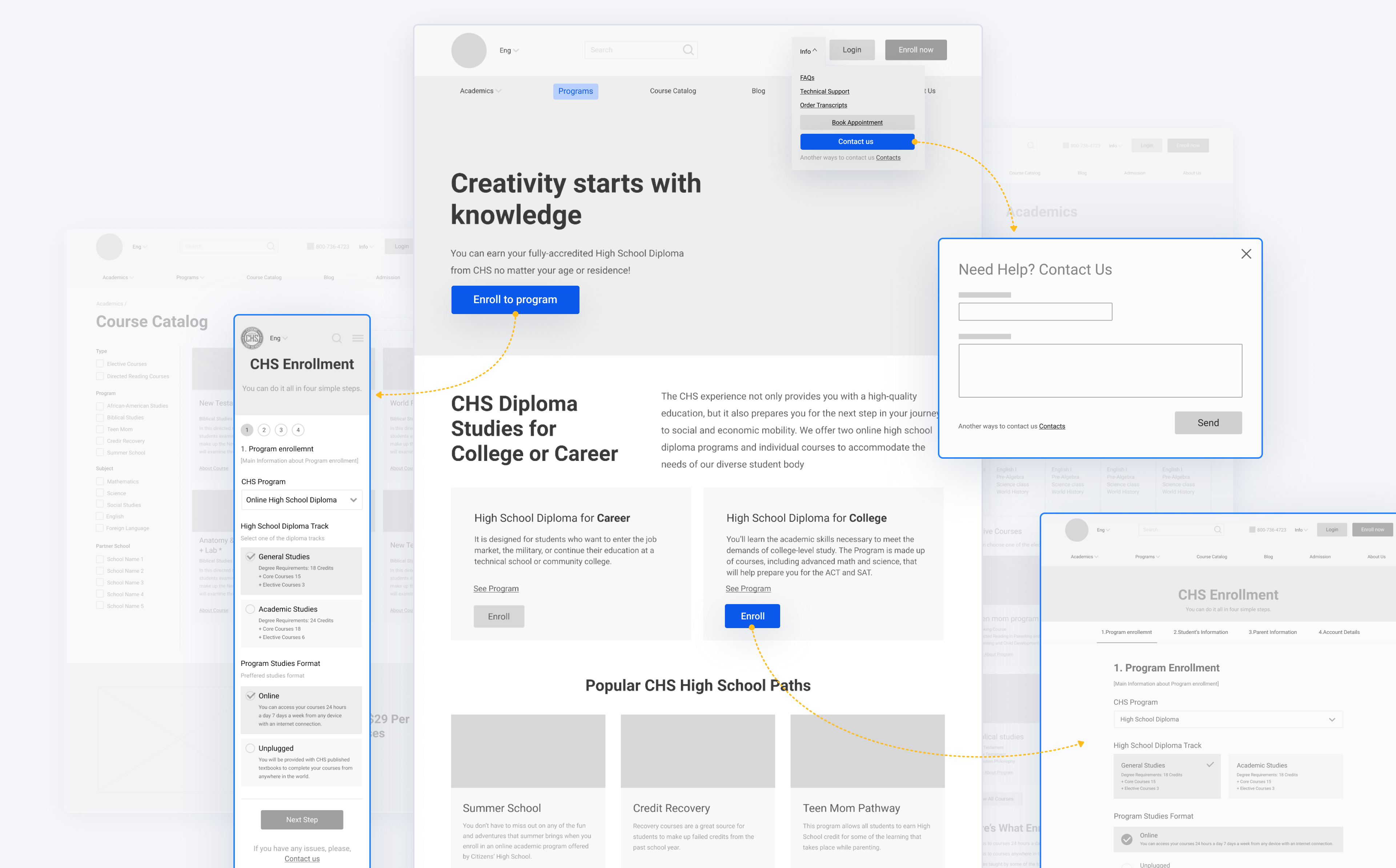
The next step was to show our client clickable interactive prototypes that offer an interactive experience that’s most reflective of what the user experience of the final website will be like. After showing a demo version, we moved forward to the UI design stage.
Responsive UI Design
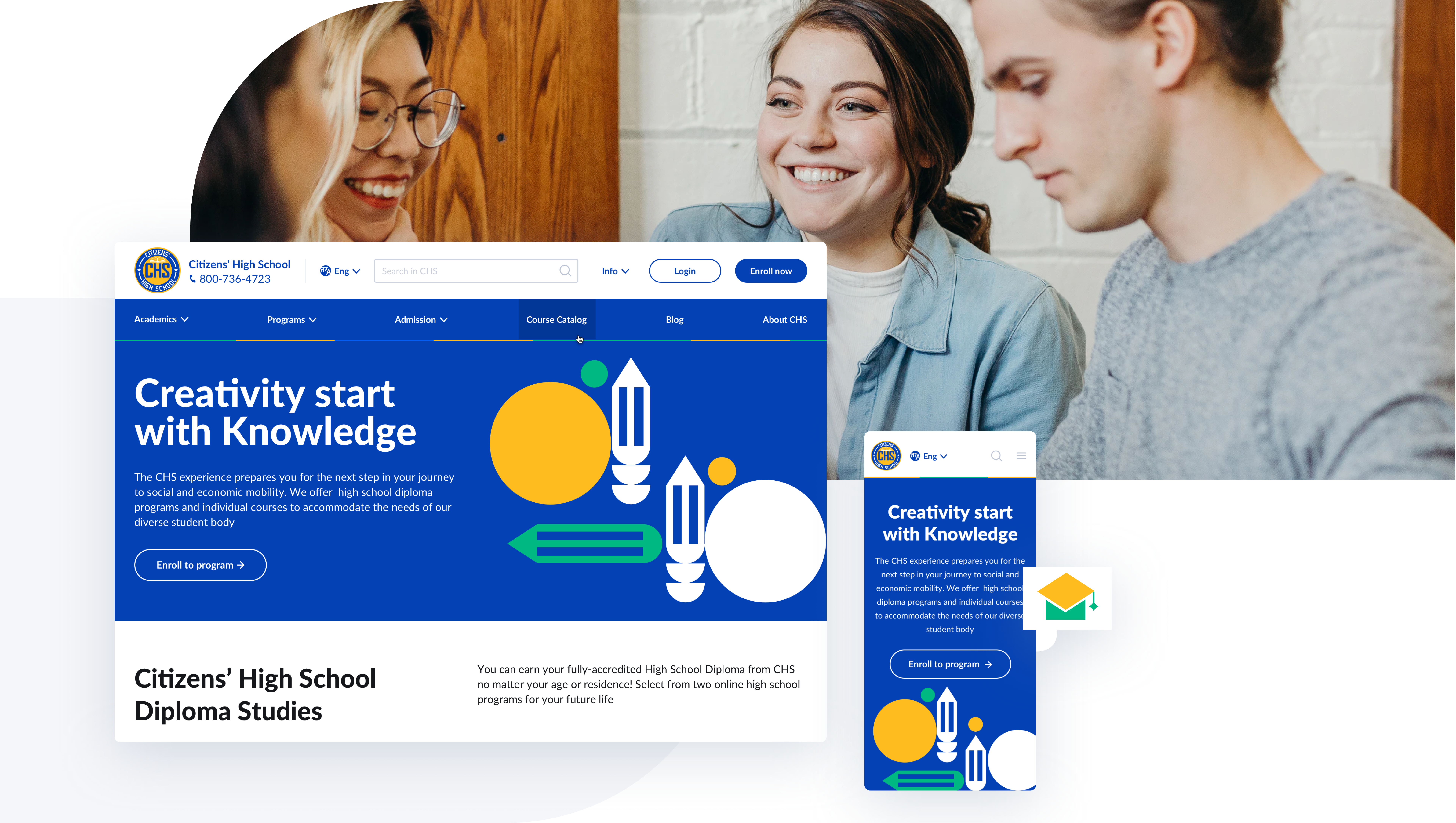
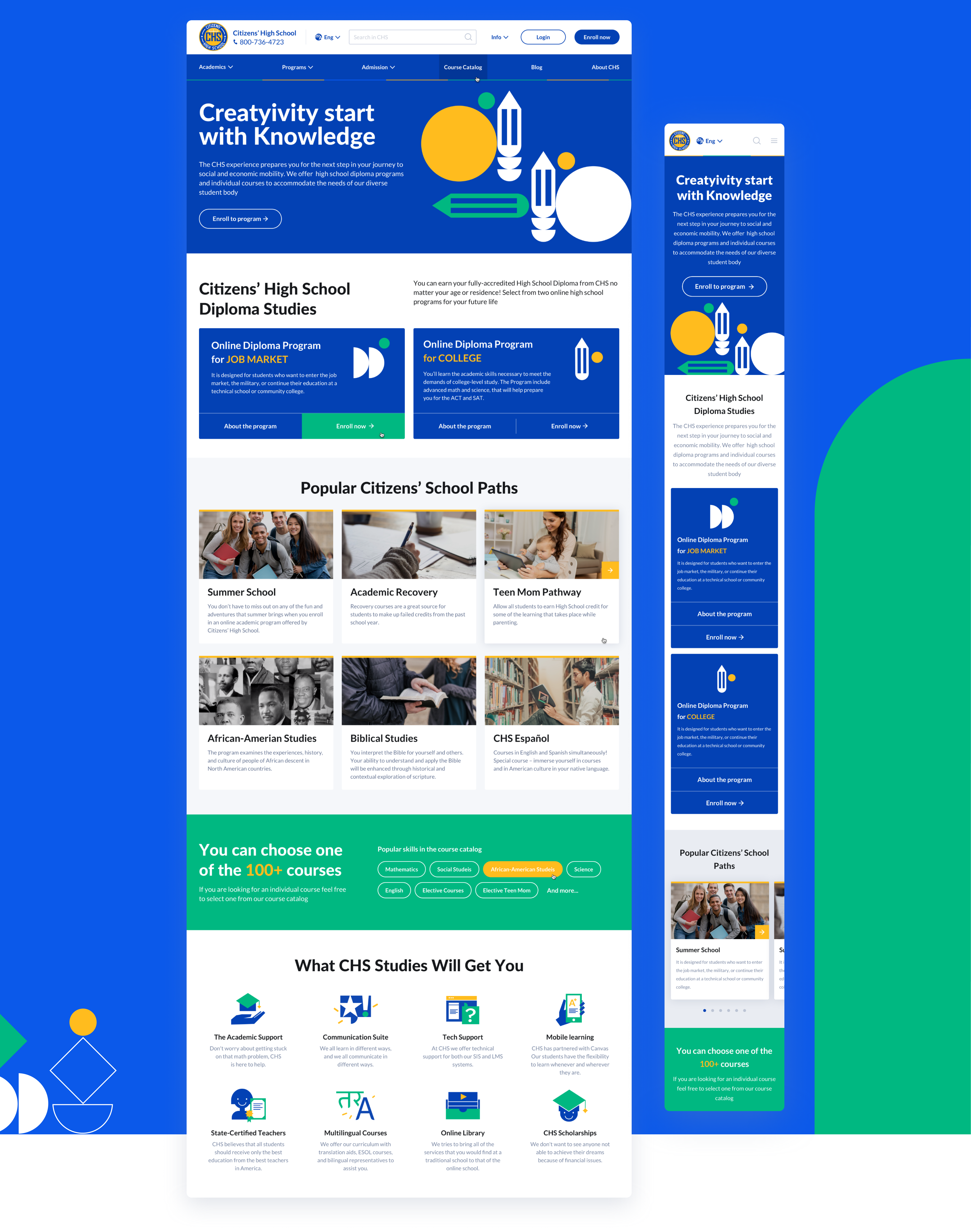
The design and layout for the website are preferred to have more white space and use the blue on the website. We changed the layout of the communication options we have on our website in a clean design.

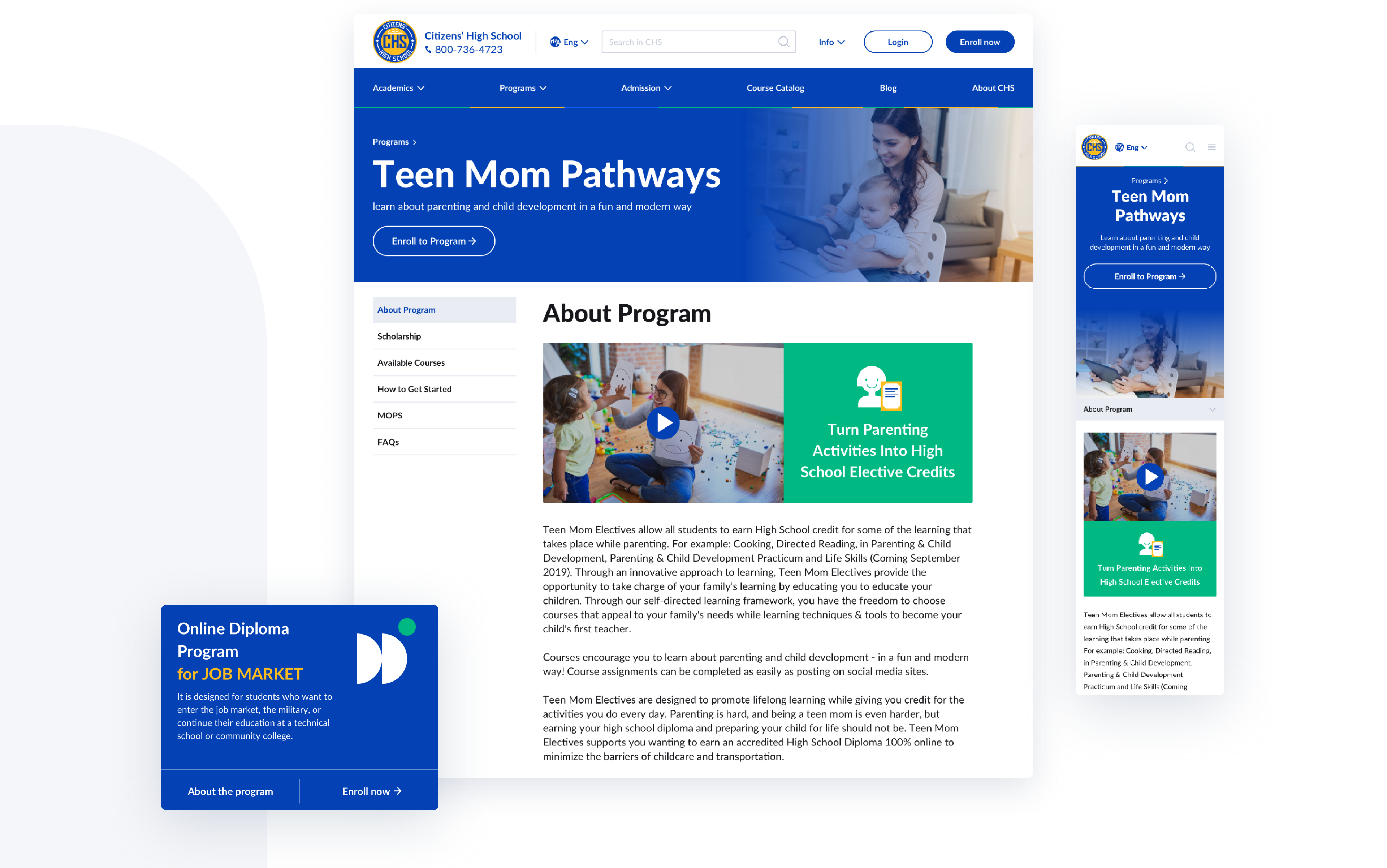
Programs Page
Program content pages were re-built in a breadcrumb approach and showed additional similar material according to the content. We used a card-based layout and accent CTA buttons to facilitate the navigation.
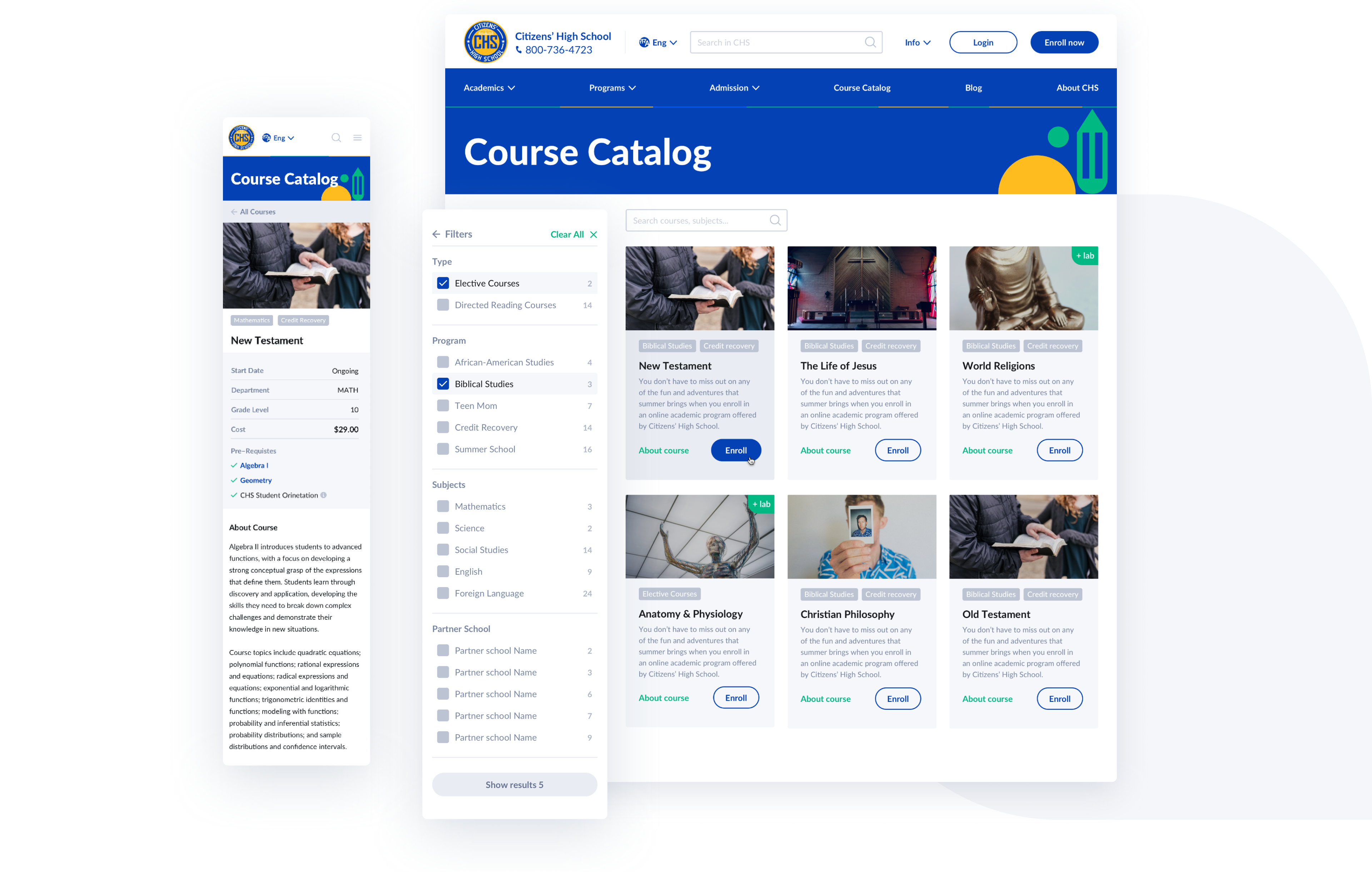
Course Catalog
The course catalog was re-designed from scratch. One of the most popular problems of e-learning platforms is the overload of information. We needed to re-structure the content and structurize pages. A course catalog was arranged in a simple and clean grid, a course search feature was incorporated on the homepage to help users quickly find their desired courses.
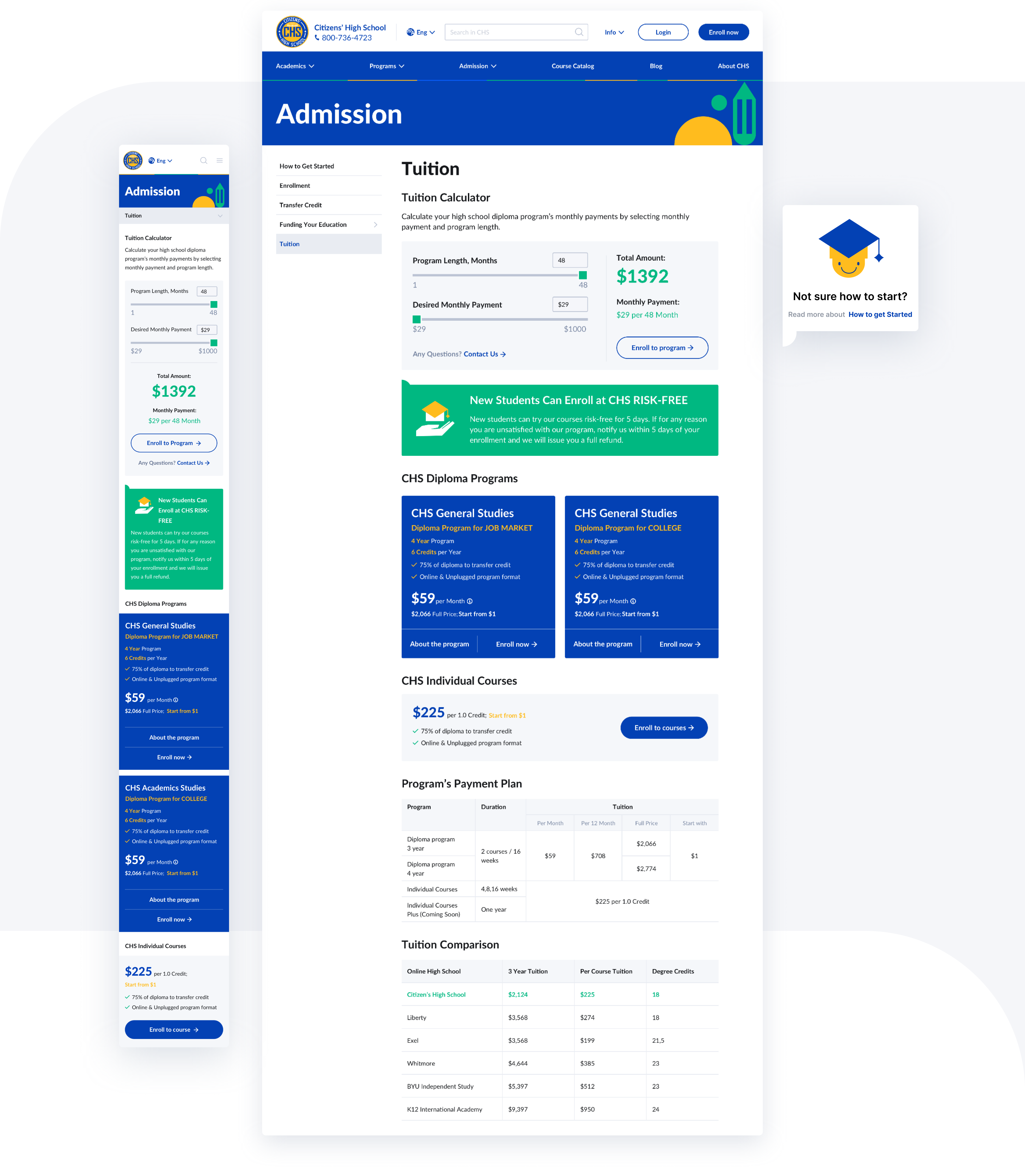
Admission Page
On the Admission page, we addressed some content gaps by providing relevant information about different programs. The payment plan info was arranged into simple and understandable tables.
Enrollment Process
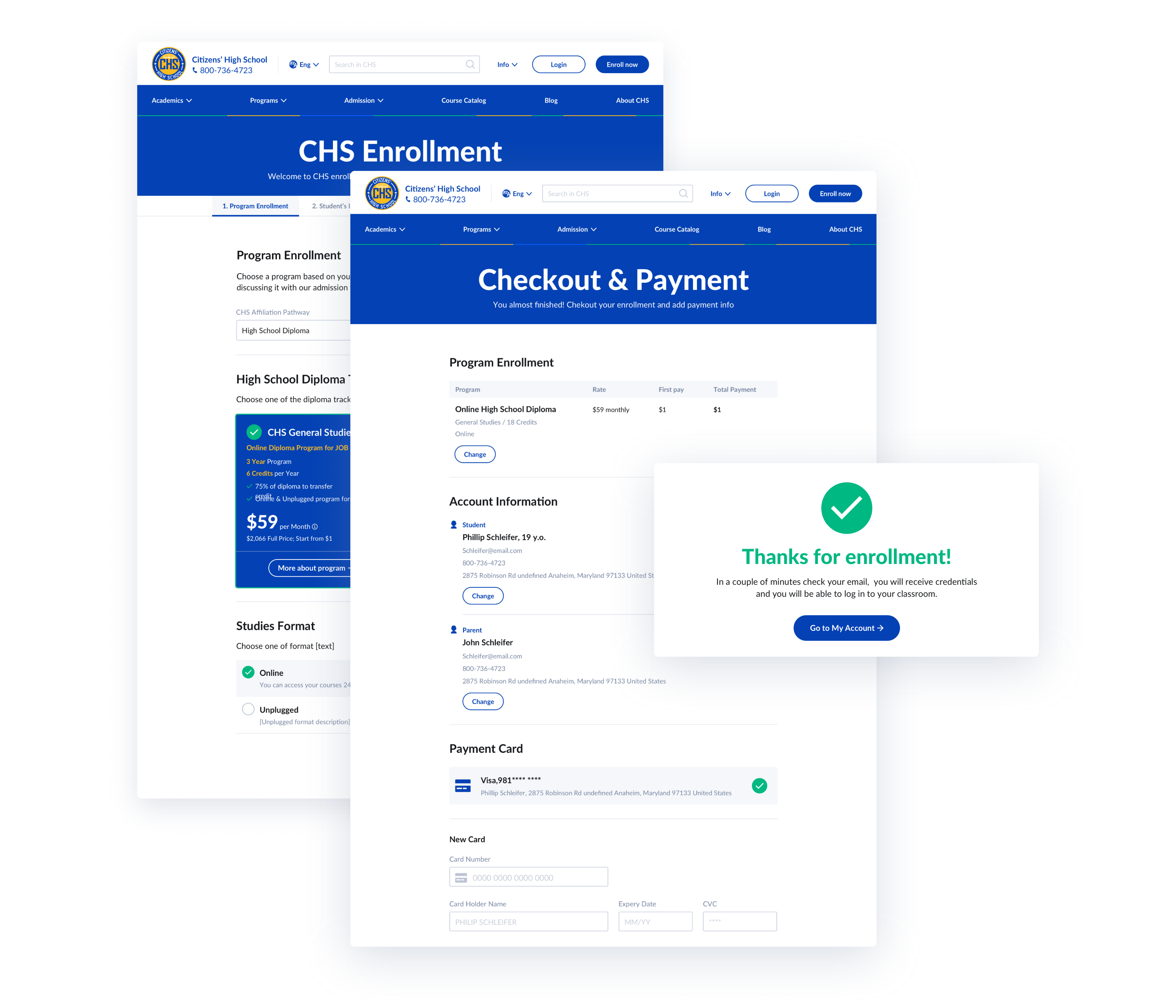
After a user has selected the desired course or program for himself, he can easily proceed to the enrollment page which is arranged in a breadcrumb step-by-step approach, which consists of the following stages: program enrollment, student’s information, parent’s information, and account details, where a user can do the checkout.
Custom Illustrations
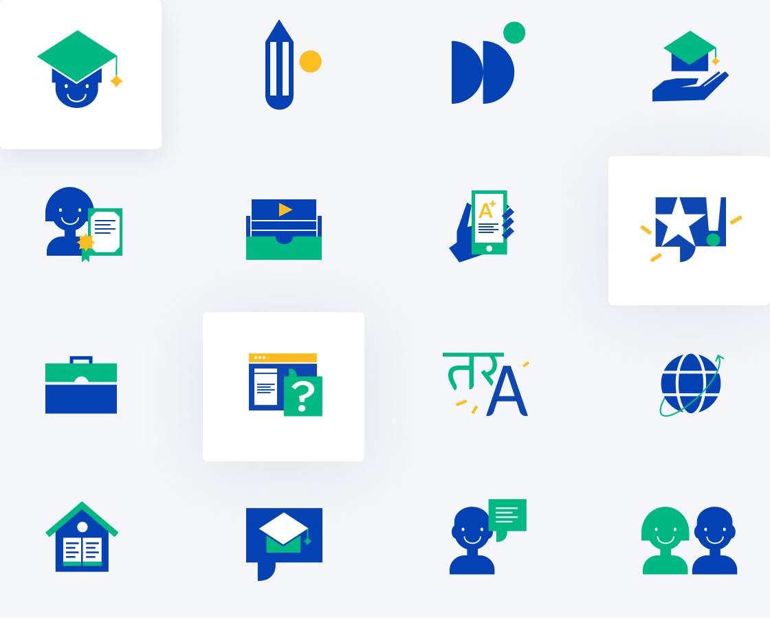
As the main focus of the website was on the big and high-quality photos of happy students, we also decided to liven up the high school website with custom illustrations and vivid colors.
Results
Our client got a bright and user-friendly website, that reflects the high school's values of innovation and joy of learning. The main lesson learned is that an information architecture can greatly affect the functioning of the website. This project will become a background for future IA and user flow redesign projects for learning websites.

Let's talk
Is there a challenge your organization or company needs help solving? We’d love to discuss it.

