E-learning Platform
Agente was approached by a company to develop the 12-K e-learning platform, providing a comprehensive learning experience with self-study classes, personalized 1-to-1 lessons, and group sessions. Our goal was to create a robust learning management system with diverse modules, engaging students in the studying process. The platform includes comprehensive statistics and progress tracking features, giving valuable insights into student progress and results for teachers and parents.
Our dedicated team of project managers and UX/UI designers collaborated closely with the client to analyze requirements and design exceptional information architecture and user flow. The resulting e-learning solution boasts unique features such as various course formats, gamification, quizzes, exams, progress statistics, and an efficient teacher's admin panel. Our goal was to positively impact students' educational journeys.
Research and Prototyping
UX Stage
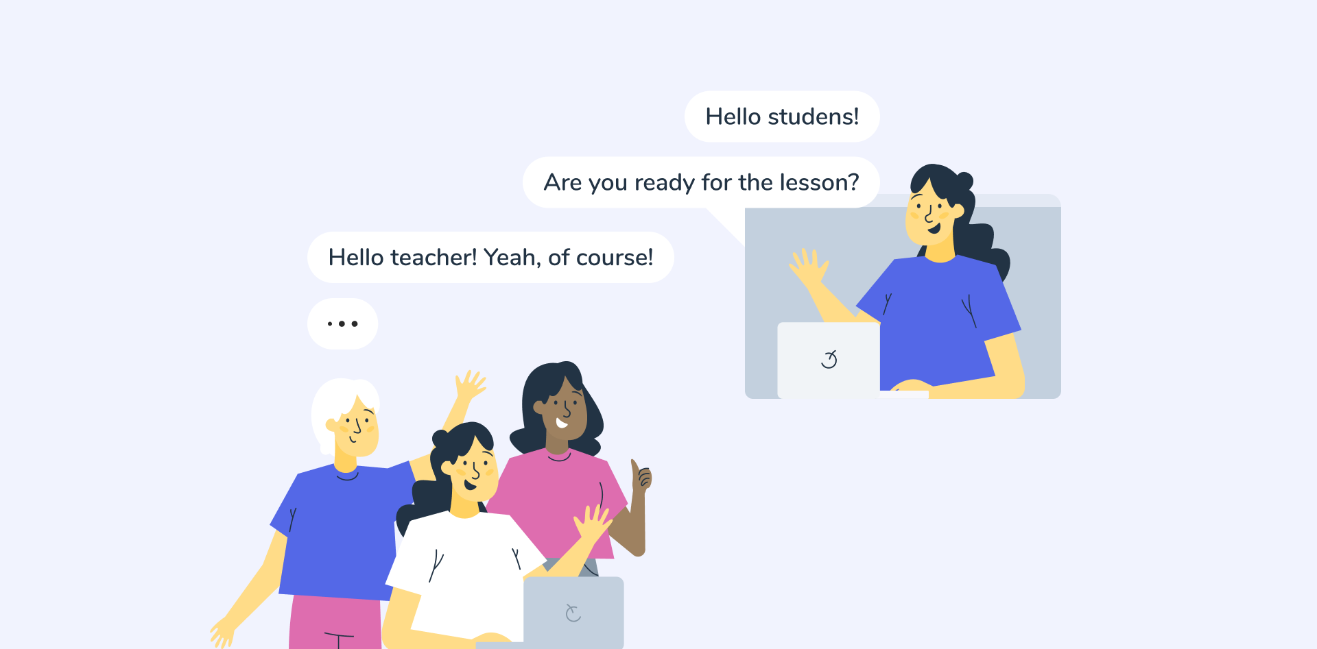
To create the e-learning platform, we started by thoroughly analyzing the client's concepts and needs. From there, we established personas, crafted user stories, and developed user flows that aligned with their vision.

Define Personas
By conducting user research and analyzing behavioral data, we capture the unique characteristics and behaviors of our intended user groups

Write User Stories
From there, we developed user stories that capture the specific needs and goals of these personas

Create User Flows
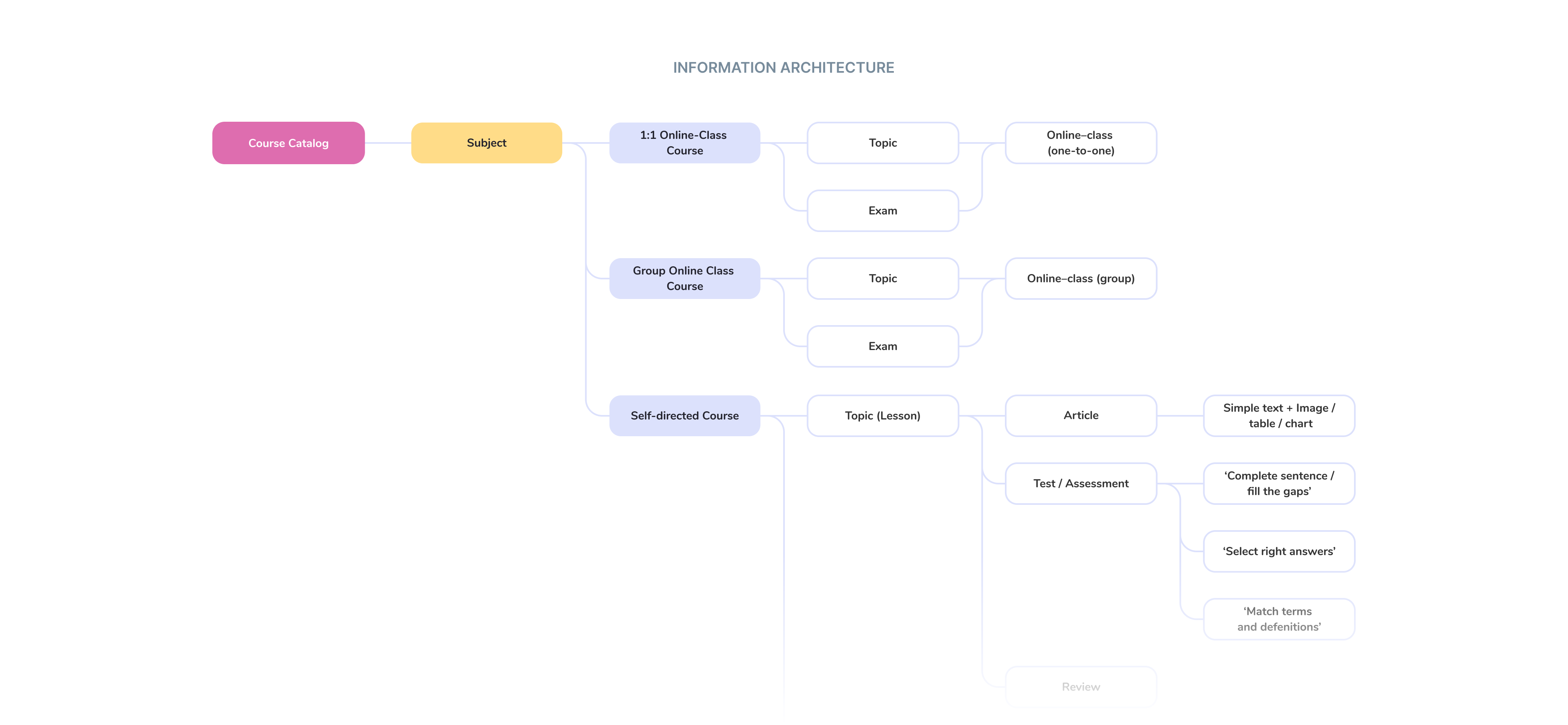
By diving into the details of each user story, we were able to establish clear user flows. These flows outline the sequence of actions and interactions that users will experience while navigating the platform.
Wireframing and prototyping
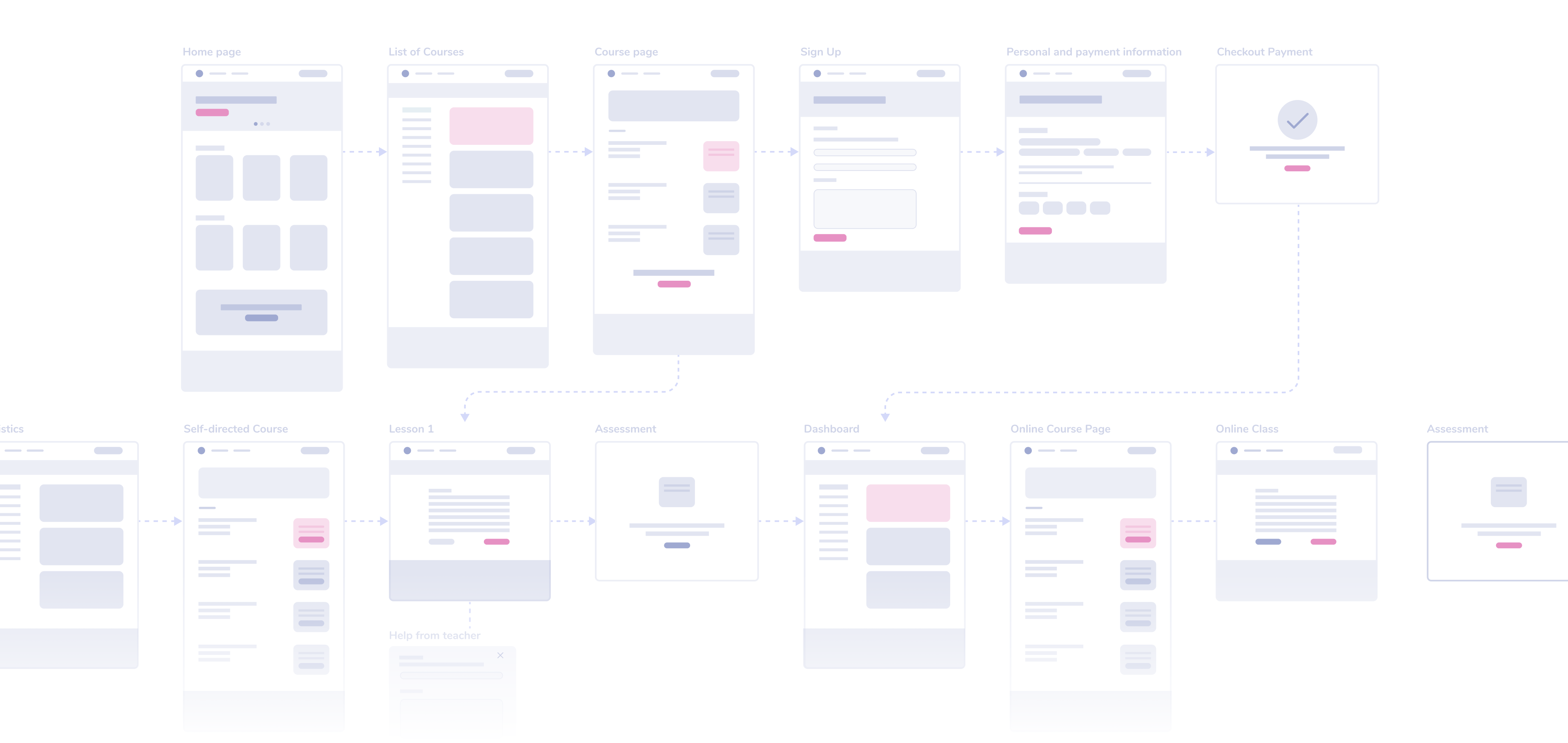
We first created low-fidelity wireframes to help us visualize and finalize important design features. Next, we focused on refining the design details and developing a prototype that accurately represents the product's appearance and functionality.
UI Design stage
Innovative Self-learning System
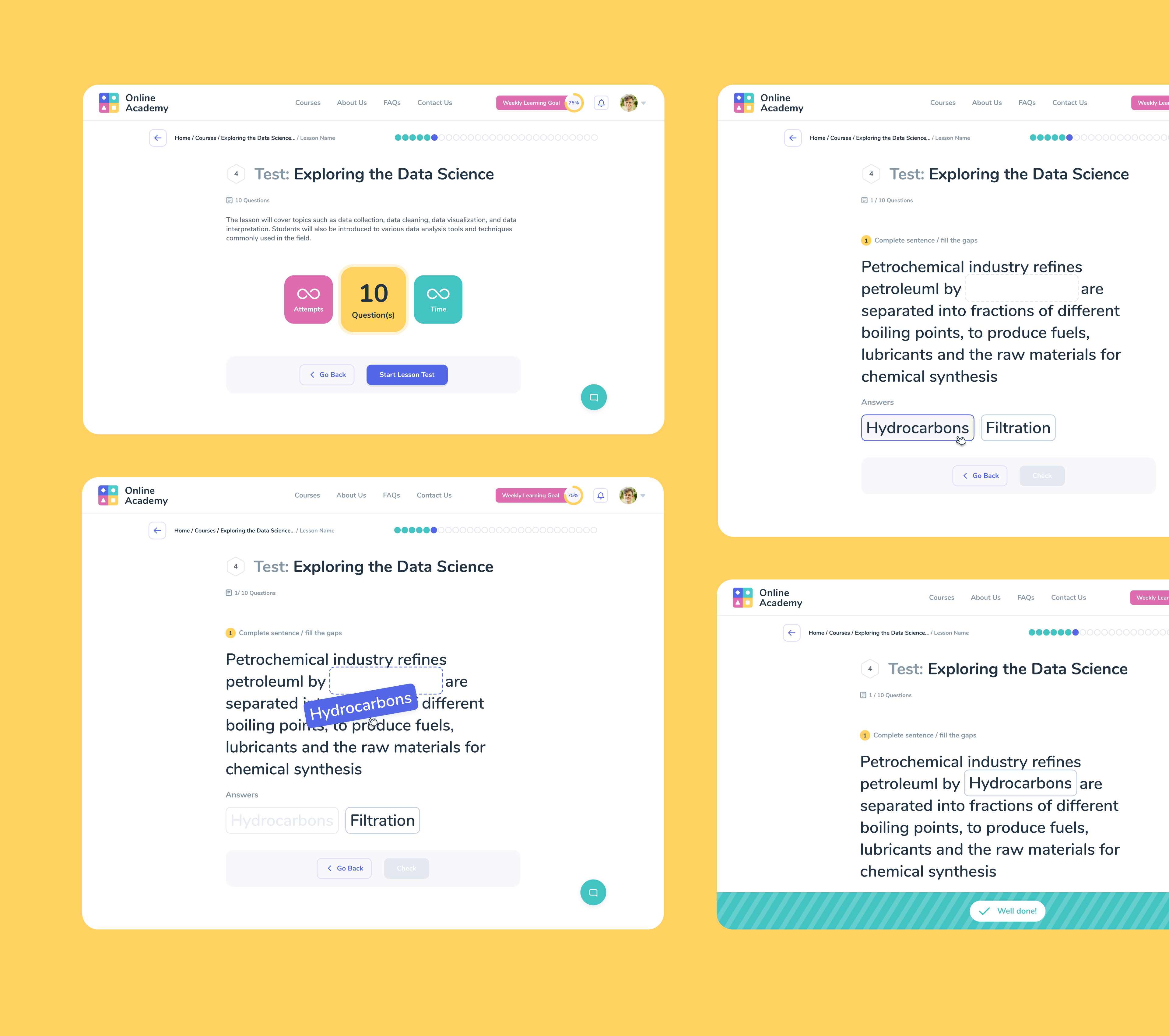
With the self-directed course builder, teachers have the freedom to incorporate a range of materials such as videos, text, and interactive tasks or quizzes to enhance students' learning experience. This approach encourages students to set their own goals, earn achievements, and obtain certificates upon completing exams, making learning more engaging and enjoyable.
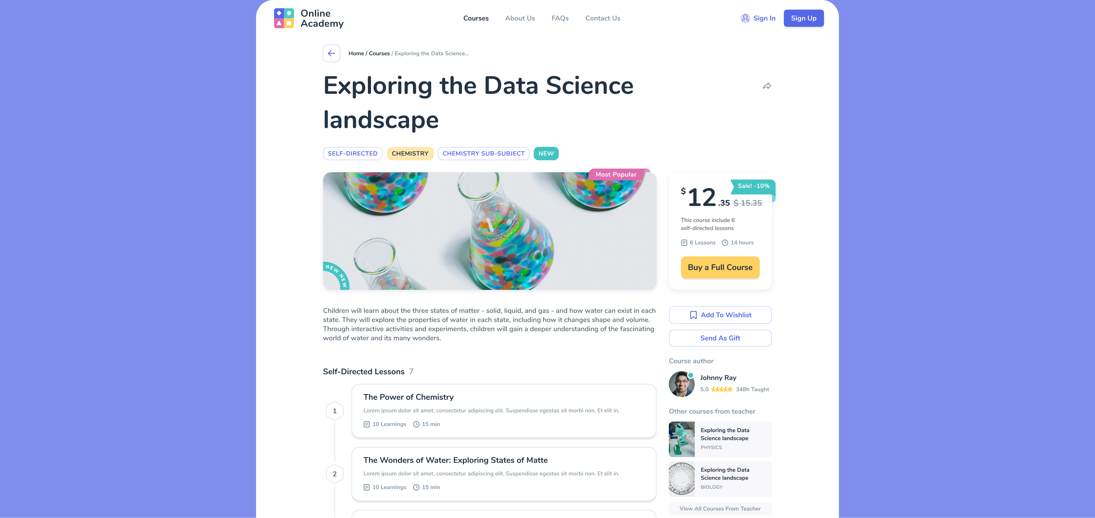
Course Catalog
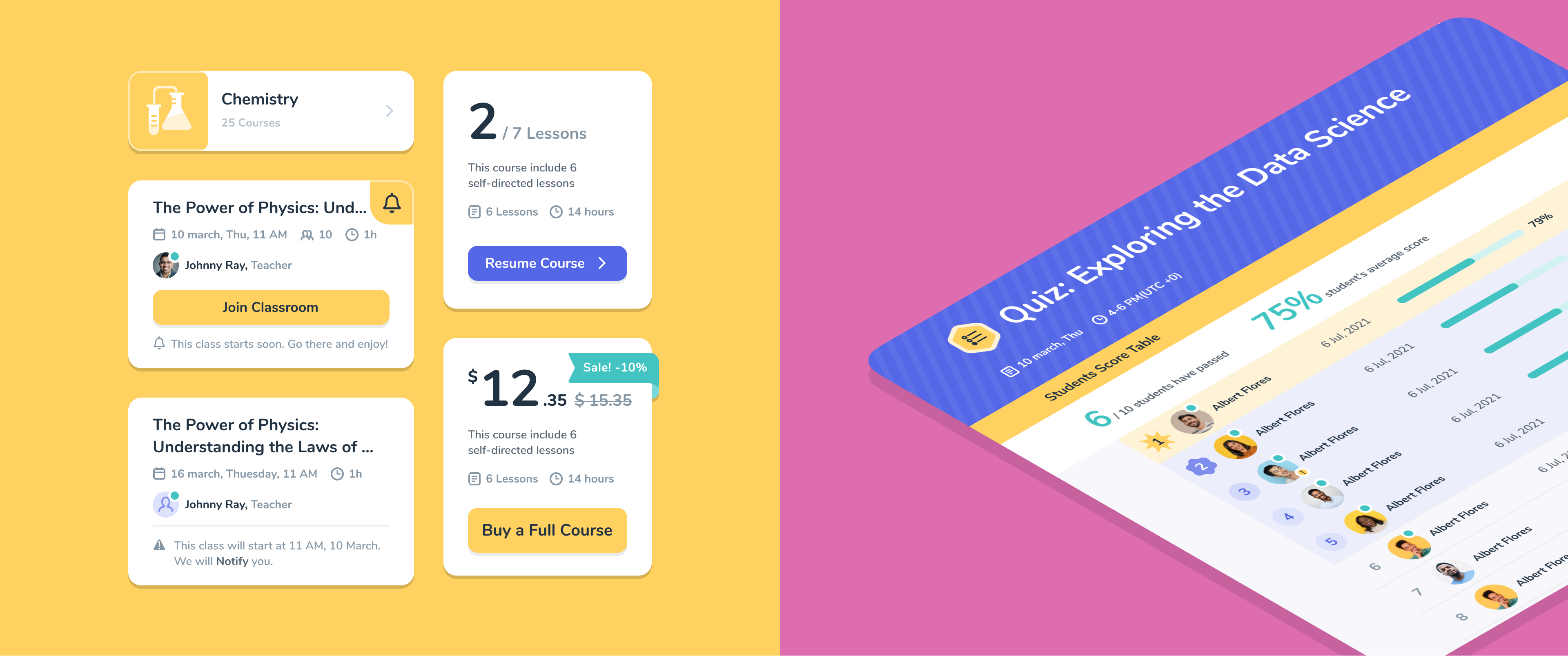
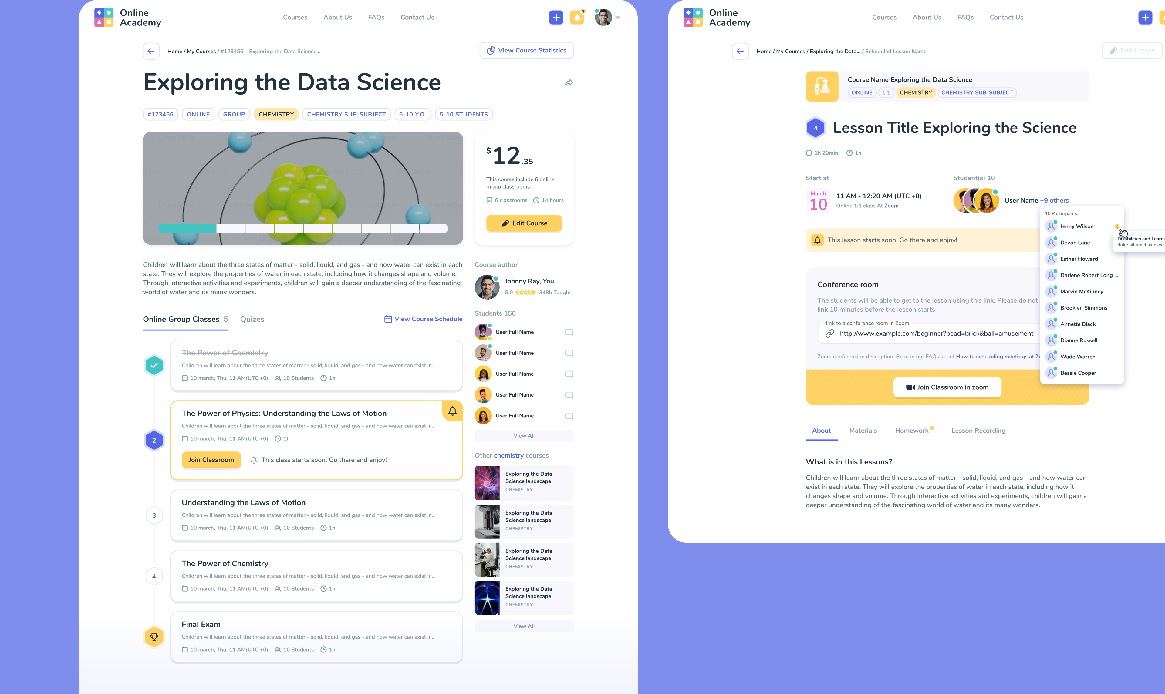
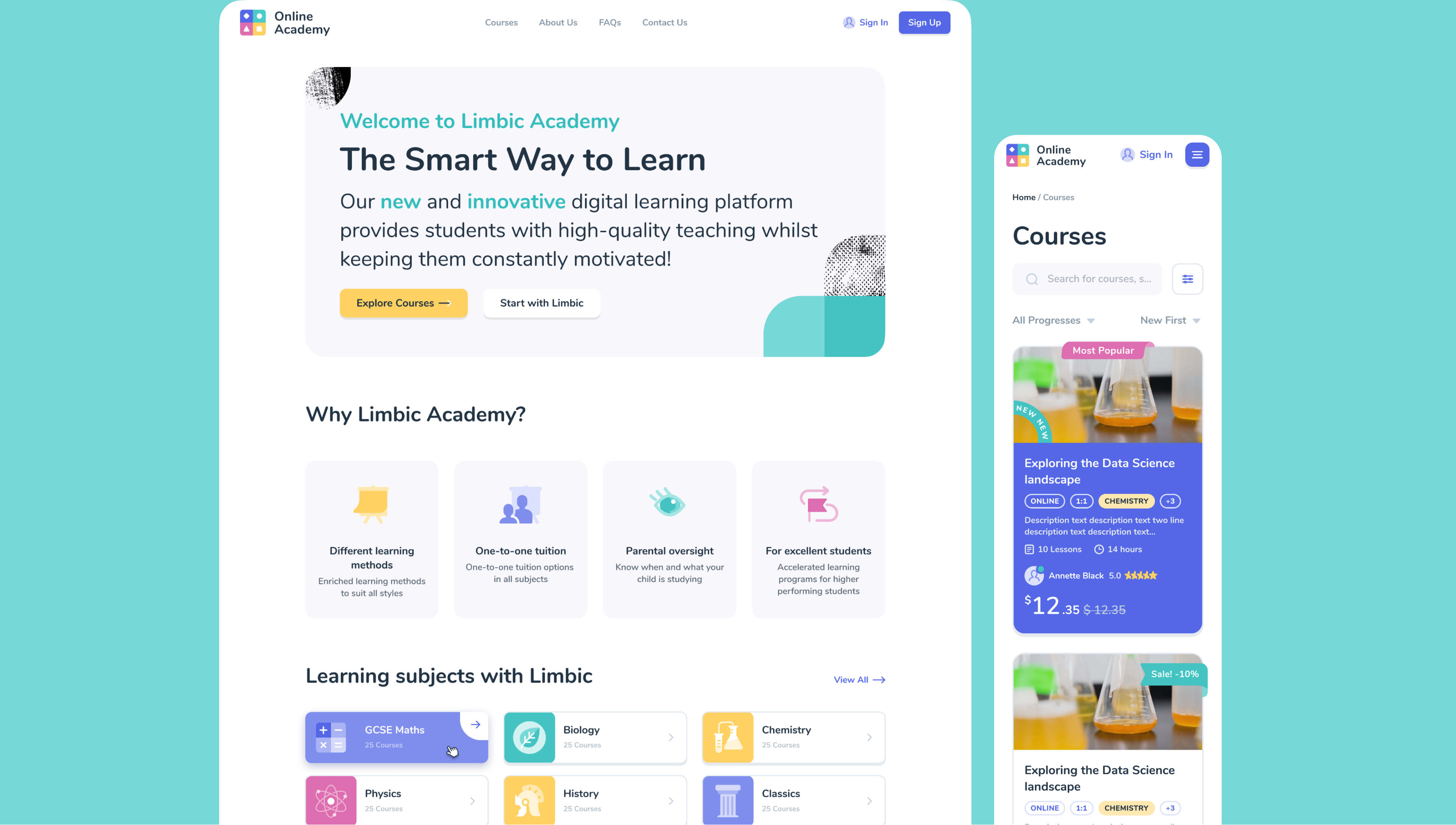
Our course catalog design offers easy search and categorization by subject and age, with each course having its own page displaying progress. It's intuitive, user-friendly, and convenient, with categories and detailed information on each course including goals, duration, cost, and certificate options. Progress tracking allows users to understand their stage of learning.
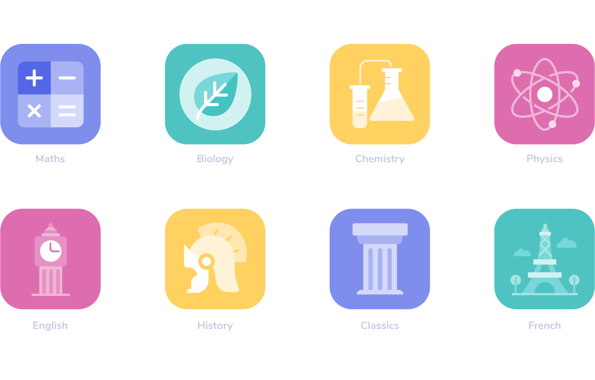
Icons for Subjects
We developed a set of icons for various subjects, each with its own color coding. This allows users to quickly and easily identify each subject and find the necessary information. Each icon is designed with the unique features of each subject in mind, making them intuitive and appealing to users. With our icons, users can easily navigate through the sections and find the information they need.
Adaptive Dashboards
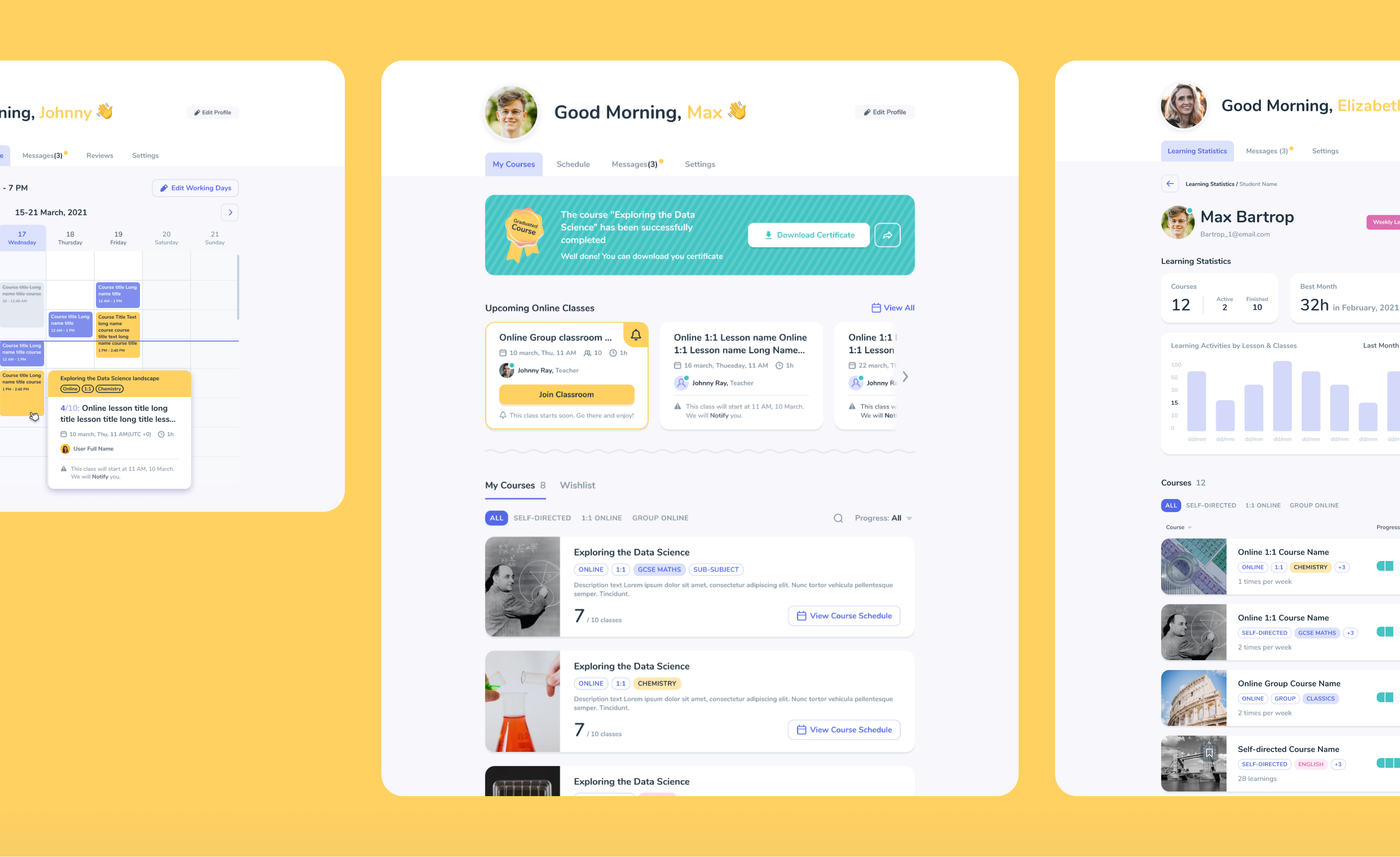
Users can easily tailor the dashboard to their specific needs. For teachers, it acts as a gateway to a powerful teaching platform and provides teachers with easy access to features such as class management, content creation tools, and student performance tracking.
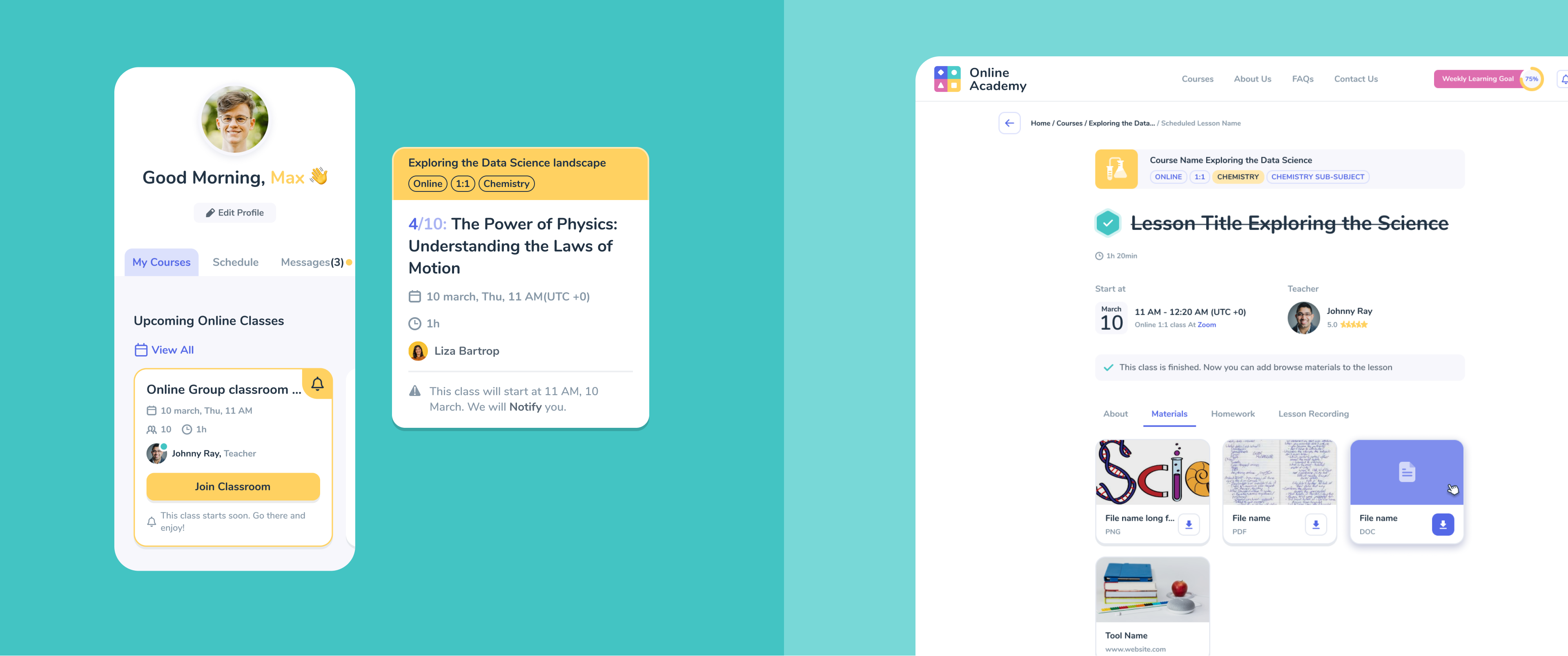
Learning Dashboards
We designed a user-friendly and simple dashboard for the central character of our platform - the Student. Since the age of our platform users can be as young as 4-5 years old, we took their love for bright and cheerful interfaces in mind to make the learning process enjoyable.
landing Page Design and Branding illustrations
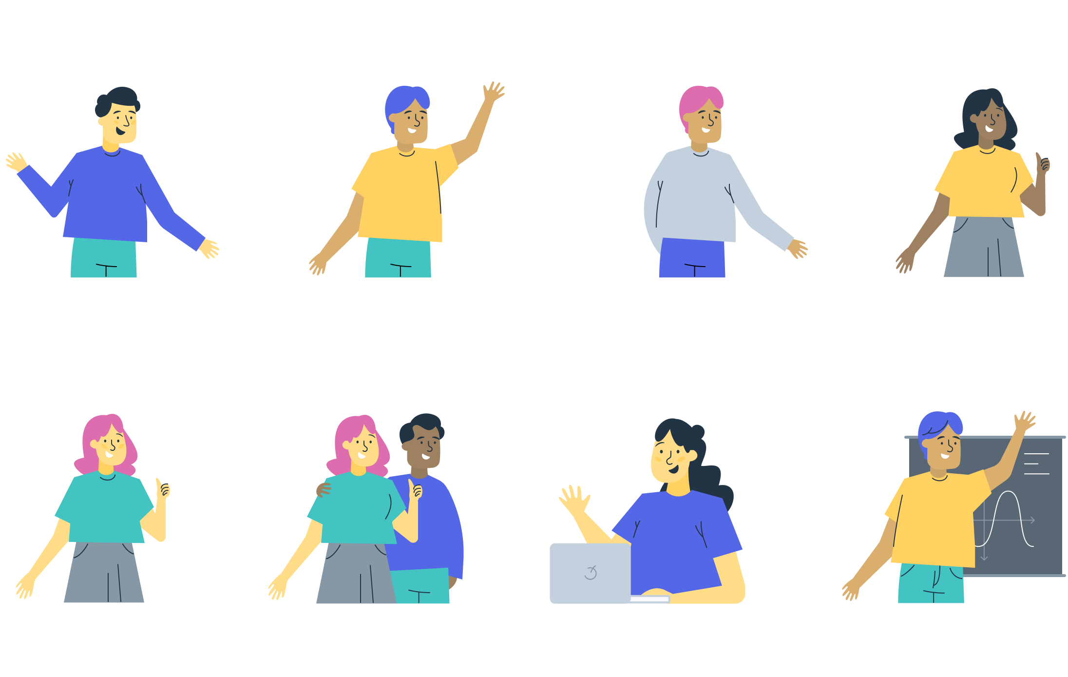
We created a delightful set of characters to bring our brand to life and create a friendly atmosphere. Each character has been carefully designed with vibrant colors that represent our brand's essence.
Landing Page Design
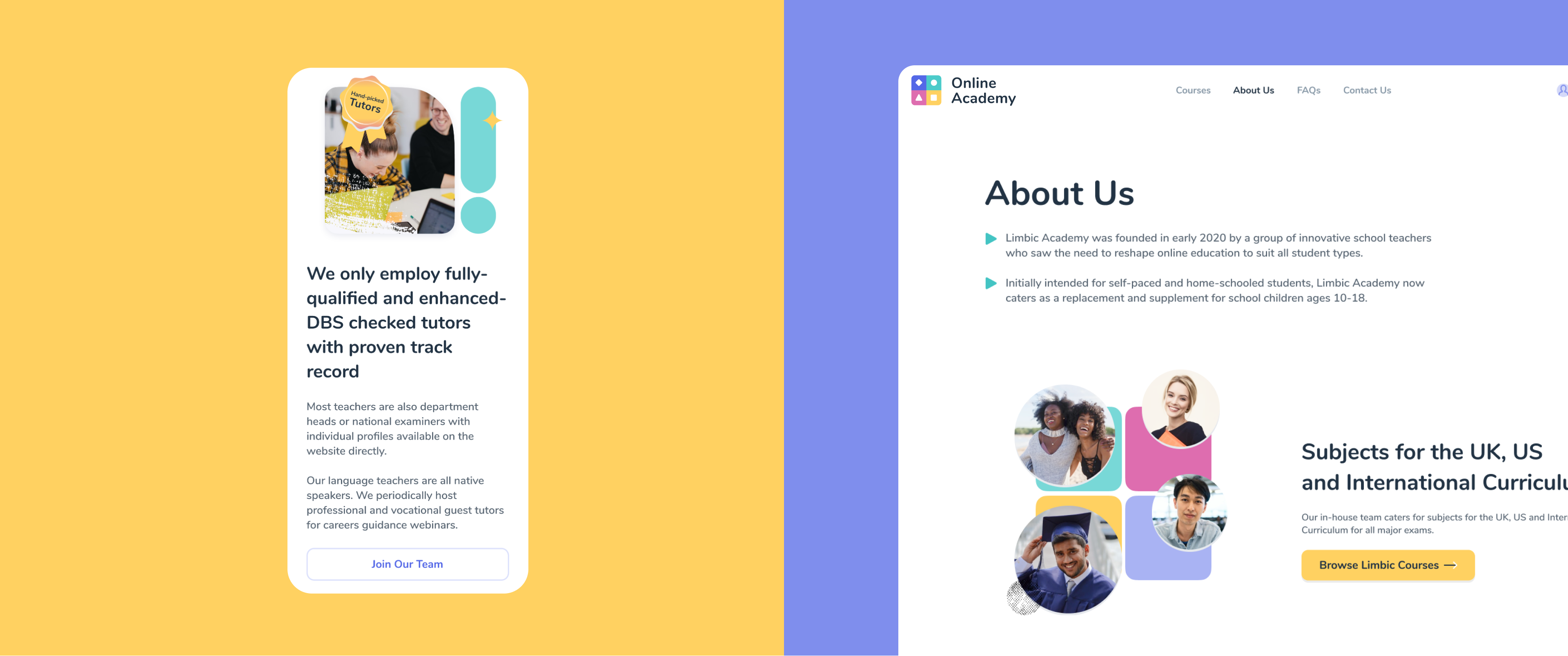
Our landing page has one goal: to provide an intuitive and seamless browsing experience while showcasing the diverse range of content and possibilities our platform offers. We've designed an intuitive layout with organized sections that cater to teachers and students, ensuring easy access to relevant information. Our user-centric approach fosters an environment that supports the needs of all platform users.

Results
We paid close attention to detail and used user-centered design principles to align our development process with the client's vision. As a result, we created a top-notch e-learning platform that caters to the unique needs and preferences of its users.

Let's talk
Is there a challenge your organization or company needs help solving? We’d love to discuss it.

