04 December 2017
How to Make Your Website Mobile Friendly?

For a long time, web design focused on desktop devices. Today the web is going mobile, and businesses take advantage of communicating with clients via their mobile devices. Mobile apps prove to be effective when it comes to cementing a relationship with loyal customers, but they will not bring the majority of traffic, as that still comes from the web.
Creating a mobile-friendly website is a bright idea in this case. According to Statista, mobile devices account for approximately half of all web page views worldwide as of early 2017. In the U.S., for instance, more than 40 million Internet users are expected to access the Internet exclusively via their mobile devices in 2017. So, launching a mobile friendly website has become a surefire solution for businesses that want to thrive.
Search engine giants have noticed this tendency. They do their best to help site owners and developers design great sites for various audiences. For instance, Google has a special test that allows users to check whether a website is mobile-friendly.
We couldn’t stay on the sidelines, either. Our team has prepared some advice to give you an idea of what a mobile friendly design is, and what you should consider in order to succeed in making a website mobile friendly.
Tips on Making Website Mobile Friendly
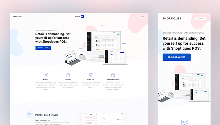
Source: dribbble.com
A user experience must be tailored to devices that visitors are using. You can’t just take a desktop version of your website and clip its content to make the site fit smaller screens, and then claim that you are adhering to the principles of mobile friendly web design. The best practice is to reconsider a user experience from the very beginning in order to gain a full understanding of mobile visitors’ needs, as they differ from those of desktop users.
For instance, such users tend to access the Internet on the go, they rarely have two free hands to navigate screens, and cannot stand pages and images that are slow to load. In short, you need to rearrange the website’s content for mobile and desktop audiences and come up with a truly mobile friendly website design in order to make it work well.
It’s essential to analyze how mobile device owners interact with your existing site via their devices; when they access it, which pages are popular among them? Which pages have the highest bounce rates and need to be fixed? And so on. All these factors must be reflected in the new design.
Creating Design
There are two major approaches to the development of a mobile-friendly website: responsive web design and a separate site. Let’s start with common development steps for all sites.
● Set Your Goals

Discuss the project with your team to determine its goals. Ask yourself what you want to achieve—a higher Google ranking, increased sales, etc. By defining what you want to achieve ultimately, you will be able to find the right solution.
● Create a Sitemap and Wireframe

A sitemap is an effective planning tool that can help designers and non-designers join forces to organize the content in a logical order, and eliminate unnecessary web pages by breaking the whole site into basic building blocks. Users don’t need too much content. Mobile screens are small, and people are unlikely to bother reading much text on such screens. If you want your desktop visitors to see more content than other users, you need two versions of the same site.
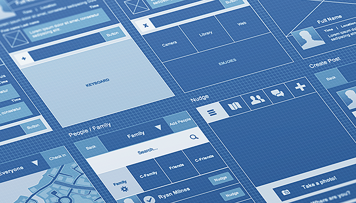
Source: dribbble.com
Once the sitemap is ready, you can proceed with making a wireframe. It’s vital to have a wireframe in hand before the design process starts, as it showcases the content hierarchy for each page.
● Consider User Needs

You need to strike a balance between the content density and site usability. Check for yourself that the site has a touch-friendly layout when it is opened on a mobile device. Targets that are too small may lead to click mistakes and turn off the user. E.g., the minimum target size of touch buttons is 48 x 48 dp, and the space between targets should be no less than 8 dp.
Make the right typography choice to meet end-users’ needs. For instance, typography experts say that the font size of the body text shouldn’t be less than 16 px to retain its readability on multiple devices.
Responsive Sites
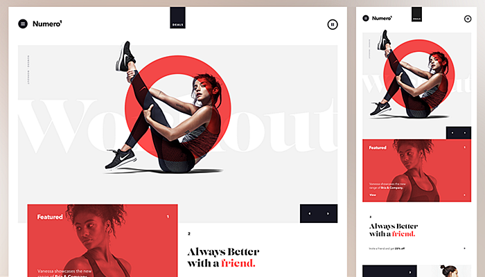
Source: dribbble.com
The responsive web design is a popular approach to making a site mobile friendly, as it allows the content to resize itself in order to fit various screen sizes without creating a new version of the same website. Such sites utilize a flexible grid to ensure the layout consistency. They make use of breakpoints describing how the content (e.g., images) should reflow on each screen. Check out this article to learn what a well-designed responsive e-commerce site looks like.
Responsive sites have the same URL on all the devices, and no redirects are needed. These websites look great on any device and benefit from flexible orientation; visitors get a streamlined user experience, and no extra SEO efforts are required. Developers leverage various tools to help them preview a responsive site on numerous devices, such as Google’s Resizer.
Separate Mobile Site
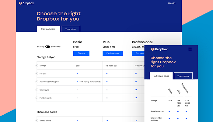
Source: dribbble.com
These sites are developed when it is important to create a website with a completely different structure. With a separate mobile version (sometimes with its own URL), site owners can deliver a user experience tailor-made for mobile visitors. There are no drawbacks caused by a responsive design, no compromises are needed. Just keep to common mobile development guidelines and utilize mobile-specific features, e.g. click-to-call links. A great fit for custom e-learning solutions.
Other Recommendations
- Eliminate unnecessary steps to improve the user experience. For instance, the more steps an e-store requires to place an order, the higher the chances that the user will abandon the cart.
- Ask developers to make site pages load fast. Don’t make your prospective clients wait and switch to your rival’s website. Utilize this tool to check the speed and get advice on how to make your pages load faster.
- Ensure your site is compatible with all the major browsers to deliver an engaging user experience. There are many online tools that you can use to check the cross-browser compatibility (e.g., Browsershots).
- Make navigation and menus simple. For instance, allow visitors to return to the site’s homepage by tapping your logo at the top of the page.
Simplify the input. For instance, employ a dropdown menu and provide a visual calendar to help users select the date.
Conclusion
Both businesses and search engines emphasize the importance of having a mobile-friendly site. We hope that our short guide will help you address these needs and do the trick. Feel free to reach the AGENTE team if you have any questions.


Rate this post!
388 ratings, average ratings is 3.0 out of 5

Related Posts

13 November 2018
How to Use Animation in Mobile Apps
Mobile apps and motion design should go hand in hand. Animations can improve navigation and interactions. When is it appropriate to use animation in a mobile app? Read on this post to find it out.

21 June 2017
Pros and Cons of Creating a Mobile-Friendly Website
The Internet has become an essential part of our lives. The advent of smartphones and tablets gave people an excellent opportunity to access it any time through cellular networks or Wi-Fi.

18 August 2015
Adaptive vs. Responsive design?
How do you preparer a site for a mobile view? What approach to choose? What are pros and cons of adaptive and responsive design?

16 January 2024
ChatGPT Plugin Development: Features and Benefits for Business
Explore the process of crafting a ChatGPT plugin tailored precisely to meet your unique business requirements.

09 May 2024
Top 7 Open-Source LLMs for 2024
Here, we break down everything you need to know about open source LLM models: top 7 offerings on the market, their pros, cons, and capabilities.

19 January 2024
AI Model Fine-Tuning: How to Use Your Organization's Data?
Organizations are transitioning from generic solutions to hyper-customized intelligence, seeking AI models designed to address their unique challenges and propel them toward strategic objectives.
This demand has propelled fine-tuning to the forefront of AI development.
Let's talk
Is there a challenge your organization or company needs help solving? We’d love to discuss it.

Managing Director, Partner
Andrew Terehin

Thank You!
Your message has been successfully sent.
We will contact you very soon.