21 June 2017
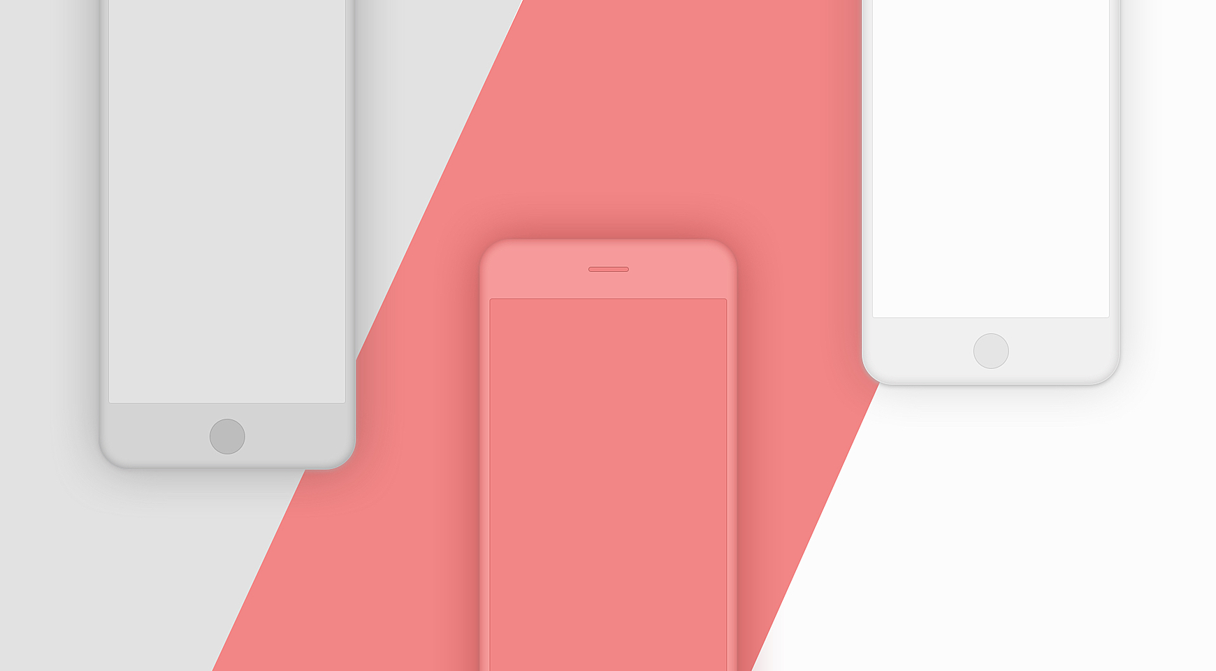
Pros and Cons of Creating a Mobile-Friendly Website
Why Make A Website Mobile Friendly
The Internet has become an essential part of our lives. The advent of smartphones and tablets gave people an excellent opportunity to access it any time through cellular networks or Wi-Fi. In the U.S. alone, 77% of adults have smartphones, and many of them use these devices as their primary means of online access at home.
The reliance on smart devices is growing. For instance, mobile devices generate 50% of Swarovski's website traffic. So, business owners who want to build their online presence have to take mobile traffic into account. Mobile friendliness has turned into a burning issue for them.
Google also devotes close attention to making sure that websites are smartphone friendly by punishing those sites that do not comply with requirements. But, this Internet search giant does give webmasters a chance to take a test to find out whether they should make any changes.
Website User Experience: What Visitors Expect
People who browse the Internet from their mobile devices rarely have a profound understanding of what mobile friendly website design is. Nevertheless, they will criticize a web page if they do not like it.
A study showed that the ease of use is critically important to website visitors. People visit sites to read the latest news, purchase different goods, find relevant information, communicate with others, send e-mails, and more.
Websites must help users fulfill their objectives and make their lives easier. Visitors must not lose their time getting used to menus or waiting until all the images are loaded.
How to Make A Website Mobile Friendly
There are two major approaches to making a website mobile friendly. Let’s discuss their pros and cons in detail.
1. Responsive Web Design (RWD)
This approach is based on the principle of fluidity and functionality. It deals with optimizing a website experience for different devices (PCs, tablets, smartphones, etc.). In short, web pages detect screen resolutions of devices and their orientation to adjust the layout accordingly.
The viewport <meta> tag signals browsers that the web page can adjust to any device. The line may look as follows:
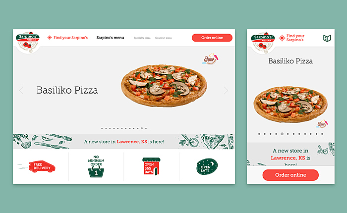
Source: gosarpinos.com
Advantages
- RWD is time- and money-saving: developers need to maintain only one existing website, as such sites use the same URL and code.
- Developers are unlikely to repeat common mistakes that they make when mobile websites are created.
- No redirection is required.
- The crawling efficiency will be improved, as there is only one version of content and each page needs to be crawled by Google only once.
- Indexing properties will be assigned accurately to the web page, and there is no need to differentiate it from a mobile version.
Disadvantages
- Creating a mobile-friendly website with the help of RWD may be too expensive.
- The development cycle (from scratch) may be longer if compared to a regular website.
- User experience is often not optimized across devices, and it may be not good enough. Meanwhile, wise practitioners create responsive layouts by employing CSS media queries and the viewport tag.
- Navigation issues: developers may fail to ensure easy navigation.
- Web pages may be slow, as responsive sites have to load all the objects (the same as a full desktop version).
- Some strings may be too long. But this problem can be solved by employing word-wrapping.
2. Separate Site for Mobile

Many businesses still prefer having mobile-dedicated websites. And here's why:
- Such websites are a cheaper alternative to RWD, and they do not take too much time to build.
- They deliver better user experience and are easy to navigate. The developers create separate layouts for the mobile version. They adhere to design guidelines for mobile devices and may target specific devices.
- The sites load quickly, as they utilize content that is optimized for mobile devices (e.g. image files are smaller than those of the desktop version).
- These web pages may contain content and features that are not appropriate for the desktop version.
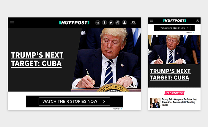
Source: huffingtonpost.com
There are some disadvantages, too:
- The need to maintain one more version of the website.
- Extra SEO efforts may be required to target mobile users.
- The need to redirect visitors to another web page by employing plugins/a .htaccess redirect/etc.
- Faulty redirects. Sometimes websites are unable to redirect users to the right page. People want to be redirected to the page they visit, not to the homepage/other pages.
Responsive Design or Mobile Site: Which One to Choose
Imagine that you have a choice between a responsive site and a separate mobile version. What would you choose? You'd better start with determining the type of website you need. RWD is entirely appropriate in some cases, while a mobile site is an attractive option in others. Check the examples below to get an idea of the best scenarios.
Corporate websites
They are developed to inform existing and potential customers about services offered by the company, its history, latest news, and more. Brand consistency (not high-resolution images) is the number one priority in this case. Business owners want their websites to work well on different devices. That's why they usually opt for RWD.
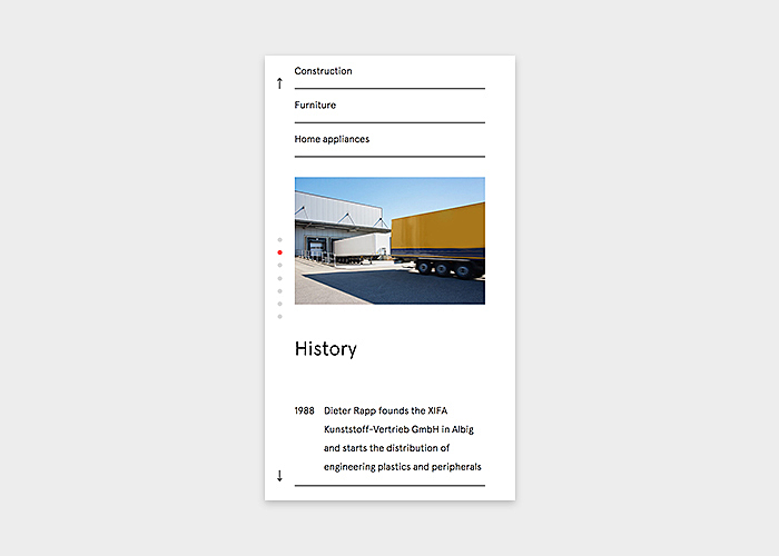
Source:http: xifa.de
Blog Sites
Bloggers put great emphasis on the content that they produce. They do not use many high-resolution images. Blog sites’ pages can load quickly on any devices. So, these sites usually do not have a separate version for mobile devices.
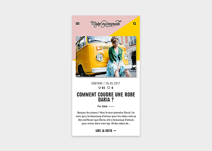
Source: makemylemonade.com
News Portals
They are flooded with content: texts, images, and more. Time is a crucial issue for these websites’ owners, and the content is often updated in real-time. It may be time-consuming to manage updates when two versions of the same site exist, and developers usually utilize RWD.
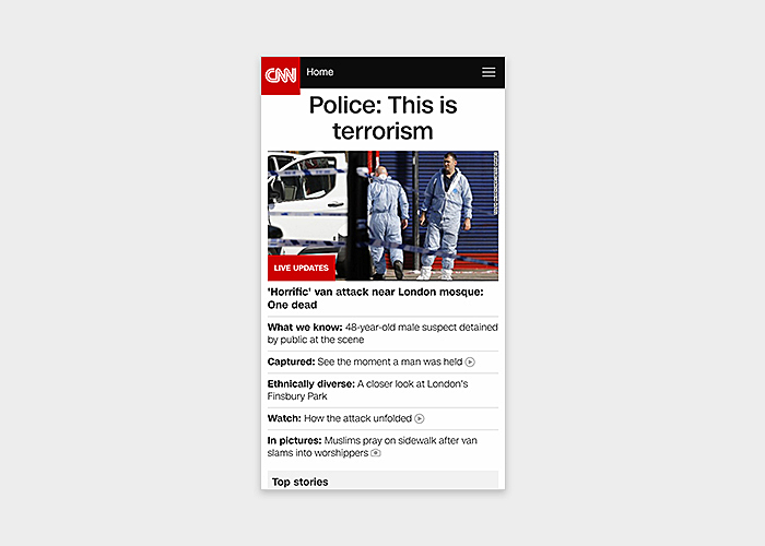
Source: edition.cnn.com
Some news sites choose a separate version for mobile devices.
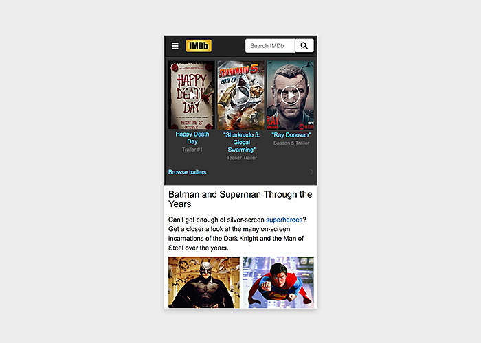
Source: imdb.com
Online Maps
RWD is exactly what their owners need, as site visitors must have an opportunity to zoom in and out on a webpage to see things better on the screen.
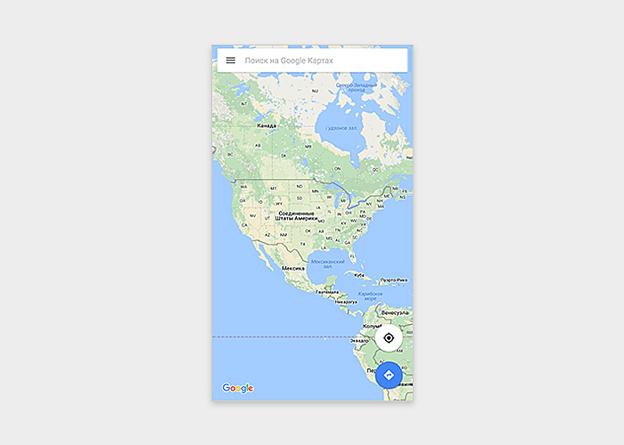
Source: google.com
Separate mobile versions or apps can be developed, too.
Complex Sites
These sites involve different content (texts, images, and videos) that is equally important to users. The companies that provide training platform development services or social network design, should consider a mobile version for such solutions. Their owners double-check that all the content is displayed correctly, while responsive designs may have unplayable content.
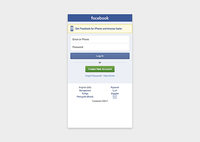
Source: facebook.com
E-commerce websites may also have mobile versions:
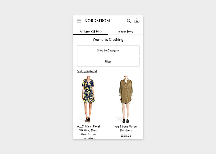
Source: nordstrom.com
Conclusion
A mobile friendly web design is now a must for site owners, as the number of people who browse the Internet from their mobile devices is increasing. Leading search engines also pay close attention to whether sites deliver a valuable experience to users who access them from smartphones or tablets.
The Agente team is always ready to give business owners a helping hand by creating web solutions that are easy to use on any device and boast cutting-edge design.


Rate this post!
768 ratings, average ratings is 4.0 out of 5

Related Posts

13 November 2018
How to Use Animation in Mobile Apps
Mobile apps and motion design should go hand in hand. Animations can improve navigation and interactions. When is it appropriate to use animation in a mobile app? Read on this post to find it out.

04 December 2017
How to Make Your Website Mobile Friendly?
For a long time, web design has been focusing on desktop devices. Today the web is going mobile, and businesses take advantage of communicating with clients via their mobile devices. Our team has prepared some pieces of advice to give you an idea what a mobile friendly design is, and which you things you should consider to succeed in making a website mobile friendly.

18 August 2015
Adaptive vs. Responsive design?
How do you preparer a site for a mobile view? What approach to choose? What are pros and cons of adaptive and responsive design?

16 January 2024
ChatGPT Plugin Development: Features and Benefits for Business
Explore the process of crafting a ChatGPT plugin tailored precisely to meet your unique business requirements.

09 May 2024
Top 7 Open-Source LLMs for 2024
Here, we break down everything you need to know about open source LLM models: top 7 offerings on the market, their pros, cons, and capabilities.

19 January 2024
AI Model Fine-Tuning: How to Use Your Organization's Data?
Organizations are transitioning from generic solutions to hyper-customized intelligence, seeking AI models designed to address their unique challenges and propel them toward strategic objectives.
This demand has propelled fine-tuning to the forefront of AI development.
Let's talk
Is there a challenge your organization or company needs help solving? We’d love to discuss it.

Managing Director, Partner
Andrew Terehin

Thank You!
Your message has been successfully sent.
We will contact you very soon.