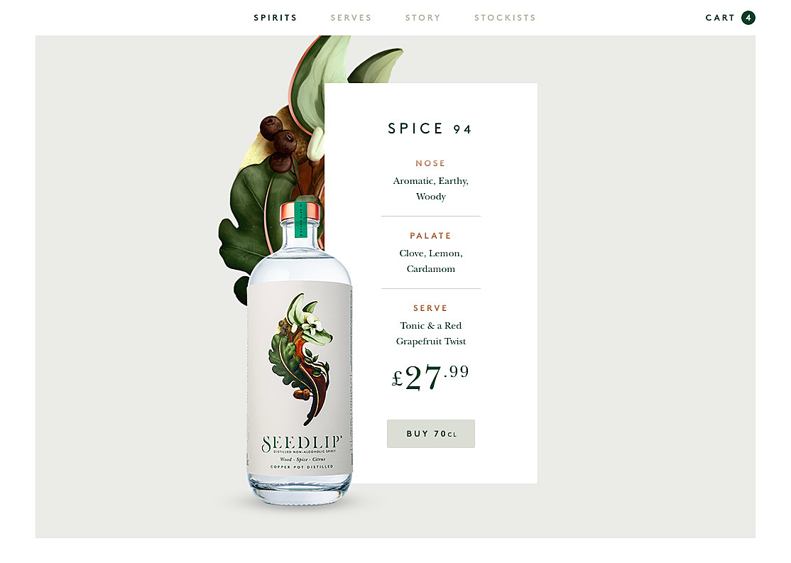
Each time a new website is created, designers solve a number of common problems, such as layout, navigation, login, profile and so on. And these problems are common because every new website has them. So no wonder someone once noticed that and started collecting solutions to solve them. Right now there are many different websites offering a wide range of web design UI patterns for this or that issue. In this article, we will take a look at design patterns that will be trendy this year, in our opinion. There are probably thousands of patterns for every element available out there, so in order to keep this article short, let’s take a look at only five patterns that no doubt will be trendy this year.
1. Grid-free layout
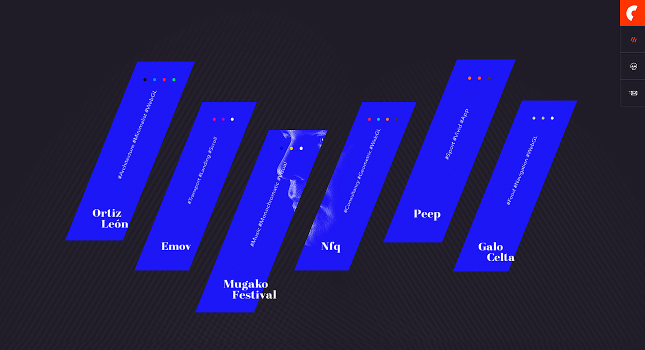
Having a container-free layout allows you to focus the user’s attention more sharply on the content and highlight one message at a time, as such representation differs from the more traditional grid approach. Users’ eyes will see unfamiliar patterns, and thus you’ll get their attention. It can be useful for websites that offer some new services or products to their customers, as this is one of the approaches that helps customers actually feel the “difference”.
2. Cards
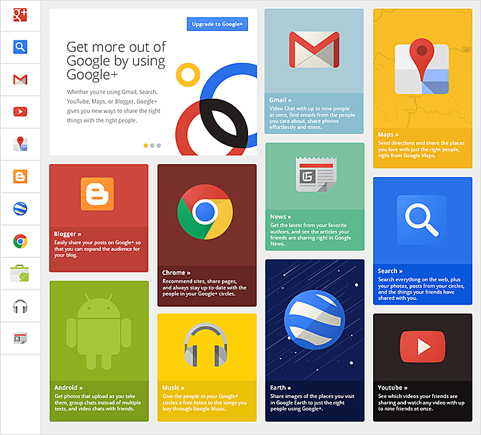
Though this pattern was introduced long ago, it is still one of the most powerful ways to design a content-heavy website and is one of the basic e-commerce website design features. It can be applied to any type of website, and the reason is that it allows for more items on a page, but at the same time it doesn’t make the page look cluttered. Rather, the page seems well-organised. So this definitely will continue being one of the most effective UI patterns.
3. One page website
There are several reasons for one page or single page design patterns to be trendy this year:
- It usually takes less to design and develop a single page website than a website with a complex navigation
- It is simple and intuitive, and thus user-friendly.
Users just need to scroll (which everyone can do) to see more, and they’ll know exactly where to go if they’d like to get back to the recently viewed item — simply scroll back.
Even some web giants like Gmail, Spotify, and Tumbler use this one-page approach, as they tend to allow users to accomplish their tasks and goals within one page. This pattern is one of the best web application design patterns out there, which is why this it is too good to be left out.
4. Asymmetry
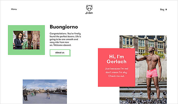
Such a pattern allows your website to stand out, and to do so aggressively. It calls attention from the very first second the user sees it, and it entertains them. They want to see more (if it is a good example of the asymmetric layout, of course, because if it’s not then it can cause the opposite effect and repulse users from the very first sight). This approach is minimalistic and fresh; it perfectly solves the problem of too “rigid” a structure. However, you need to be careful with that, as it all depends on the type of business you have. Creatives can definitely benefit from this pattern, and it deserves being considered when designing websites.
5. Social login
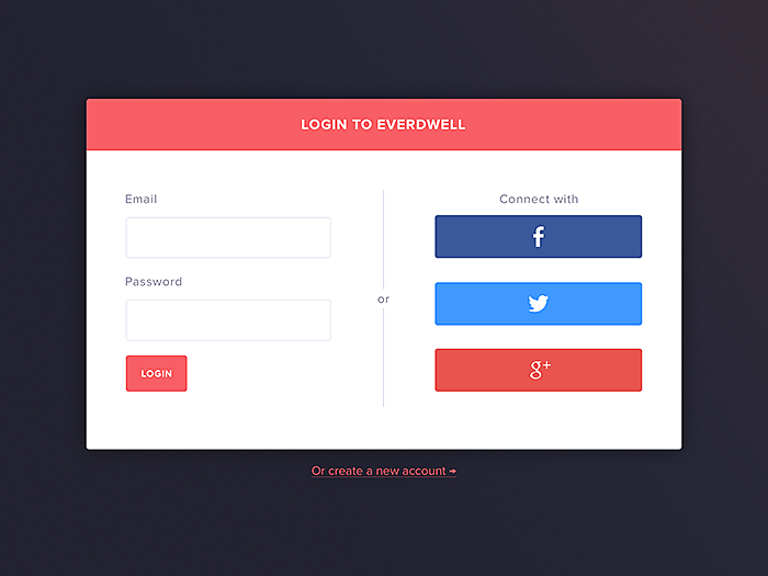
Though we talked mostly about the layout patterns, there are many other web design patterns you should know. However, in order to keep my promise and to keep this post short, let’s take a look at the pattern that is not a layout pattern and will definitely be a must-have. Social login is what users are looking for when they are new to a website. It allows them to be registered as fast as possible to get to the core. So social login is a perfect solution for login problems because of several reasons:
- It allows users to easily sign in/sign up
- It allows website owners collect user data in a pain-free way
Conclusion
There’s room for creativity with any pattern, so you can experiment and even combine several into one, so you can definitely benefit from browsing through a myriad of examples until you find the pattern that will be good enough to be applied on your website and solve some problems. This article can give you only a brief overlook of five must-know patterns, so feel free to explore more on your own, since we haven’t even touched base on the responsive web design patterns, as no article will be enough to describe them all.
Agente has been designing mobile interfaces for many years, but each website is unique, so we do not collect patterns we apply in the future in other websites. We design only custom solutions, tailored specifically to a customer’s demands. Our designers find inspiration in patterns for web design and then come up with their own ideas. And it means our client’s websites get what they need.
Further reading: Best healthcare website design.
Rate this post!
852 ratings, average ratings is 4.8 out of 5
Related Posts

05 January 2024
10 Best 404 Error Page Designs for 2024
In our new blog post, we review the best 404 page design examples of 2019 that will never disappoint you even if you meet the dead end on the website.

22 November 2022
10 Best Restaurant Website Designs & Best Design Practices
Restaurant owners always have a lot on their plate, and they are usually focused on the areas that can bring tangible benefits. Websites, unfortunately, are not one of those areas because even the perfect website does not guarantee that the restaurant will be full every evening.
26 May 2022
10 Best Examples of Beautiful Blog Design | Agente
In this article, you'll find 10 best examples of beautiful blog design, along with the tips that can help you enchant visitors.
29 April 2022
How to Design a User Profile Page in 2022
User profiles can become a constant flow of customer-related data that is extremely useful for marketing. How to design a user profile page? Read in our new article.

09 January 2022
Web Design Trends in Web Interfaces for 2022
Best practices vs. trends on the Web. Is there any difference? Find out more about the principles of good web design in 2022.

20 October 2020
How to Design a Website For Black Friday & Cyber Monday?
In this article, we will talk about how to create an attractive and selling website design for Black Friday and Cyber Monday. Let's take a closer look at each step of creating such a website.
Let's talk
Is there a challenge your organization or company needs help solving? We’d love to discuss it.

Managing Director, Partner
Andrew Terehin

Thank You!
Your message has been successfully sent.
We will contact you very soon.
