Black Friday and Cyber Monday are great opportunities for your business to make money. One in three of all Americans plan to shop on these days, so marketers shouldn’t miss the chance to attract these people to their shop.
The success of BFCM promotion activities depends on good research and well-elaborated marketing tactics, so you should consider this campaign within your annual marketing strategy. It’s obvious that among all the other activities, you will need to prepare your website for Black Friday so that shoppers can have a clear idea of what you’re going to offer them.
What benefits does a BFCM campaign bring?
The stats show that in 2017, during Thanksgiving, Black Friday and Cyber Monday online sales totaled $14.5 billion in online revenue and this figure is set to grow bigger in the future periods. If even these figures don’t impress you, take a look at these unquestionable benefits that come with a BFCM campaign:
- You’ll get new clients which may have passed you by in the non-holiday season, and you can and win their loyalty.
- You’ll “wake up” those customers who bought something once and have never come back. Black Friday deals may remind them of your company.
- You’ll grow your margin with sales volume. A lot of businesses meet their weekly or even monthly plan in a day.
However, without smartly organized activities and customs, as well as an attractive design, such a campaign risks failure. In this article, we will focus on making a Black Friday website design that your customers will love.
How to create the design for BFCM
The foundation of marketing campaign success lies in a well-thought-out concept of what, how, and why you want to sell. Identify your target audience, communication channels, and visual language of the creative concept, and that will enable you to implement website design for Cyber Monday and Black Friday, complete with styles, forms, typography, and colors. Let’s see the parts of your marketing campaign that can be embraced by BFCM design and take a closer look at web ideas for Black Friday that you can use for inspiration.
Advertising banner
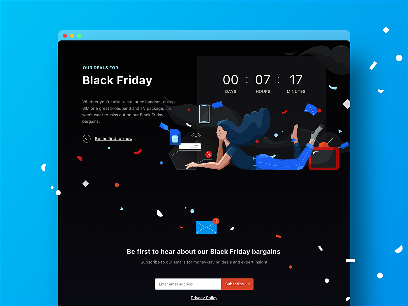
If you want to get into Black Friday stride with minimum effort, be sure to spread the word about the Black Friday discounts you are offering on your website or on your external platforms, using advertising banners stating the size of discounts, some of the most lucrative offers, or bundle deals. This solution suits great offline stores, their intent is to draw some attention of the online community and invite them to their brick-and-mortar locations, where other sales activities are conducted in a standard manner.
Landing page
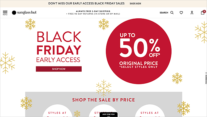
Source: sunglasshut.com
If we are talking about a really substantial approach to Black Friday website design, you need a special section on your website. That’s where your clients land, who come from social media, mailing or advertising banners. The landing page is good for many types of businesses including e-commerce websites, travel agencies or marketing and software providers—in a word, for anyone who is ready to cut their prices and welcome the crowds of new clients.
Website skin
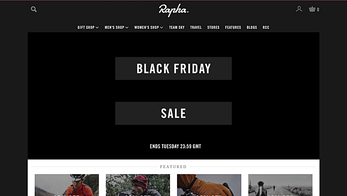
Source: shotsofshops.com
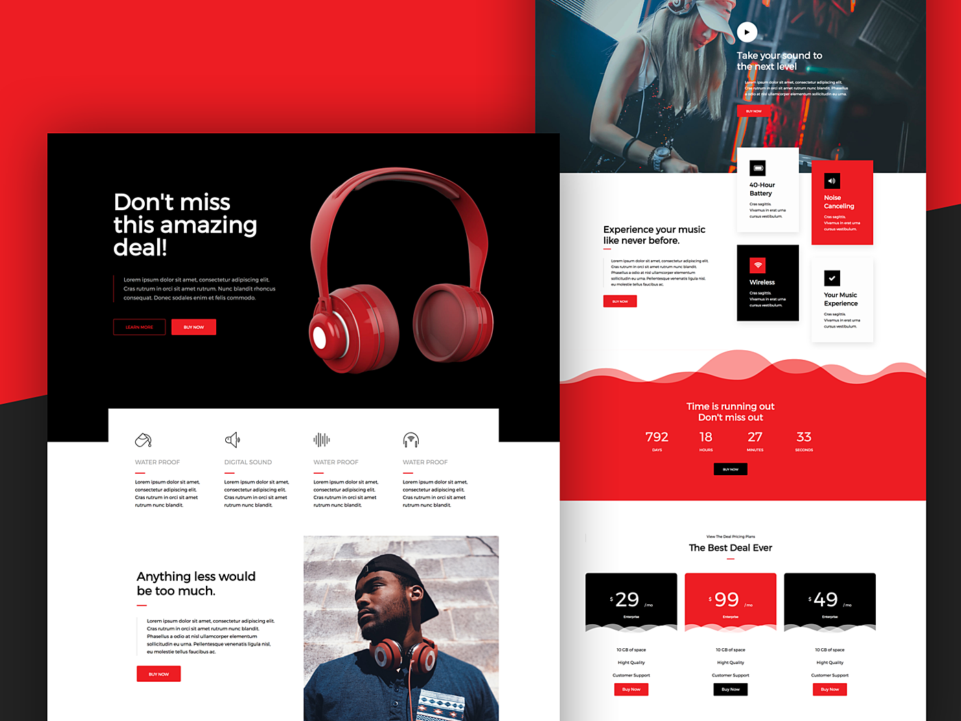
For those who really rely on Black Friday and Cyber Monday revenues, a new website skin may be a great solution that shows commitment to these holiday activities, and a desire to surprise their customers and win their loyalty. The skin is a custom graphical appearance of the website, which can be applied across multiple pages, including the header, footer, sidebars and other graphical elements, with the discounts all over the product or service range, including “deal of the hour”, bundle deals, etc.
360-degree campaign
Source: Dribbble
This approach refers to the landing page campaign which lies at the core of the 360-degree strategy.
To involve as many customers as possible, you should attack from each and every communication channel. A 360-degree marketing strategy is used by all the big brands throughout the year, and the BFCM period is no exception. The activities embrace the following marketing areas:
- Social media channels.
- Newsletter mailing.
- Banner campaign.
- Offline marketing.
- POS software design.
Each of these channels should lead customers to the landing page or the home page of your website (mobile app), where they can find information on your holiday sales and offers advertised in banners.
Before the holiday period, you’ll need to create custom social media banners, build an email template and send it to your subscribers, update your website and mobile application, and claim your listing on the Black Friday and Cyber Monday platforms.
Why custom?
When you intend to design a website for Black Friday, don’t rush into looking for standard templates to make it fast and bright. As we mentioned previously, the key success factors are research, planning, and understanding what it is all for. You will benefit more by creating a custom design, and here’s why:
- A custom solution is tailored to your target audience: holiday shoppers are not all the same, so design elements should comply with age, gender, and social status of your target client.
- It considers your business specifics: a small business website differs greatly from the website of a large corporation, and Black Friday on Amazon differs from the one in Alibaba.
- Custom design helps you build more trust. People’s eyes are blurred from similar banners all over the Internet, so they will appreciate your effort of creating something individual.
- A tailor-made design of the Black Friday website is a must if you develop the concept across all the communication channels. It’s better to turn to website designers and maintain continuity in style rather than add templates from disparate sources.
Tips for Black Friday web design + examples
Seems like no doubt left about launching a custom marketing and web design campaign for Black Friday and Cyber Monday. Once you have decided on the format and concept you are going to implement, it’s time to pay attention to details. Agente has made a list of recommendations for Black Friday website design creation:
Change specific elements
Details matter. Besides adding new banners, pages or discount signs, refresh existing elements to let your visitors fully immerse themselves in the holiday atmosphere. You can change header, footer, logo, live chat frame design or even apply a Black Friday color scheme to the whole home page.
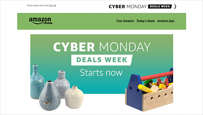
Source: printful.com
Here’s an example of Amazon’s Cyber Monday website design. It is notable for the header color change from dark blue to grass green, in order to match the Cyber Monday banner.
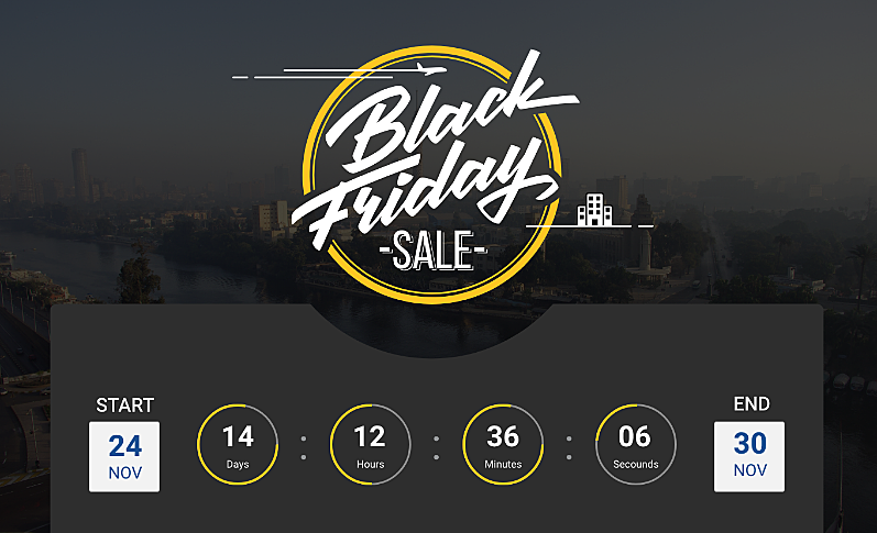
Add countdown before sales start
Researchers say that shoppers start searching for upcoming discounts in October, a month before Black Friday sales begin. It means that they may visit your website earlier than you are ready with your holiday design. The countdown widget is a great solution to what clients’ appetites and let them know when to come back.
Use “marketing” colors
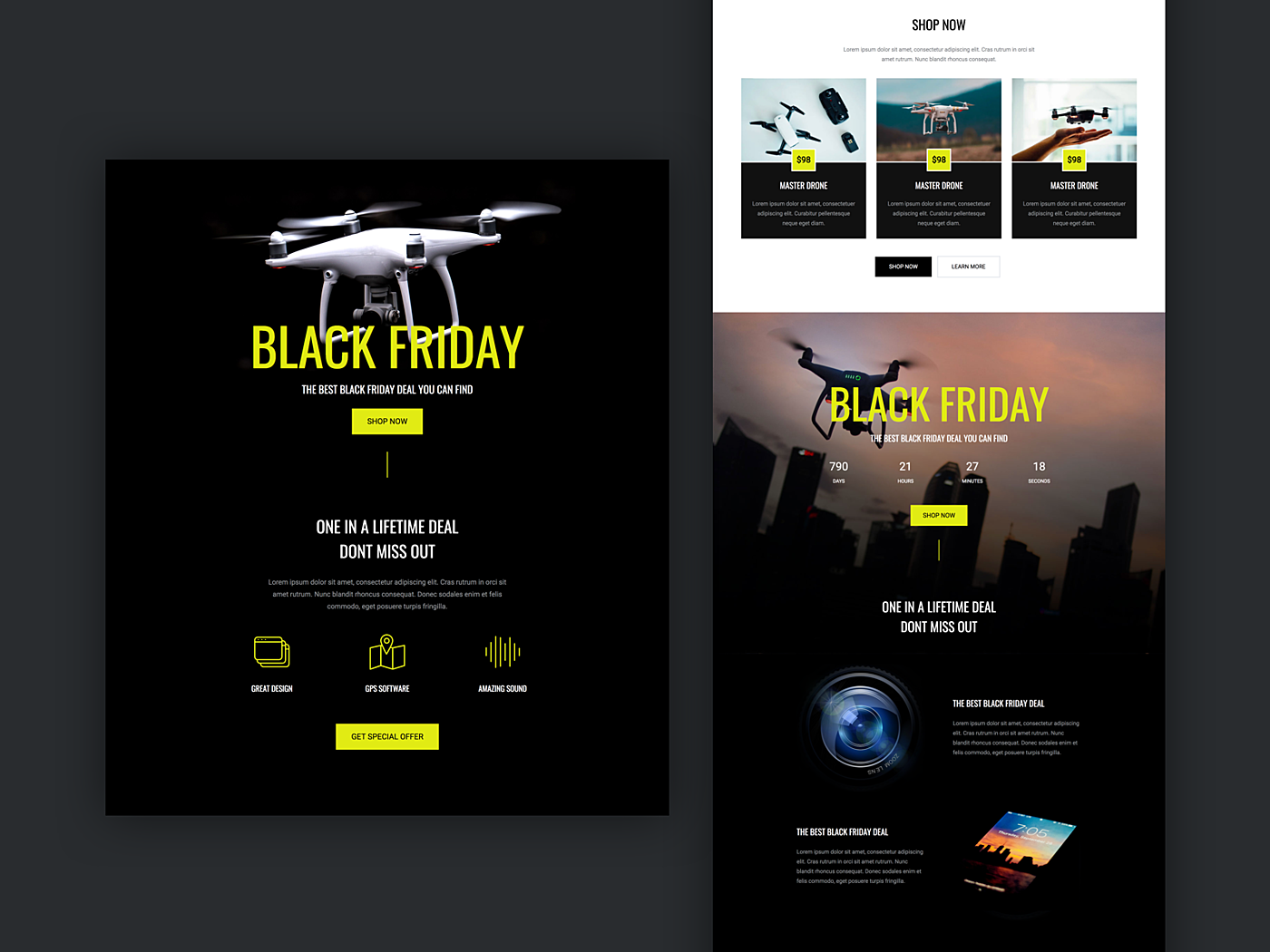
“Marketing” colors are no longer limited by hues of red. While black is generally avoided on selling websites, Black Friday is the time to add this accent. Combine a black background with yellow, red, white, or any other color of your choice. As for the Cyber Monday colors, the main selling colors are a gradient of purple, blue, and red.
This example proves that you shouldn’t be afraid of bold imagery and animations, all means are good when it comes to discount time.
Think mobile first
60% of shoppers look for Black Friday and Cyber Monday deals from their mobile devices which calls for “mobile first” approach. Make your website design responsive and update your mobile app.
Source: dribbble.com
Simplify the flow
Source: matalan.co.uk
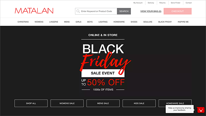
Update your website design for Black Friday so that your clients get what they need faster, without overloading your servers. Minimize clicks to complete purchases and simplify the checkout process. The example above features a call to action which also speeds up purchasing decisions.
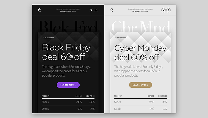
Make your emails consistent and responsive
Source: dribbble.com
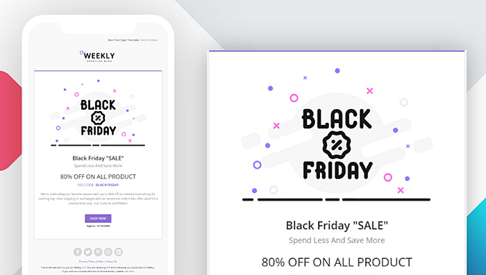
Use a simple column-based structure to make your email responsive, align your fonts and styles, and don’t overwhelm your letter with text; add CTA buttons which lead the readers to your website.
Conclusion
Everybody wants to buy something on Black Friday and Cyber Monday, and your task as a retailer or a service provider is to make the customer journey easy and delightful on these days. A successful marketing campaign is impossible without good UX/UI design, so here’s the key advice from our article:
- Remember to plan the campaign in advance.
- Mind your target audience and business specifics.
- Customize website and mobile design.
- Spread your word across channels and maintain the style.
Want to attract more customers in the holiday season? Agente will inspire you and help you to form a design strategy from scratch. Drop the AGENTE team a line and let Black Friday begin!
Rate this post!
317 ratings, average ratings is 4.7 out of 5
Related Posts
17 January 2024
What Does a UX Designer Do in 2024: Role & Responsibilities
What does a UX designer do? It’s time to define core responsibilities, functions, and perspectives in one place.
11 January 2024
Mobile-First Design: Full Guide for 2024
What is mobile first design? Well, the mobile first approach is a central principle of progressive enhancement. In a nutshell, it’s all about producing a small screen design and then scaling it up to other devices. In our new blog post, we cover some aspects that need to be taken into account when launching a mobile first web design project. We also share some outstanding design examples for your inspiration.
05 January 2024
10 Best 404 Error Page Designs for 2024
In our new blog post, we review the best 404 page design examples of 2019 that will never disappoint you even if you meet the dead end on the website.

03 January 2024
10 Best Game Website Design Examples: How to Design Yours
Game website design: importance in attracting new players, awesome examples and design tips.
22 November 2022
10 Best Restaurant Website Designs & Best Design Practices
Restaurant owners always have a lot on their plate, and they are usually focused on the areas that can bring tangible benefits. Websites, unfortunately, are not one of those areas because even the perfect website does not guarantee that the restaurant will be full every evening.
31 May 2022
10 Best Examples of Website Footer Design
10 website footer design best practices examples for inspiration ⚡ Things that can go in website footers ⚡
Let's talk
Is there a challenge your organization or company needs help solving? We’d love to discuss it.

Managing Director, Partner
Andrew Terehin

Thank You!
Your message has been successfully sent.
We will contact you very soon.
