11 January 2024
Mobile-First Design: Full Guide for 2024

The world is becoming ever more connected. Most of the traffic generated by Internet-enabled devices already belongs to mobile. To be more precise, mobile devices account for approximately 60% of top site traffic, turning designing for mobile into a necessity. And mobile first design is also gaining traction these days as one of the most effective strategies.
What is mobile first design? Well, the mobile first approach is a central principle of progressive enhancement. In a nutshell, it’s all about producing a small screen design and then scaling it up to other devices (e.g., tablet and desktop). As a result, the smallest design will have only necessary features, reducing the risk of losing the core message and functionality, and ensuring a great user experience. This is also beneficial for owners of such sites as Google, who rolled out mobile-first indexing not long ago.
How to Produce Mobile First Designs
There are some core aspects to keep in mind when launching a mobile first web design project.

Remember that Content Impacts Your Design
Do you know the Bill Gates’ phrase “Content is King”? That’s certainly true about the design strategy in question. The very first step towards a successful project is deciding on content priorities for a small-sized layout.
You need to work hard on the copy to prioritize what is really important and to remove irrelevant content. Mobile devices have many limitations such as bandwidth and screen size.
Consider these parameters, pay attention to context, and you will write the perfect copy that will enchant visitors. Writing user scenarios is extremely handy in such a case, as it helps developers to understand the difference between interactions on desktop and mobile screens, and to avoid irrelevant content changes. At this stage, you can also add content-specific breakpoints with the help of media queries that will allow the design to adapt to multiple screen sizes.
Minimize the number of typing users are required to do. Typing on mobile takes too much time, and users often make mistakes. You may leverage forms, or auto-complete to help visitors quickly go through all the typing-related steps.

Focus on Navigation
Information architecture plays a big role in the mobile-first design, but developers often skimp on the navigation too. They forget that good navigation is the key to success in the mobile-driven world, as it contributes to the website’s usability.
Created properly, navigation makes it hassle-free for mobile visitors to find what they need. To achieve this aim, you should plan all the steps beforehand. Don’t make navigation too complex. It should be short and sweet. For greater convenience, you may temporarily hide the navigation bar when the full-page content is displayed, or use a search icon as a substitute for a search bar. For a more detailed guide head over to this article.

Give Screen Orientation Your Attention
Screen orientation (portrait or landscape) is another aspect which plays a pivotal role. Depending on the usage context, website visitors may need to change the orientation of their screens.
If you expect that at least some people will view your website in landscape orientation, it’s crucial to create this version of the design too. You may even make it a little bit different from the portrait version, for instance, by setting a new background color. Remember that the primary goal here is to create a usable environment for visitors in any context.

Avoid Complex Graphics
Eye-catching images may do you a good turn by piquing visitors’ interest. But will all the images look well on a mobile screen? Certainly, they will not. Images with fine detail (especially small ones) or complex graphics, or landscape photos are a bad idea. They will not be displayed as intended on a screen that is only a few inches across.
Uploading the same “heavy” images for all the screen sizes is bad practice too. As many consumers use mobile traffic to surf the Internet, they are likely to immediately abandon a page where images take too long to load, signaling that their size is more than 1 MB.
Opt for flexible images and media by applying responsive design principles. This way you will keep content intact at any resolution and under any circumstances.

Stick to the Rule of the Thumb
Though consumers interact with touchscreens in three separate ways, most of them hold the device with only one hand and, more importantly, they rely on one thumb (usually the right one) when using mobile apps, browsing sites, and so on.
Make the top-level menu, all the necessary controls, and common actions easily reachable by visitors who use one hand to ensure the usability of the site. Take a look at the image below to find out where to place these elements.

Remember Mobile Design Principles
Don’t forget that fingers are much bigger than a cursor. It’s vital to have enough space between clickable elements and buttons on small screens. Make sure that your touch targets are at least 44x44 pixels (as recommended by Apple). Don’t worry if they are larger than that: Google believes that controls should have a size of 48x48 pixels.
When it comes to Android devices, you can utilize automated testing tools such as Robolectric to automatically detect touch targets that are too small, or Accessibility Scanner if you want to perform manual testing. Create forms that will fit neatly on a mobile screen, and use readable typography.

Create a Prototype and Test It
A prototype creation using a framework such as Bootstrap is an important step towards a functional and easy-to-use site. With an interactive prototype at your fingertips, you will be able to test it with real users and on all kinds of devices.
Test it on many devices and take notice of how images look on each display (e.g., retina). Ask your friends and relatives to try the site too. Such testing will help you find out whether the site needs any improvements, i.e., a smaller navigation bar, larger buttons, new images, etc.

Use Meta Tags and CSS
There are some basic HTML tags and media queries that developers utilize to produce the right design. Here are a few of them:
<meta name="viewport" content="width=device-width, initial-scale=1" />
This meta tag will tell the device that the content is optimized for mobile and must be set device-width. Some developers also set “user-scalable” to “no” to disable zooming.
“min-width”/“max-width” media queries are introduced to apply specific design styles according to the width of the device.
Great Mobile First Design Examples
If you are still wondering what a mobile-first site looks like in reality, check out these stunning examples:
1. YouTube
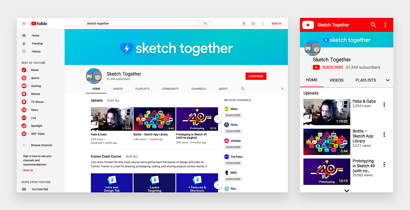
Source: YouTube
2. Pitchfork
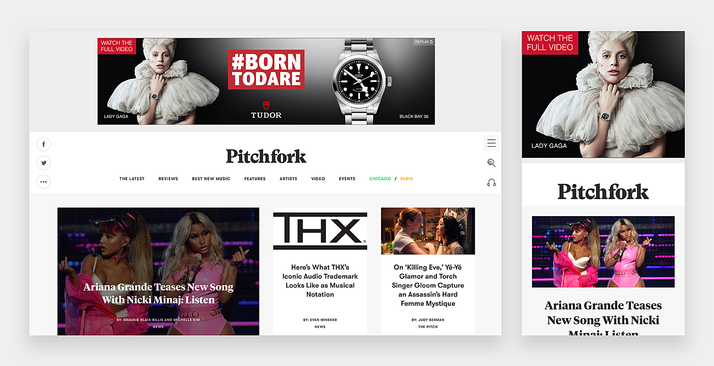
Source: Pitchfork
3. Apple
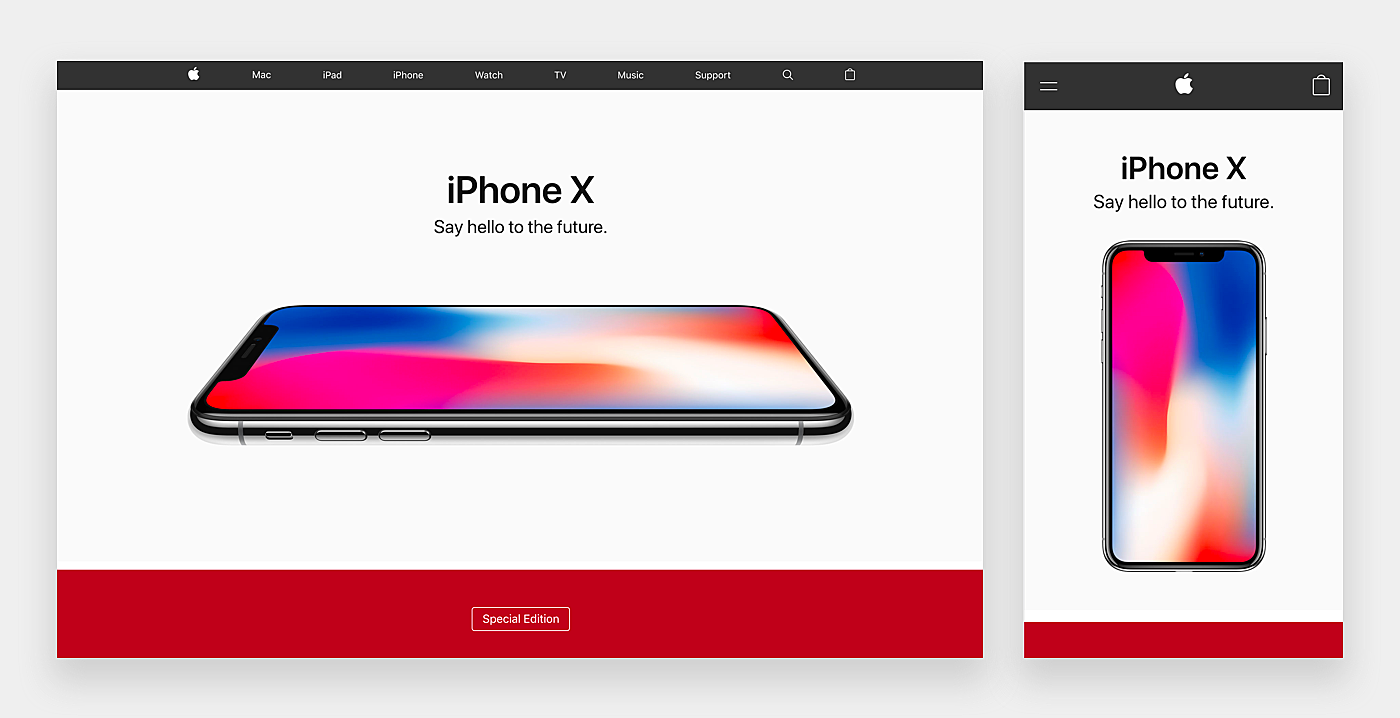
Source: Apple
4. Airbnb
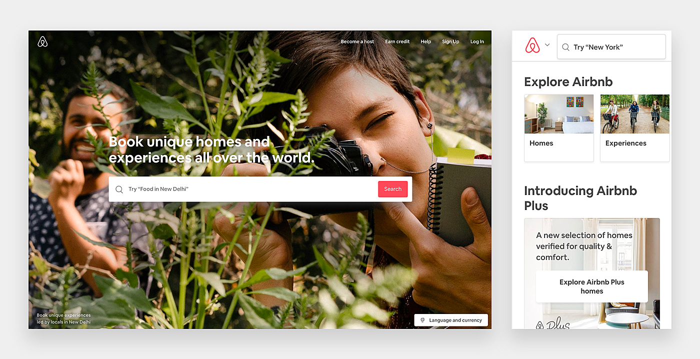
Source: Airbnb
5. Smashing Magazine
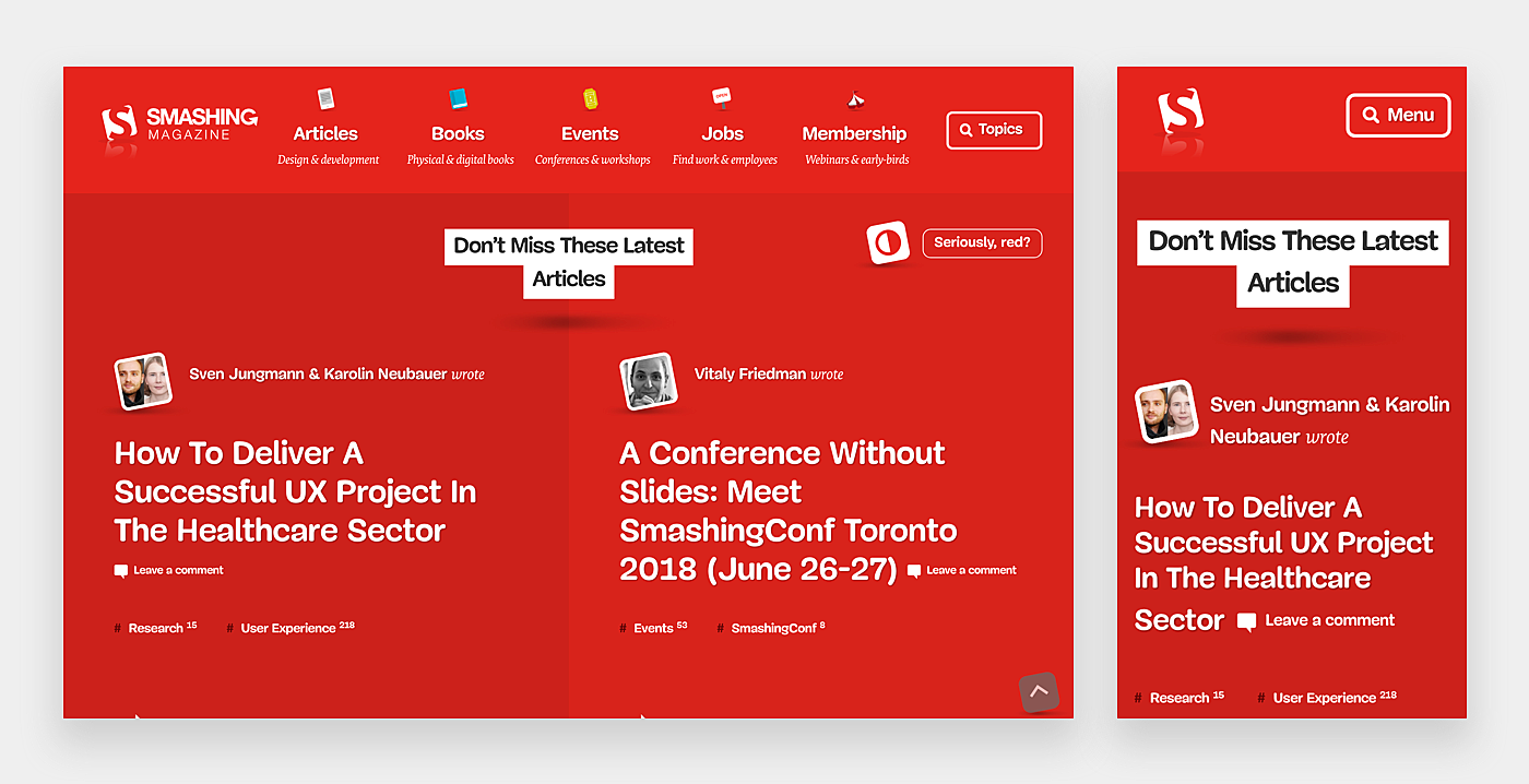
Source: Smashing Magazine
6. AusMaids
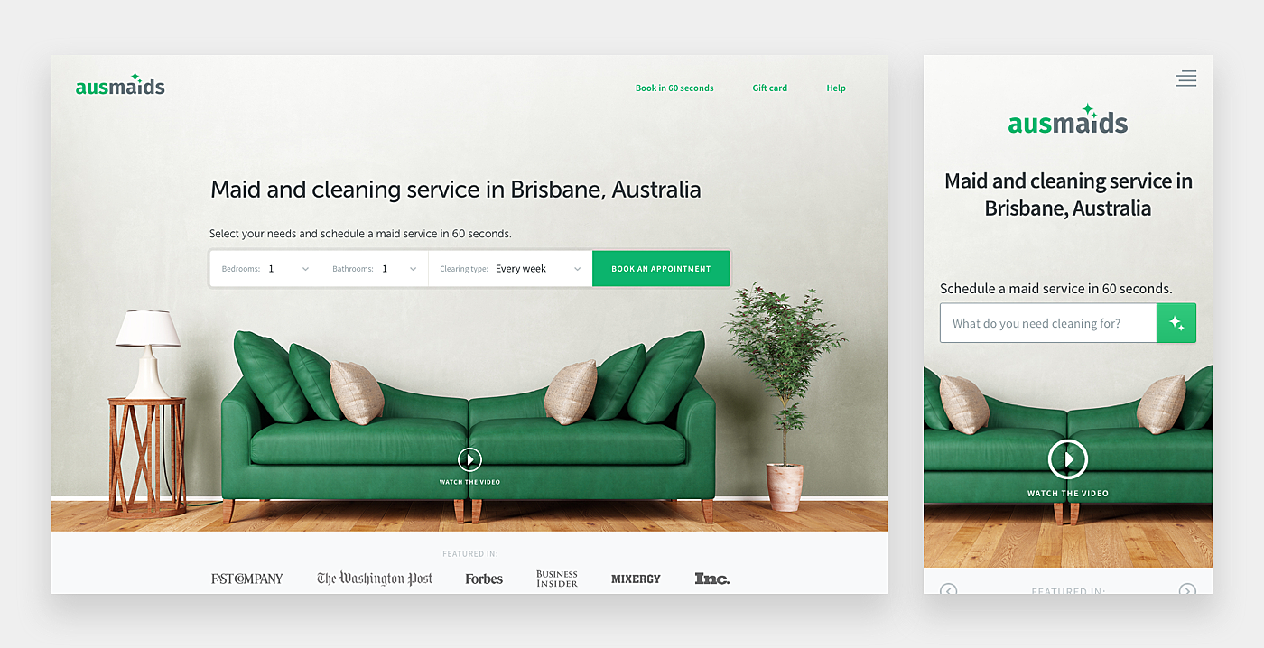
Source: AusMaids
7. Xapo
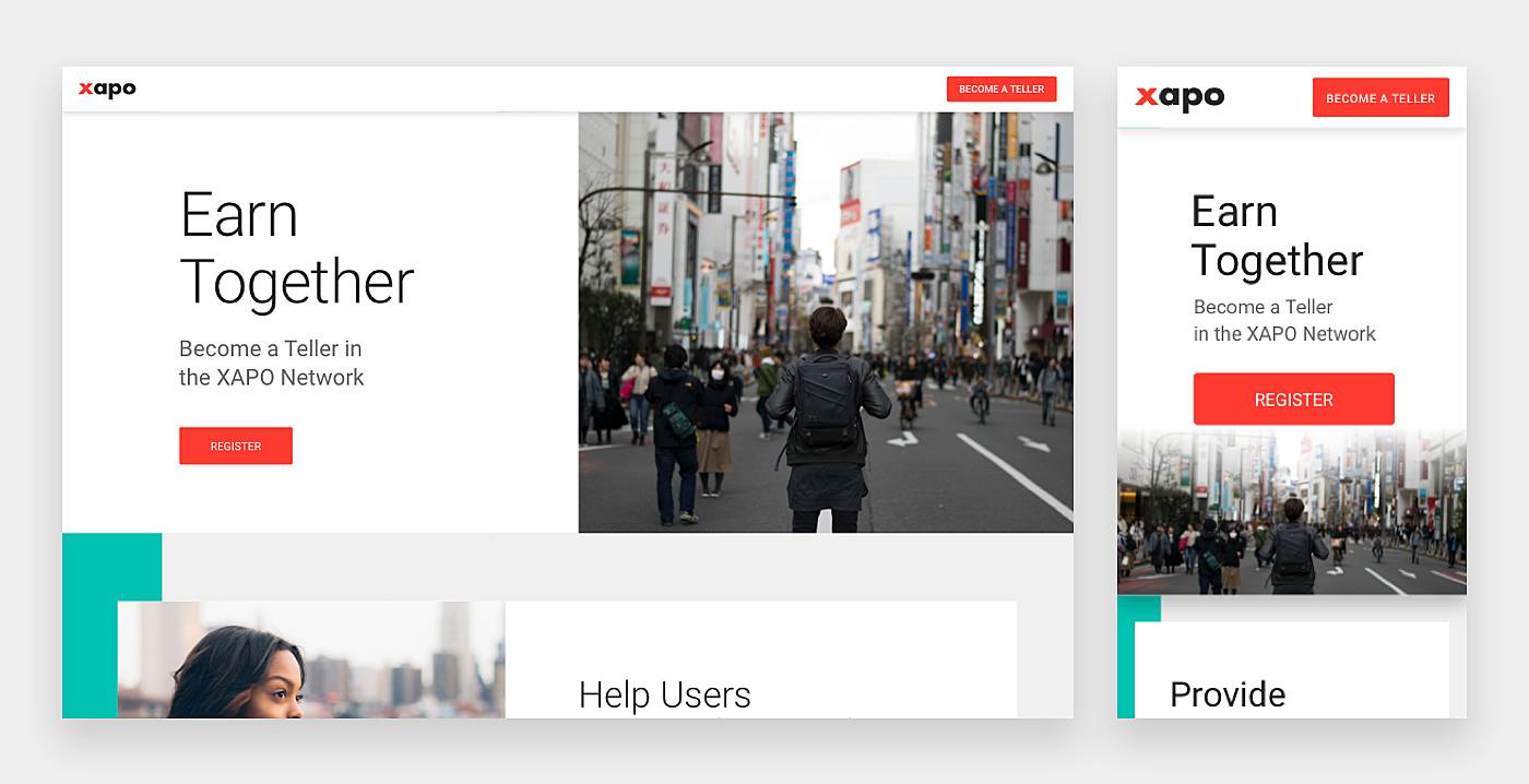
Source: Xapo
8. Handy Theme
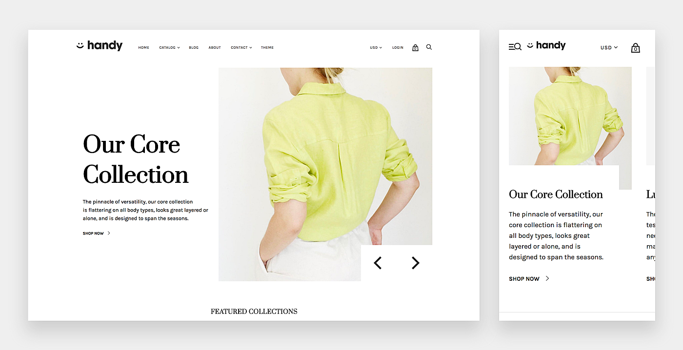
Source: Dribbble
9. Proj-e
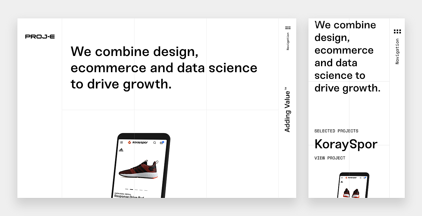
Source: Proj-e
10. Handsome
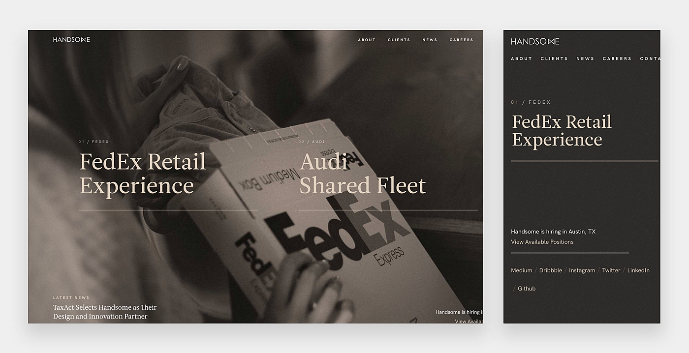
Source: Handsome
Wrapping Up
As mobile devices are increasingly becoming a preferred gateway to the Internet across the globe, the delivery of seamless user experience has turned into a burning issue in the design world.
Starting with a design for small screens is a silver bullet for website developers since it enables them to take into account all the mobile peculiarities from the very beginning, and then adjust it to other devices. In this article, we’ve outlined some mobile first design principles. Be mindful of them while working on your site. For any additional information feel free to contact the AGENTE team.


Rate this post!
246 ratings, average ratings is 4.6 out of 5

Related Posts
17 January 2024
What Does a UX Designer Do in 2024: Role & Responsibilities
What does a UX designer do? It’s time to define core responsibilities, functions, and perspectives in one place.

03 January 2024
10 Best Game Website Design Examples: How to Design Yours
Game website design: importance in attracting new players, awesome examples and design tips.

22 November 2022
10 Best Restaurant Website Designs & Best Design Practices
Restaurant owners always have a lot on their plate, and they are usually focused on the areas that can bring tangible benefits. Websites, unfortunately, are not one of those areas because even the perfect website does not guarantee that the restaurant will be full every evening.

31 May 2022
10 Best Examples of Website Footer Design
10 website footer design best practices examples for inspiration ⚡ Things that can go in website footers ⚡
26 May 2022
10 Best Examples of Beautiful Blog Design | Agente
In this article, you'll find 10 best examples of beautiful blog design, along with the tips that can help you enchant visitors.

22 April 2022
Pagination Design Examples and Best Practices
Structure and hierarchy help to simplify things and make them easier to read ⚡ In this article we will come across pagination design examples and best practices.
Let's talk
Is there a challenge your organization or company needs help solving? We’d love to discuss it.

Managing Director, Partner
Andrew Terehin

Thank You!
Your message has been successfully sent.
We will contact you very soon.