17 May 2018
User-Friendly Form Design: Best Practices & Examples | AGENTE
Let’s be honest: people hate filling out forms. The reasons vary: some care about security and data theft, the others are puzzled by ugly web form design and irrelevant questions or complicated interfaces. In short, people just want to perform their action: buy goods, chat with friends, or leave a comment, and forms represent an unavoidable step in achieving these goals. From the design standpoint, the goal is to make this experience easy for the customer and beneficial for the website owner, so that people not only stay on the page, but complete the form and satisfy their needs, but also become new customers.
In this article we’ve gathered the best practices of user-form design, learned through multiple studies, our own experience, usability testing and actual feedback from our customers. We hope this material will help designers to make productive and user-friendly forms.
The basic principles of great form design
Remember the first rule: there’s no one-size-fits-all solution to design a web form. The final look and feel will depend on the function, business goals and compliance to the UI of the specific website or the app to which this form belongs. The most popular from types include:
- Login/registration
- Purchase order
- Ticket reservation
- Payment checkout
- Download white paper
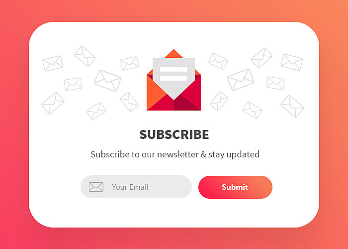
- Newsletter/subscription
- Consultation/audit request
- Donation
- Survey
- Custom form
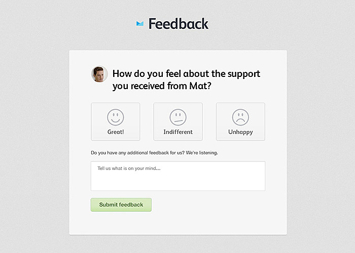
In general, a form is a multiple-field box with labels and an action button which is placed on landing or checkout pages, with some call to action and feedback on successful completion:
Source: Dribbble
Above is an example which follows good form design principles - simple and clean; but what if we need something more sophisticated - yet unintimidating? Let’s dig deeper into user experience and see what can be done.
Tips for good form design
One-column form
Keep it simple - this is the rule running through all the following tips. A modern user is always in a hurry, trying to embrace as much information as possible and skip long, complex, and time-consuming forms.
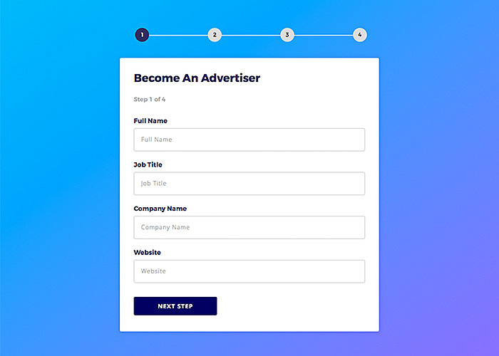
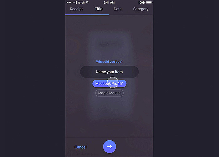
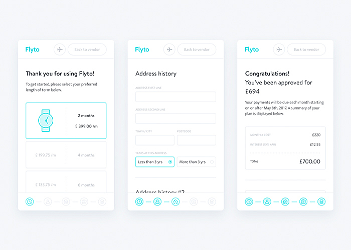
A one-column design creates a single-line perception: from top to bottom. Multiple columns, in contrast, cause the eyes to zigzag, which increases completion times. However, it doesn’t mean that you should put all of your twenty fields in one column, like in website design for banks, and make your visitor scroll and fill out forever. Always ask yourself which fields could be united or omitted. If, after such a review, long forms are still unavoidable, make them multi-step:
Source: Dribbble
Multi-step forms have at least three advantages:
- The first impression is less intimidating than a long form with lots of question fields.
- Users are more motivated to fill all these form fields, as they see a step-by-step bar which delivers a progress effect.
- Fields can be divided into semantic groups: name and title, contacts, and additional info - small steps encourage users to deal with complex actions.
Labeled fields
Labels on the fields go without saying, the only question is where to put them. Think of the devices on which the web form will be used. Top-aligned labels are probably the best option for adaptive design, as they work well on mobile devices, where long horizontal lines interfere with a comfortable user experience.
Left-aligned labels are better for complex web forms, as they reduce height and allow the user to look through the field names in one column in order to estimate the effort required for completion.
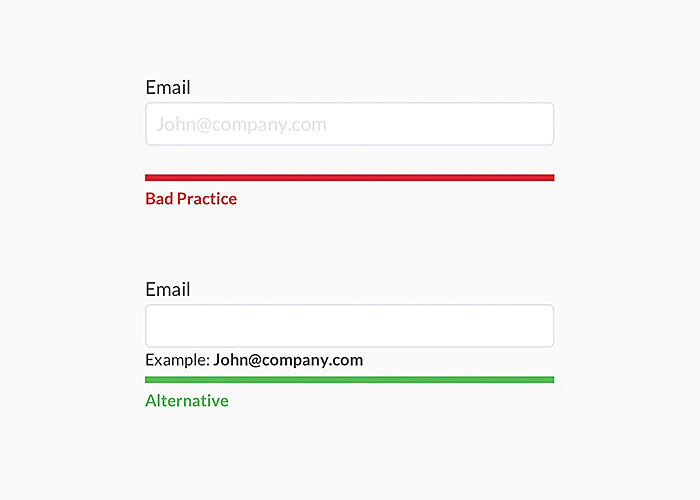
Don’t label fields with placeholder text: it is better to prompt the user with an exact example of what should be entered.
Source:Uxdesign
Fields prefill
This is a discreet issue: information today is so easy to gain but customers may feel intimidated if they think you know too much about them. However, it’s appropriate in some cases, for example, if a user comes from the emailing campaign and you definitely know their email, or after typing the first digits of credit cards, input field for the type of card. The other way is to ask the user to allow sharing data through native features: geolocation, date, time or use camera to scan documents such as driving license or credit card and pre-populate using their details.
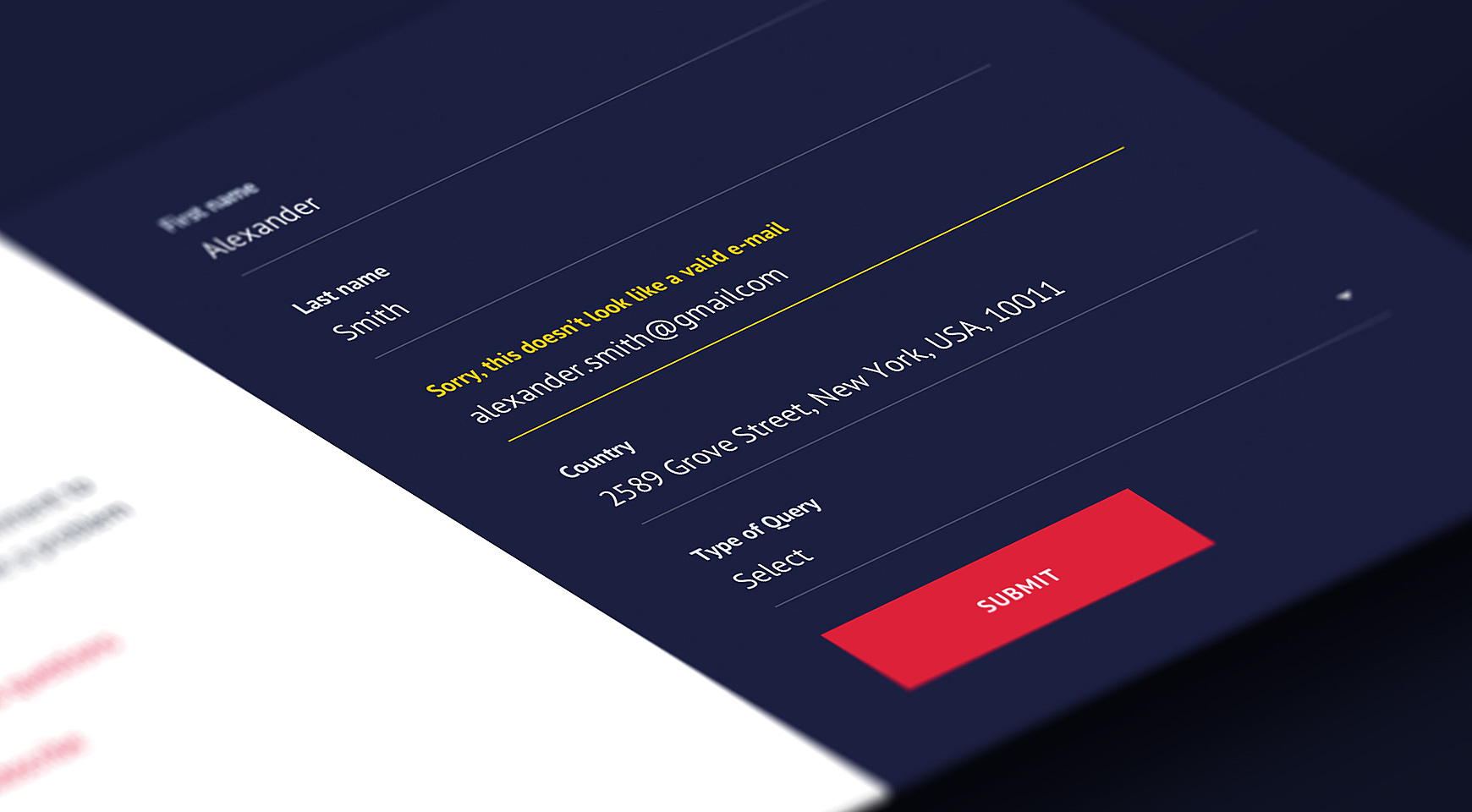
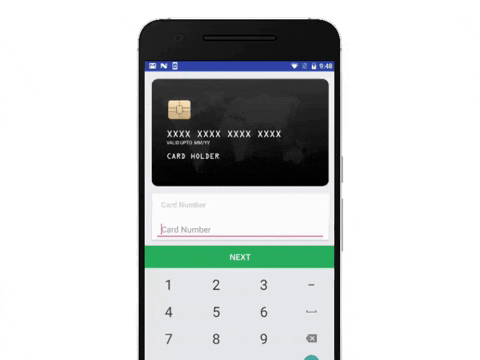
Input constraints
Visual input constraints prevent a large number of mistakes or incorrect data, so you are absolutely welcome to put some as placeholder text or as a hover when pointing at the specific field. What do they look like?
- Data format - numeric, alphabetic, etc.;
- Number of characters - no more than 16 for credit card number fields;
- A valid e-mail address checker;
- Required vs. optional fields - a “*” character is not as evident as it may seem, it’s better to denote mandatory fields in-line.
It’s logical to mention error messages in this context, no matter how you perform the validation. They should be used properly in context, so that users can be referred to the specific field, not somewhere at the top of the form.
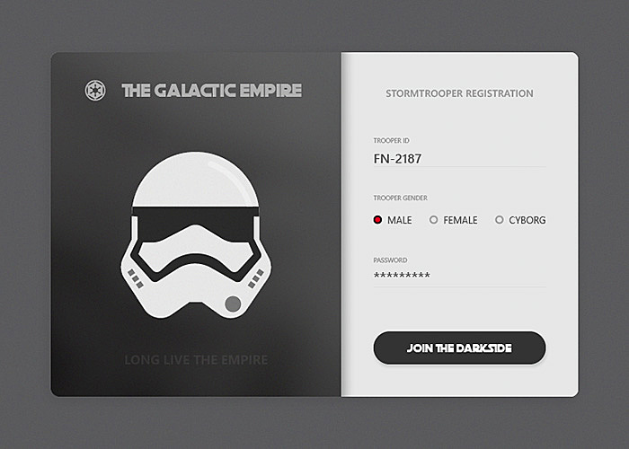
Option selection
Forms are filled out faster if the fields offer options to select from. These may include checkboxes, radio buttons, toggles, or drop-down lists. However, take care to use them in the right context:
- Checkboxes for multiple choice;
- Radio buttons for mutually exclusive options;
- Toggles for disambiguation or switching the option on and off;
- Drop-downs for a large picklist.
Source: Dribbble
Visible CTA
A next-step button should state the action. A good practice is to highlight the action button (in comparison to the cancel option) or enable it upon completion. Adhere to the best practices of buttons UI design.
Mobile compatibility
Mobile devices require the separate approach to form design UX, f.e. automatically switch to digits when a card number or age is required. It may sound obvious, but you should check that your forms work across all major browsers and devices. To reduce doubt, check mobile material design guides from Android or iOS.
Source: Media.giphy
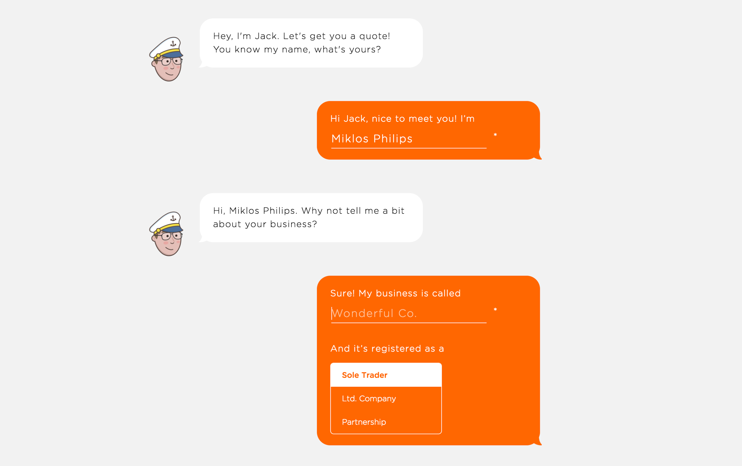
Chatbot
The new way of engagement is personalized conversational interfaces, or chatbots. They are already successfully implemented as a replacement for web forms on some websites, and have proven to be even more effective than the standard approach. Real-time chat is the way that people normally communicate with each other in various areas of their lives.
Source: Uploads.toptal
Examples of the best form design
Let’ see how these UX form design best practices seem on real websites. Below are some examples of effective and user-friendly design patterns for web forms, with comments on why we consider them worth your attention.
Source: Dribbble
What’s good: large buttons performed in material design style, option selection with custom graphics.
Source: Pinterest
What’s good: pictorial options, placeholder text, visible action buttons.
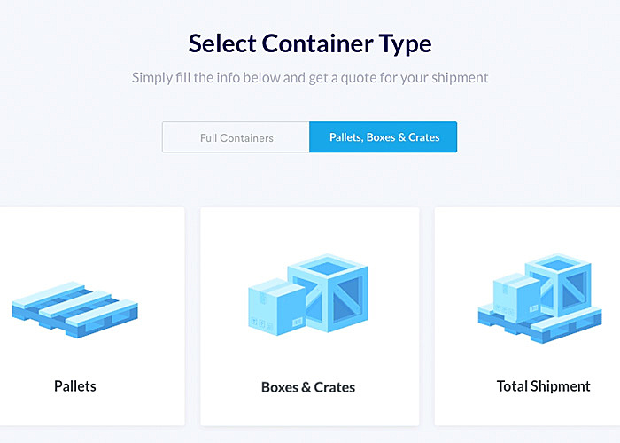
Source: Dribbble
What’s good: creativity, relevant colors, radio buttons for exclusive options.
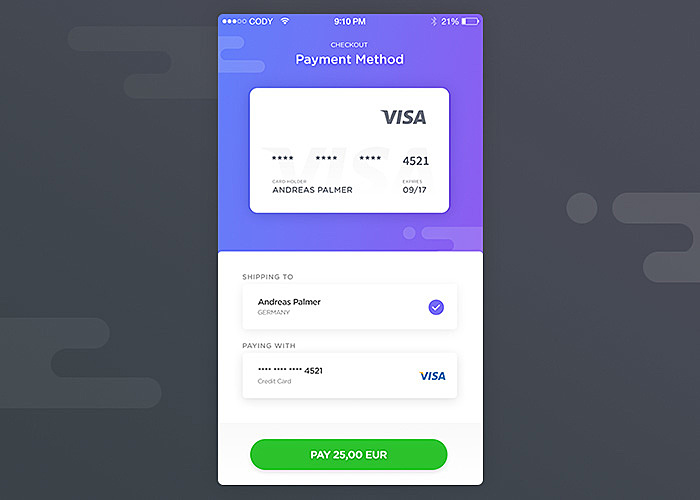
Source: Dribbble
What’s good: card image for real-life user experience.
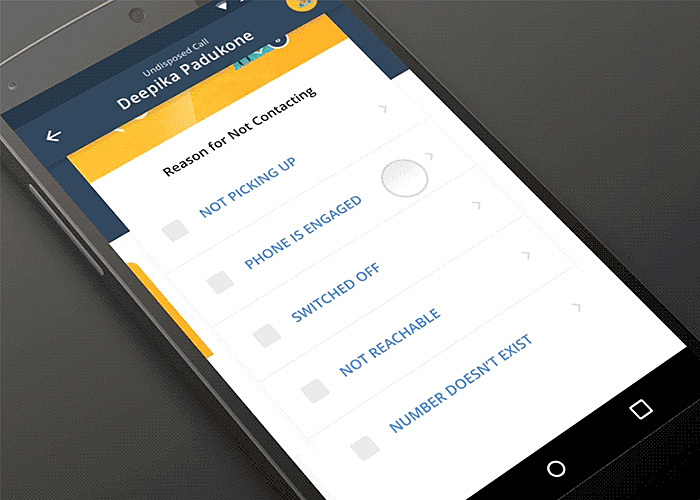
Source: Dribbble
What’s good: multi-step interface with checkbox options.

Source: Dribbble
What’s good: clearly stated what materials are in the newsletter.
Source: Dribbble
What’s good: multi-step interface, option selection, feedback text.
What you should avoid in website form design:
- Complicated messages: Designing user-friendly forms is impossible without simplicity. Try to use “human” language even if you place some legal information on security issues or complex disclaimers, or else make sure you explain why they are needed.
- Auto-subscriptions: Do not cheat on users by enrolling them in your mailing list without warning. Most users will opt out or mark your letters as spam.
- Inline validation: This is an ambiguous option which may cause a bad user experience when used after each typed character: people may have a perception of doing something wrong, sometimes even when the field is empty.
Final takeaway
The principles of good form design UI and UX are changing, towards simplicity, unambiguity, and transparency. In the competitive world, each component of the form matters in retaining users, completing their actions, and becoming loyal customers of a company. Do you know what is specific to your company? Entrust the design to professionals from Agente and generate more leads from effective forms.


Rate this post!
378 ratings, average ratings is 4.9 out of 5

Related Posts

11 January 2024
Mobile-First Design: Full Guide for 2024
What is mobile first design? Well, the mobile first approach is a central principle of progressive enhancement. In a nutshell, it’s all about producing a small screen design and then scaling it up to other devices. In our new blog post, we cover some aspects that need to be taken into account when launching a mobile first web design project. We also share some outstanding design examples for your inspiration.

22 April 2022
Pagination Design Examples and Best Practices
Structure and hierarchy help to simplify things and make them easier to read ⚡ In this article we will come across pagination design examples and best practices.

Infinite Scroll Tutorial: Implementation, Best Practices and Examples
Infinite scrolling was designed as a faster and user-friendlier alternative to pagination. But is that the case? In our new article, we delved into this web design technique and shared some best practices and examples of endless scroll implementation.

06 November 2020
How to Run a Product Design Workshop
Our secret of successful collaboration on product design is that each team member understands the product at its core. That’s why we leverage product design workshops at Agente when kick-starting new projects.

05 September 2018
7 Points About Accessibility in Web Design
Web accessibility is the practice of designing and creating websites in such a way that individuals with disabilities can use them. The importance of accessibility in web design is undeniable. To find out whether your site is accessible, you can read our new article.

02 December 2016
10 Best Practices for Website Conversion Rate Optimization
Conversion rate optimization or shortly CRO is a process aimed to increase the amount of website visitors that convert into customers, subscribers or followers.
Let's talk
Is there a challenge your organization or company needs help solving? We’d love to discuss it.

Managing Director, Partner
Andrew Terehin

Thank You!
Your message has been successfully sent.
We will contact you very soon.