Have you ever analyzed the way people consume web content? They view hundreds of pages a day. They read on the go. They stop at images and bold text. Moreover, they scan rather than read.
So it makes perfect sense that long scrolling websites have become popular; it saves time when clicking through pages. Driven by the overwhelming fear of missing out, people prefer to get all the content on the fly within one page. See more about Agente`s cases of pagination vs infinite scroll or how to make a continuous scrolling website.
Have you read our recent article about pagination? Today we’ll delve into another method of content consumption — endless scroll —and share some nice examples of infinite scrolling websites.
What is infinite scrolling?
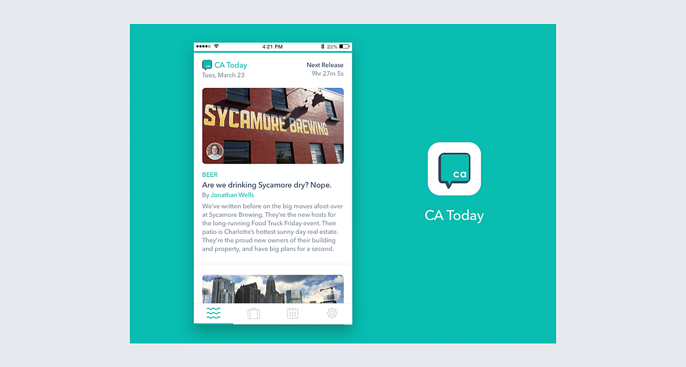
Source: Behance
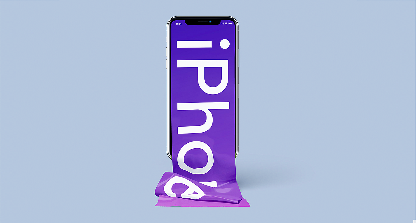
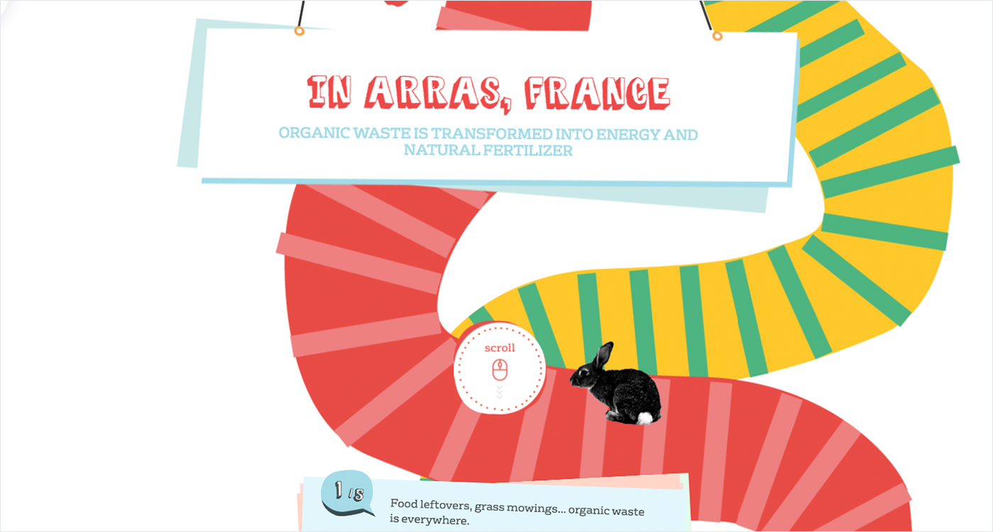
Infinite scroll is a design technique that loads the new content within a single page when you scroll down it. It grabs the text and visuals from actual pages in CMS or from static files and presents them in a never-ending fashion. Depending on the script, content can be loaded at once or divided by subsections that appear on demand, by the click of a button.
Allegedly, infinite scrolling was designed as a faster and user-friendlier alternative to pagination. But is it true?
In fact, it’s all about the context. There is no reason to load 100 pages of content at once for the sake of seamless navigation; the chances are that many people will leave halfway through. So it seems like a good idea to divide the use cases into those that are good for infinite scrolling and those that need an alternative.
Where to use infinite scrolling?
The main reason for using infinite scrolling in page is the high-volume content that must keep visitors interested all the way down. Sounds obvious, but the content should really last long and have a flat hierarchy. Otherwise, consider alternatives—there are some at the end of the article.
For social media
In social media and blogs, all posts are relatively equal. Well, some of them might be more or less interesting, but it’s too subjective to divide them into “hot or not” subcategories. Such platforms as Facebook or Twitter are updated in real time and leave the previous history of posts behind. That makes them truly bottomless.
For equally important content
Say it’s a website for design inspiration represented by images. As a rule, people aren’t looking for something specific there. Rather, they’ll be scrolling over and over, until they find something that catches the eye. The most you can do is let them sort the results with the hottest or the newest on top.
For mobile interfaces
Touch devices have made infinite scroll an intuitive action for mobile users. It allows the user not to load all content at once, thus making an app or a mobile website lighter.
For storytelling
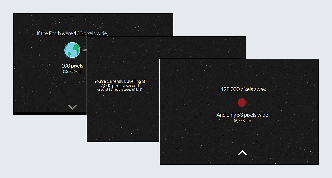
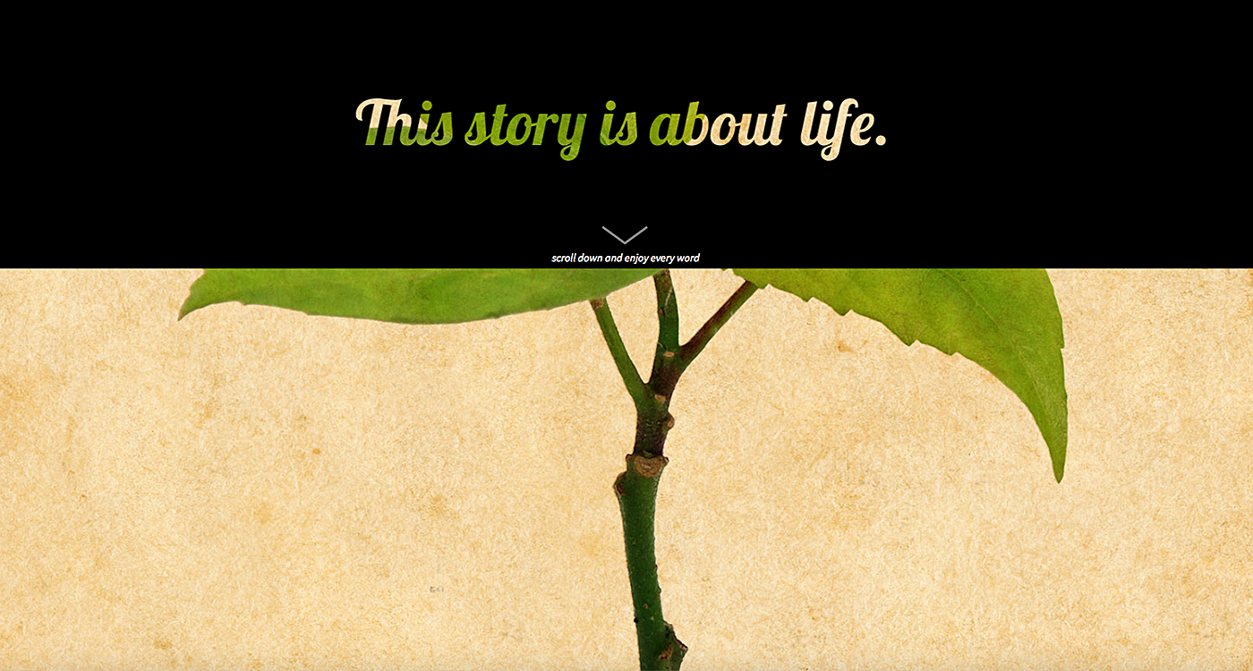
“What will happen next?” That’s the question that makes people scroll down. Layouts are changing but the story goes on. Stir up curiosity and fuel it with engaging content:
Source: Distance To Mars
Where NOT to use infinite scrolling
In short, infinite scroll is not a good idea for websites that want users to take immediate action and achieve goals. Let’s look at this in detail:
If user productivity matters
It’s obvious that when you use infinite scroll in a website that the page needs more time to be loaded. This situation is unpleasant for those who have a poor Internet connection: they’ll either bounce or browse with limited functionality.
If precision matters
Without proper reference points, people tend to lose track of their location. They have the feeling that they have missed something or vice versa, they are not sure whether they’ll ever find what they need.
If you call to action
According to a recent study by Nielsen Norman Group, 57% of viewing time is concentrated above the fold. The lower you get, the less time you spend there. That’s why they suggest placing CTAs in the top of the page, while those at the bottom of the long scroll are likely to stay unnoticed.
Alternatives to Infinite Scroll
As you can see, infinite scroll is far from being a one-size-fits-all solution. Fortunately, for each alternative case, there are other scenarios.
Pagination
Splitting up the website content into pages is still the number one technique in terms of user experience. Pagination gives people a feeling of a specific location and the choice of where exactly to go next. It works well with pages that have a complex architecture, or that need to be short and consistent.
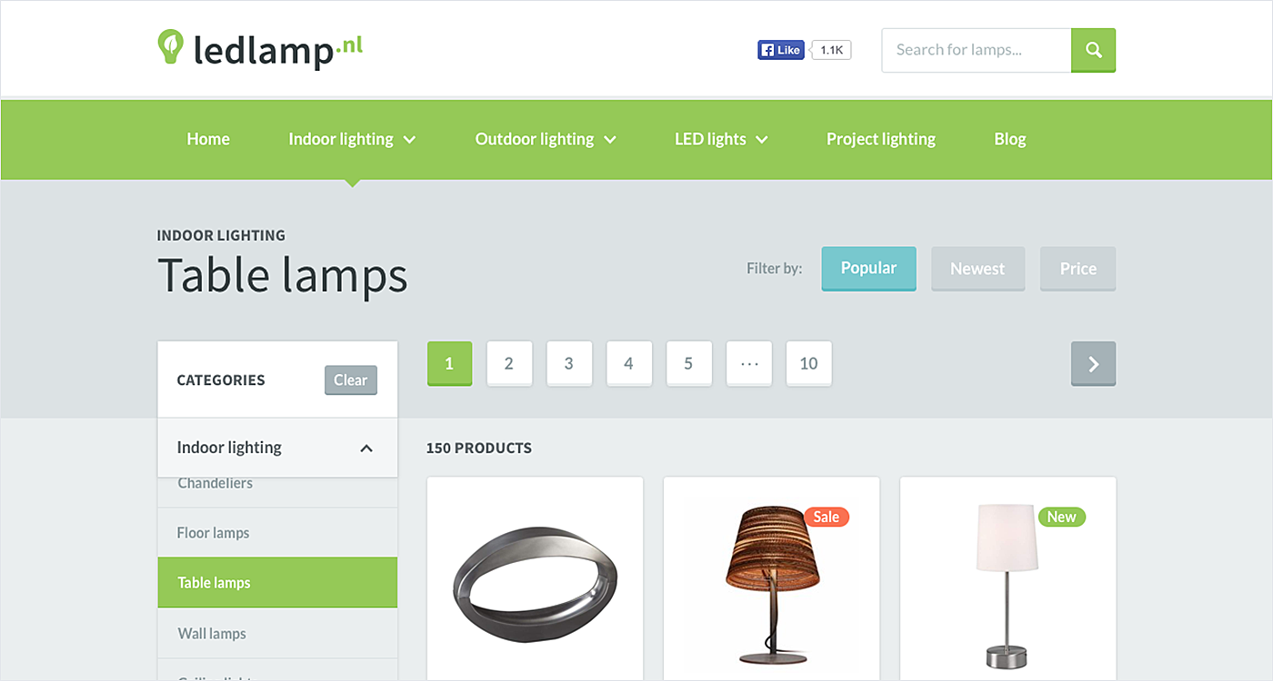
Source: Dribbble
Modal scrolling
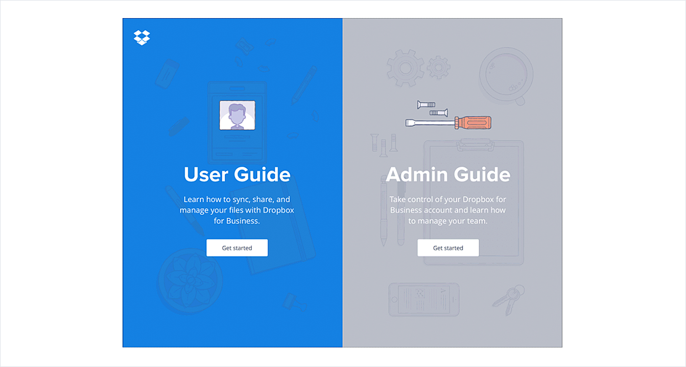
Modal scrolling is a good fit for the pages that need to be kept brief. The perfect case is a mobile app with the accent on the visual content and CTAs.
Source: Dribbble
Load more button
“Load more” is a hybrid model rather than a sheer alternative to infinite scroll. This is an infinite scroll delivered in small portions. It gives a sense of control over the content and makes logical stops. And you’ll be able to stop at the footer for more than 2-3 seconds!
Source: Dribbble
Sub-category grid
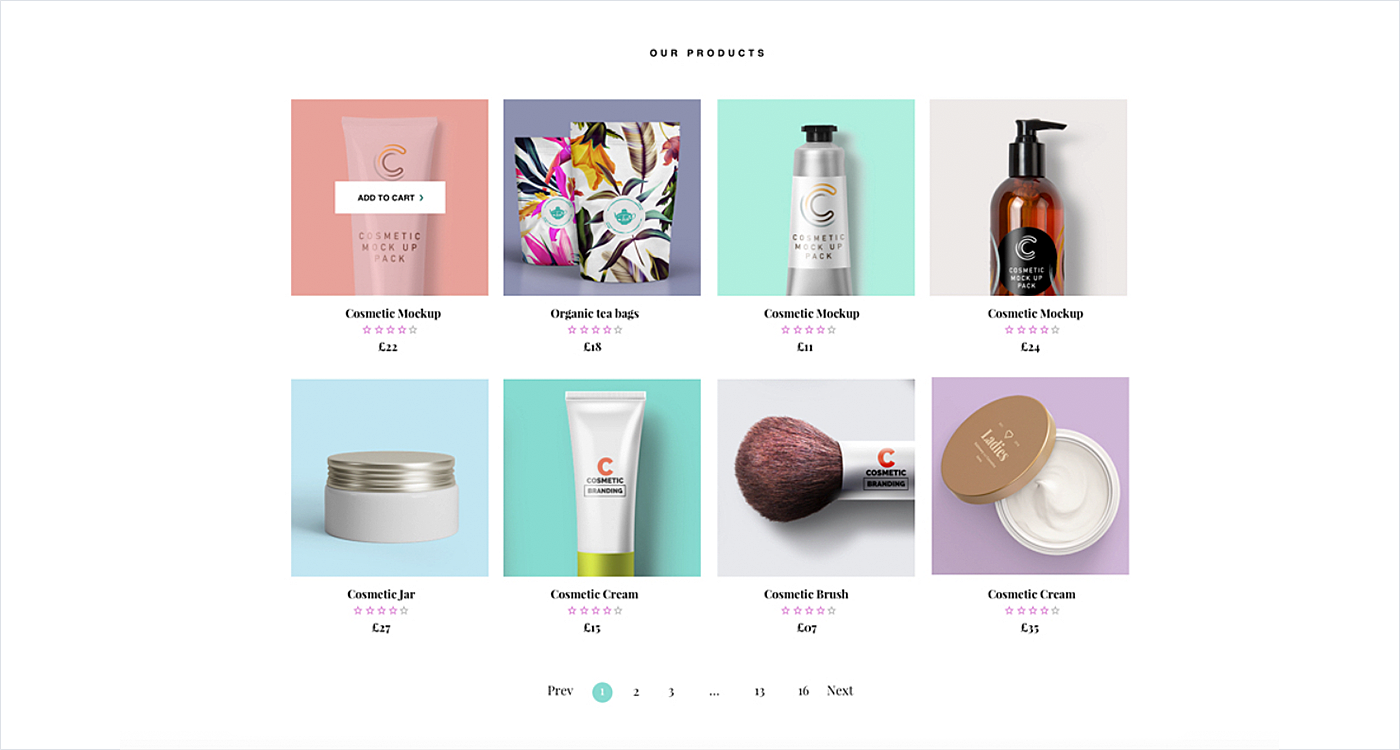
Infinite scrolling allows for the content to be on a single page but lacks hierarchy or organization. Sub-categories cover both, providing the option to filter results and display them in a grid. It’s great for something like an online catalog.
Source: Dribbble
Ten tips for good infinite scroll website
1. Setup with the right tools and plugins
When you decide to create infinite scroll, make sure design and development teams use time-proven and trustful tools and plugins, like these for Javascript or Wordpress.
2. Provide outstanding content
As Luke Wroblewski, the author of Mobile First says,
“Unless your layout makes it look like there’s nothing to scroll… people will.”
Put the most engaging imagery and copy above the fold without requiring any action from visitors. The story you tell should keep readers’ attention focused all the way down to the bottom.
3. Stick the navigation bar
Not everything has to move up or down. People get confused when they don’t see the header or navigation menu. Leave key elements visible as everything else disappears from view.
4. Avoid a false bottom
Users should acknowledge that there is more information below the fold. People won’t scroll when content seems to end due to the layout. That’s why you should avoid design patterns that look like a logical end of the page. While implementing infinite scroll, remove the following:
- large white spaces
- horizontal lines
- CTAs and pricing pages that seem like a checkout.
5. Let users jump back to the previous position
The other problem when you implement infinite scroll is fear of losing important information when you leave the page or scroll on. If the user clicks “back” in their browser, it gets them to the very top. Similarly, when someone leaves the page to follow a link, he would like to come back to the exact place where they’ve been.
6. Show the progress
It’s no secret that ultimately, even an endless page has an end. Let users know where it is and how much they have scroll to get to the current point. People will feel they have control over pages as well as make progress in exploring your content.
7. Offer advanced search functionality
Even if you’ve done your best in navigation, people still get lost when there is a lot of content. A jump back option sounds good, but where would they find themselves? What you need is a powerful search on the page to find a certain point in a scroll.
8. Divide into subsections
Come up with the several stop points to divide your infinite page into logical subsections. As users scroll, they’ll know what they’ve done, where they are and where to click to see the previous info, without the need to trudge all the way down or back up.
9. Create infinite scroll pagination
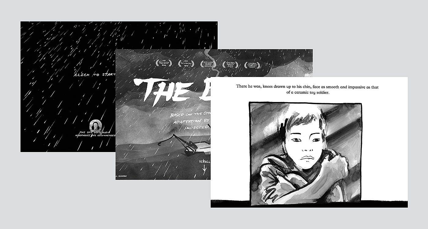
Source: The Boat
Paginate the subsections in a continuous scrolling website, and provide a means of navigating quickly to each. This will work as a sign that new content is loading and create equal chunks of information to be loaded.
10. Give the option to disable
“I enjoy browsing for the first few scrolls, and then I get this unsettling feeling that it will never end, and I'll never get back to work. This has the immediate side effect of me leaving reddit, but the emotional impact is very different than before” (c) Reddit user.
Like it or not, there’ll always be haters of never-ending pages. Let them turn it off and control the process with a ‘load more’ button like they do in Reddit.
5 Nice Examples of Infinite Scroll
To see our tips in action, take a look at this bunch of decent infinite scroll examples picked by Agente team.
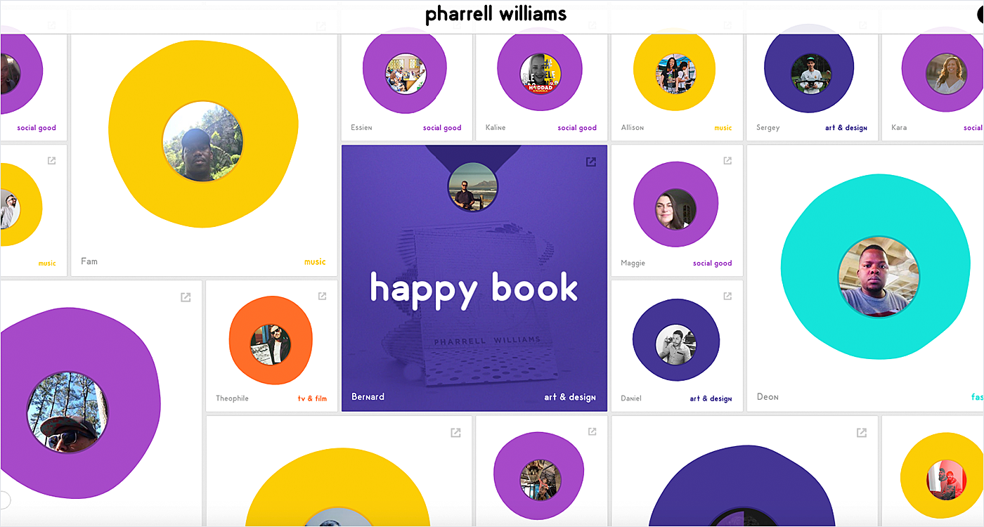
1. Pharrell Williams
Source: Pharrell Williams
2. Resourcing machine
Source: Resourcing Machine
3. Cheetos
Source: Cheetos
4. Stolen girlfriends club
Source: Stolen Girlfriends Club
5. Food is for eating
Source: Food Is For Eating
Last but not least: know your target audience and give them what they want. If the website content and UI reflects what is in your customers’ minds, they won’t mind scrolling long.
Don’t know whether you need infinite scroll in your project? Drop a message in our live chat to have a brief chat about it.
Rate this post!
498 ratings, average ratings is 3.6 out of 5
Related Posts

11 January 2024
Mobile-First Design: Full Guide for 2024
What is mobile first design? Well, the mobile first approach is a central principle of progressive enhancement. In a nutshell, it’s all about producing a small screen design and then scaling it up to other devices. In our new blog post, we cover some aspects that need to be taken into account when launching a mobile first web design project. We also share some outstanding design examples for your inspiration.
22 April 2022
Pagination Design Examples and Best Practices
Structure and hierarchy help to simplify things and make them easier to read ⚡ In this article we will come across pagination design examples and best practices.

06 November 2020
How to Run a Product Design Workshop
Our secret of successful collaboration on product design is that each team member understands the product at its core. That’s why we leverage product design workshops at Agente when kick-starting new projects.

05 September 2018
7 Points About Accessibility in Web Design
Web accessibility is the practice of designing and creating websites in such a way that individuals with disabilities can use them. The importance of accessibility in web design is undeniable. To find out whether your site is accessible, you can read our new article.
17 May 2018
User-Friendly Form Design: Best Practices & Examples | AGENTE
In this article we’ve gathered the best practices of form design, learned through multiple studies, our own experience, usability testing and actual feedback from our customers. We hope this material will help designers to make productive and user-friendly forms.

27 February 2017
How to Design the Perfect One-page Website?
You probably saw those websites that have only one page. They may be simple and contain small amounts of information, and they can be full of tricks and animated objects, but the only thing that unites them is that they have only one page to accommodate it all (though there are some exceptions to this rule).
Let's talk
Is there a challenge your organization or company needs help solving? We’d love to discuss it.

Managing Director, Partner
Andrew Terehin

Thank You!
Your message has been successfully sent.
We will contact you very soon.
