You probably saw those websites that have only one page. They may be simple and contain small amounts of information, and they can be full of tricks and animated objects, but the only thing that unites them is that they have only one page to accommodate it all (though there are some exceptions to this rule).
Please keep in mind, that such websites should not be confused with single-page web applications. The difference between these two is the difference between a website and an application such as Gmail or Facebook, for example. In today’s post, we will talk about one-page websites and how to design the perfect one from scratch. We will focus on the more general aspects of website one-page design and on the preparations in particular because having a good strategy beforehand is vitally important to the success of any project.
The popularity of this type of website is determined by their qualities:
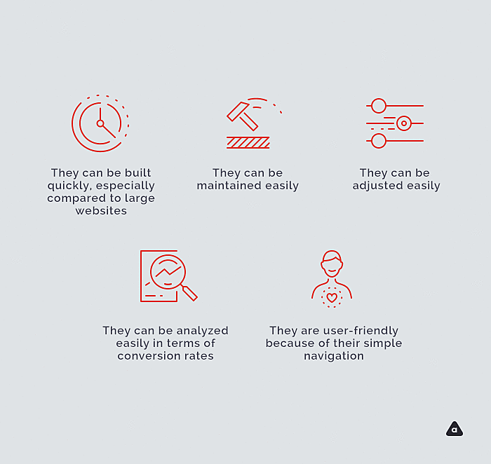
- They can be built quickly, especially compared to large websites.
- They can be maintained easily.
- They can be adjusted easily.
- They can be analyzed easily in terms of conversion rates.
- They are user-friendly because of their simple navigation.

A Single page design can offer anything from a beautiful and engaging storytelling experience, focusing users’ attention on one specific message, to a clean and simple presentation of small pieces of information like an “About us,” “Contacts,” and “Portfolio.” All the sections still need to work seamlessly together in order to gain maximum profit with minimal content.
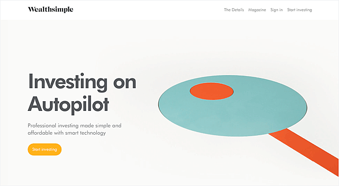
One-page websites can be designed with animation that invites you to continue scrolling until the end of the page. Wealthsimple is a good example of such animation.
Another popular effect is parallax, like on the Melanie. F website.
But there is a more technical side to a single-page web design, and it all depends on what the needs are. These needs are determined by the type of website you need to build. While one-pager is unlikely to be used by, say, e-learning website developers, that require complex hierarchy and lots of integrations. However, some other businesses can benefit from the following solutions:
- Landing pages.
- Promo websites.
- Shops.
- Portfolio.
- Dedicated to particular events.
This was the general overview of one-page websites, so now let’s move on and show you how to build such a website.
4 Tips to design a single-page website
1. Content first

I assume that by this point you have an idea of what you will be displaying on the website, what your audience is and what goal you plan to achieve with the website. So the first step is to write the copy for the website. Think about what you would like to say, what should be your call to action and so on. If you have a large piece of information, it is better to cut it into small chunks that will be easy to perceive because one-page websites are all about simplicity.
2. Define the direction

It means to decide whether your one-page website design should entertain, tell a story or be more of a corporate style. If you are working with an agency, they can help you with creative ideas that can be implemented in terms of the direction you choose; otherwise, you can browse through the free templates until you find what you are looking for. You can also probably try one of the one-page builders that allow you to create the page you like.
3. Find the perfect tools
First find inspiration in the best one-page website designs, as it will give you an idea of what you should expect from your website. Then decide how you are going to achieve that. There are many ways to build such a website, as mentioned in the previous step. One sure way is to hire an agency that will take care of your web presence. But if you’d prefer to do it on your own, you can utilize builders. Here are just a few:
- Spark by Adobe (a complex builder)
- Wix (a complex builder)
- Persona (most suitable for telling a few words about a person and leave contacts )
- Tilda (another easy and powerful website builder)
- Readymag (perfect for portfolios or personal info)
You can also find a bunch of themes for one-page websites that can be installed on WordPress, for example, but a theme is only half the battle. Besides that, you will have to think about the responsive version of your website, find a host and a domain, and configure everything by yourself. And it might be tricky, as there might be some hidden obstacles you can be unaware of until you get there. But if you work with an agency, you can count not only on custom designs and unique creative solutions but also on the technical support.
4. Set and Analyse

When your website sees the world, it doesn’t mean the work is done here. There’s always room for improvement. And in this situation, improvement means better conversion. Set your Google Analytics to track your vital metrics and test your assumptions to make sure they really work. You can find more info on the best practices for website conversion rate optimization in one of our previous blog posts, but in short, you can change anything on your website based on the analytics results. The key to success is constantly keeping track of your users’ behaviors to find out what of your assumptions really work and what doesn’t.
Conclusion
So now you know how to design a one-page website. If you need to launch a website in the shortest time possible and the amount of information that you’d like to share is not large, consider this type of website. By keeping in mind your audience’s preferences, your main goals and the type of business you have, you will be able to benefit from one-page websites, and Agente is always happy to assist in achieving your goals.
Rate this post!
234 ratings, average ratings is 4.8 out of 5
Related Posts

03 January 2024
10 Best Game Website Design Examples: How to Design Yours
Game website design: importance in attracting new players, awesome examples and design tips.

Effective Food Delivery App: Key Tips & Best Practices
In this article, we will share our experience in creating a design for a specialized food delivery management software, as well as best practices in designing such an application.

22 November 2022
10 Best Restaurant Website Designs & Best Design Practices
Restaurant owners always have a lot on their plate, and they are usually focused on the areas that can bring tangible benefits. Websites, unfortunately, are not one of those areas because even the perfect website does not guarantee that the restaurant will be full every evening.

31 May 2022
10 Best Examples of Website Footer Design
10 website footer design best practices examples for inspiration ⚡ Things that can go in website footers ⚡

Infinite Scroll Tutorial: Implementation, Best Practices and Examples
Infinite scrolling was designed as a faster and user-friendlier alternative to pagination. But is that the case? In our new article, we delved into this web design technique and shared some best practices and examples of endless scroll implementation.

09 January 2022
Web Design Trends in Web Interfaces for 2022
Best practices vs. trends on the Web. Is there any difference? Find out more about the principles of good web design in 2022.
Let's talk
Is there a challenge your organization or company needs help solving? We’d love to discuss it.

Managing Director, Partner
Andrew Terehin

Thank You!
Your message has been successfully sent.
We will contact you very soon.


