Each and every website is designed to achieve certain goals. Conversion rate optimization, or CRO, is a process of an e-commerce website redesign aimed to increase the amount of website visitors that convert into customers, subscribers or followers.
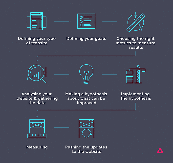
Basically, conversion rate optimization tips consist of the following:
- Define your type of website.
- Define your goals.
- Choose the right metrics to measure results.
- Analyze your website and gather the data.
- Make a hypothesis about what can be improved.
- Implement the hypothesis.
- Measure the results with the right tools.
- Push the updates to the website.

This is just a simple guide, but with this in mind, you can start working on website conversion rate optimization.
The tricky thing is that best practices, in this case, doesn’t guarantee success. Some changes that worked for some other websites but not necessarily will work for your website. Therefore, before implementing any changes, you need to clearly understand your goals and collect qualitative and quantitative data that would be specific to your website. After that, you will be able to clearly see what can be improved.
Depending on the type of website different desired actions can be considered as a conversion. For eCommerce, website conversion is when a visitor converts into a customer. For a blog, conversion is when visitors read articles and convert into followers. That is why best practices also differ, as they can be specific to a particular type of website. You can consider hiring an agency that offers website conversion rate optimization services to help you.
In this article we will give you an overview of the best practices. You don’t need implement all of them on your website, but it can be something to think about if you're doing it on your own. If you are working with a conversion rate optimization consultant, then the process would be much easier.
1. Change the text on CTA to offer benefits

If you have a website offering a service and you would like to increase the number of users clicking on the button, instead of writing simply “contact us” (which is general and laconic), you can try something like “get our free sample” so visitors have an incentive to contact you. You can offer something free or you can just write the general benefit that your website offers, such as “start monetizing”. Try different CTAs using A / B testing and see what works best. If the website conversion rate of one of the variants satisfies you, implement the changes on your website.
2. Reduce the number of fields and steps

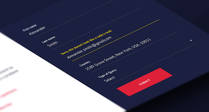
Among all of the best practices for conversion rates optimization this suggestion is the most frequent one. It can be useful if there are forms (like a registration form) or a process that consists of several steps (like checkout). If your data shows that a lot of visitors start filling the fields or following the steps but rarely finish it, it might happen because of the following reasons:
- visitors are not patient enough to insert all the data
- they encounter certain difficulties along the way
If it is the first case, then reducing the number of fields and steps can help. Try leaving only absolutely necessary fields. Minimize the number of steps. At this point, you can at least search in Google for some examples of good registration forms or you can contact a UX / UI design agency to help you. All other information can be obtained later when visitors are converted and will have plenty of time to spend in their accounts.
3. Change the page structure to accomplish its goal

Let’s say you offer a service and have a landing page. Experts suggest you avoid distracting users' attention from the main message with any kind of elements including the pop-ups. users will probably spend a few seconds on each screen so make sure that during that period they get the message. Place the CTA so it is visible, reduce the unnecessary copies and images, accentuate the core idea, and test it.
4. Add testimonials

They convince visitors. If someone else has already tried your product or service, get their recommendations. If testimonials have photos and even links to the social profiles of real users, then chances are people will trust the website. If they trust the website more users will conver.
5. Offer immediate feedback

This practice works well for the websites that sell something costly, as some visitors can feel better if they can talk to a real person about the product before spending a lot of money. It also might be faster to ask someone rather than search for the answers on the website. Immediate feedback can be offered in the form of a chat or a phone call. Try different options to see what works best and then optimize your website for conversions.
6. Remove fake content and add real information

Try to avoid using stock images and templates. It is better to be unique and use custom designs, as it helps to differentiate you from your competitors. Add images of the real people associated with the website, plus tutorials and authors to your articles. Showing real team members, real environments, and real products is an advantage. Even in a digital world people still want to communicate with real people. Some website owners even incorporate Instagram feeds to show how other real people use their products, and it works.
7. Have a well-structured navigation

If visitors cannot easily reach their destinations, then you need to take a closer look at your website’s navigation. If there are a lot of tabs and drop-downs, change the navigation, unite some items, and put some links in footers, freeing up space in the header. If there are more than three levels of navigation, it would be useful to introduce breadcrumbs, so users will see where they are now and how to go back to the previous page.
8. Add awards badges

If you won some awards, displaying them on your website will be beneficial. If the data shows that visitors hesitate, do not spend a lot of time on the page and do not convert in customers, then such badges can help to assure them. If you have a lot of awards, consider leaving only the most significant, which shows your expertise in the sphere.
9. Improve readability

Long swaths of text without any subheadings or bullet points are extremely difficult to read, and readability is still an issue for many websites, especially for websites for e-commerce. This isn't only about blogs. If reading copies thoroughly is important for your website’s conversion rate, you have to make sure they are easy to read. If you have pieces of information all over the page, they should be laconic and organized in a way that would follow the rules of normal eye movement - from left to right, from top to bottom. Not having this might be the reason why visitors leave the page too soon. Try improving readability and see if it helps.
10. Use limited time offers and exclusive deals

If you sell products, this strategy is obvious, as you might have already known that it works to bring you new customers. But it also works if you only started to grow your customer database and the website is dedicated to an app or service. If a subscription block contains general fields and a subscribe button that is ok, but if it offers, for example, a free lifetime support for early birds, that is already a stronger argument than then usual “Be the first to know”.
So now you have an idea of what a conversion rate optimization is. All of the suggestions mentioned above can be your starting point in conversion rate optimization. After you set your goals and collect the quantitative and qualitative data, this list of suggestions might give you an idea of where to look next. But every business is unique, just like the CRO for a website should be. So it is better to use techniques specific to your website.
AGENTE works closely with website owners, helping them optimize their websites to increase their conversion rate. Using the power of A / B testing, our clients can test different hypotheses, and with our help incorporate changes that offer a better conversion.
Rate this post!
379 ratings, average ratings is 4.8 out of 5
Related Posts

11 January 2024
Mobile-First Design: Full Guide for 2024
What is mobile first design? Well, the mobile first approach is a central principle of progressive enhancement. In a nutshell, it’s all about producing a small screen design and then scaling it up to other devices. In our new blog post, we cover some aspects that need to be taken into account when launching a mobile first web design project. We also share some outstanding design examples for your inspiration.

22 April 2022
Pagination Design Examples and Best Practices
Structure and hierarchy help to simplify things and make them easier to read ⚡ In this article we will come across pagination design examples and best practices.

Infinite Scroll Tutorial: Implementation, Best Practices and Examples
Infinite scrolling was designed as a faster and user-friendlier alternative to pagination. But is that the case? In our new article, we delved into this web design technique and shared some best practices and examples of endless scroll implementation.

06 November 2020
How to Run a Product Design Workshop
Our secret of successful collaboration on product design is that each team member understands the product at its core. That’s why we leverage product design workshops at Agente when kick-starting new projects.

05 September 2018
7 Points About Accessibility in Web Design
Web accessibility is the practice of designing and creating websites in such a way that individuals with disabilities can use them. The importance of accessibility in web design is undeniable. To find out whether your site is accessible, you can read our new article.

17 May 2018
User-Friendly Form Design: Best Practices & Examples | AGENTE
In this article we’ve gathered the best practices of form design, learned through multiple studies, our own experience, usability testing and actual feedback from our customers. We hope this material will help designers to make productive and user-friendly forms.
Let's talk
Is there a challenge your organization or company needs help solving? We’d love to discuss it.

Managing Director, Partner
Andrew Terehin

Thank You!
Your message has been successfully sent.
We will contact you very soon.


