Web accessibility is the practice of designing and creating websites in such a way that individuals with disabilities can use them.
The importance of accessibility in web design is undeniable; the statistics support this statement: 36 million people in the US have at least one disability. So the chances of such individuals accessing your website are high. To find out whether your site is accessible, you can use this Chrome extension.
If a website is designed correctly, people with diverse abilities have equal access to all the information and core functionality it provides, enabling social inclusion for such people. Web design accessibility is also extremely vital to users from developing countries, people living in rural areas and older people.
Putting the given approach to use will do you a good turn by growing your audience and improving your results in search engines, as they favor sites that take into account the needs of people with diverse abilities.
Read on to learn how to improve your website accessibility.
Website Design Accessibility Tips
There are multiple factors to consider when designing for accessibility. In this section, we are going to guide you through the key ones.

Color as a Visual Means of Providing Information
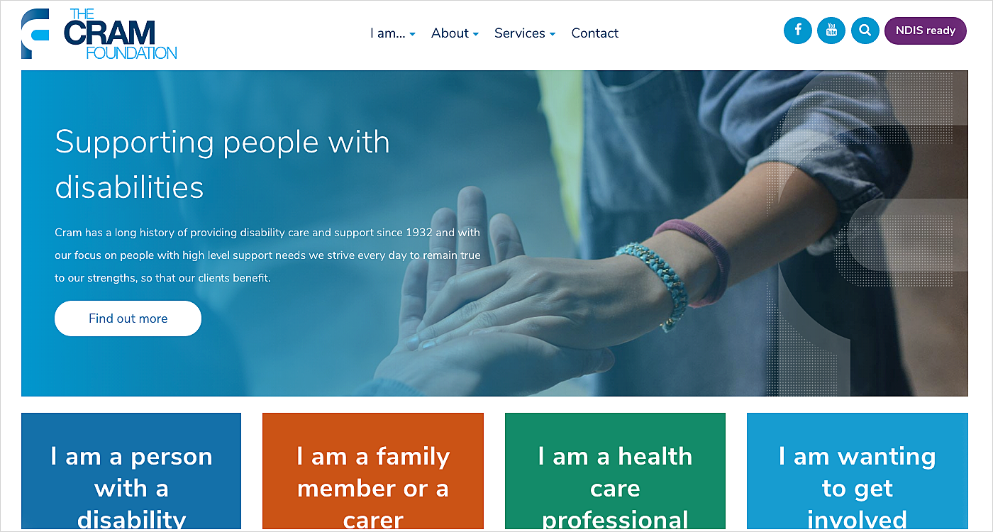
Web designers often apply colors to communicate some information to users. Not a bad thing, is it? Well, there are still some drawbacks when there are people who have problems with telling the difference between colors: color blind individuals (cannot distinguish between red and green), visually impaired people and those who are blind.
To be certain that your website is accessible for disabled users, it's essential to introduce an adequate color contrast of images and text, as well as a text against the background, and never to apply color as the only means of indicating useful information like required fields. Online tools for checking the accessibility of your color palettes such as Color Safe or Color Contrast Checker will be extremely helpful in this case. Also, employ asterisks and sufficient color contrasts to completely solve the problem.
Source: The Cram Foundation
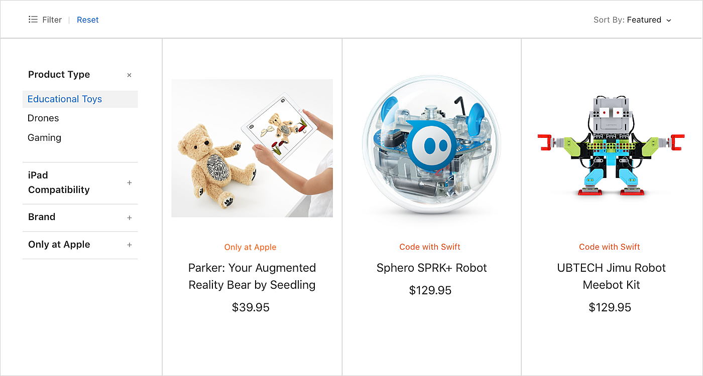
If you are running an e-commerce store, add color names in the selection options. This way you will eliminate the guesswork caused by color swatches to disabled users.

Pay Attention to Web Form Design
The design of form fields has changed significantly over the recent years. Today's forms are much more minimalistic than they were a few years ago.
But there is something that many of the new designs lack: visible labels and clearly-defined borders. These visual cues are vital for users experiencing cognitive disabilities, and people who have mobility impairments. Favoring minimalistic forms you make your website inaccessible to a large number of potential customers. Some sites introduce place holders instead of visual labels, but this tactic won't work for everyone as contrasts used are usually lower than the 4:5:1 ratio recommended for disabled people.

Site Visitors are Helped
Accessibility in web design is also much about being assistive. Web forms and other necessary interactions may be tough to fill in for some site visitors, meaning that mistakes will certainly occur.
Helping people to avoid and correct them will increase the website’s usability. What requires attention first?
● Submission forms. Make them reviewable to give users an opportunity to correct mistakes and reverse their submissions if needed.
● Instructions, suggestions (e.g., corrections), and error messages. They should be descriptive enough so that even non tech-savvy individuals understand what you expect from them.
● Assistance. Context-sensitive help creates a highly accessible environment.

Content is Organized Wisely
Web design for accessibility also means employing predictable user interfaces to remove the danger of disorientation and distraction caused by behavior or visual inconsistency.
When arranging content, be careful about the following things:
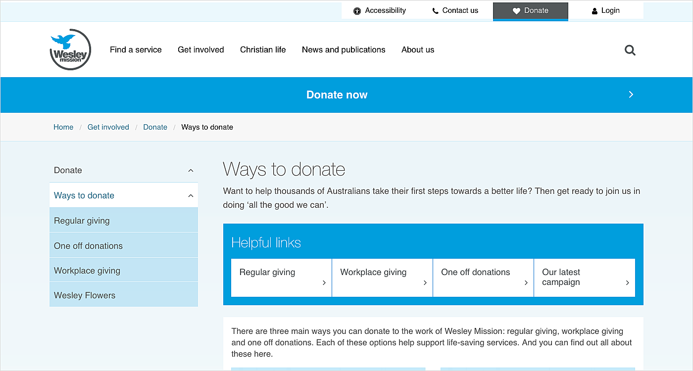
● Website navigation is consistent and its elements are displayed on the same page on all the pages.
● Site visitors can always easily determine where they are as they are informed about their current location.
● UI elements used on more than one page always have the same labels.
● A simple and consistent layout will improve accessibility significantly.
Source: Wesley Mission

Enable Keyboard Access
To interact with sites, people with visual impairments apply speech recognition tools, while those with motor disabilities take advantage of assistive technologies mimicking the keyboard-enabled functionality such as input, controls, and other UI elements.
Here is how you can achieve this:
● Needs of users with alternative keyboards (e.g., on-screen keyboards) are taken into account.
● The website can be fully used with a keyboard.
● Keyboard support is in place for the most common browsers as well as for authoring tools and solutions alike.
● Keyboard focus is always visible, no matter where it is located on the page.

Add Alternatives for All the Non-Text Content
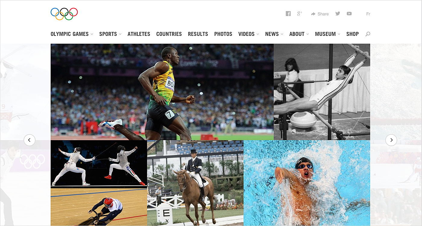
Introducing text alternatives for all the non-text content is a vitally important step towards an accessible website as text can be converted into other forms: speech, symbols, etc.
When it comes to images, icons, specialized graphics, and buttons, the alternative text should be included in the code/markup to cater to the needs of people with vision disabilities who leverage various tools (e.g. a screen reader) to access the website’s content. You can leave the alt text field empty in case an image is used for decoration only.
Labeling controls with the help of text improves the keyboard navigation, as well as the navigation enabled by voice recognition. For multimedia, such alternatives are also essential. Transcripts and captions for both audio and video facilitate the delivery of the content to disabled users.
Source: IOC

Give Visitors Sufficient Time to Interact with Content
Make sure that people who access your site have enough time to read and fully understand the provided content, including cases when text-to-speech solutions (reading aloud) are utilized. This can be a great idea if you are planning e-commerce website redesign services.
Identify the primary content of the web page and determine its individual parts. Write in plain English, or at least choose simplified versions of words and phrases. Introduce definitions for any uncommon words, phrases, or idioms to help people with cognitive disabilities, and those who are deaf, and deal with hearing impairments.
Source: Apple
Other Advice
Above are the most important tips for improving sites’ accessibility. But there is some other valuable information worth your attention:
● Flashing content may cause seizures. Try to avoid it so as not to cause any risks to site visitors.
● Let users choose the communication channel to use when making appointments, asking for assistance, etc.
● Adding diagrams and images to support text is one of the best ways to serve people with dyslexia.
● Enable pausing and stopping audio and video, as well as volume adjustment.
● Make it possible for site visitors to turn off the background audio or make background sounds low.
● Links should have unique and descriptive names properly stating where they will go.
Wrapping Up
Accessibility is a vital part of designing a website and it should not be skimped on. An accessible gains a competitive advantage and wins the loyalty and recognition of existing and potential customers.
In this article, we outlined the most essential tips to boost a site’s usability for disabled users. Seeking more information about the accessible web for your next project? Reach the AGENTE team via email.
Rate this post!
680 ratings, average ratings is 4.9 out of 5
Related Posts
11 January 2024
Mobile-First Design: Full Guide for 2024
What is mobile first design? Well, the mobile first approach is a central principle of progressive enhancement. In a nutshell, it’s all about producing a small screen design and then scaling it up to other devices. In our new blog post, we cover some aspects that need to be taken into account when launching a mobile first web design project. We also share some outstanding design examples for your inspiration.

22 April 2022
Pagination Design Examples and Best Practices
Structure and hierarchy help to simplify things and make them easier to read ⚡ In this article we will come across pagination design examples and best practices.

Infinite Scroll Tutorial: Implementation, Best Practices and Examples
Infinite scrolling was designed as a faster and user-friendlier alternative to pagination. But is that the case? In our new article, we delved into this web design technique and shared some best practices and examples of endless scroll implementation.

06 November 2020
How to Run a Product Design Workshop
Our secret of successful collaboration on product design is that each team member understands the product at its core. That’s why we leverage product design workshops at Agente when kick-starting new projects.
17 May 2018
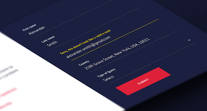
User-Friendly Form Design: Best Practices & Examples | AGENTE
In this article we’ve gathered the best practices of form design, learned through multiple studies, our own experience, usability testing and actual feedback from our customers. We hope this material will help designers to make productive and user-friendly forms.

02 December 2016
10 Best Practices for Website Conversion Rate Optimization
Conversion rate optimization or shortly CRO is a process aimed to increase the amount of website visitors that convert into customers, subscribers or followers.
Let's talk
Is there a challenge your organization or company needs help solving? We’d love to discuss it.

Managing Director, Partner
Andrew Terehin

Thank You!
Your message has been successfully sent.
We will contact you very soon.
