Content is king, but its structure and hierarchy are extremely important, too. They are vital when it comes to reducing content complexity and improving readability. The more organized the content, the better the website user experience.
Agente will help you understand how to implement pagination for products on your site read more in our case studies
Pagination and infinite scrolling are the two principal methods of achieving this. Pagination came into play first but it fell after infinite scrolling appeared.
Facebook and Pinterest are bright examples of websites where infinite scrolling is used. However, despite the popularity of this method there are still debates about the usability of both pagination and infinite scrolling within the web design community.
In our new article, we discuss pagination vs. infinite scroll dilemma and give some tips for e-commerce website design concerning pagination.
What is infinite scrolling and where to implement it?
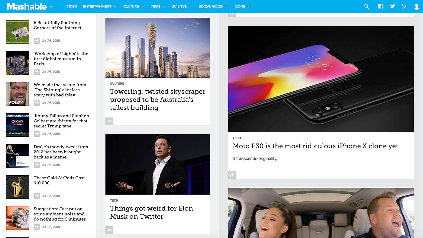
Infinite scrolling is a functionality allowing users to scroll down a massive amount of information, presenting it in easy-to-consume chunks. Some developers believe this method is a silver bullet for any site, as it keeps users engaged, but that's not true.
Infinite scrolling has the potential to make a web page nearly endless. Making users continuously scroll down the page to see, say, previous blog posts or products belonging to the same category may frustrate them, causing page abandonment. Information overload is another issue that users may face when visiting such pages.
Source: Mashable
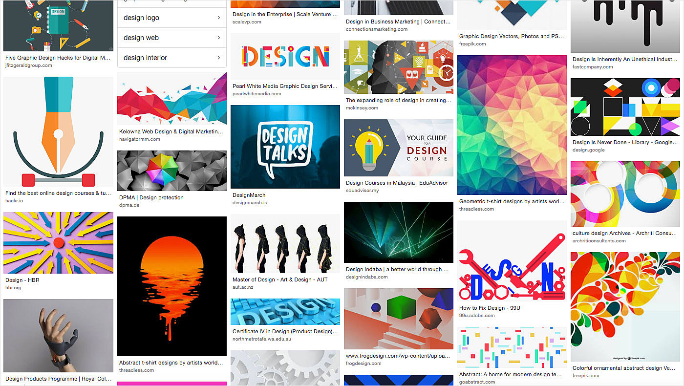
This functionality is a great choice for website projects which provide entertaining content to users, such as the above-mentioned social media sites. It is suitable in cases when consumers need to see numerous search results before reaching a decision. Google Images is an example of a page that loads results dynamically.
Source: Google Images
What is pagination in web design and where to put it to use?
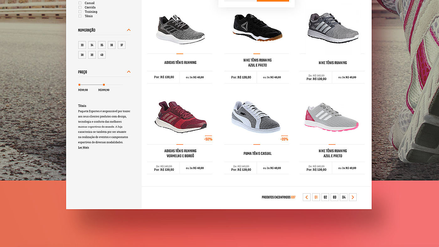
Pagination is a method of dividing web content into discrete pages, thus presenting content in a limited and digestible manner. It has many advantages over the previously discussed method. For instance, everyone is familiar with it, as it reminds them of conventional book pagination, a functionality consumers are already familiar with.
Source: Behance
Thanks to the break provided by pagination, users have time to consider their next move. With its help, they can also easily navigate between various groups of items.
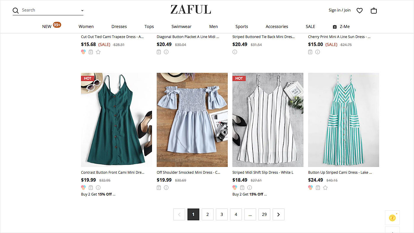
This method is usually employed to display resulting items on a website. Google search results page is a typical example of such a search. It is also widely used on e-commerce websites and in point-of-sale system design, where there are lots of products to choose of.
Source: Zaful
Keep on reading to learn how to create a great pagination design for your web project.
Best practices for designing pagination in web
There are some golden rules a web designer should observe to design a pagination template for a web project.
● Choose the right place
Placement plays a crucial role in ensuring good usability. If the pagination position is selected unwisely, users may miss it. For long pages, the best practice is to add this feature both at the top and the bottom to eliminate the need to scroll up and down, offering flexibility in accessing other pages easily.
● Make buttons big enough and leave space for clicking
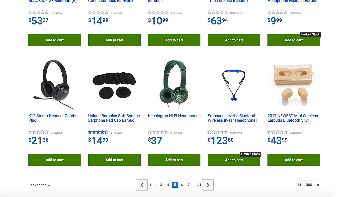
Designers quite often pay too little attention to the size of pagination buttons. But that’s an absolutely wrong approach. Numbers that are too small may result in accidental clicking of another button, thus taking the user to a place he/she doesn’t want to visit. As billions of people access the Internet from their mobile devices, it is essential to make these buttons big enough for a mobile screen (use at least 44 x 44 points).
Spacing between elements is also important. So make it big enough too. Don’t commit a mistake similar to the Walmart’s.
Source: Walmart
● Underlines are not always a good idea
Though underlines usually accompany web links, they may cause a negative user experience when utilized in pagination or in menus. And the reason is simple: people already know that these elements are clickable and unwanted reminders may frustrate them. Think twice before using these links on your webpage. Otherwise, you will never produce the best pagination design for your site.
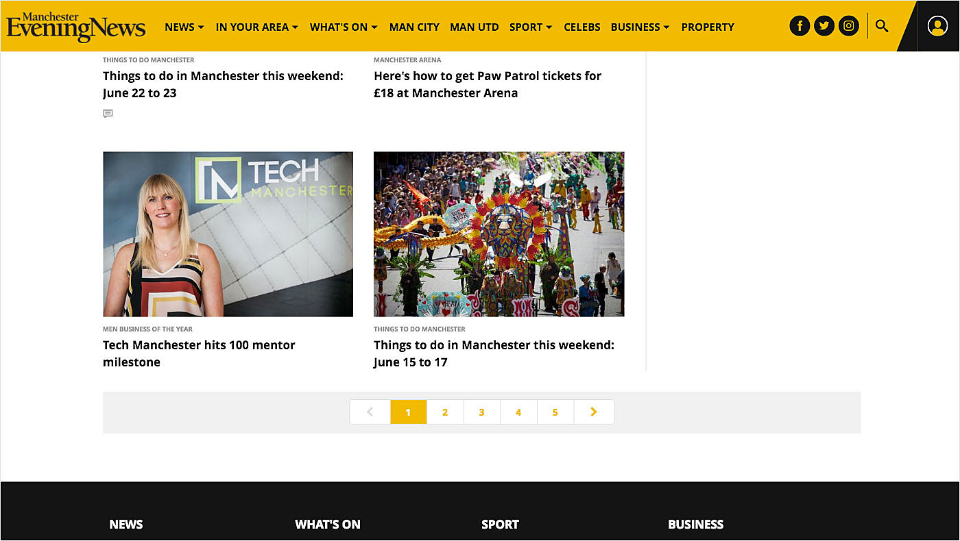
● Identify the current page
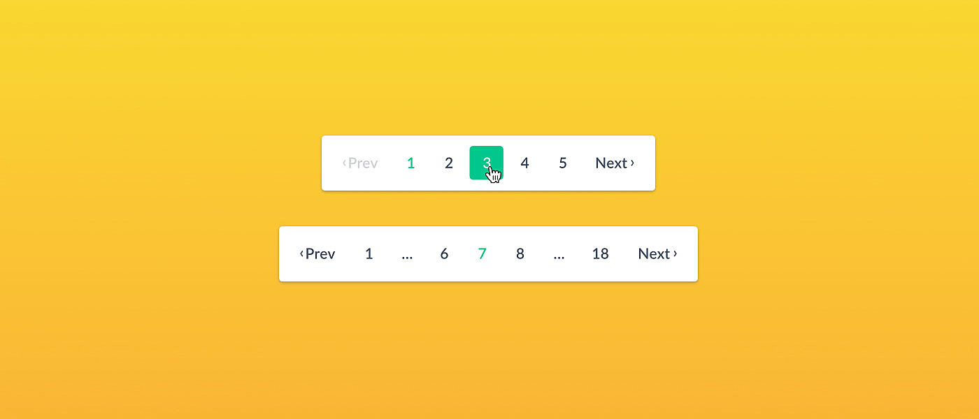
Tell site visitors where they are by indicating the current page. You may simply highlight it, or you can go further by choosing another style to let users differentiate it from other figures/buttons or numbers. Double-check that the figure/button is not linked in order to avoid unwanted reloading.
Source: Manchester Evening News
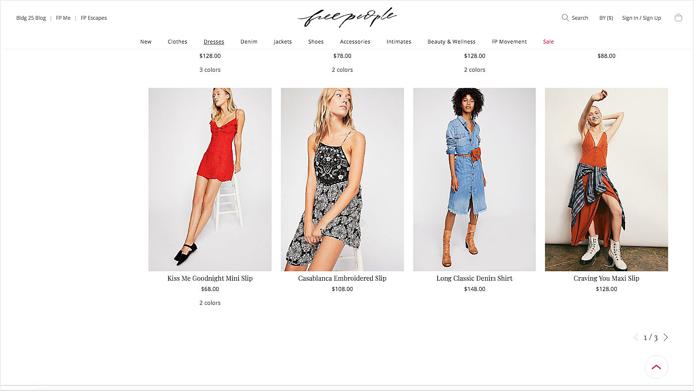
● Enable controls
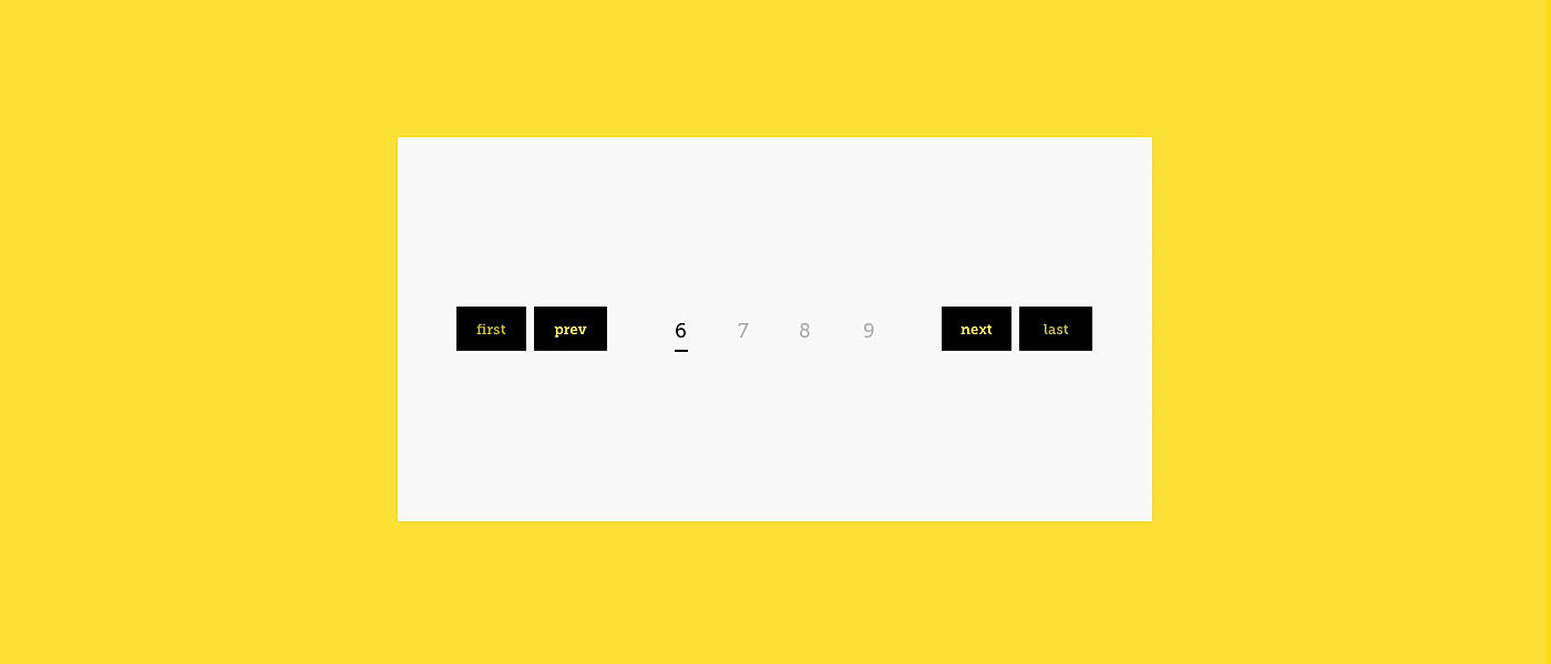
Using controls, one can easily move forwards and backwards through web pages. Provide controls and links to allow users to come back to a previous page, proceed to next one, or access the first or the last page of a site, so that you meet their expectations of usability.
Source: Free People
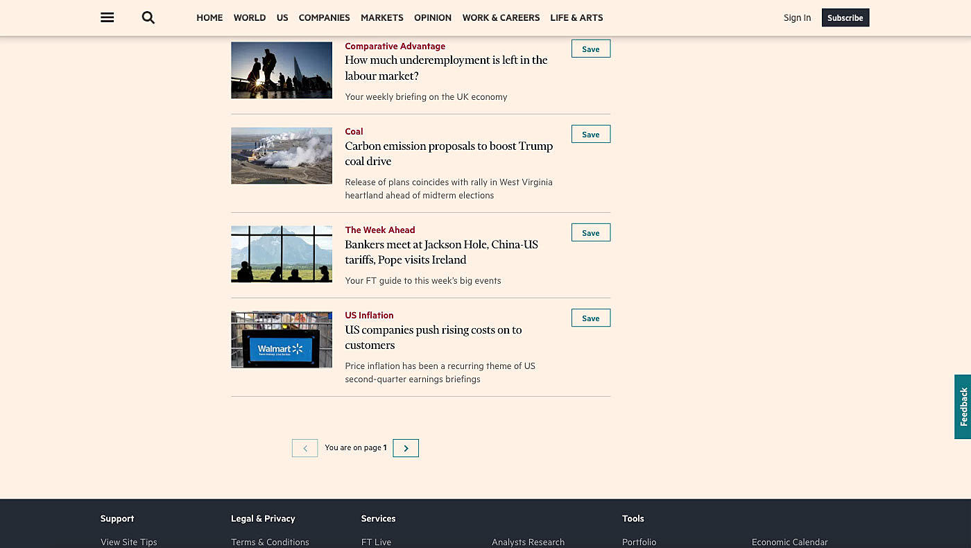
Note that if you decide to introduce custom graphic elements as in the example below, it may be difficult for first-time visitors to understand how they work.
Source: The Financial Times
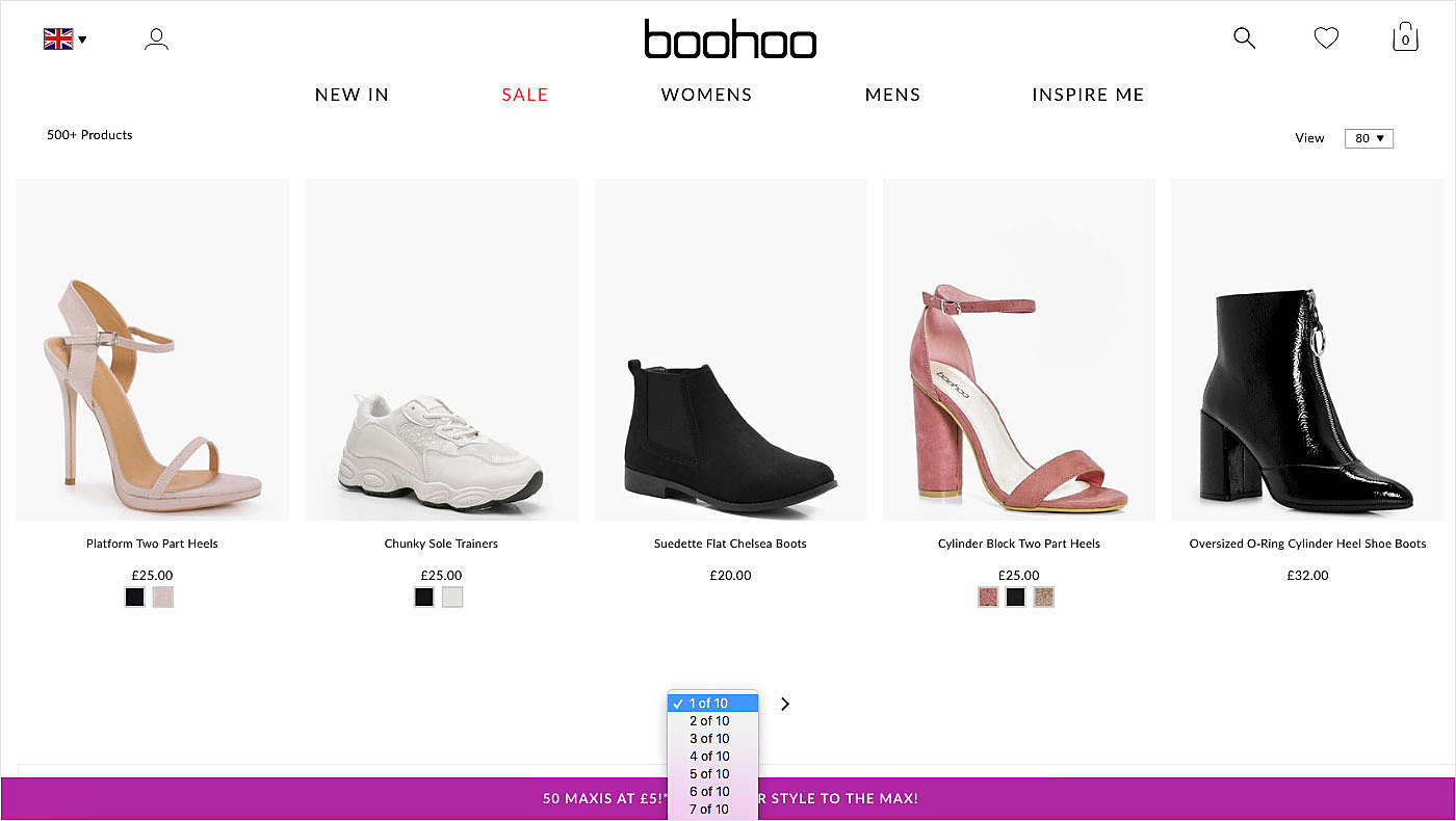
● Enable manual input
If there are multiple pages on the website and someone wants to jump from the first page to the one in the middle, the controls we’ve just discussed will be of little help.
Source: Boohoo
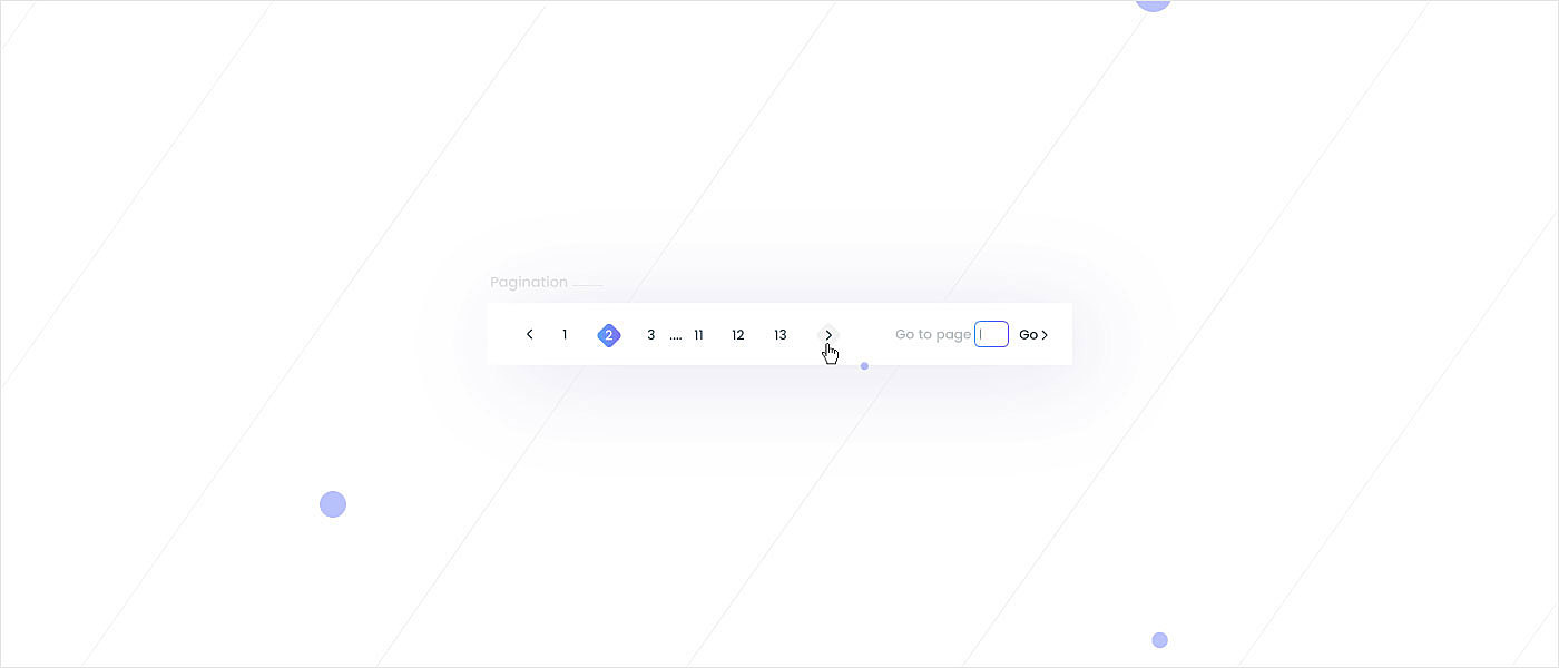
The ideal solution is to introduce manual input for quick and painless moving between pages of the site. Let users directly enter the necessary page number and access it by putting the ‘Go to’ functionality into action.
Top 10 pagination design examples
If you are up to e-commerce website redesign, and still in two minds about which pagination will suit your site best, take a look at the examples we have found for you.
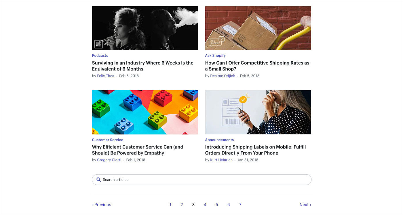
1. Shopify
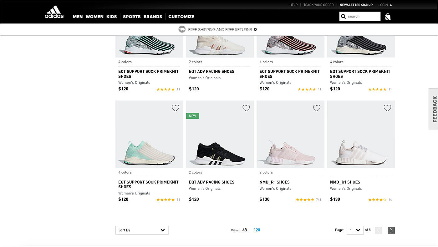
2. Adidas
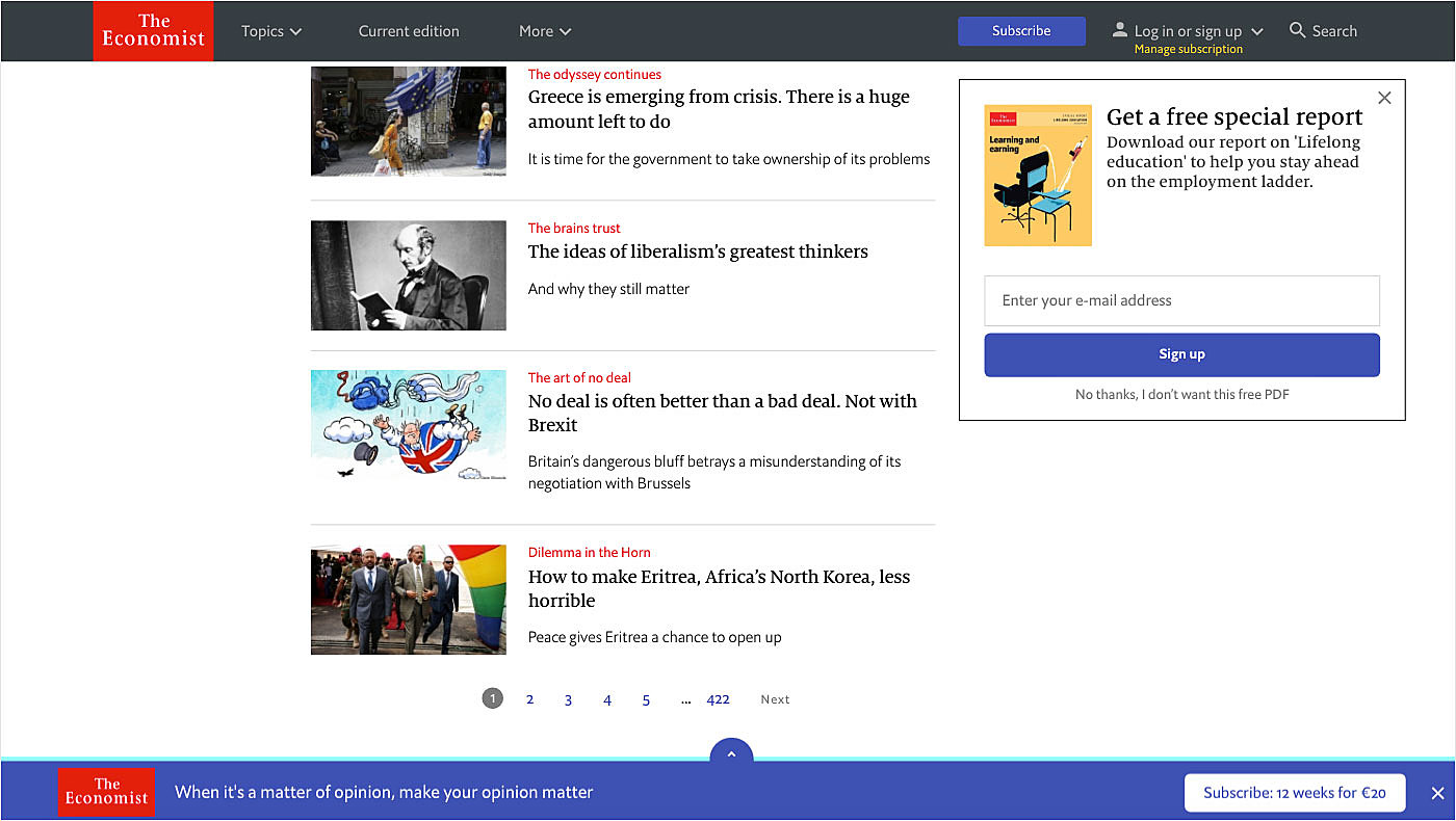
3. The Economist
4. Dribbble
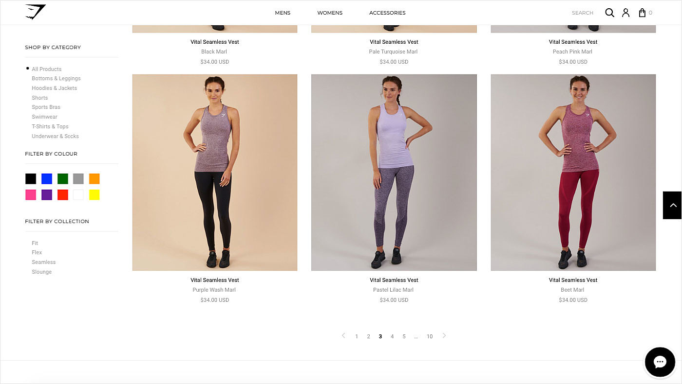
5. Gymshark
6. Dribbble
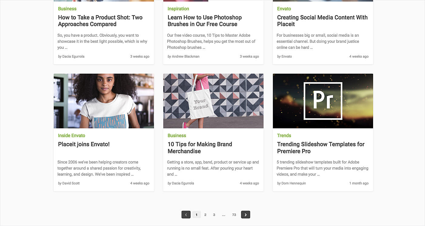
7. Envato
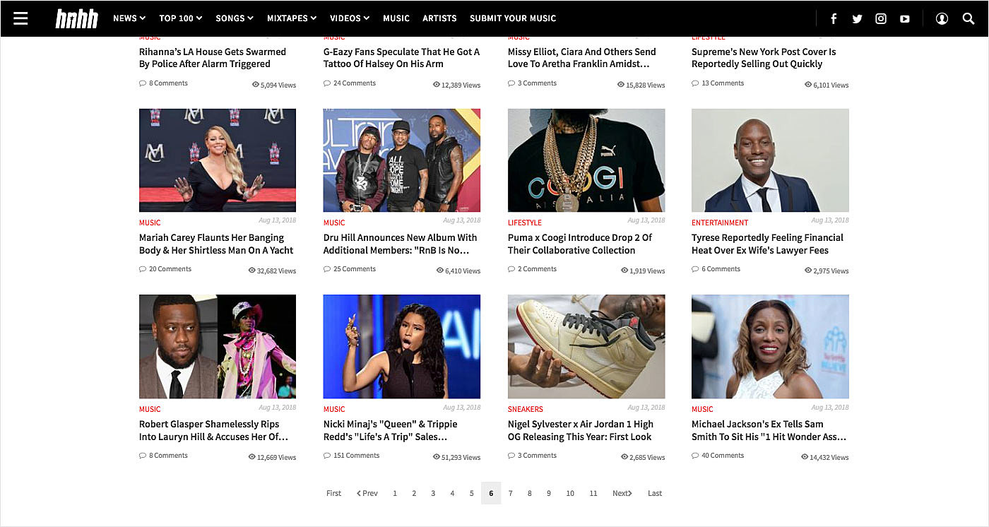
8. HNHH
9. Dribbble
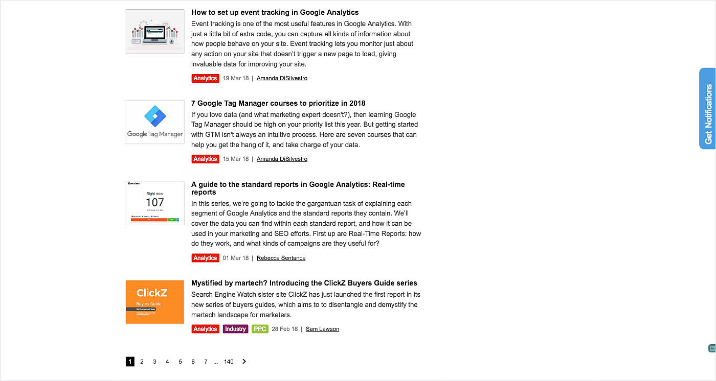
10. SEW
Wrapping Up
Pagination is a web content organization technique that has been used for decades. Though such alternatives as infinite scrolling have emerged, it is still a prime choice in many projects due to its familiarity and convenience.
In this article, we shared with you some useful tips on how to create good pagination for a website. Use them and you will never get complaints from your site visitors. We also provided some examples for visual inspiration.
Have some thoughts to share with us regarding pagination for websites? Don’t be shy, contact the AGENTE team right now.
Rate this post!
556 ratings, average ratings is 4.2 out of 5
Related Posts

11 January 2024
Mobile-First Design: Full Guide for 2024
What is mobile first design? Well, the mobile first approach is a central principle of progressive enhancement. In a nutshell, it’s all about producing a small screen design and then scaling it up to other devices. In our new blog post, we cover some aspects that need to be taken into account when launching a mobile first web design project. We also share some outstanding design examples for your inspiration.

Infinite Scroll Tutorial: Implementation, Best Practices and Examples
Infinite scrolling was designed as a faster and user-friendlier alternative to pagination. But is that the case? In our new article, we delved into this web design technique and shared some best practices and examples of endless scroll implementation.

06 November 2020
How to Run a Product Design Workshop
Our secret of successful collaboration on product design is that each team member understands the product at its core. That’s why we leverage product design workshops at Agente when kick-starting new projects.
05 September 2018
7 Points About Accessibility in Web Design
Web accessibility is the practice of designing and creating websites in such a way that individuals with disabilities can use them. The importance of accessibility in web design is undeniable. To find out whether your site is accessible, you can read our new article.
17 May 2018
User-Friendly Form Design: Best Practices & Examples | AGENTE
In this article we’ve gathered the best practices of form design, learned through multiple studies, our own experience, usability testing and actual feedback from our customers. We hope this material will help designers to make productive and user-friendly forms.

02 December 2016
10 Best Practices for Website Conversion Rate Optimization
Conversion rate optimization or shortly CRO is a process aimed to increase the amount of website visitors that convert into customers, subscribers or followers.
Let's talk
Is there a challenge your organization or company needs help solving? We’d love to discuss it.

Managing Director, Partner
Andrew Terehin

Thank You!
Your message has been successfully sent.
We will contact you very soon.
