Even the creme de la creme of the world web opt to refresh their websites to stay top players in their industries. We’ll give you at least five changes that happen after redesigning an eCommerce website:
- Higher conversion rate;
- Increased overall traffic;
- Escalating leads and sales;
- More overall and return visits.
In this article, we’ll take a closer look at some reasons to revamp your eCommerce website, the A to Z process, and the cost of eCommerce redesign.
Why It’s Time to Redesign an eCommerce Website
Why redesign an eCommerce website?
The first obvious answer that comes to mind will be “because it’s ugly.”
Well…no, not always. In most cases, it’s not the main reason.
eCommerce websites need new faces because they are ineffective. They don’t grab attention, and they take too long for visitors to understand how to navigate. They just don’t sell. Here is the alarm checklist that shows that your website needs some changes:
1. It’s time to go mobile
Most of us make purchases on the go via mobile devices. This is the main reason why Google came up with their mobile-first index concept. It says websites that are mobile user-friendly receive better SERP rankings than those that aren’t. That means mobile-friendly websites appear higher in search results. What’s more, responsive websites make online sharing simple, so your web visitors are more likely to share on their social platforms.
Customers will never scroll down a mobile-unfriendly website—not to mention trying to make a purchase. You can give your website a minimalist style to fit a smaller screen, but that is not enough. You need to optimize a lot of aspects to ensure flawless mobile user experience.
When redesigning, think about how mobile devices will resize the design. Use tools like Responsinator to test out your new design on all mobile devices. Keep in mind, too, that devices change, so follow the trends and be the first to adapt your mobile website version to new trends.
Source: Agente case
Source: Agente case
2. High bounce rate and low ROI
Google Analytics will tell you about onsite visitor behavior and conversions. A bounce rate for eCommerce ranging from 26 to 40 per cent is fantastic, 41 to 55 is average, and anything between 56 to 70 is subpar. If your bounce rate is above 70 per cent, the website is considered ineffective. If you see low traffic and high bounce rates, it’s time to take action, namely, revamp the eCommerce website focusing on such parameters as exit and bounce rates, conversions, and average visit duration.
Your eCommerce website redesign will deal with the reasons why visitors are bouncing off your website. Reasons include confusing navigation, uninspiring design, limited technological functionality, and a convoluted structure.
3. Declining sales
Redesign for eCommerce website is what should first come to your mind if your sales numbers are continuously going down, even during your peak season, and you are not able to attract new customers.
A bad user interface and confusing CJM often become deciding factors in users opting for a competing service, which could be a reason for the disappointing sales figures.
If this is the case, Agente can help you evaluate your sector’s top eCommerce websites to assess the functionalities, special features, and user interface that are best suited to keeping your competitors on their toes.
4. Your current website doesn’t fit the target audience and business objectives
Do you know what your customers actually want? Are your target audience’s attitudes, buying patterns and behavior as well as your business objectives taken into consideration? If not, there’s no way your eCommerce website will perform.
Many store owners use intuition to make decisions, which is a mistake. Redesigning the eCommerce platform will help you to meet specific user requirements.
Take a look at the small example before we start. Fashion retailer platform Atterley wanted to redesign category, brand, and product pages on their eCommerce fashion website.
Before:

Source: Wayback Machine
After:

Source: Agente case
In a matter of months, the Agente team optimized Atterley’s UX and doubled the website's conversions. You may learn more about this case by the link.
But how do you make a new version of the website that will do all that? The answer is to obtain user feedback and test your store. User feedback can be secured by emailing your subscribers a quick questionnaire, or having a slide-up question box on your site.
A good idea is to run two separate versions of your eCommerce website for a while, with minor differences. You’ll be able to understand the features of the site that your target audience uses more.
5. Obsolete technology and poor usability
Too heavy, feels like eternity for customers to load pages, poorly integrated plugins, and terrible responsiveness—these are the hallmarks of out-of-date technology.
Poor usability goes hand-in-hand with obsolete technology. If you recognize some of these problems on your website, please, fix them.
No structure and abundance of elements. Little space between informational blocks, contradicting colors, fonts that are too “artsy.” All of these elements confuse users and don’t contribute to sales. Take a look:
- Multiple navigation options. Users are overwhelmed with the offers and simply forget why they came to this store.
- Complicated checkout process. Think of Amazon. This is the standard of a checkout process. If yours has more steps, make it easier.
- No search feature. It takes too much time to find a particular product in a catalogue. Let users easily find what they’re looking for with the help of a search bar.
6. Your business is mature enough to have a custom website
At the dawn of your business, it’s normal to buy a website template due to budget constraints. But its lack of uniqueness and restricted business possibilities become too obvious to ignore. If your eCommerce website design is one of many clones on the market, don’t expect high visitor rates. Redesigning from scratch and adding a sprinkle of custom features on top will make your website a player in a major eCommerce league.
One of the benefits of revamp an eCommerce website is that it will boast custom appealing visual content and sizzling product descriptions, which are of no less importance. Some people absorb and process information in a more visual manner, while others prefer the written word. Product description should engage your site visitors, help to gain valuable information and, ultimately, sell the product. Therefore, use emotional words that convey the benefits of the product you’re selling.
eCommerce Website Redesign Process by Agente
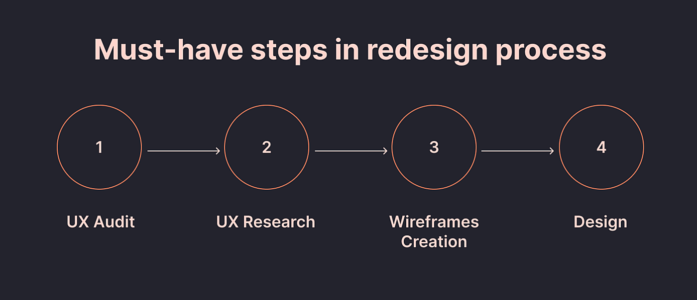
- UX audit. Depending on the complexity of a project and its tasks, an audit may include interviews with stakeholders, analysis of analytics data, and click-through maps. We also analyze successful eCommerce website examples and note what we can put into practice.
- UX research. This includes work with user personas, website maps and user flows. We define the user persona’s age, goals, needs, and frustrations to get insights. Then we work with a website map and user flows, gathering end users' pain points such as difficulty in reading, small spacing, and inconvenient layout.
- Wireframes creation. There are many types of wireframe designs, for example, low fidelity wireframes, high fidelity wireframes/ site map, user flows, etc. Here we represent the user persona’s best-case scenario or a storyboard of a shopping experience at the given eCommerce store.
- Design. We design UI and build interactive prototypes with all the features that will be available in the final version.
Next comes the software development, testing, and improving phase. We perform several testing iterations. Each time we get valuable feedback that we use to make changes in the website’s UX/UI.
eCommerce Revamp Website: Best Practices
Let’s talk about the methods and tricks that will make your eCommerce website stand out from other shops.
Communicate trustworthiness
- Include an overview of your business, including the “about” section, photos of people behind the business, contact info, social media links, and FAQs.
- Publish store policies: shipping and return, privacy policy.
- Add recognized trust seals that verify the legitimacy and security of a website.
- Share product reviews; they help customers to understand more about the product. It will help alleviate any concerns they may have and provide great eCommerce UX.

Source: vitl.com
General UI design considerations
- Follow the brand identity throughout the website. Ensure brand experience is consistent across all channels: online, in-store and on mobile devices.
- Adopt visual hierarchy. The most important content should be displayed above the fold.
- Keep it simple. Limit font formats such as face, sizes, and colors.
Navigation
- Have well-defined product categories. The top level of navigation should show the set of categories that your site offers. Category labels work best when they are single words that describe the range of products, so shoppers can scan through them and instantly understand what they represent.
- Make search easy to find. Put the search box on every page and in familiar locations. The box should be visible and quickly recognizable.
- Include a search auto-complete functionality and allow filtering.
- Make special offers, discounts and deals visible.
- Let the search support all kinds of queries, such as product names, categories, and product attributes, as well as customer service related information.
Product page
- Use a neutral background. The background for product images should not conflict with the product itself. A background of neutral colors works best because it allows the product to stand out.
- Give the right amount of information. Give shoppers detailed information about the product. Show availability, color and size options, materials used, total cost, and warranties.
- Use a variety of high-quality images. Good images sell the product. High-quality images catch customers' interest and show them exactly what they are buying.
- Show related products that shoppers might also like and that work well with the current product.
Shopping cart
- Use a clear call-to-action (CTA) with bright colors, plenty of clickable areas and simple language.
- Use a mini cart widget. Allow shoppers to add products to their cart without leaving the page they are on, by using a mini cart. It also allows them to discover more products.
Checkout
- Offer various payment options to expand the customer base. For example, bank/credit card, PayPal, Apple Pay.
- Make registration optional. Give them an option to register after the purchase. Highlight the benefits of registration when asking them to register.
- Offer support via a live chat.
How Much Does It Cost to Redesign an eCommerce Website?
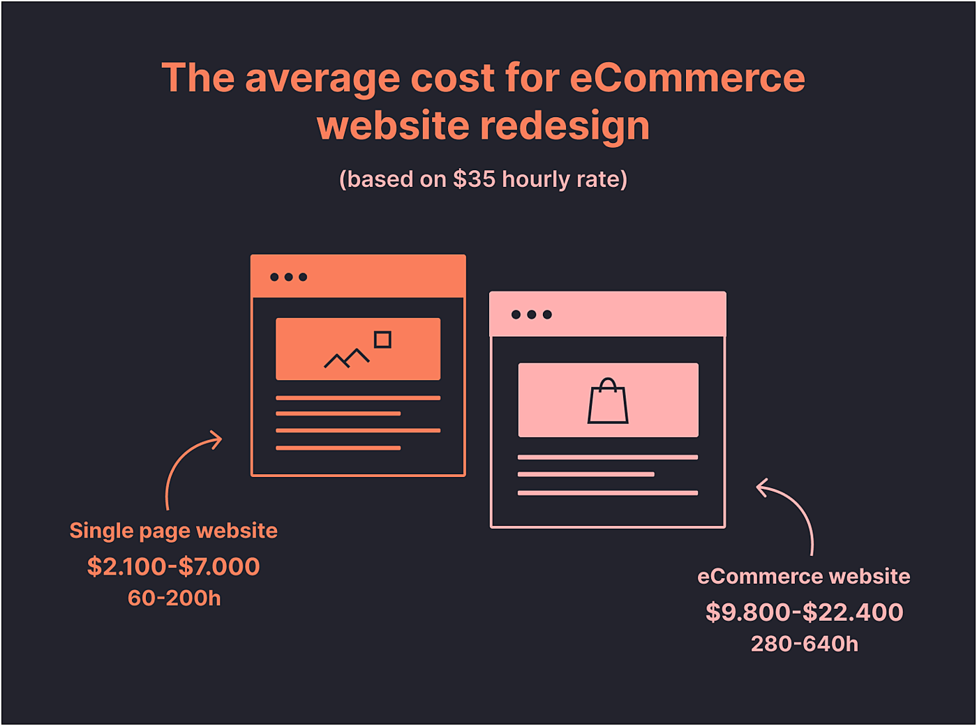
Parameters affecting the budget for an eCommerce website redesign include:
- Project size and type
- Design approach and processes
- Design quality and geographic factor
Project size and type
The number of pages depends on the size and the type of the eCommerce platform, its business model and many other factors, but in general, the number of pages can vary from 10 to 30. P.s. Right now we are working on one eCommerce marketplace with 50+ page templates.
There are three main types of eCommerce website:
- Static Content Site, similar to IT company websites where products can’t be sold online without discussion.
- Online Marketplace or Auction Site, connecting buyers and sellers/brands.
- Transactional Site, that looks like a catalog of a single retailer or a showroom for manufacturers.
Responsive Design Breakpoints: Desktop browser screen resolutions, tablets, and smartphones. The final number of screens for an eCommerce website will be from 30 to 90 pages.
Design approach and processes
For a general design and redesign project, it consists of three main stages:
- Information analysis
- Wireframing and prototyping
- Visual UI design
The duration of a project can vary. It depends on the project type, size, design approach and internal processes within design agency, analysis, wireframing and UI design stages.

We described our design process and approach from analytics to launch in this article, so you can see that it's divided into 10 substages.
Trying to sum up all these parameters we get the following results:
There can be from 10 to 30 pages and three responsive design breakpoints, so the final amount of screens for all three types of screen resolutions can be from 30 to 90.
The total for a complex eCommerce website can be 280-640 hours.
Design quality and geographic factor
We are almost at the end of our incredible pricing journey and we are ready to answer the question. “How much does it cost to redesign a website?” The two most important factors that can affect your website redesign budget are the location of your design company with its designers, as well as the quality of their design.
With globalization, it’s not a secret that the prices for the same type of work, such as website redesign services, may vary in different countries. Let's look at the hourly rate in different countries:
The United States and Canada
An average hourly rate of US-based design teams and experts are $60-170. The US is the hottest and most competitive market for IT and UX/UI design services.
The UK and Western Europe
A website redesign company from the UK or Western Europe will charge $60-120 per hour. The top IT hubs in Europe are located in London, Berlin and Amsterdam.
Eastern Europe (Poland)
The hourly rates of Polish design teams can vary from $35-45 per hour.
Let's calculate the average price for eCommerce website redesign based on a $35 hourly rate. The process of redesigning will cost:
- A single page or promo site — $2,100-$7000 (60-200 hours)
- An eСommerce website — $12,600-$28,800 (280-640 hours).
Our experience
Agente has more than 10 years of experience in custom web design and eCommerce website redesign services. We engage with a full cycle of website design to deliver platforms that sell, be it a fashion retailer platform, furniture marketplace, food retailer website, or POS terminal. Here are some of the projects from our portfolio:
Furniture marketplace
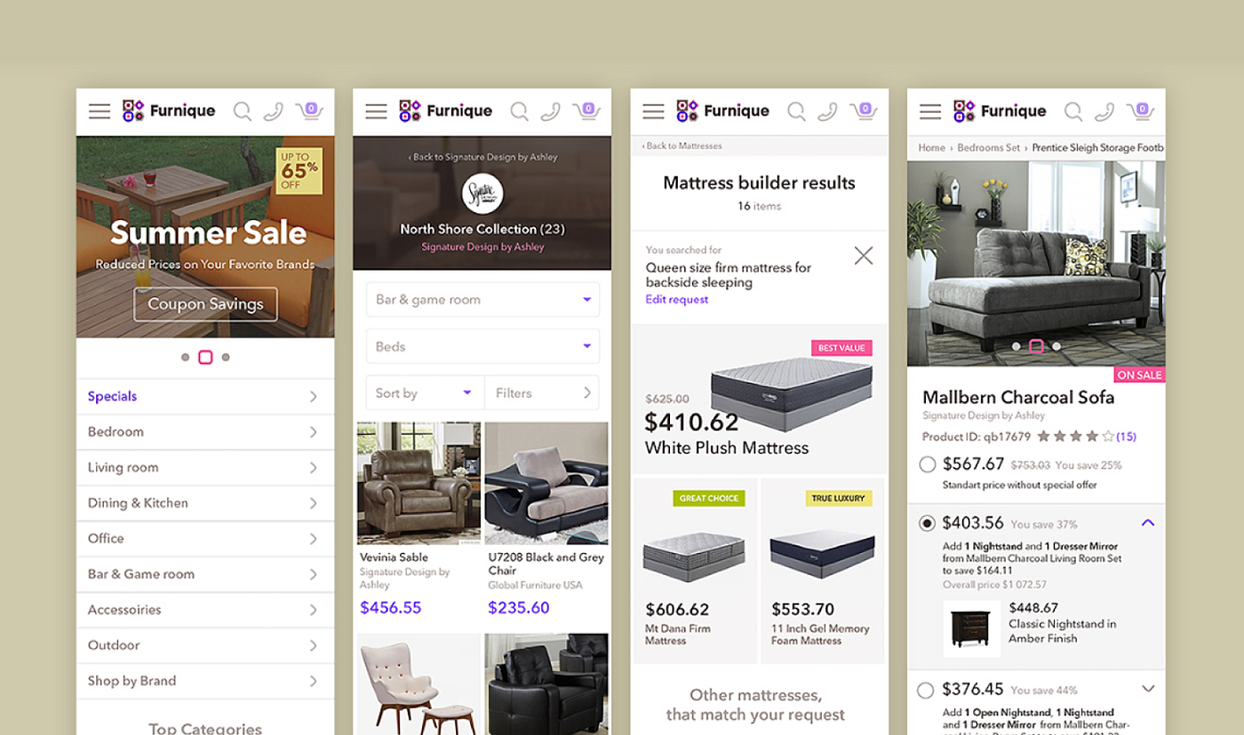
Furnique furniture marketplace needed an adaptive user interface for thousands of product names, as well as dozens of categories and brands. The project plan included a full range of services associated with prototyping and designing user interfaces: Competitor analysis, hit-maps analysis, information architecture, prototyping, and designing desktop and mobile interfaces. The project also included a new logo design.
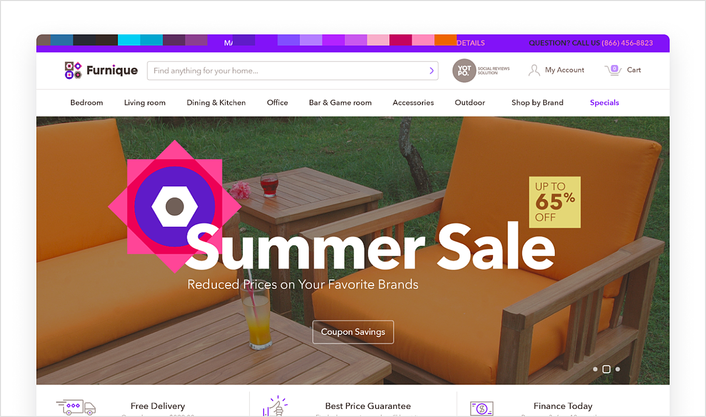
Source: Agente case
eCommerce website for a pizza chain
Sarpino’s Pizzeria approached us to investigate the reasons behind their low conversion rate and high bounce rate on mobile devices. In addition, we aimed at producing a new visually attractive user interface that would allow integration of a new logo.
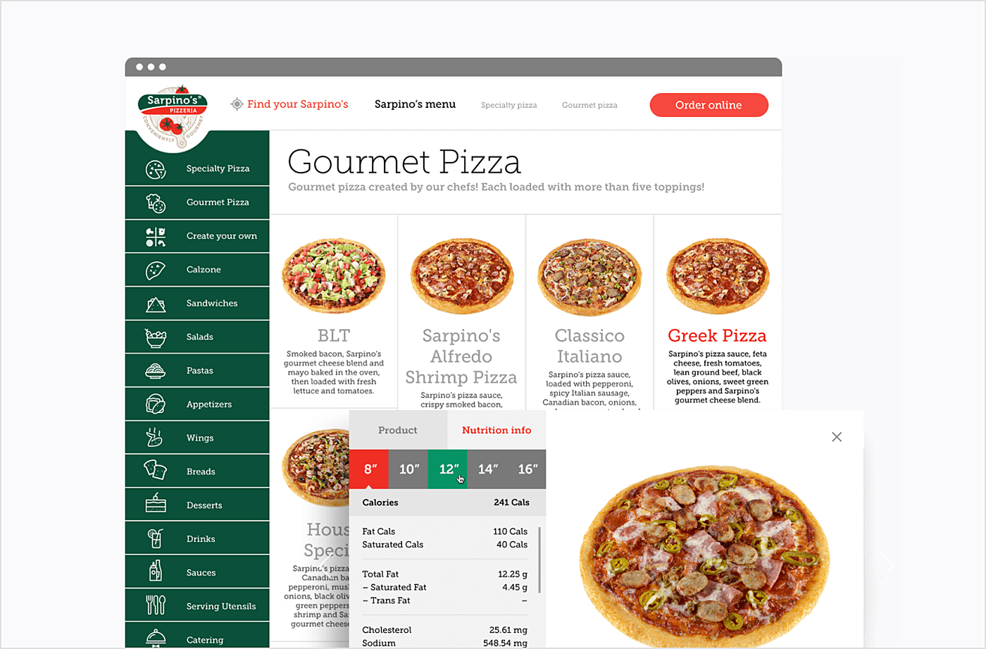
Source: Agente case
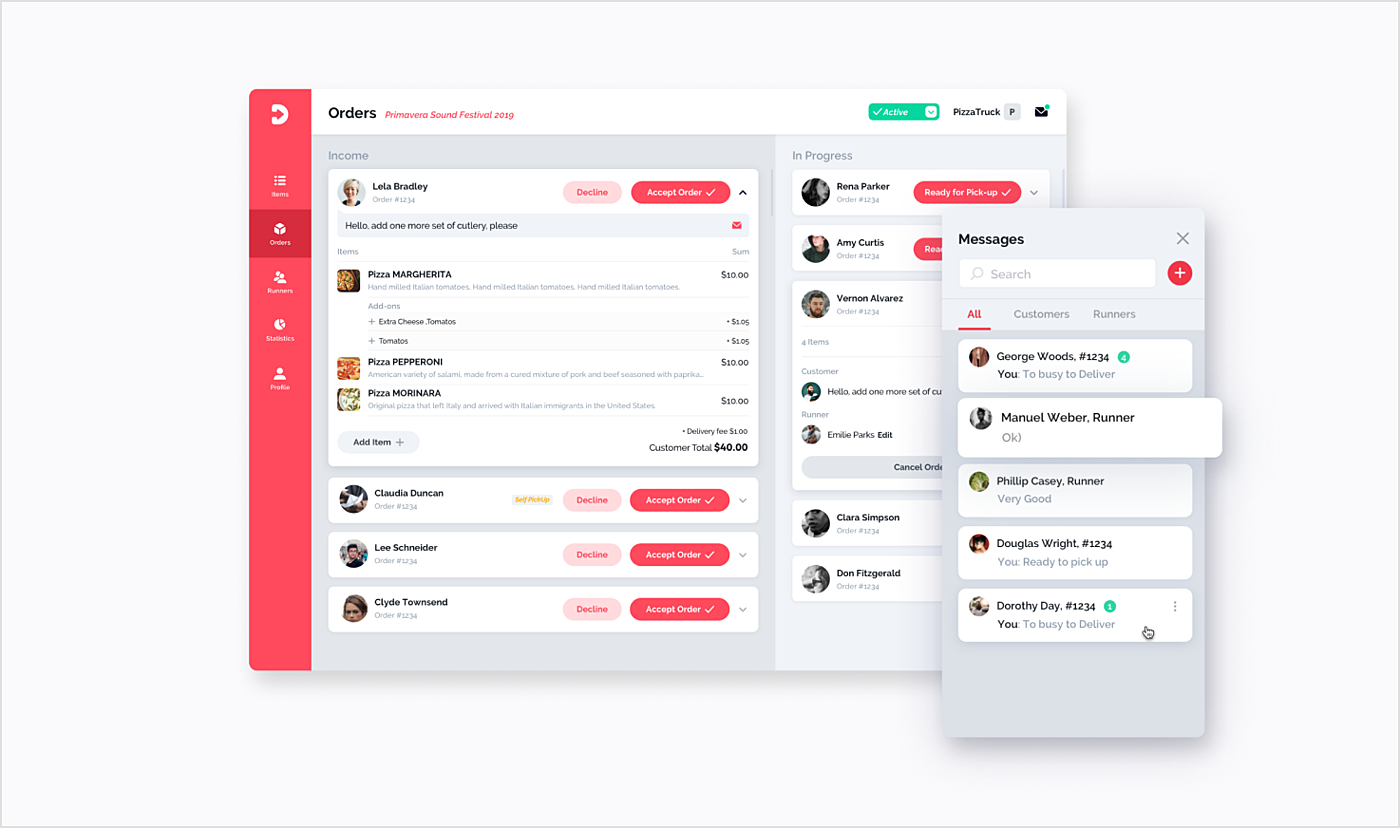
Having analyzed the data, we came to the conclusion that the website did not adapt to mobile devices, so we decided to develop a new user interaction strategy. As a result, we created consistent pass-through navigation and added an option to quickly order pizza from any page of the website. Additionally, we created an interface that easily adapts to desktop, tablet and smartphone.
Wine ordering eCommerce platform
Another challenge we eagerly rose to was to design a user interface for a wine-ordering eCommerce platform. Our client came to us with an idea to design and develop two apps: One iOS app for customers and one web app for corporate clients. We managed to build a strong and simple UX and UI of iOS app, and we worked on the logo book and brand identity of the company. We also developed a promo website to advertise the apps.
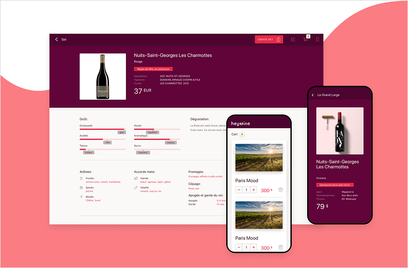
Source: Agente case
At the product research stage, we discover the weak points and opportunities for your eCommerce website. We develop a UX strategy that helps to analyze user behavior and to look inside your product. And then comes the UI design. We prototype and design actual screens for each screen of your website, bearing user interactions in mind. And last but not least: Usability testing. It’s crucial to make sure that people love it. We run remote or in-house testing with potential users of a website before it goes live.
Final Thoughts
eCommerce stores have already attracted over two billion buyers around the world. It's quite likely that yesterday’s consumer has just opened his or her own store to sell stuff. Yes, the e-market is an immensely competitive place. If you want to attract new clients and keep the old ones, think of planning an eCommerce site redesign. Contact our specialists to get expert vision of your platform.
Rate this post!
1003 ratings, average ratings is 4.6 out of 5
Frequently asked questions
Whether you represent a private business, a large enterprise or an educational institution, our e-learning platform development services will greatly improve the performance of your company.
How to evaluate the effectiveness of an e-commerce website redesign?
One way to assess the effectiveness of a redesign is to conduct usability testing. This involves observing users as they navigate the site and collecting feedback on their experience. In addition, website analytics can provide useful information about user behaviour, such as bounce rates, conversion rates and average session length. Customer surveys or interviews can also provide an understanding of their satisfaction with the redesign. By combining these evaluation methods, companies can gain a comprehensive understanding of the effectiveness of their ecommerce site redesign and make the necessary improvements.
What are the key elements of a successful e-commerce website redesign?
One of the most important key elements is user experience - the website should be easily navigated, having clear and intuitive menus, search functionality, and well-organized product categories. Next, the website should be visually engaging and have a design that reflects the company’s brand identity.
Reasons to redesign your e-commerce website
Firstly, technology and trends are constantly evolving and an outdated website can make your company look unprofessional. Improving the user experience through a redesign can make your site easier to navigate, more visually appealing and more up to date. A redesign can also help your website to be mobile friendly, as more and more customers are making purchases on their tablets and smartphones. A redesign can also help to update your branding and messaging to ensure that your website represents your company's principles and business objectives.
Related Posts

How to Launch Your Online Travel Marketplace Platform in 2024?
Learn how to launch your own online travel marketplace platform in 2023 with our comprehensive guide and step-by-step insights.

14 January 2024
Marketplace Website Design and Development in 2024: Features, Tech Stack & Cost
Discover the latest in marketplace website design and development, explore features, technology stacks, and gain insights into cost-effective strategies.

Top eCommerce Website Design Features and Tips in 2024
While creating an online store, it is difficult to orientate quickly and understand how the website should look to create a positive impact on the owner’s income. It determines whether clients remain on store’s page, would they have confidence in the store and would they like to purchase

POS Interface Design Principles
There's hardly a retailer who doesn't have POS software in place or not planning to start using it in the future. In this article, we're going to discuss the Design Principles of POS Interface.

What Is mCommerce and How Your Business Can Benefit from It
Find out about m-commerce advantages and disadvantages, benefits for consumers and future trends in the sector.

How to Improve Online Shopping App Design for Better UX | Agente
Dissecting shopping app UX design: how to make your design work and provide a superb user experience.
Let's talk
Is there a challenge your organization or company needs help solving? We’d love to discuss it.

Managing Director, Partner
Andrew Terehin

Thank You!
Your message has been successfully sent.
We will contact you very soon.


