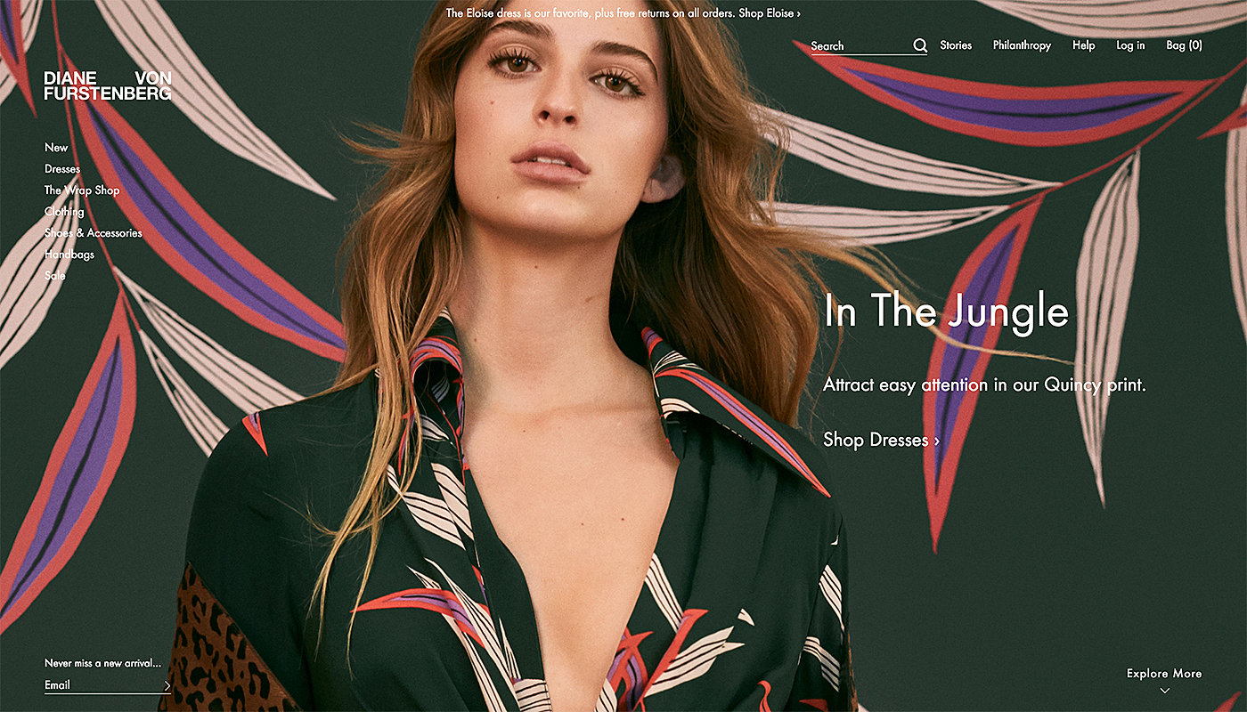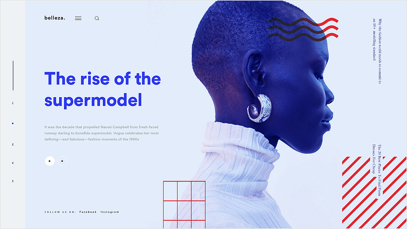
The fashion industry is one of the most appealing and followed in the world, with the global market valued at over $3 trillion dollars. As the visual aspect for such projects is crucial, fashion website design examples can be a good inspiration while creating your own platform.
Digital presence has become really important nowadays and even world-famous fashion brands like Prada and Versace have entered the online space to become closer to existing and new customers. The competition is tough, and fashion websites do their best to keep up with these changes by constant e-commerce website revamping.
The Agente team has a wide experience in designing and redesigning the platforms, including a project in the fashion industry with a special talent for eye-catching design and convenient user flow.
In this article, we are going to share some of our experience and discuss how to design a fashion website that will rock.
The Secret of a Stunning Fashion Website Design
To stand out from the competitors and prosper, the best fashion websites have to be a combination of a great UX and UI. Let's take a look at the feature list for a fashion website:
An Eye-Catching Homepage
A homepage is usually the very first thing visitors see, making it one of the most important touchpoints.
So pay special attention to this page. A successful page will engage users and efficiently communicate your message to them, building the relationship and trust. Never display product prices here: being that pushy will do more harm than good. Your homepage must encourage users to continue exploring your store instead.
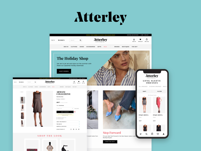
But you can add some irresistible visuals to the main page, like Atterley did with their eye-catching photos. Follow the link to read Atterley case study by Agente.
Great Navigation
A good website is easy to use, and this can be achieved through user-friendly navigation. Double-check that even non-tech-savvy store visitors won't have trouble finding what they are looking for.
Create an easily-navigable fashion designing website so the visitors spend more time there. Your sales will also grow if the site has a clear route to complete the purchase.
*A small hint: add a menu link to the page that lists your offline stores. Many people still prefer shopping offline.
Try to make navigation consistent, straightforward, and intuitive. Check out this article for a detailed guide to site navigation.
High-Quality Visuals and Videos
Fashion industry is highly visual, and the same applies to the fashion design websites. Users expect to see big and attractive high-quality images. Large scale pictures can promote a positive impression of your brand. Visuals should look good on both desktop and mobile devices of varying screen sizes.
Videos are another effective means of visual communication with customers. Don't skimp on them; take advantage of them to get your brand into store visitors’ brains.
Drool-Worthy Product Pages
With more and more brands selling online, clothing website design ideas become increasingly similar to that of e-commerce stores. Remember to make a difference at the product pages when choosing a fashion website design, because that’s where visitors can easily convert into customers, increasing your conversions — and thus your profit.
Multiple design components can help you to achieve this:
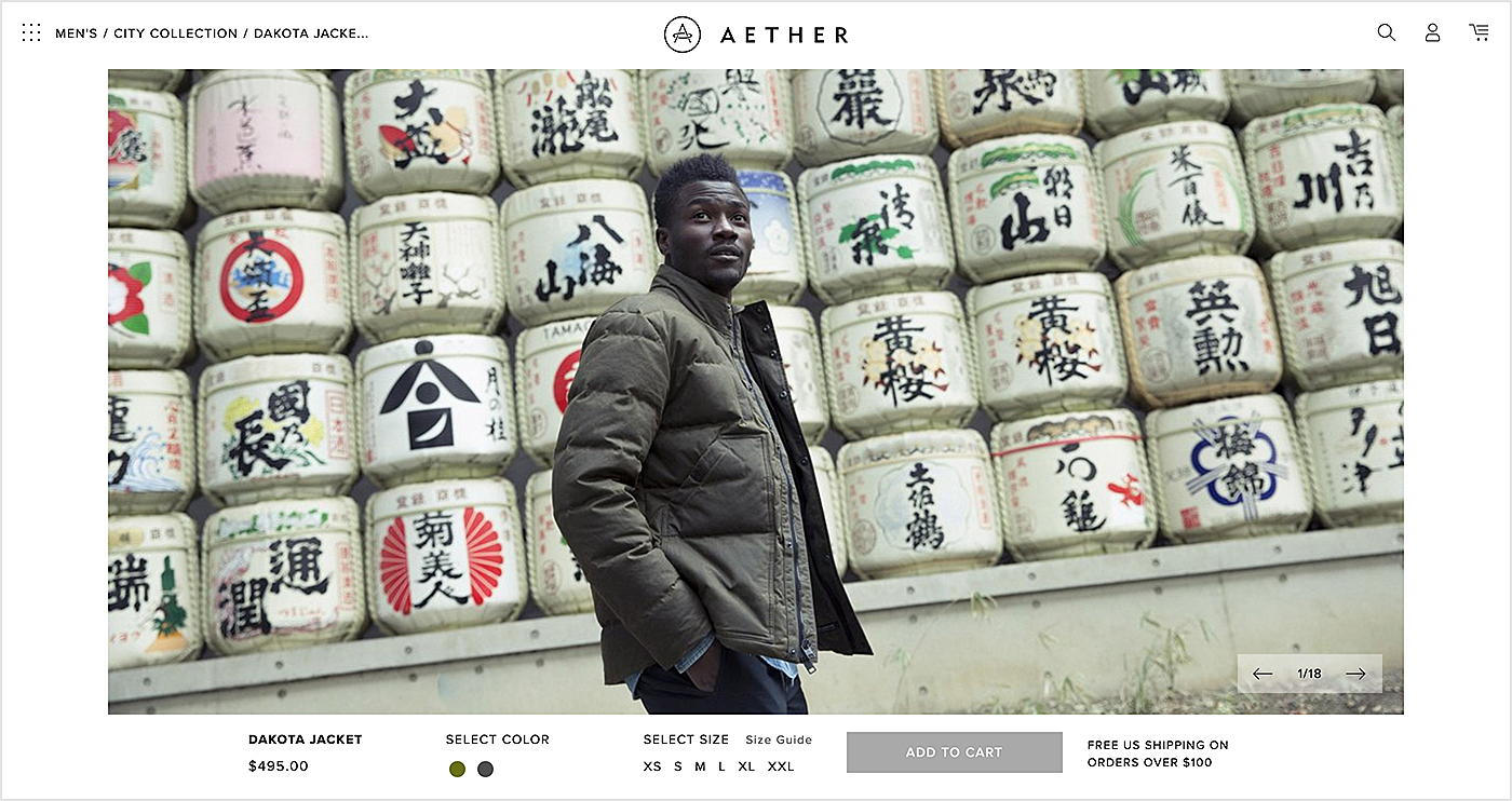
- Photos and videos. Customers want to see how the product looks in real life and from multiple angles.
- “Add to cart” button. It should be clearly visible on the page, enticing a user into hitting it as soon as possible.
- Product descriptions. They must depict the product in detail, focusing on the peculiarities and benefits it offers. All available colors and sizes must be displayed too.
- Social media buttons. People are heavy social media users. It's a wise idea to enable a social sharing button in order to leverage word-of-mouth marketing.
- “Customer Reviews” section. Things that others say about your products have a large impact on buying decisions. You may be tempted to edit negative reviews or to write fake ones, but it's much better to stay honest. Real reviews mean a wise purchasing decision as well as fewer returns and refunds.
- Sell a look. Turn into a stylist by offering a ready-to-go look to your customers. Many people fail to create them by themselves and they will certainly be interested in such an option.
Color Choice for the Best Fashion Website
The black and white scheme seems to be a natural choice for a fashion site as fashion designers and stylists tend to rave about this combination. So if you want your site to look stylish, simply opt for this scheme.
Otherwise, you can go further and ask designers to create a theme that will match your brand identity completely. This will help you to raise brand awareness and recognition. Note: in the fashion world, there is a growing tendency to depersonalize logos. Some designers remove serifs and capital letters for this purpose.
Interactivity (dimensionality) is another trend to keep an eye on.
What Else Will Work for Your Clothing Website Design?
We have prepared some more advice that might be helpful.
The Least Amount of Content Possible on the Homepage
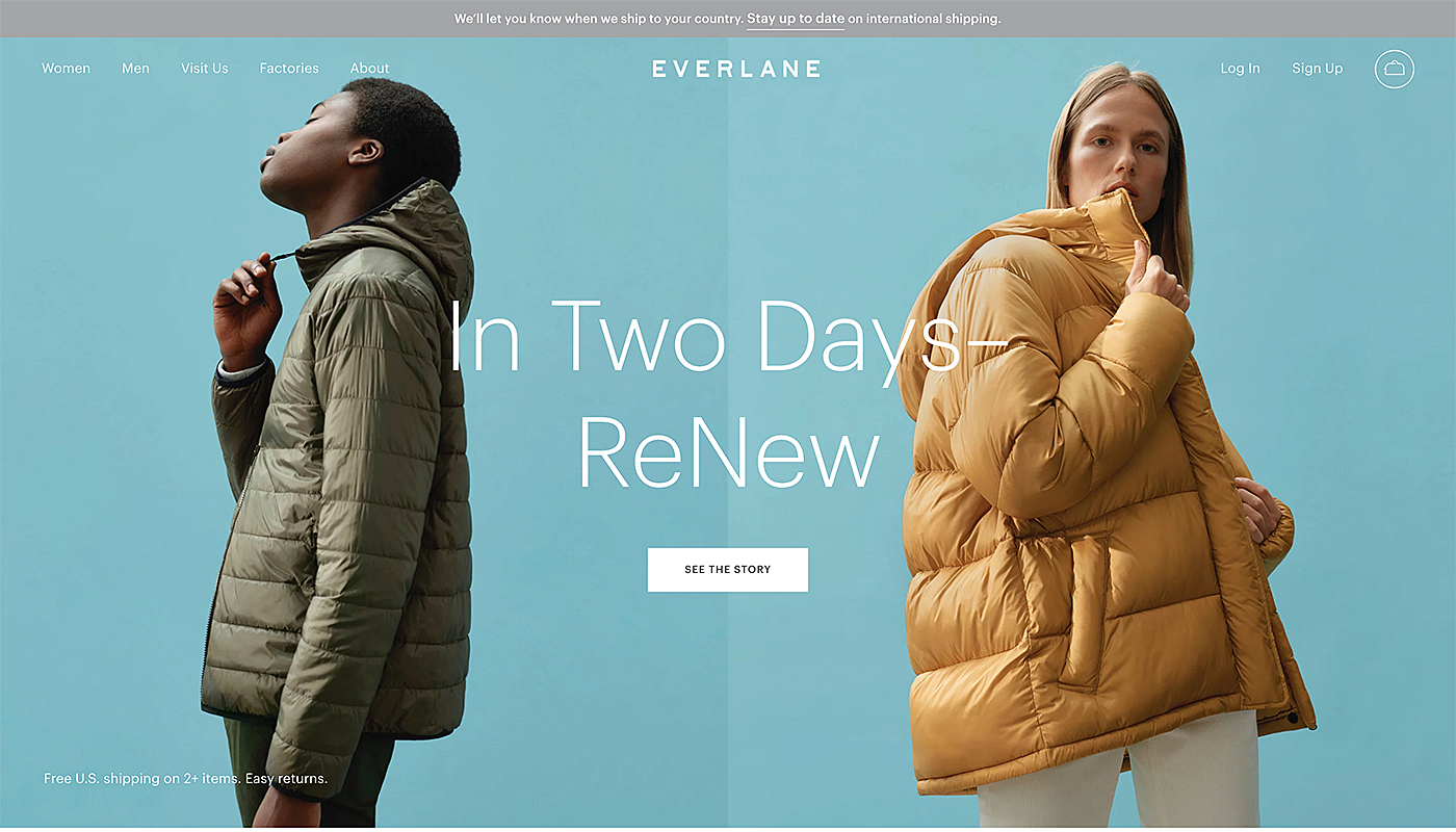
Less is more when building an apparel website. And the best of them will have almost zero content and elements on the main page, with a maximum of a huge banner, simple navigation bar and a call to action, so the users feel they can explore the platform more and view the pages. In this approach it is important to make the navigation intuitive, so the visitors know what to do straight after they’ve opened the website.
Enable Guest Sign In
Guest checkout is a proven way to generate more sales than your competitors — especially those who don’t have the feature. Shoppers may be in a rush or just may not be inclined to register at your store (especially if it’s their first purchase there).
Product Showcase
A gallery of the items is a must-have in a closing-store website design. Most of the brands will show the model in a range of pieces to demonstrate the best products and how they look when worn.
Choose the Right Typography
Many brands use unique typography fonts in clothing website design to help customers to recognise their brand. To put an accent on their message contemporary brands use bold and custom typography.
Mobile-Friendly Design
Most people access the Internet from mobile devices. So when crafting a design for a website, pay scrupulous attention to mobile screens too. Want to find out more? Follow this link for all the necessary details.
Interface Simplicity and White Spaces
Interface simplicity is becoming increasingly popular. Designed in such a way, it helps sites to deliver their message to users quickly and efficiently as they don’t get distracted. Remove unnecessary elements and bring white spaces into action to achieve this.
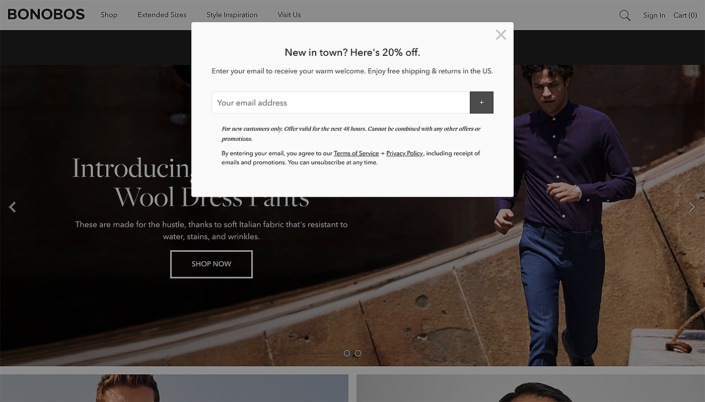
Quick View Pop-Ups
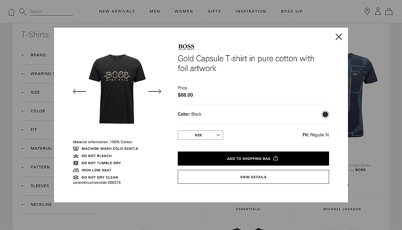
Customers will appreciate a quick-view option with more pictures and additional information about the project, so they don’t need to load a whole new page. That’s even more valuable if you have a large stock, because it will allow visitors to see more items in a shorter time, which can increase the sales
Fashion Website Design Examples
We hope that by now you have some sort of idea of how to achieve the best fashion website design.
To make it even easier, we carefully searched the Internet to find inspirational fashion website design examples for you. You can find them below.
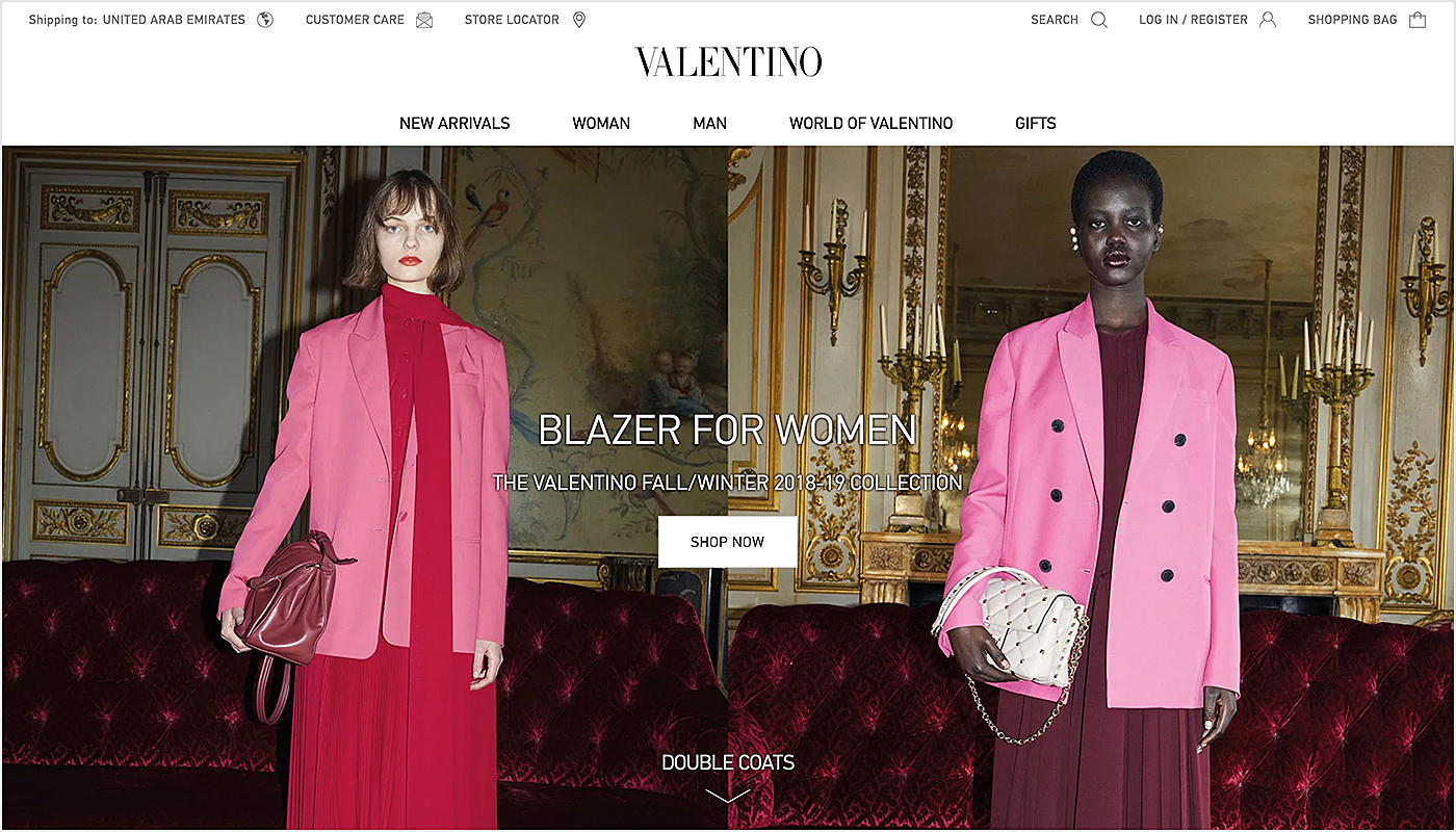
Valentino
Exquisitely designed fonts and clear structure of images combined with simple but effective design elements such as buttons and categories. The Valentino website homepage has a lot of well-organised content, but no cluttering at all.
Marucci Sports
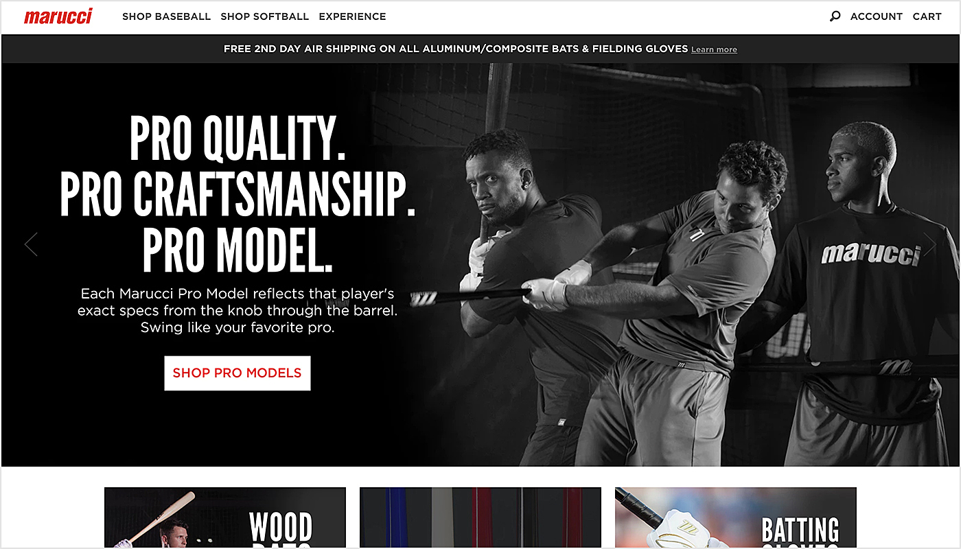
High-definition pictures with clear typography, simple but stylish colour scheme and visible calls to action make the Marucci Sports website not just attractive, but also effective.
Massimo Dutti
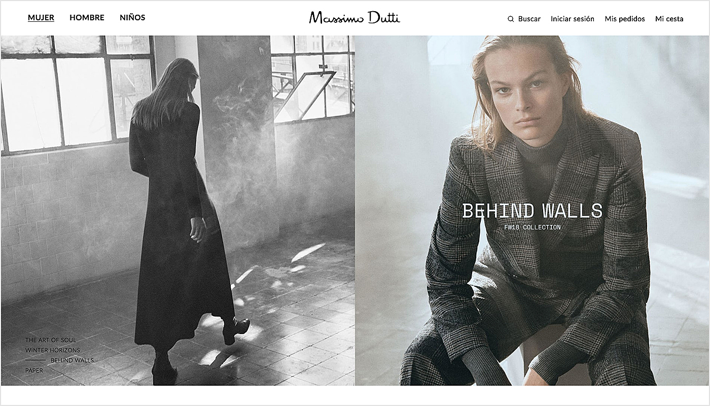
Clean and simple details on the Massimo Dutti website remind visitors of their products. The minimalist design with high-definition catchy photographs and videos together with clear-but-stylish fonts create an exclusive and pleasurable user experience.
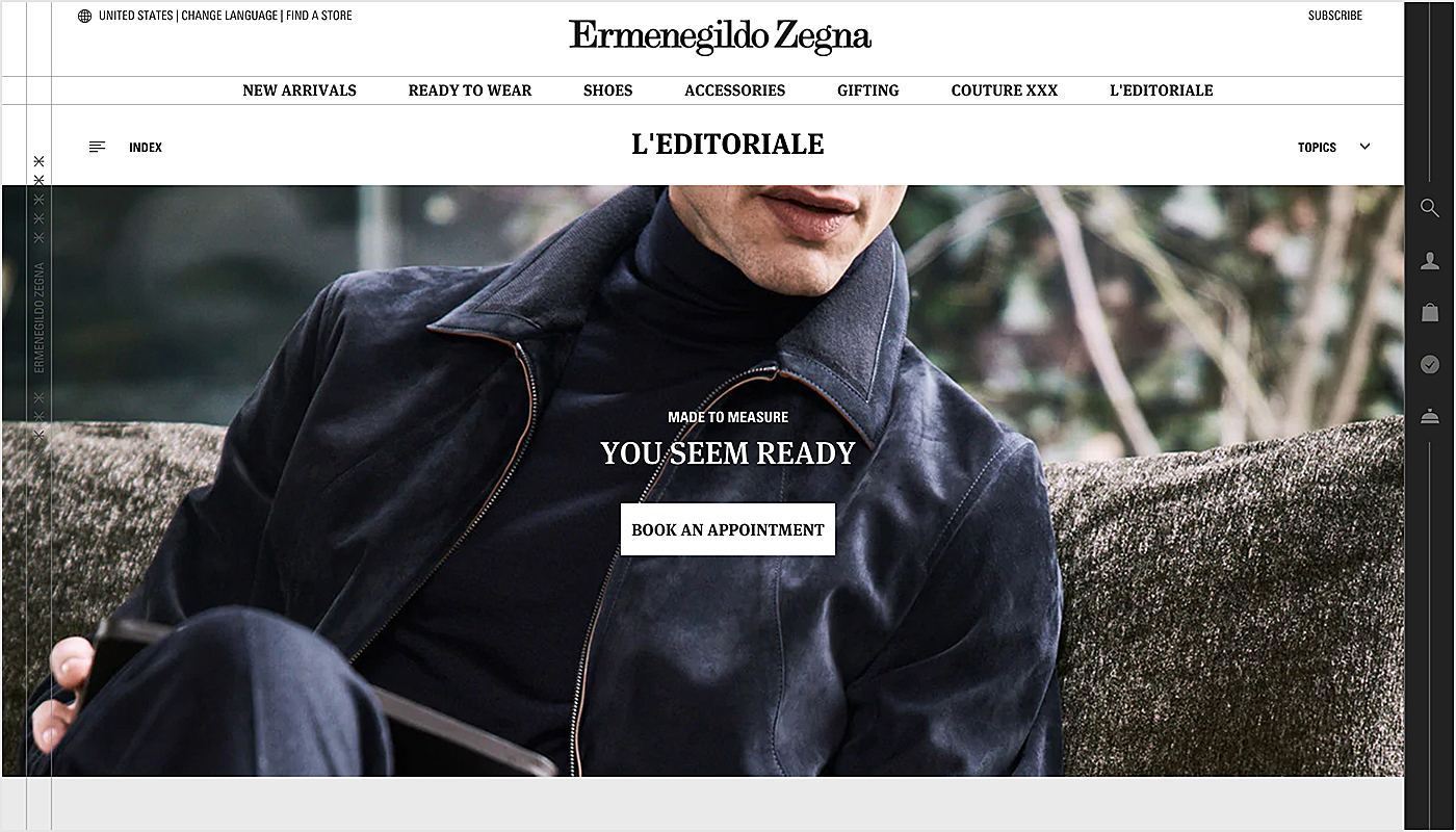
Ermenegildo Zegna
The elegance of the brand is expressed in the strict and discreet design. A black and white color scheme and a lot of negative space on the page doesn’t disturb the visitor's eye, but draws the attention to the brand’s moto and navigation elements.
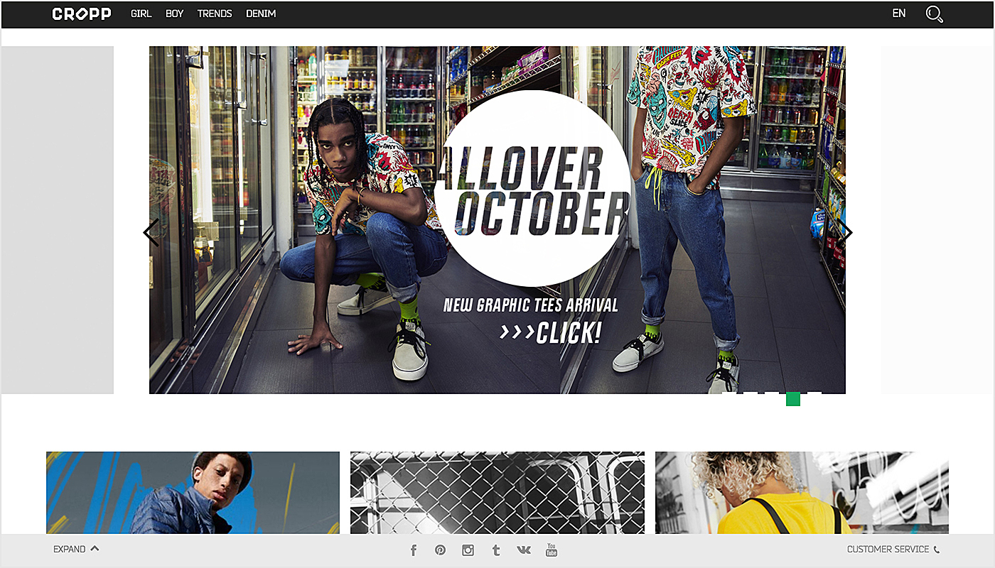
Cropp
Clothing and art design company, Cropp, created a bright and experimental design for their website, with huge pictures displaying models wearing the clothes in contemporary surroundings. Modernistic fonts and simple design elements are aligned with the brand style and ideology.
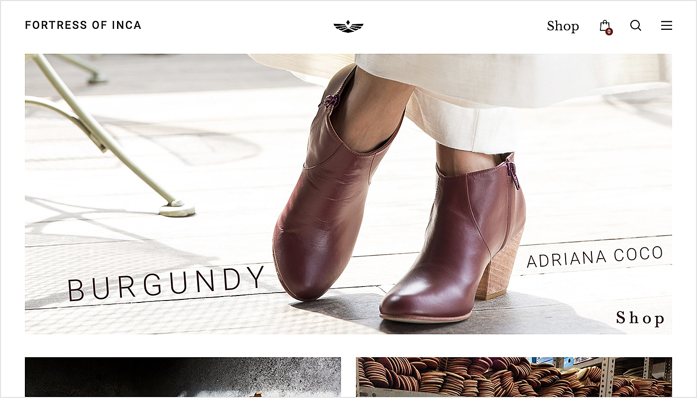
Fortress of Inca
Laconic details and light pleasantness for the eye color scheme are letting the main subject of the brand come to the sight in its elegant excellence. Even though the website doesn’t seem to be full of content, all the necessary functions are visible and easily accessible.
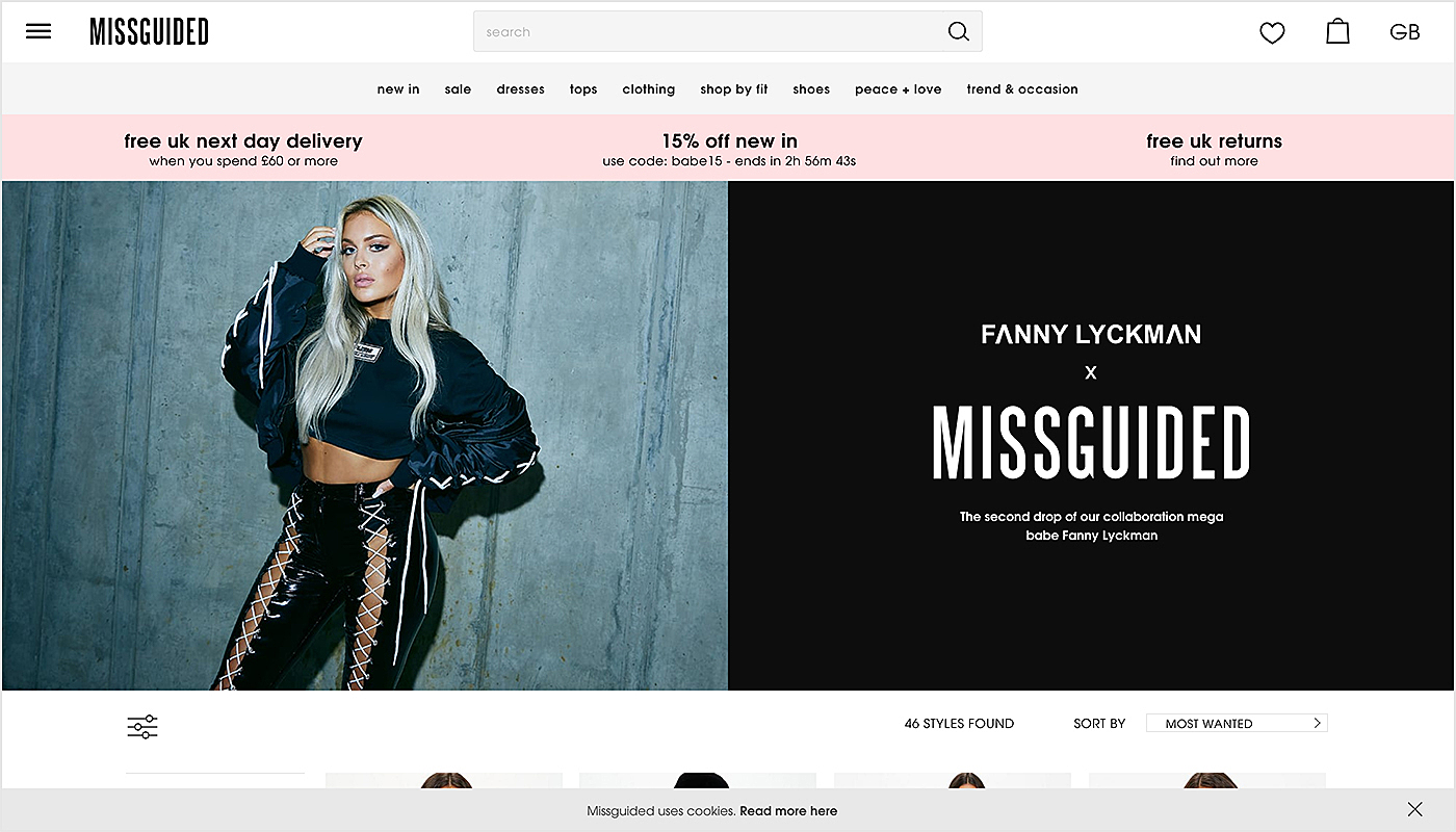
Misguided
A simple but harmonised color scheme with well-organised page elements reflect the fresh and vibrant vibe of Missguided clothing brand. It has everything a proper fashion website needs — the offers, categories, menu, favorites and big photographs of models demonstrating the best products, but at the same time looking clear and easy to comprehend.
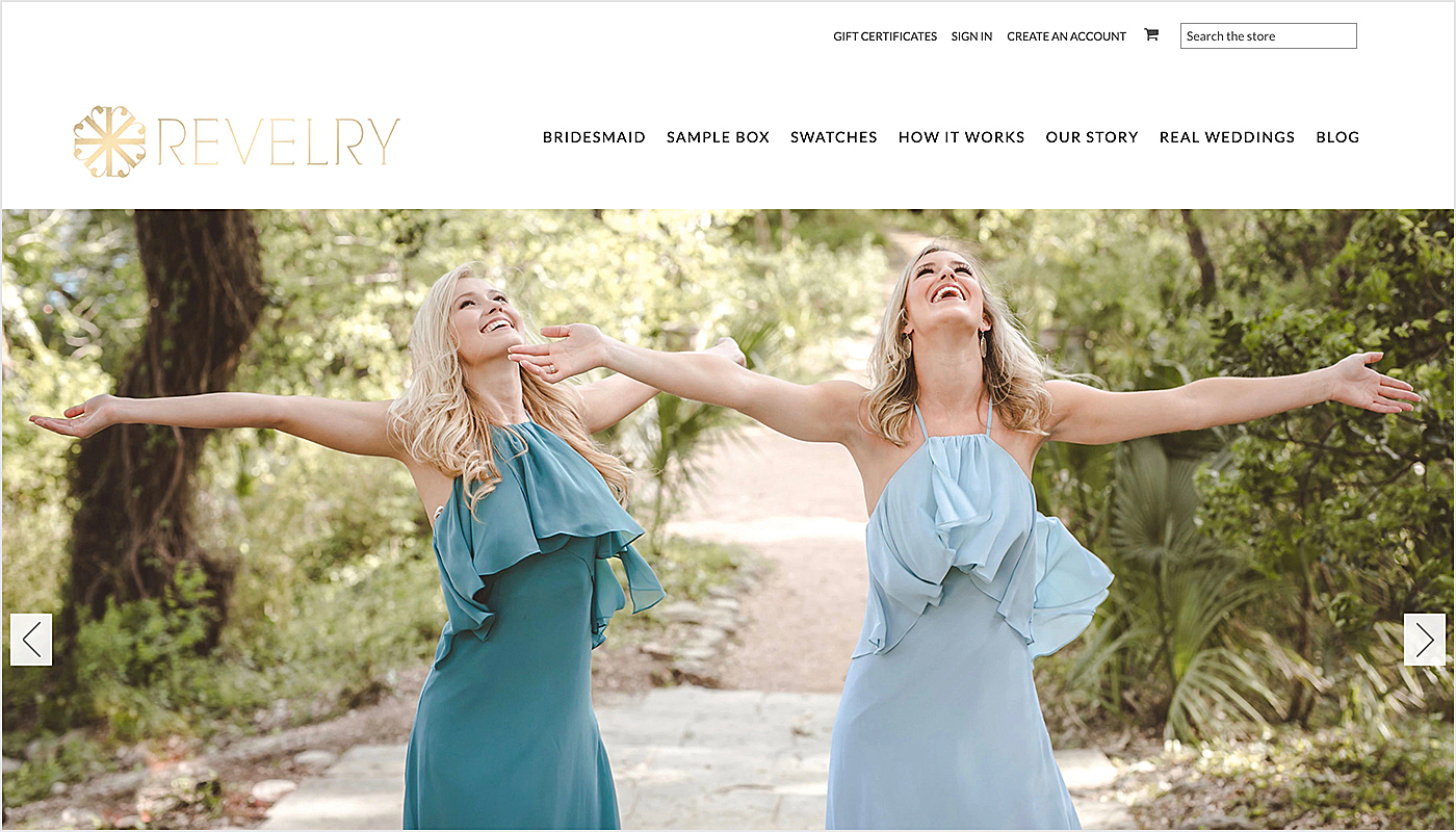
Revelry
Revelry has a simple and soft website design that shows off their work and also offers a user-oriented navigation to the most important parts of the website including Bran’s story, as well as an option for a completely free trial and check so loved by everybody switches.
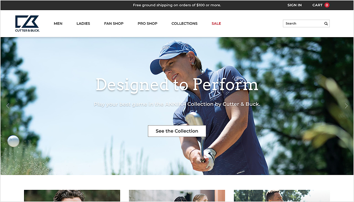
Cutter & Buck
The aesthetics of the website reflect the elite golfing experience the brand offers. Large-scale photography reinforces the positive impression of the brand. Clear and visible navigation invites the users to explore the website more, so they can find exactly what they want without going to an extra menu
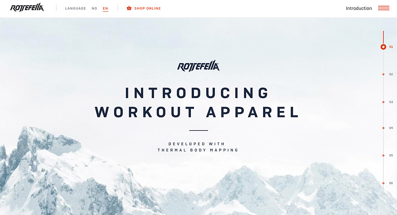
Rottefella
A clean but engaging homepage design from the first sight has almost no details. But the right combination of creative fonts and a high-quality background keeps the attention right where it should be — on the most important parts. We really like the side termometr solution for the menu, so the page does not have excessive content
Fashion Website Development: Step-by-Step
There are several steps to be taken if you want to create a web platform that can compete with the best fashion websites.
Project Definition
You need not only to understand the offer and unique value proposal, but also how it can be transferred through the design. This part also includes analysis of competitors in order to develop a strategy that will make your website stand out as remarkable.
Planning
At this stage the development team or an agency will define the layout and necessary functionality. According to the data gathered in stage 1, the developer will suggest the best ideas to create a sitemap (list of pages, their placement and relationship on the website). The plan will include user-facing elements and those intended for search engines only.
The map will help to define and organise the content, allowing your designer to create a look and functionality for each page. After this stage of development you will know all about the journey for the visitors, moreover you will be able to visualise the result.
Design
The UI-design stage will express your branding and make the experience of your fashion website complete. In this stage, together with the designer you can choose the color palette, type of iconography, images, logos and any other elements that define your brand. This part is very important, because it will directly affect your revenues. Just look, according to HubSpot, more than 90% of visitors leave pages because of poor design.
Development
As soon as the design is approved, the development stages start and everything becomes technical. The developers will code everything according to the plan and the preferred hierarchy, making your website and each page on it work.
During development all the previously designed parts are connected resulting in a working fashion website.
QA
Testing is one of the most important parts of the development process, as it allows the developers to check the functionality of all the elements on your website. The validators check the code in order to see if it works properly and test the speed and mobile responsiveness. Once manual and automated testing are done, the website is ready for the launch
Maintenance
This is not only the last part of the development; it is also a never-ending process of assistance and support. And it’s best if it’s done by the same team, as they will already be familiar with all the nuances.
When your fashion website grows it might be necessary to increase the number of pages, add more functionality and features. Moreover, certain tasks need to be performed on a regular basis, including:
- editing content
- fixing bugs and issues
- doing platform’s bacups
- installing plugins.
Digital trends are changing quickly, as well as the trends of the fashion industry, so it’s important to keep your site updated, including both UX and content.
Fashion Website Development Challenges
Web design is vital for a clothing website. The customers will judge your portal in less than three seconds, and following that they will either stay on the page or leave it. That’s the essential challenge for website design—to differentiate design elements from a useful feature-enhanced user experience.
Selecting responsive design
The average clothing website gets more than 60% of its organic traffic from mobile phones. That’s why it’s necessary to create a responsive design that is:
- fast and navigation-friendly
- renders data tables on both big and small screens
- has dynamic design elements rearranged for multiple devices of varying dimensions.
Keeping the Fashion Website Informative but Fast Loading
Once the website has all the content, you need to make sure it will load quickly. Normally people prefer websites to load in 2–3 seconds. If it takes longer they become impatient and may turn to a competitor’s website.
Even Google listed website loading speed as one of the three main ranking factors. That’s why the backend load should be really light. With time the number of products and visitors will grow demanding additional plugins. The main challenge here is to continuously deal with the growing back-end bulk.
Creating Intuitive and Easy Navigation
It’s very important while creating navigation to avoid offering an overwhelming number of navigation options, otherwise the visitors will be confused more than pampered. The navigation should be easy and should lead in just one direction. Various approaches can be used to mitigate this issue: creating disting visual hierarchy with the design elements, make the clickable buttons easily recognizable by using patterns and colours, eliminate any visual distractions and separate the pages into distinct areas.
If the designers fail to get rid of excessive elements and also leave visual clues leading to nowhere it lowers the quality of UX. So it makes sense to give some extra time for A/B testing of navigation options.
Understanding the Users Expectations
The communication gap is one of the main obstacles for developers, that’s why it’s so important to have a clear insight into the niche, a portrait of the clients and their demands, the target audience and your competitors. It is worth putting effort into market research first to achieve better client satisfaction. Pay extra attention to the specific business requirements which will vary from brand to brand, because the fashion website will not only sell the products it will also represent the company's values.
Clothing Website Development Cost
The total price for developing a clothing website from scratch will include the expenses on market research, design and development, and also maintenance.
The amount you will really need to pay varies from project to project and will depend on functionality. It can start at $15 000 and extend more than $50 000. It all depends on the website style, size, and functionality.
There is no way to determine the exact price of fashion website development as every business is unique, but you can define it by thinking about your company and its goals. However, we can provide the approximate rates and duration for each stage of the development.
Fashion website development can be cut into several stages:
- discovery phase (design discovery + technology discovery);
- development (web + mobile);
- QA (testing);
- project management.
Depending on the needs of your business the functionality — and thus development duration and cost — will vary from $10 000 for a simple user-friendly portal to $100 000 for a custom cutting-edge website with add-ons such as data-bases, payment gateways, etc.
You will pay for each development stage hourly with a $25—75 hourly rate depending on the area, developer’s experience and the task complexity.
The best way to estimate the budget for the project is to sit with the developer (or a team), discuss all the necessary features and get the best rate.
You can also decide either to hire a single developer or a whole team. This choice might affect not only the price, but also the duration of the project.
Our team is ready to assist in making a decision, explaining the pros and cons of each type of development, and finding the best solution for your business at the most reasonable price.
Agente Experience
The Agente team has worked with several fashion projects and is ready to share and offer their experiences.
Take one more look at Atterley — the e-commerce fashion retailer platform where we worked on category redesign, as well as creating brand and product pages. We redesigned the navigation making it more intuitive, added new sections and improved check-out flow. We also created an original user interface to make it clear and elegant.
We also completed the full-cycle development for the Backstage project in the fashion industry. Even though the portal is for listing the events, not shopping, it has all the features of contemporary fashion websites.
We created an easy-to-use platform with fast data updates to share information about fashion and events all over the world.
As the examples show, the Agente team can perform full-cycle clothing website development, but also help to modify existing platforms, offering redesign and functions extension.
Conclusion
Just like other sites, fashion websites aim to draw the attention of their visitors. In this article, we have covered the basics of creating a successful site; we have explained why they are important and how Agente can help you in creating the best fashion website.
Planning such a project?
Contact AGENTE today for assistance and estimation. We are ready to offer our best ideas and solutions so that your business can conquer new heights.
Further reading: Best practices of healthcare website design.
Rate this post!
246 ratings, average ratings is 3.7 out of 5
Related Posts
How to Launch Your Online Travel Marketplace Platform in 2024?
Learn how to launch your own online travel marketplace platform in 2023 with our comprehensive guide and step-by-step insights.
14 January 2024
Marketplace Website Design and Development in 2024: Features, Tech Stack & Cost
Discover the latest in marketplace website design and development, explore features, technology stacks, and gain insights into cost-effective strategies.
Top eCommerce Website Design Features and Tips in 2024
While creating an online store, it is difficult to orientate quickly and understand how the website should look to create a positive impact on the owner’s income. It determines whether clients remain on store’s page, would they have confidence in the store and would they like to purchase
Ecommerce Website Revamp [The Ultimate Guide]
Learn why you should redesign your e-commerce website and how it can improve your online store's performance, including increasing traffic, engagement, and sales. Get expert tips now.
POS Interface Design Principles
There's hardly a retailer who doesn't have POS software in place or not planning to start using it in the future. In this article, we're going to discuss the Design Principles of POS Interface.
What Is mCommerce and How Your Business Can Benefit from It
Find out about m-commerce advantages and disadvantages, benefits for consumers and future trends in the sector.
Let's talk
Is there a challenge your organization or company needs help solving? We’d love to discuss it.

Managing Director, Partner
Andrew Terehin

Thank You!
Your message has been successfully sent.
We will contact you very soon.
