08 January 2018
How to Design an Excellent Checkout Page? | AGENTE

Online merchants strive to convince their customers to stay on the checkout page and make the purchase, but checkout abandonment remains an acute problem in the e-commerce universe. In 2016, for instance, the average checkout page abandonment rate reached 25%. Top performers faced a little bit lower figure of around 13%.
Shoppers abandon the checkout process due to multiple reasons: unexpected shipping costs, a poor e-commerce checkout UX, the requirement to create a user account, payment security concerns, and more.
We are going to shed light on the most common issues that arise when you redesign an e-commerce website, and the best checkout page design practices to solve them.

How to Design a Perfect Checkout Page
Enable Guest Login and Prefilled Fields for Registered Users
Visitors come to an online store to purchase. So, give them the opportunity to do that without creating an account. By allowing shoppers to place an order and not to go through the registration process, you may convert one-time buyers into regular purchasers thanks to the positive shopping experience that you delivered.
You can still grab email addresses for marketing campaigns (e.g. for your abandoned cart series) by asking guest users to enter their address before you take them to the guest checkout, or after they have placed an order.
Don’t force customers to create an account, give them a good reason to create one. For example, use a pop-up saying that registered users don’t need to complete multiple fields, as all the necessary details are automatically extracted from their accounts. Offer visitors bonuses: a discount for newly registered clients, order tracking functionality, etc.
Eliminate Distractions
Shoppers should be attentive on the checkout page, and you must remove any distractions. It’s a good idea to get rid of the store’s header and footer navigation to make users focus on what you want.
Here is a good example of such a page:
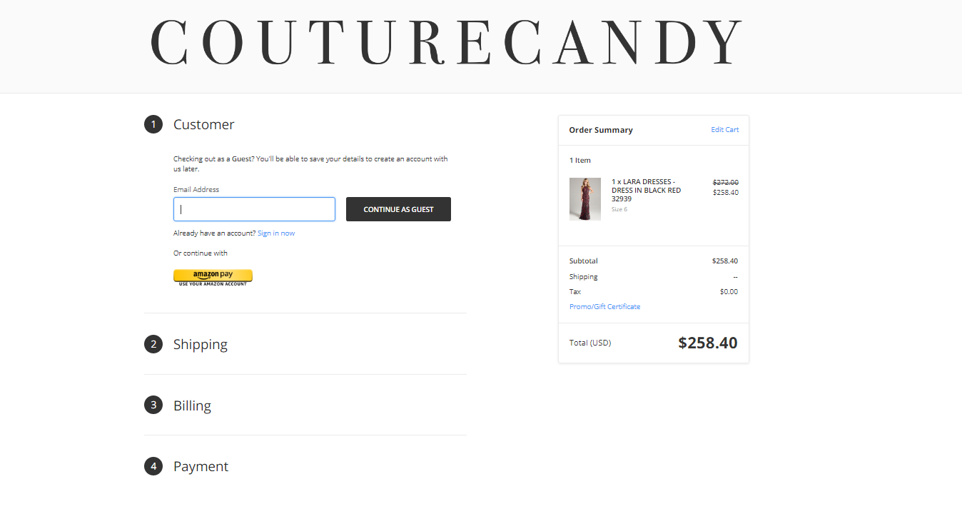
Source: couturecandy.com
Remove Redundant Form Fields
People hate filling out long forms, and smart retailers eliminate unnecessary fields in the checkout form design. If you want many fields, make sure to mark both optional and required ones. For instance, mark the age field as optional, because it is for marketing data.
Tell Shoppers What to Do
Help customers to successfully complete the form by providing descriptions and input examples. Pay special attention to numeric inputs: people enter numbers in various ways, regardless of any formatting examples you provide.
Input masking is one of the checkout page best design practices among stores, as it ensures that shoppers enter data in the required format. This works especially well with a mobile checkout design since typing on a mobile screen is more difficult compared to a desktop environment.
Enable inline help at this stage. Users may fail to correctly complete a field if it’s description is vague, and the available example is of little help. For example, if you ask the shopper to enter a CVV2, barely one in three users will know what it is. Inline help is also crucial for sensitive data fields: customers want to know why you need certain information.
Remind Clients What They Are Buying
Include photos and product summaries on the page. If there are multiple products in the cart, shoppers may still be hesitant about some of the ordered items. Real-life photos and short descriptions can help them to remember all the products they have selected.
Let Customers Edit
Very often shoppers want to make edits right on the eCommerce checkout page, for example, to change a dress size, update the delivery address, change the number of ordered items, etc. It’s vital to offer them this option since the need to go back and forth between the storefront and the checkout can frustrate even extremely patient people.
If your checkout page design doesn’t allow users to completely delete items by hitting the ‘remove’ button, at least give them the option to change the product’s quantity to ‘0’
Allow Users to Save Products for Later
If possible, let shoppers remove selected items from the checkout by leveraging a ‘Save for Later’ button or by adding specific products to the ‘Wish List’. This enables customers to come back to the items later on.
Recommend Other Items
Wise retail practitioners like Crocs utilize a ‘You may also like’ block on such pages to recommend trending and/or related products, thus encouraging users to add extra items to the cart.
Show Real Costs
Surprising additional charges usually make buyers abandon the checkout. It’s crucial to display all the costs up front: handling and service costs, taxes, etc. You can also take advantage of a delivery calculator to let shoppers choose the most appropriate delivery method by themselves. They will calculate the cost of each option before arriving at a decision.
Make the Checkout Look Secure
An SSL certificate is often not enough to gain shoppers’ trust. Visual reinforcement of the credit card section is a sure-fire solution. Give the page a secure look by employing visual styling: borders, different background colors, shades, and so on. Don’t forget to add a visual icon (a seal) to give clients a hint that all transactions are 100% secure.
Single-Page Checkouts Vs. Multi-Step Checkout
Let's compare these two types of checks and try to understand which one is better for the checkout page design.
Single-Page Checkouts
Single-page checkouts alleviate the pain of loading multiple pages or following multiple steps during the checkout process. They are great for mobile users, allowing shoppers to make purchases quickly.
If there are many fields on the same page, users may feel overwhelmed and leave the store for good.
Multi-Step Checkouts
These solutions break the process into multiple steps, allowing the customer to focus on the specific step, and eliminate any possible mistakes.
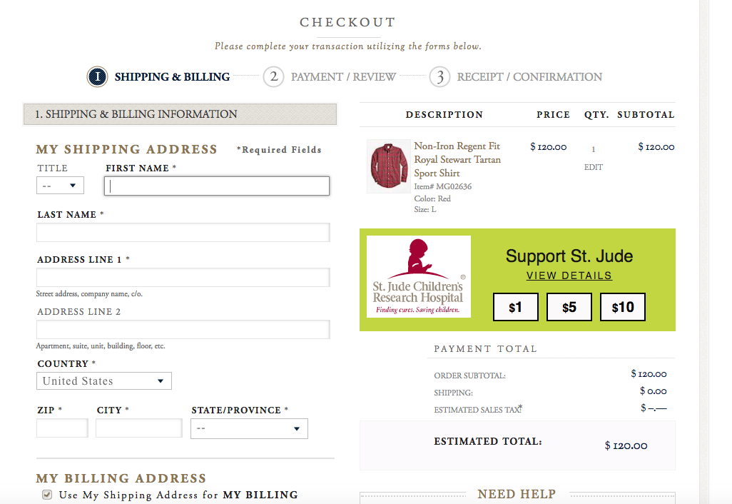
Source: brooksbrothers.com
Mobile visitors may be not satisfied with such an experience, as they will have to wait for each step page to load. It’s okay if they can connect to Wi-Fi, but it may cause frustration if they only have a slow mobile Internet connection available.
Accordion Checkouts

A hybrid of the two above-mentioned pages, accordion checkouts are used by many web stores. They break one page into several steps that are loaded individually upon their completion.
Shoppers may perceive these pages as single-page solutions if they are AJAX-based. The use of the AJAX technology disables the page reload, thus making the user experience similar to that of a single-page checkout.
Optimized for Mobile

Take into account that mobile shopping is not a buzzword anymore, but reality. The look and feel of all the e-store’s pages must be mobile-optimized to deliver the desired user experience. You can reach this by making some fields clickable (e.g., delivery dates) since it is easier to tap than type on a small mobile screen.
A/B Testing

Employ A/B testing to evaluate various user experience options and find the optimal solution for your store. Continue to use this testing after you have launched the page in order to give shoppers the best-in-class experience.
Common Mistakes
Non-Linear Checkout Process
The non-linear checkout process is one of the most serious usability violations. Such a process confuses shoppers and drains the overall user experience, as by taking a round trip (e.g., to add an alternative email address) customers feel that they haven’t made any progress.
Form Fields Not Long Enough
Make form fields long enough for mobile screens, which are much smaller than desktop screens. It may be difficult for mobile shoppers to enter the required data into the field correctly. If fields are short, they usually have to delete all the data in order to correct any mistake and re-input the information from scratch.
Checkouts Lack Proper Ongoing Review and Back Button Functionality
Some accordion checkouts don’t show a checkout steps summary to customers so that they can keep track of their progress and constantly review the order data. ‘Go-back’ buttons also often don’t meet user expectations, sometimes they go back to the previous page, not the previous step at an accordion checkout.
Quantity Field Auto Updates are Disabled
If the e-commerce store design doesn’t allow auto-updating of the quantity field, the client may forget to tap the ‘update’ button, or just won’t see it at all, and all the changes won’t be saved. So, the buyer has to either cancel the order or purchase the unwanted number of items.
Conclusion
The eCommerce checkout page is the most important part of the e-store, and merchants should do their best to offer shoppers a relevant user experience. We’ve provided some useful design tips for entrepreneurs who want to create a highly converting page, feel free to put them into practice at your online store. If you have any comments or questions, you can contact the AGENTE team anytime.


Rate this post!
985 ratings, average ratings is 4.0 out of 5
Related Posts
How to Launch Your Online Travel Marketplace Platform in 2024?
Learn how to launch your own online travel marketplace platform in 2023 with our comprehensive guide and step-by-step insights.
14 January 2024
Marketplace Website Design and Development in 2024: Features, Tech Stack & Cost
Discover the latest in marketplace website design and development, explore features, technology stacks, and gain insights into cost-effective strategies.

Top eCommerce Website Design Features and Tips in 2024
While creating an online store, it is difficult to orientate quickly and understand how the website should look to create a positive impact on the owner’s income. It determines whether clients remain on store’s page, would they have confidence in the store and would they like to purchase
Ecommerce Website Revamp [The Ultimate Guide]
Learn why you should redesign your e-commerce website and how it can improve your online store's performance, including increasing traffic, engagement, and sales. Get expert tips now.
POS Interface Design Principles
There's hardly a retailer who doesn't have POS software in place or not planning to start using it in the future. In this article, we're going to discuss the Design Principles of POS Interface.

What Is mCommerce and How Your Business Can Benefit from It
Find out about m-commerce advantages and disadvantages, benefits for consumers and future trends in the sector.
Let's talk
Is there a challenge your organization or company needs help solving? We’d love to discuss it.

Managing Director, Partner
Andrew Terehin

Thank You!
Your message has been successfully sent.
We will contact you very soon.