27 February 2020
How to Improve Online Shopping App Design for Better UX | Agente
The share of mobile retail commerce sales has grown from 52.4% in 2016 to 62.7% in 2019 and is predicted to reach the point of 72.9% in 2021. More and more e-commerce businesses go mobile, which creates a competitive environment among retailers.
In this article, we’ll discuss the importance of shopping app UX and the ways to improve an online shopping app design.

The importance of user experience for shopping apps
In simple words, UX (User Experience) is the way an application looks, its usability, and the way you feel while using the app. The golden rule is the more user-friendly your application is for your customers, the more loyal your customer will be to your brand and the more services and products you will be able to sell.
Why a UX for a retail app matters
To engage and attract customers.
A good app gives you a competitive edge among other retailers selling similar products. What is a good app? It’s the one with a convenient UX design, fast loading speed and intuitively understandable navigation that helps a user make purchases quickly and with no hustle. What’s more, positive UX increases customer satisfaction. Loyal customers tend to make 10 times more expensive purchases in comparison with their first purchase.
To increase ROI and revenue.
Investing in a well thought out user experience can lead to success among customers and gives you a considerable return on investment (ROI). Do you know about the $300 million button case? Once upon a time, there lived a “Register” button on a retail website. The button existed because customers had to register their accounts before checkout. One day, the button got another name: “Continue”, which allowed customers to buy products without registration. The result – sales increased by 45%, bringing in $15 million in revenue during the first month, which totaled $300 million per year.
To establish a solid reputation for your brand.
Amazon, Google, Airbnb, etc. have a spick and span UX design of their websites and application. It helped them to gain an army of loyal customers that have become brand advocates. They spread the word across review sites, forums, and social media and attract new customers.
Read also: Ecommerce Website Revamp
Guide for improving shopping app UX design
Usually, a mobile app is an addition to an e-commerce web solution. However, it’s a huge mistake to apply the same online shopping store design to a mobile solution. Here are the core principles that are used in the UX design for a shopping app and any other mobile solution.
Intuitivity
An engaging app presupposes intuitive interaction with it. This is achieved by the right balance of familiar screens that reduce the learning curve required to use your app. For example, we all have an idea of how product listings look like. A designer embraces these familiar screens and creates an online shopping app design that will be familiar to us.
Minimalism and simplicity
These two principles are crucial for a mobile shopping UX design since there’s a small margin for error. If the information is not needed for a user’s action, then don’t include it. To prevent Overloading the user, an excellent solution will be to introduce collapsible elements or progressive disclosure. This way, a user will be able to control the amount of information on the screen. Simplicity in the navigation involves the use of standard components employed in the mobile platform (e.g., Android or iOS), consistent colors and patterns, and keeping navigation visible at all times. Another way to minimalism is to minimize user input. Typing on a mobile screen isn’t as convenient as on a keyboard, so it’s important to use autocomplete anywhere possible.
Source: Dribbble
Control
The user must feel in control of their app experience which is achieved through consistent design and predictability. The way that an element looks should inform the user what to do with it, e.g., tap or swipe. Let the user handle errors in the right way. When something goes wrong, explicitly state the problem and indicate the reason for it. Also, pay attention to the “back” button. A common mistake is to take the user back to a home screen. Make sure the user has two options: returns to the latest page and get back to the home screen.
Consistent text, images, and video
- Text. In e-commerce website design, the typography should be easy to read, so make sure you stay loyal to one font family, choose the right font size (usually recommended is 16px), and check the contrast between your app’s typeface and the page background. Also, limit the line length of sentences and mind the line spacing.
- Images. To avoid stretched images, it’s advisable to have an adaptive solution that will detect the display size and adjust the resolution of the images in your app accordingly.
- Video. Users prefer to watch videos in portrait mode. So think about the quality of the picture.
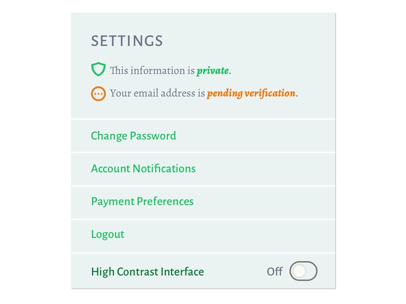
Accessibility
Make your shopping app design available for users with hearing, seeing, and other disabilities. For example, consider color blindness. A lot of people suffer from the inability to distinguish between red and green. These are the most common colors used for error and success messages. A good idea will be to add a separate icon that indicates this.
Source: Dribbble
Personalization
Boost app engagement keeping your communication via push notifications personal. Also, use the device location wisely to provide timely information to users.
How to improve UX of mobile shopping applications?
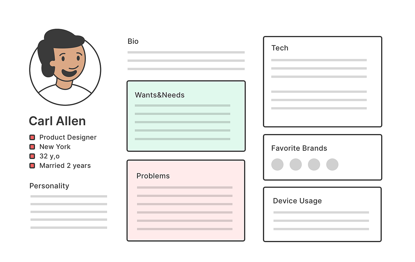
Create a user persona
First and foremost, you need a comprehensive understanding of your users – their behaviors, goals, challenges, motivations, needs, demographics, interests, and unique identifiers. You’ll do that by creating a user persona or several ones. These personas should have:
- Name
- Age
- Gender
- A photo
- A profile description outlining what they do in their lives.
- Experience level with the product or service and the reason for interacting with the app.
Source: Agente
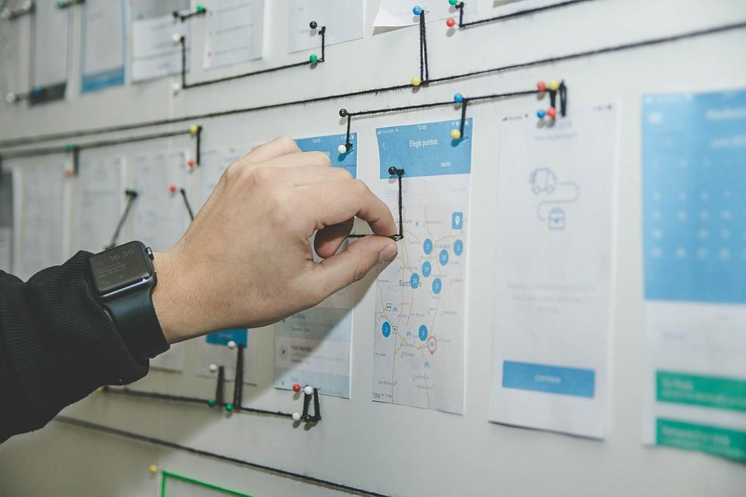
Work out a user flow
After that, it’s necessary to create user flow, that is to lay out the user’s movement through the product, mapping out every step this user takes. When users experience no hesitation or confusion floating across pages, there is a greater likelihood that they will purchase your product or visit the app again.
Source: Unsplash
Make your shopping app design work
Every page requires individual attention. Improving UX for a shopping app means making sure each of the following tips is applied.
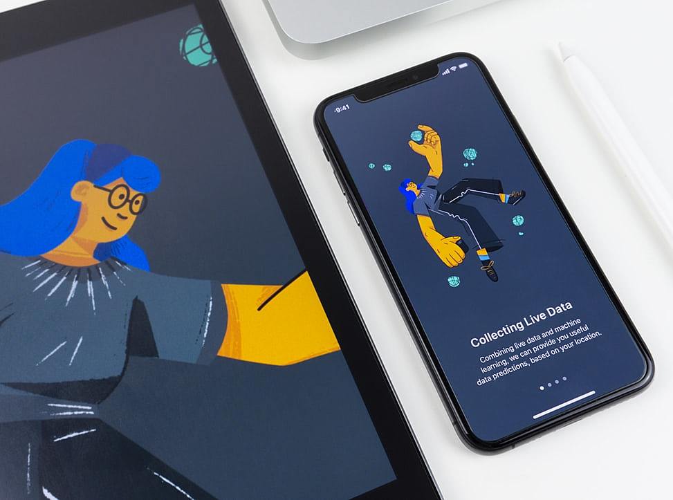
The onboarding screen
It should educate a user on how to use the app and get the most from the features without giving extra information. A good practice will be to use custom illustrations, a mascot to guide the user through the onboarding process, and complete it with a concise copy, short and to the point. 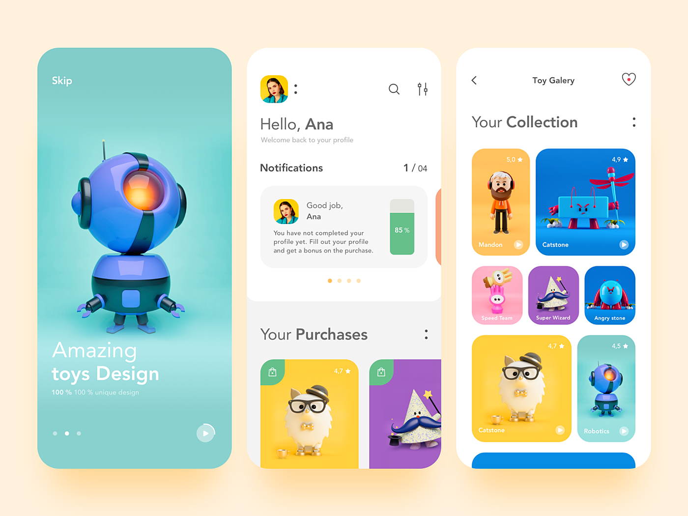
Source: Dribbble
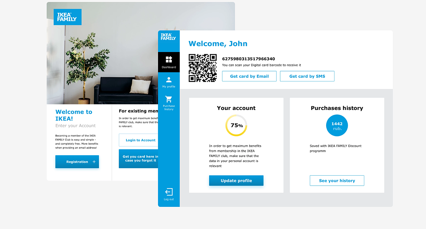
Profile page
We’ve discussed earlier that your app should be highly personalized, and the profile page allows users to communicate with the app in the most customized way. Make the process of creating a profile easy by keeping the number of fields short and offering simple logins. Also, remember to include two options on a profile page: sign up and log in.
Source: Agente
Home screen
This is the primary screen for interaction, the place where users will go to perform critical tasks and interact with the essential parts of the application. Although every home screen is unique styled, there are key elements that help to make the app more responsive:
- A search option that allows users to instantly get the right content from any app page.
- Clear navigational elements
- Fast load time.
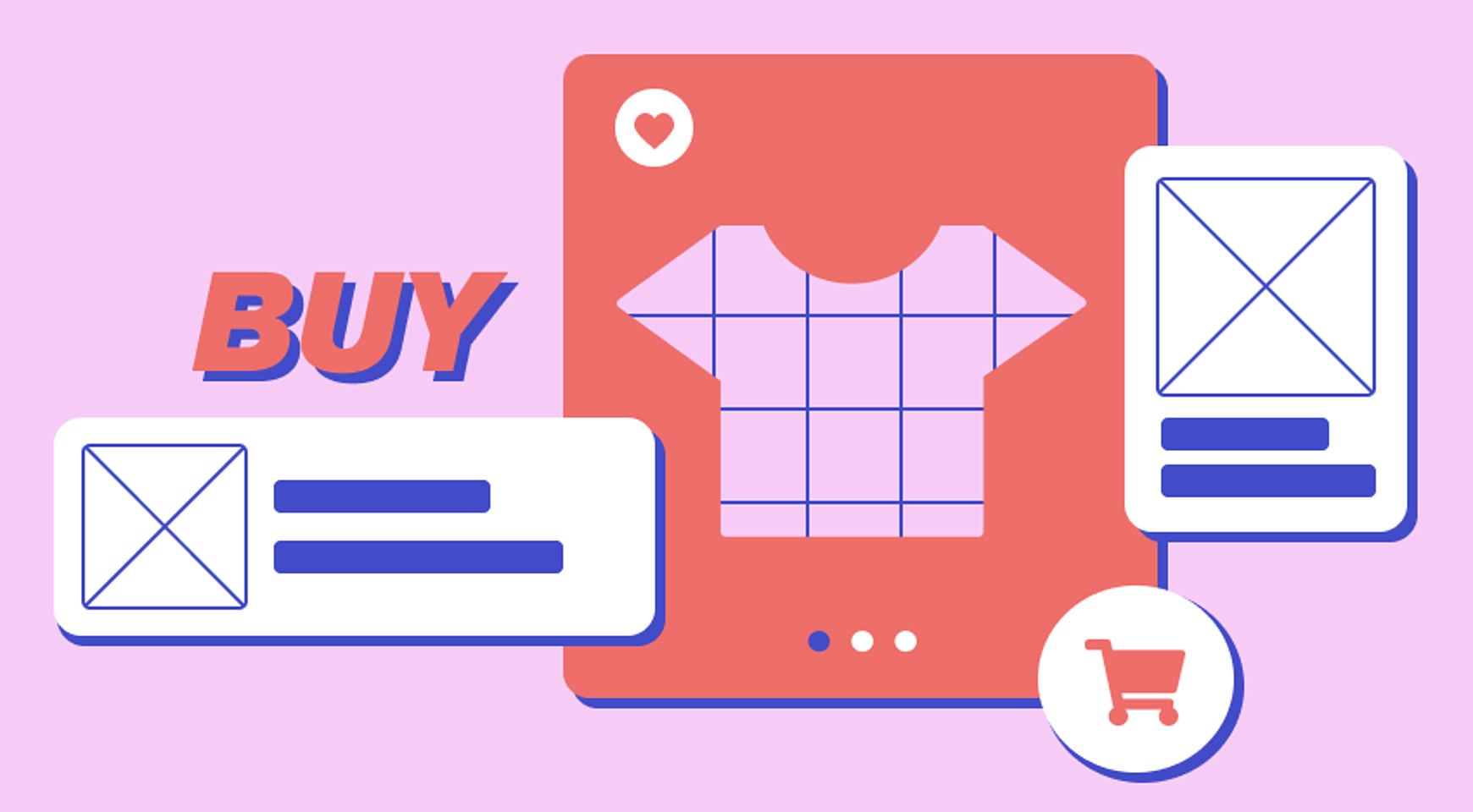
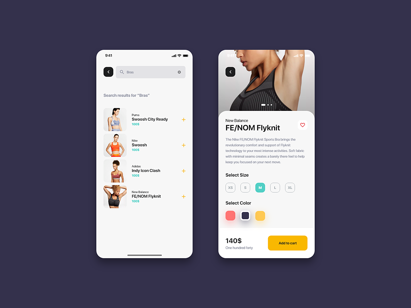
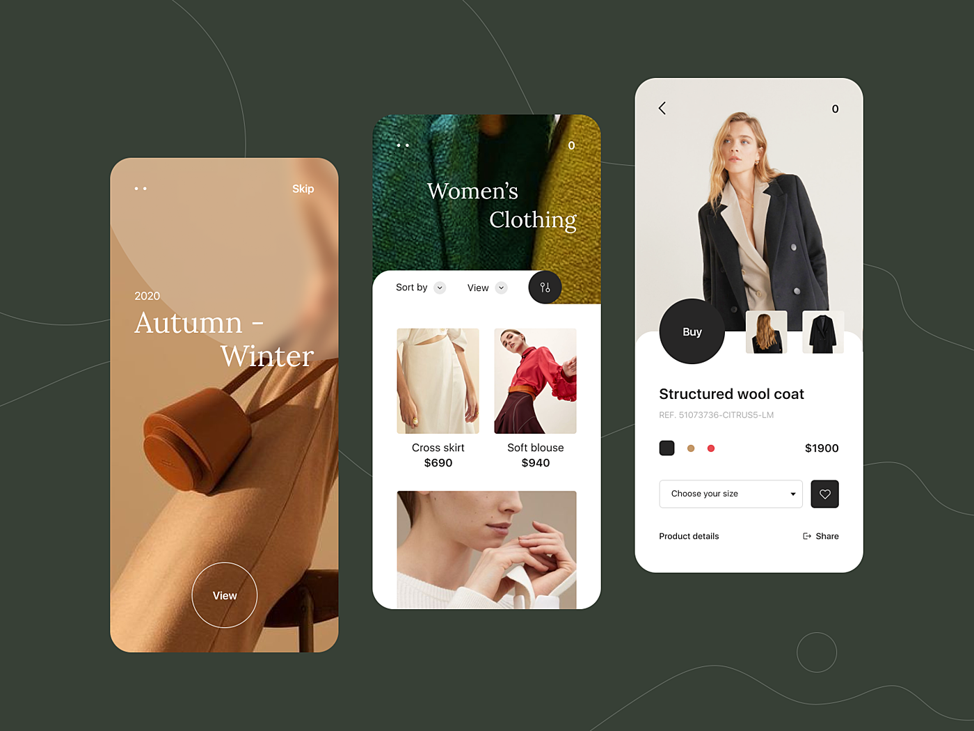
Catalog page
This is the screen where all your products and services should be displayed at their best. That’s why high-quality illustrations are a must. If you have relatively few items, display them horizontally. The user will swipe them left or right. With more options, stick to the standard vertical display. Don’t forget about the CTA button that is easily identifiable.
Source: Dribbble
Product page
This screen allows a user to get detailed information about the product and look at it more closely. That’s why it’s important to:
- High - quality pictures from different angles, image zooming (either by pinching or double-tap gestures).
- Product specifications.
- Auto-suggestion of related products.
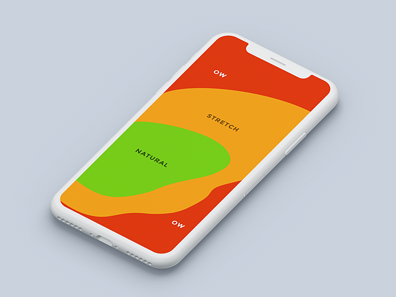
- Thumb-Friendly screen zones for UX/UI design (the green area is where the frequently used actions should be).
- User reviews.
Source: Dribbble
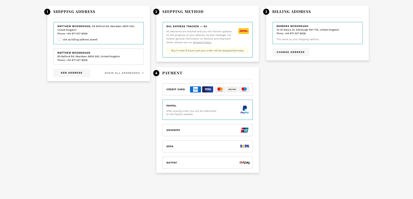
Checkout and payments
Don’t mess up the final stage of the user journey. Try to make the purchase easy and secure:
- Make the checkout option visible.
- Introduce a concise and clear check-out form.
- Include visual elements that indicate the security of personal information.
- Provide a one-click/fast checkout option.
- Include promotion and deals banners.
Source: Agente Case Studies
Our experience
For 10 years we’ve been helping our customers to unveil their potential by creating engaging eCommerce applications and conducting eCommerce UX audit. Take a look at some of our works.
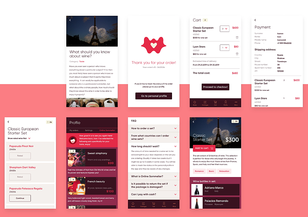
HeyWine
The app clearly defines the information and actions necessary for users when browsing through a catalog, forming orders, buying wine, and leaving feedback.
Source: Agente Case Study
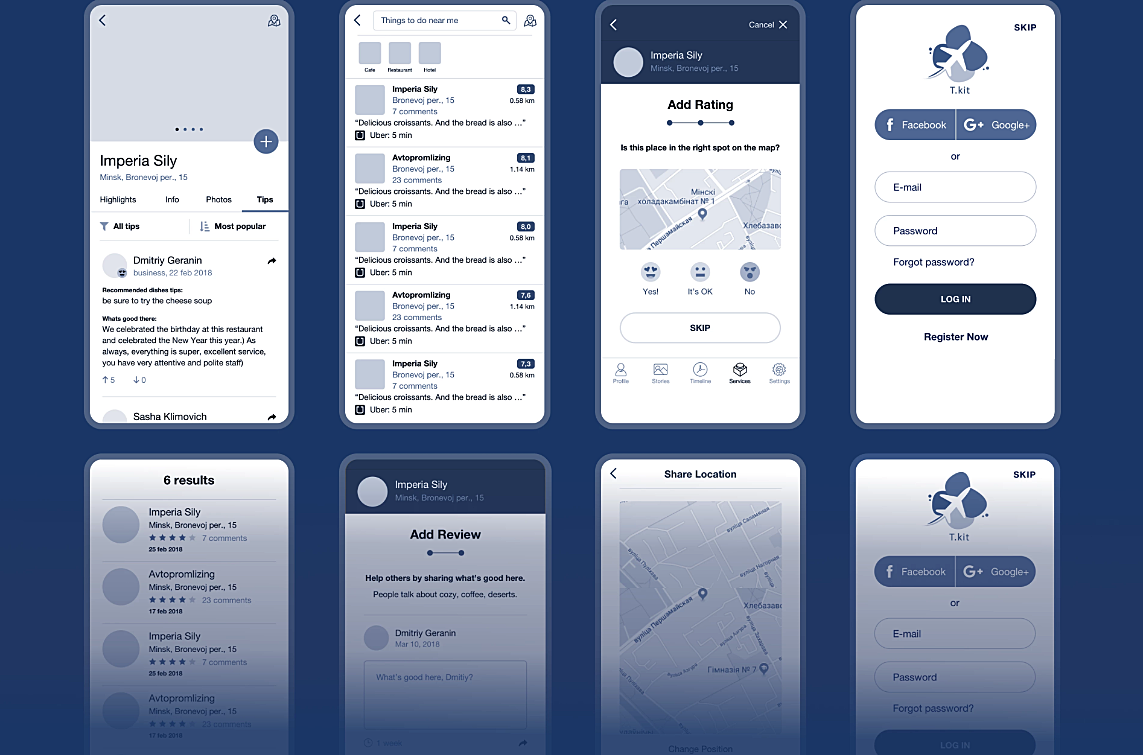
Tkit
We designed and developed a multifunctional iOS app that allows ticket booking and social networking where businesses can list themselves and post events that are taking place.
Source: Agente case study
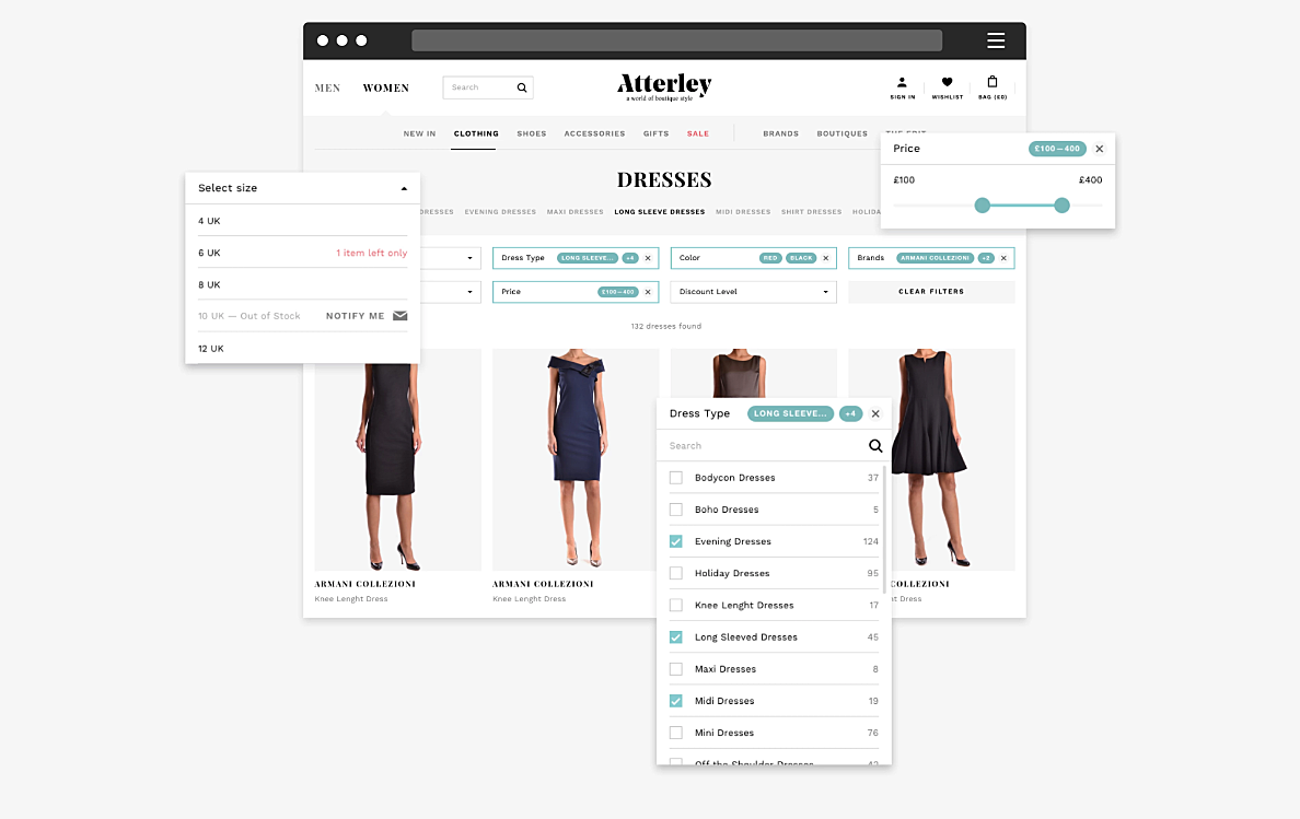
Atterley
Agente team optimized the platform’s UX for higher conversion. We improved Atterley’s catalog and product pages, polished the information architecture and strengthened the brand identity.
Source: Agente case study
Final thoughts
A retail app UX design is an excellent tool to engage customers and increase ROI. What’s more seamless UX flow gives an e-commerce application a competitive edge and helps to build a solid reputation. However, it’s not easy to achieve. The mobile device screen gives no room for mistakes, that’s why you need to check every tiny detail regarding its contribution to the superb user experience.
Further reading: What are the reasons to redesign your e-commerce website?


Rate this post!
528 ratings, average ratings is 4.7 out of 5

Related Posts

How to Launch Your Online Travel Marketplace Platform in 2024?
Learn how to launch your own online travel marketplace platform in 2023 with our comprehensive guide and step-by-step insights.

14 January 2024
Marketplace Website Design and Development in 2024: Features, Tech Stack & Cost
Discover the latest in marketplace website design and development, explore features, technology stacks, and gain insights into cost-effective strategies.

Top eCommerce Website Design Features and Tips in 2024
While creating an online store, it is difficult to orientate quickly and understand how the website should look to create a positive impact on the owner’s income. It determines whether clients remain on store’s page, would they have confidence in the store and would they like to purchase

05 January 2024
10 Best 404 Error Page Designs for 2024
In our new blog post, we review the best 404 page design examples of 2019 that will never disappoint you even if you meet the dead end on the website.
Ecommerce Website Revamp [The Ultimate Guide]
Learn why you should redesign your e-commerce website and how it can improve your online store's performance, including increasing traffic, engagement, and sales. Get expert tips now.

06 November 2020
How to Perform UX Audit that Will Pay Back x2 | AGENTE
How to perform a successful user experience audit? Why does your company need one? In this article, you'll read about important steps to perform an audit, its cost and deliverables.
Let's talk
Is there a challenge your organization or company needs help solving? We’d love to discuss it.

Managing Director, Partner
Andrew Terehin

Thank You!
Your message has been successfully sent.
We will contact you very soon.