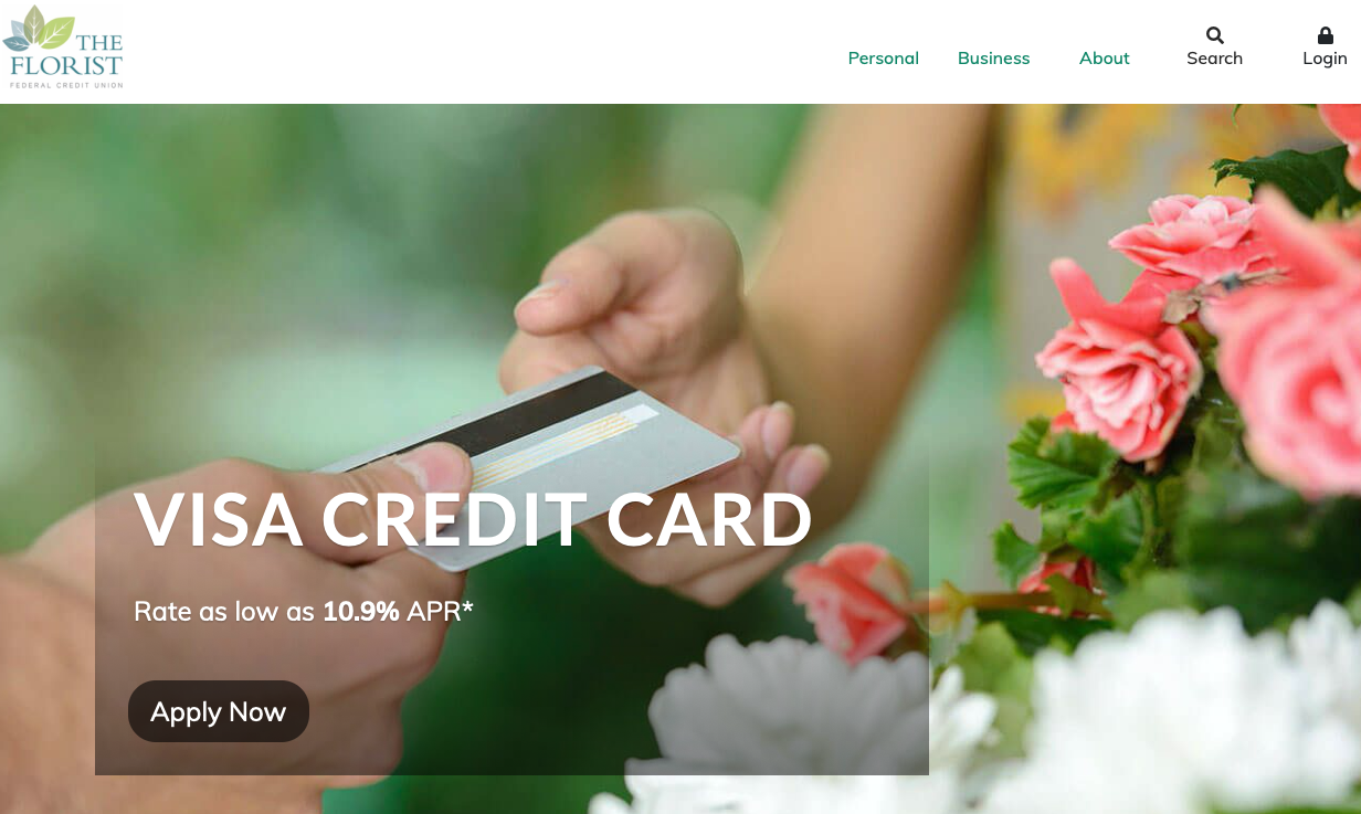
In the digital world, where users are increasingly glued to connected devices, banks target consumers through multiple online channels, including websites. It’s no longer enough for banks to roll out sites with simple designs that resemble each other. A unique bank website design has more chance to hook visitors, as people are looking for custom experiences and diversity.
This means that a banking website, with a design that is both original and functional, is becoming a today’s priority. In our article, we will cover the principles of best banking website designs,current trends, killer features, tech stack required, and the cost of bank web development.
Principles of Excellent Banking Website Design
When web designers and developers are focusing on the question of how to create a bank website, there are some essential principles to take into consideration. Here is a list of the most important ones.
Applying Security Measures
Recent research has found that banks often skimp on the security of their websites. This approach may jeopardize their reputation, since a potential risk of losing sensitive customer data — or even their own assets — is involved.
Security measures are particularly important when it comes to the online banking design and mobile banking design; users must be 100% sure about the security of online banking transactions, otherwise they will never use the services offered.
Read how to develop an NFT marketplace.
Ensuring Accessibility
A good banking website design takes into account all categories of people. A disabled person who cannot use and benefit from services offered by the site will never become a loyal customer. And a loyal client with some disabilities is likely to abandon the online channel if. it doesn’t have accessibility features.
In contrast, an accessible site may help the bank to win loyalty and trust of visitors. It will also have a better SEO score, and its owner will take advantage of the word-of-mouth marketing.
Developing for Multiple Devices
Computers, smartphones, and tablets are not the only means of accessing the Internet. Consumers also utilize other connected devices to visit the desired sites, including smartwatches and smart TVs.
Bank websites that support a multitude of the devices, OSs and browsers often encompass a responsive design. Such a tactic ensures a consistent user experience across all devices and browsers.
Creating Customer Journey Maps
Customer journey maps (CJM) play a vital role in the web design. They are a surefire solution for delivering an outstanding customer experience. Developers need CJMs, as they visualize the process the customer will go through when accomplishing a certain goal.
Putting these maps to use, they can take better UX decisions. Head over to our article to learn more about the creation of CJMs and the most effective CJM design tools.
Maintaining Brand Identity
Banks put a lot of time and effort into building a strong image that people trust. A brand identity is a part of their strategy, because it assists them in delivering a particular message and gaining recognition.
A website can maximize brand identity by following guidelines from the brand book, or from other identity style guide documents. Remember to use logos, fonts, colors, and other design elements specified in such documents.
Major Trends in Bank Website Design
Being a web development agency, we keep track of the latest trends in web design. In this section, we’re going to share some user-centered design examples.
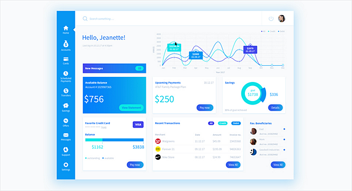
Dashboard Approach
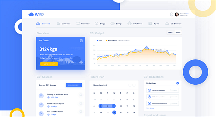
People love dashboards, as they help to find all the necessary data very quickly. Managing raw data in a convenient way, dashboards can convert it to something meaningful and useful.
Registered site users often have banking dashboards in their accounts. These dashboards display info about recent transactions, upcoming payments, statistics, and more.
Source: dribbble.com
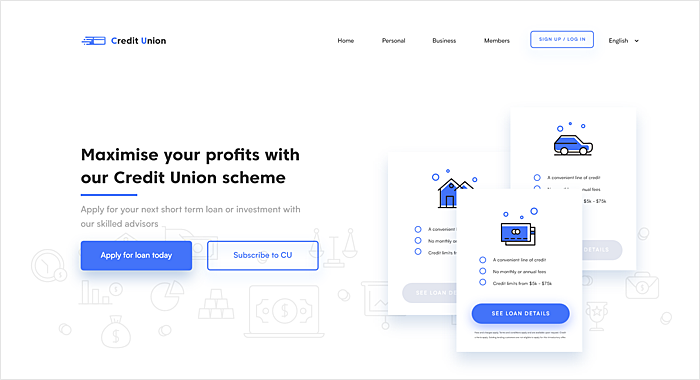
Cards
Cards started to gain momentum in web design a couple of years ago. There are many reasons why sites use them. For instance, they give the interface a much cleaner look, and make it easier to browse.
Cards look perfect on any screen, and they are often used in responsive designs. Cards don’t contain much information, so it‘s easy to get the gist of them. They come in various sizes, shapes, and colors to match the website design.
Source: dribbble.com
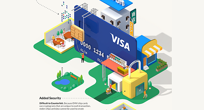
Data Visualization
The amount of information online users come across every day is growing, and banks explore ways of structuring and organizing data in an easily digestible manner. Data visualization in the form of graphs, charts, and infographics is very common across the web.
Banking sites have also followed the general trend by using data visualization to educate consumers about important bank-related topics.
Source: behance.net
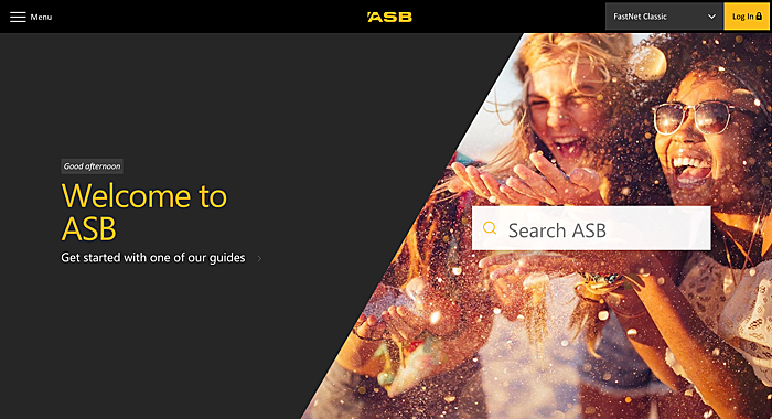
UI without UI
This design approach is all about eliminating unnecessary UI patterns. People don’t want to lose time moving back and forth across the page in an attempt to get the desired information. They expect to be offered it as soon as they open it.
So use your customer knowledge to create the perfect site. Remove all the unnecessary patterns to make UI as simple and intuitive as possible.
Source: asb.co.nz
Custom Typography
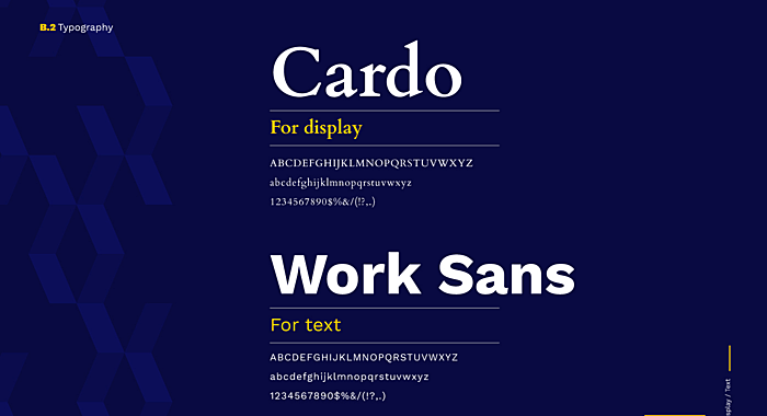
The general tendency towards simplicity in banking design development is beneficial for sites that have custom typography, by making them distinct from others. Typography gives the site a touch of creativity.
Typography is also a substantial part of the brand identity strategy. Implemented properly, it can deliver the right message to visitors.
Source: behance.net
Custom Iconography
Icons represent a universal language that everybody understands. They provide visual context and enhance the website’s usability.
Smart practitioners avoid relying on stock icon sets, because they can be misleading, and they never strengthen the brand’s style. Custom icons are growing in popularity, as they can get the job done easily.
Source: behance.net
Simplicity
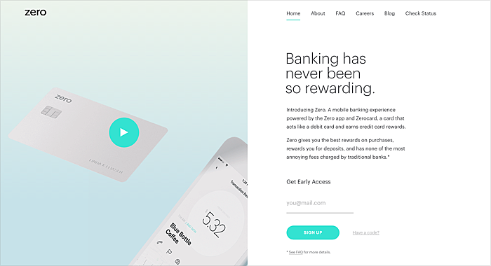
As you may have noticed already, simplicity has turned into a major trend. The best banking websites get rid of all the unnecessary elements to create the best possible user experience.
Producing a simple design is a daunting task for inexperienced designers, since it requires deep customer knowledge and much planning. But a simple design serve the bank well by making its services clear, obvious and intuitive for users.
Source: zerofinancial.com
Consistency
Consistency is crucial for an excellent bank website design. An inconsistent user interface will never get recognition and appraisal. Consumers who have to deal with it are likely to feel confused and/or frustrated.
A consistent design is intuitive. It carefully guides users through the banking website by eliminating any confusion and creating a sense of control, familiarity, and reliability.
Source: dribbble.com
Best Banking Website Designs Features to Have
To make banks stand out in the online space, bank website developers and designers add features that will make every website visit stress-free and informative. Take a look at the most useful ones:
Site Search
Banks have loads of informational content and forms that customers may be looking for. One of the primary ways they find this information is through the site search, which has to be easy to use and provide the most relevant results.
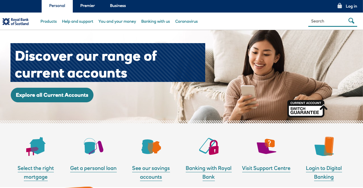
Source: Royal Bank of Scotland
Financial Calculators
Every bank website should include financial calculators that can be embedded on any page, for example, to calculate personal loan, home affordability, retirement, savings, or tuition.
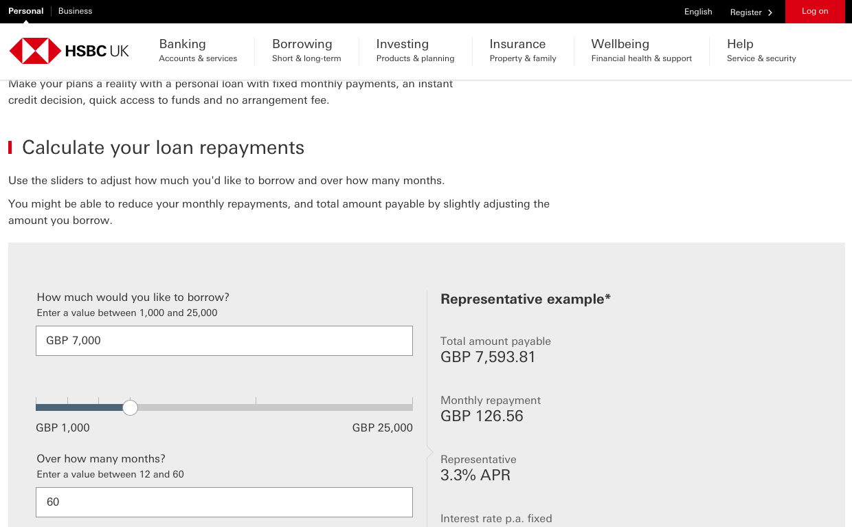
Source: HSBC
Third-party Applications
Integrations can be anything from two-factor authentication, secure log-in, account opening, mobile banking, etc. They provide a 360-degree experience and allow clients to satisfy all their financial needs in one place.
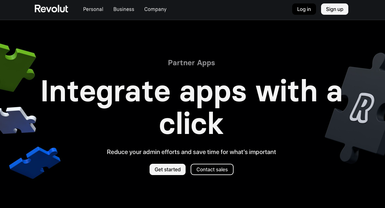
Source: Revolut
Banner Alerts and Notifications
The feature became popular during the pandemic. It was used to share pandemic-related time-sensitive information with customers when they landed on a bank's website. Today, banner alerts and notifications are useful in highlighting exclusive offers or important news that impacts your customers.
Social Media Integration
Banks that are presented in social media and have their own communities have more chances of getting new clients and keeping them engaged. Provide users with up-to-date financial information, create videos, and share educational content—it will increase users’ loyalty.
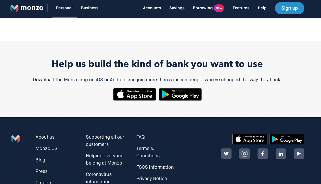
Source: Monzo
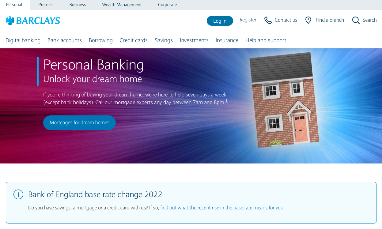
Source: Barclays
Intuitive Navigation
Creating an intuitive site navigation structure is important in helping visitors to explore the whole range of services. Good bank website design uses the so-called “mega menus” with second and third levels.
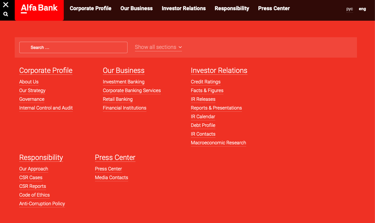
Source: Alfa-Bank
Live Chat
Usually, forms help visitors to contact you, but live chat is the most effective way to assist customers who are needing an immediate response. People always have a lot of questions when it comes to their money, which is why it is important to be there immediately.
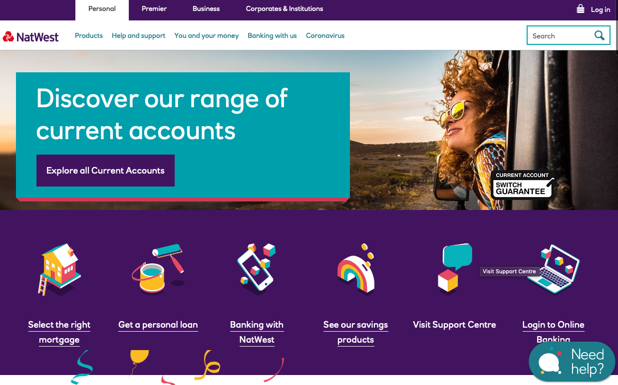
Source: NatWest
Prominent Links to Top Pages
To get to things quickly, people need to see the primary menu on every website page. It usually includes log-in, business services, personal services, online and mobile, news, resources, and the about us page.
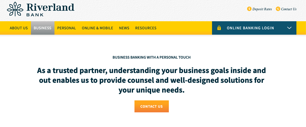
Source: Riverland Bank
Clear CTA
CTAs can be in the form of a button, as well as a link to that action. If you want people to apply for a loan or open an account, say it clearly with “Apply Now” or “Open an Account” buttons. The best bank websites make the calls to action prominent and thereby assist the user and funnel conversions.
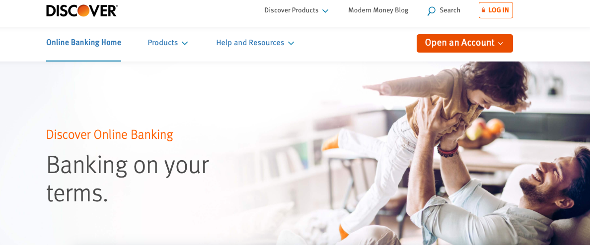
Source: Discover
Prominent “Help” button
Usually, people look for help when visiting an institution’s site. It is not a coincidence that Contact Us is one of the most popular pages. Make sure that your Contact Us/ Customer Services or Get Help buttons are prominent on every webpage.
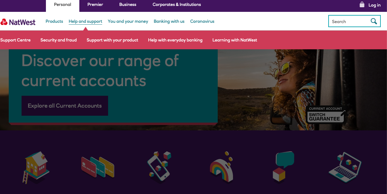
Source: NatWest
Top 15 Bank Websites
Though the number of banks understanding the importance of a good design is rising, few use it. We believe that the following banking sites and concepts are worth your attention, as they are great examples of beautiful and functional design.
1. Starling Bank
This site has a simple layout and navigation that won’t confuse users. By making use of white spaces and avoiding too much text on its pages, it catches the user’s eye.
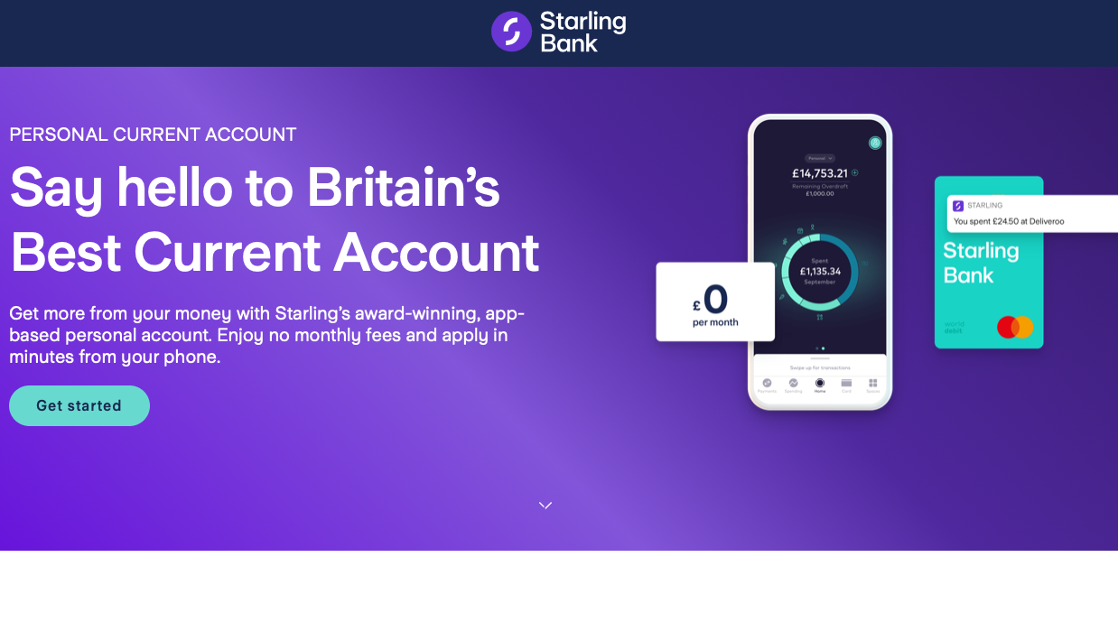
Source: Starling Bank
2. P&N Bank
Source: pnbank.com.au
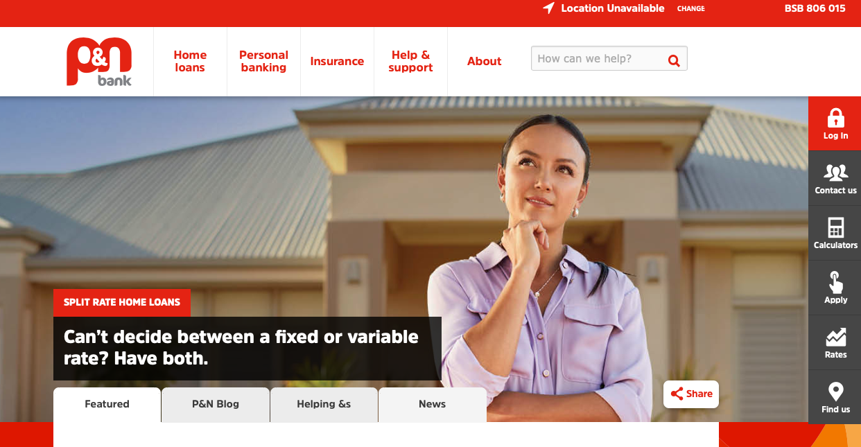
This website does a great job by using a custom background on the homepage that hints about their existing and potential customers. Related articles displayed on the same page add details about the bank’s mission.
3. Heritage Bank
Source: heritage.com.au
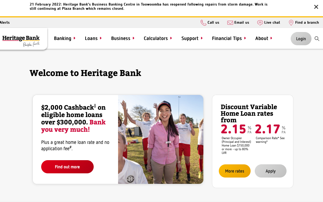
Heritage Bank website pays much attention to the user experience by giving them an opportunity to find the desired resources with ease, utilizing CTA buttons, prominent help buttons, dropdown menu, banners with time-sensitive information, and service options.
4. Bank of Melbourne
Source: bankofmelbourne.com.au
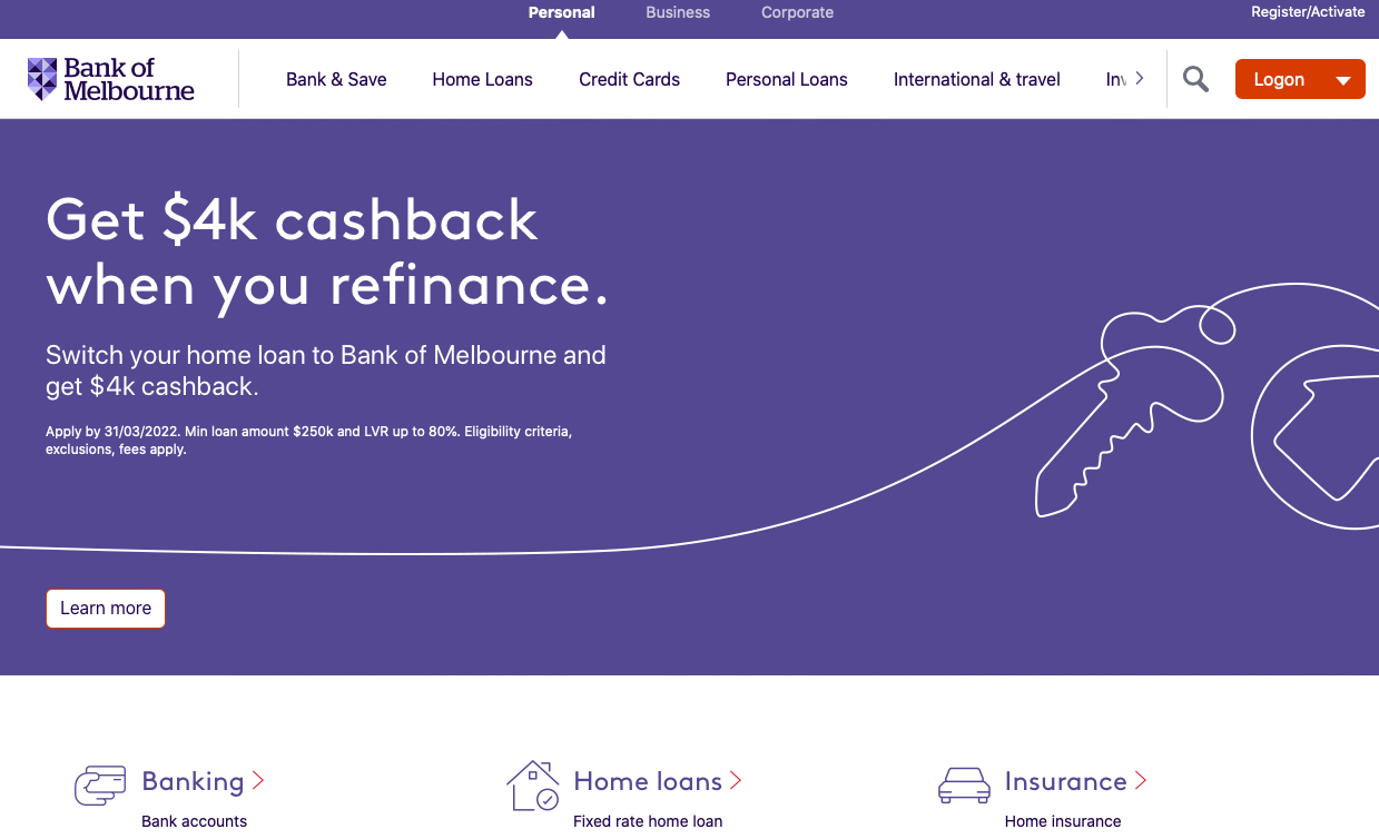
We love the minimalistic style and custom iconography. The website is a bright example of a simple design that looks good on any device. What’s more, the cards that were implemented in its design make its layout simple and intuitive.
5. Alfa-Bank
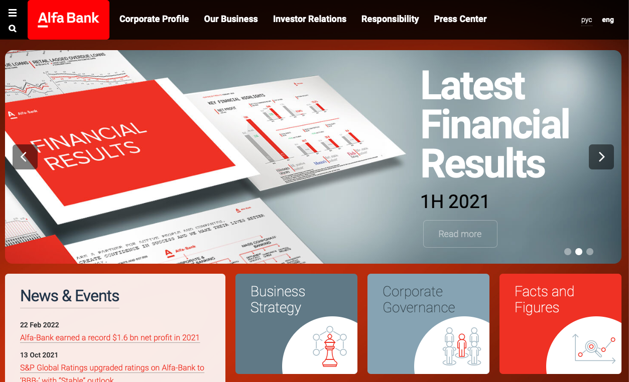
The bank website design is bright and dynamic, with a well-thought use of space. This effect is achieved with the help of block structure. The architecture is simple and easy to navigate.
Source: Alfa-Bank
6. Solarity Credit Union
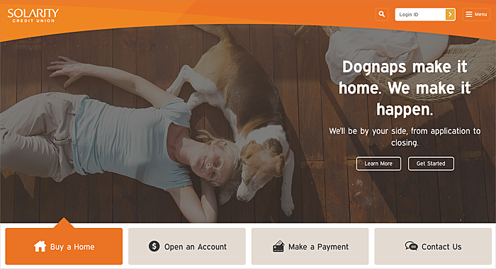
This bank sticks to the principle of simplicity to delight its users. The site layout and navigation are extremely simple, so visitors can quickly and easily find what they are looking for without feeling overwhelmed by information.
Source: solaritycu.org
7. Zenith Bank
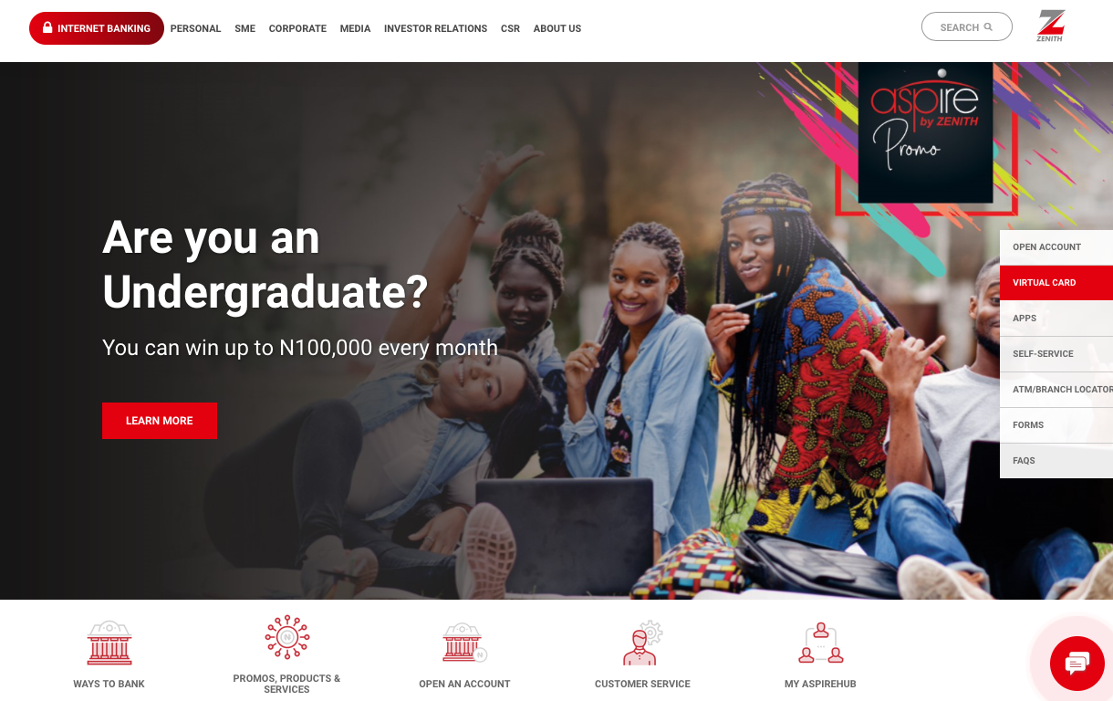
This site is on our list for many reasons, not least its custom icons, which you can see on the homepage. A custom background, animation, and consistency are some other elements that can draw attention.
Source: zenithbank.com
8. Credit Union Online
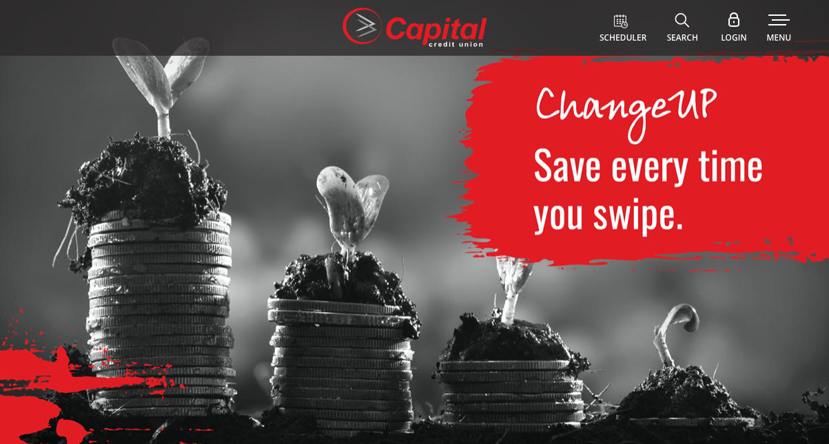
The website developers did it right by choosing a color scheme that will never distract customers. Custom icons, typography, and cards make it irresistible for consumers.
Source: capitalcu.com
9. The Florist Federal Credit Union
This is an extremely intuitive and user-friendly site, with an original and businesslike design that enchants consumers from the very first second. CTA buttons clearly show the services that customers can access there.
Source: thefloristfcu.org
10. Wells Fargo
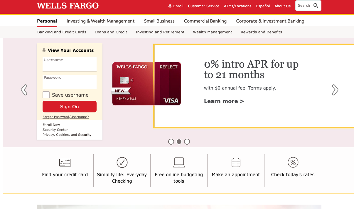
This website design is super responsive and easy to navigate across multiple devices. It is simple with attractive images and prominent CTAs for all the banking services.
Source: Wells Fargo
11. HSBC
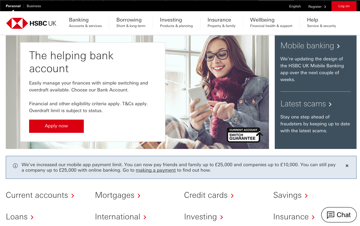
HSBC offers the main features right on the first page, so there’s no need to search for them by clicking through dozens of pages. The design is simple but well-organized: clear CTAs, live chat, and a many-level menu.
Source: HSBC
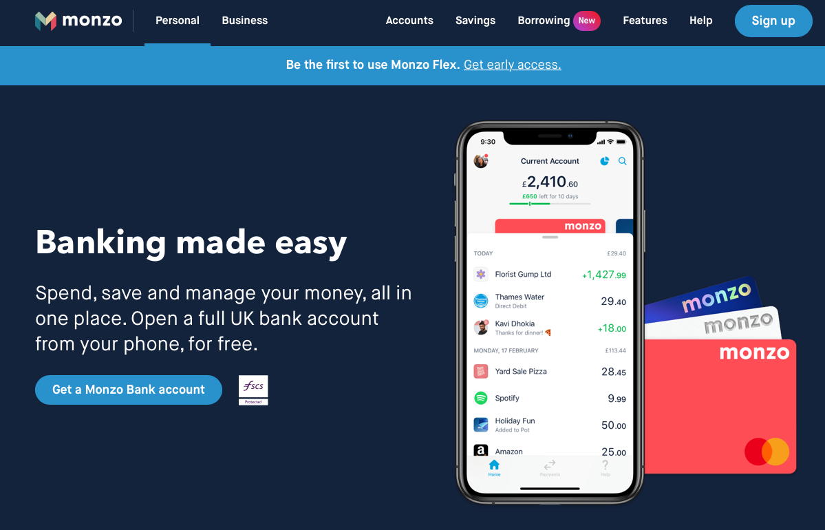
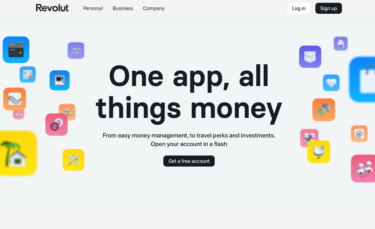
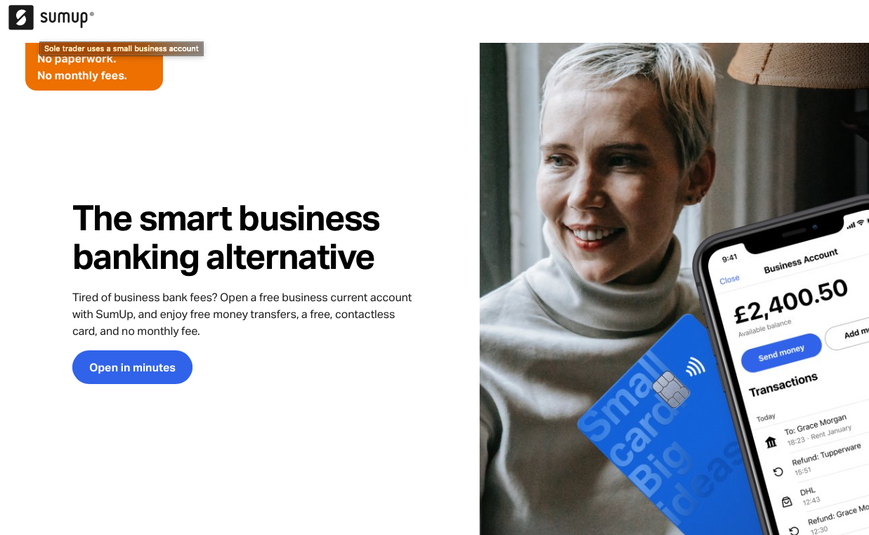
12. Neobank designs
We decided to unite the most prominent Neobank designs in one section, as they all have similar design concepts, which are based on minimalism with simplicity, bright colors, and prominent fonts:
Source: Monzo
Source: Revolut
Source: SumUp
Bank Website Design Cost Breakdown
The cost of bank website development and design depends on a number of factors:
- the scope (number of pages, features, customization)
- number and location of specialists (designers and engineers from Eastern Europe will normally cost less than their American counterparts).
A bank website MVP will require a team of 7–10 members, including a tech lead, PM, data scientist, two or three frontend developers, two or three Backend developers, and one or two QAs.
Note that a bank website will cost more than any other type of website due to the security measures required.
Typically, the cost ranges from $6,000 to $15,000 for a small-sized project. If you want to build a fully-fledged banking website with multiple pages, get ready to pay $25,000 or more.
Tech Stack for Bank Website Development
Security, reliability, and performance play a crucial role in web development for banks technologies must address these two main challenges:
Front-end tech stack
- HTML
- CSS
- JavaScript
- Each programming language supports specific frameworks. Among the most popular frameworks are Angular, React, Vue.js.
Back-end tech stack
- Java
- Kotlin
- Python
- C ++
- C#
- Ruby.
Why Choose Agente for Bank Website Development?
As a fintech website and app developer, we follow the principles of reliable and user-centric design: adherence to web standards, guaranteed security, responsiveness, and optimization across multiple devices. What you can see in the fintech platforms we have designed:
Prometheum
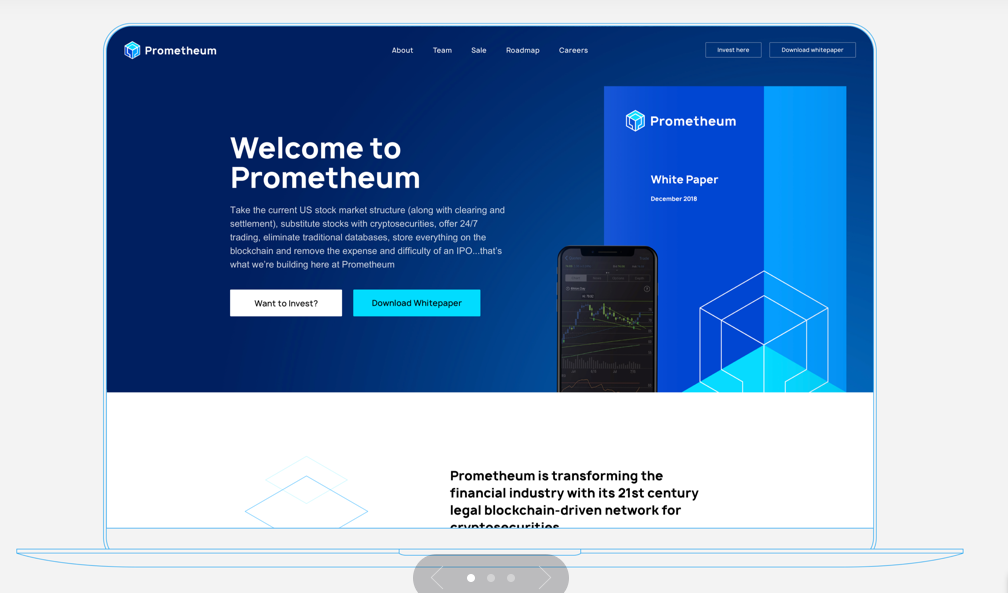
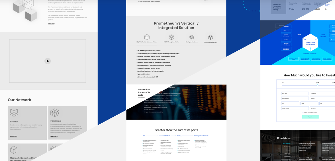
Prometheum a simplified trading platform for cryptosecurities that clears and settles trades in 24 hours. We re-designed the client’s corporate website together with brand identity and whitepaper so that users could understand the mission of Prometheum. Our team managed to depict the brand as a reliable and hi-tech company staying on the edge of progress.
Source: Agente
Final Thoughts
Today, an excellent website with great functionality is an effective marketing tool used by online practitioners. Banks can also leverage this trend by introducing custom design to their sites. First impressions matter, and beautifully designed banking websites will certainly help their owners to stay ahead of the competition.
In this article, we have described the fundamental principles for banking web design, discussed some of the hottest trends, and covered the best bank website designs to inspire you. If your bank website needs an expert touch or you want to develop a robust website from scratch, reach out to our team.
Rate this post!
710 ratings, average ratings is 3.8 out of 5
Related Posts
16 January 2024
ChatGPT Plugin Development: Features and Benefits for Business
Explore the process of crafting a ChatGPT plugin tailored precisely to meet your unique business requirements.
09 May 2024
Top 7 Open-Source LLMs for 2024
Here, we break down everything you need to know about open source LLM models: top 7 offerings on the market, their pros, cons, and capabilities.

19 January 2024
AI Model Fine-Tuning: How to Use Your Organization's Data?
Organizations are transitioning from generic solutions to hyper-customized intelligence, seeking AI models designed to address their unique challenges and propel them toward strategic objectives.
This demand has propelled fine-tuning to the forefront of AI development.

07 May 2024
What are large language models: a complete guide
Get your large language model definition straight: in this article, we cover the concept of LLMs, their capabilities, types, and challenges.

Develop Custom Corporate Microlearning Platform
Custom microlearning solutions for corporate training: Discover how to develop a tailored platform for efficient and engaging employee learning

24 January 2024
Employee Training Management Software Development in 2024: Features and Cost
Streamline your employee training with cutting-edge software solutions. Explore the features and costs of employee training management software.
Let's talk
Is there a challenge your organization or company needs help solving? We’d love to discuss it.

Managing Director, Partner
Andrew Terehin

Thank You!
Your message has been successfully sent.
We will contact you very soon.
