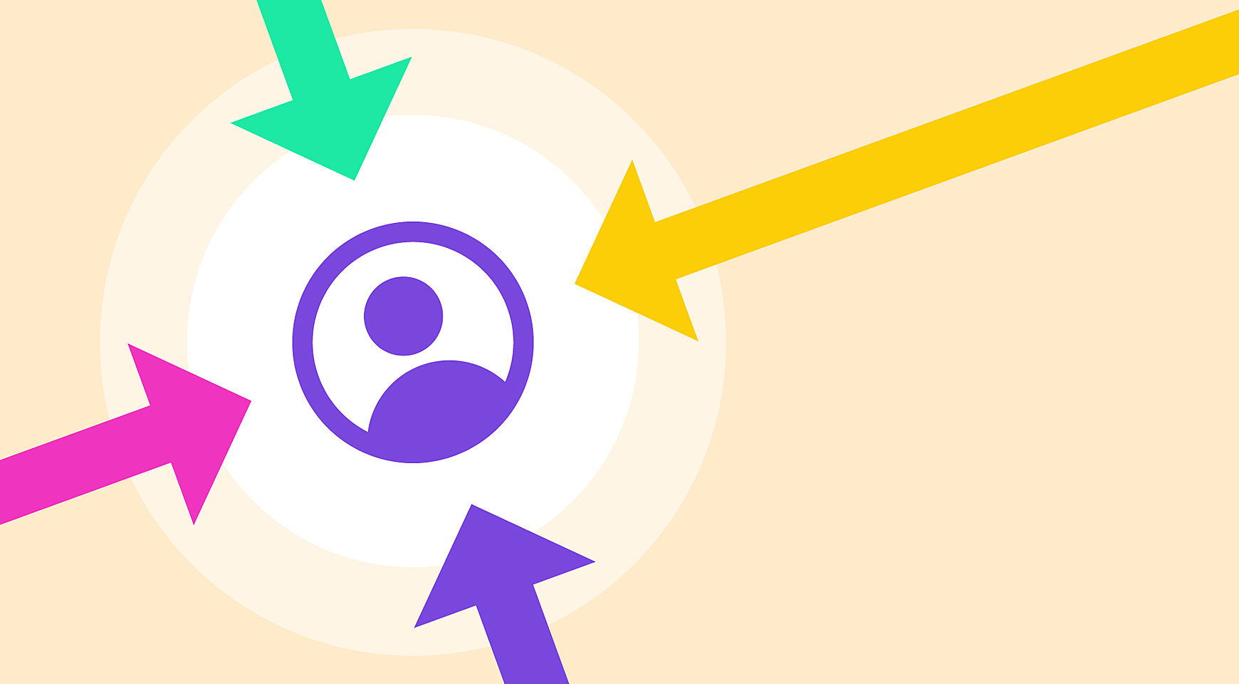
As designers, we always look ahead. Trends and methodologies are changing; likewise, our designs are evolving into interesting, sophisticated experiences.
However, success is measured by the way users feel about a website. Do they feel comfortable? Can they find the needed information? Do they encounter any pitfalls on their way?
One thing is clear: a good UX designer always has the end-user in mind.
We’ll tell you more: according to the latest research from McKinsey, it makes sense to treat user-centric design as a top-management issue, as it is strongly correlated with a company’s income.
In this blog post, we shed light on how to achieve user-centric design when creating websites and apps.
What is UCD in UX?
UCD is not a part of UX. Rather, this is a strategy of bringing users into the design process to ensure a specific user experience. In other words, creating a design aimed at the emotional satisfaction of a user.
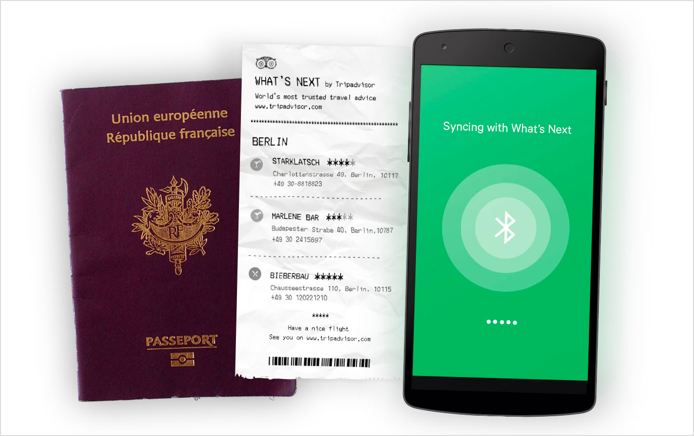
Let’s take the example of Samuel Medvedovsky's concept.
What is the user experience while traveling? Visiting new places? Meeting interesting people? Having adventures? That’s what travel websites are feeding us.
What is usually missing in their narrative, is a great deal of sitting and waiting at the airport and being frustrated in unknown places. That’s the actual user experience.
Source: Samuel Medvedowsky
In this case, user-centered design is what makes a traveler’s schedule fully-booked with micro activities that make waiting time more pleasant. The solution is a suggestion system that advises how to spend this boring time.
Source: Samuel Medvedowsky
How can we make it possible?
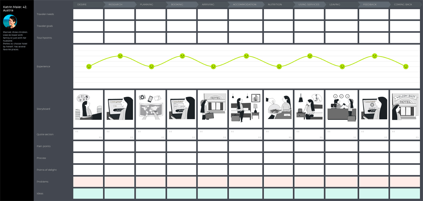
The answer is simple: by studying your users. Gather info about what they are expecting, the amount of time they normally have, what is comfortable or what is stressful for them, create personas, map their journeys and voila! But let’s stop here and look closer at the user-centered design principles and processes.
Key principles of user-centered design
In short, the concept of user-centered design is expressed in a quote by Joshua Porter:
“Technology serves humans. Humans do not serve technology.”
Officially, the key principles of user-centered design are clearly articulated in the standard ISO 9241-210 “Human-centered design for interactive systems.” Let’s decode the dry, formal language and single out six main principles:
- The design is based upon an explicit understanding of users, tasks, and environments.
- Users are involved throughout design and development.
- The design is driven and refined by user-centered evaluation.
- The process is iterative.
- The design addresses the whole user experience.
- The design team includes multidisciplinary skills and perspectives.
What is the user-centered design process?
A user-centered design process is a complex of actions aimed at creating effective and manageable products that are customized to users’ requirements. Here are some steps you should take to make sure a website is user-centered.
Gathering the team
The first step is to invite as many people as you can to the user-centered design research and customer journey mapping process. There should be literally everyone from user-centered designers, sales and marketing reps, customer service folks to general management and customers themselves.
How about the fact that 40% of companies still aren’t talking to their end users during development? This means that they have no chance of making a product focused on humans.
Having multiple departments and users themselves in play, you’ll bridge the gaps between all steps of a customer journey.
User and market research
Once the team is gathered, it’s time to identify the primary users of the product and the context of usage. It would be great to find your potential customers whenever possible—by word of mouth, from social media or among the user profiles of similar products on the market.
The best way to study your audience is to speak to the people you’re targeting and make them your beta testers. Interview them and write down their feedback to understand the following:
- Who are your users?
- What are the tasks and goals of users?
- What is the environment in which your product will be used?
- What your customers' hopes and expectations for your product?
Source: UXPressia
The list can be continued depending on the product. If you are working on the website, think of the adaptive or responsive design and the context in which mobile devices will be used. The important thing is to clearly understand users’ goals, tasks, fears, and pain points and to identify the experiences viewed as most favorable.
The next step is to make a list of your competitors and ask customers to describe how they interact with these products. What do they like about them? What features should be improved? Is the flow and navigation OK? What do they never use?
This will help you evaluate the opportunity on the market and review the areas you might have overlooked.
Requirements specification
At this point, when you have learned about users' needs and pain points and you have conducted a comparative market assessment, it’s time to translate the data into the customer journey scenarios, build maps and storyboards and specify the business and technical requirements for the product.
UX/UI design
Based on the specified requirements, you can start a process of product design and user-driven development. You can read our blog post about the website design process in Agente to grasp a better understanding of what it looks like. Let’s see how users are involved at each stage of these activities:
Begin with the low-fidelity wireframes and show them to the users. This can be even simple sketches on paper. People will feel freer to participate at this stage actively. Users may even sketch some features or flows themselves without striving for pixel-perfect design.
Then, work the wireframes in detail, using Invision or Sketch. These tools are easy to learn and friendly to non-designers who like to review and comment on project details. Remember to follow the general principles of design while building the interface of your product.
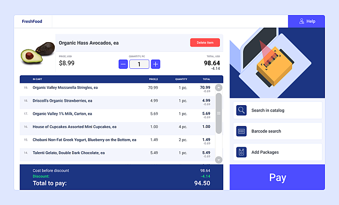
Source: POS system UI design
By the end of this stage, users should clearly understand how they will interact with the product.
Development
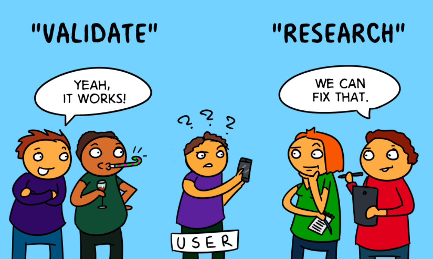
Once the project has been passed to the developers, and the minimum viable product is ready, there’s also a way your customers can evaluate the product. You can simulate customer environments for beta testers and get immediate feedback about the implementation of your product features. Thus, customers from a test group will be the early adopters of your product and anticipate the bugs before the product is launched.
Source: NNGroup
Test and Iteration
As you can see, the process of evaluation is ongoing: from the very beginning of user needs’ analysis to prototyping and development. No wonder this process doesn’t stop after development is complete. Each new element, feature or flow brings on new rounds of evaluation and feedback gathering.
Once a product is made, stand back and analyze the whole picture. It’s time to test patterns and trends in real life, where there are significantly more customers and a larger opinion poll. Don’t get frustrated. This doesn’t mean you need to fix something after each feedback is received.
Define the actions for the responsible team members to analyze customer journeys, optimize customer experience and mitigate the pain points in their field of responsibility.
Outcomes
Why is user-centered design important? It brings positive outcomes to all the stakeholders.
Executives: it saves time at each stage, cuts costs, improves user and team satisfaction, and saves money.
Designers: it helps to see a product through the lens of a human user and think up the optimal concepts and flows instead of focusing on artistry.
Developers: it is a matter of success or failure of the project, better quality of specifications and lesser fixes.
Users: not only does it give them satisfaction from interacting with your product, it ultimately determines whether they’ll complete their task or not.
Examples of user-centered approach in web design
Now that we have scratched the surface of user-centered design principles and processes, let’s see some user-centered design examples.
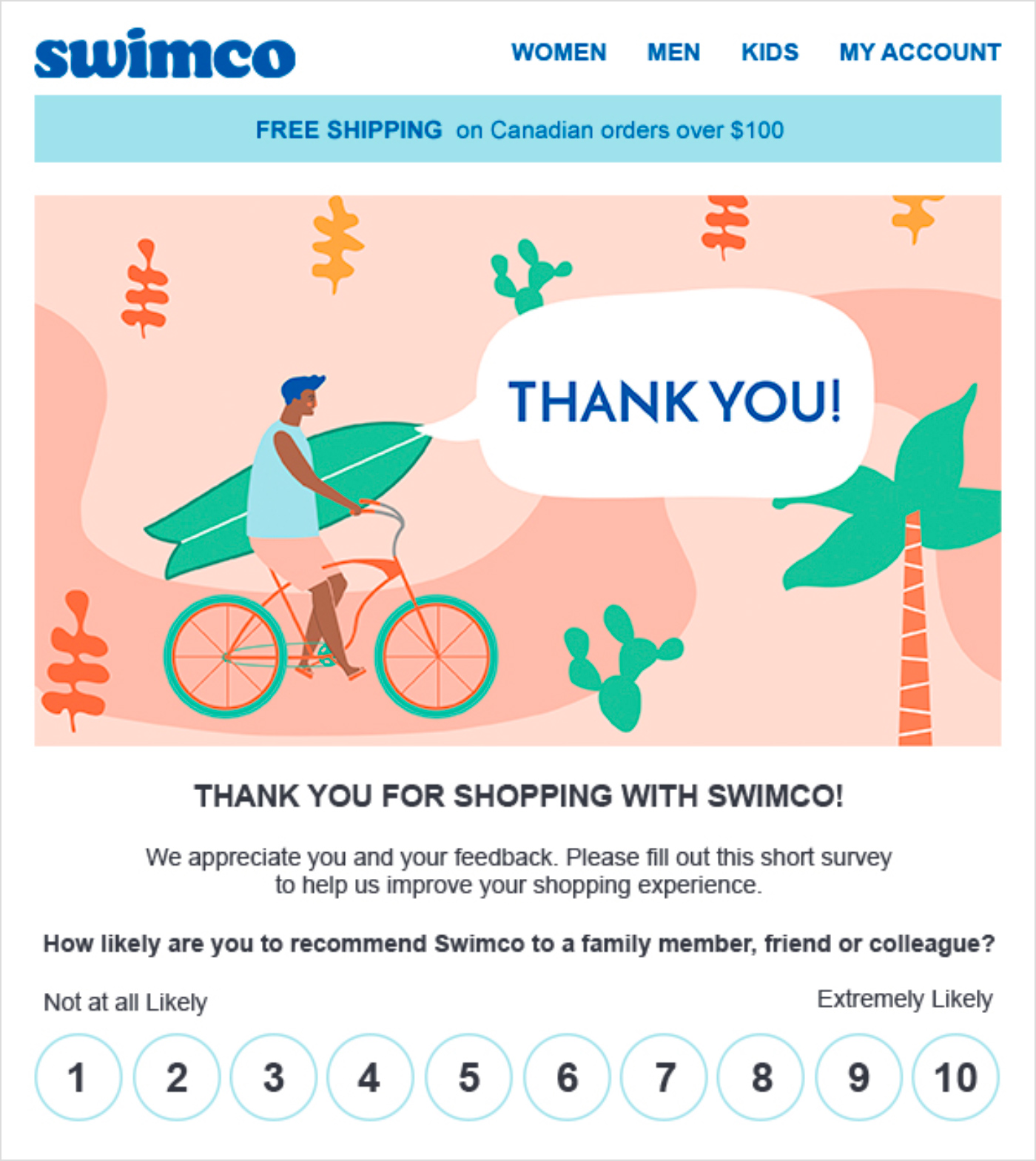
Emailmonks
With the capabilities of the HTML-based newsletters, subscribers can fill in forms or leave feedback without leaving their mailbox:
Source: Emailmonk
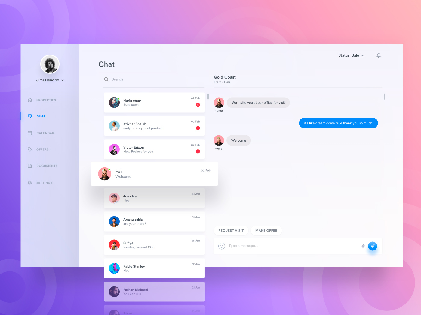
Property dashboard
Lots of users are asking similar questions. While FAQ may seem like too much information to search from, a support chatbot will answer the typical questions for you.
Source: Dribbble
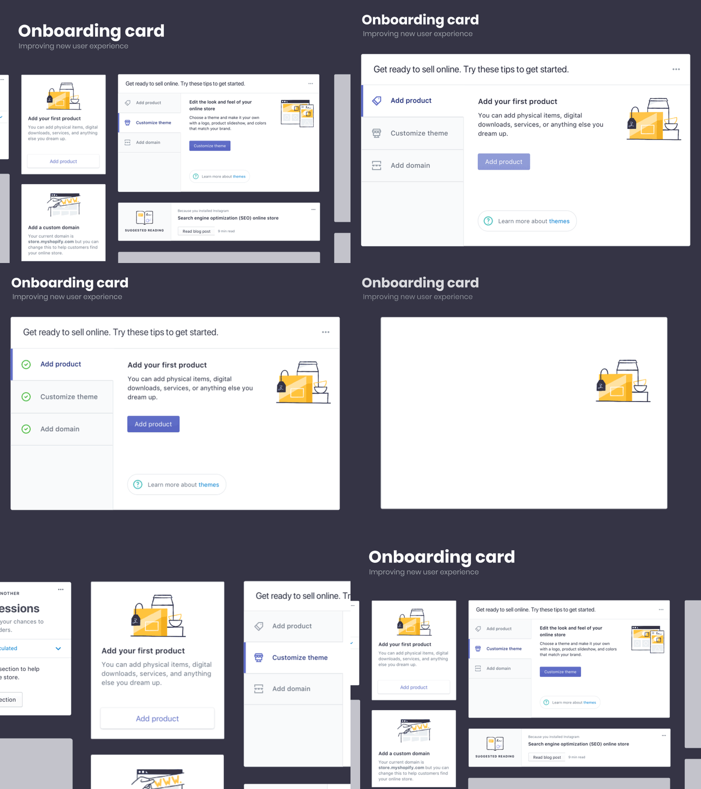
Shopify
Onboarding is a must-have for user-centered design. With microinteractions and animated interface, it's engaging for customers.
Source: Dribbble
Taxi
In taxi apps, people care about the length of time they need to wait for a driver, their location at any point during the ride, and the length of time it will take to reach the destination.
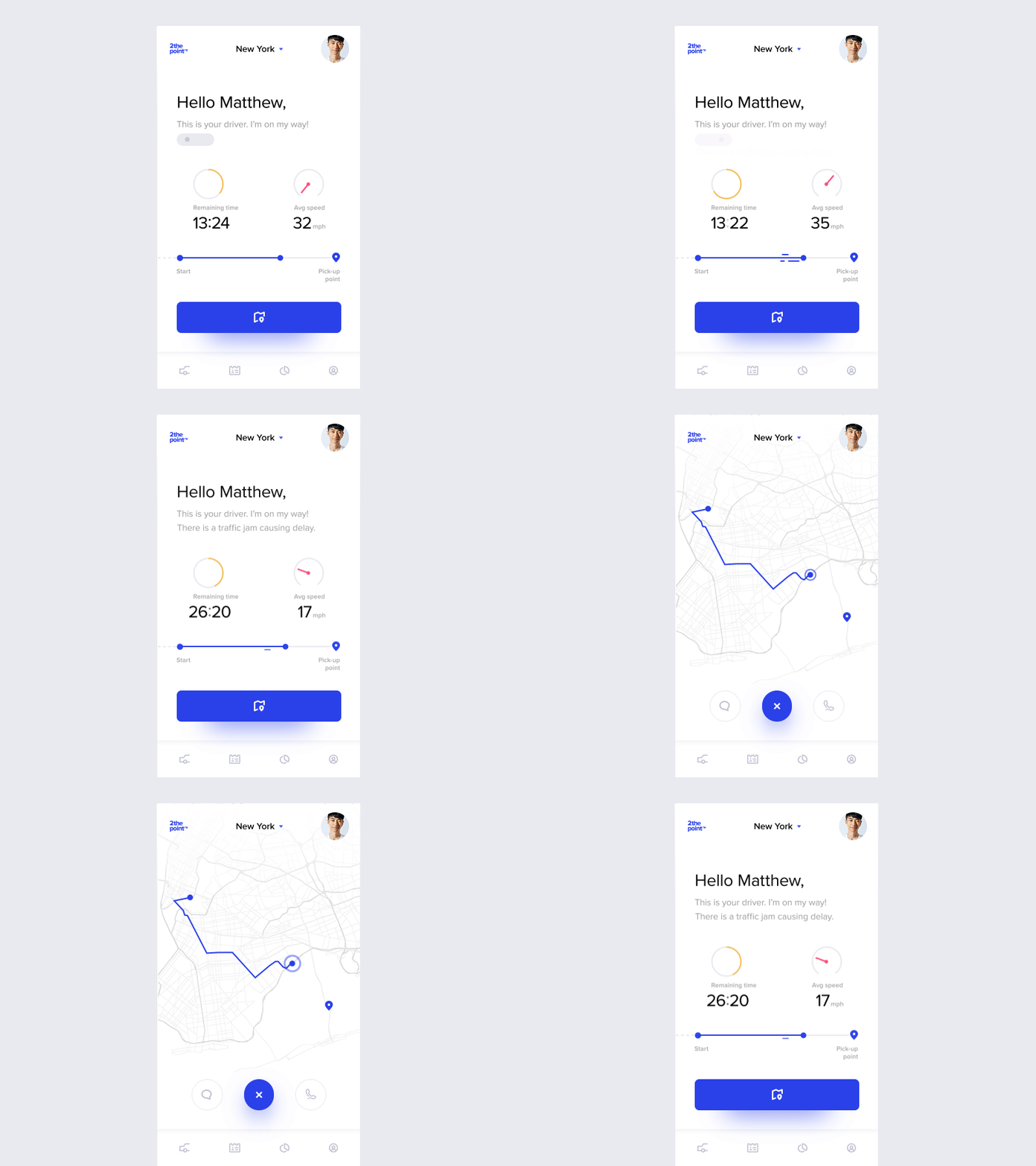
Source: Dribbble
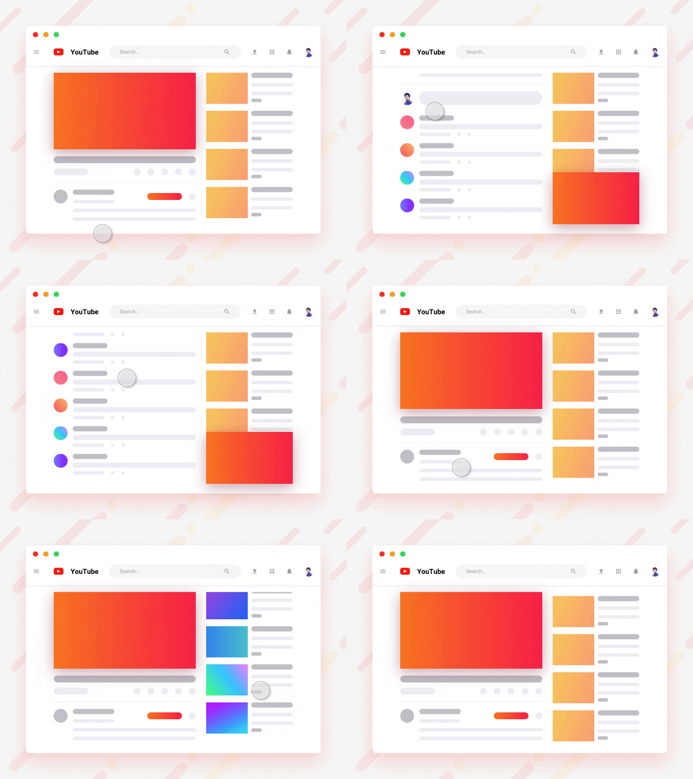
YouTube
Exploring video content is not enough; it’s a community where browsing through comments and scrolling down recommended stuff is all simultaneous with watching.
Source: Dribbble
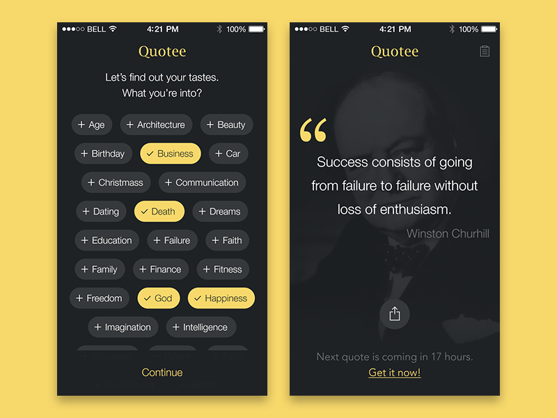
Quotee
Suggestions ensure that user will not deal with random content they didn’t ask for. However, some prefer the normal flow of feeds.
Source: Dribbble
Bank app concept
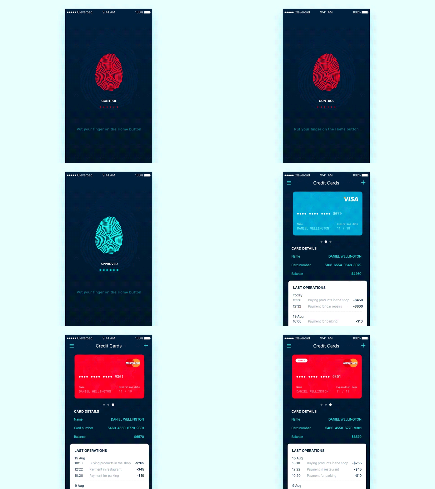
Remembering dozens of passwords is no longer needed in many mobile apps. Fingerprint login or face ID solve this problem in a matter of seconds.
Source: Dribbble
Smartwatch apps
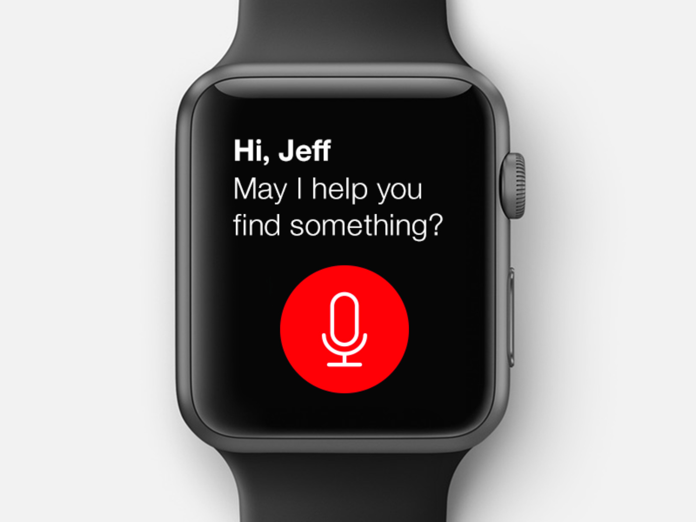
Small screens make it very difficult to type using a thumb. That’s why apps for wearables are good with voice user interfaces.
Source: Dribbble
Visual cues
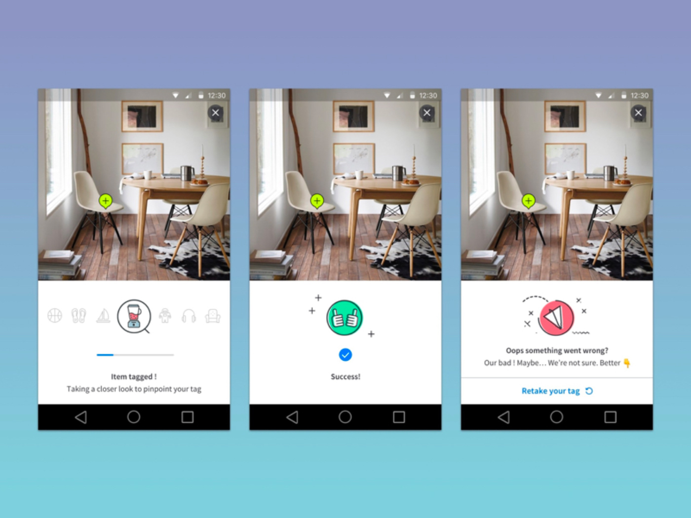
When completing some action, people need cues that help them make sure they have done it right.
Source: Dribbble
Smart home app
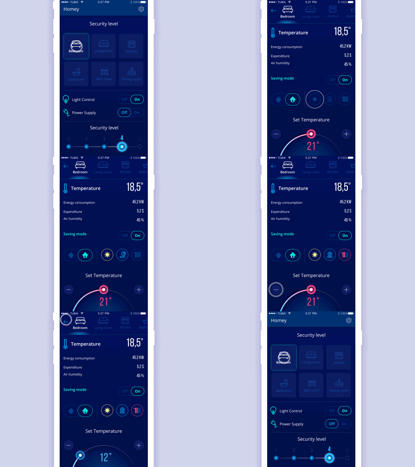
In a smart home app, controlling the levels of security are controlled through several taps of a screen. It’s critical for users to see what’s on and off right on the home screen.
Source: Dribbble
The bottom line is this
Thoughtfully and iteratively, even the most complicated systems can become human-centered. No user personas should be сonceived out of thin air. Moreover, you need to have your users nearby along the whole way of the design and development process in order to make sure your product solves their problems.
This approach is particularly essential in food app design, where understanding the user's dining preferences and habits is key.
Liked the topic? Drop us a message to discuss how you can apply user-centered design principles to your project.
Rate this post!
294 ratings, average ratings is 4.4 out of 5
Related Posts
11 January 2024
Mobile-First Design: Full Guide for 2024
What is mobile first design? Well, the mobile first approach is a central principle of progressive enhancement. In a nutshell, it’s all about producing a small screen design and then scaling it up to other devices. In our new blog post, we cover some aspects that need to be taken into account when launching a mobile first web design project. We also share some outstanding design examples for your inspiration.
05 January 2024
10 Best 404 Error Page Designs for 2024
In our new blog post, we review the best 404 page design examples of 2019 that will never disappoint you even if you meet the dead end on the website.

03 January 2024
10 Best Game Website Design Examples: How to Design Yours
Game website design: importance in attracting new players, awesome examples and design tips.
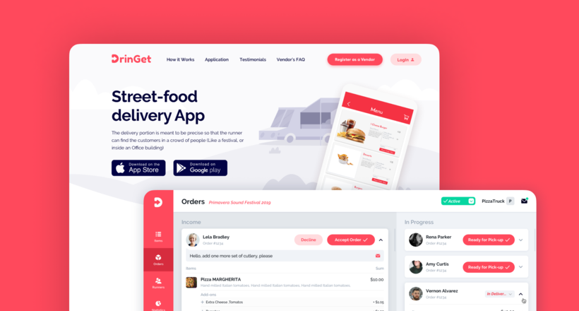
Effective Food Delivery App: Key Tips & Best Practices
In this article, we will share our experience in creating a design for a specialized food delivery management software, as well as best practices in designing such an application.
02 August 2023
E-learning Platform Development: Features & Steps to Build
Build an online learning platform with ease: A guide to essential features and step-by-step processes for successful e-learning platform development.

22 November 2022
10 Best Restaurant Website Designs & Best Design Practices
Restaurant owners always have a lot on their plate, and they are usually focused on the areas that can bring tangible benefits. Websites, unfortunately, are not one of those areas because even the perfect website does not guarantee that the restaurant will be full every evening.
Let's talk
Is there a challenge your organization or company needs help solving? We’d love to discuss it.

Managing Director, Partner
Andrew Terehin

Thank You!
Your message has been successfully sent.
We will contact you very soon.

