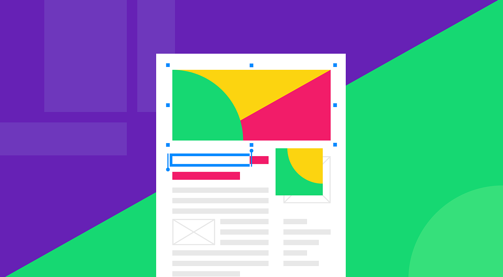
“How do I create a blog that will enchant visitors and make them come back to it again and again, subscribe, and share it with friends?” is one of the most common questions of newbie bloggers.
Well, in an ideal world there would be a one-size-fits-all approach to achieving a beautiful blog design. Unfortunately, there's none in reality, but we have some tips that can help you with this endeavor
In this post, Agente will share with you some of the best blog web designs on the Internet. See more in our portfolio.
Decide on the Platform
Be careful when selecting a platform for your blog. A perfect platform will give you the elbow room by providing multiple design possibilities.
What platform comes to mind first? Certainly—WordPress. This open-source site creation tool is a perfect choice, not only for websites but also for any blog. There are thousands of both free and paid ready-to-go themes that are based on the most popular blog design styles and can be easily installed and customized.
Looking for alternatives to make an informed choice? Check out Wix, Blogger, Ghost, and other popular platforms. If you launch a blog for the first time, educational platforms like First Site Guide can be of great help for finding actionable tips, tutorials and tool reviews.
If you want the blog to be unique, scalable, and flexible, you'd better go with a custom website for a blog. Run a product design workshop, study your customer, and start from scratch.
What Makes a Killer Blog?
There are many creative web blog designs, but only a few of them make users’ hearts sink. How are these sites different from others? Read further to find it out.
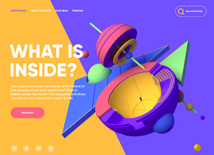
Stunning Homepage
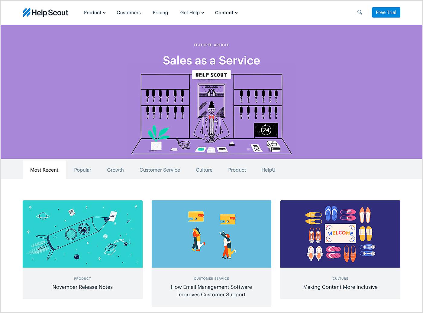
A great homepage is crucial for any site, and blogs are no exception. Your homepage is the central point of your blog. Designed properly, it meets the three major purposes of such pages: catch visitors’ attention, educate them on your company, and tempt them into accessing other pages.
Make the page simple enough to serve the above-mentioned purposes. Spend as much time as you need on thinking about its design and content. Don't rush things. The result must be a careful decision, not a half-baked idea. Only in this case, you'll come up with something memorable.
Source: Help Scout
Well-Thought-Out Header and Navigation
Being at the very top of the site, the header is what people immediately see when landing on any page of your site.
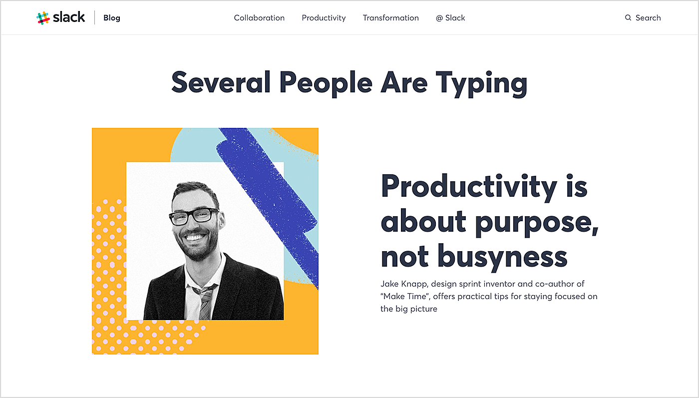
When it comes to a business blog design, the header has paramount importance. It helps first-time visitors recognize your brand in less than a second. Make sure to add your logo.
Navigation is the most important part of the header as it’s like a guide to the hierarchy of your blog's pages. Double-check that it is easy to use and intuitive. You should also display main post categories there.
If you wish to make the header as simple as possible without too many elements, don't remove top-level navigation elements that seem to be less important, leverage hamburger navigation to have them in place.
Source: Slack
Choose Simplicity
It takes just a few seconds for new visitors to decide whether they are going to at least explore your site. You must get their attention immediately, and this can be achieved with design simplicity.
Put usability first when working on your blog design. Get rid of excess elements — they may distract users and even slow down page speed by times (e.g., if it's an animation).
Remove buttons, ads, widgets, and other elements that may result in a poor UX. They won't make your website stand out in the crowd but they may damage its reputation.
So focus on quality, not quantity. Put more emphasis on content rather than on anything else. Content is the number one reason why people will come to your site.
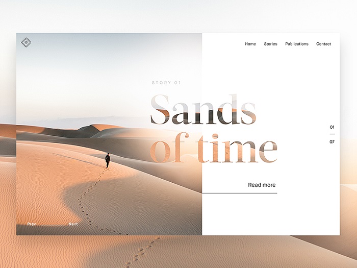
Embrace white space to frame key parts of your content. Don't be afraid of leaving some design parts empty whenever it seems necessary.
Source: Dribbble
Be Wise About Colors and Contrasts
Colors play an important role in design. Don't use too many of them, select a simple scheme. Employing appropriate contrasts is also crucial. Contrasting colors are a secret of a great design.
Keep to the same color scheme throughout the website in order to create styling consistency. If you already have a brand identity design, put it to use on your blog too.
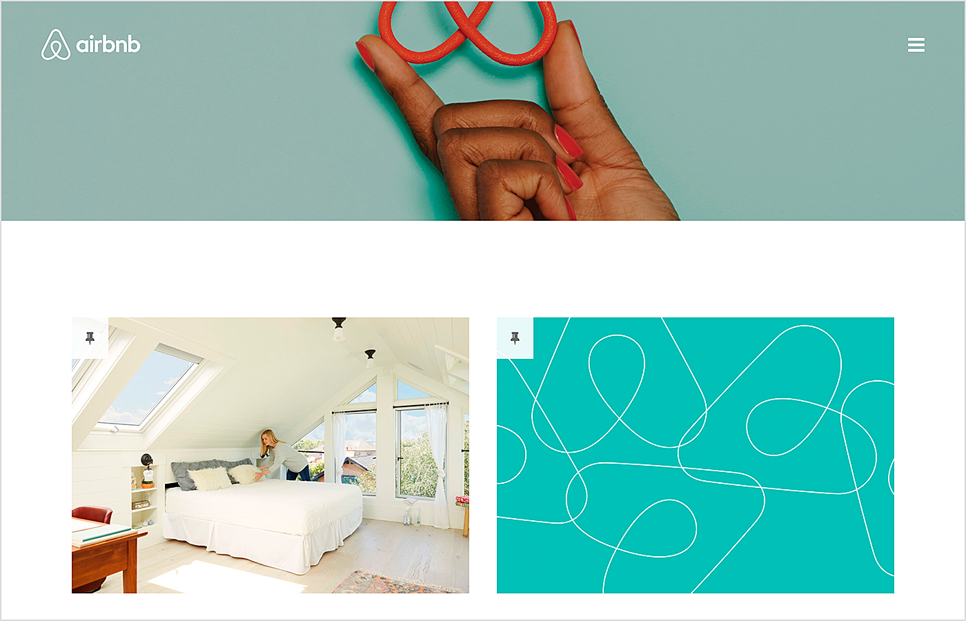
Source: Airbnb
Employ Custom Imagery
Want people to remember you? Custom images can be of a great help there. Utilize them both in the theme design and posts you write.
One more tip: to take advantage of word-of-mouth marketing, duplicate content with pinnable images that users will share with others.
Source: Dribbble
There are some other tips that are no less important:
Keep responsiveness in mind
Today's users expect from websites the same UX regardless of the device they utilize to access it. Some ready-made themes take responsiveness into account. But if you have decided on a custom design, make sure it is responsive.
Show related posts
The best way to keep the attention of visitors who come to your site for a specific topic is displaying related posts.
Showing the most popular posts is also a good idea. The chances are high that content that your readers love will be loved by new visitors.
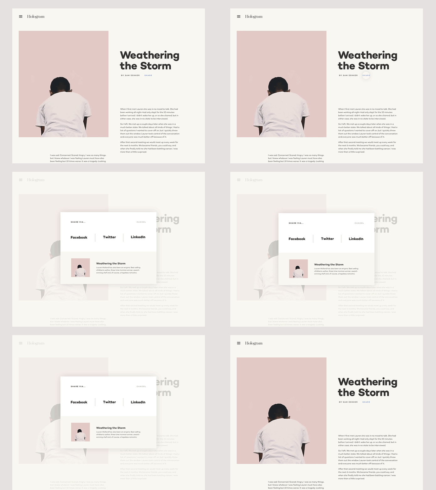
Enable social sharing
There's hardly a person who doesn't have a social media profile. Add social sharing buttons to your site and users won't be able to resist sharing your content with their friends.
Source: Dribbble
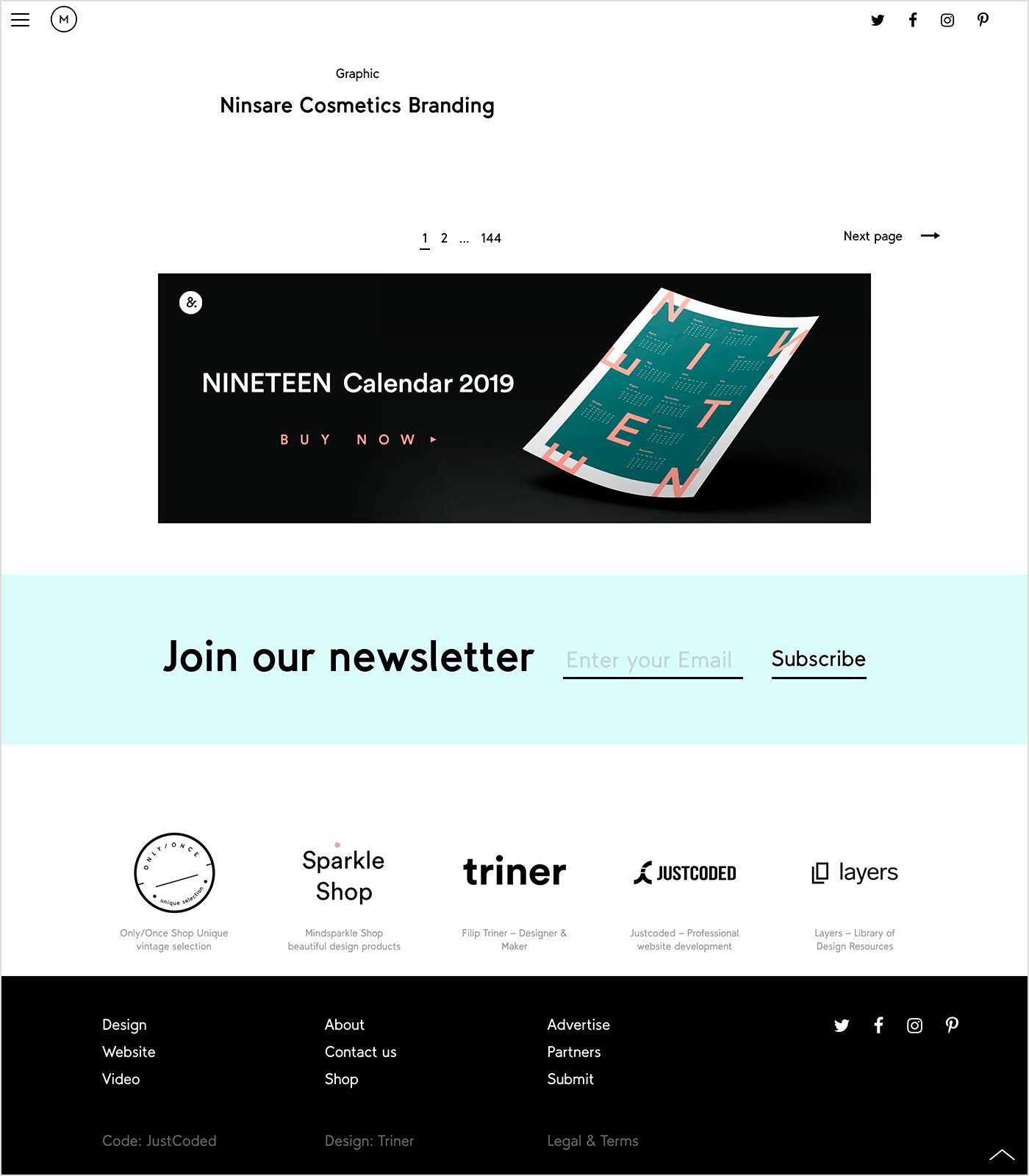
Implement newsletter signup
Newsletters are a proven marketing technique and wise blog owners don't skimp on it. To make a sign-up form irresistible, ask designers for help.
People are curious creatures and they want to know everything that is behind the scenes. Give your readers a chance to learn your story directly from you by writing a great page.
Add custom images and photos to illustrate what you are speaking about. Encourage visitors to share your story by adding social sharing buttons.
Source: Mindsparkle Mag
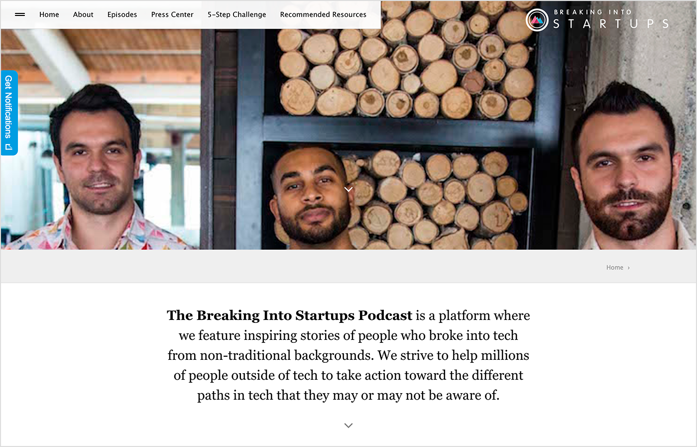
"About me” page
People are curious creatures and they want to know everything that is behind the scenes. Give your readers a chance to learn your story directly from you by writing a great page.
Add custom images and photos to illustrate what you are speaking about. Encourage visitors to share your story by adding social sharing buttons.
Source: The Breaking Into Startups
Blog Design Examples
We hope that now you know how to create a stunning blog. If you still doubt, take a look at the beautiful blog design ideas we collected for you.
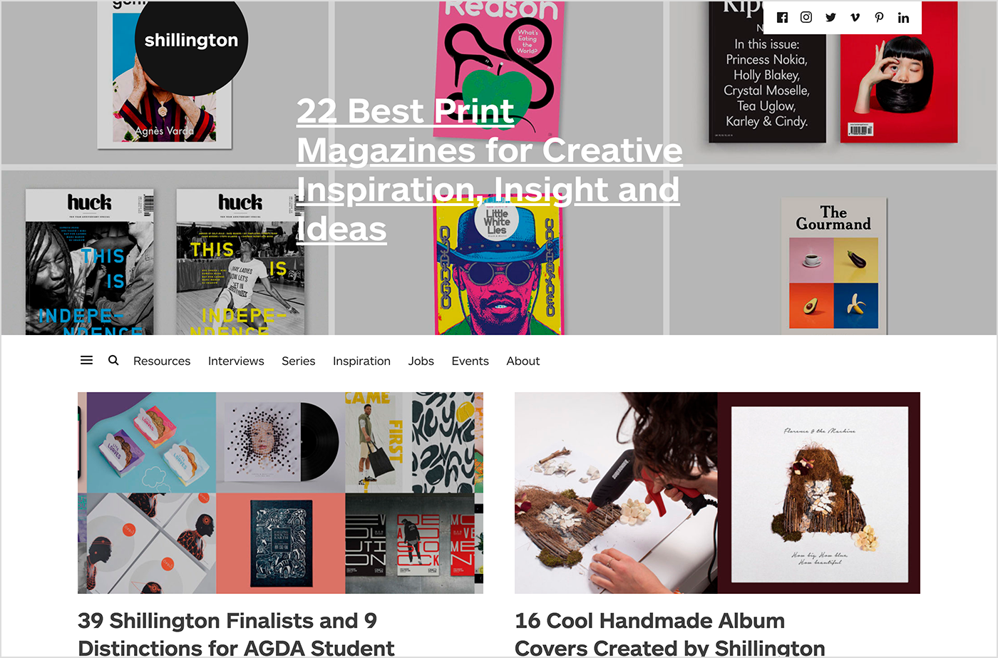
1. Shillington
Source: Shillington
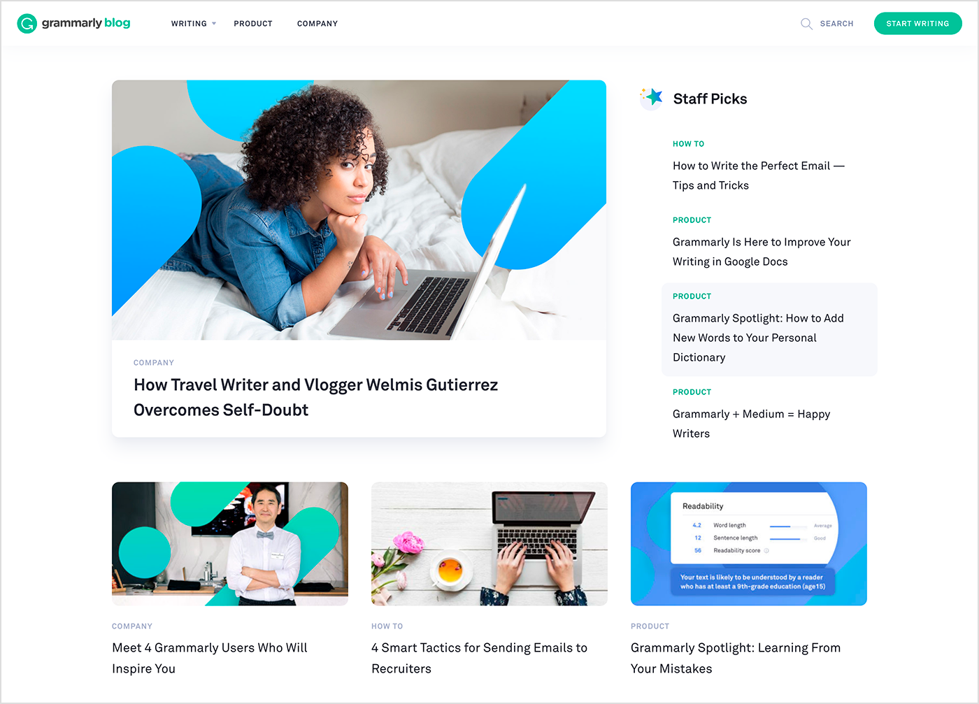
2. Grammarly
Source: Grammarly
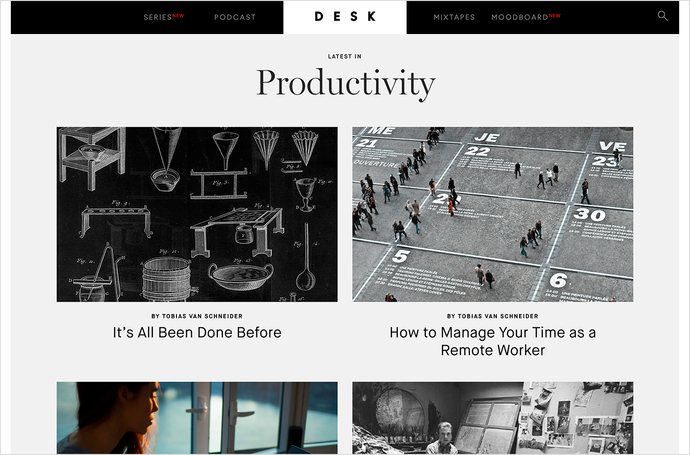
3. Van Schneider Blog
Source: Van Schneider Blog
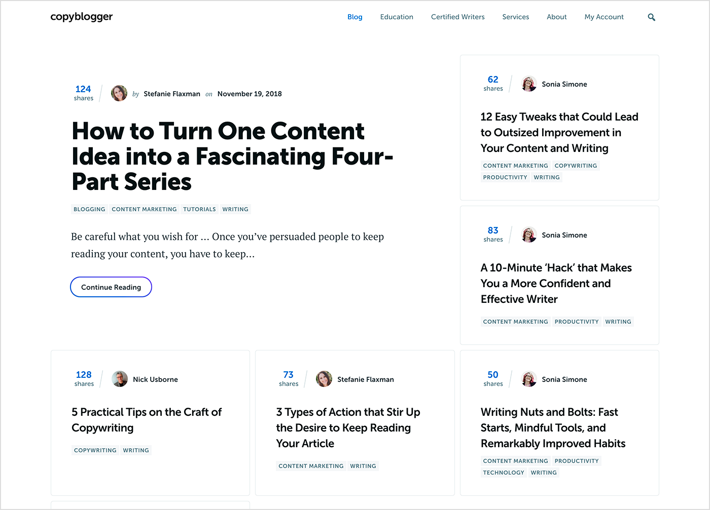
4. Copyblogger
Source: Copybloggers
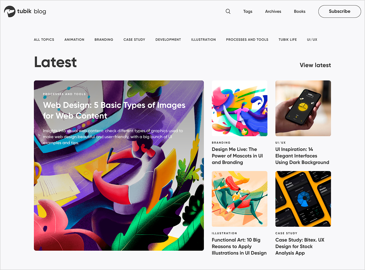
5. Tubik Studio Blog
Source: Tubik Studio
6. Cedrick Lachot
Source: Dribbble
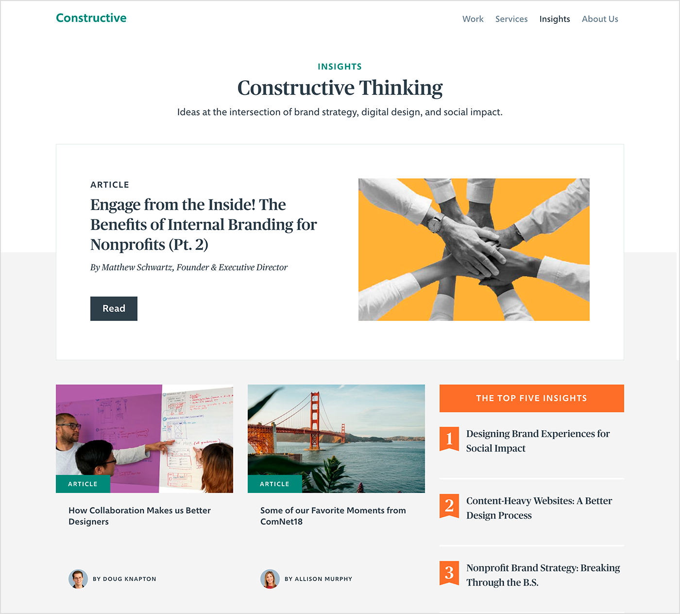
7. Constructive
Source: Constructive
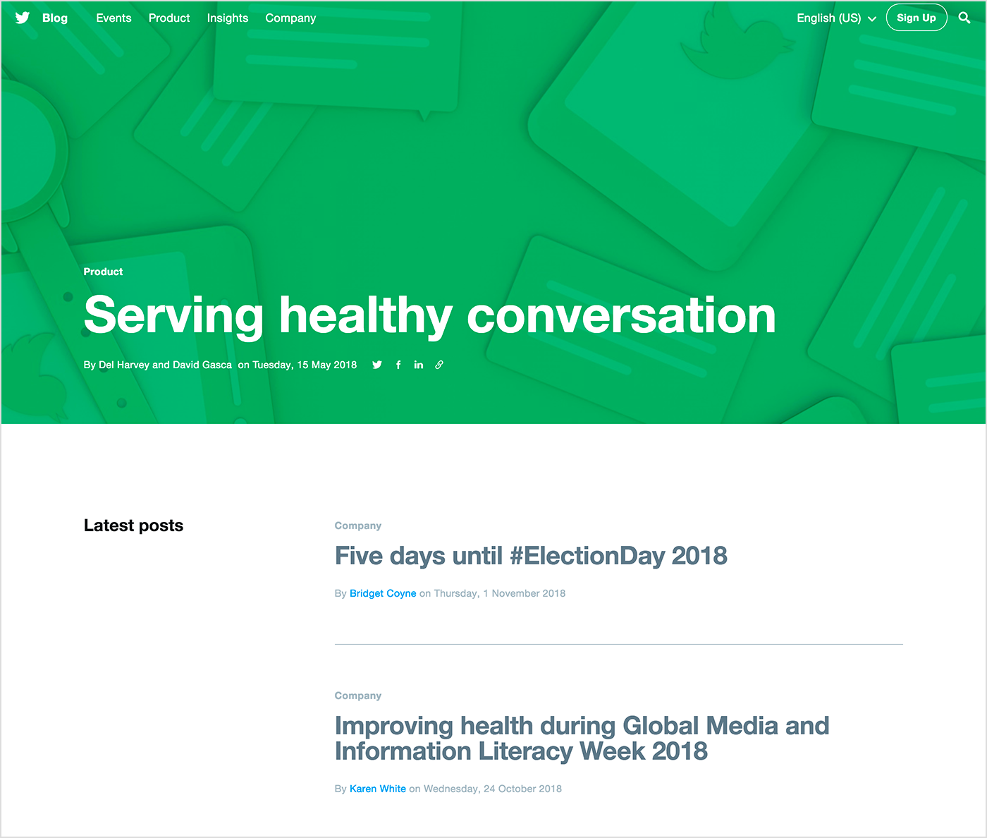
8. Twitter Blog
Source: Twitter
9. Mailchimp Blog
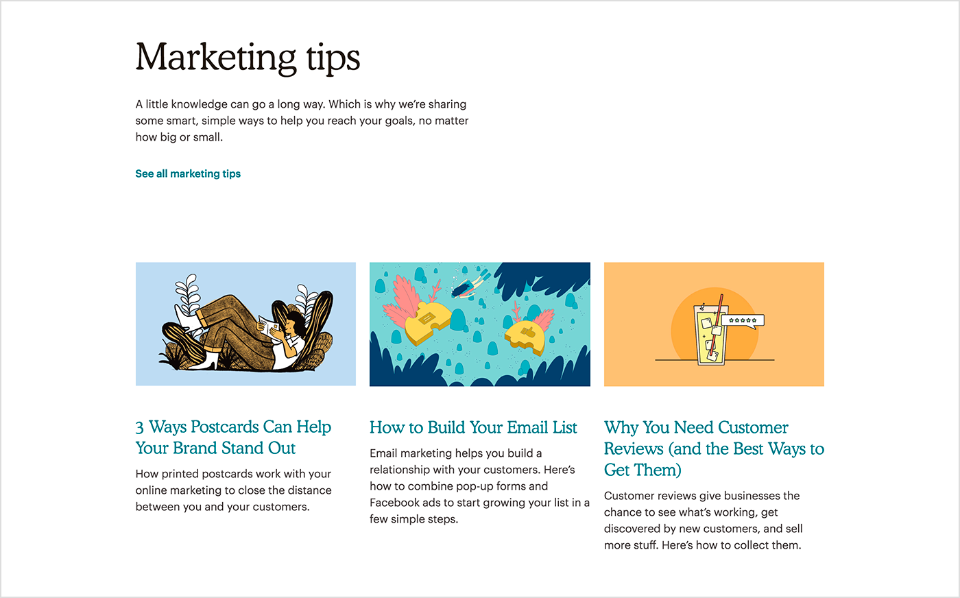
Source: Mailchimp
10. Hubspot Blog
Source: Hubspot
Summing up
Every blogger dreams about a stylish and well-structured blog. In this post, we discussed how to produce it and shared some amazing examples of blog layout design.
Any questions? Contact AGENTE today to get all your questions answered regarding designing a blog.
Rate this post!
1014 ratings, average ratings is 4.4 out of 5
Related Posts

11 January 2024
Mobile-First Design: Full Guide for 2024
What is mobile first design? Well, the mobile first approach is a central principle of progressive enhancement. In a nutshell, it’s all about producing a small screen design and then scaling it up to other devices. In our new blog post, we cover some aspects that need to be taken into account when launching a mobile first web design project. We also share some outstanding design examples for your inspiration.
05 January 2024
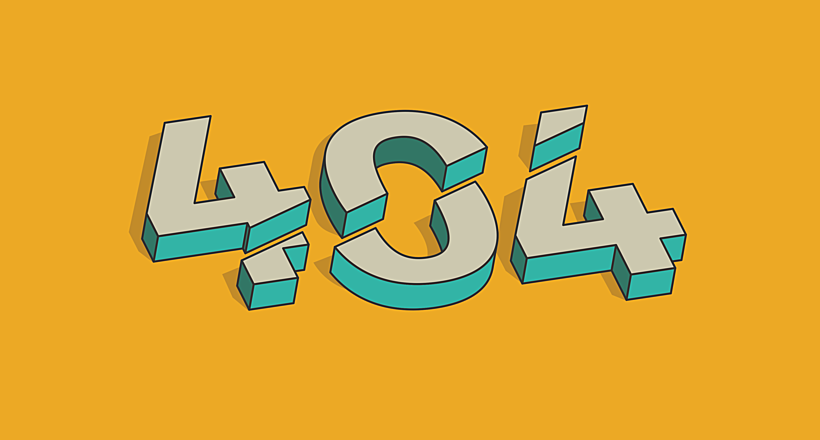
10 Best 404 Error Page Designs for 2024
In our new blog post, we review the best 404 page design examples of 2019 that will never disappoint you even if you meet the dead end on the website.

03 January 2024
10 Best Game Website Design Examples: How to Design Yours
Game website design: importance in attracting new players, awesome examples and design tips.
22 November 2022
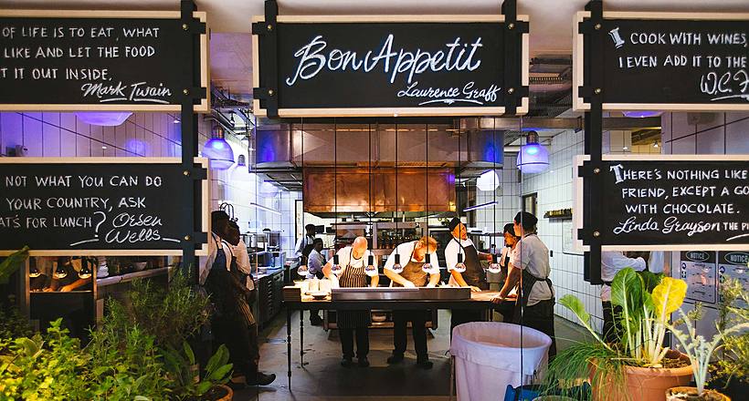
10 Best Restaurant Website Designs & Best Design Practices
Restaurant owners always have a lot on their plate, and they are usually focused on the areas that can bring tangible benefits. Websites, unfortunately, are not one of those areas because even the perfect website does not guarantee that the restaurant will be full every evening.
31 May 2022
10 Best Examples of Website Footer Design
10 website footer design best practices examples for inspiration ⚡ Things that can go in website footers ⚡
29 April 2022
How to Design a User Profile Page in 2022
User profiles can become a constant flow of customer-related data that is extremely useful for marketing. How to design a user profile page? Read in our new article.
Let's talk
Is there a challenge your organization or company needs help solving? We’d love to discuss it.

Managing Director, Partner
Andrew Terehin

Thank You!
Your message has been successfully sent.
We will contact you very soon.
