11 May 2022
Hamburger Menu Examples and Alternatives
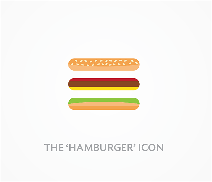
Take a look at the top left corner of our website. Do you recognize this triple bar icon? Every Internet user has seen it before, and we intuitively know what’s inside - a website or mobile menu. For any designer, it's known as a “hamburger menu” as it takes after the form of the famous sandwich. The icon’s design is super simple; however, its UX causes a lot of controversies, with a lot of authoritative resources, like Techcrunch, calling for killing this button and replacing it with user-friendlier options.
In this article, we’ll get to the bottom of the advantages and disadvantages of a hamburger icon, we’ll share some good examples of its usage and offer some hamburger menu alternatives. You can find more works in our case studies.
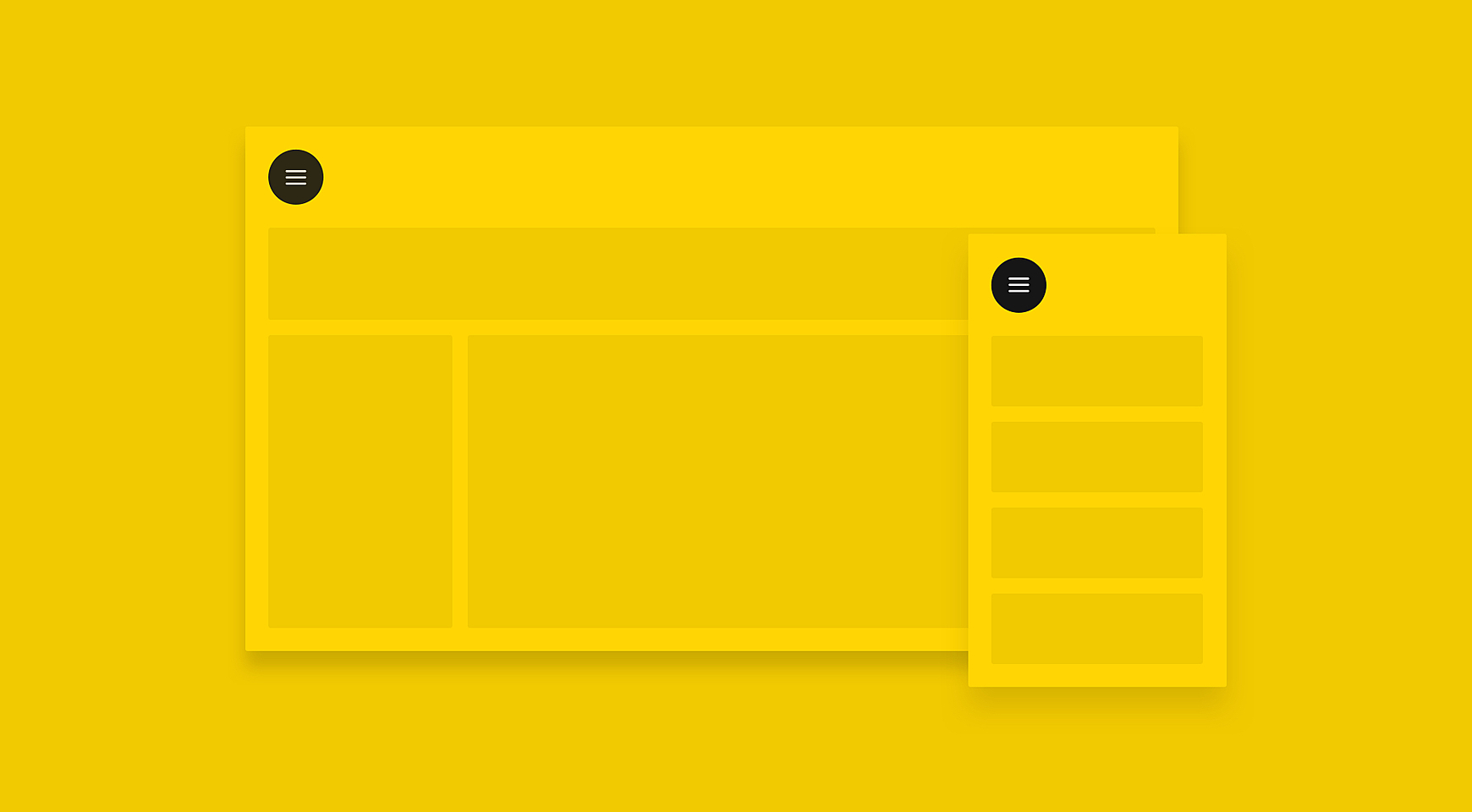
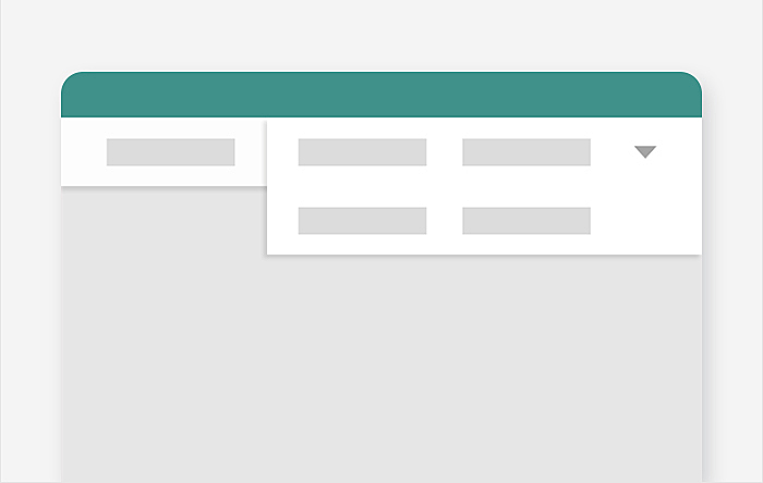
Source: Dribbble
What is a hamburger menu?
Let’s start with a few words on the origin of the hamburger icon. It was created by the designer Norm Cox for the first computer Xerox Star in 1981, and looked like a three-line button that represented menu.
However, it wasn’t widely used until 2009, when it appeared on the Facebook user interface in the form of a grid menu which was transformed to the “sandwich” in 2010. By this time, it started spreading to every popular platform on the Internet.
Thus, it has become a staple in UX/UI design and seems set to stay there for a long time. The designers community has met the new trend cautiously: some of them dislike the icon and suggest replacing it with convenient tabs, while others welcome the new minimalistic hamburger menu website design and place it in every system, be it a corporate website or bank website design. So, we might assume, the reason for the dislike is not in how it looks, but when and where it is used.
Hamburger menu pros
No matter what haters say about hamburger icons, they have won the trust of millions of users across the world. You can see a hamburger button in almost every place where a compact menu is required, and here’s why:
Recognizability
The triple bar icon is a universally understood sign, even though many users may not know it is called a hamburger. The user’s brain detects icons faster than any word and it doesn’t require translation into other languages.
However, this doesn’t work with all types of icons. Some designers replace menu tabs with relevant icons to save space on mobiles. In this case, instead of making users guess what’s underneath, it might be reasonable to replace multiple icons for one hamburger button, with a side menu hidden inside.
Clearer navigation
The hamburger menu allows the designer to drag the user’s attention to primary navigation by shifting secondary options from the main screen to a hidden side menu. It is especially appropriate in mobile design where main CTA buttons are sticky on the main screen, such as map, taxi, or gaming apps, with the main functions to find a place, request a car, or play. In these cases, the hamburger button will cover the menu with settings, account, payment options, etc.
Direct access
The hamburger icon allows users to access the section they need without scrolling through all the content or clicking on screens step-by-step. It means they complete the necessary action faster with direct access via the hamburger.
Hamburger menu cons
The hamburger menu seems like a perfect solution for minimalist design, doesn’t it? But there’s a flip side.
It is difficult to discover
There are at least three reasons why a hamburger navigation menu may be unnoticed:
- A small button is unlikely to be found and recognized as a menu. Over 50% of people are deleting apps right after downloading for many reasons, including a complex interface, so users may bounce if they have not found familiar menu patterns.
- The position of a mobile hamburger menu is the top left corner which is the same position as a back button: people may try to get back to the previous screen and end up in a menu.
- Wide usage doesn’t make the hamburger icon universally understood by all users. What is a “navigation drawer” for one user may be “three unknown lines” for another. Some also recognize this icon as a list rather than the main navigation button.
It is not one-click
Being hidden under the hamburger menu, features take longer to discover, which makes users first click on the icon, then on the tab, and probably search for them in sub-sections. This may cause frustration as most people prefer to act immediately instead of browsing the website.
It’s hard to reach on mobile
The Hamburger menu UX is not well-thought in terms of physical location. While smartphone screens are getting larger, it’s harder to reach out to a button in the top corner without messing everything up. In comparison, bottom tabs, or slider menus allow the user to comfortably browse the app. We’ll get back to the alternatives a bit later.
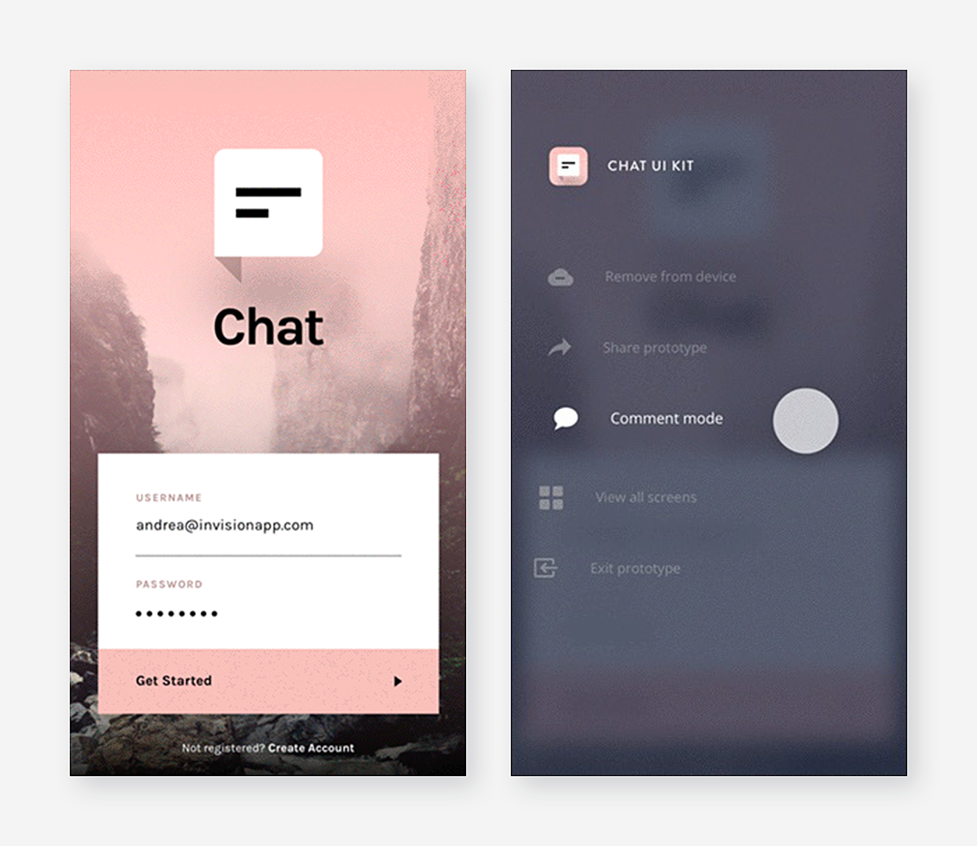
Tips to make a good hamburger menu
Despite the disadvantages we listed above, there’s a way to make a hamburger menu better. Bear in mind that hamburger menus are becoming more sophisticated and go beyond a triple bar icon, so you have to deal with additional content and complex layouts. To help you improve the hamburger menu, we’d like to share some tips:
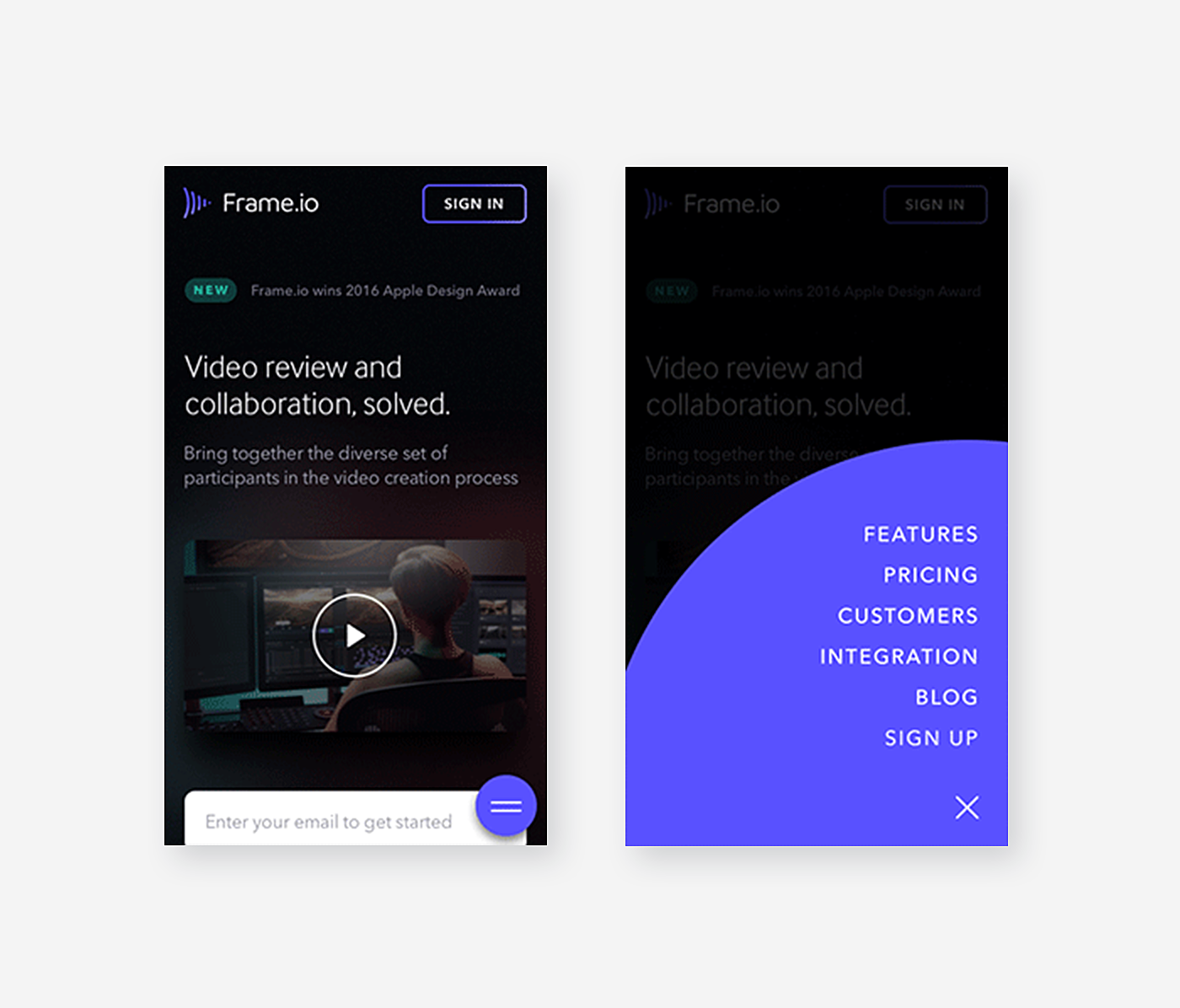
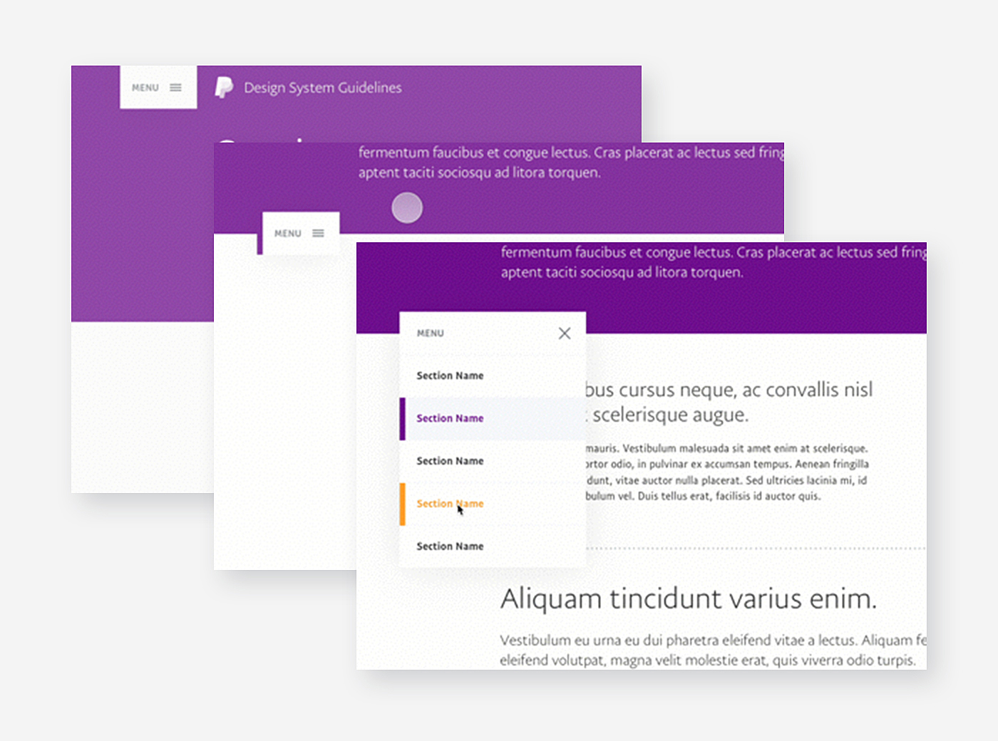
Create a custom icon
The three-line form doesn’t leave much room for imagination. The aim is to remain consistent and recognizable for a good user experience, and to be creative at the same time:

Source: Userapi
Make it responsive
What to put in the hamburger drawer?
Desktop users would appreciate a mega menu with vertical links, rows and tabs of content. Mobile users prefer a horizontal navbar or vertical sliding navigation, and it doesn’t make sense to display more than one column of the menu. What can be done to satisfy both? Use a responsive or adaptive design and make a hamburger menu wrap up on mobile and roll out on a desktop. The popular approach is to wrap the visible topnav desktop menu into the hidden hamburger menu: click to explore how to do it with HTML, CSS and Javascript code.
Think over animation
A hamburger menu is impossible without animation that turns three lines into an arrow or cross button and opens up a menu. The hamburger menu animations tend to become fluid and elastic in order to create intricate but seamless transitions. Work on duration and delay, and experiment on audio to provide cues for each of the menu elements. You can even play with CSS - this will allow a captivating user experience from the hamburger menu design.
Source: Tumpanus
Conduct user tests
Conduct A/B tests showing two groups of web and app visitors versions of your hamburger menu or hamburger menu vs. alternatives. Also, use heatmaps to discover how users navigate through your website and use the hamburger menu, in particular.
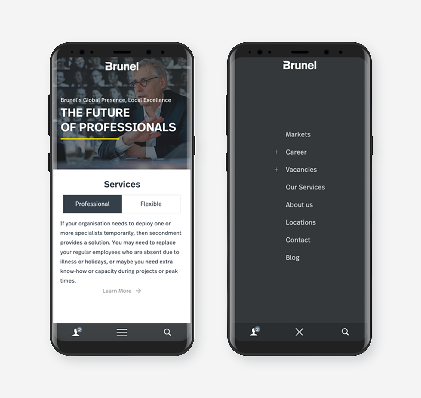
Hamburger menu inspiration
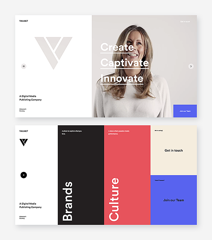
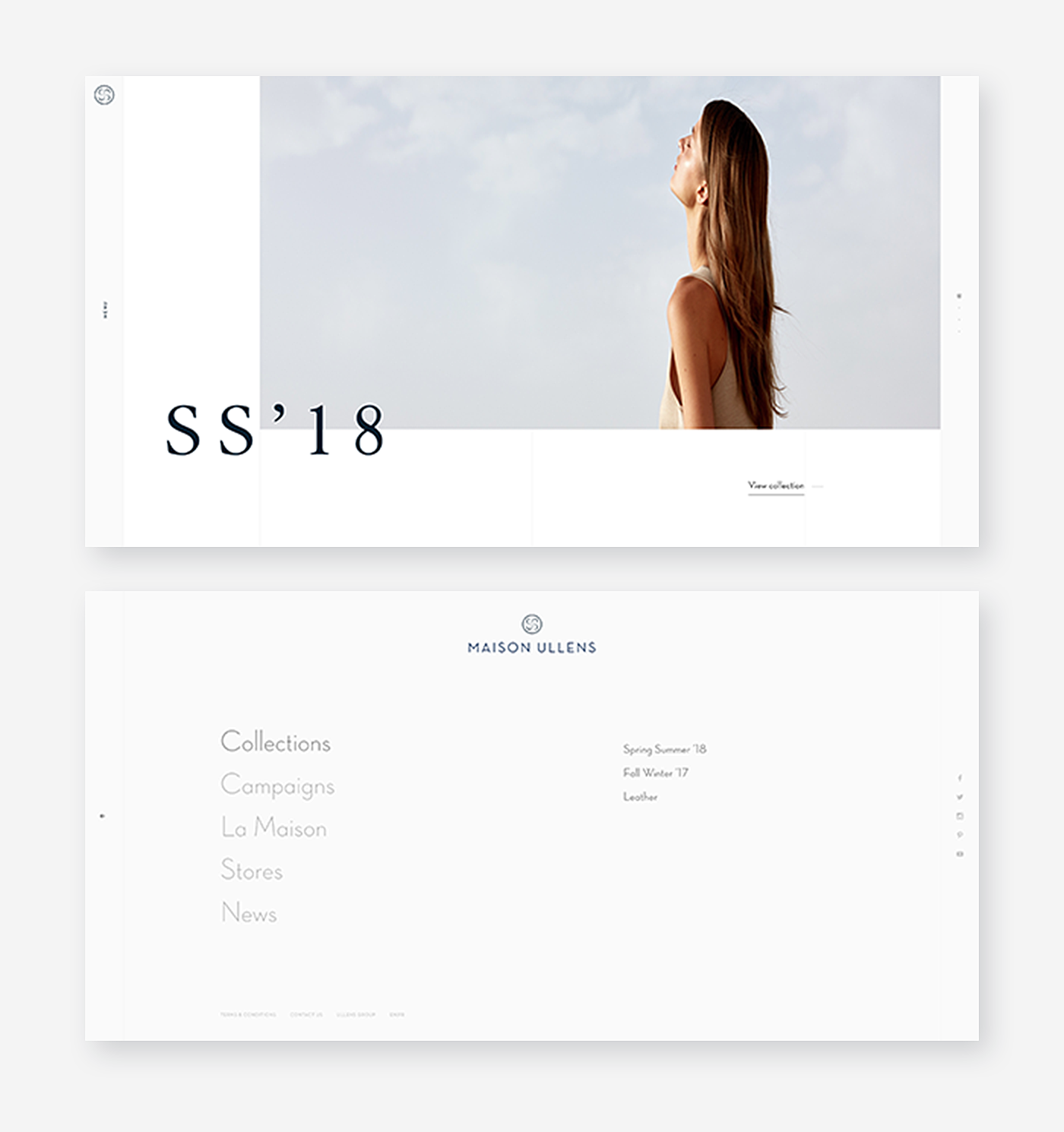
Now that we have shed some light on the pros and cons of hamburger menu and learned some best practices of its design, it’s time to take a look at some decent hamburger menu website examples:
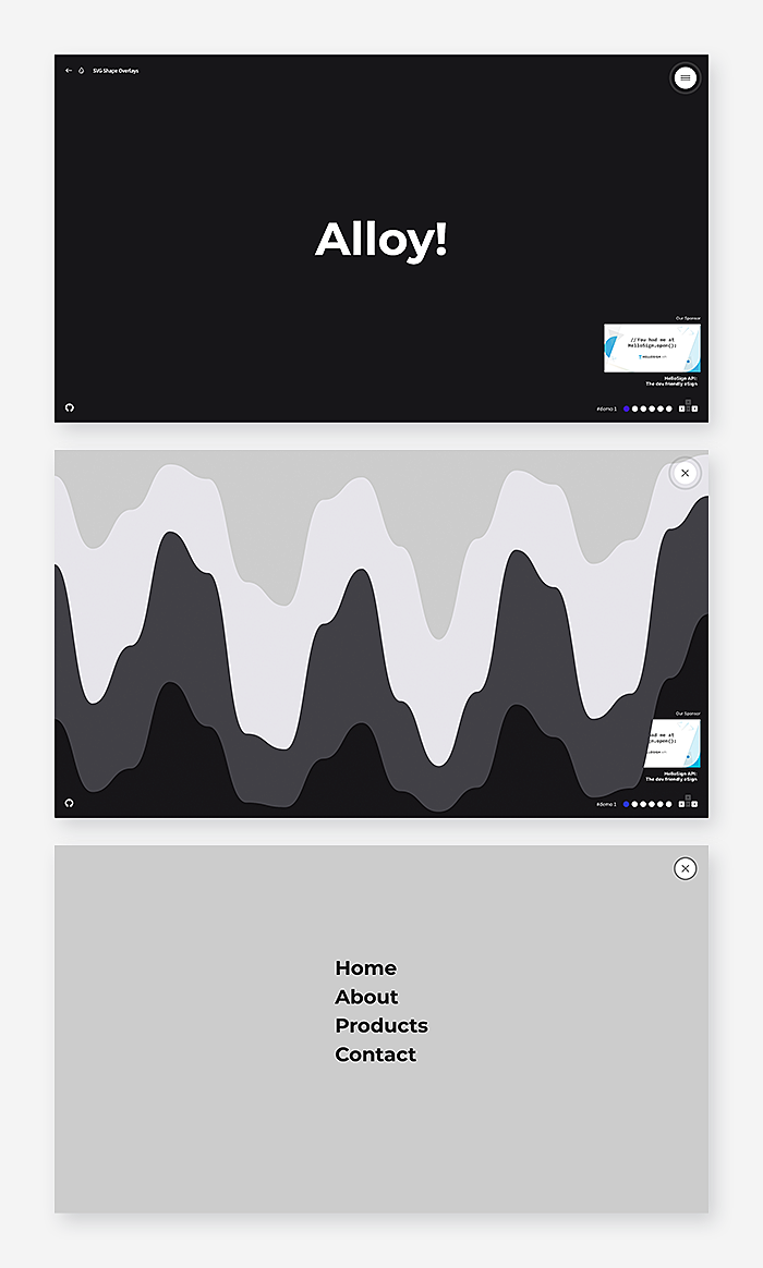
Source: Awwwards
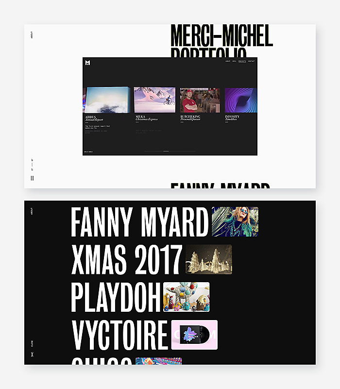
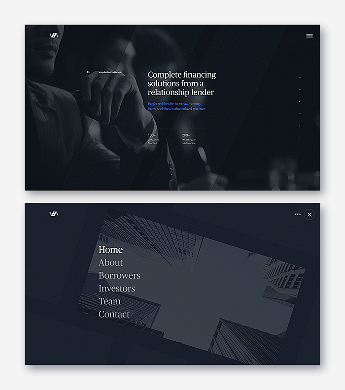
Source: Patrickheng
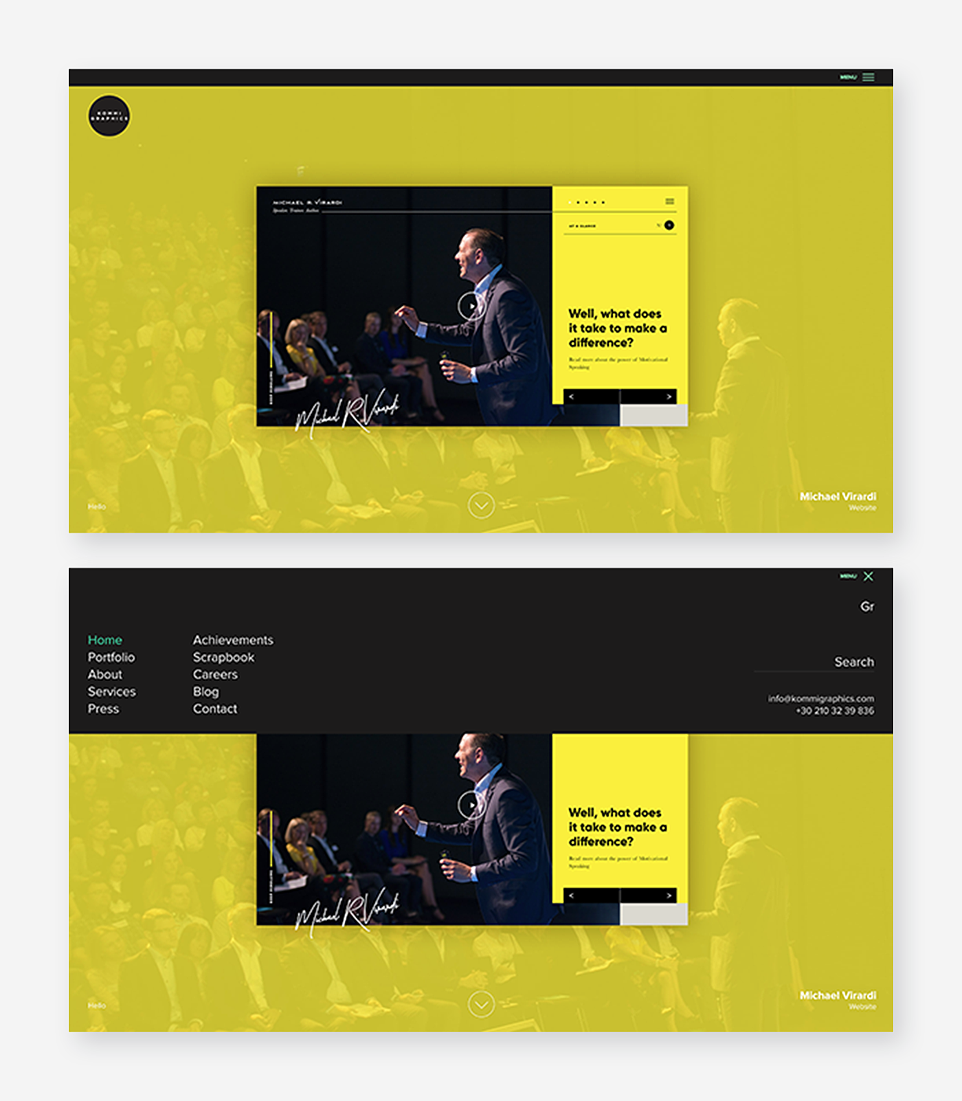
Source: Kommigraphics
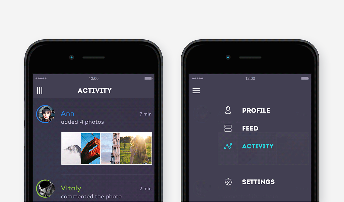
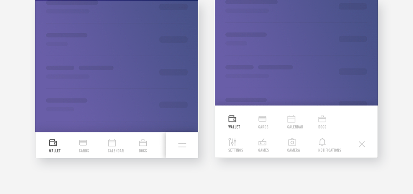
And here are some hamburger menu mobile examples - with custom icons, smart interactions, and minimalistic design:
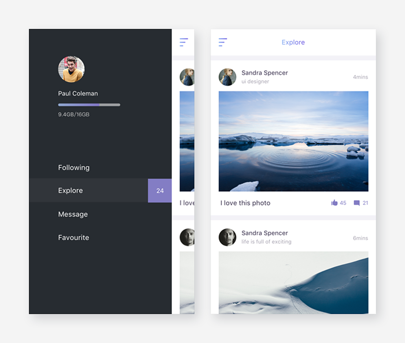
Source: Dribbble
Source: Dribbble
Source: Dribbble
Source: Dribbble
Source: Dribbble
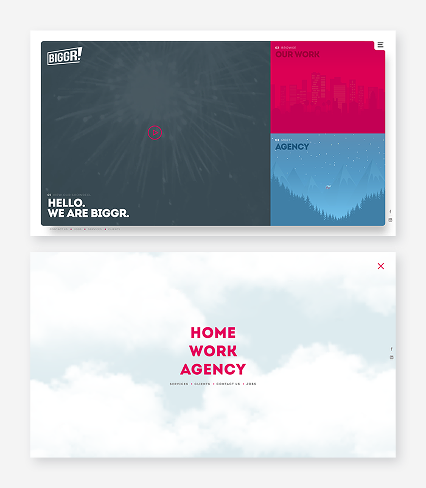
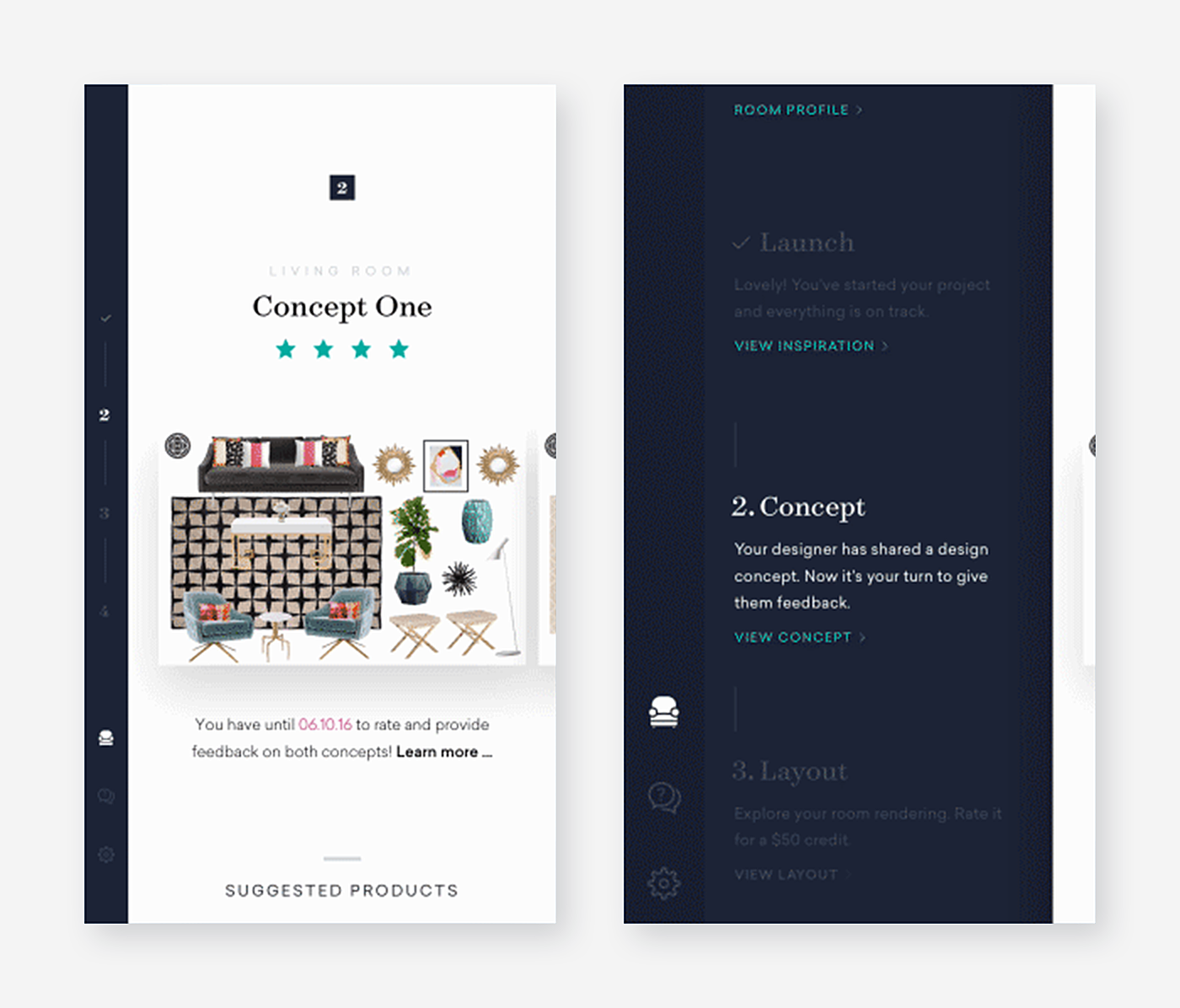
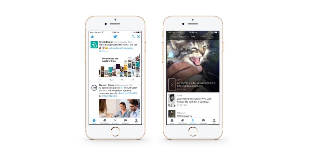
Alternatives to the hamburger menu
Let’s be straight: sometimes cons outweigh pros and require an alternative to hamburger ui menu design. If you doubt the effectiveness of a hidden menu and feel that users will miss something important without visible sections, we suggest you consider these alternatives:
“Add” button
With this UI, the main menu functions are presented on the home screen and optional ones pop up upon clicking the “add” button.
Source: Сdn-images-1
Sticky navbar
In the web interface, it often makes no sense to hide the menu at all. As LMS developers, we know that some products like online courses require to be always in sight.
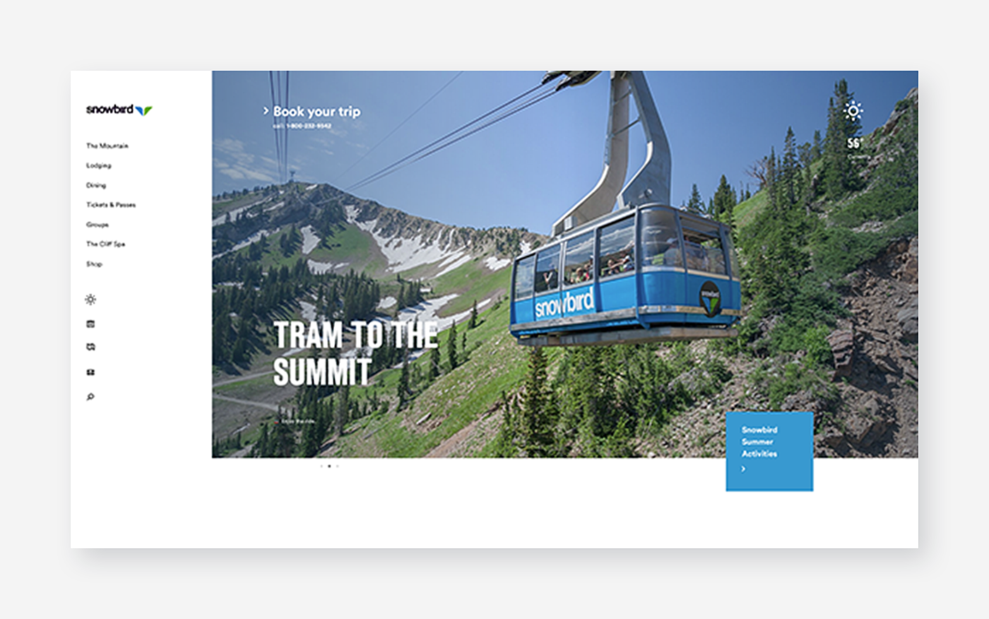
Source: Snowbird
Single page dot navigation
Long-scrolling pages is a popular trend of recent years - why click and search when you can scroll down and down, see everything and find what you need?

Source: Codropspz-tympanus
Swipeable contextual menu
A swipeable menu works well for mobile app interfaces in which you click on the feature and swipe for more options to deal with it.
Source: Dribbble
Narrow vertical
A narrow vertical sidebar which turns into a full-screen menu and rolls back when you select the necessary section - it saves space but is not a widely accepted pattern, and might be difficult to notice.
Source: Dribbble
Tabs
The bottom tabbed menu must be one of the most popular solutions for mobile. It comes in handy when the menu is small. In other cases, it works well stacked on top with drop-downs.
Source: Dribbble
Hamburger variations
Sometimes the problem is that a hamburger button doesn’t imply menu for an inexperienced user. In this case, it’s reasonable to have hamburger menu pattern but label the icon with a word.
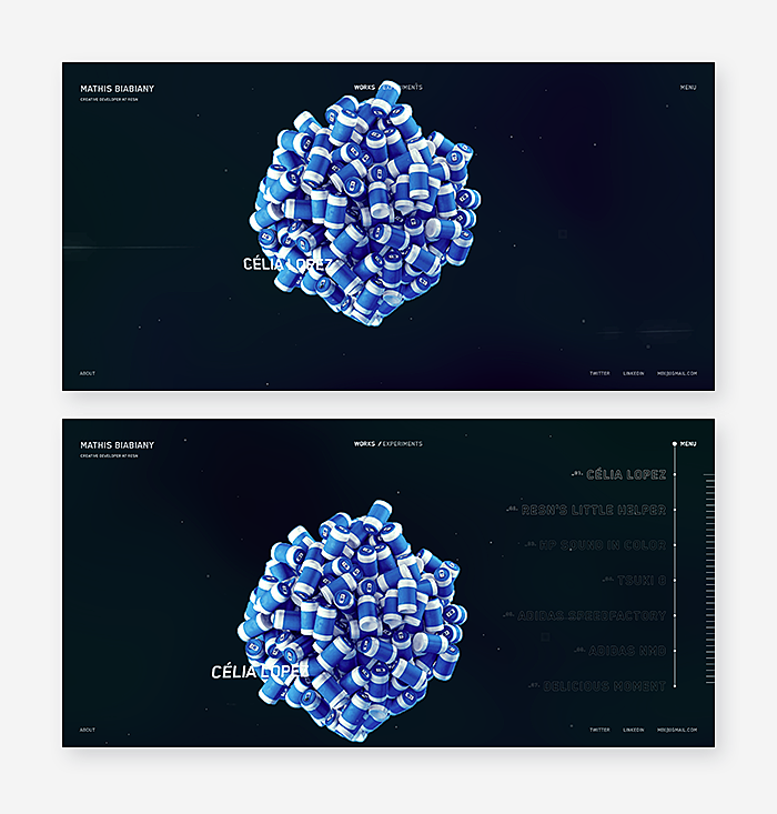
Source: Mathis-biabiany
Central vertical
The simpler, the better. Don’t hide the menu, put it right in the center of the screen.
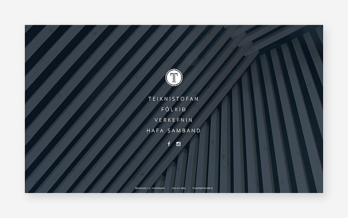
Source: Tvihorf
Progressively collapsing menu
Unlike the hamburger, a progressively collapsing menu offers several options, plus the full stack of options and the “more” button.
Floating menu
A floating menu might be one of the best hidden navigation options. Users do not need to look for a hidden menu, a floating panel follows the user across screens.
Source: Dribbble
Final word
The key take-away from this article is that the hamburger menu is neither good nor bad but it fits individually to each specific context and audience. That’s why it’s critical to run tests and consider alternatives. Do you know what type of navigation suits your company best? Feel free to drop us a line in the live chat to discuss.


Rate this post!
175 ratings, average ratings is 4.2 out of 5

Related Posts

01 October 2020
Your Ultimate Guide to Successful User Experience Research
Your UX Research step-by-step guide to benefits, approaches, methods, tools, conferences, and influencers.
23 July 2020
How Developers Pick the Right UI Framework to Build Mobile Applications
Explore how the right framework is needed to develop apps for the ultimate user interface.
14 March 2018
17 Examples of Login Page Design & Best Practices | AGENTE
The success of websites and mobile apps depends on a variety of factors, and UX is not the last on that list. Such a small constituent as a login form usually plays a crucial role when it comes to UX. An attractive login page may turn a first-time website visitor into a loyal friend, while a poor login page design may increase the bounce rate.

08 March 2018
Buttons in UI Design: Best Practices for Button Design | AGENTE
How do you describe a UI button design in three words? We picked these: “action upon touch.” Indeed, the main goal of putting buttons on a website is to enable users to take action and complete one or more tasks. That’s why it’s vital for great button design to make these actions visible and unambiguous, thus empowering user flow and navigation.
13 April 2017
10 Great Examples of Website Navigation Design
What is web navigation? Why is website navigation a top priority for any site? Web-development studio Umbrella IT is here to answer all your questions.

16 January 2024
ChatGPT Plugin Development: Features and Benefits for Business
Explore the process of crafting a ChatGPT plugin tailored precisely to meet your unique business requirements.
Let's talk
Is there a challenge your organization or company needs help solving? We’d love to discuss it.

Managing Director, Partner
Andrew Terehin

Thank You!
Your message has been successfully sent.
We will contact you very soon.