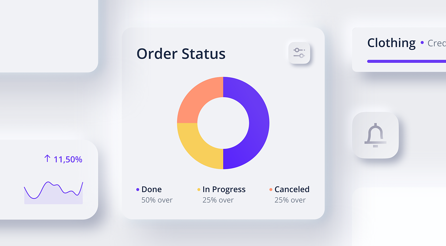
Welcome a new design trend – neumorphism! It seems like everyone’s in the design community talking about this trend in recent months.
Neumorphism – new skeuomorphism – is a new term in UI design that is used to describe graphical elements that mimic real-world objects, like buttons.
Unlike skeuomorphism, the fresh trend doesn’t look very realistic. Instead, neumorphic elements extrude a little from the background making using inner and outer shadows to create an illusion of volume shapes.
Being inspired by that trend, we at Agente couldn’t resist making our own set of neumorphic icons for one of our target industries – e-commerce. Our set consists of 20 most popular e-commerce icons that come in black and white colors.
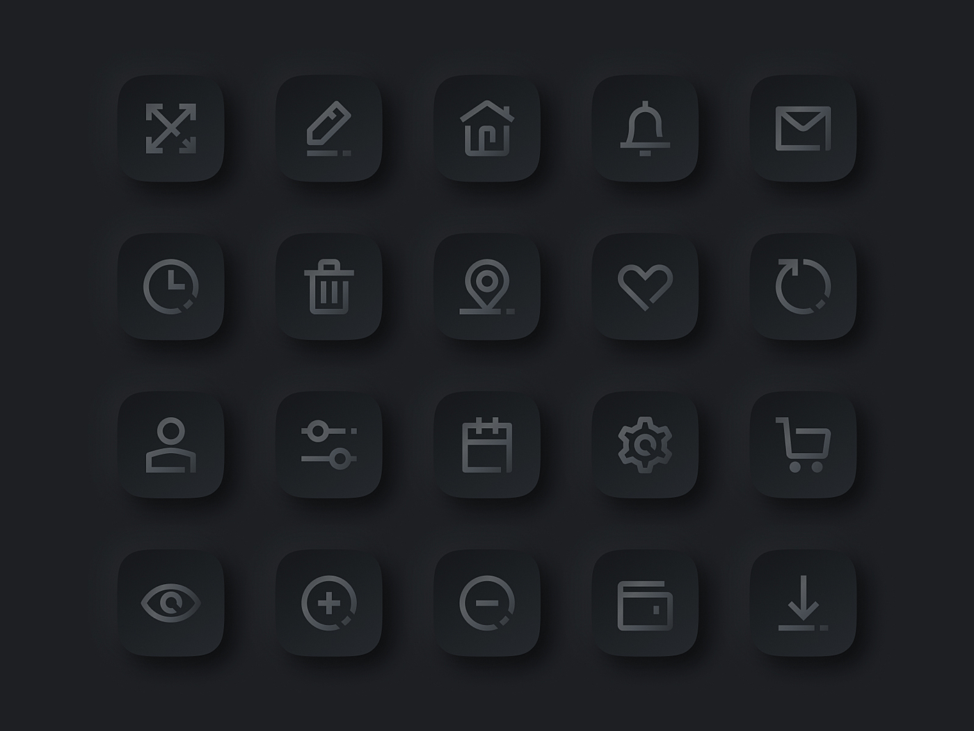
And the main news is…. You can download them absolutely for free! Just click the link below and read the instructions inside on how to use it:
You are very welcome to mention our work on social media if you like it!
Remember that neumorphism is not a replacement to flat design. It’s a great addition to UI that is meant to make the interface more interactive, thus more engaging for users (as the legend has it).
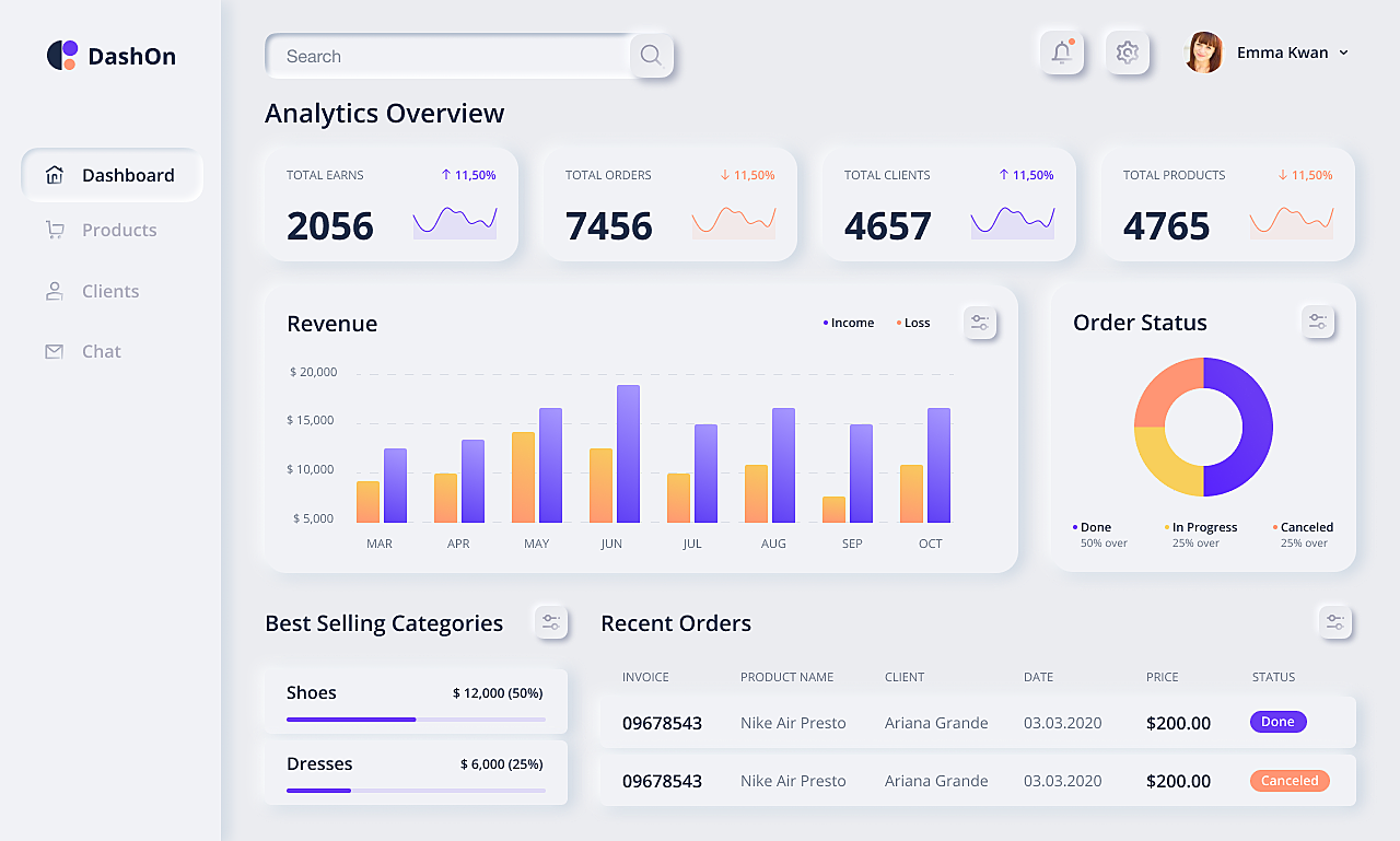
Just take a look at how we played around with the trend to freshen up an e-commerce dashboard. We added some shadows and highlights to the main cards and applied some of the icons from our custom set. And here’s what we’ve got:
Do you like the new trend? What do you think about neumorphic design? Share your opinion with us.
Rate this post!
728 ratings, average ratings is 4.4 out of 5
Related Posts
05 January 2024
10 Best 404 Error Page Designs for 2024
In our new blog post, we review the best 404 page design examples of 2019 that will never disappoint you even if you meet the dead end on the website.
26 May 2022
10 Best Examples of Beautiful Blog Design | Agente
In this article, you'll find 10 best examples of beautiful blog design, along with the tips that can help you enchant visitors.
29 April 2022
How to Design a User Profile Page in 2022
User profiles can become a constant flow of customer-related data that is extremely useful for marketing. How to design a user profile page? Read in our new article.
20 October 2020
How to Design a Website For Black Friday & Cyber Monday?
In this article, we will talk about how to create an attractive and selling website design for Black Friday and Cyber Monday. Let's take a closer look at each step of creating such a website.
14 November 2019
How to Design Dark Themes for iOS Apps?
In this article, we’ll touch on the basics of dark themes and share some tips on how to design them. In the end, you’ll find our dark concepts of the popular apps that haven’t accepted the trend yet.
14 February 2019
18 Examples of Mobile Checkout Form Design
After reading this article, you’ll find out the features that improve checkout design and, hopefully, get some inspiration from checkout page design examples.
Let's talk
Is there a challenge your organization or company needs help solving? We’d love to discuss it.

Managing Director, Partner
Andrew Terehin

Thank You!
Your message has been successfully sent.
We will contact you very soon.


