13 October 2022
3D Software UX UI Audit Explained [Case Study for JP Interactive Viewer]
Nowadays, the struggle for user satisfaction is growing. Much attention is paid to users' interaction with services, products, and digital platforms.
While aiming to improve your current product, taking an unbiased look at the current design solution could be a huge challenge.
This is why the UX audit process can help to identify problem areas and bottlenecks of the current product interaction and, on the other hand, provide fascinating insights and solutions for product improvements.
The usability audit can clearly define all weaknesses and product strengths. And thorough and professional UX audit report gives a workable structure for future improvements and new features implementation.
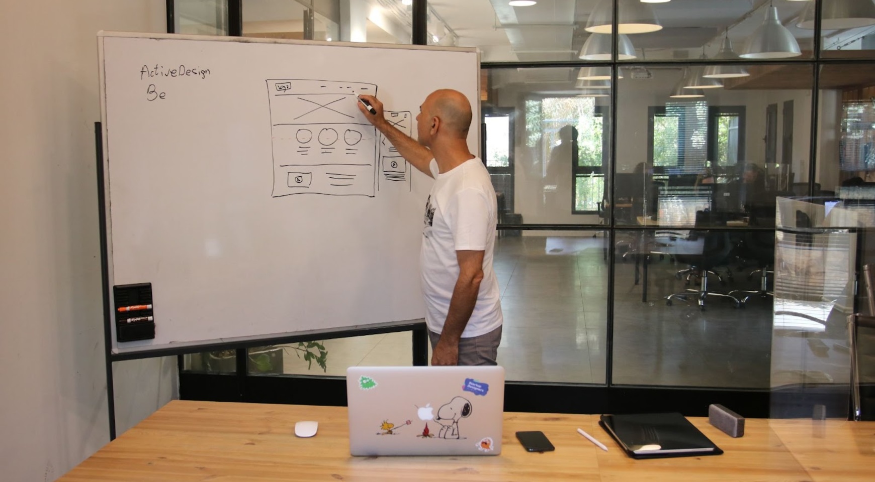
Based on the experience of the Agente team with UX audit for 3d visualization software, we are happy to share the main principles and steps that involve the software UX audit process.
Why Did the client need a UX Audit Service?
There are several typical reasons why a client or product manager in a company working on creating or improving a digital product comes up with the idea to start a UX audit. The most common reasons are:
- A growing number of user requests that the product is somehow inconvenient or poorly thought out.
- The product team independently engages in user interaction analytics with the product and notices that the conversion is falling on some key user flows. Users do not see some critical UI controls or do not understand how to use them.
- The current interface design of the product is outdated, but the client does not want to implement a new version of the interface, simply recoloring the buttons. He wants to improve the user experience simultaneously with the UI redesign process.
JP Global Digital contacted us because they knew we already have previous successful experience designing and developing systems that work with 3D and Digital Twin technology but in the field of Property Technology.
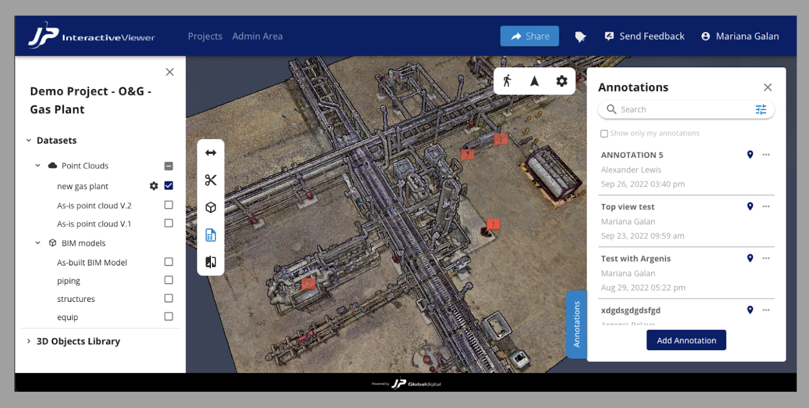
The core product of JP Global Digital at the moment is the system that allows users to share, visualize, manage, analyze, and get insights from complex 3D datasets by being a central data hub for different data assets such as point clouds, 3D meshes, BIM models, and images in 360 format. JPIV cloud-based capabilities allow everyone to convert massive 3D datasets into actionable insights while improving team collaboration.
As more and more real users connected to the system, the JP team noticed, with a growing number of user requests, that some parts of the system, or the overall navigation logic in general, were not user-friendly or could be improved from the UX design perspective.
JP's top management and key stakeholders on the client side understood that user satisfaction, as well as a positive UX experience, is a crucial component of the success of any digital product or solution. Therefore, they decided to engage the Agente team to conduct a UX audit of their software.
Typical Problems of The Product & Why They Happened to
The issues identified during the UX audit process are typical in most cases. Most appear because, at the product design stage or ideation stage, little attention is paid to user interaction design since developers focus more on implementing a specific set of functionality.
Or during the development process, the project randomly grows with additional functionality or is generally pivoted into some other product, and originally thought-out UX logic either stops working or worsens.
We faced issues during the JPIV ux audit for 3d visualization software.
1. Information Architecture and Navigation issues
The overall navigation logic of the JPIV product had several shortcomings. Most likely, this was due precisely to the fact that the product quickly acquired new functionality and changed a lot during the MVP development process. The developers did not pay due attention to the design of the general navigation logic, and did not think through User Flow Maps in detail, did not design the Information architecture map.

2. The Lack of consistency of UI elements, wrong grouping, and illogical arrangement on the screen
If a product or system develops in a patchwork manner and the primary navigation logic is poorly thought out, then; as a result, problems begin on the screens or pages of the system themselves.
For example, during the audit of JPIV, we encountered UX inconsistencies in the same functional UI elements, their illogical arrangement on the screen, a poor grouping of the toolbars, and so on.
3. The UI design issues
Visual inconsistency and clutter in the organization of the UI library of elements, are most often a consequence of problems we have already identified in the previous steps. In the JPVI project, we faced the same set of problems.
The same functional elements, such as buttons or other controls, have a different visual representation. That leads to users' confusion and reduces the satisfaction of using the system.
The phases of the Digital Product UX Audit Process We Conducted for JP Interactive Viewer
1. Stakeholder’s Interview
Any software product UX audit starts with stakeholder interviews. This stage is very important and allows us to get into the head of the project's primary stakeholders, see the problems through their eyes, achieve perfect synchronization, and equally understand the overall goals they want to achieve through the audit process.
Typically, stakeholder interviews can contain from 20 to 40 questions, which are grouped into main sections such as
- Stakeholders
- Business Goals
- Audience and Customers
- Value Proposition
- Product
- User Goals
- Competitors
- Technologies
- Obstacles
This time, we prepared a list of 40 questions and interviewed different people from the JPs’ top management. The main task during that stage was to collect people from the different departments (business, marketing, product, and development departments) to get a combined and balanced vision of the product improvements.

It is crucial to conduct interviews separately with each participant, to try to build an open and trusting conversation to get the most accurate answers.
We summarized the results of the interviews of all participants in a standard table, removed duplicate answers, and re-arranged the answers in order of importance.
2. Data Analysis
Data is a new oil nowadays. Usually, we also perform the Data analysis stage if the user interaction data were gathered before.
But not all projects use any analytical tool to collect information about how users interact with their product, or the amount of this data may be too small and unrepresentative if the product has a small audience so far.

In this case, when working with the JPVI project, we had to skip the stage of working with data due to their absence.
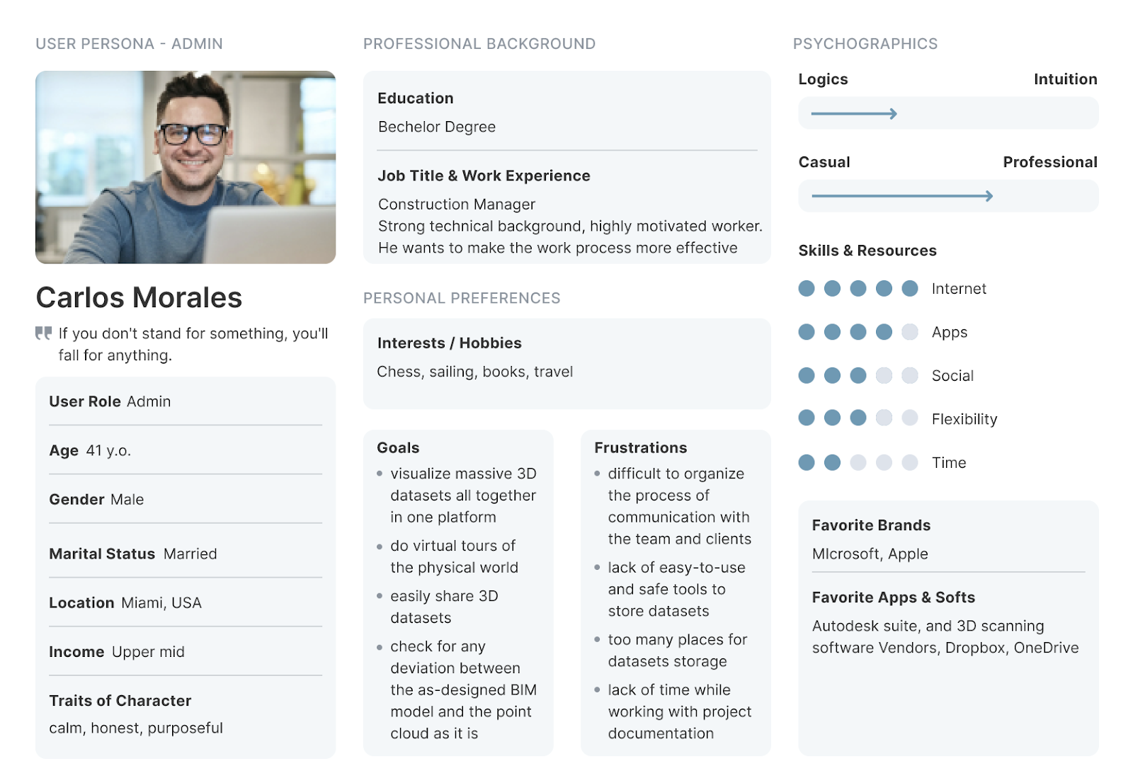
3. User Research: Proto Persona Mapping
The User Research stage is often needed for projects just being developed to create the proto user for whom the product will be created. But in the case of a UX audit, the product already exists. This stage is helpful first for studying the behavior of existing users and a more transparent visual representation of the most typical Personas.
We devised a typical User Persona during the Persona mapping workshop and the information gathered in the previous stage.
During a workshop, we went through the following stages:
- Identification and segmentation. To begin with, participants identify all the possible people who could use the system, then group similar users.
- Demographics and environment. We determine the demographic characteristics for each group, how old these people are on average, what gender they are, where they live, their education, interests, and hobbies.
- The goals of using the product and the tasks they solve. We define typical goals for each group and how and why they use the product.
- Narrow and problematic places. Difficulties encountered by users while solving their tasks.
- We fill in the cards of user personas. To consolidate all the information into a more substantive set, user cards are filled in, and all information is summarized.
4. User Research: Customer Journey Mapping
This process is a little similar to the previous activity; it allows you to achieve deeper detail and a level of approximation of the steps the user takes to achieve his or group of goals during product usage. It allows you to visually document how the user interacts with your product and what positive or negative emotions they experience.
We formed several user journey maps during the CRM workshop and captured the existing user experience, and user flows.
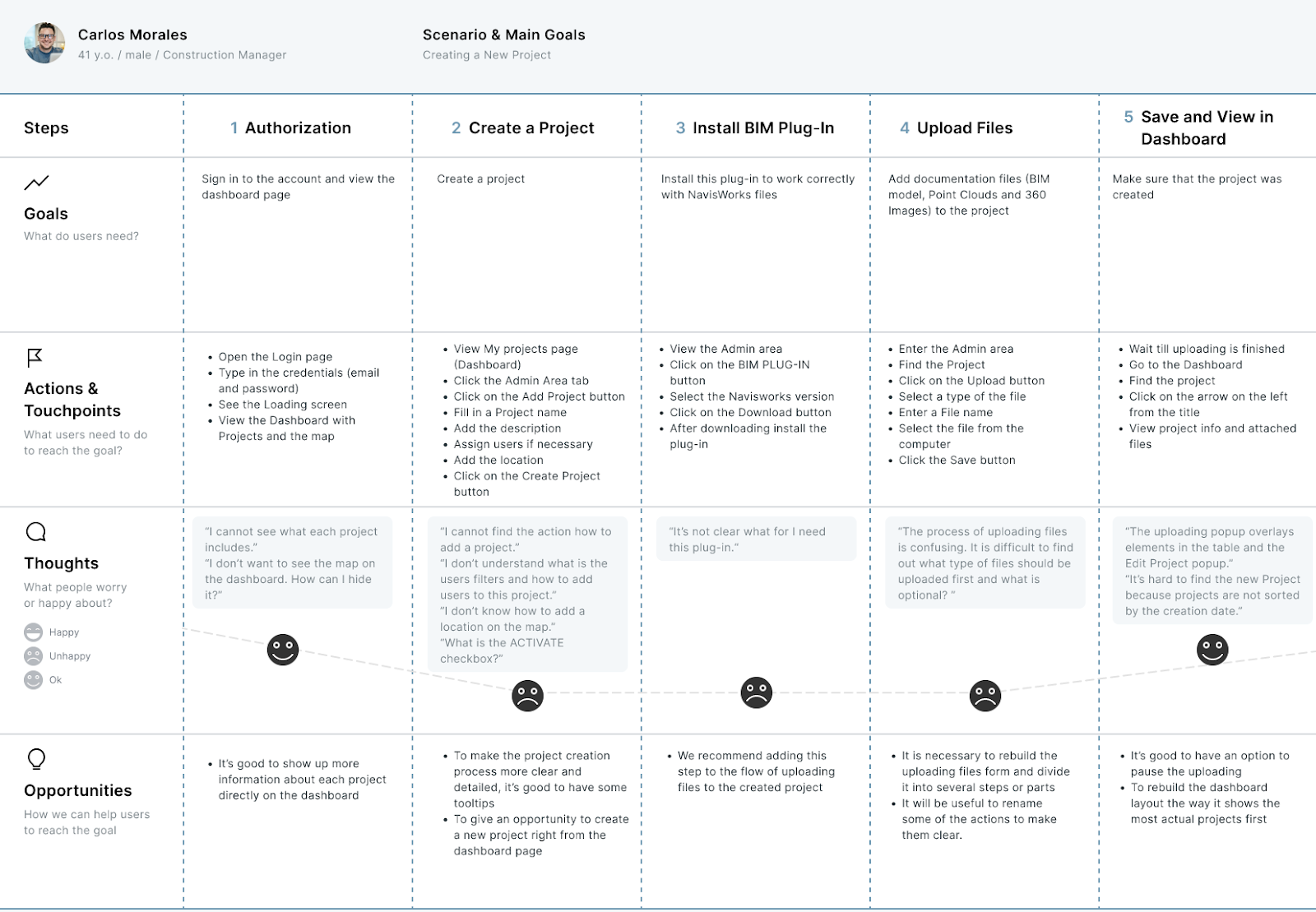
We defined the five most important user scenarios and created user journey maps for each of them. Then, we divided each scenario into the steps and actions that the user performed during those steps.
Then we described the typical user frustrations they faced during the product interaction during each step. And also came up with improvements for the same stages.
As a result, JPIV stakeholders received a visual and easy-to-read list of improvements to the product design.
5. Design and usability testing with Heuristic Evaluation
The next stage was the usability audit. Our main task at this stage is to analyze the visual interface and its usability aspects.
We use a technique Jakob Nielsen developed for the visual interface analysis called heuristic evaluation based on ten UX rules (heuristics). These ten heuristics usability principles are the basic rules that help auditors identify UI design usability problems.
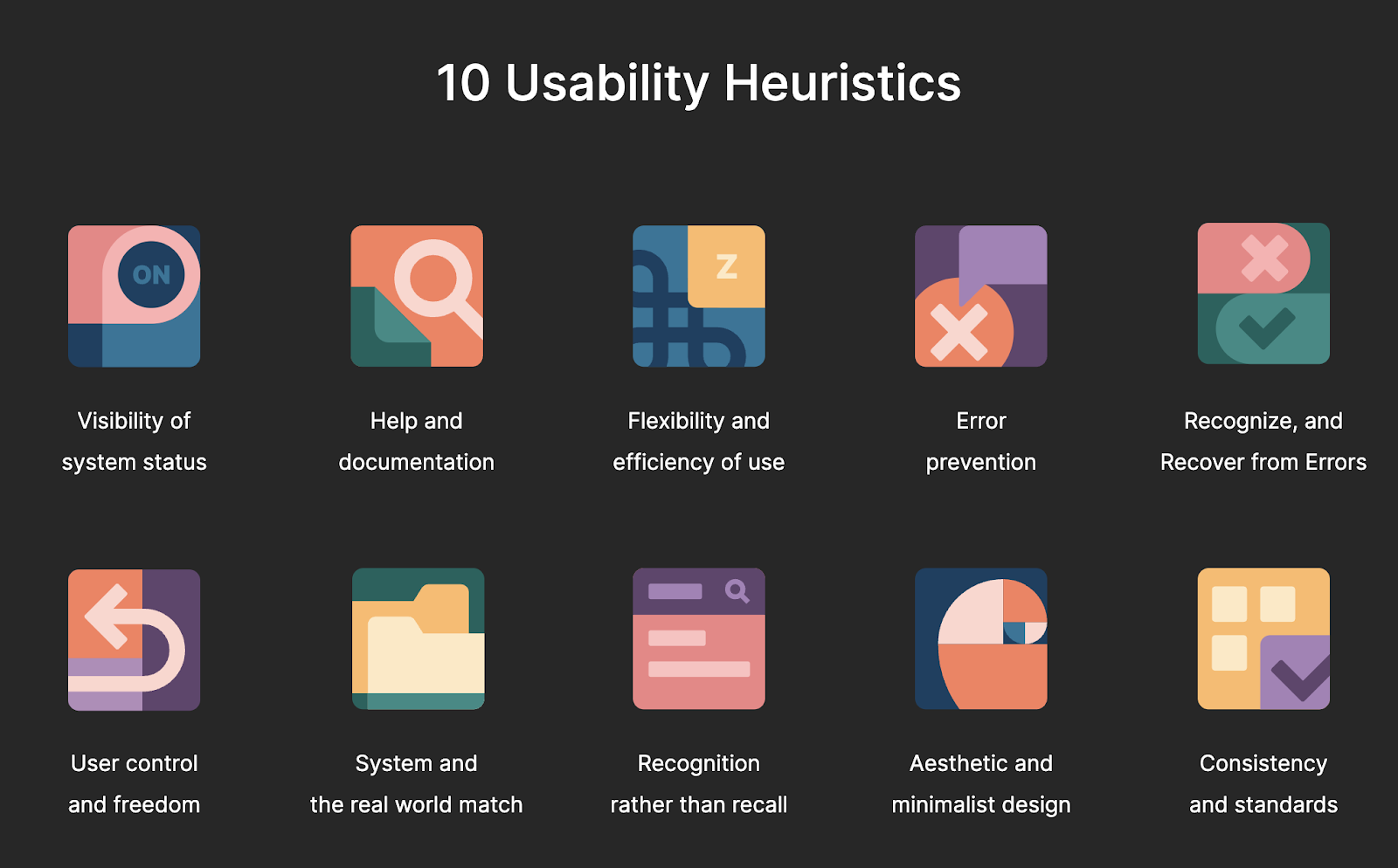
This part of the audit is one of the most difficult and takes the most time. Since several UX specialists participate at once, they methodically click through the entire user interface of the product, executing user scenarios defined in the previous stages and fixing all the difficulties or shortcomings they encountered in interacting with the product.
Each problem that has been identified is correlated with ten basic usability heuristics, classified and also ranked by importance, from very important to unimportant, and recorded in the list.
As a result of this stage, the lists of all participants are merged, all issues are ranked, and finally, we get the final list, which is used to compile the final report.
During the heuristic audit of the JPVI product, we were able to identify about 50 issues, 18 of which were of high priority.
In the final software product UX audit report, each issue found was described and illustrated with an appropriate example showing how it could be fixed or improved.
6. The Final Outcomes and Report
The final stage of a usability audit is delivering a UX audit report.
During this step, we gathered all findings, recommendations, results of previous stages, and conclusions together in one well-structured PDF document of around 90 pages.
Report format and structure may vary depending on the complexity of the projects, the client’s needs, and expectation. But primary sections stay the same.
The main sections of the JPIV report were as follows:
1. Audit Methodology.
2. Stakeholder interview.
3. Proto persona and customer journey mapping.
4. Heuristic evaluation. The findings describe each issue in detail with examples of best UX practices.
5. Summary of the audit. Outcomes with recommendations for UX/UI design improvement.
The demonstration of the final report can be done in person or online. During the final demonstration, our experts provide all the audit results, explain the findings, and answer the client's questions.
If you are interested in getting more details about the UX audit process, You can read our UX audit checklist article.
Some Screens/Sections That Have Been Usability Audited during JPIV audit
We audited the entire JPIV platform on behalf of different types of users, but let's look at a few examples:
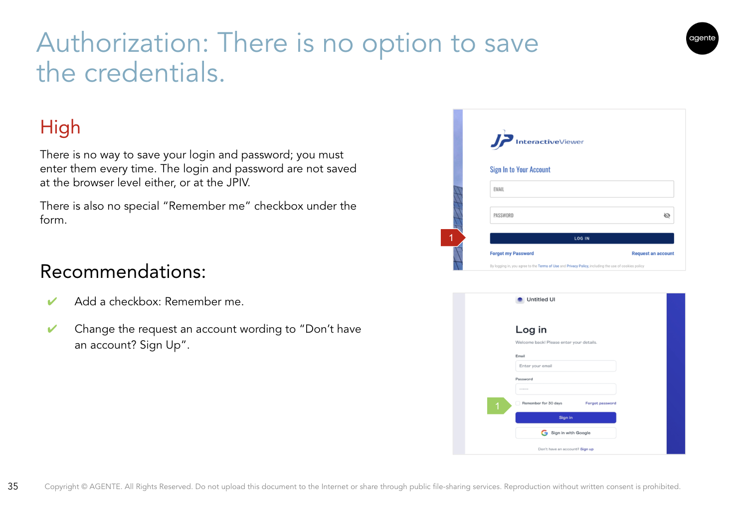
The Authorization screen
There is no way to save your login and password; you must enter them every time. The login and password are not saved at the browser level or the JPIV side.
There is also no special “Remember me” checkbox under the form.
Recommendations:
- Add a checkbox: Remember me.
- Change the request to an account wording to “Don’t have an account? Sign Up”.
The Dashboard
The map is taking up too much space on the dashboard.
When clicking a place on the map, it just opens the project details. It’s not informative or functional.
Recommendations:
- Add an option to hide the map.
- Make it more functional, e.g., add an option to open up projects on the map.
- This space could be used to add more project details without hiding them.

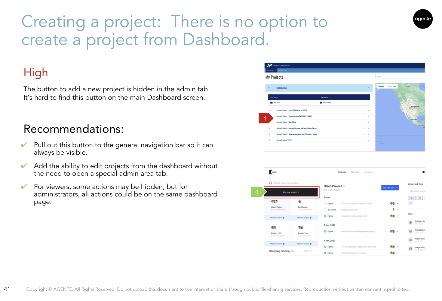
Creating a project
The button to add a new project is hidden in the admin tab. It's hard to find this button on the main Dashboard screen.
Recommendations:
- Pull this button to the general navigation bar so it can always be visible.
- Add the ability to edit projects from the dashboard without the need to open a special admin area tab.
- Some actions may be hidden for viewers, but for administrators, all actions could be on the same dashboard page.
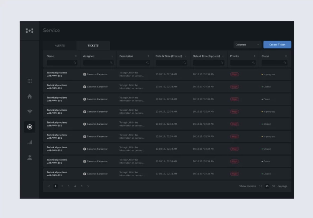
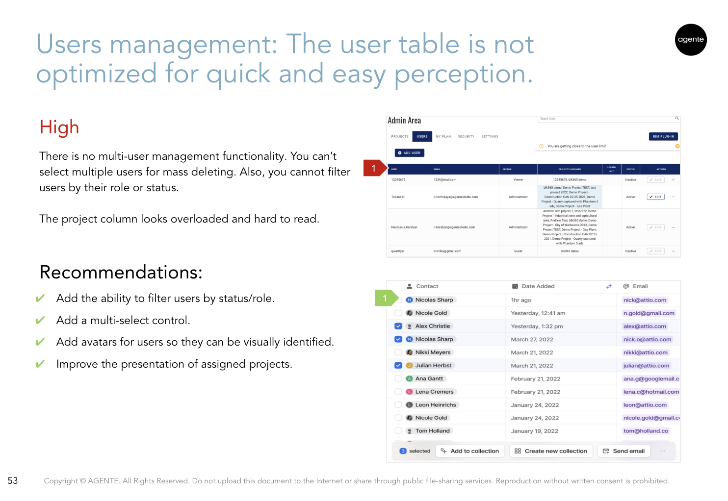
Users Management
There is no multi-user management functionality. You can’t select multiple users for mass deletion. Also, you cannot filter users by their role or status.
The project column looks overloaded and hard to read.
Recommendations:
- Add the ability to filter users by status/role.
- Add a multi-select control.
- Add avatars for users so they can be visually identified.
- Improve the presentation of assigned projects.
Working with Project
The toolbars in the open project window are badly grouped and organized, which could confuse the user.
Recommendations:
- Re-group and redesign the location of the main toolbars to provide a better intuitive user experience.
- Try to avoid a lot of small toolbars in disparate parts of the screen. It is better to unite tools that logically can be in one toolbar group.
- Remove view parameters (BIM, cloud, 360) to global level navigation or the top bar. Or design this section just like icons to look different from the main toolbar.

General highlights for improving UX for the software product
To achieve better business results and to improve the user's experience, we recommended the following action items:
1. The Platform Information Architecture Review
During the software product UX audit, we discovered that the platform’s information architecture and navigation were chaotic.
We recommend following these steps:
- Define user personas and form the most typical use cases for them.
- Create the current user flows maps for each persona and finds bottlenecks.
- Update the information architecture of the platform based on use cases and user flows.
2. Update the page's layout and in-page navigation
We recommend creating new wireframes based on the revised information architecture, specific use cases, and user flows.
- We recommend creating a clickable prototype based on wireframes to validate the new navigation logic and ensure that it covers all use cases.
- If needed, we recommend running a user testing session at this level to ensure that all use cases are covered and that all the essential logic is designed properly from the user’s perspective.
3. Develop a consistent new visual UI style
- Design a new visual concept based on approved wireframes and prototypes.
- Define color and font styles.
- Unify layout grid and navigation.
- Unify the naming of buttons, menu bars, etc.
- Unify the visual style of icons and images.
- Create a unified library of all UI elements for future system improvements.
What's Next for JP Interactive Viewer
JPIV team received a full detailed review of the current platform user experience state, with actional future steps.
The Agente team works closely with the JPIV team and discusses new large blocks of work to improve and change the product.
Add a quote here
Conclusion
Sometimes product owners or developers may have a clear idea or hypothesis of how the product should work and how the user should behave. But the user's consciousness does not always work as the creators suggest.
With a professionally conducted software product UX audit, we can help bridge the gap between our understanding of user behavior and their experience.
This UX audit case study described just a part of our UX audit services. Feel free to contact the Agente UX team if you want more information and insights on how UX/UI audits from AGENTE can improve your product's business metrics and user engagement.


Rate this post!
424 ratings, average ratings is 4.3 out of 5

Related Posts

16 January 2024
ChatGPT Plugin Development: Features and Benefits for Business
Explore the process of crafting a ChatGPT plugin tailored precisely to meet your unique business requirements.

09 May 2024
Top 7 Open-Source LLMs for 2024
Here, we break down everything you need to know about open source LLM models: top 7 offerings on the market, their pros, cons, and capabilities.

19 January 2024
AI Model Fine-Tuning: How to Use Your Organization's Data?
Organizations are transitioning from generic solutions to hyper-customized intelligence, seeking AI models designed to address their unique challenges and propel them toward strategic objectives.
This demand has propelled fine-tuning to the forefront of AI development.
07 May 2024
What are large language models: a complete guide
Get your large language model definition straight: in this article, we cover the concept of LLMs, their capabilities, types, and challenges.
Develop Custom Corporate Microlearning Platform
Custom microlearning solutions for corporate training: Discover how to develop a tailored platform for efficient and engaging employee learning

24 January 2024
Employee Training Management Software Development in 2024: Features and Cost
Streamline your employee training with cutting-edge software solutions. Explore the features and costs of employee training management software.
Let's talk
Is there a challenge your organization or company needs help solving? We’d love to discuss it.

Managing Director, Partner
Andrew Terehin

Thank You!
Your message has been successfully sent.
We will contact you very soon.