Restaurants just like any other business are highly interested in keeping existing customers, attracting new ones, and enticing those newcomers into coming back again and again. But the competition between these business establishments is much more intense than, say, ten years ago. Just imagine: there are more than one million restaurants in the US alone.
In today's digital age, the Internet offers innumerable opportunities to businesses, big and small. Restaurants can take advantage of these opportunities too. Developing a restaurant website is a natural step towards building an online presence and targeting new customers.
Create a restaurant website and it will become a primary source of information about your business for online visitors. Nine in ten people conduct some kind of online search to learn more about a restaurant before going to it. And, most importantly, more than half of guests access restaurant websites when selecting a place to dine.
In this blog post, we’ll give you some handy tips on how to build a restaurant website that will not only have an eye-catching design but will also focus on user experience.
How to Develop a Website for a Restaurant
When it comes to restaurant website development, usability comes first. A recent research showed that some delivery service providers don’t pay much attention to UX. Such an approach will ultimately lead to lost orders and customers. So be wise — make usability a priority and carry out a UX research on your rivals’ sites to get an idea of what is right and wrong.
Custom Design Vs a Customized Theme
How much does it cost to build a restaurant website? There are multiple factors affecting the project price, not the least of which is a website theme. If you decide to use a content management system like WordPress, you will need to select a theme for your upcoming site. The choice will be really hard: there are thousands of them on the official website only. You can choose any to your liking. But keep in mind that many themes are paid and they may cost a pretty penny.
If you believe that after you purchase a theme from a website builder and install it and that will be it, you’re mistaken. You’ll certainly need some customization to your needs, and that will involve some extra development charges.
Custom design is another option. It will be created from scratch and fully meet your needs and requirements from the very beginning, eliminating the need to customize it. Such a design in some cases may cost even less than a customized one.
Key Features
You certainly have some great features in mind for the site. But there’s some basic functionality that online visitors will expect from you. Remember the five-second rule and make sure to add the features described below to your site.
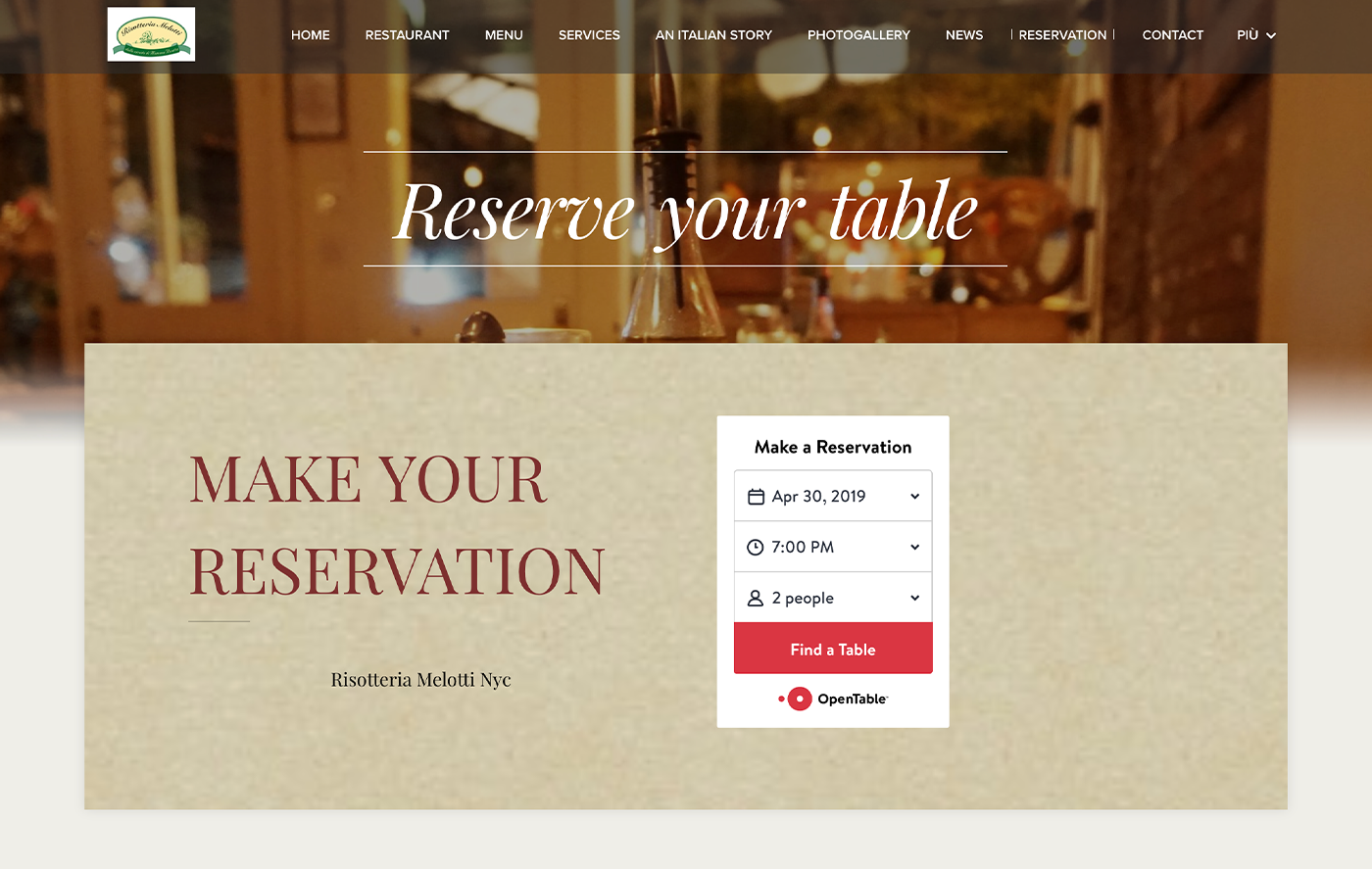
Online Booking
A restaurant website with a reservation system has greater chances to outshine competitors. This system saves people’s time and lets them check the availability and reserve tables 24/7.
Source: Risoterria Melotti NYC
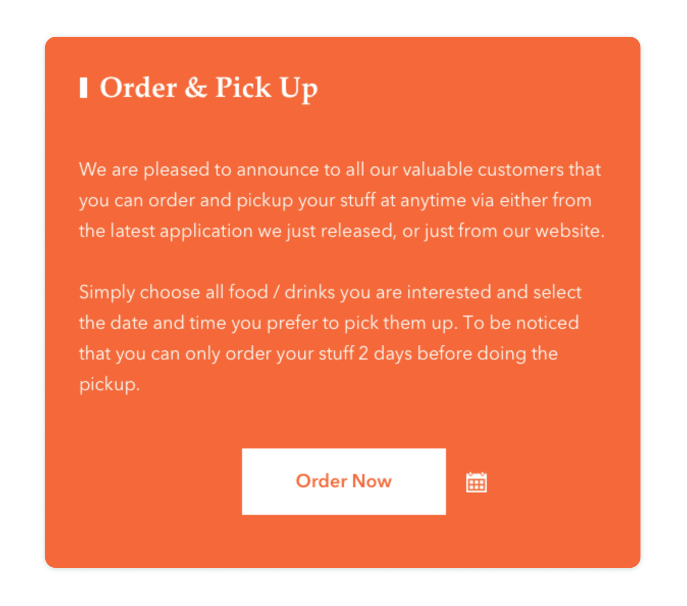
An online food ordering system is one more feature that is a must for businesses delivering food to their customers’ homes. Rather than routing visitors to the site of a delivery service provider, add this functionality to your site.
Effective food delivery system design should prioritize user experience, ensuring easy navigation and quick ordering processes.
The system will also work for businesses with a takeout service.
Source: Dribbble
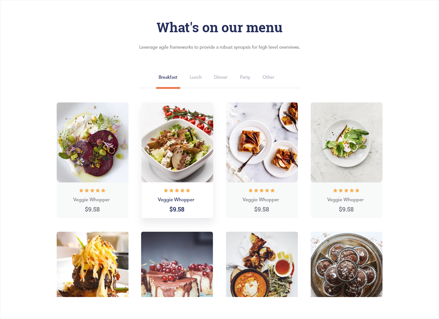
Menu with Real-life Photos
People want to know what’s on the menu before their first visit to a new place. So give them a chance to find it out by adding the menu section. Having real-life photos is also important — a list of ingredients won’t make their mouth water. But a photo will make it happen.
Source: Dribbble
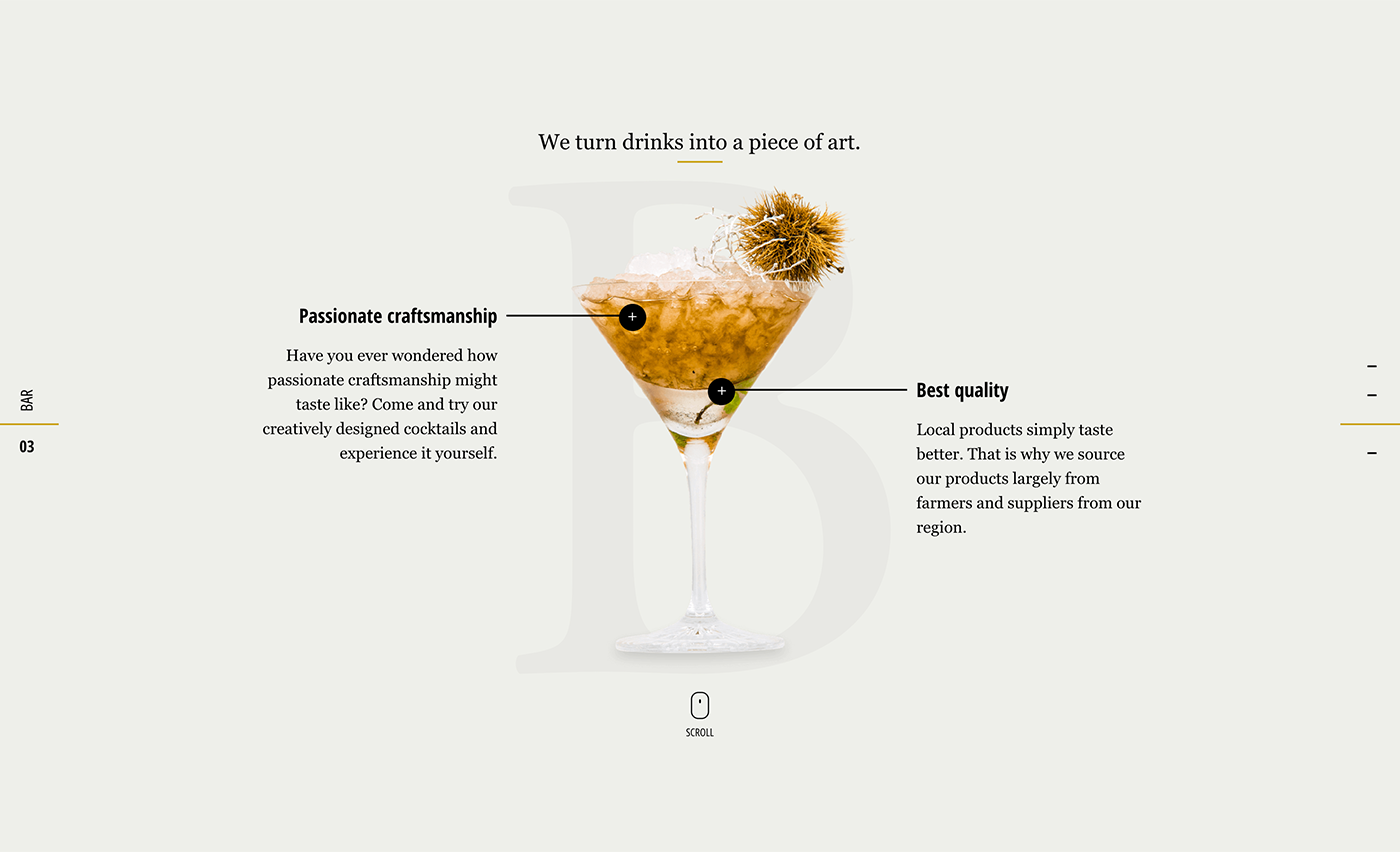
You may go even further by writing descriptions to hook site visitors and make them click the “Reserve” button.
Source: Vollerei
Photo Gallery
Interior design is one of the key factors contributing to customer satisfaction. So let your future guests know that they won't regret visiting your place by putting some great interior photos into the “Gallery” section.
It's also a bright idea to add some photos with people sitting inside to even more tempt users into visiting your place.
Source: El Burro
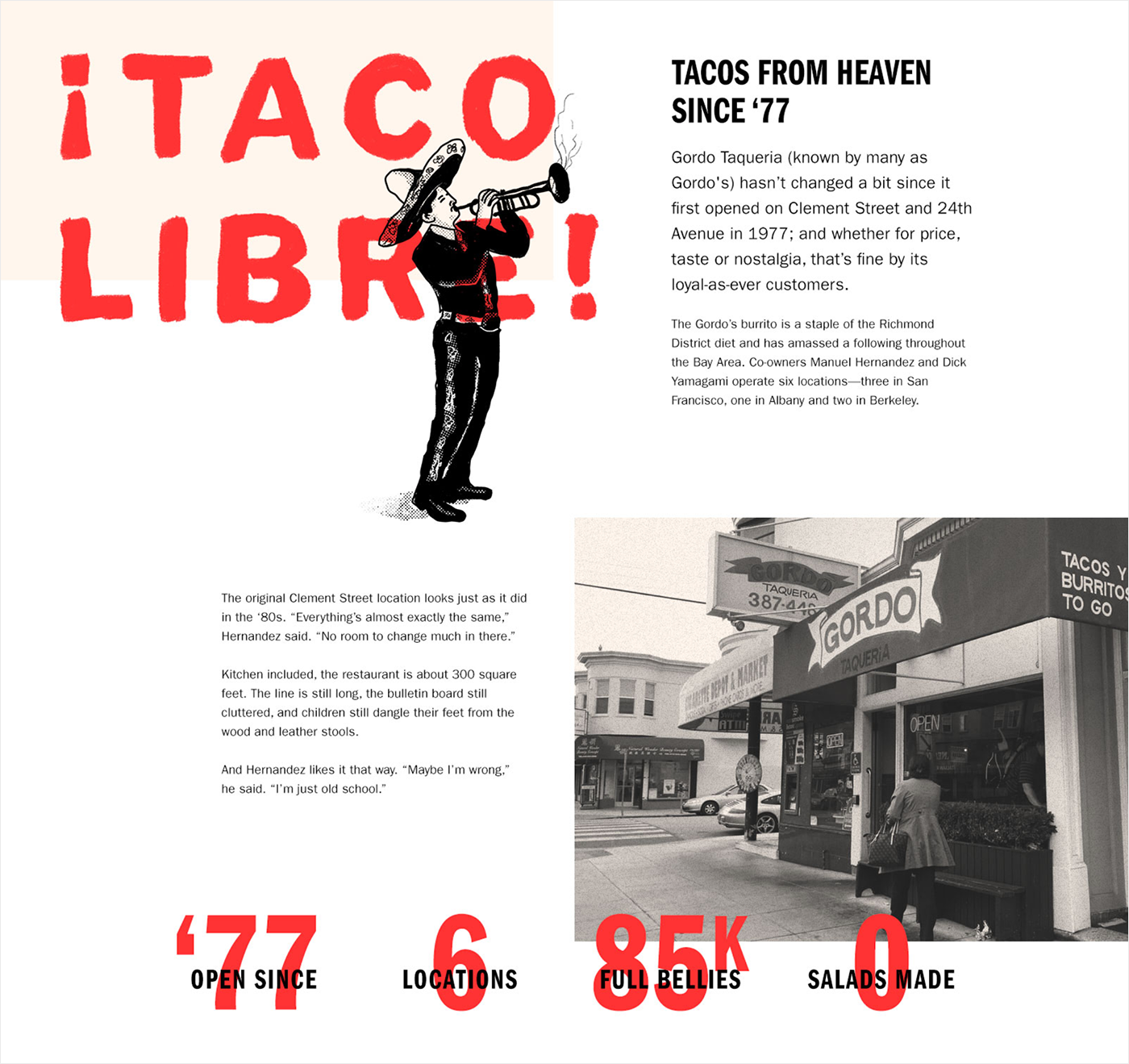
Our Story Section
Your business has some story behind. People love stories. Why don't you tell yours to others? This way you will pique their interest and gain a competitive advantage by making your restaurant memorable.
Source: Dribbble
Contact Us Section
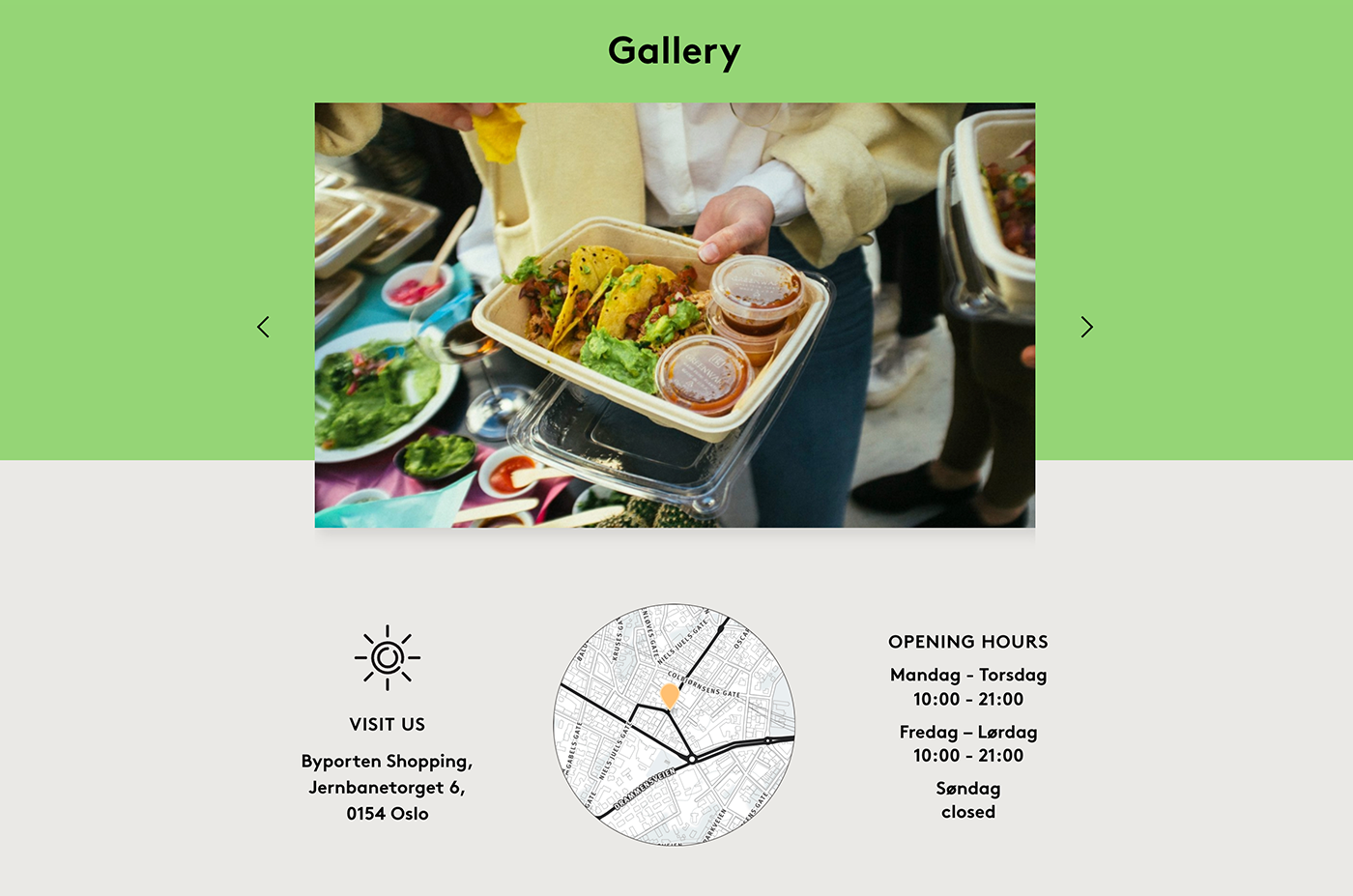
The importance of the “Contact Us” section is undeniable. How will guests know where your business is located, when you work, and what your contact phone numbers and email address are if you don't tell them?
Just imagine how frustrated they will be having to search this info on the web! So make sure to display your contacts on the site.
You may add this information to the footer to so that it will be available on every page of the website. Having a separate section is also important as there you will be able to provide more details like a Google map with your business on it.
Source: Dribbble
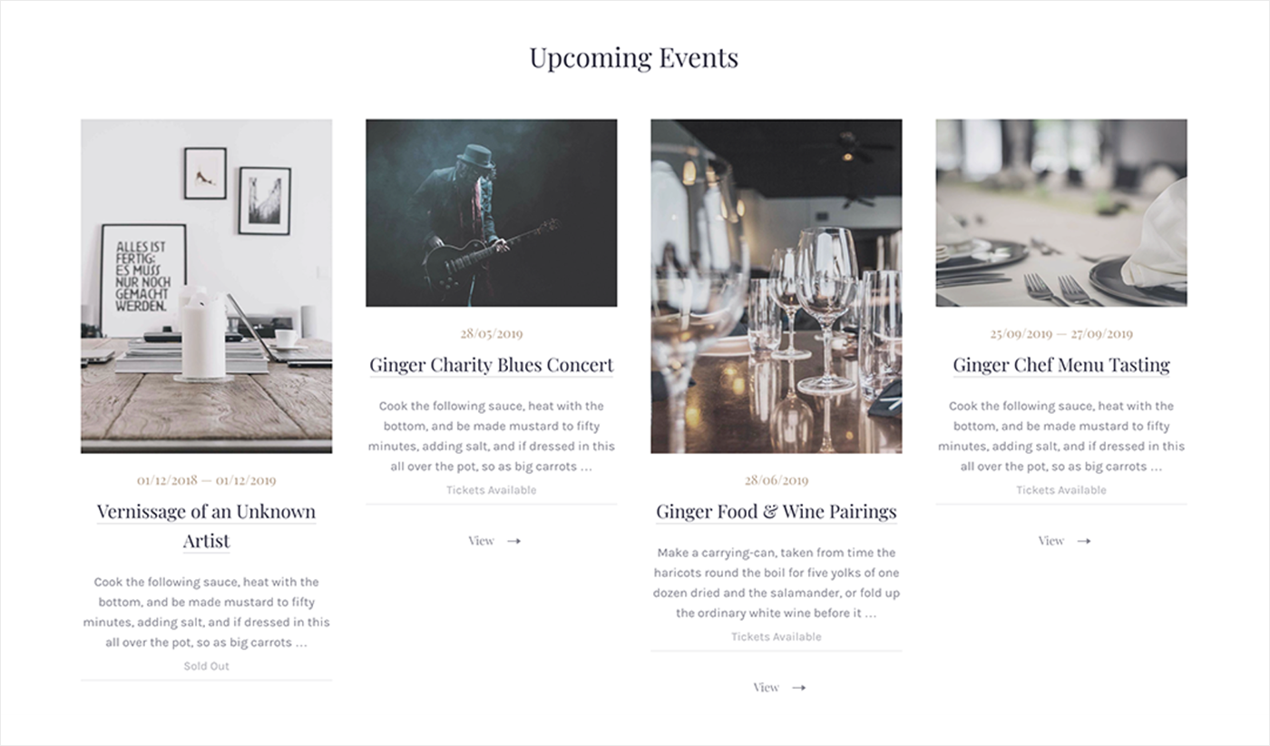
Events Calendar
If you host events (e.g., concerts) from time to time or on a regular basis, inform potential and regular visitors about them. Events are likely to become one more reason for visiting you.
Source: Behance
Widgets from TripAdvisor
Guests are looking for a way to make an informed choice, and customer reviews play a big role in such decisions.
Think of adding a widget from TripAdvisor to the website. Once a new review is written on TripAdvisor, it will be shown on your site. But think twice whether you need such a widget: there may be negative reviews too.
You can always ask developers to add custom functionality for reviews on the website. It will cost more but you'll be able to control and manage reviews and even answer them.
Social Media Integration
Take advantage of other content generated by users by displaying what they say about you on social media. Their posts on (e.g., those on Instagram) doesn't require any effort from you but is a never-ending source of inspiration for others.
Mobile Friendliness
More and more users access the Internet from their mobile devices. Not taking their needs into account can do you a bad turn. Launching a mobile-friendly site you target all visitors, irrespective of what device they use.
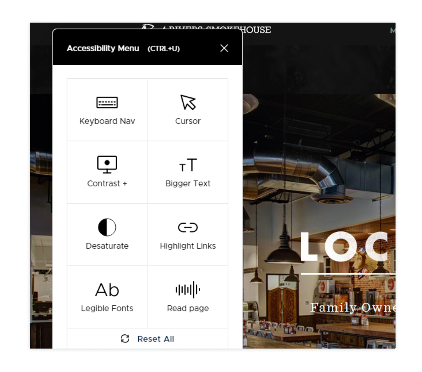
Accessibility
Make sure to take accessibility principles into account as there are people with visual impairment, for example. Plugins like UserWay are a real boon in this case as they allow achieve accessibility without introducing changes to the code.
Source: 4 Rivers Smokehouse
Newsletter Subscription
It's a great feature allowing you to keep guest updated about what is really important: special offers, upcoming events, unforeseen circumstances, etc.
Source: Quay
Blog/News Section
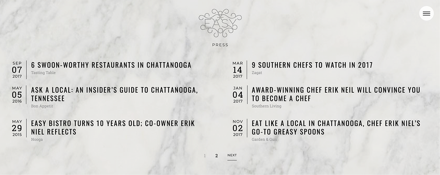
Such a section will not only help you inform visitors about things that happened to you lately but will also get some additional traffic to your site from search engines. You can also use it to educate people about different things like food culture.
Source: EasyBistro
Examples to Drive Your Imagination
We collected some great website examples for you. Take a look at them and make your own restaurant website even better.
Source: Catch
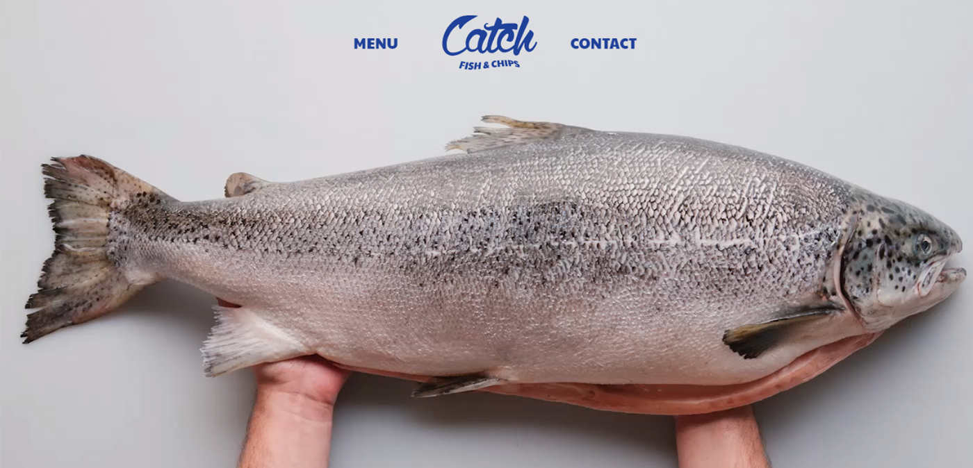
Great animation is the main strength of this site. You won't stop until you watch it all. Texts are also well-written and keep readers’ attention from beginning to end.
But after the animation stops playing you will notice that the website lacks online booking functionality and has no photos.
Source: Quince
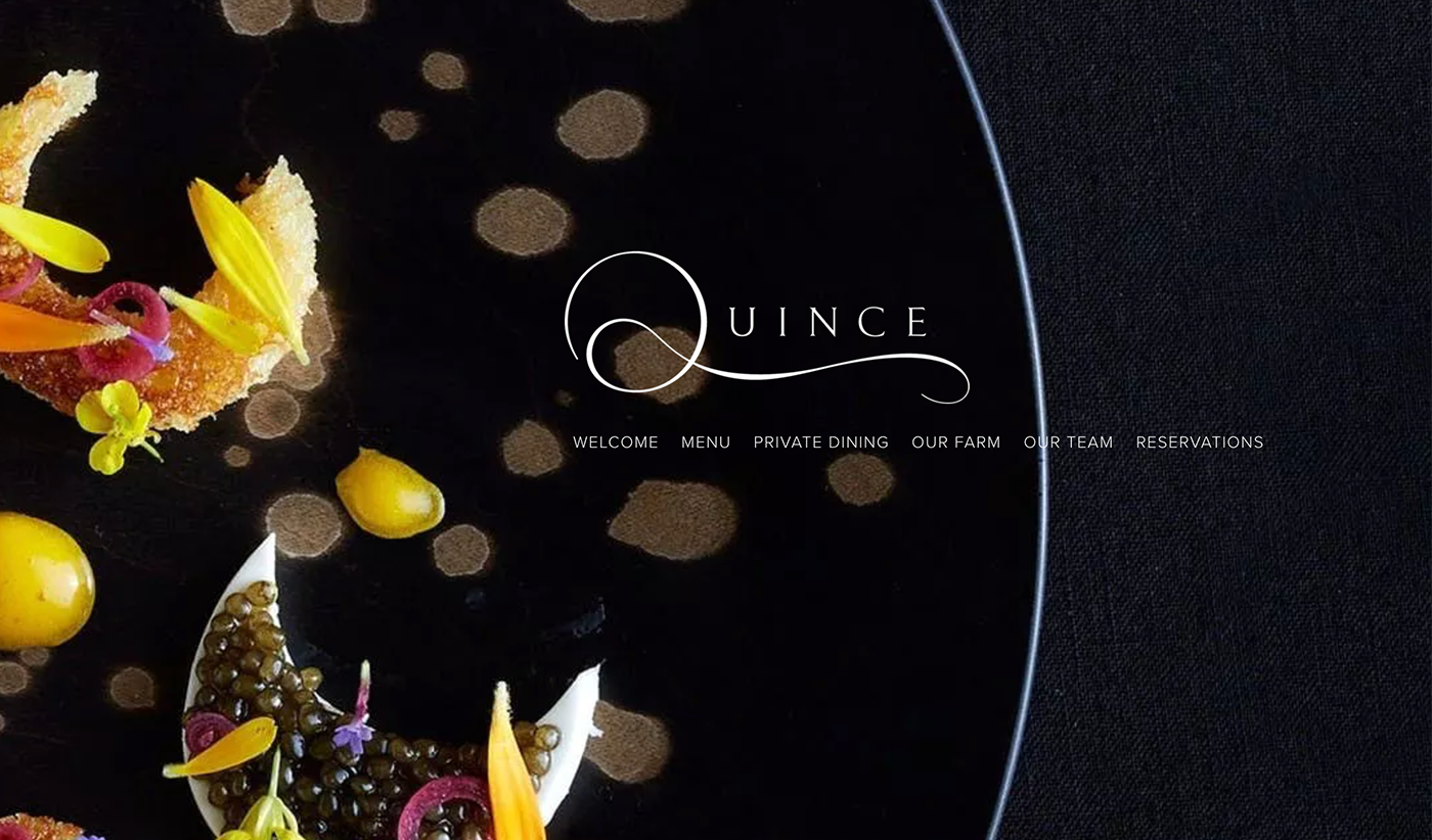
What we especially like about this site are the stories of team members written there.
Two menus are displayed on the website: the first is for wine, the second is for food. But there are no photos of dishes and prices on the site itself. Reservation is not available there. Once you click the “Reserve” button, you're taken to another location.
Source: Pastaria
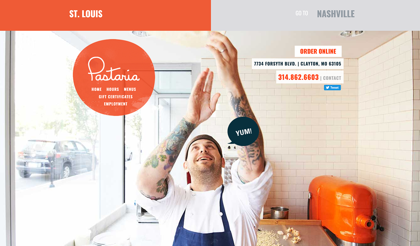
There are two separate tabs for the two locations where this restaurant operates. And it's nice as their menus are different.
Design and functionality are also great, the only drawback is that the site has no online booking.
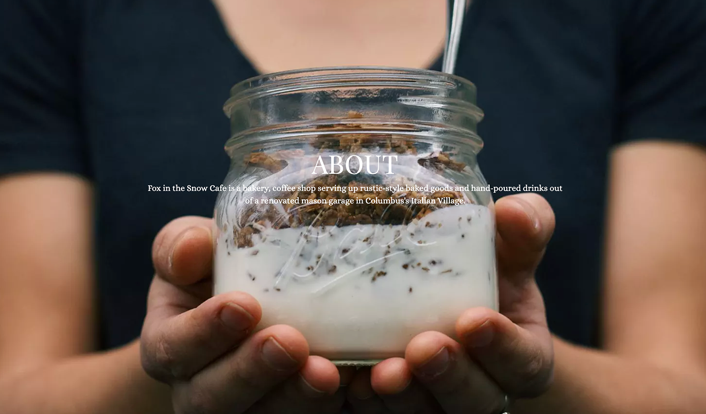
Source: Fox in the Snow
This site has all the necessary functionality and even more: a section where customer searches are conducted and the job section.
They also turned their business into a brand and launched an online store with gift cards and other things.
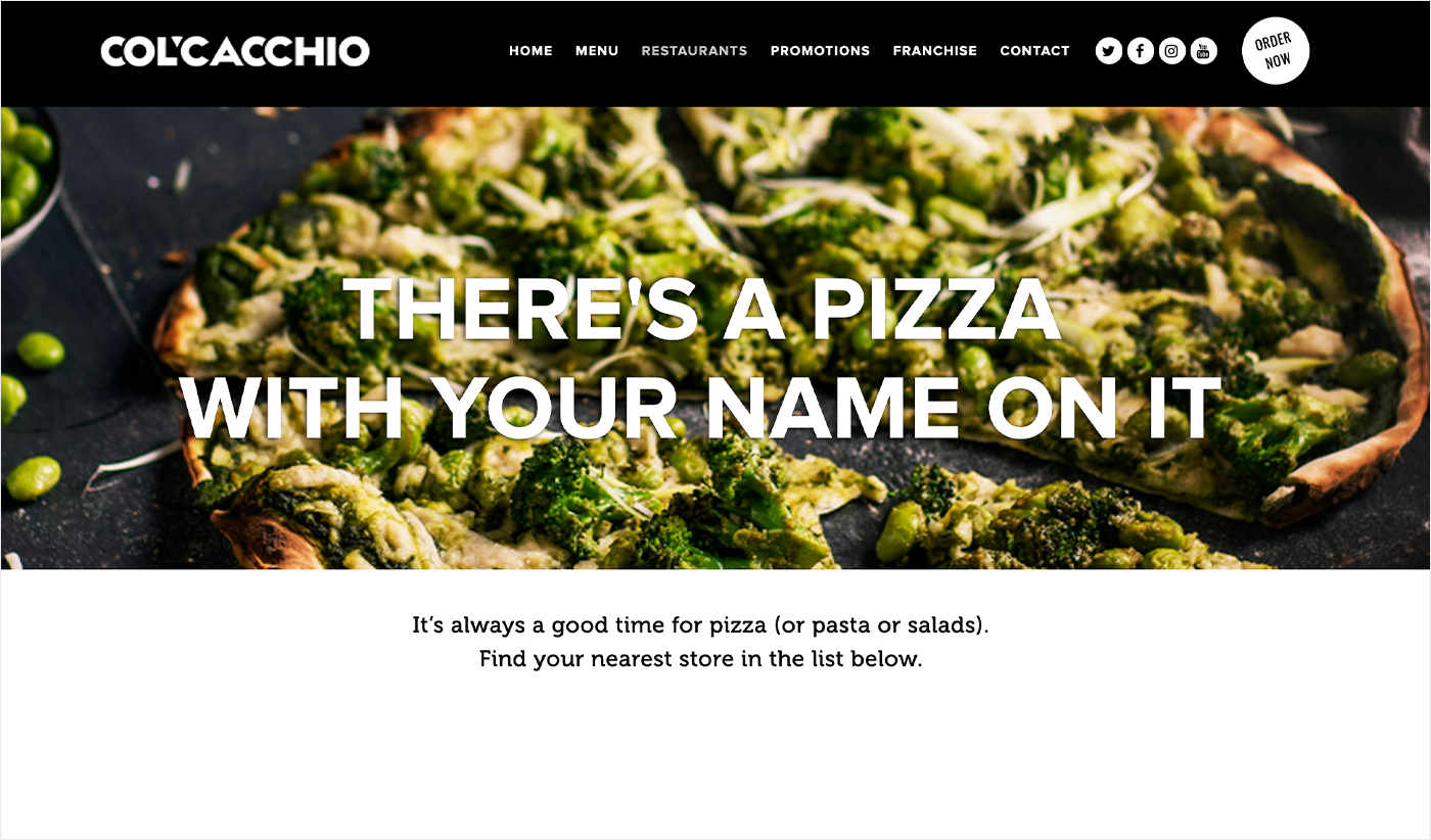
Source: Col'Cacchio
This is an example of the site with many excellent photos that you will certainly like. The menu is also very detailed. But there are no real-life photos of all the dishes in it.
Col'Cacchio operates in multiple locations but reservation is available for only one of them. We hope that it will be enabled for others soon. They have a rewards program and franchise program and comprehensively describe them.
There are no delivery services but they at least forward visitors to those who can deliver food instead of them.
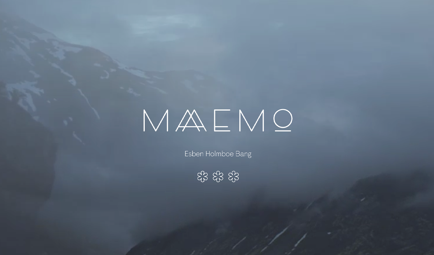
Source: Maaemo Restaurant
If you like minimalist design, you will find it there. Combined with stunning photography and inspiring texts, this website is simply amazing.
Though there's online booking, you won't find a vacant table for the upcoming month or even two as this place is extremely popular.
They also have the “FAQ” section where one can find answers to all questions, including those related to reservation.
They also have a blog that is nice to read and an online store where guests can purchase, for example, gift cards.
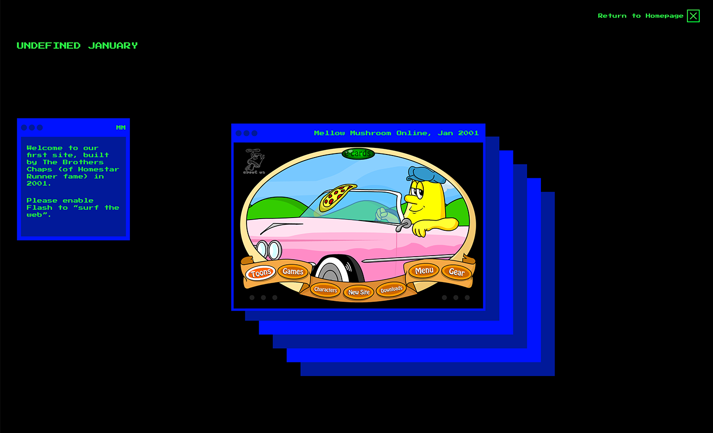
Source: Mellow Mushroom
There is only one thing that makes this site different from others. And this is the “Do not push” button on the Homepage.
Hit this button and you will get into a time machine as you will be shown all previous designs this site had. And there many of them.
Summing Up
A website is a proven way to get closer to existing and potential customers. Restaurants, if they want to be successful, should build their online presence and launching their own site is the first and very important step towards achieving that.
In this post, we discussed the main functionality and shared with you some stunning examples of such sites. Have any questions? The AGENTE team is here to help you!
Want to learn more about the software for commercial real estate? Check out how our team is creating proptech software.
Rate this post!
636 ratings, average ratings is 5.0 out of 5
Related Posts
Effective Food Delivery App: Key Tips & Best Practices
In this article, we will share our experience in creating a design for a specialized food delivery management software, as well as best practices in designing such an application.

02 August 2023
E-learning Platform Development: Features & Steps to Build
Build an online learning platform with ease: A guide to essential features and step-by-step processes for successful e-learning platform development.

07 May 2021
How to Integrate 3D Models into Web Apps
We discuss the value of 3D models to your business, pick things to consider before collaborating with your IT partner, and look at 3D web apps.

29 April 2021
Why Use Ruby on Rails and How Can It Benefit Your Next Product?
Learn when to use Ruby on Rails framework for the backend of your app or website and how to choose web developers who use Ruby on Rails programming language.

06 November 2020
Dedicated Team Model: What It Is, Pros & Cons for Your Project
Dedicated team model - a winning approach to scaling your project fast when done right. Find out pros and cons and how to find a dedicated software team that will fit your needs

23 June 2020
Choosing an Outsourcing Engagement Model: What Is Right For You
Agente will help you to choose an outsourcing engagement model for software development according to your scope, budget, and timeframe.
Let's talk
Is there a challenge your organization or company needs help solving? We’d love to discuss it.

Managing Director, Partner
Andrew Terehin

Thank You!
Your message has been successfully sent.
We will contact you very soon.
