Does your brand have a design system? If no, we have some bad news for you — you've missed a lot. Design systems are not only a timesaver for your design team but also for marketers, partners, and anyone working with your brand and products.
This article will focus on the basics: what is a design system in general and how can a company benefit from own design system?
What is a design system?
Before proceeding to the nitty-gritty of visual design systems, let's draw a clear distinction between design systems, pattern libraries, and style guides.
Some people believe that these terms are interchangeable, but they are mistaken. The two last terms are simply subclasses of the first one.
Style guides are traditionally made with a focus on visual design aspects.
Pattern libraries are, at the core, just a format for documenting patterns. But when done well, it is a very powerful format that can be infinitely expanded and can exist in many layers, each focusing on the details of a solution, ranging from the business to the front-end or even back-end code.
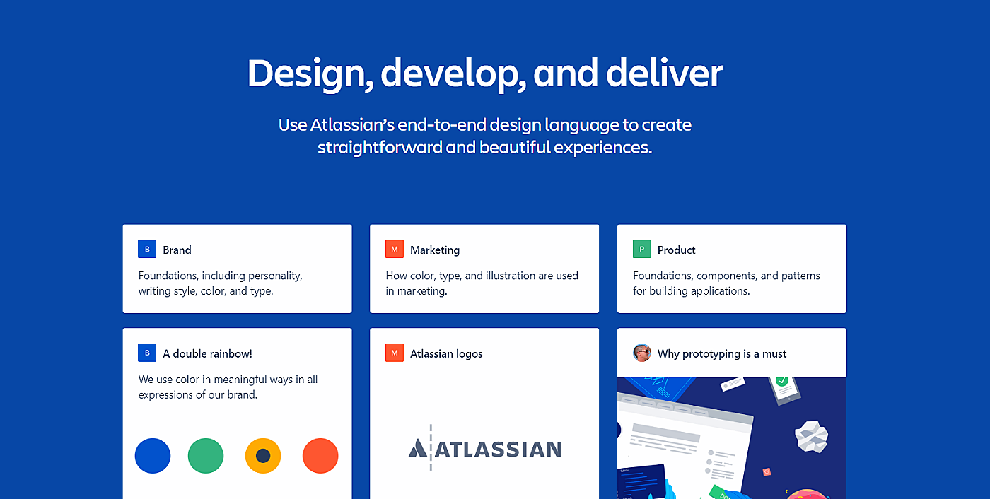
So what is a design system? It's a combination of design standards, deliverables, tools, and style guides that help companies build and maintain digital products with a modular approach. It converts a visual design language into a super easily digestible format, improving product quality and accelerating the development process.
Source: Atlassian
What are the advantages of a design system?
Many aspects of a product can thus be documented in a pattern library and made available to product managers, UX designers, developers and all other parties involved. Properly used, a design system has many advantages:
Design systems enable consistency
When there's a large team working on the same project, for example, create an online learning platform, it's common practice to distribute design tasks within a team.
In case design decisions of team members are not the same, the product may have a fragmented look. Having a design system in place is extremely useful. Such an approach creates a shared perspective and aligns the whole process. The final product will have a consistent look. And you will also maintain visual consistency across all your products.
Design systems improve code
Having design patterns in place allows developers to reuse previously created code, thereby saving time and avoiding code redundancies. This also simplifies quality assurance.
Secondly, there may be misunderstandings in the communication between designer and developer (or product manager and designer, you name it). Ideally, the developer was of course already involved in the discovery and has no problem understanding the solution. But it would also be enough if designers and developers exchange precise and detailed information.
Design systems improve the user experience
With a design system, identical solutions are used for the same design issues. It makes the UI consistent and more understandable and predictable to the user.
The use of standardized components is beneficial in one more way: designers spend less time creating new components and more time on improving UX.
Design systems save time on prototyping
Trying to develop the solution as soon as possible, companies often skimp on design. But it’s a really bad decision: a design will look cheap or half-done, tarnishing your brand and leading to a poor UX.
Armed with a design system, you won’t need to build something from scratch and will be able to build numerous prototypes for solutions more quickly, saving time for further iterations or for dealing with new problems.
Design systems leverage quicker iterations
Should you choose iterative development for your projects, every iteration may result in changes in the product’s code and look. A design system will make these changes painless and quicker.
Design systems facilitate the onboarding of new team members
A design system is a good start and a reference point for new designers and developers, who can find here at a glance a reference to all available elements and solutions.
What makes a good design system?
There’s no surefire recipe for creating one, but all successful systems have much in common:
- Well-prepared documentation. Style guides are written in a clear, concise manner. All use cases are described in detail and are easily understandable to anyone reading it.
- Clear examples. There are examples illustrating how each pattern should be used, its possible states, and variations it may have.
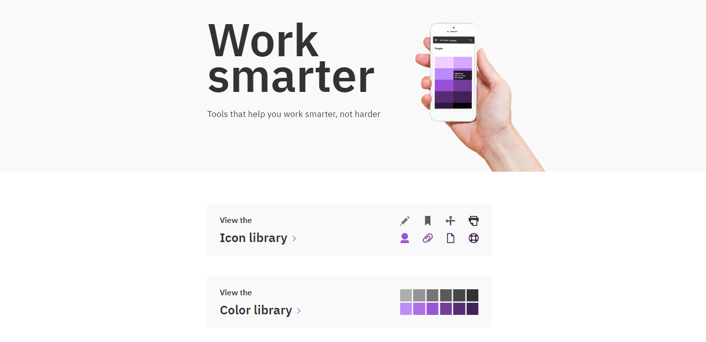
- Code pattern library. The aim of code references is to make it as easy as possible for developers to integrate patterns into their templates. API is detailed to eliminate any concerns and issues that may arise.
Source: IBM
How to build a design system?
Most companies introduce such systems only after the product is built. No matter whether you’ve decided to create one before releasing anything to the wider public, when you work on your first solution or after you launch it — your efforts will pay off soon.
Who should be involved?
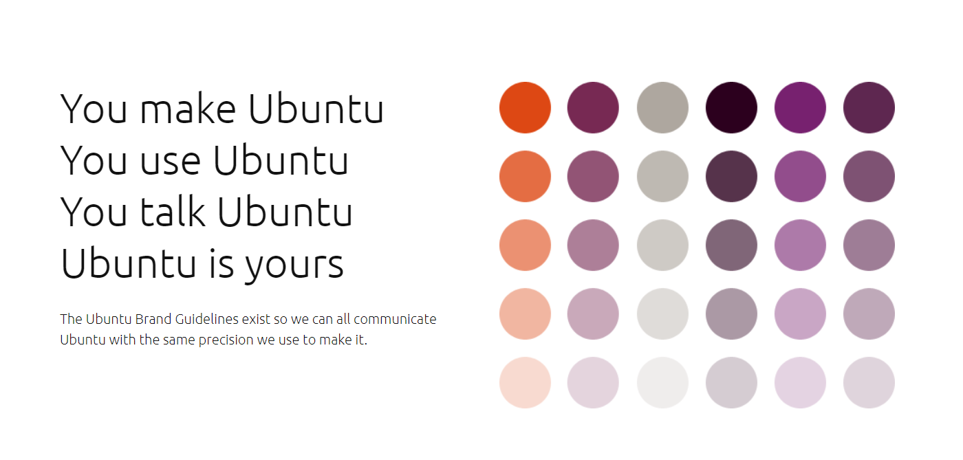
Designers are not the only ones who should take part in the process. Other project stakeholders should participate too: front-end developers (to give code-related advice), WCAG specialists (to ensure that the product will be accessible), product managers (to communicate customer needs), decision-makers (e.g., directors), and other people who may use the produced materials one day. Include them in the team and you’ll reach this goal for sure.
Source: Ubuntu
How it works? There are some critical steps to take to create something really useful and usable. We’ll guide you through them all.
Carry out an audit of your current design
It’s a necessary first step for any company unless it’s a startup. Analyze your website, social media accounts, and any digital and print materials you produce. Creation of patterns, colors, typography, and space, and icons inventory will be of great help here.
Read also: How to Perform a User Experience Audit
This will help you discover its strong and weak sides and areas that need improvement.
Decide on fundamental elements
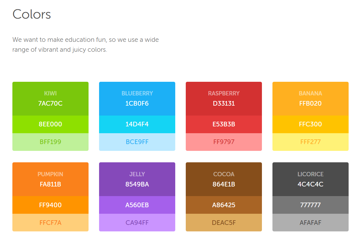
Colors. They are not only part and parcel of brand identity but also one of the key components of a design system. Listing only primary colors and adding guidelines for them is not enough. Double-check that you’ve included colors for the multitude of use cases: an error state, a hyperlink, a table border, an SVG fill, charts, backgrounds, and many more. Group colors to demonstrate how they work together and make the choice easier.
Source: Duolingo
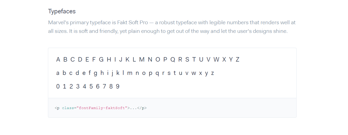
Typography. State clearly fonts that can be used and weights and sizes they should have depending on their location and usage. A small tip: a custom font may not work well as there are many common fonts that look great and that are familiar to users.
Source: Marvel
Spacing, paddings, and margins. Though decisions about spacing, paddings, and margins are largely driven by different factors like site responsiveness, you may want to add some unique recommendations. If there are none, you still need to pay some attention to these things. Why? To simply save the time of those who don’t know all these rules by hear. Insert links to sources to demonstrate what your decisions are based on.
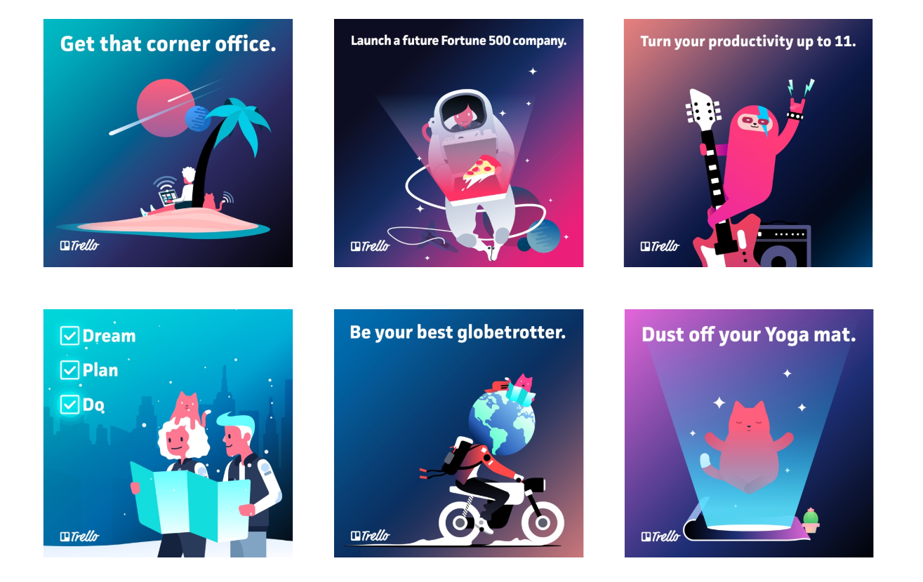
Icons, images, and illustrations. Drawing icons and placing the whole set in a repository, don’t forget to present clear guidelines for them: icon sizes, line weight, styles for different icon types, etc. For images and icons, mention file formats that will work best. For diagrams, photos, and illustrations, mention recommended height and width.
Source: Trello
Other elements. If you will be using other elements (e.g. progress bars, buttons, and videos), remember to say at least a couple of words of them too and include relevant examples and use cases.
Build
Now you need to document everything: design principles and policies to help users understand how and why to use any components. Prepare an informative style guide on how your brand should be presented both online and offline.
Examples of great design systems
To take a small leap from theory to the conclusion of this article, we have chosen some beautiful examples of design systems below:
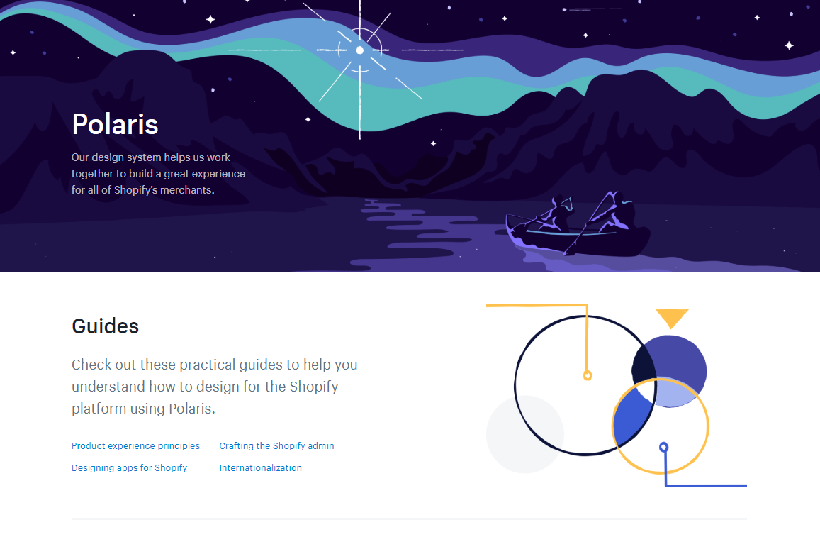
Shopify Polaris
Source: Shopify
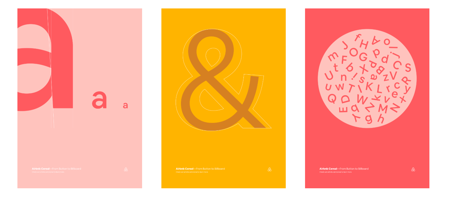
Airbnb
Source: Airbnb
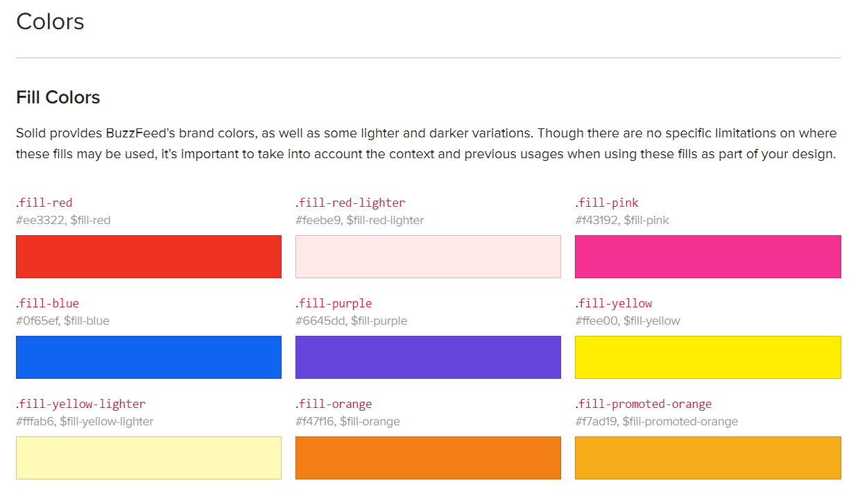
Buzzfeed
Source: Buzzfeed
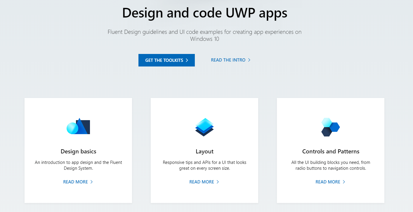
Microsoft
Source: Microsoft
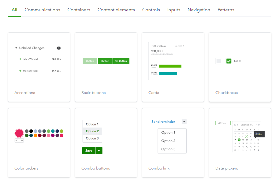
Quickbooks
Source: Quickbooks
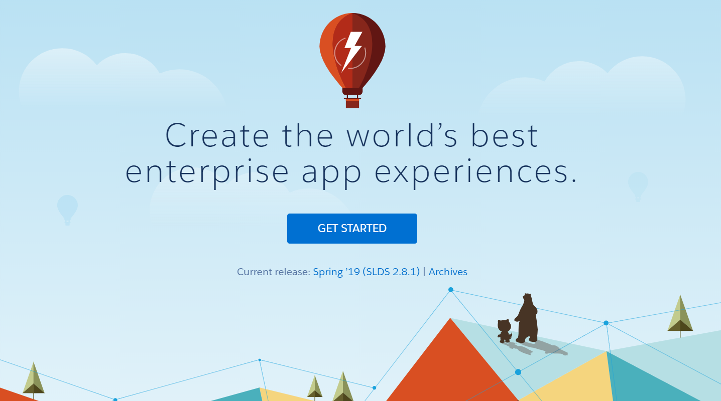
Lightning
Source: Lightning Salesforce
Need more amazing examples? We suggest you check out Styleguides. There are also a lot of articles, books, videos, podcasts and a ton of other useful information that inspire our design team as well.
So what do you think? Is it worth creating a design system for your company? Share your thoughts in a live chat!
Rate this post!
886 ratings, average ratings is 4.7 out of 5
Related Posts

16 January 2024
ChatGPT Plugin Development: Features and Benefits for Business
Explore the process of crafting a ChatGPT plugin tailored precisely to meet your unique business requirements.

19 January 2024
AI Model Fine-Tuning: How to Use Your Organization's Data?
Organizations are transitioning from generic solutions to hyper-customized intelligence, seeking AI models designed to address their unique challenges and propel them toward strategic objectives.
This demand has propelled fine-tuning to the forefront of AI development.
09 May 2024
Top 7 Open-Source LLMs for 2024
Here, we break down everything you need to know about open source LLM models: top 7 offerings on the market, their pros, cons, and capabilities.
07 May 2024
What are large language models: a complete guide
Get your large language model definition straight: in this article, we cover the concept of LLMs, their capabilities, types, and challenges.

Develop Custom Corporate Microlearning Platform
Custom microlearning solutions for corporate training: Discover how to develop a tailored platform for efficient and engaging employee learning
24 January 2024
Employee Training Management Software Development in 2024: Features and Cost
Streamline your employee training with cutting-edge software solutions. Explore the features and costs of employee training management software.
Let's talk
Is there a challenge your organization or company needs help solving? We’d love to discuss it.

Managing Director, Partner
Andrew Terehin

Thank You!
Your message has been successfully sent.
We will contact you very soon.
