There’s a common misconception that landing pages are hard to create and maintain. Not true. We are burdened with a glorious purpose to prove that building landing pages for e-commerce is not as challenging as it seems. The benefits outweigh anyway.
Why E-commerce Landing Pages are Important
What is a landing page?
It’s a standalone page which is distinct from any other pages and serves a single and focused purpose – to convert a visitor into a customer. On your landing page, you make a trade, special offer or a deal, in return for providing contact information. The main purpose of a landing page is to make visitors interested in the offer and continue their way down the sales funnel.
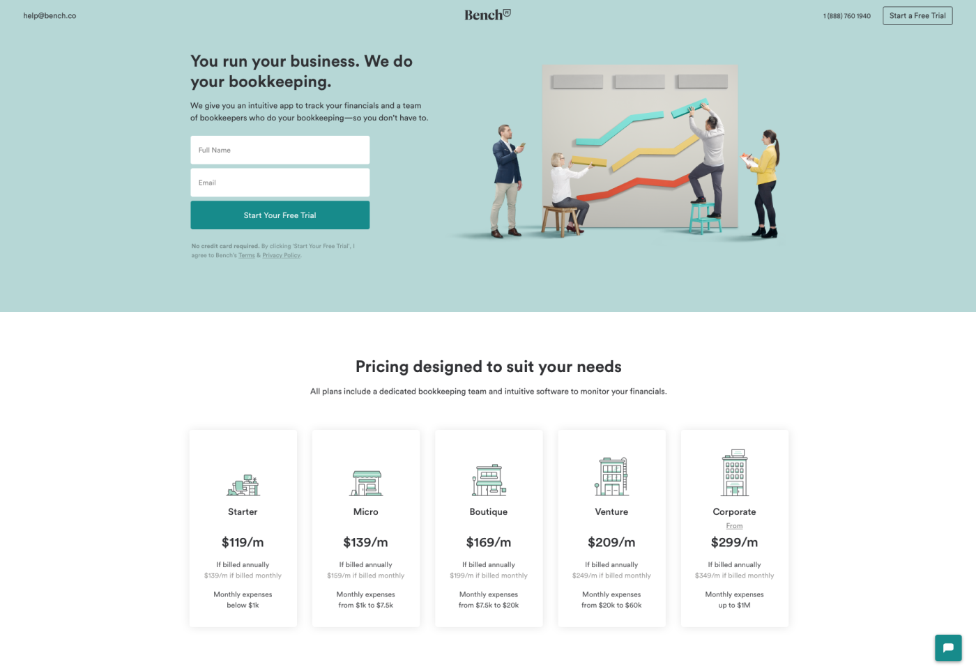
Source: Bench
Why use landing pages?
Landing pages are of key importance to lead conversion. Even if you’ve done a hell of a job building your brand and launching a website or doing e-commerce redesign, there’s a slim chance that your e-commerce business will be a success without well-designed landing pages. They drive traffic and improve your SEO. According to HubSpot, 10-15 landing pages can increase your leads by 55%.
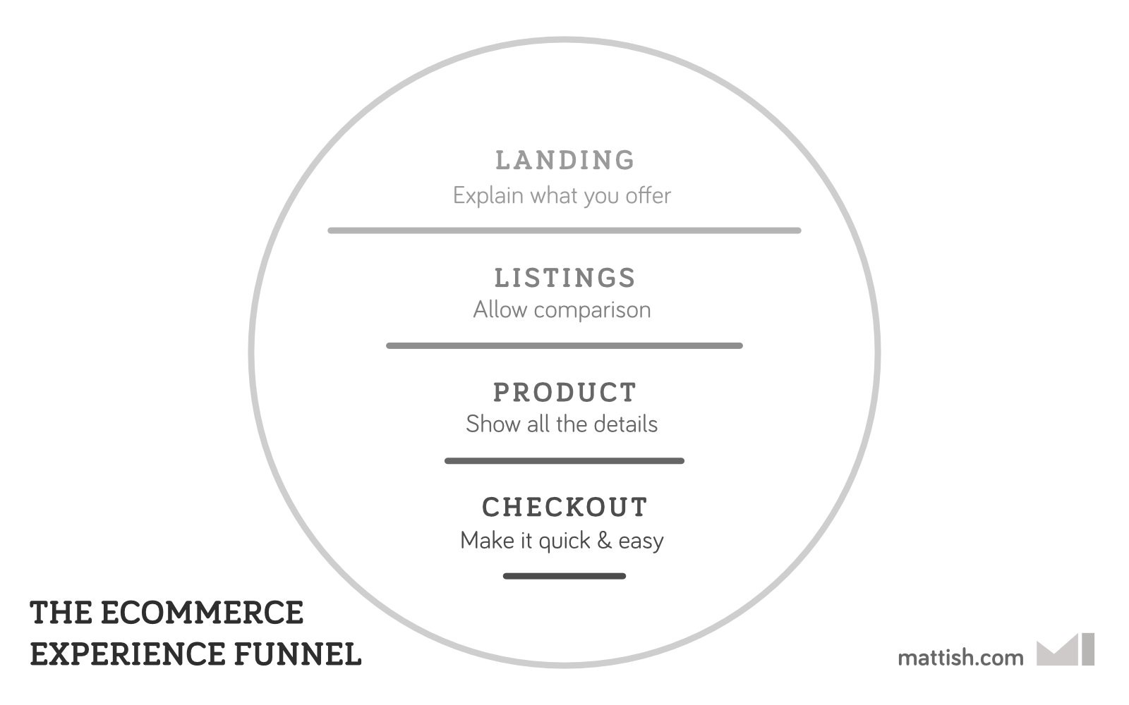
Source: Mattish
Website visitors are quick to switch to your competitors if they don’t find your page useful within seconds. Literary s e c o n d s! So you should create an e-commerce landing page design that provides visitors with your most convincing arguments. Great landing pages reduce your bounce rate and increase your conversion rate.
Briefly about the benefits of effective e-commerce landing pages
- SEO ranking. Quality landing pages are designed to target a specific set of search terms. They’re also promoted using Google Adwords or other paid boosting methods.
- Specific promotion. This is the starting point for a visitor’s journey on website pages. A landing page explains what you offer briefly and welcomes visitors to find out further details.
How to Create a High-Converting Landing Page
The significance of landing pages is huge, but it doesn’t mean creating high converting e-commerce landing pages is rocket science. Here is a four-step guide with e-commerce site design tips on how to make a high converting landing page.
1. User research and competitive analysis
Make sure the landing page talks to a specific audience with their problems and needs. Your landing page should contain a unique offer that will keep visitors engaged. Tell what makes you stand out from similar businesses and why you can be trusted. To do that, study your competitors and keep track of the emerging ones.
2. UX and wireframing
Create a prototype. A prototype is an important element of a landing page creation process. It helps to see how the page structure is going to look and flow and how much information is really necessary on the page. The layout is very important as well. Page visitors’ attention span is fleeting, so you need to make the top of the page (“above the fold”) the most catchy bit: eye-grabbing headline, attention-grabbing photos. The main goal is to grab your attention and maintain your interest. Tell readers what to do (e.g., click here or scroll down). Add proof elements, such as logos of major customers and customer testimonials.
Define your most-wanted action. One landing page — one action. This golden rule is a prerequisite of high-converting E-commerce landing pages. You need a conversion-centered design that focuses visitors on one specific thing, be it sending in an application form, signing up for an open house, or requesting more information about a specific program. Check if your page has a standard header or footer with links or your logo on the top left which is linked to your main site. This can kill the ROI on your campaign.
Source: AGENTE
Talk about problems and pains. Usually, people buy something because they want to solve their problems or get rid of/ avoid pain. So if you want to create a high-converting E-commerce landing page, mention what someone will lose if they don’t use your product or service. We are more likely to imagine the pain of losing something (for example $100) than receiving it. Be sure you say how to relieve the pain and solve the problem. Don’t just upset people. Be the painkiller.
Source: AGENTE
Mention guarantees. Reassure visitors that they won’t lose anything in case their customer experience won’t be satisfactory. Position your guarantee statement close to the CTA. Your guarantee can be explicit, such as money-back or like in the following example: This is the guarantee that Help Scout placed at the bottom of their landing pages. No money-back, but the guys are serious about my privacy and demonstrate excellent record. Feels good.
Source: AGENTE
Specify contacts. The best way to state clearly that you are open for dialogue with customers is to specify contact methods. The more channels of communication you have, the better. This should include a phone number, a physical address, an email address, social media pages, and a contact form. It’s great to have live chats where a customer service representative asks me if they can be of help.
3. UI design
Motivate visitors to become customers with effective design. E-commerce landing page ideas that convert can have different designs. Imagine a unique scenario that will fit landing pages which aimed at selling shoes, legal consultations and property. Don’t even bother. There’s none. So it’s important to understand the specifics of your business, study competitors, and offer something that will make you stand out. Keep reading and you’ll find out the basic elements of a landing page.
4. Content and SEO.
It’s high time to demonstrate you some e-commerce landing page best practices in content and SEO.
Headline. Make sure you’re killing it with your landing page headline. This is the element that grabs visitors’ attention and compels them to read further or leave the page altogether. The headline should сatch attention, give the idea of what the page is about, be concise : no more than 20 words, focus on 1 thing that your prospects believe to be highly desirable, and be distinctive. Make them big and dark, dark grey (or, when on a dark background, white).
Graphics. Visual content saves visitor’s time on detecting useful information on a page. The pictures should be of high quality and reflect the message of the page. For example, if you sell a particular product, please place its image on the landing page.
CTA. Let it be a button. People are used to such form of CTA. Don’t disappoint them. Take a look at the key principles of the most important element on the landing page:
- Identifiable. Buttons should indicate that they can trigger an action.
- Findable. Buttons should be easy to find among other elements, including other buttons.
- Clear. A button’s action and state should be clear.
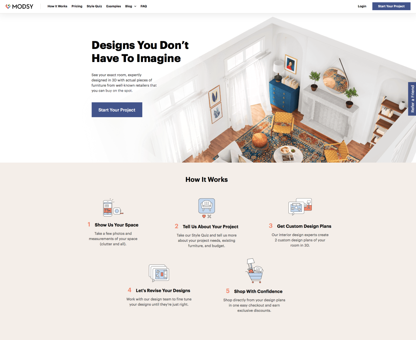
Source: Modsy
Examples of High-Converting E-commerce Landing Pages
Want to make conversions on your e-commerce pages? You gotta learn from the best cases. Here we go.
Shopify
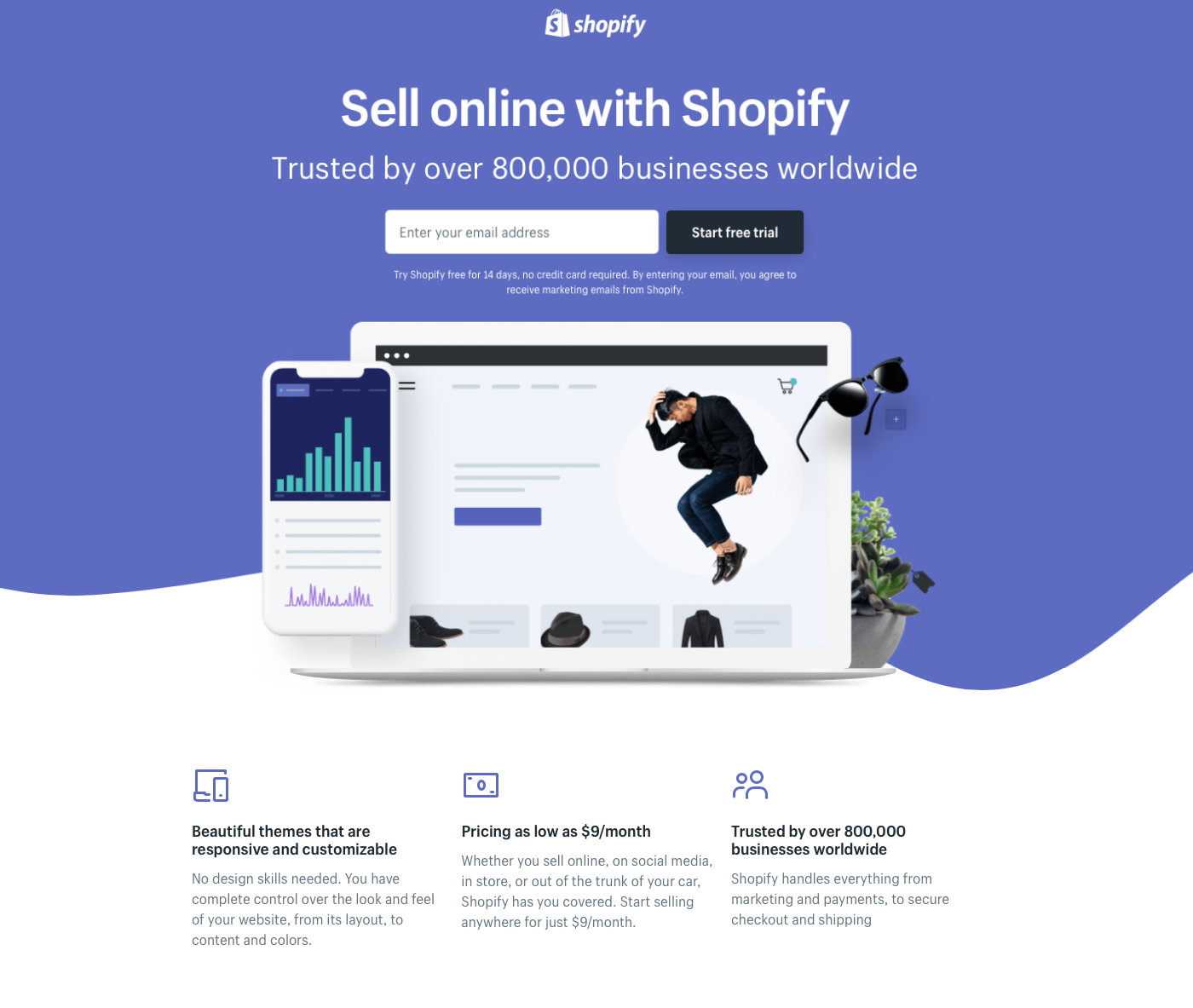
Shopify keeps it simple. The headline is user-oriented, bullet layout, Just a few fields to fill, and you’ll get started.
Source: Shopify
Teambit
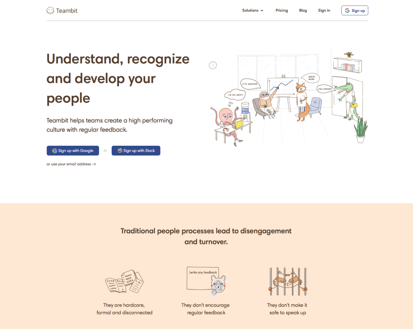
This HR software wins over with its whimsical illustration. The form is simple, just one field. Pictures of cute animals is a surefire way to engage visitors and make them scroll down.
Source: Teambit
Airtable
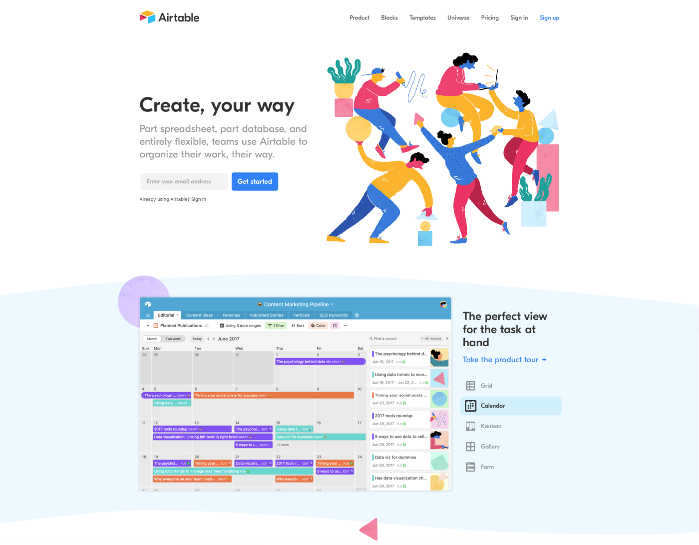
A clever, minimalist style. There's an instant call to action, simple and concise copy to let the visitor know what the company does. All is followed by the CTA to select a city. The color palette is light and airy giving space to breathe.
Source: Airtable
Our Experience
For over 10 years, we’ve been creating E-commerce landing page designs. One of the key principles we adhere to is consistency. A landing page can never exist in its own universe. It’s a part and parcel of a marketing strategy. That’s why it should be created within the framework of products’ design and development. Take a look at some e-commerce landing page examples.
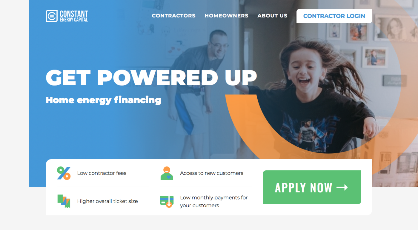
Constant Energy Capital
The text is simple and succinct. The main message is centered and surrounded by an ample space. Distinct CTA coupled with clear benefits from the suggested action.
Source: Constant Energy
Heywine
The principle “one page = one idea and action” is strictly followed. Should a visitor want to learn more, there’s a drop-down menu to answer further questions. 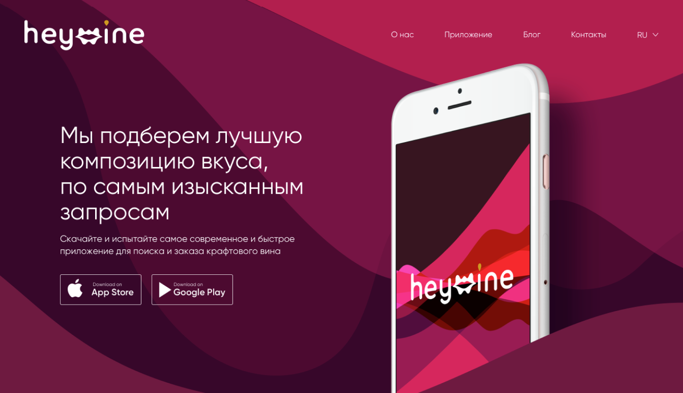
Source: Agente case studies
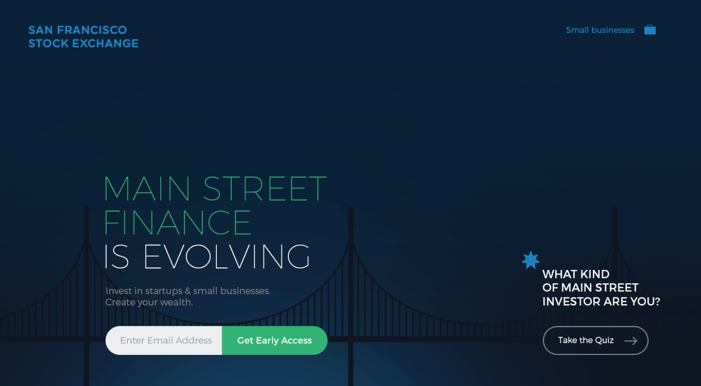
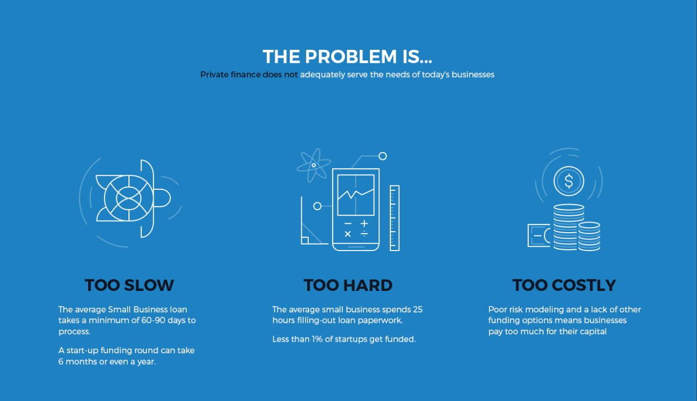
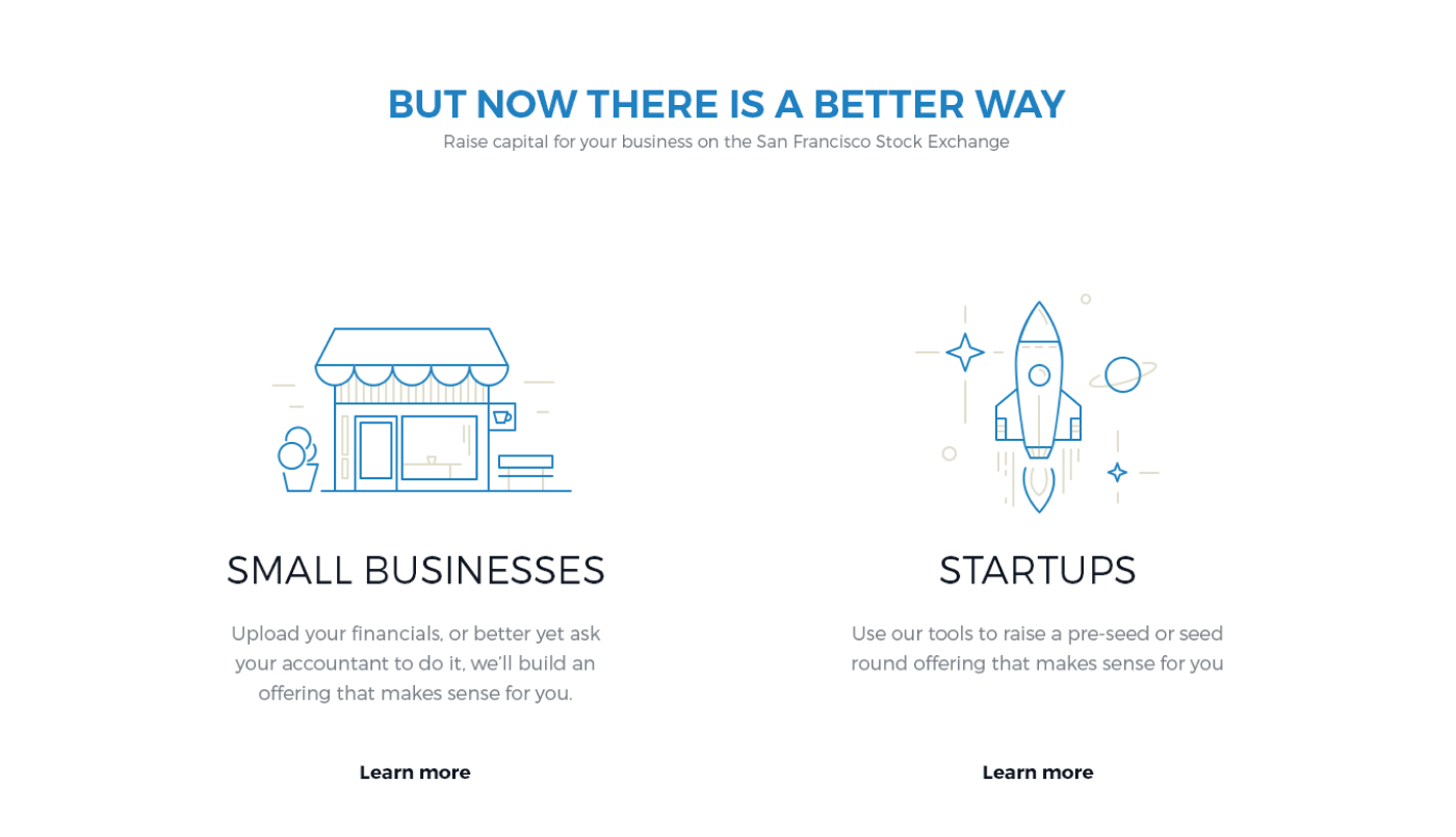
San Francisco Stock Exchange
This interactive landing page tells a story. Visitors see what was before, what are the main problems. And, of course, an easy and light way to solve them.

Source: Agente case studies
Final Thoughts
Agente believes that a high-converting landing page is the foundation of a successful online business. We make it simple, clear, and, at the same time, engaging. Contact us for your new e-commerce project!
Rate this post!
935 ratings, average ratings is 4.0 out of 5
Related Posts
How to Launch Your Online Travel Marketplace Platform in 2024?
Learn how to launch your own online travel marketplace platform in 2023 with our comprehensive guide and step-by-step insights.

14 January 2024
Marketplace Website Design and Development in 2024: Features, Tech Stack & Cost
Discover the latest in marketplace website design and development, explore features, technology stacks, and gain insights into cost-effective strategies.

Top eCommerce Website Design Features and Tips in 2024
While creating an online store, it is difficult to orientate quickly and understand how the website should look to create a positive impact on the owner’s income. It determines whether clients remain on store’s page, would they have confidence in the store and would they like to purchase
Ecommerce Website Revamp [The Ultimate Guide]
Learn why you should redesign your e-commerce website and how it can improve your online store's performance, including increasing traffic, engagement, and sales. Get expert tips now.

POS Interface Design Principles
There's hardly a retailer who doesn't have POS software in place or not planning to start using it in the future. In this article, we're going to discuss the Design Principles of POS Interface.
What Is mCommerce and How Your Business Can Benefit from It
Find out about m-commerce advantages and disadvantages, benefits for consumers and future trends in the sector.
Let's talk
Is there a challenge your organization or company needs help solving? We’d love to discuss it.

Managing Director, Partner
Andrew Terehin

Thank You!
Your message has been successfully sent.
We will contact you very soon.

