Website owners often underestimate the importance to their business of pricing pages. By putting effort only into creating convincing landing and product pages, they may lose those visitors who proceed to the site’s pricing page. And here is why:
What is a Pricing Page and Its Importance?
Pages with the product and/or service prices (aka pricing pages) can be extremely effective. Poorly designed ones may cause a prospective customer to change his/her mind after failing to find all the necessary details in one place and turn to your competitor, whose site is more user-friendly.
A successful pricing page acts as a sales rep, enticing site visitors into making a purchase, launching a free trial, or contacting a member of a sales team. This is particularly critical to customer-facing businesses (e.g., SaaS companies) that generate most of their sales online. As an e-learning software development company, we know how important a sales page is in online course platforms.
In a nutshell, designing a pricing page that converts means producing one that is simple in terms of both design and language, but catches the attention of the target audience from the very first second they open it.
There are multiple things to consider when working on a pricing page design. Let's get down to the nitty-gritty of creating a high-converting one.
Produce a Stunning Design
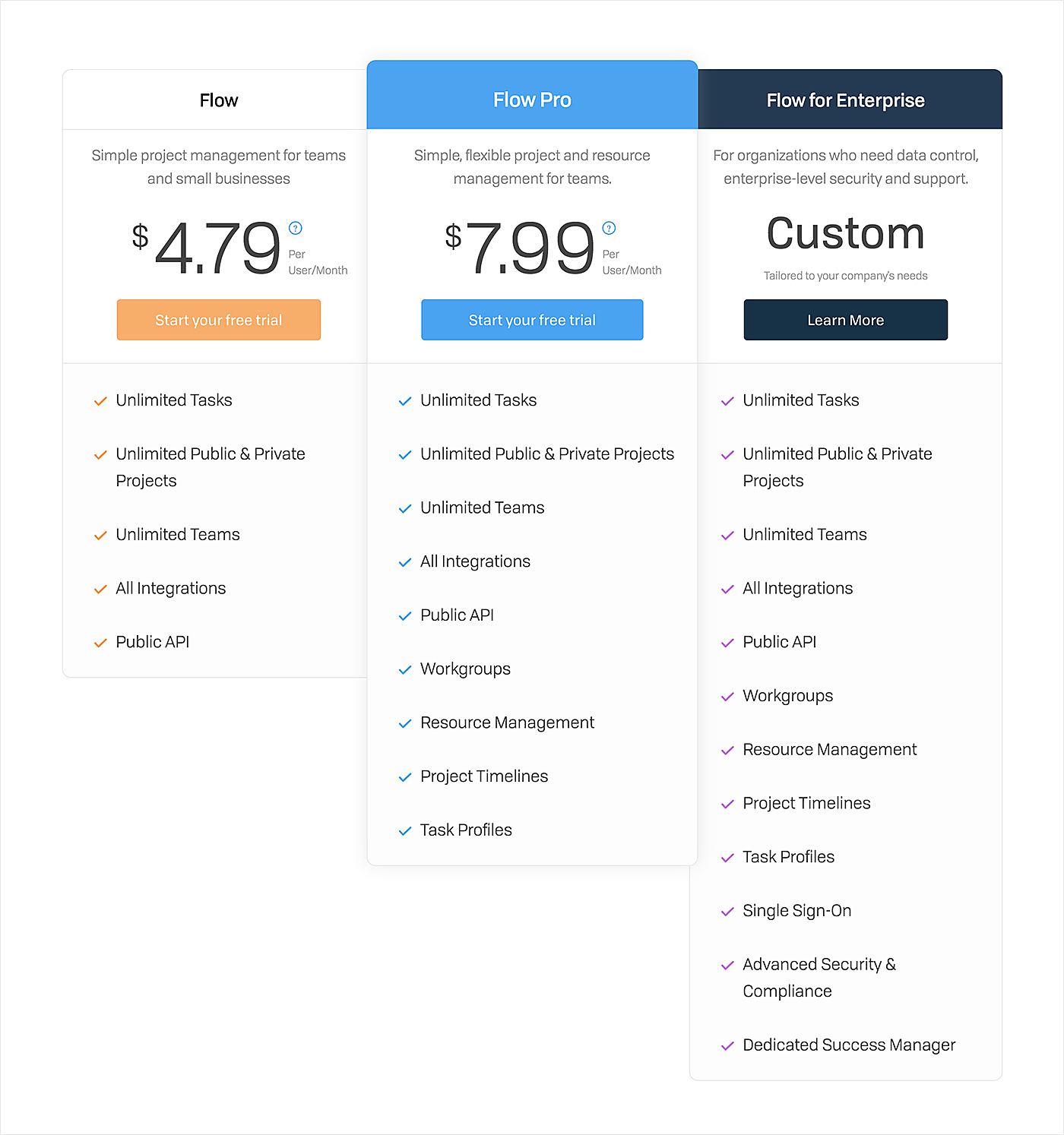
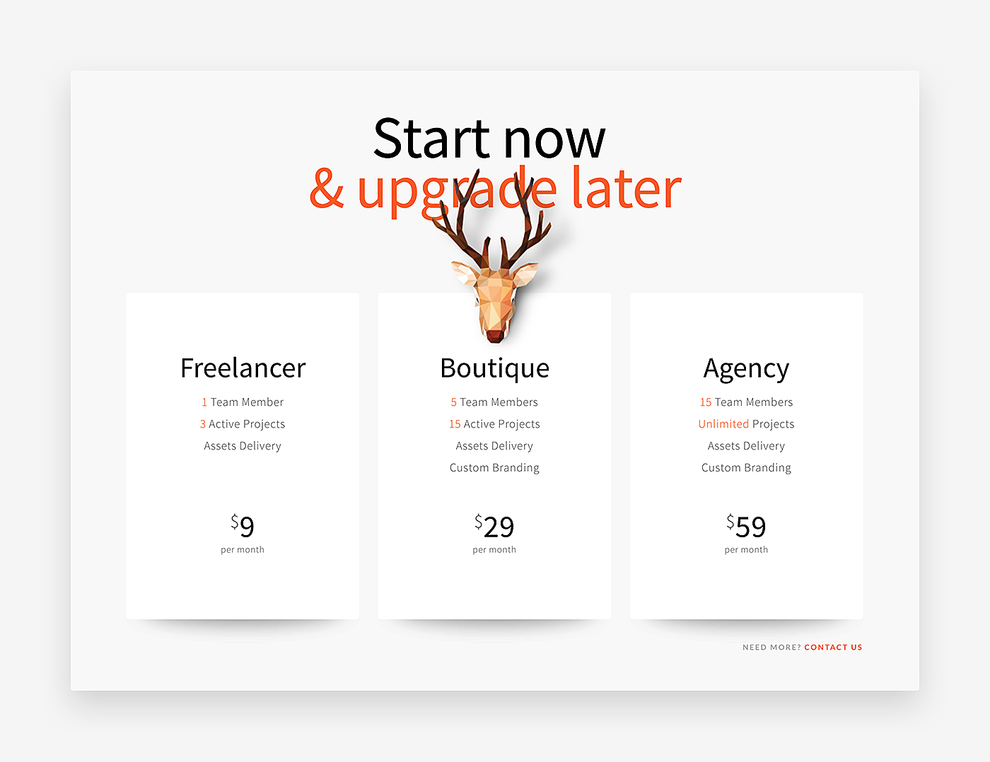
Design a pricing page that will not only provide site visitors with the necessary information but also speak for your brand. Use custom images, colors, typography, and other design elements specified in your brand book.
To gain the trust of potential clients, add customer testimonials (e.g., client logos) to offer visitors an example of companies leveraging your products and services. This way you will minimize friction caused by the need to pay money to you, and persuade website visitors to click the ‘buy now’ button.
Source: Flow
Eliminate Content Complexity
Write a copy that is easy to understand, whether you are preparing content for a music streaming service or SaaS pricing pages.
Start with a well-thought-out headline to set the right tone and voice, and to ensure that the visitor continues reading your offer.
Make sure you include a list of key features and benefits. Avoid the temptation to go into detail, it will not help you get a sale. You should generate content that is skim-able and easy to digest. Giving clients more information than they expect may overwhelm them.
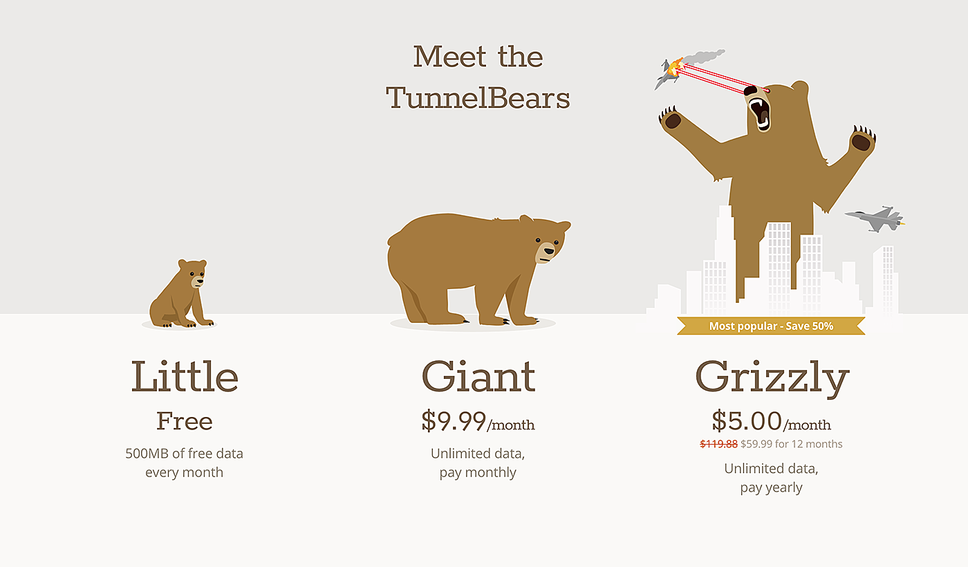
It's a bright idea to introduce descriptive and meaningful names, as they reduce customer frustration and show the plan or product that fits them best. You may even name packages based on customer segments: e.g., Beginner or Growing Business.
Source: TunnelBear
Make Options Easy to Compare
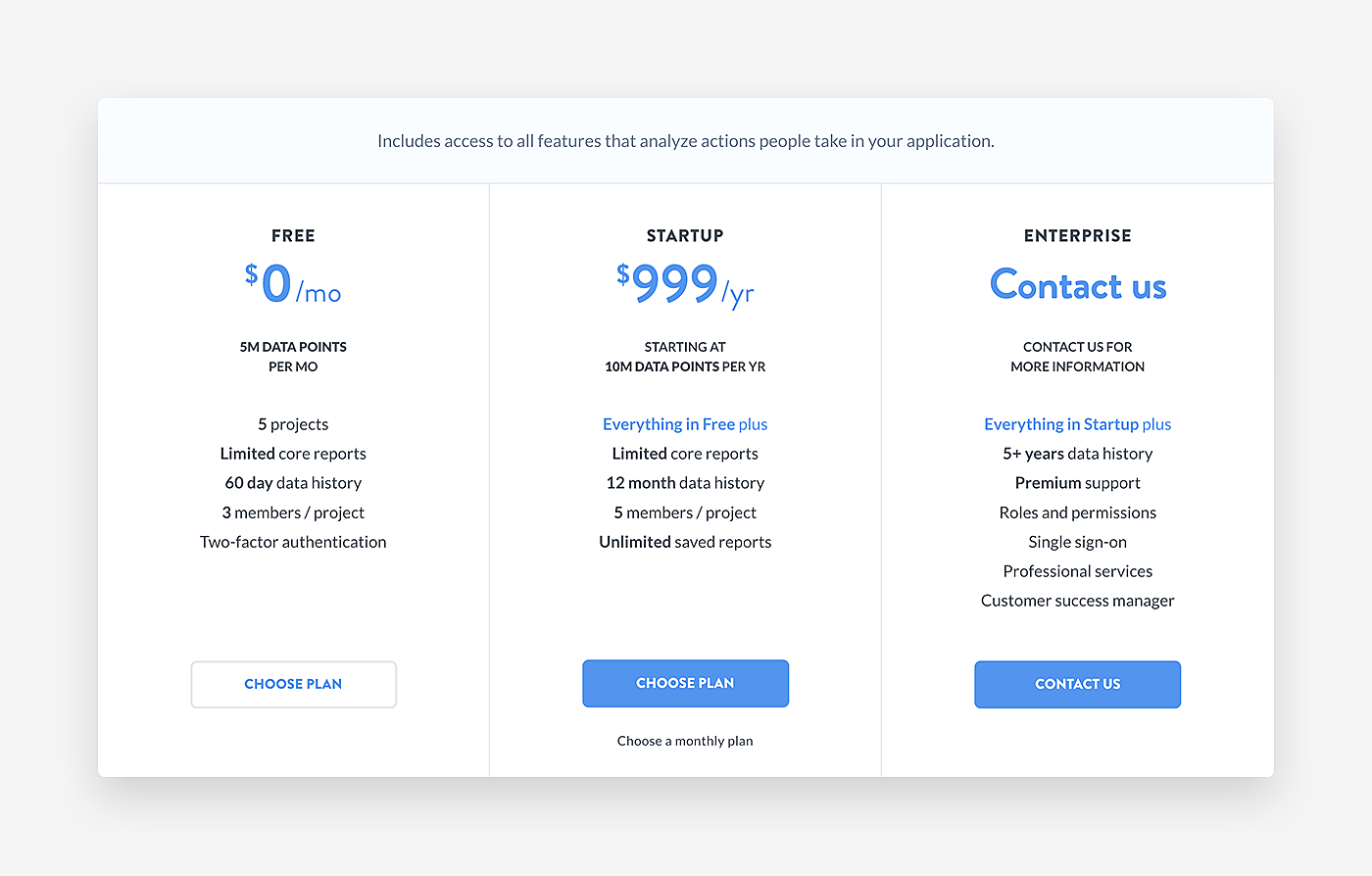
Double-check that you clearly indicate the difference between your pricing plans and/or products and that there is zero confusion between the stated options. Try to be concise and crystal clear about the benefits of each option, its features and price. Don’t follow Mixpanel’s example: their offering looks a little bit confusing as there is too much difficult-to-compare information below the plans.
Source: Mixpanel
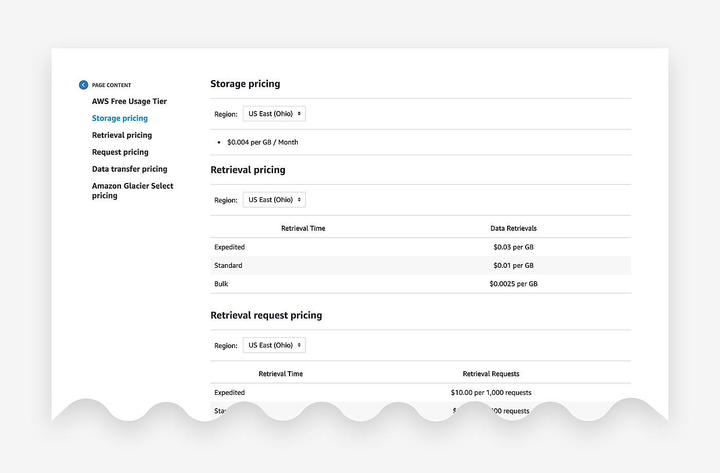
One more tip: if you have multiple pricing plans, don’t list them all like Amazon did.
Source: Amazon
Show just the best one and ask the customer to contact you for details about others.
CTA Buttons are a Must
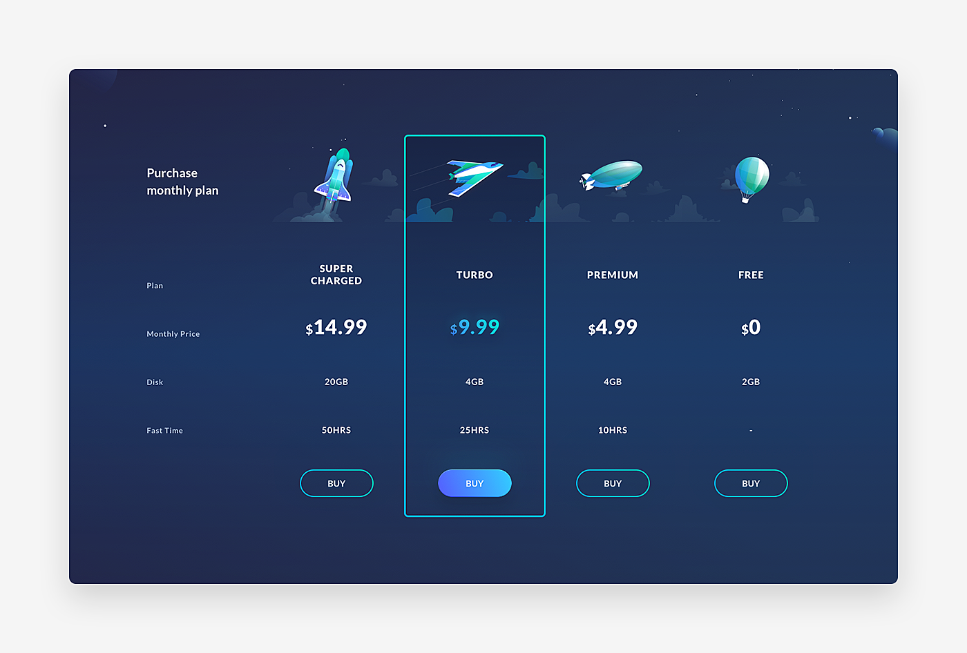
Always include CTA buttons, they are a prime source of best pricing pages. If there are no CTAs, your pricing page will not deliver the desired result. Use brightly colored buttons that will grab everyone’s attention. Experiment with differing text to find out which one maximizes conversions. and experiment with the position of A/B test buttons.
Source: Dribbble
Provide Clients with Additional Information
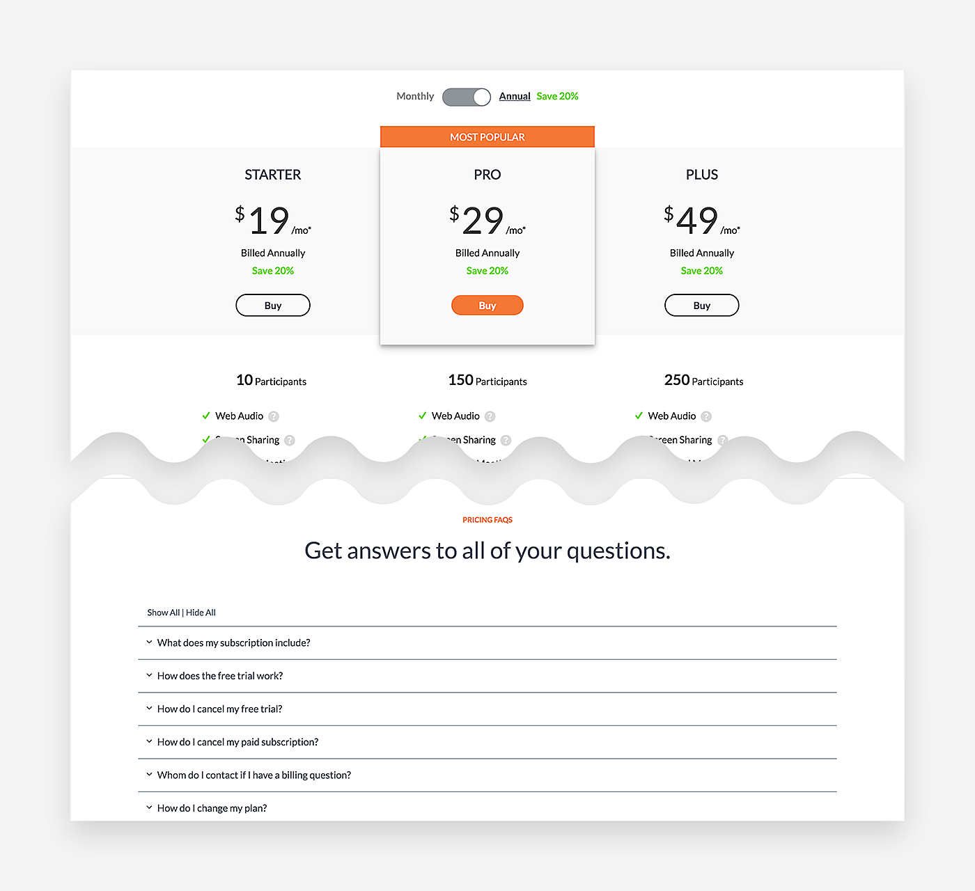
Some clients may still remain undecided after reading what you have to offer. Adding FAQs below the fold with extra information that site visitors may need is extremely helpful in such a case.
Source: GoToMeeting
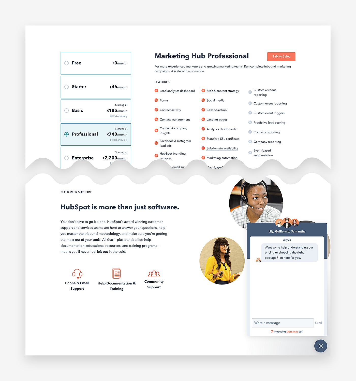
Not sure that this is enough? Install chat software and monitor it around the clock, or at least during business hours, to answer all the questions that may arise. Visitors may also search for alternative ways of contacting your team, such as making a phone call or sending you an email, so display them too on the page.
Source: HubSpot
Organize Options Wisely
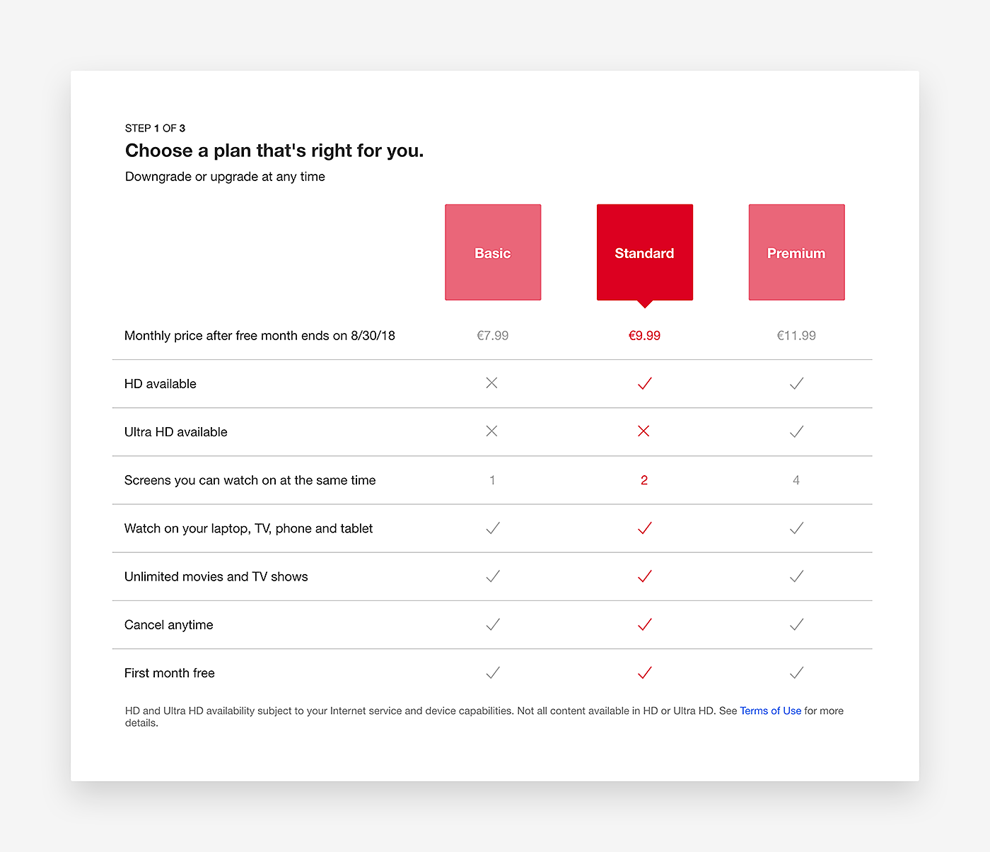
If you intend to sell a specific product or package, or if you believe that a certain option is a perfect choice for beginners, place the most expensive options before it, and highlight this particular product/package as a recommended one. Highlighting the most popular product/plan will also do you a good turn.
Source: Netflix
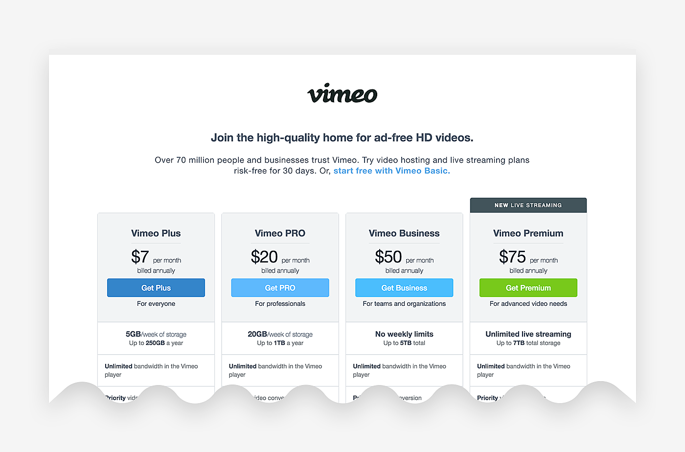
If you have decided to let your clients try the services first for free, add information about the free trial too.
Source: Vimeo
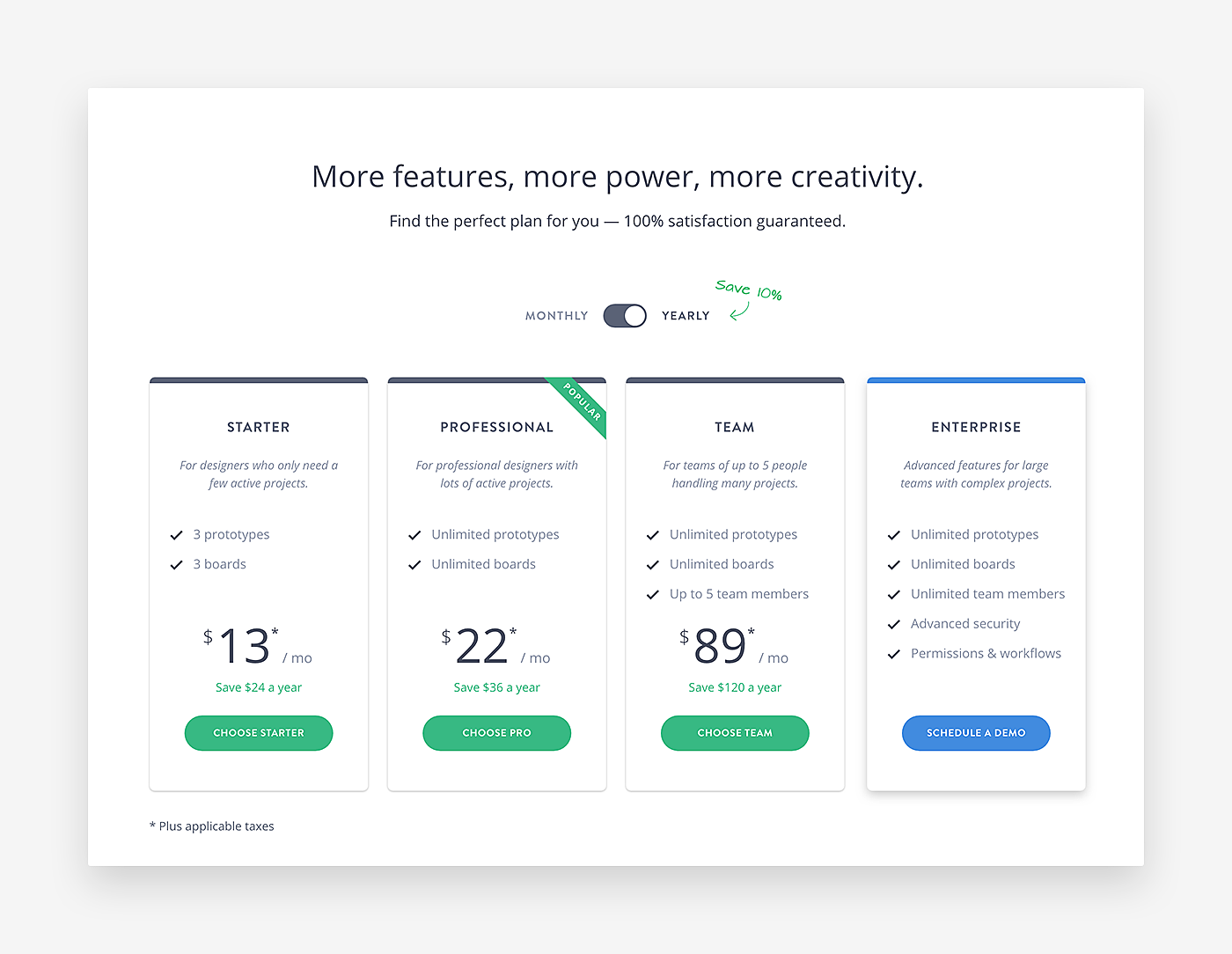
You may even use the design to talk customers into selecting a particular billing plan by indicating how much they can save with it.
Source: Marvel
Deliver a Game-Like Experience
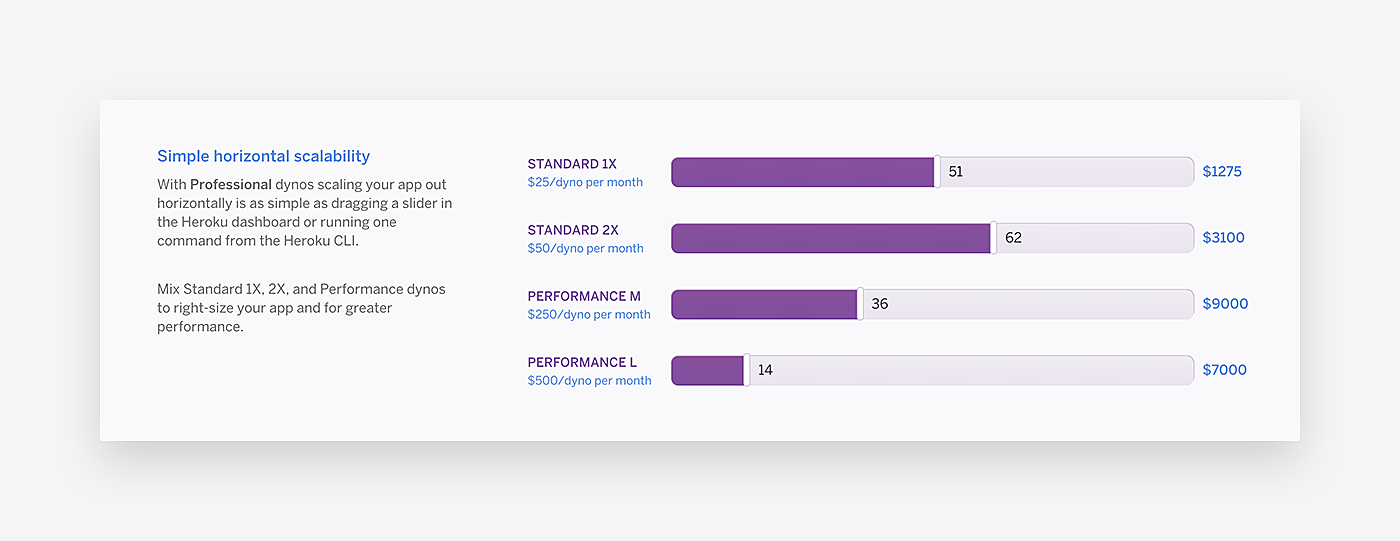
People of all ages love games. They are absolutely crazy about pressing various buttons, and dragging items to see the produced effect. Looking for a way to increase engagement? Add some playfulness and you will achieve this goal.
Source: Heroku
Make Clients Feel in Control
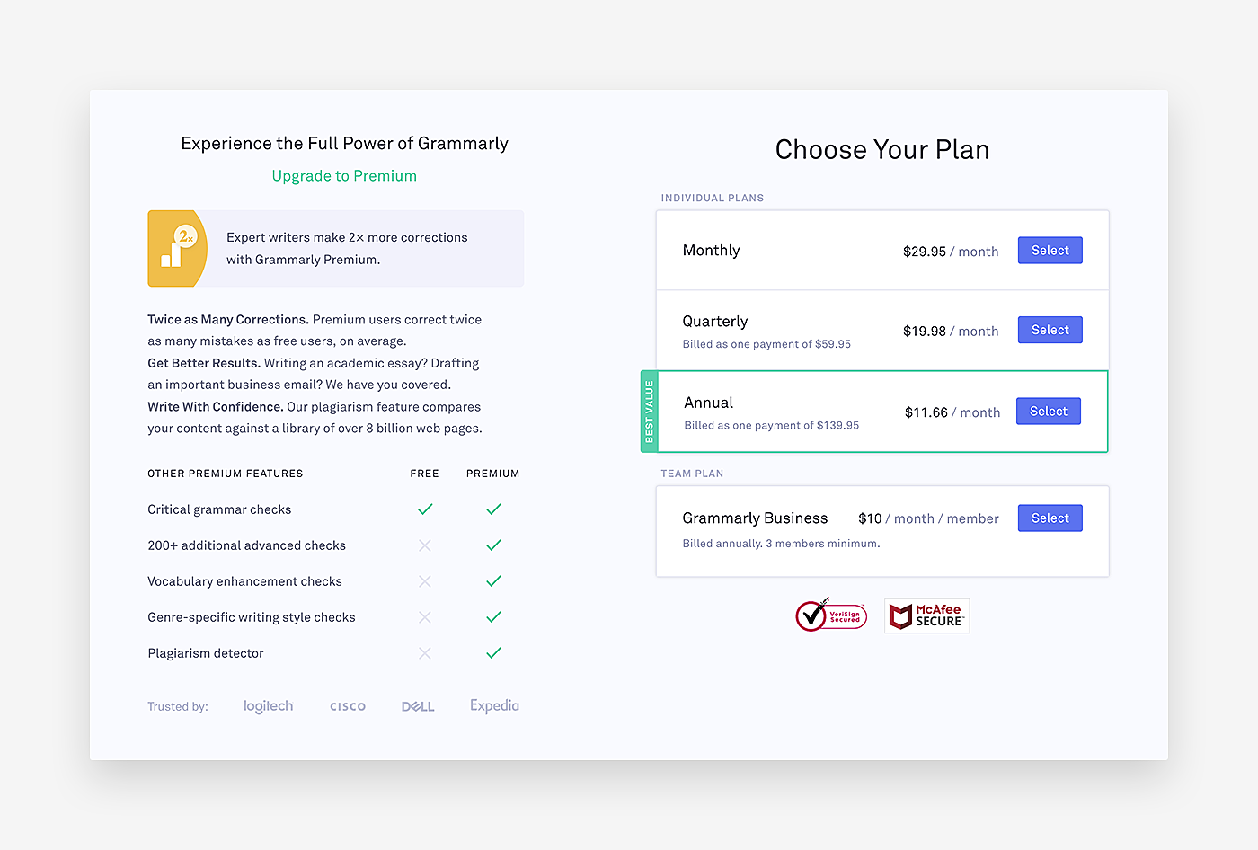
Human beings like knowing what happens next, as it gives them a sense of control. Eliminate unpleasant surprises by telling your customers beforehand what to expect after they make payment.
Source: Grammarly
Best Pricing Page Examples
We hope that now have an idea of how to produce a great webpage. If you still have some doubts, check these outstanding examples.
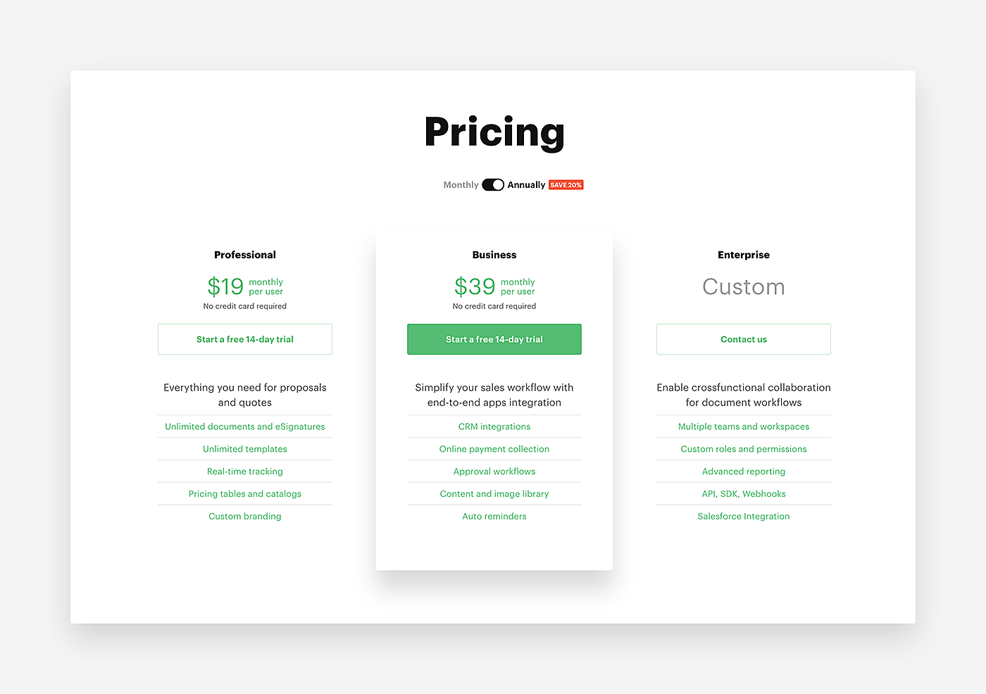
1. PandaDoc
Source: PandaDoc
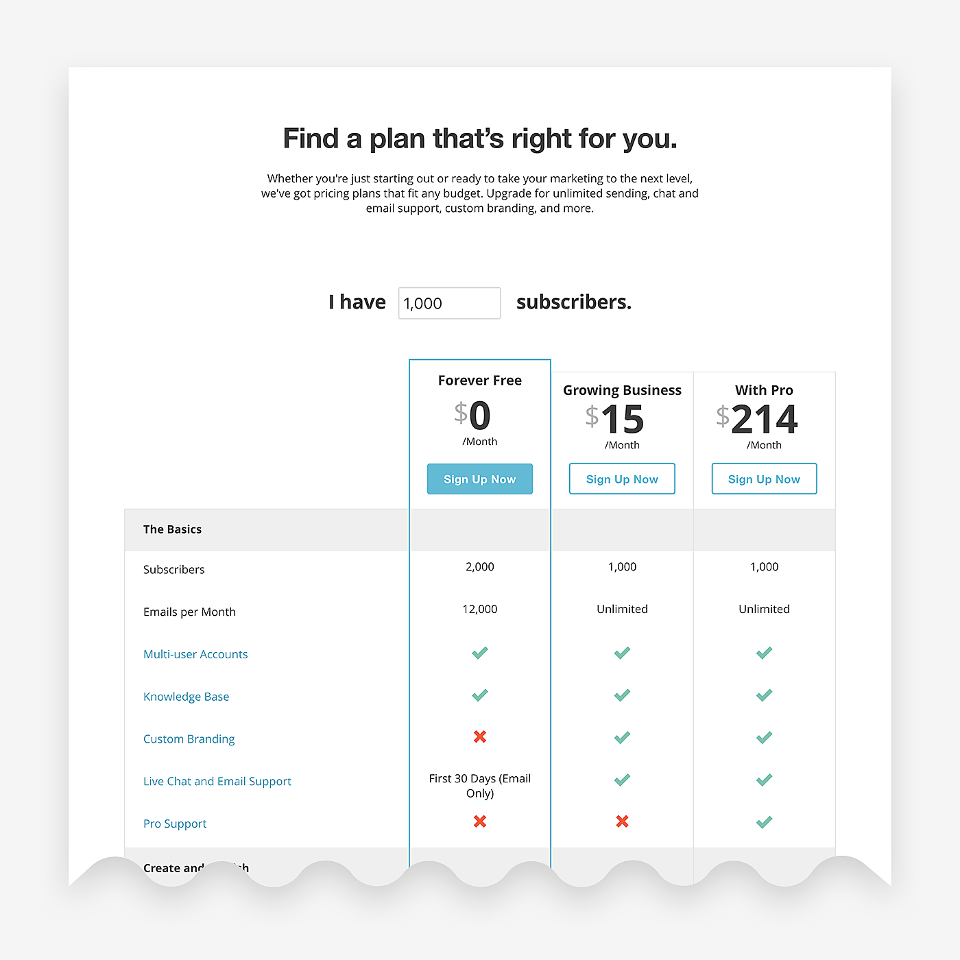
2. MailChimp
Source: MailChimp
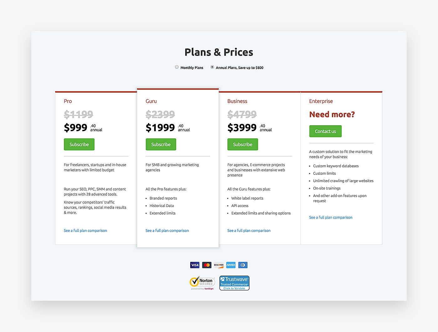
3. Semrush
Source: Semrush
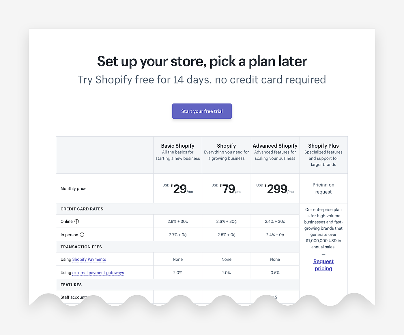
4. Shopify
Source: Shopify
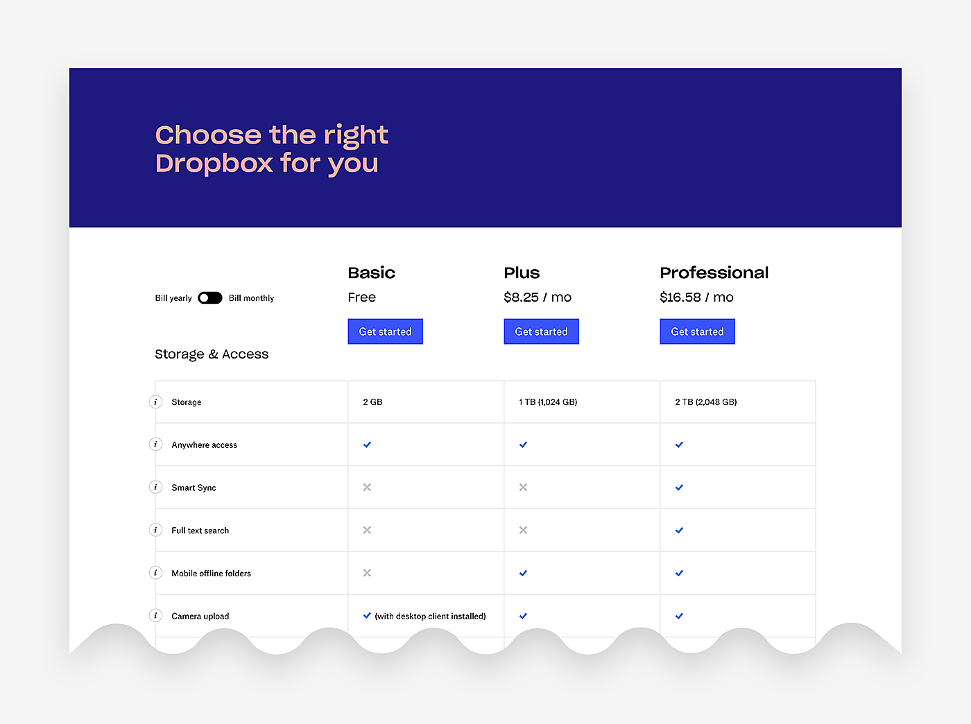
5. Dropbox
Source: Dropbox
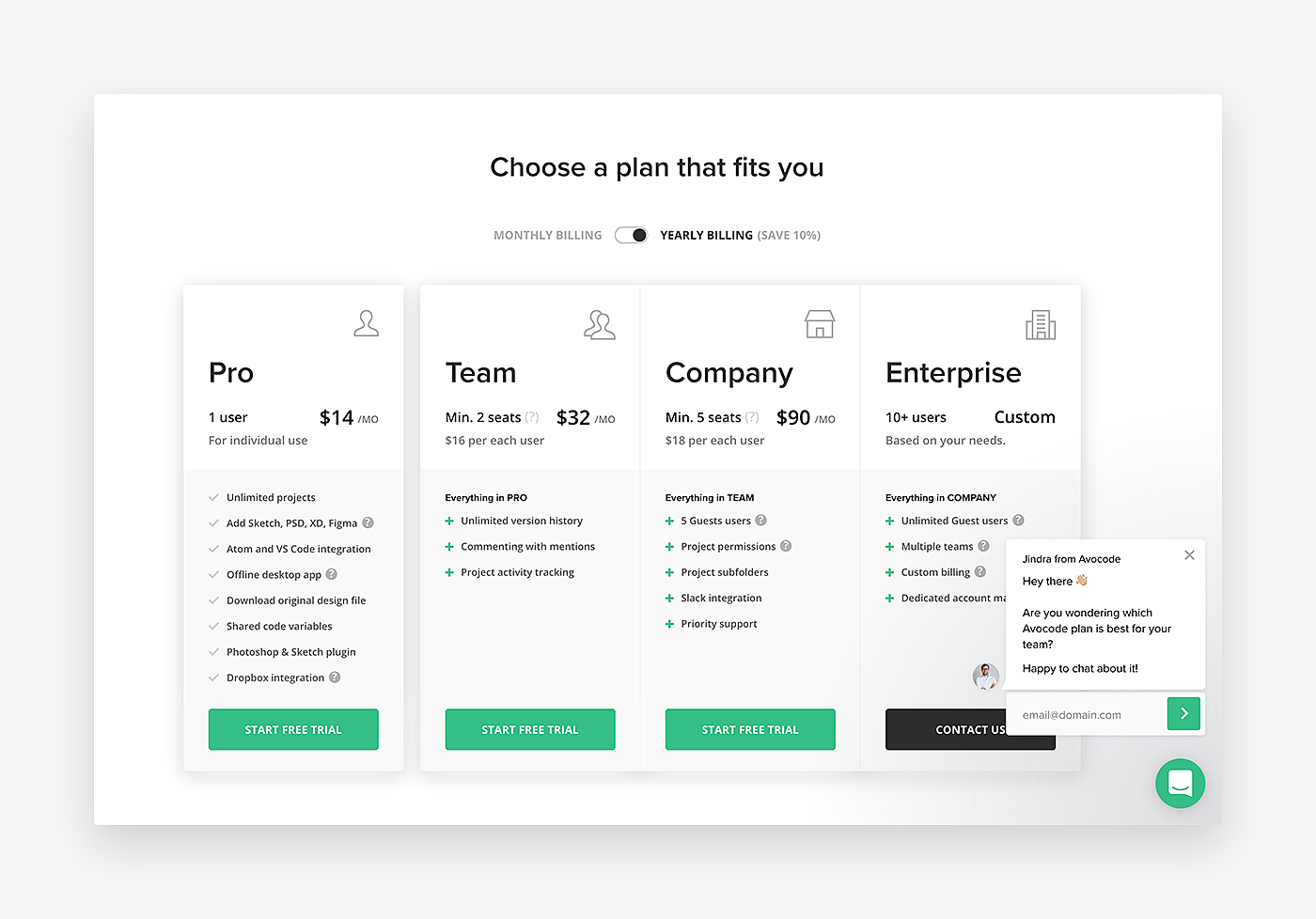
6. Avocode
Source: Avocode
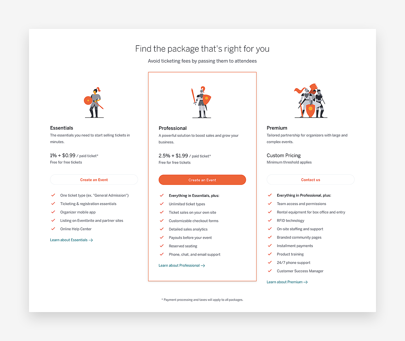
7. Eventbrite
Source: Eventbrite
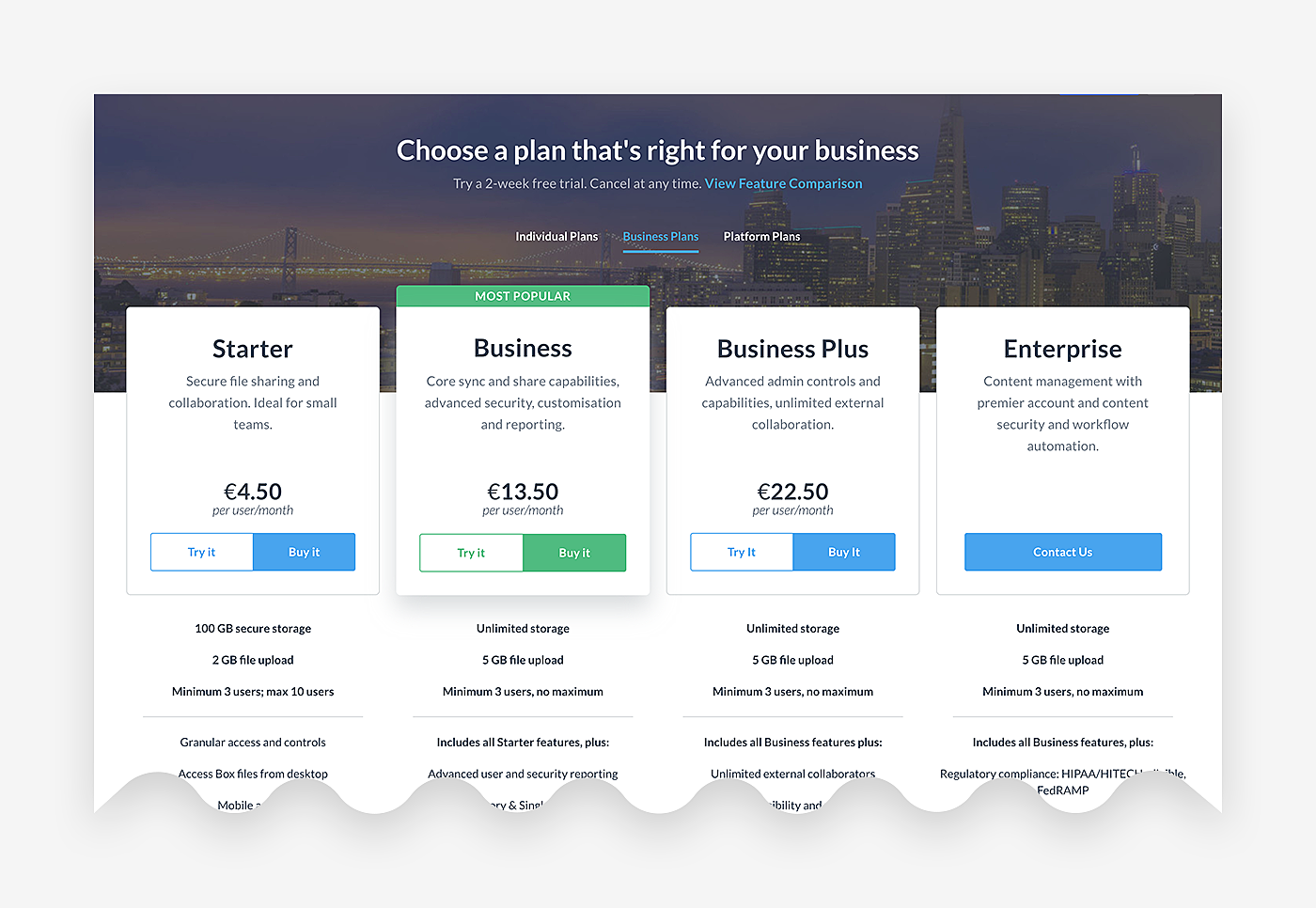
8. Box
Source: Box
9. VeewFlux
Source: ViewFlux
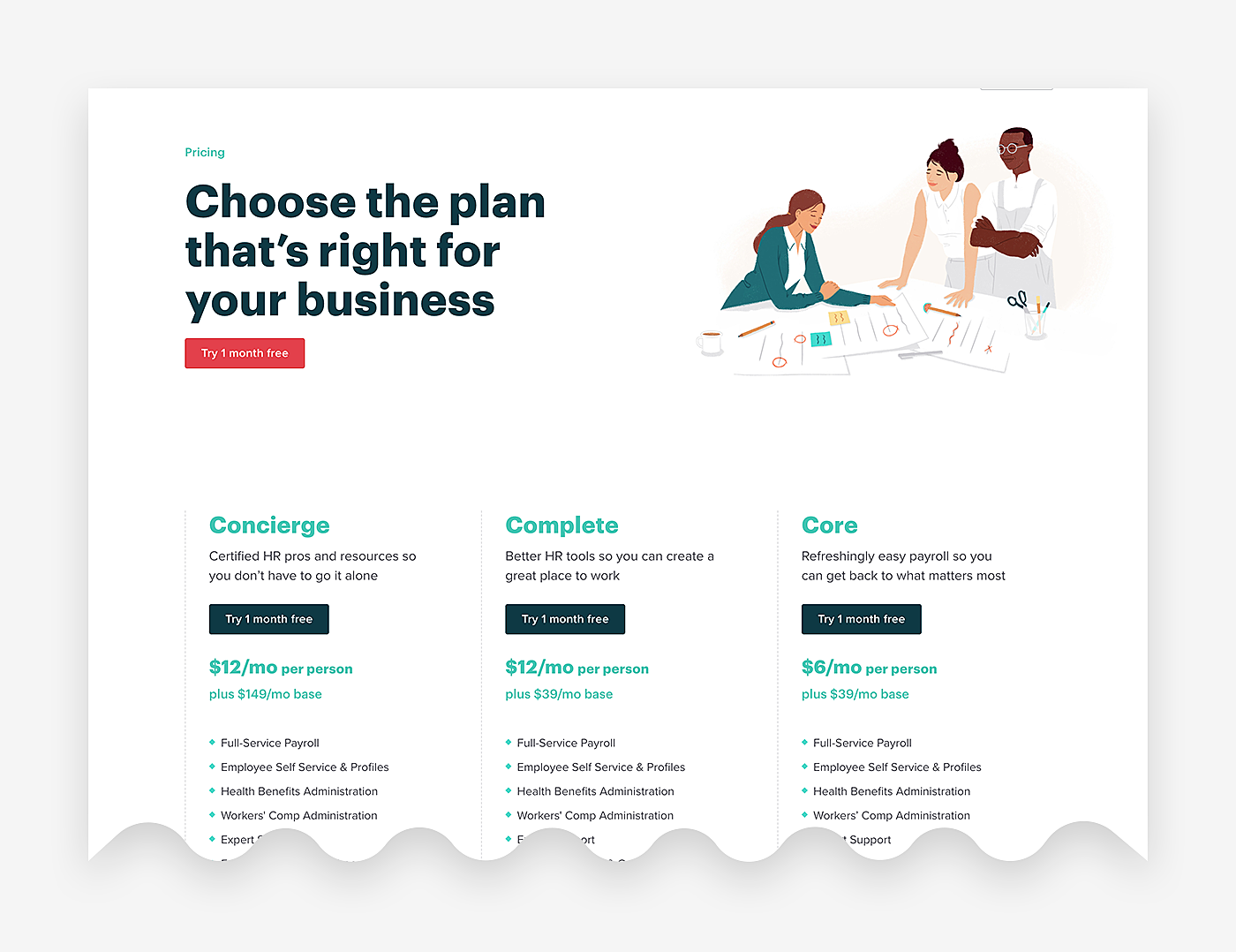
10. Gusto
Source: Gusto
Final Words
Effective pricing pages are well-designed, intuitive, and communicate the right message to potential clients. Acting as a powerful sales engine, they can bring a lot to your business, as nearly every customer sees one upon visiting the site. They help website visitors to find out the difference between products and services they are offered, and then make a choice.
In this article, we have outlined the features that a killer pricing page should have. Still have questions? Contact the AGENTE Team right now.
Rate this post!
826 ratings, average ratings is 4.5 out of 5
Related Posts
22 January 2024
Top 15 Software Project Risks and Mitigation Examples in 2024
Explore our guide to the top 15 software project risks and learn mitigation examples to ensure project success.

Travel Agency Website Development in 2024: Features, Tech Stack & Cost
Explore the world of Travel Agency Website Development, discover features, and get insights into the costs of building your online travel platform.

03 January 2024
10 Best Game Website Design Examples: How to Design Yours
Game website design: importance in attracting new players, awesome examples and design tips.
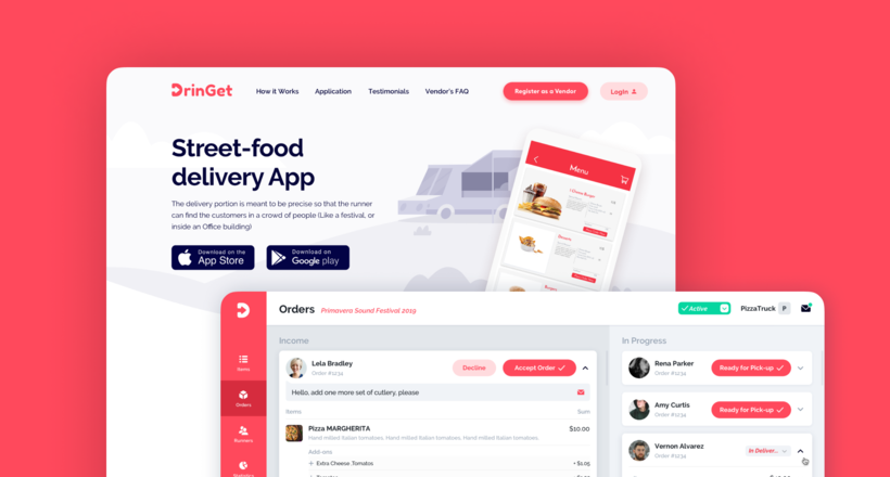
Effective Food Delivery App: Key Tips & Best Practices
In this article, we will share our experience in creating a design for a specialized food delivery management software, as well as best practices in designing such an application.
22 November 2022
10 Best Restaurant Website Designs & Best Design Practices
Restaurant owners always have a lot on their plate, and they are usually focused on the areas that can bring tangible benefits. Websites, unfortunately, are not one of those areas because even the perfect website does not guarantee that the restaurant will be full every evening.
31 May 2022
10 Best Examples of Website Footer Design
10 website footer design best practices examples for inspiration ⚡ Things that can go in website footers ⚡
Let's talk
Is there a challenge your organization or company needs help solving? We’d love to discuss it.

Managing Director, Partner
Andrew Terehin

Thank You!
Your message has been successfully sent.
We will contact you very soon.
