Best Healthcare Website Design Tips [With Examples]
Did you know that the digital health market is to reach nearly $660 billion by 2025 with an expected CAGR of almost 25% from 2019 to 2025? Given that 4.88 billion people around the world use the Internet, compared to 1.97 billion in 2010, interest in online medical websites is expected to grow continuously.
Online presence is a strong business tool that helps to provide better customer support, attract new customers, and cut costs. Patients find healthcare providers online and make their decision about the qualities of services based on the health website design. Visual and written content, as well as a marketing strategy, are important, but the UX is of primary significance.
Healthcare website design may become a daunting task for designers who lack relevant experience. Healthcare providers must be extra cautious when they choose a design company, as various issues should be taken into account, for example, HIPAA compliance to ensure patient data security and eliminate any potential data breaches.
In this article, we’ll look into the best practices in website design for healthcare organizations, give you some design inspirations, and share our experience to make your website an educational and reassuring platform for prospective patients.
Major Types of Medical Websites
Broadly speaking, there are five types of websites that need separate medical web design approaches.
1. Medical Catalogues and Portals
The first of the doctor website examples are devoted to a specific hospital or medical center and contains comprehensive information about services that the institution offers, their staff, locations and directories, working hours, and more.
2. Hospital/Medical Center Websites
People visit these clinical websites to read information about healthcare institutions and doctors, read real people's reviews, find hospitals and/or healthcare professionals that can treat their diseases and medical conditions, send inquiries, etc.
3. Medical Marketplaces
These marketplaces offer general or specialized medical services to their visitors. The websites contain doctor ratings, and give details about the qualifications and experience of doctors who have listed their practice there, enable online appointment booking, etc.
4. Medical Practitioner Websites
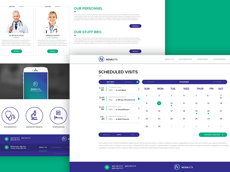
Medical practitioners have started to launch separate websites to promote themselves. Appropriate web design for doctors and medical practitioners with blog posts, customer testimonials, and sharing of healthcare news communicate doctors’ knowledge to visitors.
5. Online Doctor Consultation Platforms
Being too busy to spend their precious time on face-to-face visits, many people take advantage of online consultations. They use this service to receive detailed medical advice from certified specialists through an Internet connection.

Must-Have Features of Healthcare Websites
Be it a doctor website design or web design for medical clinics, there are a number of best practices to follow that make visitors return and engage. They include data visualization techniques, appropriate speed, usability, and content features, access to the online patient portal, and a secure web presence. Let’s discuss these in greater detail.
Data visualization
Ninety percent of the information transmitted to the brain is visual. People come across gigabytes of data online and grab only the ones that are well-interpreted. That’s why presenting key insights in charts or graphs to visualize significant amounts of complex data is more effective than relying on spreadsheets or reports.
Grab some data visualization tips:
● Use infographics with minimum text. Include charts, maps, pie charts, and gauge charts.
● Choose a color scheme and be consistent in it throughout the website. Use clear contrasts to distinguish important information.
● Create a clear layout and hierarchy to prioritize information.
● Include comparisons. Present two graphs together, each showing contrasting versions of the same information over a particular time frame, for example the number of satisfied patients last year and this year.
Speed
Remember, high-performance websites increase visitor engagement. Keep the page and image weight small. Avoid over-downloading of high-res images. PageSpeed Insights is a great tool to make your pages load fast on all devices.
Usability
Adequate interface across multiple devices is the first essential point to note. In all probability, most of the patients will visit your website through a mobile device. That’s why you should make sure the website is equally usable on computers, mobile phones, and tablets. To make your website work on mobile devices take a look at Google recommendations.
Other tips include:
● Use descriptive buttons to help users understand where they are. For example, “Step 1 of 3” instead of “Next”.
● Touch target size should be at least 7mm, up to 10mm.
● Font size should be at least 10 pixels for optimal visibility.
● Adapt hover to mobile screens. Choose touch and hold or swipe left/right.
● Be careful with pop-ups. The following techniques make content less accessible to the user.
○ showing a pop-up that either immediately covers the main content when the user navigates to a page from the search results or while they are looking through the page
○ displaying a standalone pop-up that the user has to dismiss before accessing the content.
Pop-ups on mobile devices can be replaced with in-text hyperlinks and call-to-action prompts.
Content
Here, you should pay attention to consistency, accessibility, structure, space, web search, and data reliability.
Consistency
Create a pattern library (a collection of user interface design elements) or a design system. It's a combination of design standards, tools, deliverables, and style guides that help companies to build digital products and then maintain them with a modular approach.
Accessibility for people with disabilities
Follow these simple tips:
● Use alt tags. These are little words that pop up when you hover your mouse over a website. People with visual impairment use a screen reader (a program that reads text on a website out loud). All alt tags are read aloud and are the only way a user knows what the image is.
● Write subtitles and transcripts. All videos on your healthcare website should have transcriptions.
● Put periods in acronyms. For example H.I.P.A.A. instead of HIPAA. A screen reader won't recognize an acronym without periods.
● Underline links or make sure that there is a color contrast between hyperlinked text and regular text. That way, colorblind users will be able to find a link immediately.
● Keep your copy simple. It’s extremely helpful for elderly people and those with learning disabilities. Break the text into smaller paragraphs. Use simple, straightforward language in the active voice.
Content structure with headings
Section headings (e.g., <h1>, <h2>) with large or bold text can help quickly scan and understand web pages without fishing for the main ideas. HTML headings are classified starting with level 1 and ending at level 6. Headings on well-designed web pages will form an outline of the page’s content.
Such content structure also helps users with visual disabilities who use assistive technologies to detect subjects covered in the text and navigate quickly to a specific section.
Space
Let the page breathe. To avoid logical parts from blending in, keep them separate, inserting a large space (at least 120 px) between them. For easy navigation, split the text into paragraphs or introduce breaks such as an image or a key phrase. A wall of text makes reading difficult to understand.
Note that a mobile page should not be packed with information. The standard recommendation is that there should be 30 to 40 characters in a line. Anything more or less could affect readability adversely.
Website search
Most users don’t have enough time to go over a healthcare website to find particular information. A robust keyword search feature will help them filter searches by criteria, such as news, medical services, events, providers, and locations. It’s a good practice to feature a listing of recent searches in the left/right margin that allows users to track their search history.
Separate navigation for patients and healthcare providers
Patients and healthcare providers usually need separate pieces of information. It’s worth considering setting up a separate version of a website for each audience.
Priority information for patients: doctors, appointments, disease description, treatment, information about drugs (benefits, side effects, affordability).
Priority information for healthcare providers: appointments, prescribing information, information about drugs, mechanism of action.
Reliable data
Best health websites minimize marketing and become a source of reliable information for both patients and healthcare providers. Here are some tips on how to do that:
● links to original research and clinical trials
● always up-to-date information
● images of real people, true case studies, and testimonies from patients and caregivers
Your website should also include proof of your medical authority and expertise, namely:
● awards and achievements
● rankings in “Best of” publications
● affiliations
● doctor pedigrees
● associations.
Access to an online patient portal
An online patient portal is a secure online website that gives patients convenient 24-hour access to personal health information and connects them with doctors. It also keeps doctors in the know about their appointments. Healthcare providers should have the ability to access online patient portals through the website as well.
Secure web presence
Every website related to healthcare should meet the standards of H.I.P.A.A. Security Rules. It provides guidelines for the transmission of electronic patient health information and states who has access to that information.
Medical Website Design Process
The classic process of health website design involves three stages: Design discovery, UX design, and UI design.
Design discovery
This is an important stage that leads to a common understanding of the project; it reduces risks, helps to estimate the project budget, and involves feedback from clients. UX/UI specialists determine the appearance of the final product by structuring all the ideas properly and formulating the strategy of the actions.
During this stage, user personas, user stories, user flows, information architecture, and low-fidelity wireframes are created.
● User personas represent user types with their needs, problems, behaviors, and goals.
● User stories depict how a particular feature will deliver value to users.
● User flows show how a user should go from their entry point through a set of steps towards a successful outcome.
● Information architecture is a visual representation of the website infrastructure, features, and hierarchy.
● A low-fidelity wireframe helps to focus on the key purpose and functionality, excluding specific details like colors, fonts, logos, and exact sizing.
UX design
This stage is a design plan that involves wireframing and prototyping, all of which results in creating a layout of the website displaying the interface elements that will appear on each page. The essential purpose is to provide a clear visual understanding of the website usability across devices.
UI design
UI design involves creating high-fidelity UI mockups, which are more in-depth iterations of the wireframe outline. A mockup includes more stylistic and visual UI details that present a realistic model of the final healthcare website.
A mockup includes additional visual details: navigation graphics, colors, styles, graphics, typography, component spacing, styled buttons, and text.
10 Best Medical Website Design Examples [With Tips]
We’ve selected 10 examples of website design for medical practice that we hope, will give you a better understanding of how to make your own.
Medical Catalogues and Portals
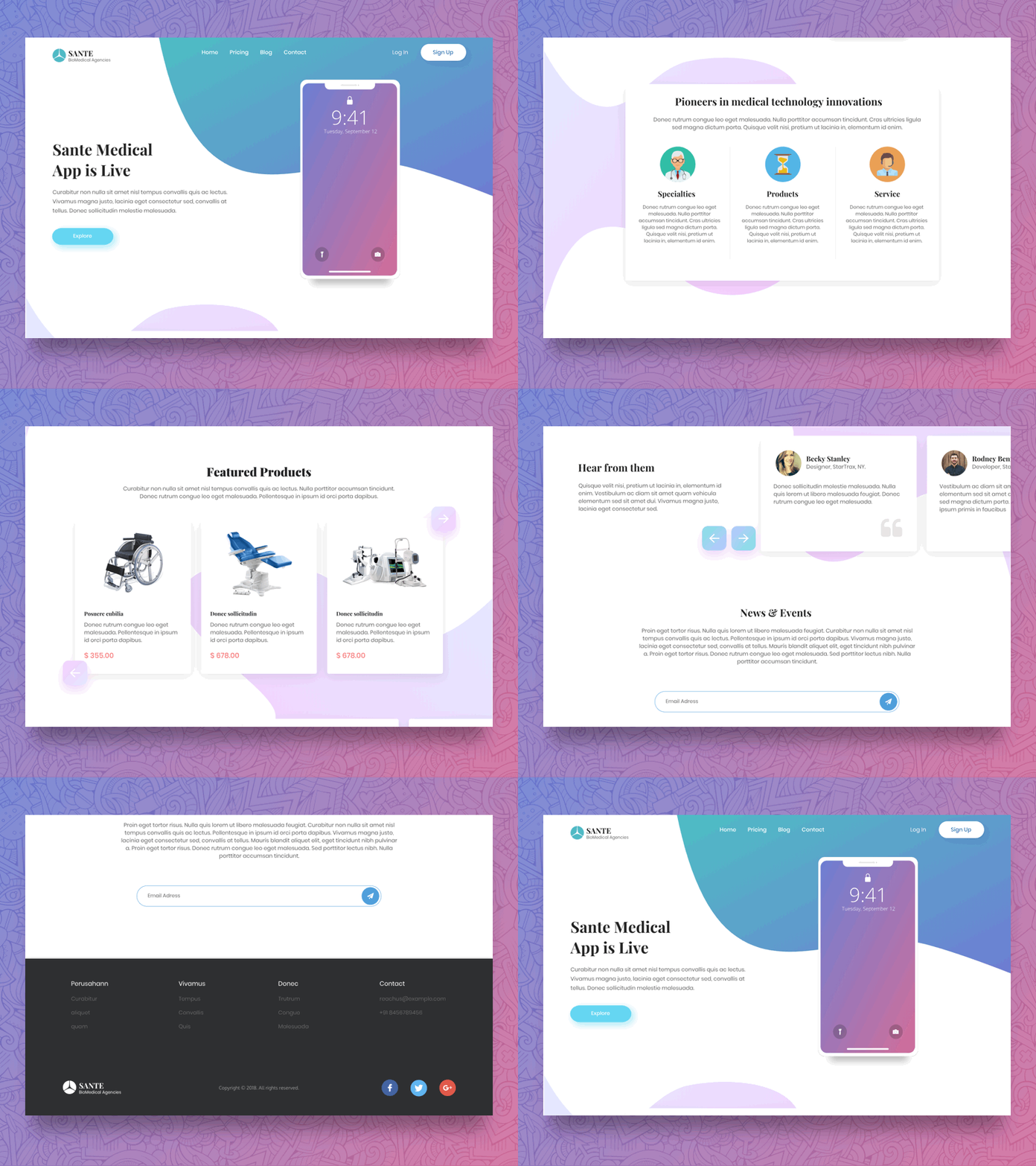
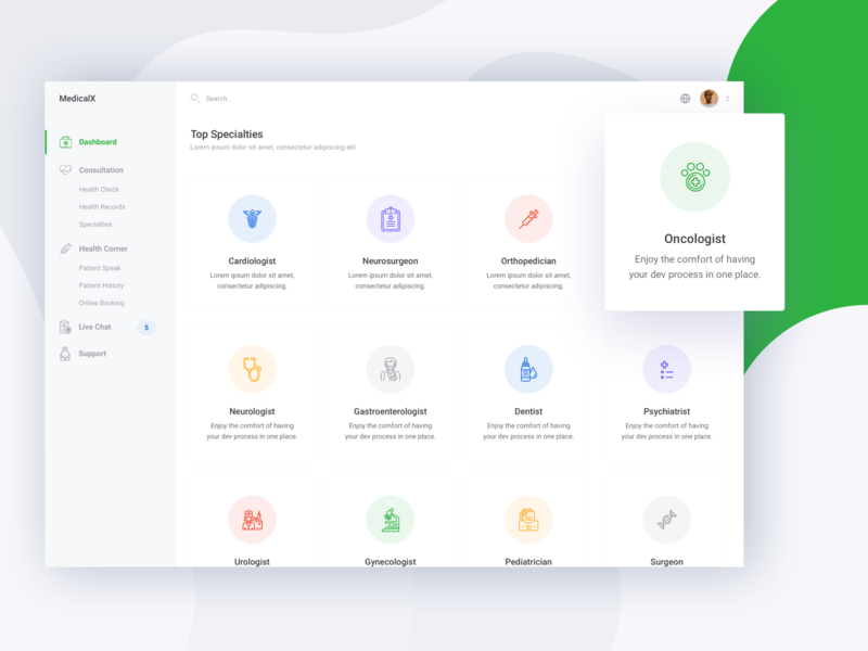
Such websites do not need a sophisticated design with multiple images, animations, colors, etc. They should have a simple and clean design. As their main purpose is to help visitors find the medical information they need, these sites should have a search box that is visible to all visitors, regardless of the page they are currently on. A big search box may be located on the top of the home page or in its middle to let people start searching immediately after accessing the website.
Source: Dribbble
Site developers should make sure that a website is intuitive to use by placing the main navigation bar on the top of the website, using sidebars and call-to-action (CTA) buttons, like caredash.com does.
Source: Dribbble
Hospital/Medical Center Websites
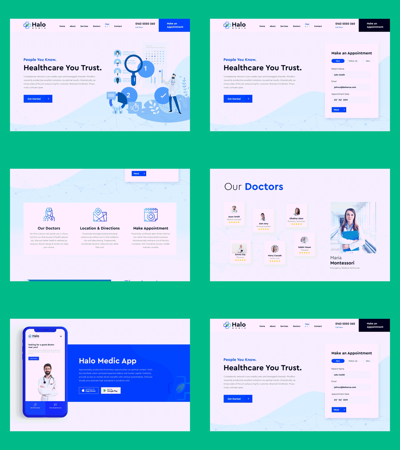
As these sites promote the services of a hospital/healthcare center, they should use CTA buttons extensively from the main page onwards in order to encourage visitors to take certain actions, e.g., find a doctor, request an appointment, manage an account, etc.
Source:Steelkiwi
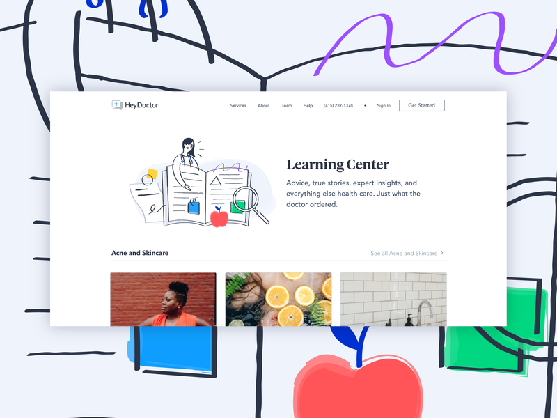
A medical clinic website design should not be too complex. It is a wise idea to include a looping video on the homepage of the site to let first-time visitors get acquainted with the medical institution. Real photos of employees and the building’s interior as a background image form one more option for the hospital website design.
Contact details (e.g., phone number) should be found in the header so that visitors can find them at any time. The navigation bar should be displayed on each page to make a search easier. Patient stories, testimonials, and achievements should be showcased to build credibility and trust.
Source: Dribbble
Medical Marketplaces
These marketplaces do not require an innovative healthcare website design, as they are developed to connect service providers with customers. Yet, if a marketplace specializes in specific services, there is more room for imagination. For instance, orthoindy.com has an introductory video that gives visitors a brief insight into the services that are offered.
Source: Dribbble
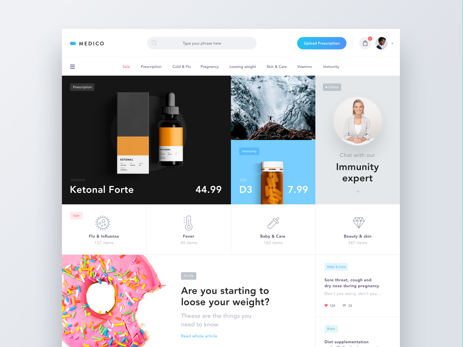
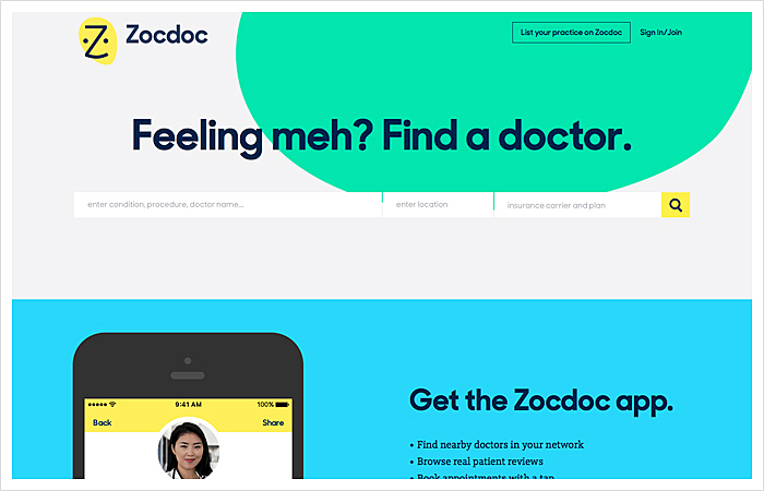
The search box is as important here as it is for medical catalogs and portals. An advanced search can be utilized to show visitors all the options that are available. For example, Zocdoc lets users do an advanced doctor search where they can choose not only symptoms/doctor's specialization but also gender, language, etc.
Source: zocdoc.com
Such websites should have rating systems based on customers' reviews, and service provider profiles that contain detailed information: education, experience, and certifications. CTA buttons cannot be neglected, either. They should be found on each page to suggest some sort of action to visitors.
Medical Practitioner Websites
Website design for physicians and other medical practitioners is, to a certain extent, similar to that of a personal website, as they both are dedicated to a specific person. But unlike personal sites, where someone's personality is the center of attention, these websites cover the professional goals of their owners to create a favorable first impression.
Source: Kaplan Orthodontics
They are an extension of the practice, and medical specialists may let site visitors request appointments (by clicking CTA buttons), watch videos, order books that have been authored by the medical practitioner, share their thoughts in the guestbook, send messages, and more. The website design for doctors should contain photos of their owners to earn potential patients’ trust.
The other reputation-building feature for doctor website design is a blog that spreads trustful healthcare information among the readers. It’s also good practice to add a newsletter subscription CTA button as a part of medical practice website design and share publications, news and press releases that matter most.
Source: Dribbble
Online Doctor Consultation Platforms
When it comes to an online medical office website design, demonstration of such services is the focus of attention there. Designers usually employ an introductory video for this purpose.
Source: Dribbble
These platforms should be easy to use, as people of diverse ages and physical conditions may utilize them to get a consultation. In short, the sites need simple and intuitive navigation. CTA buttons should also be employed on each page.
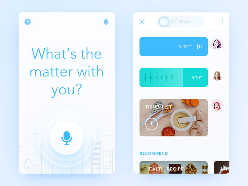
Some sites suggest that visitors start their journey with search activities by entering their symptoms, medical conditions or a medical specialist title they look for.
Source:Dribbble
It is essential to include precise information about medical professionals who provide services via the website. Include customer testimonials and reviews and enable a rating system.
When Is the Right Time to Redesign a Healthcare Website?
Below are several questions that will help you to understand whether your current healthcare website needs redesigning.
● Has your practice changed? Ask yourself: “Does my website currently reflect my specialisms and your values?” If not, it’s time for a change.
● How old is your current website? If it was designed and built just a couple of years ago it can be labeled as ‘out of date.’ Ten years ago websites used to be filled mainly with text and rarely worked on mobile devices, recent trends involve videos, GIFs and motion pictures.
● Is it performing how you want it to? Check for any UX problems. Ask your patients how easy it is to schedule an appointment online, what they like and dislike about your website. Take their feedback to heart.
● Are you seeing a return on your investment? A website is still a form of marketing/ advertising. This means it needs to be quantified against results.
What Should a Medical or Doctor Website Design Cost?
On average the cost of healthcare websites can range anywhere from $1,000–$20,000. With disparity in pricing, it’s important to consider several factors when estimating final costs:
● Is it a template or custom design? A template design can be customized to a limited degree. In addition, these sites are often coded poorly, which can result in equal performance on search engines. Custom layout, imagery, content, and other features—can be tailored to meet your specific needs.
● What time is dedicated to the project? It’s critical to understand that developing a custom website properly takes time, which is reflected in pricing.
● What is the scope? The homepage of a website is the main point of attraction, but a great design shouldn’t stop there. Internal landing pages are where patients will likely spend most of their time, as they are looking for specific information.
Other Considerations
![]()
There are some other features that are applicable to any healthcare websites:
● The number of people who use their mobile devices to access the Internet is skyrocketing, so it is a clever idea to choose a responsive website design (Google loves these) or create a separate mobile version of the site.
● Custom website design is always better than pre designed website templates, as it lets developers build a site that is distinct from others and provide a unique experience to its visitors.
● The website navigation should be simple enough to eliminate any difficulties for unseasoned Internet users.
● The search bar should be available on all the pages, thus allowing visitors to start searching for information they need from any page.
● It’s better to get rid of stock photos and use unique images, icons or real photos.
● Do not forget to include links to social media accounts.
● Utilize interactive forms (e.g., to book an appointment) and include HIPAA-compliant patient forms.
● Create an information portal by starting a blog.
● Show contact details on each page and do not be afraid to employ CTA buttons everywhere.
Agente Experience
For years, we’ve been developing custom healthcare apps, mHealth and telehealth solutions that address the most acute challenges of medical providers. Take a look at some of the cases.
Medical website
This is a website for a pharmaceutical company. Our designers meticulously picked up the color palette, which is varying shades of blue throughout the website. It helps to maintain continuity and a sense of cohesion. We see a healthy proportion between images and text, which makes the page look neat and not overloaded with information. All the key functions like checkout, ordering, and product range stand out and catch the user’s attention.
Mobile patient portal
One of our recent projects is a mobile patient portal allowing users to store and edit patient records, share patient check-up history, make notes, and communicate with the healthcare provider. As you can see.
Clinical management system
This was a long-term project clinical management system for a non-profit medical resource organization.
Conclusion
Medical institutions and specialists are increasingly interested in building their online presence by launching their own sites. It is important to find the right web development team, one that can make an outstanding healthcare website design by utilizing the latest design techniques and taking into account domain-specific requirements (e.g., HIPAA compliance). Reach out if your aim is to attract new clients and retain existing ones.
Frequently Asked Questions
Why does your medical practice need a website?
For a number of reasons: your patients have the ability to acquire information about you faster and easier. It will also help you grow your referral stream. Scheduling appointments will be streamlined using a simple booking system online or video consultation. Finally, a good health website design provides a great first impression.
Why should you hire Agente to design a healthcare website?
In creating healthcare solutions for companies across business sectors, we have always put design guidelines for online medical website design into practice, such as data visualization adequate view across devices, accessibility for people with disabilities, clear content structure, simple copy, reliable data, robust search tools, separate versions for healthcare providers and patients, access to an online patient portal, and secure web presence.
Can Agente update my existing website or make enhancements?
Yes, we design from scratch as well as redesign healthcare websites. Firstly, we analyze what is wrong with the current version and go through all medical web design stages: Discovery, UX and UI.
How Often Should I Redesign My Practice Website?
The best practice is to redesign your practice website every four-to-five years. You don’t need to do a big overhaul; it’s enough to redesign certain aspects to ensure that patient experience is the very best it can be.
Rate this post!
429 ratings, average ratings is 4.3 out of 5
Related Posts
17 January 2024
What Does a UX Designer Do in 2024: Role & Responsibilities
What does a UX designer do? It’s time to define core responsibilities, functions, and perspectives in one place.

11 January 2024
Mobile-First Design: Full Guide for 2024
What is mobile first design? Well, the mobile first approach is a central principle of progressive enhancement. In a nutshell, it’s all about producing a small screen design and then scaling it up to other devices. In our new blog post, we cover some aspects that need to be taken into account when launching a mobile first web design project. We also share some outstanding design examples for your inspiration.

03 January 2024
10 Best Game Website Design Examples: How to Design Yours
Game website design: importance in attracting new players, awesome examples and design tips.

22 November 2022
10 Best Restaurant Website Designs & Best Design Practices
Restaurant owners always have a lot on their plate, and they are usually focused on the areas that can bring tangible benefits. Websites, unfortunately, are not one of those areas because even the perfect website does not guarantee that the restaurant will be full every evening.

31 May 2022
10 Best Examples of Website Footer Design
10 website footer design best practices examples for inspiration ⚡ Things that can go in website footers ⚡

26 May 2022
22 Best Serif Fonts for Your Website
Find the best serif font with our roundup of the best serif fonts of 2022! Complete with logo design tips and famous serif logo examples.
Let's talk
Is there a challenge your organization or company needs help solving? We’d love to discuss it.

Managing Director, Partner
Andrew Terehin

Thank You!
Your message has been successfully sent.
We will contact you very soon.


