28 September 2017
10 Website Color Schemes: 10 Best Color Palettes for a Website
You’ve spent too much time deciding on the best color palettes for your website. Black-greyish-white, like Apple? Or blue hues, like Facebook?
What if you need more than two or three colors, and match some additional shades that work well with them?
First, don’t rush into emotional choices. Colors are all about our personal feelings, mood, taste, and perception — let’s put all of this to one side and concentrate on business. What are your website’s perfect colors? What will help you attract visitors and make them stay?
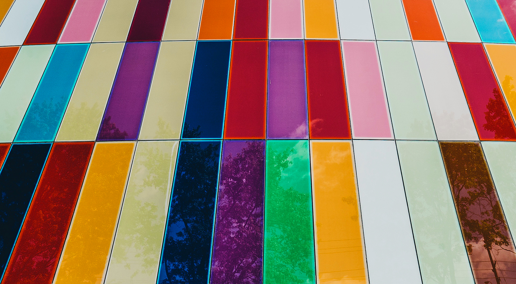
In this article, you’ll see the best practices for choosing the right color and the greatest examples of color palettes for websites.
How to choose the right color palette?
1. Identify your target audience and core goals

When choosing color schemes for websites, the first thing you need to bear in mind is a portrait of your website visitor. Age, gender, culture, business profile — everything matters for a better user experience. Let’s dig deeper into each of the aspects:
When it comes to gender difference, don’t be misled by the pink-and-blue paradigm. According to a study made by Kissmetrics, blue, purple, and green are women’s favorites, while men prefer the same blue and green plus black, and dislike “women’s” purple. That’s why it’s better to use “safe” gender-neutral colors—for example, blue, which is loved by the majority of both genders.
In terms of age, preferable colors become “colder” with time. Leave the hues of red, orange and yellow to the younger audience, and paint your website in blues and greens, if you aim to reach mature visitors.
The other critical detail to consider is contrast: clarity matters for little kids who are just learning to distinguish symbols, and also for elderly people, as they tend to lose acuity of vision.
Be aware of color blindness as well. Add the option to apply specific filters or color blindness simulators, if the correct perception of website colors is your company’s priority.
Despite globalization advancing in leaps and bounds, there are still culture connected colors. Website color schemes making a hit in the US may not work in Japan or India, and vice versa. Purple, is one of the least favorite colors among American males, is strongly associated with wealth and prosperity in some Asian cultures, and can be applied to trigger an association with success.
Believe it or not, your website color palette is a primary reason why visitors stay or bounce. Every color is associated with its own feelings, however, these feelings can differ depending on the context you provide.
Red can be associated both with love or danger, green with calmness or envy, black with elegance or evil, blue with sadness or freshness. Color psychology is complicated—each color arouses controversial emotions, so your concern is how to present the necessary colors in a unique way, and to choose a tone that fits the context.
Make sure that your website color combinations resonate with your corporate image. Don’t use black to advertise eco-food, which is associated with green hues, and don’t use pale blue for a horse-race betting website where red or orange are a better fit.
Also, follow the brand guidelines. While red on black has always been perceived as bad form by respectful designers, and seems to blend in with horror websites or gothic clothing listings, you’ll never know how they may work in a specific brand’s environment.
2. Pick a dominant color

Now that you have analyzed some color guidelines, it’s time to pick and mix colors! That may be a tricky game but the final result is worth your effort.
Some website owners try to save on designing work by avoiding colors. They consider it decent and business-like. However, they risk being unnoticeable and losing precious leads. On the other hand, an abundance of color may repel your visitors.
So how to pick a dominant color for the site? Analyze the goals you’re trying to reach, conduct a survey or a user experience research with a focus group, identify the needs of your target audience, and follow the guidelines above. Pick only one color that suits most — this will be your basic color, which should cover up to 60% of the site! Put it into headlines, tabs, buttons, and use it to highlight the most important information.
3. Add complementary colors
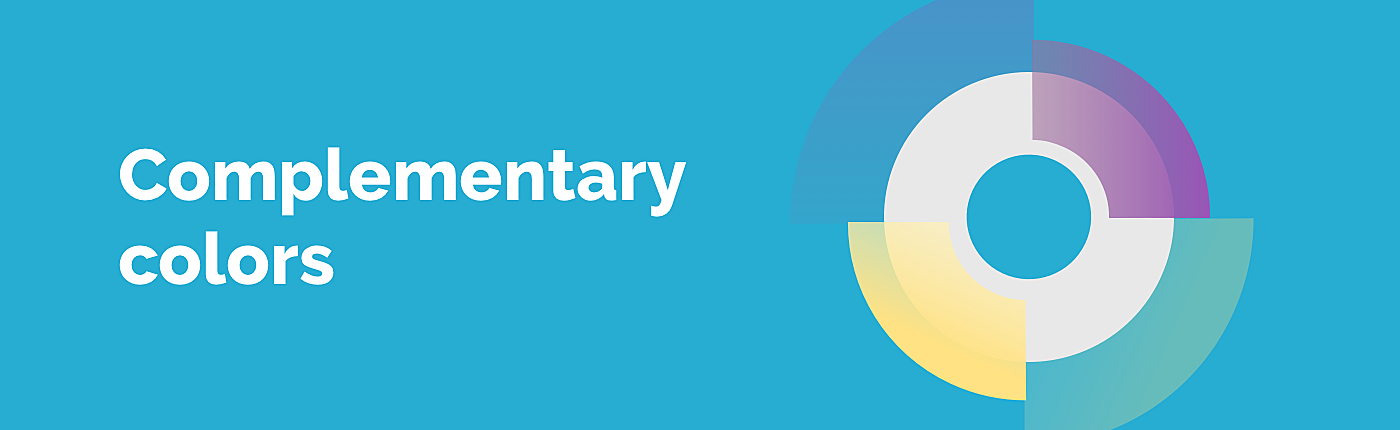
Once you have decided on the dominant color, it’s time to move on and complement it with matching hues. How would you do that?
Don’t reinvent a wheel! There’s already a great wheel that has proven to match colors perfectly. Put the end of the line at your dominant color and see where it points at the other end — as simple as that.
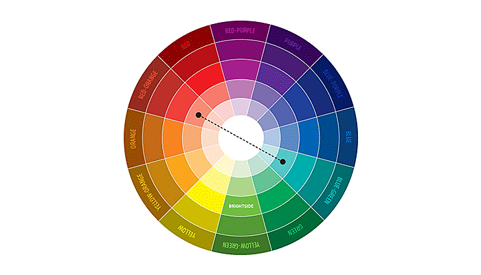
Source: brightside.me
Limit color usage to three (no more than four). Too many colors create too many points of attention. Complementary colors work well for backgrounds, subtitles, and subheadings.
4. Use images to add color

Using photos and illustrations is a great way to add some brightness and character to your website. If your website is based on listings, catalogs or featured with a collage of images, illustrations, and other graphic design elements, be aware of their coloring, too.
5. Get some inspiration

Try design-oriented tools, experiment with color wheels, learn from the color patterns other designers have combined. Here are just three examples to help you create a colorful environment for your website visitors:
- Adobe Color CC is a web- and mobile-ready tool for designers to gain color inspiration and capture color combinations you have noticed on some website, or in the real world.
- Addicted to colors is written by one of the thousands of bloggers who are inspired by colors. Surf Tumblr, Dribbble, or Behance are published by people who have a good taste in colors.
- Colorhunt this is where a bunch of colors is combined for you! Show your favorites to your UI/UX designer and take care to implement them intelligently.
10 best color patterns
1. Black + bright
Source: upperquad.com
This website’s color palette is bold and high-contrast with bright and colorful background and black accent fonts. Contrasting black with bright tones can create a positively striking effect.
2. Contrast warm and cool shades
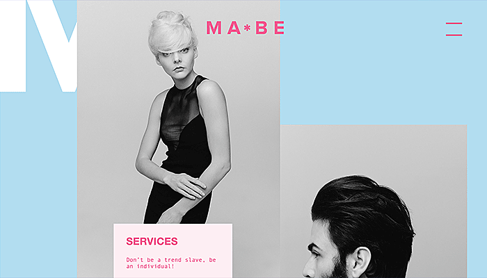
Source: mabehair.com
Warm reds and cool muted blues allow accented details without a loud effect and add to elegance and freshness.
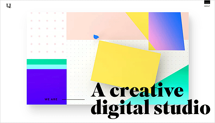
3. Accent three main colors
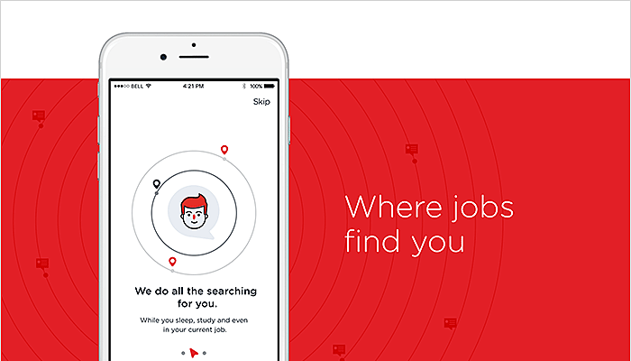
Source: agentestudio.com
The rule of three never fails if you are skillful in mixing the colors. Playing with red might be tricky, unless you tone it down with white and pale gray—a nice variant for a job hunting platform.
4. Shades of grey
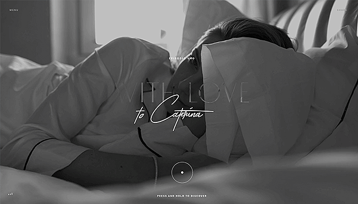
Source: pieromilano.it
A shades-of-grey color palette makes your website soft, desaturated, and muted to bring nostalgia or elegance. The well-meaning picture on the background puts aside the association with depression and sadness.
5. Vivid colors
Source: dribbble.com
This is a great example of how a vivid color scheme doesn’t shift focus from the content to the website design. The background color is light so that the main info is still visible and readable.
6. Balanced bright colors
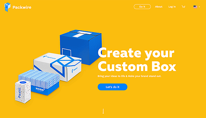
Source: packwire.com
A sharp and modern layout cannot do without bright colors. The mix of bright blue and white against the yellow background helps to keep things clean and catchy.
7. Neon tones
Source: dribbble.com
This example shows us how to deal with neon tones. The color scheme balances vibrant blue and red with dark blue color and clean white font.
8. Muted colors
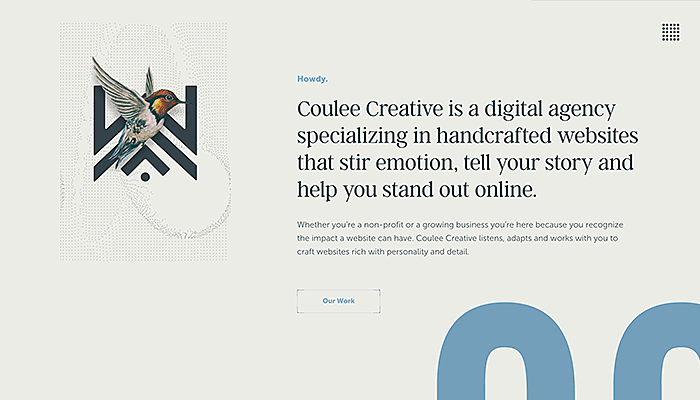
Source: couleecreative.com
Create more drama to accent your sharp and serious business approach. The palette of muted grays with sepia toning will make your website look business-like, however, don’t overdo the mysteriousness — it may scare your customers away.
9. Pastel
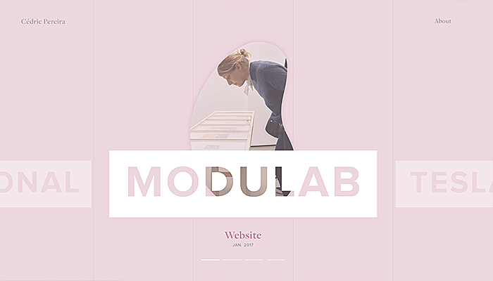
Source: cedricpereira.com
Pastel colors sometimes look too girly and too sweet. To make them clean and bright, try to mix pastels with whitespaces and clean forms.
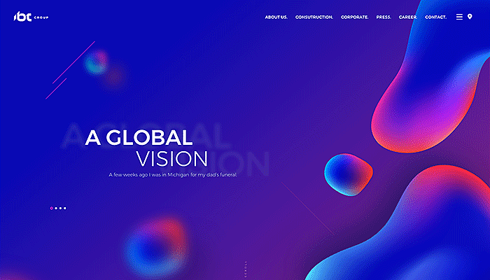
10. Unexpected color combinations
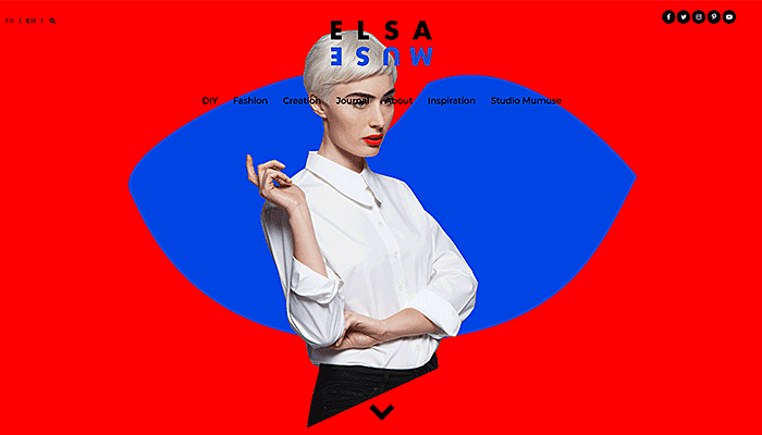
Source: elsamuse.com
Although a red vs. blue combination is generally considered off-key, this example proves that playing with tones can lead to satisfactory, and even original, result.
Long story short — colors matter.
Our designer team gets its inspiration from hues, shades, and tones to bring the most effective color combination for each single case. We are obsessed with making new swatches and palettes, individually tailored to our diverse clients. Entrust Agente with your project and we’ll bring color to your business!


Rate this post!
641 ratings, average ratings is 3.4 out of 5

Related Posts

11 January 2024
Mobile-First Design: Full Guide for 2024
What is mobile first design? Well, the mobile first approach is a central principle of progressive enhancement. In a nutshell, it’s all about producing a small screen design and then scaling it up to other devices. In our new blog post, we cover some aspects that need to be taken into account when launching a mobile first web design project. We also share some outstanding design examples for your inspiration.

03 January 2024
10 Best Game Website Design Examples: How to Design Yours
Game website design: importance in attracting new players, awesome examples and design tips.

22 November 2022
10 Best Restaurant Website Designs & Best Design Practices
Restaurant owners always have a lot on their plate, and they are usually focused on the areas that can bring tangible benefits. Websites, unfortunately, are not one of those areas because even the perfect website does not guarantee that the restaurant will be full every evening.

31 May 2022
10 Best Examples of Website Footer Design
10 website footer design best practices examples for inspiration ⚡ Things that can go in website footers ⚡

26 May 2022
10 Best Examples of Beautiful Blog Design | Agente
In this article, you'll find 10 best examples of beautiful blog design, along with the tips that can help you enchant visitors.

20 October 2020
How to Design a Website For Black Friday & Cyber Monday?
In this article, we will talk about how to create an attractive and selling website design for Black Friday and Cyber Monday. Let's take a closer look at each step of creating such a website.
Let's talk
Is there a challenge your organization or company needs help solving? We’d love to discuss it.

Managing Director, Partner
Andrew Terehin

Thank You!
Your message has been successfully sent.
We will contact you very soon.