11 September 2018
Dashboard Design Best Practices and Examples
What Is a dashboard? Well, it's a vital part of web applications that is extremely useful when it comes to presenting data-based intelligence in an easy-to-digest format, especially in data-rich systems, like logistic software or bank website design. It represents a great way of displaying the most necessary information on a single screen, making it possible to quickly monitor, interpret, and analyze it.
A successful dashboard design means that information is displayed clearly and efficiently, being communicated quickly to users; trends and changes in the data over time are shown.
How to Achieve the Best Dashboard Design
In this article, we share with you some handy tips on how to create a great dashboard UI and dashboard UX.
Set Specific Goals
Starting a new project, dashboard designers should determine information goals they want to attain with a dashboard page design and then work towards them.
This tactic will help you to decide what information is relevant in reaching the set goal and prioritizing it, removing misleading and/or unclear metrics. The outcome is clear: users will be able to easily find the data they are looking for. Make sure that your decisions on dashboard designs are guided by project goals, user needs, and the nature of data.
Source: Dribbble
Opt for Relevant Information
When selecting information to display, there's one important question to start with - whether users really need it. If the answer is “No” or “Not sure,” skip it with no doubts or regrets. Removing irrelevant information, eliminates the danger of overwhelming users with useless data and reducing their cognitive load, thus facilitating the decision-making process.
Leverage Progressive Disclosure and the Inverted Pyramid Model
The above-mentioned technique will help you to keep users’ attention by reducing clutter. In a nutshell, with this technique in place users are offered only necessary or requested information at a given time, allowing them to focus on what is really important.
The inverted pyramid methodology originally used by journalists means presenting the most significant information first, revealing less important details (e.g., trends) in the middle of the page, and placing precise details in the bottom of the page.
Source: Dribbble
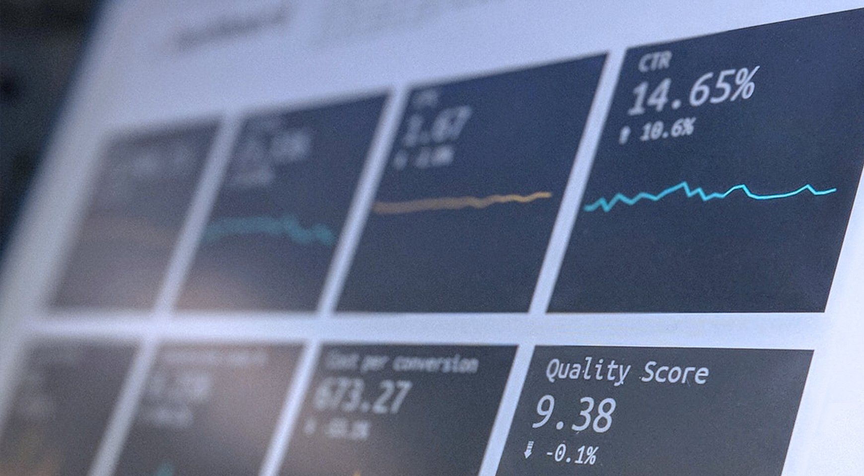
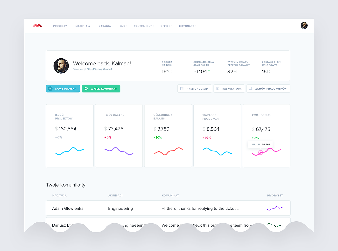
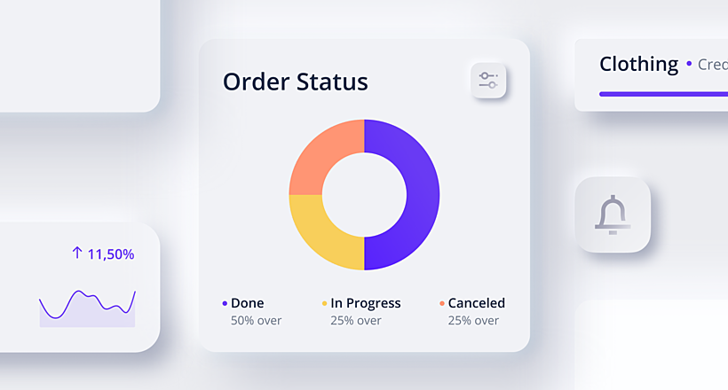
Utilize Visualizations but Don't Overuse Them
Implementing data visualizations is a proven way of helping users to understand and analyze the provided data quickly.
So when you design a dashboard UI, think of using visualizations for charts, graphs, and other UI elements at you are going to introduce.
Be careful; too many visualizations can do more harm than good as they may not look as attractive to users as when there are just a few.
Source: Behance
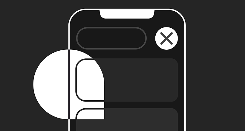
Add Animations if Applicable
Animations are a great idea as they entertain users, besides grasping their attention from the very first second. However, such surprising transactions are not always the best design choice. For instance, static images on user dashboards may communicate really important information better than animated ones.
Use animations wisely. There are some places where they can really help: areas where information takes some time to load as it comes from a variety of sources, percentage loading bars, waiting messages, and so on.
You may even use animation to upload all the data visible on a dashboard step by step if there are many areas that load slowly. Animations will assist you in creating a great user experience and in ensuring that the loading delay remains unnoticed.
Source: Behance
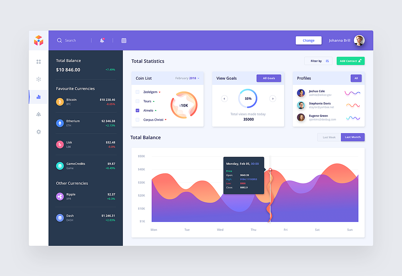
Make Orientation and Navigation Intuitive
Most dashboards resemble websites as they represent a set of pages one needs to access to see detailed information.
And like websites, they should ensure that users can navigate throughout them with no effort and easily find their way. But such a goal will never be achieved without efficient navigation.
Patterns that everyone is familiar with (e.g., left-handed panels and breadcrumbs) can become usable examples for your project, especially if you are going to design a hierarchy of dashboards. Well-known UX patterns deliver a positive user experience.
Source: Dribbble
Opt for Clarity and Consistency
Creating a good dashboard is a tough task, but one designed with users in mind will certainly stand out in the crowd and will be remembered for long periods.
A clear and uncluttered dashboard visually unites related data, providing consistency, and clearly demonstrates the connection between its elements. This ensures that information can be easily extracted and processed, and nothing can compromise the user experience.
Source: Dribbble
Choose Proper Colors
The best dashboard UI examples have a great color palette. Selected wisely, colors help users to perceive and analyze data.
There are multiple color psychology theories studying the impact of color on visual information processing. In a nutshell, some colors facilitate data perception, so choose those for your color scheme. For instance, blue is believed to be associated with confidence and peace, while green has the following meanings: fresh, money, and outdoors.
Otherwise, opt for colors from a corporate brandbook to adhere to the company identity. Remember to remain consistent: use the same color for the same purpose on all the charts, reducing the mental effort required to consume and process the data.
One more tip: Regardless of the colors you choose, fonts should always be readable. For this purpose, check color contrasts. Use an online tool, such as Check My Colors or Color Safe.
Source: Behance
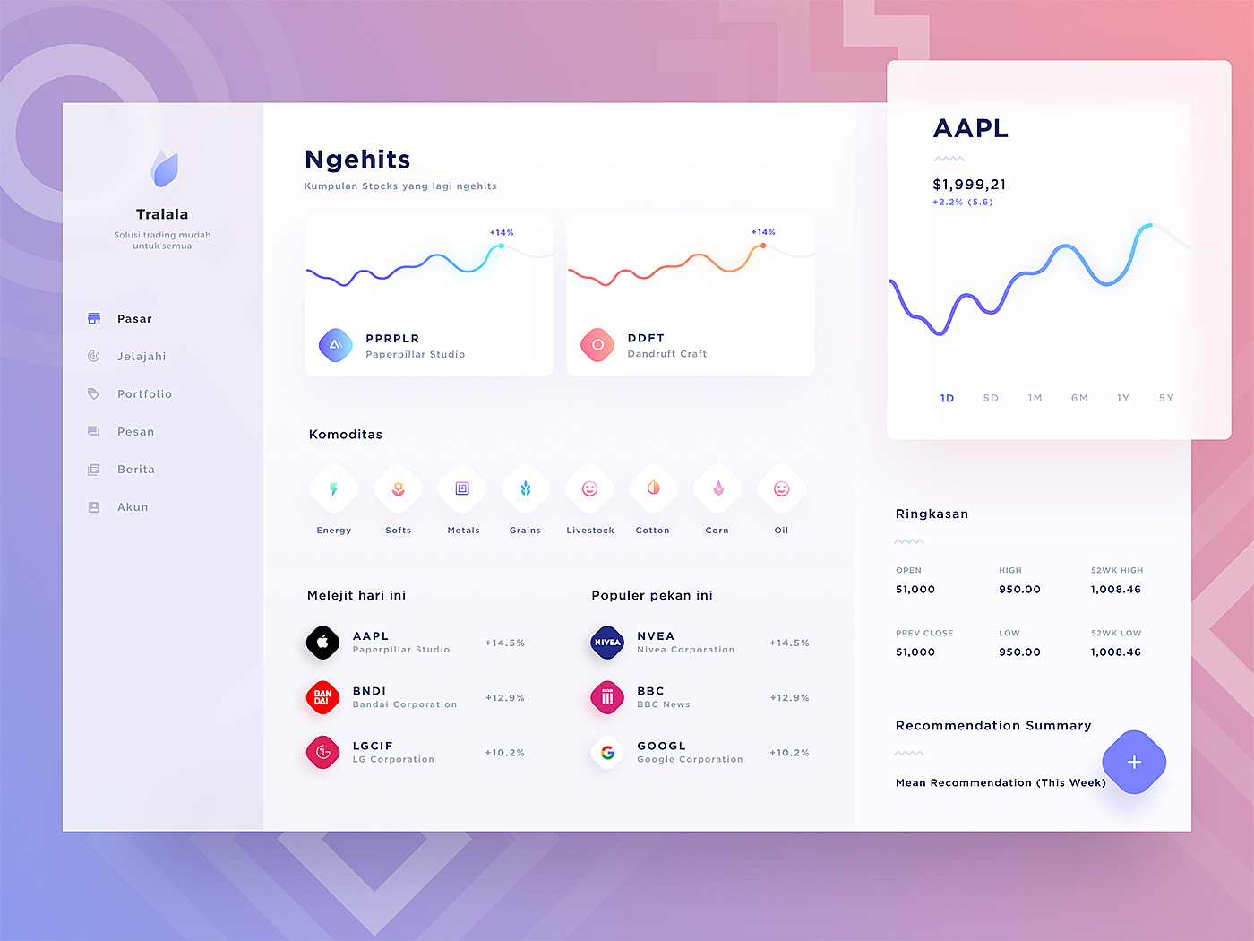
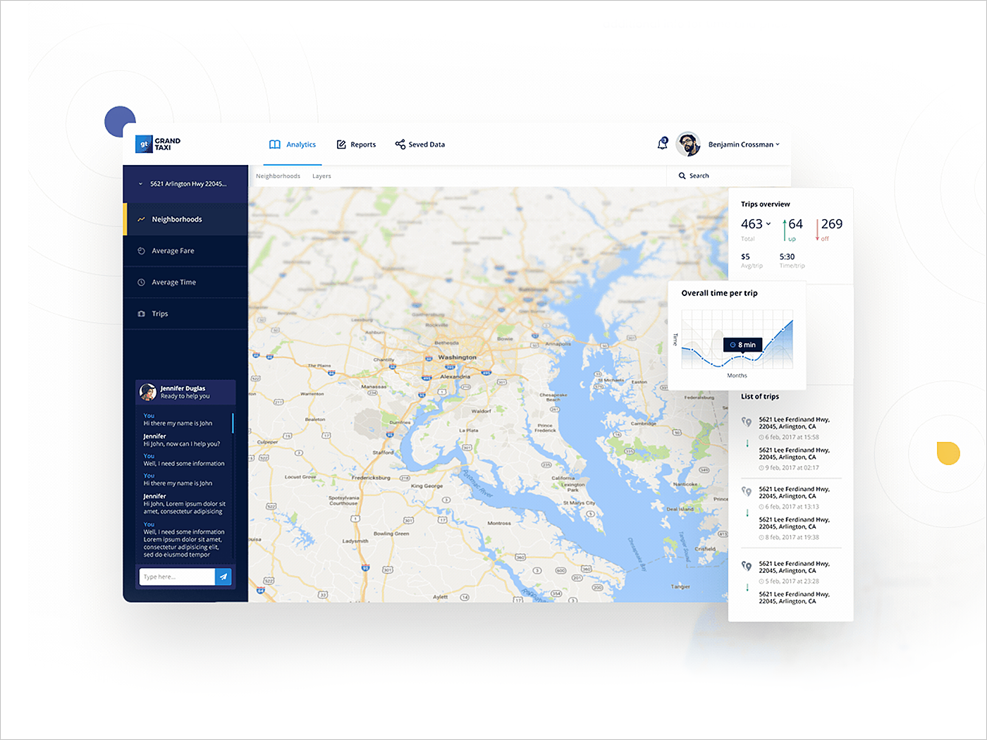
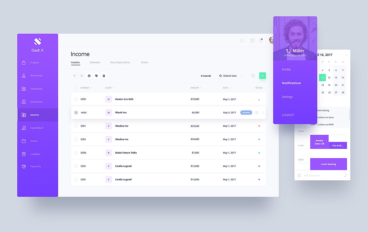
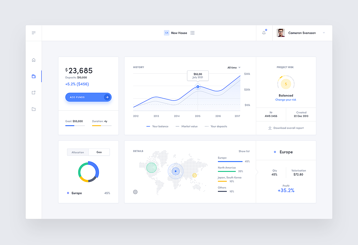
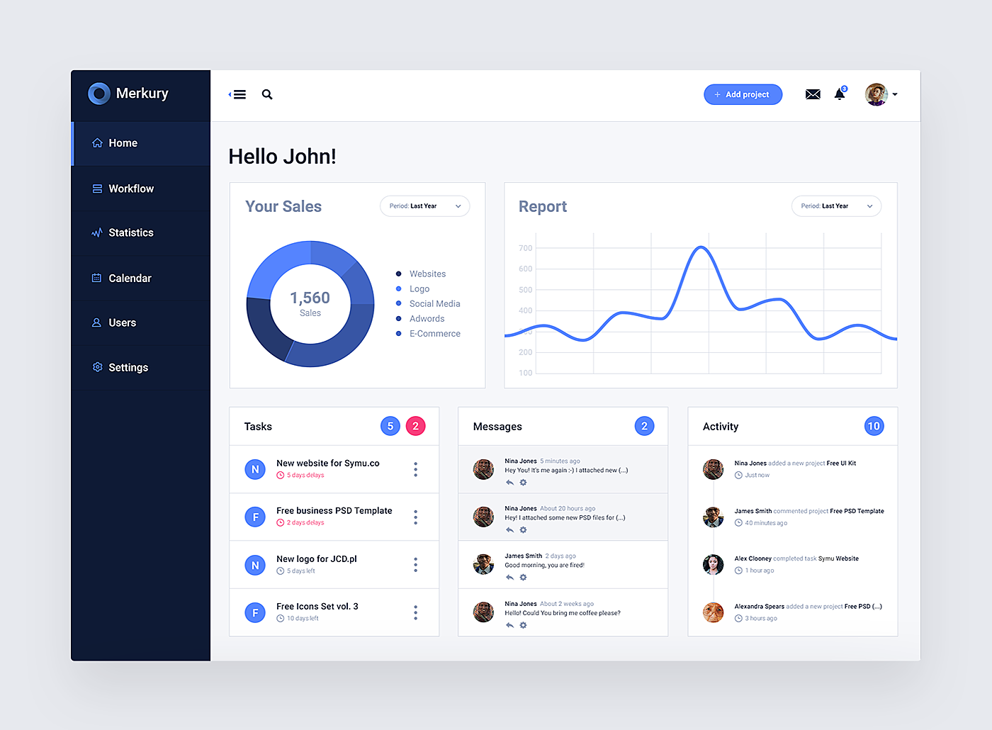
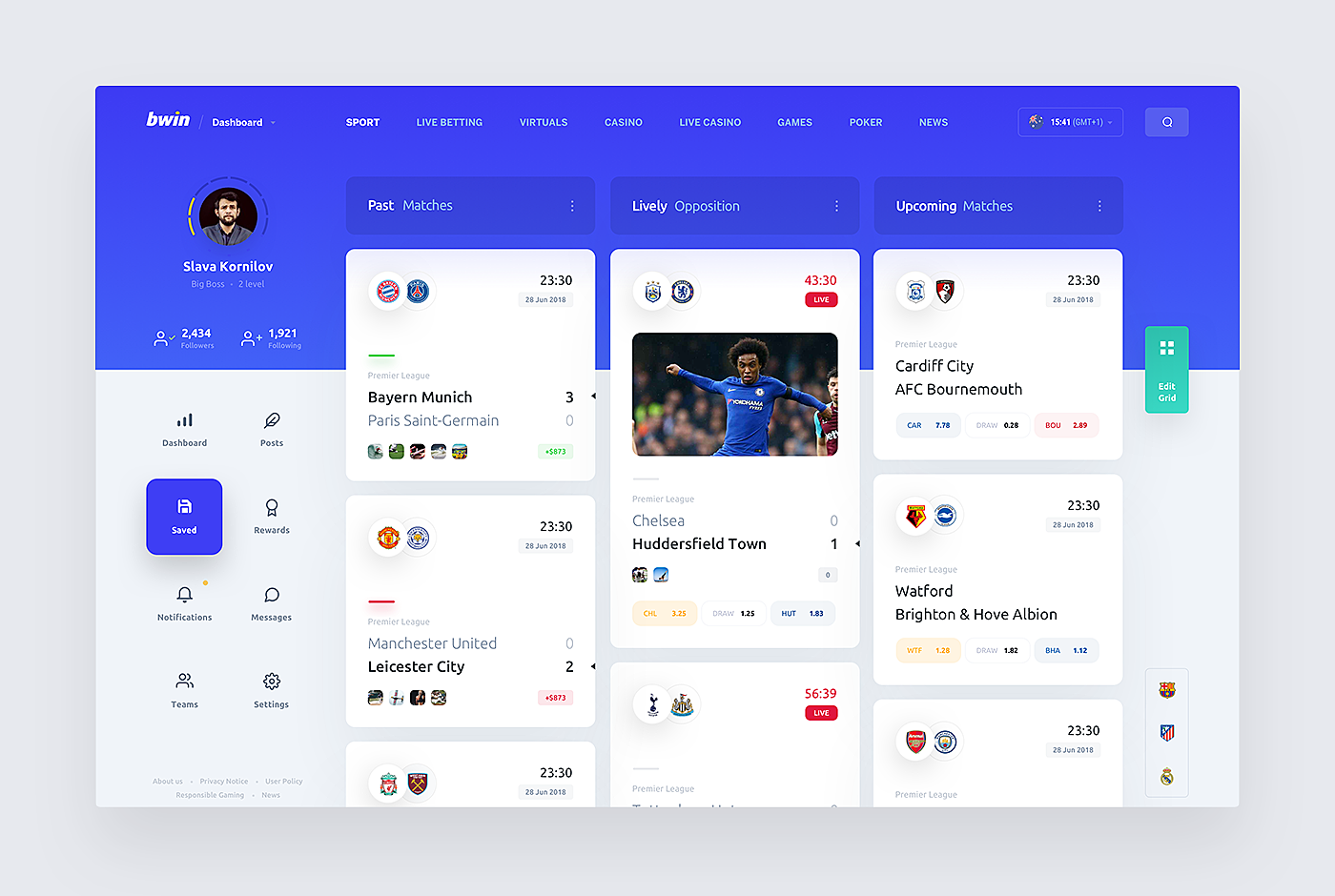
Dashboard Design Best Practices
Now you have an idea of how to create an effective dashboard. Scroll down for some dashboard UI design inspiration from the examples we have found for you on the Internet.
1.
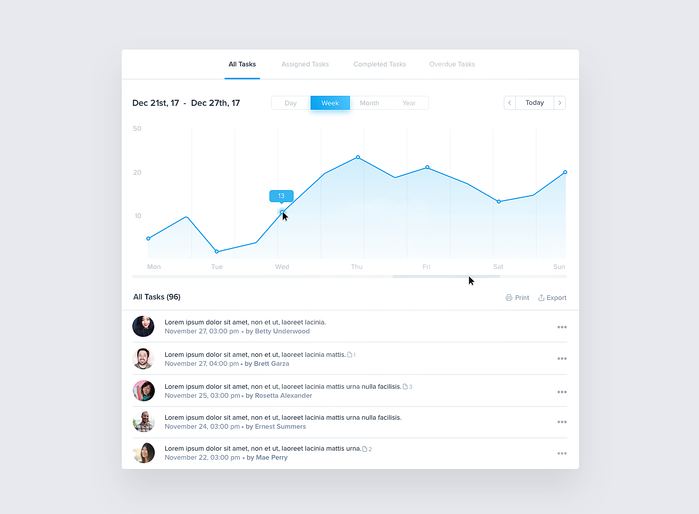
Source: Behance
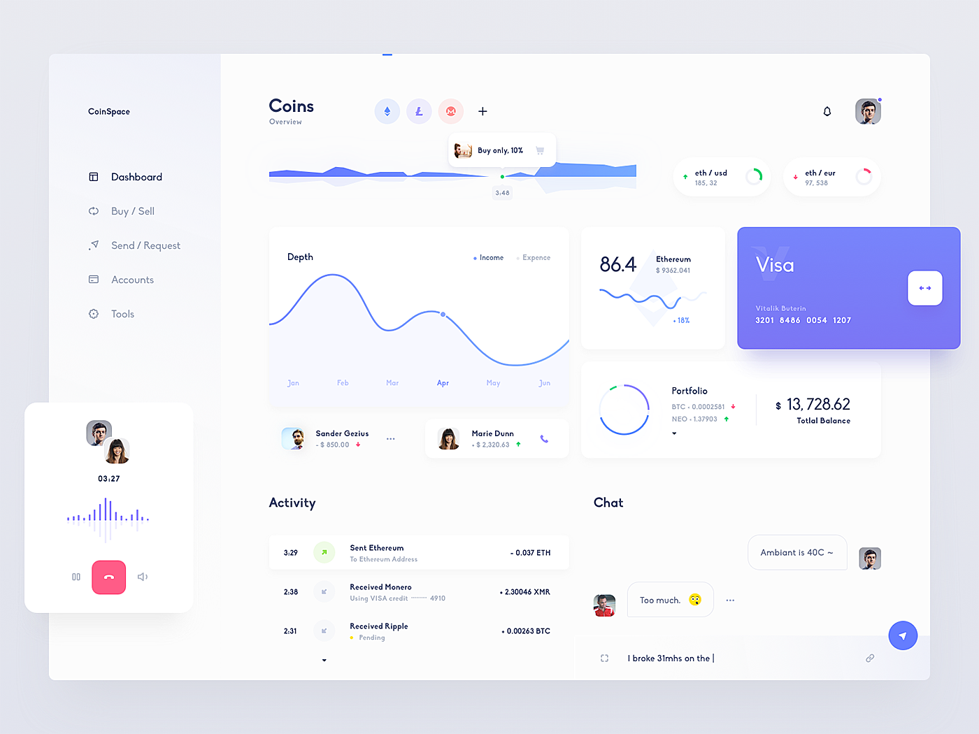
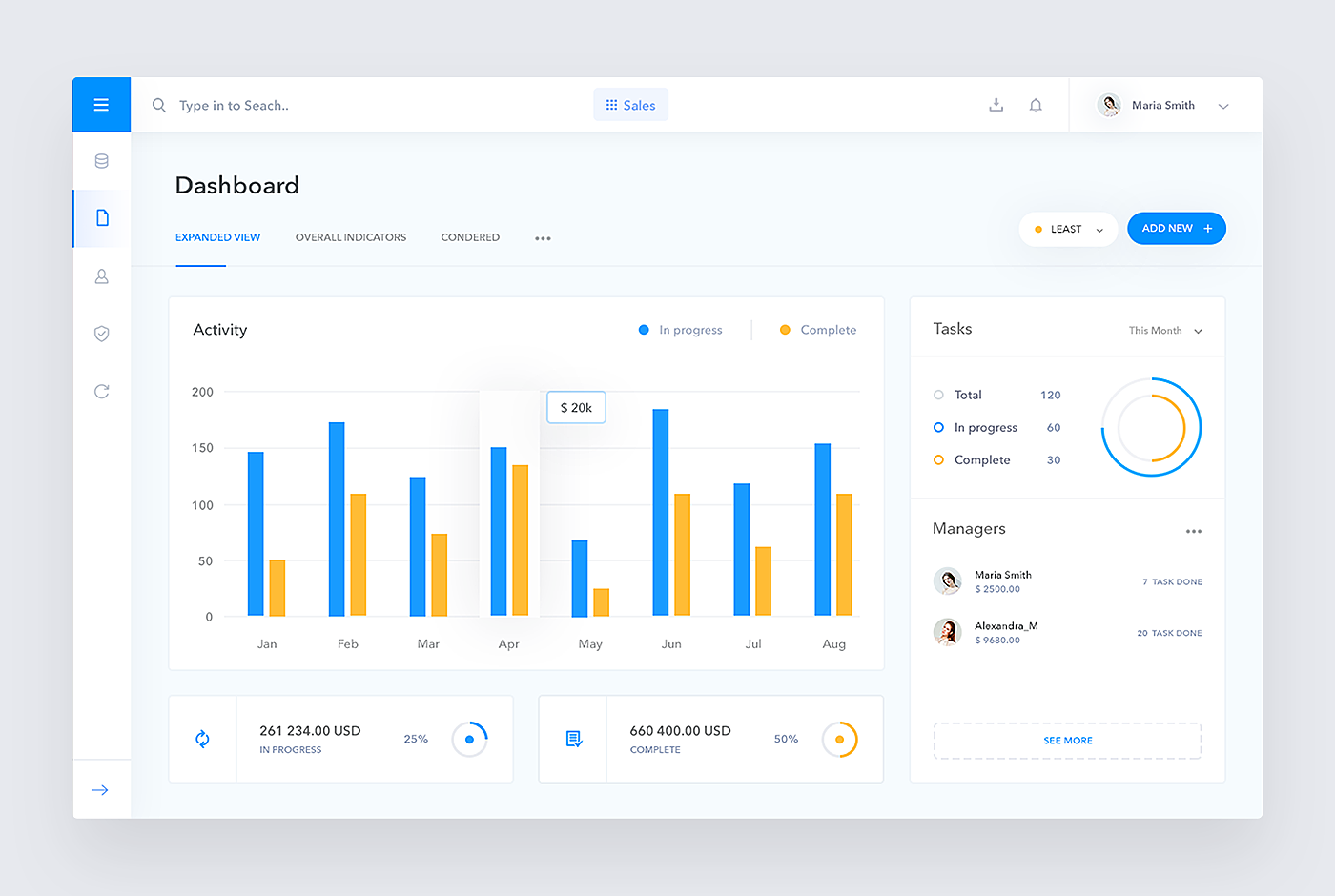
2.
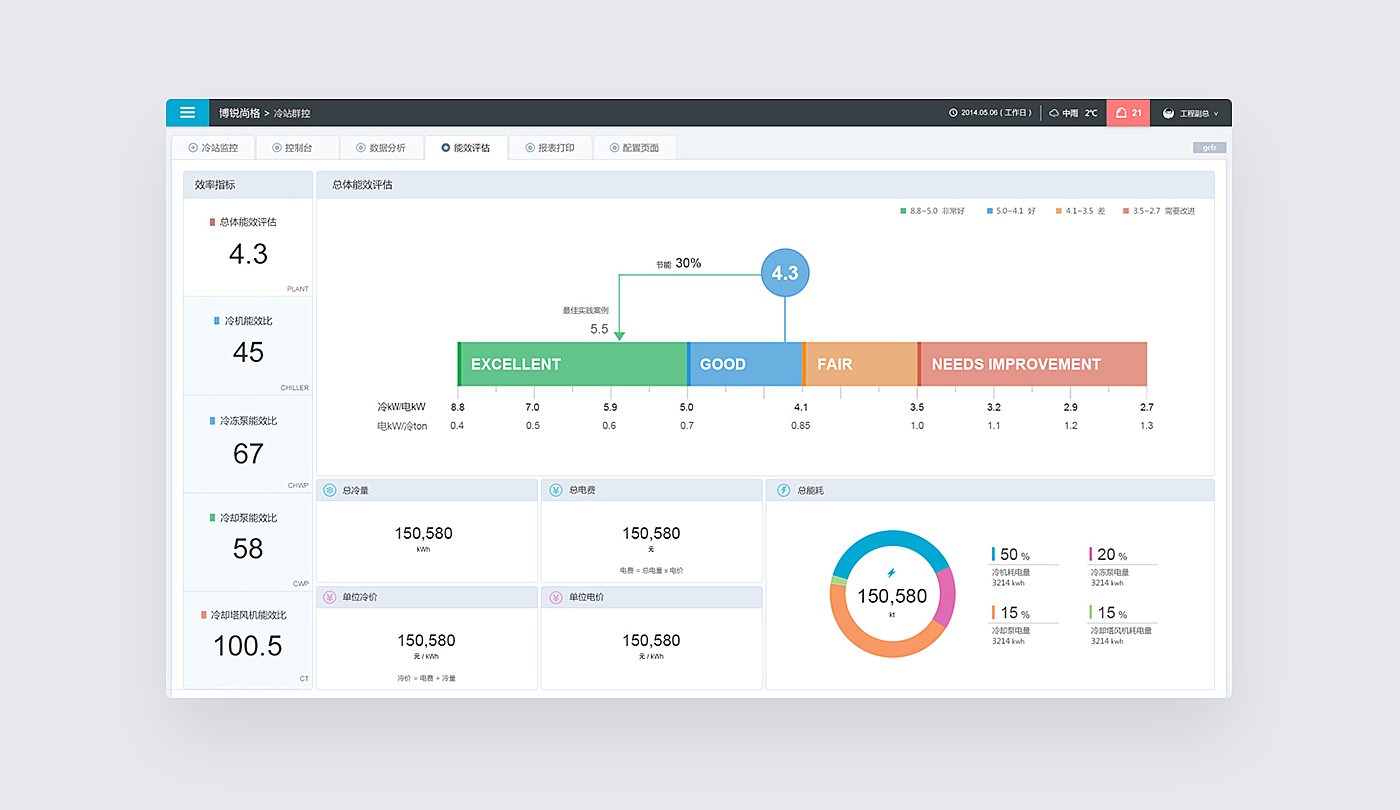
Source: Behance
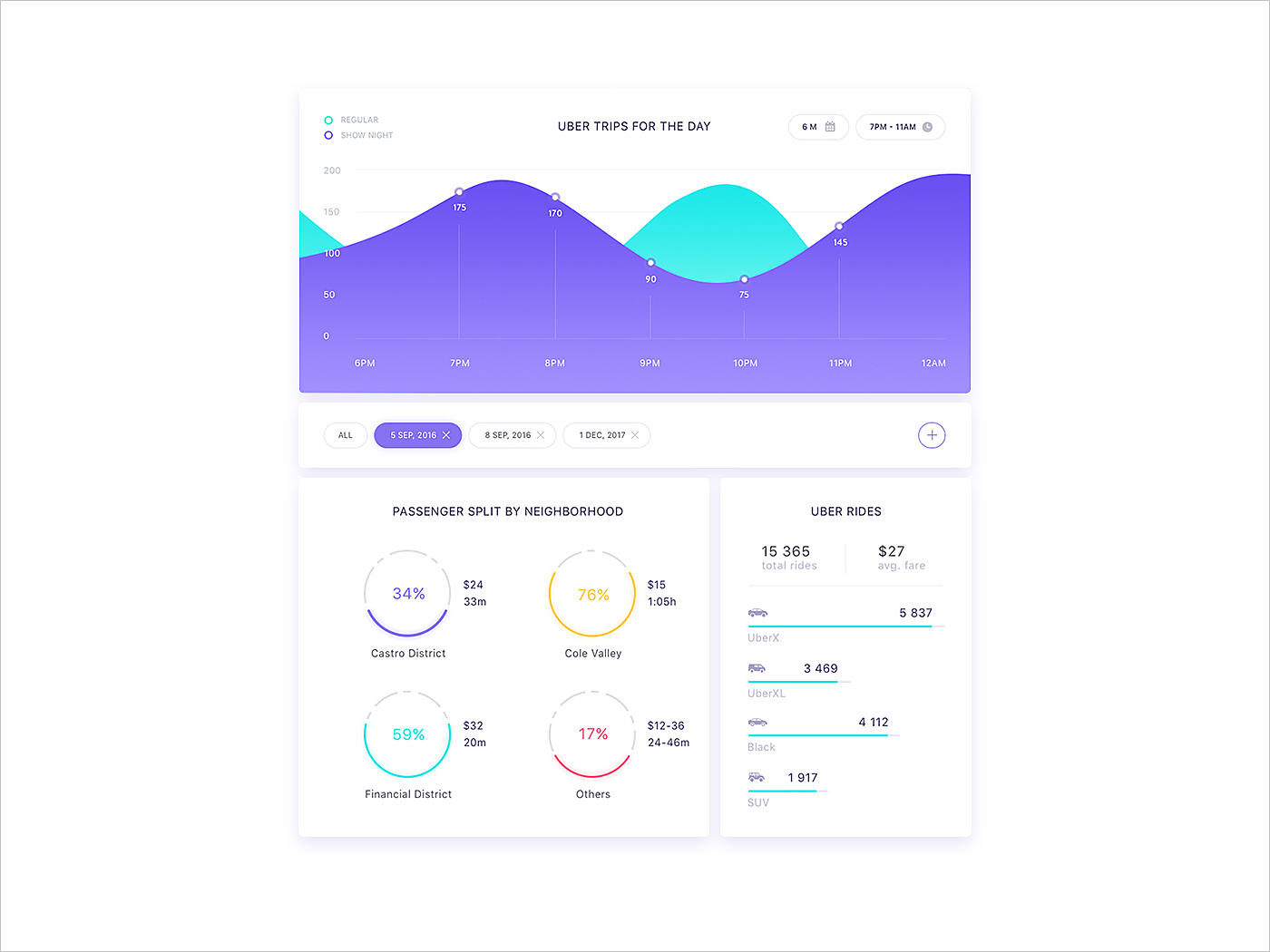
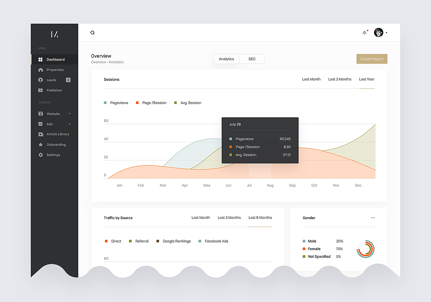
3.
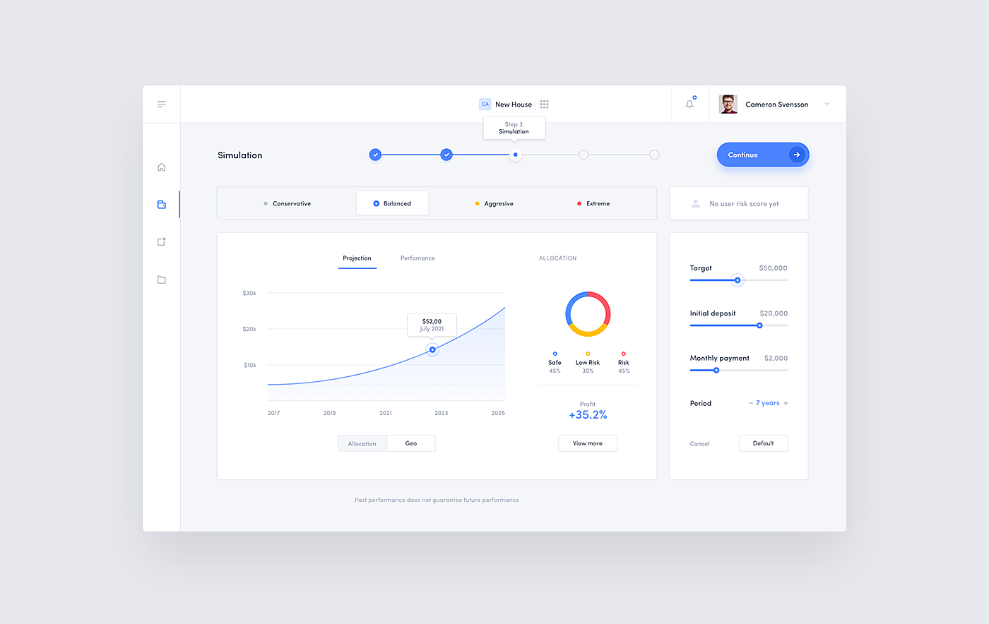
Source: Behance
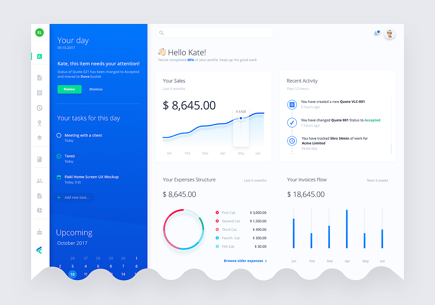
4.
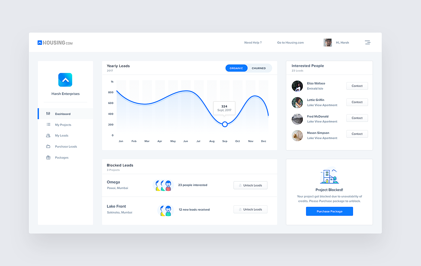
Source: Behance
5.
Source: Dribbble
6.
Source: Dribbble
7.
Source: Dribbble
8.
Source: Dribbble
9.
Source: Dribbble
10.
Source: Dribbble
Summing Up
Dashboards are an effective means of solving reporting and data challenges via visualization. Aggregating and extracting value from collected data, they provide real-time results presented in digestible chunks, enabling people to swiftly identify numbers that matter.
In this article, we’ve covered the best practices for creating dashboards, discussing both UI and UX aspects. If you need other advice or wish to discuss your design project with the AGENTE team, send us an email and we’ll reply shortly.


Rate this post!
898 ratings, average ratings is 4.9 out of 5

Related Posts

05 January 2024
10 Best 404 Error Page Designs for 2024
In our new blog post, we review the best 404 page design examples of 2019 that will never disappoint you even if you meet the dead end on the website.
26 May 2022
10 Best Examples of Beautiful Blog Design | Agente
In this article, you'll find 10 best examples of beautiful blog design, along with the tips that can help you enchant visitors.
29 April 2022
How to Design a User Profile Page in 2022
User profiles can become a constant flow of customer-related data that is extremely useful for marketing. How to design a user profile page? Read in our new article.

20 October 2020
How to Design a Website For Black Friday & Cyber Monday?
In this article, we will talk about how to create an attractive and selling website design for Black Friday and Cyber Monday. Let's take a closer look at each step of creating such a website.
05 March 2020
Neumorphism in UI: Free Icon Set
What is neumorphism? Our reply to neumorphic trend + set of free e-commerce icons inside!
14 November 2019
How to Design Dark Themes for iOS Apps?
In this article, we’ll touch on the basics of dark themes and share some tips on how to design them. In the end, you’ll find our dark concepts of the popular apps that haven’t accepted the trend yet.
Let's talk
Is there a challenge your organization or company needs help solving? We’d love to discuss it.

Managing Director, Partner
Andrew Terehin

Thank You!
Your message has been successfully sent.
We will contact you very soon.