13 June 2018
How to Design a Perfect App Icon?
Icons are small, but they make the first impression; apparently, they are how you get noticed on the market. Your app icon’s appearance affects the number of downloads, communicates the app’s function, and advertises your brand across app stores. To make sure people don’t miss your application, design it according to the best practices.
In this article, we introduce our guide on how to make a mobile app icon design and we share some good examples for your inspiration.
What is an App Icon?
First, let’s differentiate an app icon form a logo. The logo represents a brand and helps people associate some visual image with the company, its values and its services or products. The app icon takes on a similar role but it identifies a mobile application of a company. Technically, icons are almost quadratic, and should be compliant with the specific dimension of app stores, while logos are more flexible, and can fit in any part of a company’s branding.
The first thing you need to understand when you design an app icon is that it’s not just about being original and attractive, but it should also refer to the function of the app and identify your brand in general. Let’s go into more detail about app icon designs.
7 Tips to Design a Perfect App Icon
Icons are small, but still require a mindful and thorough design process. Let’s examine the best practices to improve each aspect of it.
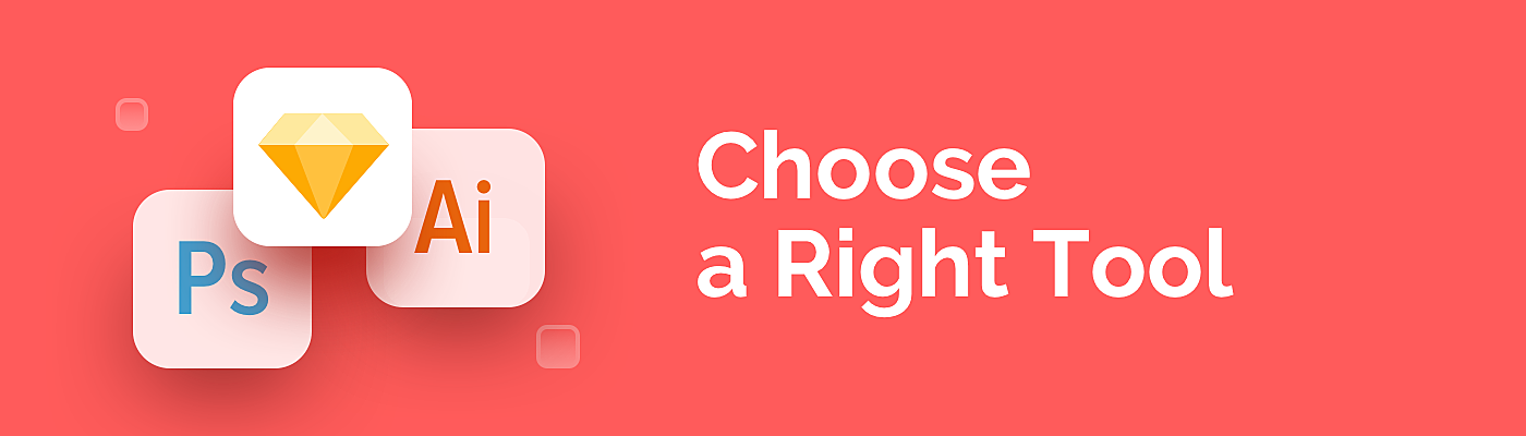
1. Choose a Right Tool
A starting point for any design is finding good software. Talking about app icons, the most powerful tools are Photoshop, Illustrator, and Sketch.
Photoshop is good for raster effects such as reflections and shadows, while Illustrator is popular for creating complex scalable designs. We prefer Sketch, as it has a user-friendly interface and comes with multiple plugins and free pre-built templates. For example, Material Theme Editor has one-click access to the Material Design icon collections, which includes many formats, sizes and styles, and shapes.

2. Mind Brand Guidelines
Designing an app icon, most companies choose their logo as a part of it, adjusting it to the “quadratic” standards. It allows them to remain recognizable across mobile platforms.
Source: Dribbble
However, it’s not an obligatory option, the main point is to maintain consistency by following brand guidelines. Icon design is an extension of the company’s design values, so use the same design language, align color palettes, fonts and elements for the app’s icon design.

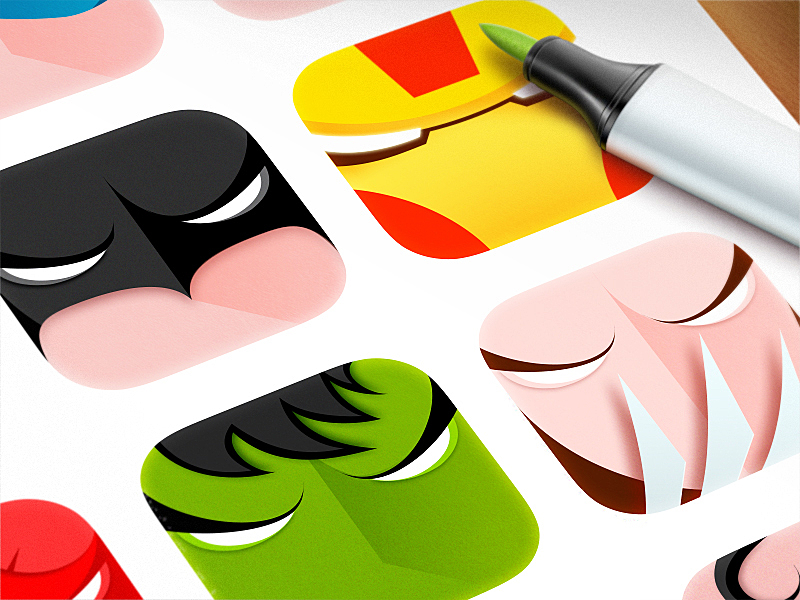
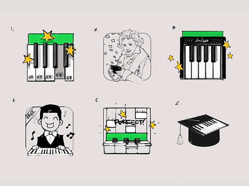
3. Reveal Function
Consistency is not limited to brandbook compliance. The app icon should also have a close connection to the app’s function.
That’s why we suggest referring to the probable visitor experience when the app is downloaded. This is especially effective when it is a utility app, such as piano keyboard app or whiteboard app - they should inspire a feeling that the user is touching a keyboard or holding a piece of chalk in their hands.
Source: Icondesignlab
Abstract icons are not a good idea, users won’t understand the meaning behind the icon, unless it refers to the previous experience, like playing the piano or drawing charts on the office whiteboard. For example, an icon which features Beethoven for a piano emulator may look unique, but it doesn’t hint at what’s inside, while a keyboard image feels like a real experience.

4. Make It Stand Out
Open the app store, enter any keyword in the search field and you’ll know what the attack of the clones looks like. It’s difficult to stay special when you create an application icon, but there’s a way to stand out:
- Learn the app icon designs of your competitors, figure out why they are popular, and how you can keep a high profile among them.
- Play with colors and metaphors, try to reframe a beaten concept.
- Remove all small details and concentrate on the core. Normally, app icons are too small to remember minor elements.
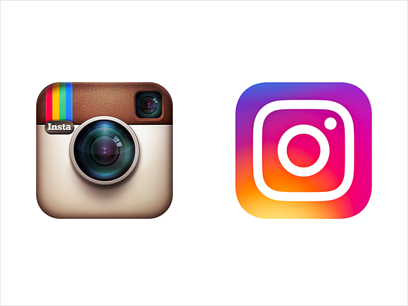
5. Make Sure Design is up-to-date
Back in 2016, a lot of Instagram users were shaken by its controversial icon re-design. Frankly speaking, few were satisfied, but the spirit of new design trends was overwhelming.
Source: Tumblr
The fact is, trends have changed, and it was time for old vanilla Polaroid to flatten and convert into the radial gradient.
Flat design has become a reverse phase to skeuomorphic, and designers have started removing volumes and realism in favor of flat design. Today, mobile app icon design is influenced by material design trends - a little step back to the realism using a flat paper metaphor.
There’s no need for words in an app icon - again, Instagram removed it, as it is no longer relevant. In graphic design, including words in an icon means the designer wasn’t able to clearly convey the message in the image itself.
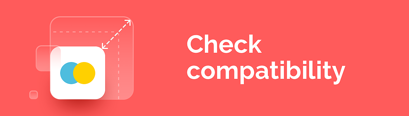
6. Check Compatibility
Designers have to bear in mind scalability, size, format, and style.
Technically, you should design a set of PNG files in sizes from 29 × 29 pixels up to 1024 × 1024 pixels, so that they fit any context, whether it is Google Play, iOS App Store, search results pages or a mobile desktop.
In terms of style compatibility, you should consult the recommendations of Android and iOS platforms. When you design icon for Android app, Material Design icon guidelines help to create the cohesive visual interface with its detailed documentation. Human Interface Guidelines for iOS icons may not be so thorough, but will suffice for those who have a vague idea of what an iOS app icon design should look like.
7. Test, Test, Test
The process of making app icons for a mobile app is incomplete without prompt testing. Icon testing can include the following stages:
- Testing on various devices (to see how the icon looks in various resolutions)
- Testing in various sizes (to see how the icon looks from small to large sizes)
- Testing on a variety of backgrounds (white, black, grey, and other wallpapers and backgrounds)
- Testing among competitors (to check how the icon looks among the other apps in app stores)
We’ve made a short list of free services that help you conduct these tests:
Icontester – online tool that lets you see how your iOS or Android icon would look in App Store, Google Play and on various devices.
Strike – easily test iOS icon designs on your home screen.
Skala Preview – pixel and color perfect icon design previews for iOS and Android.
However, nothing can replace manual testing for at least three reasons:
- None of the online services provide comprehensive competitors’ analysis. You should look for similar apps using keywords, and create a screenshot of your icon in Photoshop.
- Most tools and programs do not require precise sizes, so the results may not show blurred lines and stuck pixels.
- There’s no universal solution to test the icon in all the existing sizes and use cases.
That’s why we recommend using online tools only if you are discussing design prototypes within your team, or with a client, to quickly check how the icon will look.
Take a look at this “EverythingMe Launcher” case: this is a good example of how A/B testing changing colors, forms and styles affected the conversion rates. According to the icon designer, improvements happened after he removed the word “me” from the icon. So, now you know how to design an app icon and what you need to pay attention to. Let's look at app icon examples.
Examples of Good Icons for Your Inspiration:
How these tips may be implemented into practice? Take a look at these great examples of app icons:
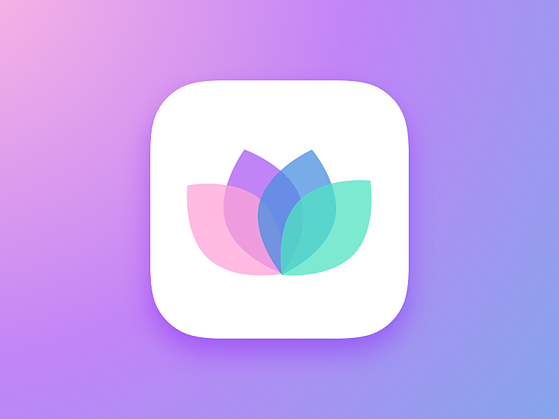
1. Social network app:
Source: Behance
2. Photo filters app:
Source: Dribbble
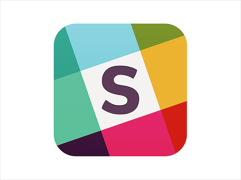
3. Version and design workfow control app:
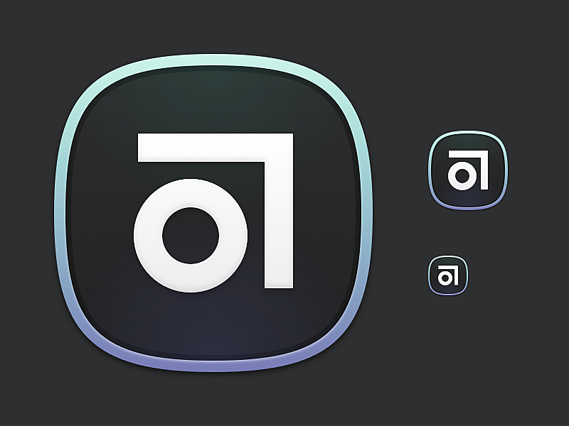
Source: Dribbble
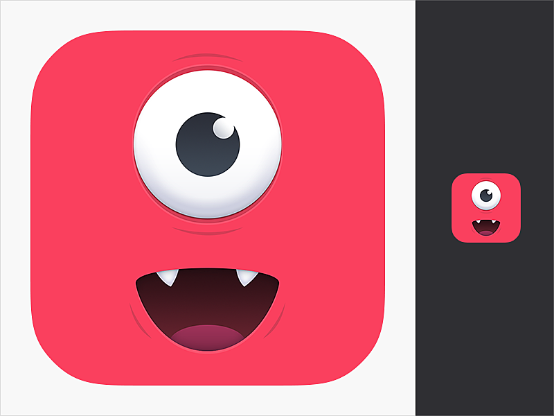
4. Game app:

Source: Talkandroid
5. Kid cam app:
Source: Dribbble
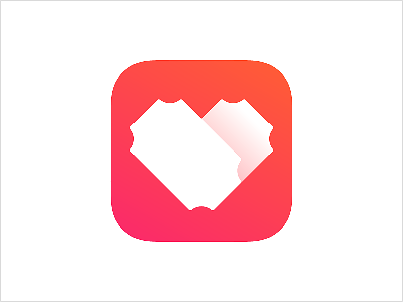
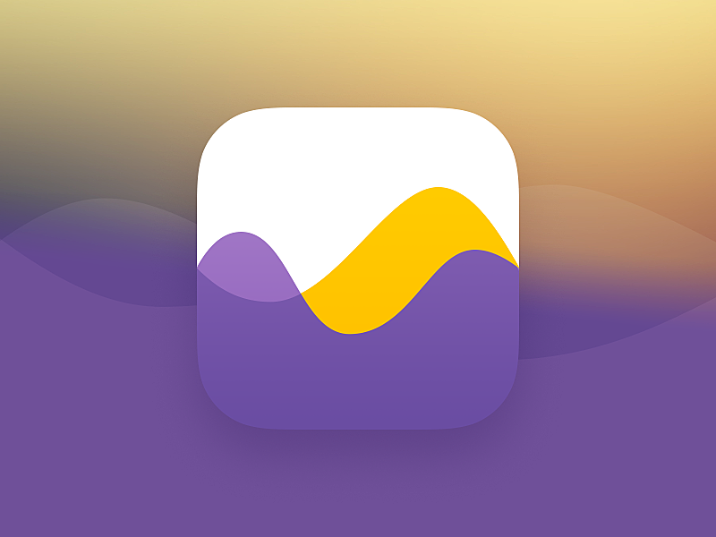
6. Taxi app
![]()
7. Navigation app:
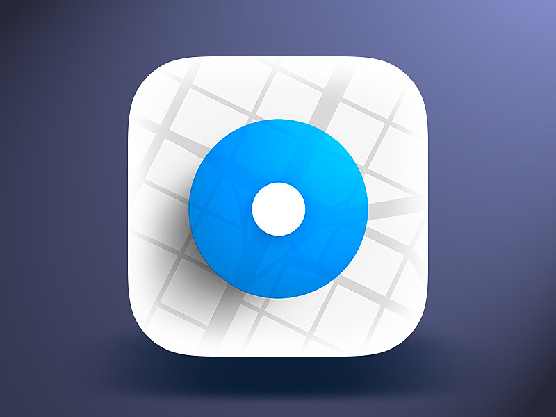
Source: Dribbble
8. Corporate messenger app:
Source: Dribbble
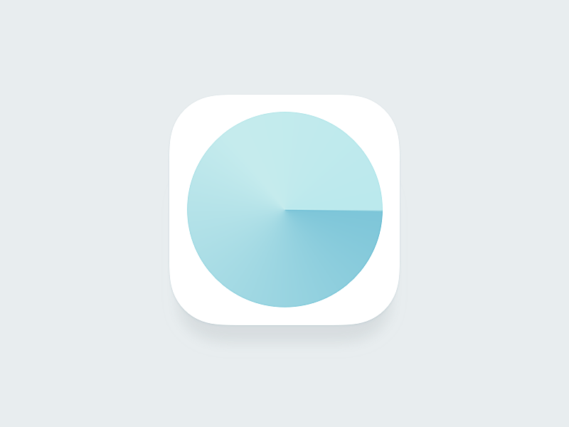
9. Audiobook app:
Source: Dribbble
10. Kitchen timer app:
Source: Dribbble
Conclusion
Although a small square symbol on the screen of your smartphone may seem insignificant, it matters greatly for your business image, and affects the number of downloads. A well-elaborated app icon design will increase your conversion rates, that’s why it’s important to keep it consistent, recognizable, and up-to-date. And don’t forget to test for quality assurance when creating app icons.
If your app doesn’t get a continuous flow of customers, think of factors that may affect your success, with the app icon being one of them. Share your experience in our live chat and we’ll help you to improve it.
For more insights on UX/UI design, read our new article on how to create an e-learning website.


Rate this post!
353 ratings, average ratings is 3.9 out of 5

Related Posts
11 January 2024
Mobile-First Design: Full Guide for 2024
What is mobile first design? Well, the mobile first approach is a central principle of progressive enhancement. In a nutshell, it’s all about producing a small screen design and then scaling it up to other devices. In our new blog post, we cover some aspects that need to be taken into account when launching a mobile first web design project. We also share some outstanding design examples for your inspiration.

03 January 2024
10 Best Game Website Design Examples: How to Design Yours
Game website design: importance in attracting new players, awesome examples and design tips.
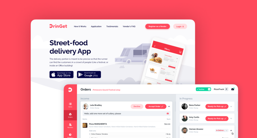
Effective Food Delivery App: Key Tips & Best Practices
In this article, we will share our experience in creating a design for a specialized food delivery management software, as well as best practices in designing such an application.

22 November 2022
10 Best Restaurant Website Designs & Best Design Practices
Restaurant owners always have a lot on their plate, and they are usually focused on the areas that can bring tangible benefits. Websites, unfortunately, are not one of those areas because even the perfect website does not guarantee that the restaurant will be full every evening.

31 May 2022
10 Best Examples of Website Footer Design
10 website footer design best practices examples for inspiration ⚡ Things that can go in website footers ⚡
26 May 2022
10 Best Examples of Beautiful Blog Design | Agente
In this article, you'll find 10 best examples of beautiful blog design, along with the tips that can help you enchant visitors.
Let's talk
Is there a challenge your organization or company needs help solving? We’d love to discuss it.

Managing Director, Partner
Andrew Terehin

Thank You!
Your message has been successfully sent.
We will contact you very soon.