Why do users bounce right from the home page? Once they come to your website or app, they want to see value from your product or service and reach their goals quickly. That’s why it is critical to make sure that visitors can understand how everything works. In this article, we are going to shed light on the best method to welcome new visitors—user onboarding—and look at the user onboarding best practices and examples.
Why do users need onboarding?
Before we figure out how to attract your visitors and make them stay, let’s see what user onboarding is. Onboarding is a mechanism for creating a first impression - building relations with a user from the first touch.
Developing an onboarding UX starts with defining the goals, which are not limited to welcoming the user, and may include:
- Giving maximum useful information;
- Personalizing the user experience;
- Encouraging visitors to switch to a paid account;
- Reducing support overheads;
- Improving user retention.
Realizing what you need allows you to build a unique onboarding flow rather than copy patterns of your competitors. You also need to find out why users may experience difficulties while working with your product - whether it has a complicated interface or too many functions that confuse people so that they don’t know where to start. Each situation requires an individual approach, depending on multiple factors. Let’s see the design process of UX onboarding.
User onboarding design process
Understanding user behaviors is a cornerstone of building onboarding UX patterns. But do you know your users? Don’t rush to answer ‘yes’; it takes a lot of time and research to determine your audience, categorize it and get to know each type of user. We divide it into three stages:
Collecting data: Start by developing customer personas; collect demographic info and analyze their behavior patterns. Understand where they came from to your website or app, what for, and what makes them use products or services like yours.
Creating customer journey maps: Consider various roles, including technical non-technical users, and design a visual representation of the way users will navigate through your product. That will help you define touchpoints where customers may experience difficulties and need the implementation of the elements of user onboarding.
Planning: Decide what the onboarding process will be like. Start from the moment when a user signs up, and guide them through your app in the most appropriate way (we’ll review these later).
Follow up: Once users are on board, make sure they understand what to do next and go with meaningful action. Reach back to your customers with emails, in-app messages and prompts to follow them up.
Analysis and iteration: Your site or app already has onboarding but people still bounce? You probably got something wrong. Learn from your mistakes, perform a UX audit, and iterate design phases until you get the desired result. Read our article on—and learn the best practices in—user onboarding UX.
Best onboarding design examples
Swipeable screens
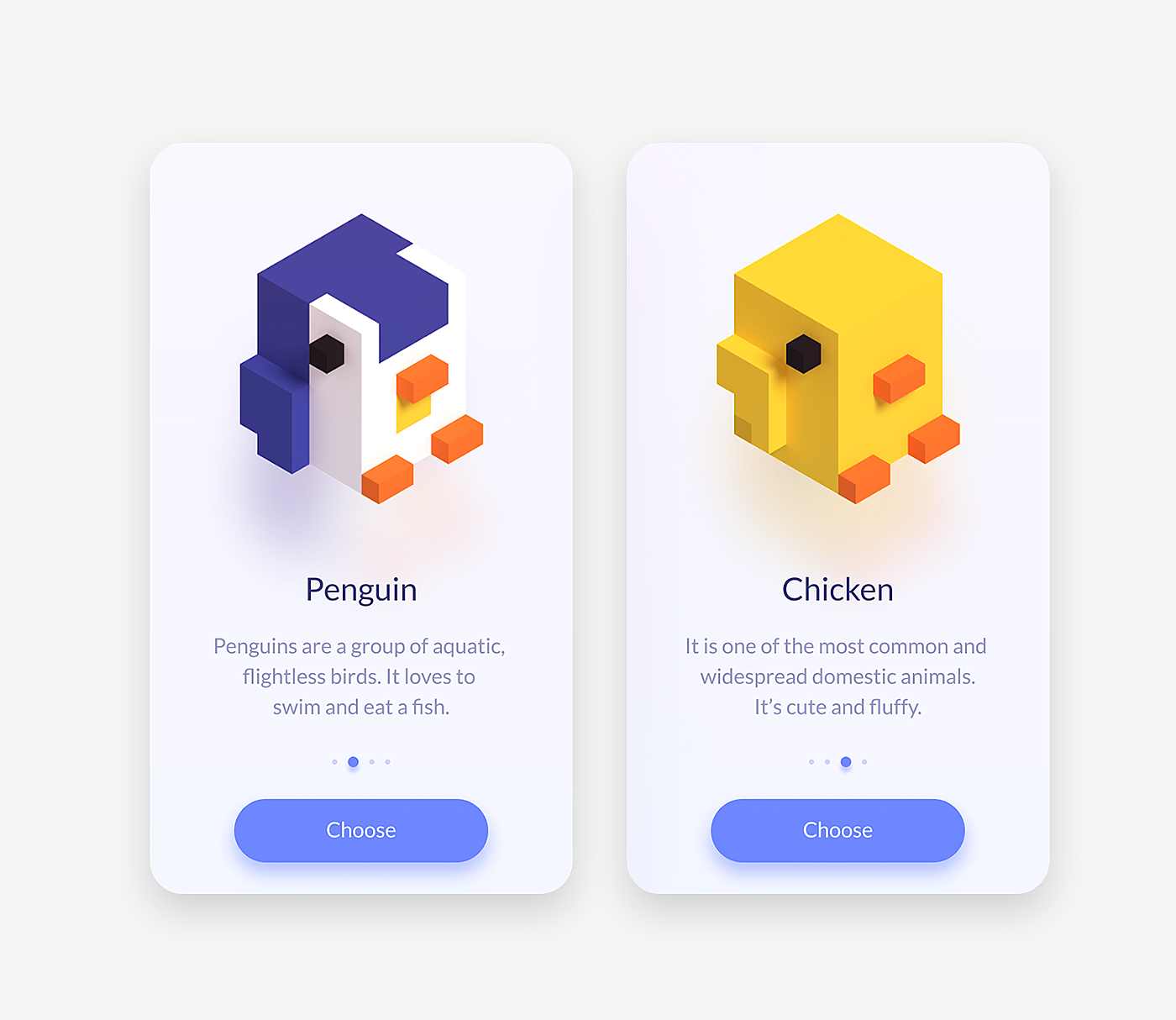
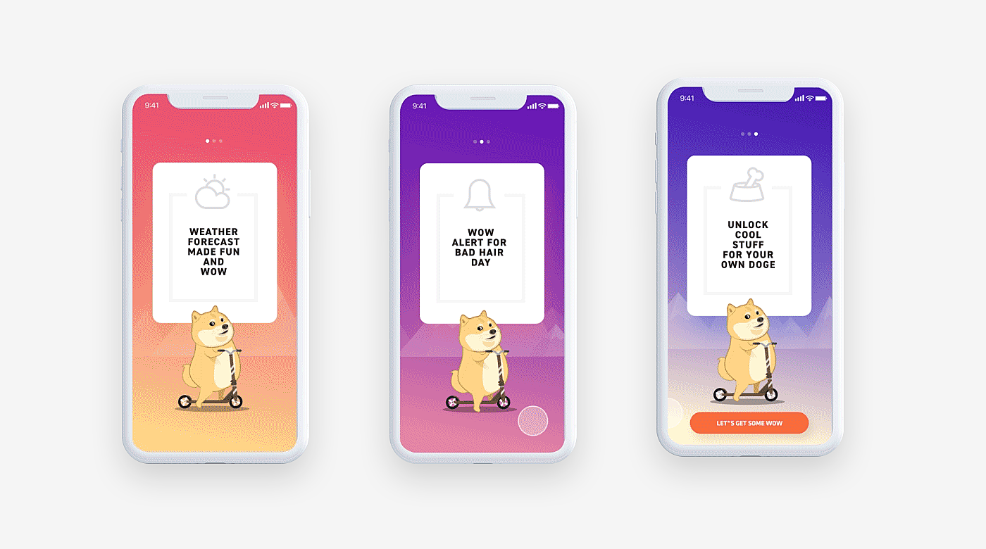
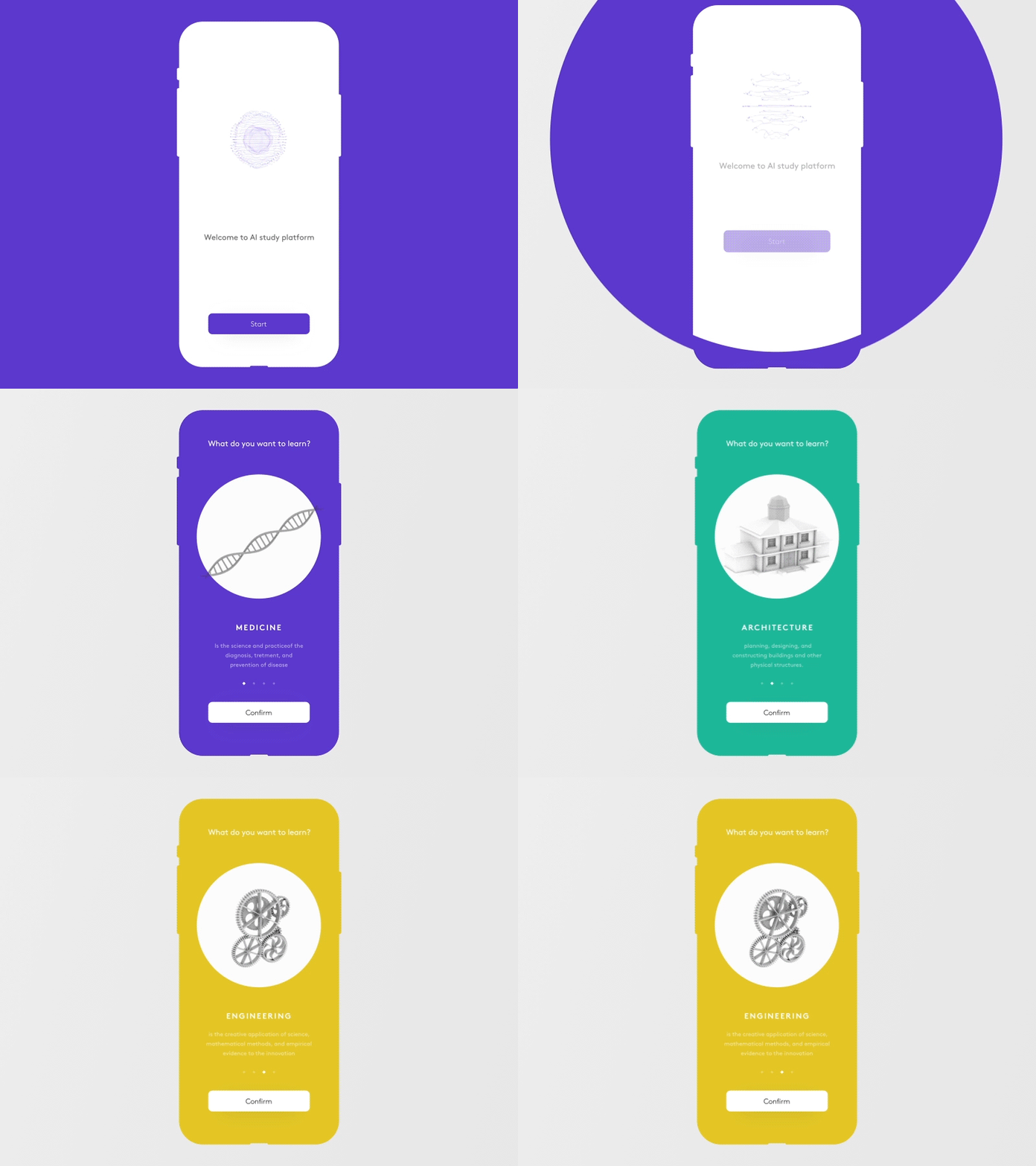
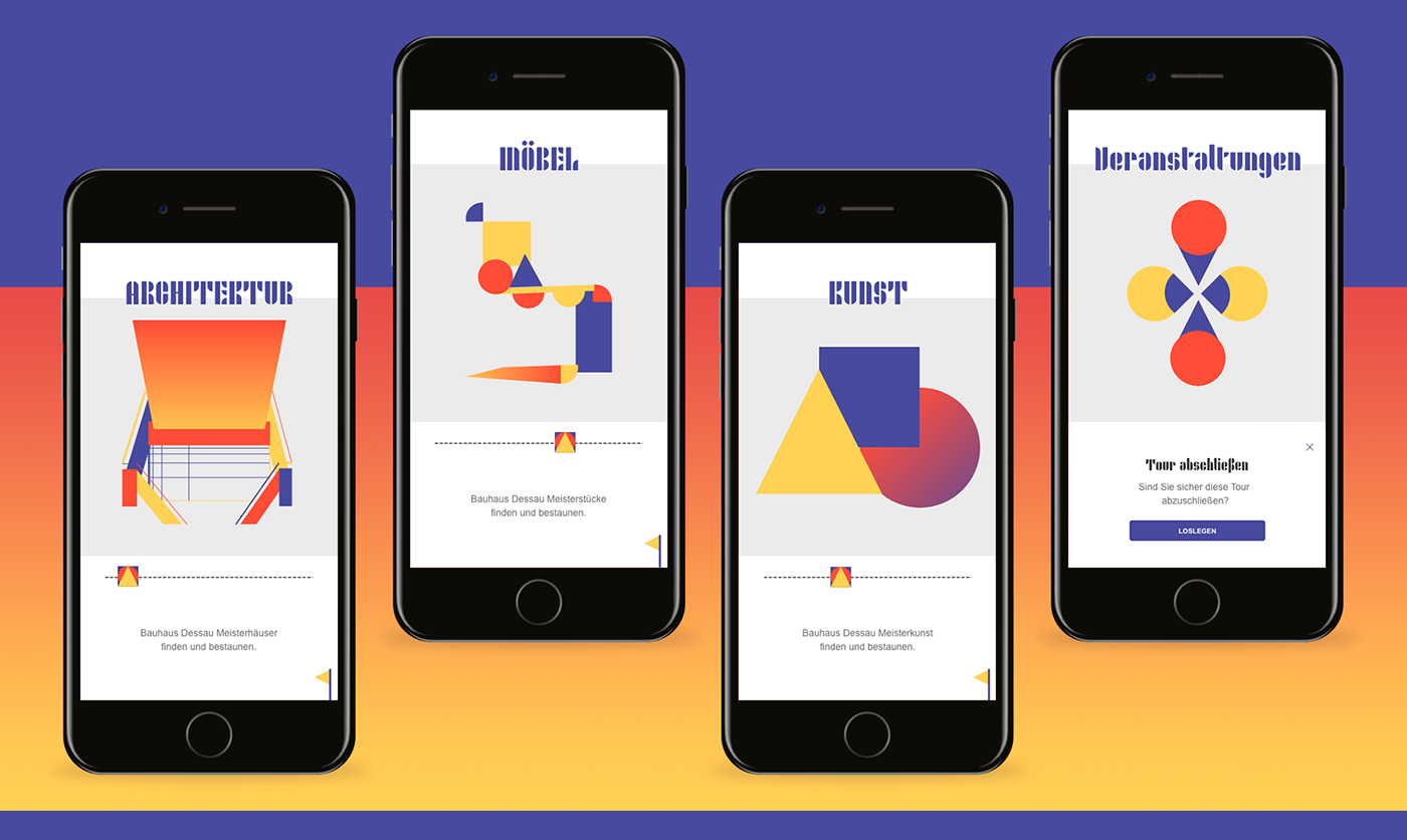
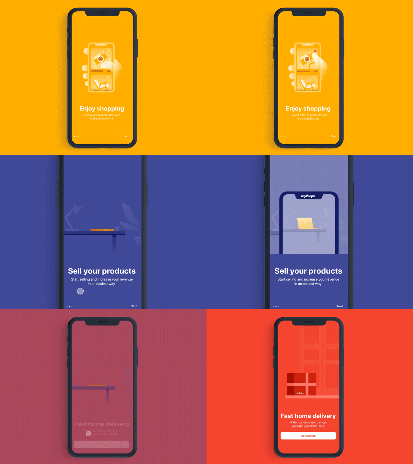
Long onboarding processes that guide the user through each and every feature of the app are likely to make users exhausted. That’s why it’s critical to break the guided tour into small pieces, making a screen-by-screen tutorial with tasks formulated in one sentence. This is especially relevant for app onboarding best practices where a screen can be browsed with a swipe of a thumb.
Source: Dribbble
Hints
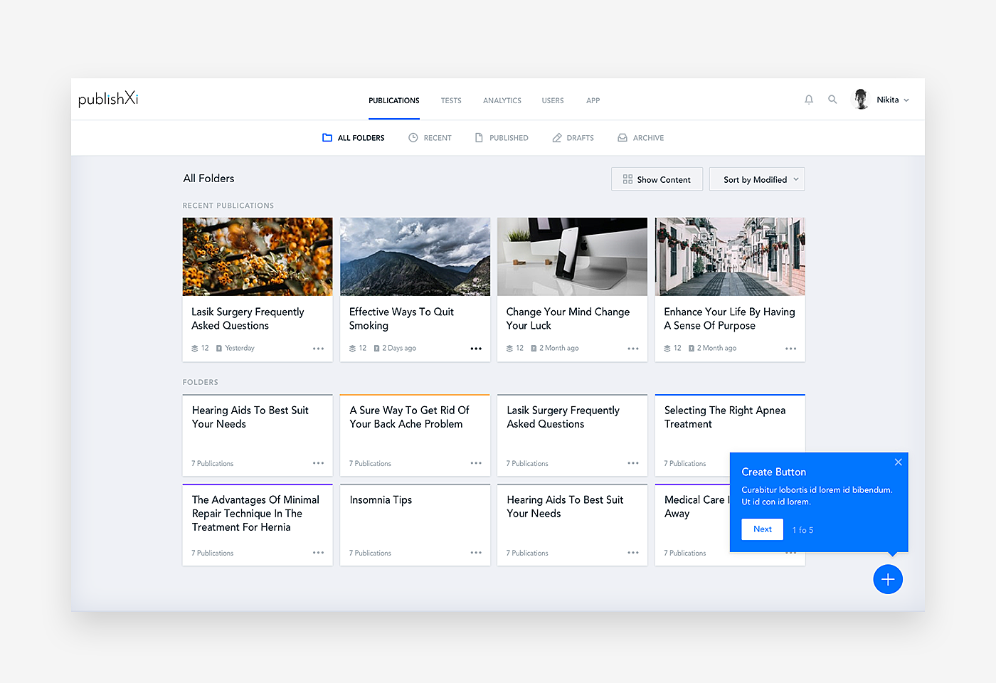
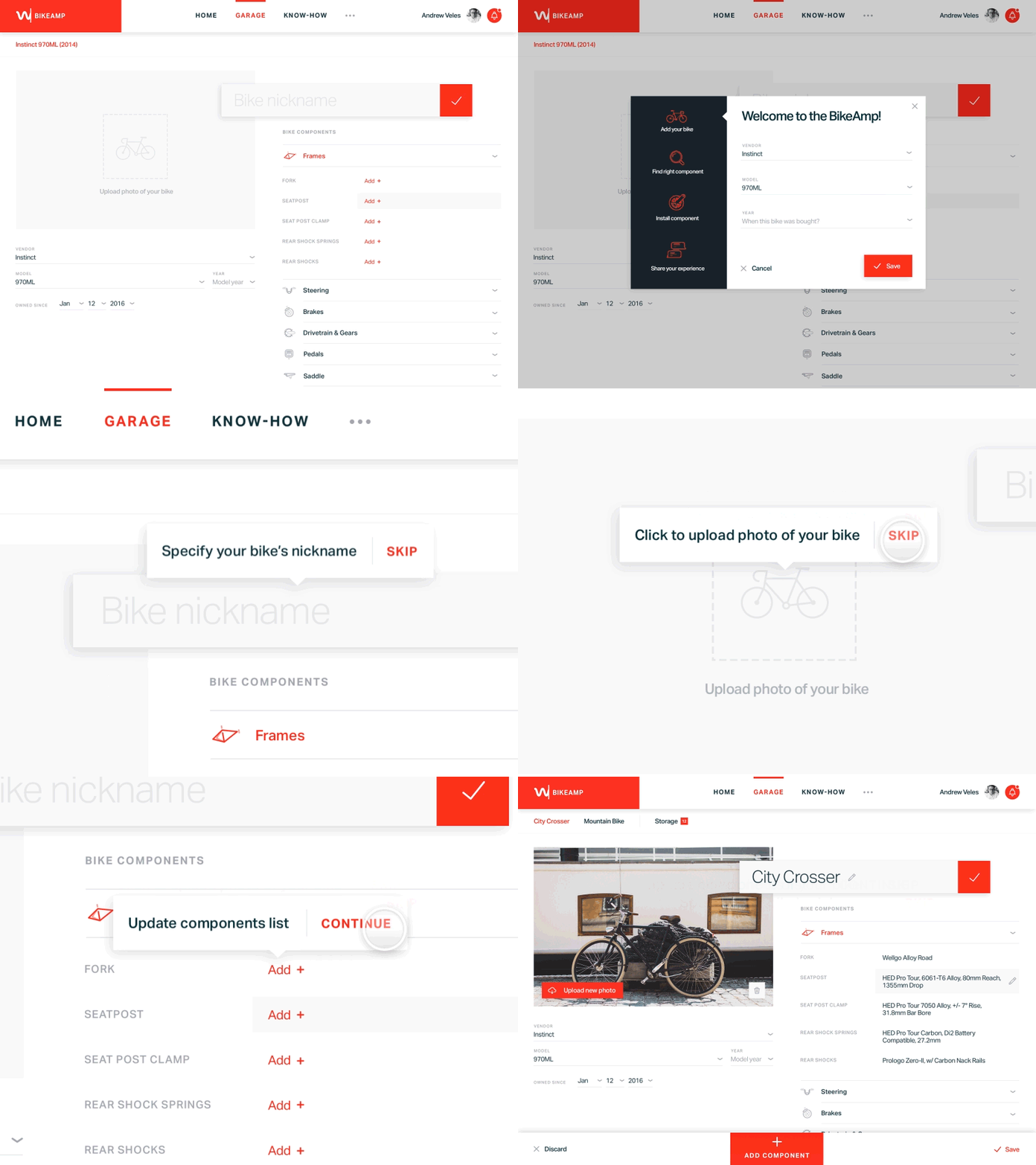
Website onboarding best practices often include the contextual onboarding approach, when hints are popping up at the point action. This suits an experienced audience that doesn’t need to understand the whole concept, yet may need some guidance at the specific points of interaction.
Source: Dribbble
Personalization
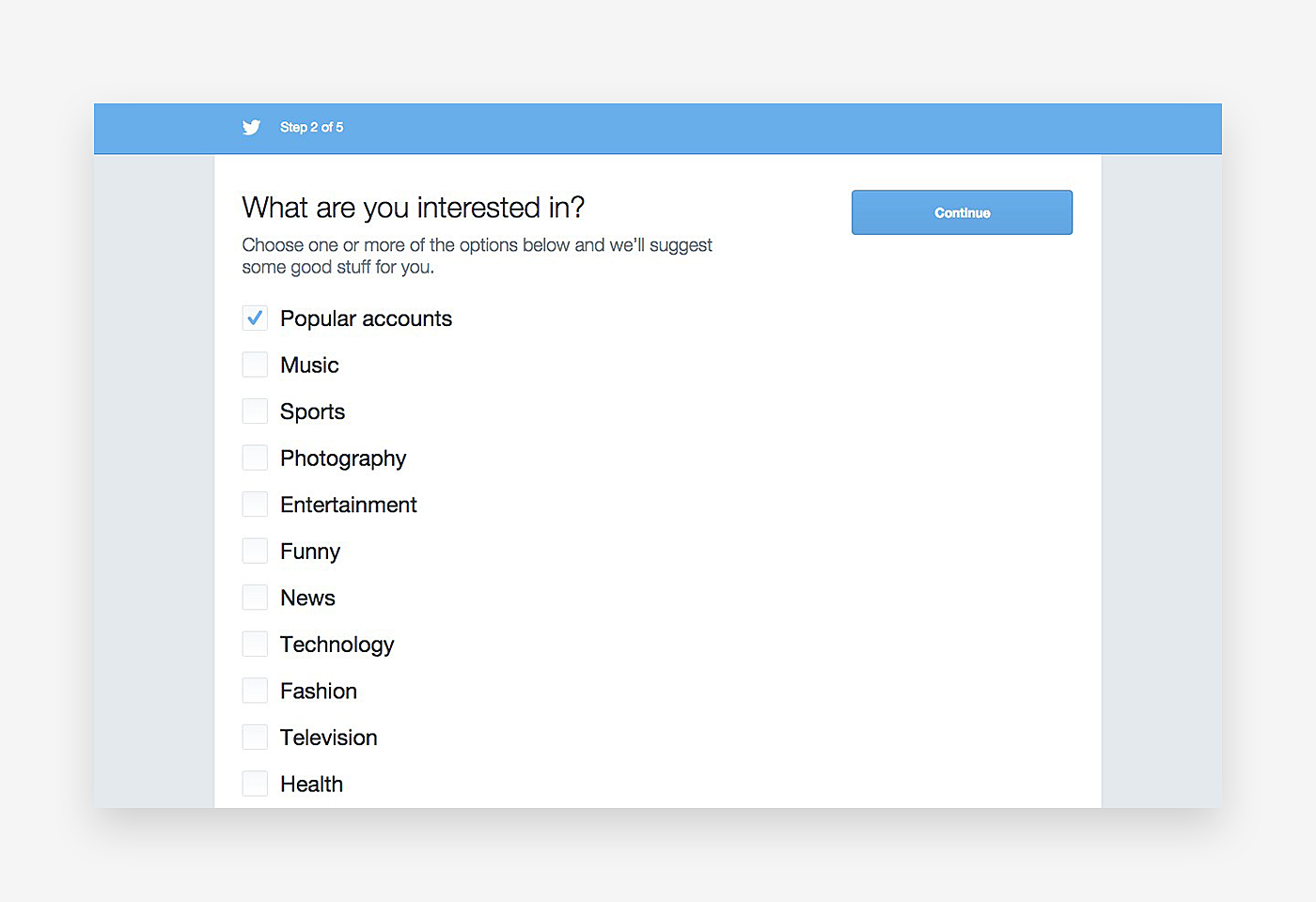
Personalization is a must for apps with a content-related value proposition. Ask users about their preferences, subscriptions, and wishes so that they get a unique feed and personalized suggestions from the very beginning.
Source: Cdn-images
Chatbot
Communicating with customers in a Q&A manner is another effective way to get them onboard. Live support is expensive and questions are predictable in most cases, so implementing a chatbot seems like a good idea.
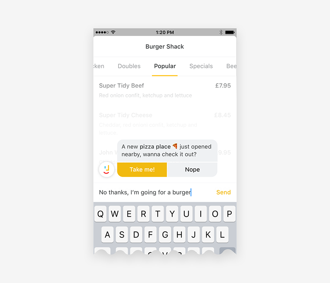
Source: Dribbble
Data collection
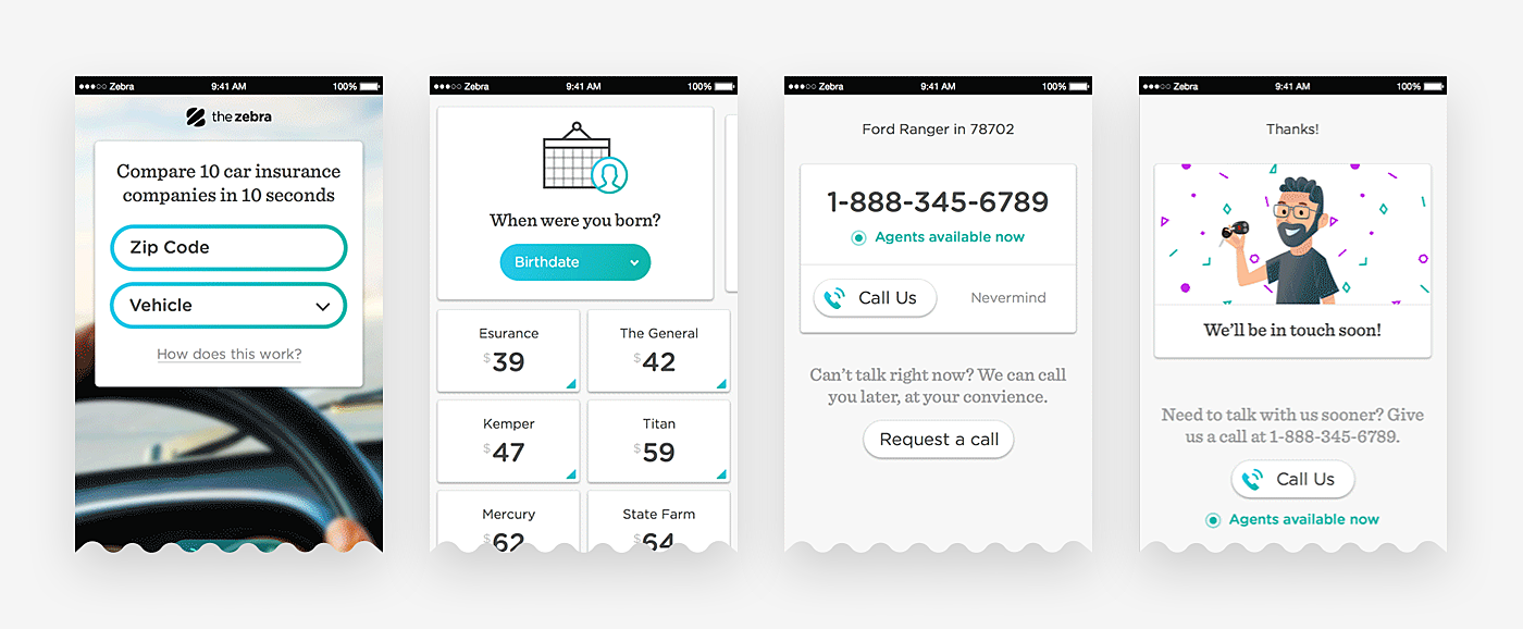
Remember that onboarding is not limited to guiding users through the app. It may help you win new leads and gather data that helps to personalize experiences and offer new products. However, don’t go too far and ask for the bank account number or very private preferences—this may be intimidating and make people bounce.
Source: Dribbble
Gamification
Plenty of onboarding examples include gamification, and here’s why: people like to set goals, achieve them, and see the progress. Set up wizards to show in-app goals, leaderboards, assign badges, and offer perks to those who reach a certain score.
Source: Dribbble
Up-sell
Onboarding is also a key factor when setting the price. The goal is to make users buy the most profitable pricing plan for your company and satisfy them at the same time. During the app walkthrough, let them know “the most popular” plan or product and the competitive advantages of the paid plan.
Source: Dribbble
User onboarding best practices
So, how to make onboarding more useful and satisfying for your users? We believe that following these UX onboarding best practices will facilitate user experience and, as a result, drive conversions:
1. Specify user goals
What goals are your users need to achieve with your app? Motivate them to complete user onboarding by telling what they’ll learn or where they’ll get in the end.
Source: Dribbble
2. Let users skip onboarding
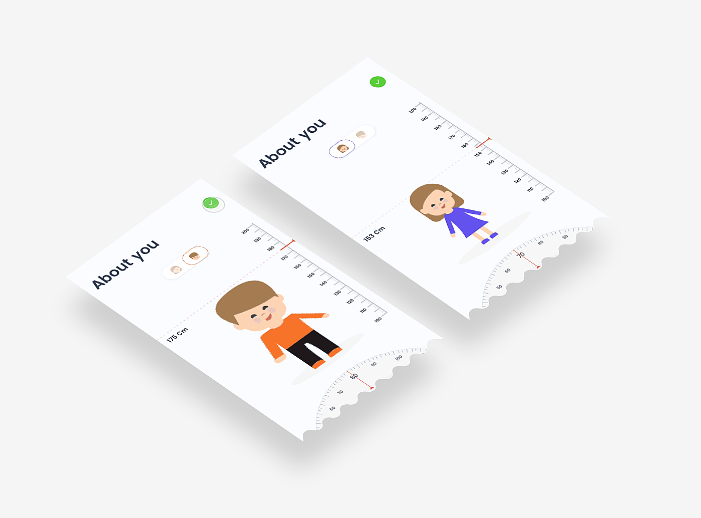
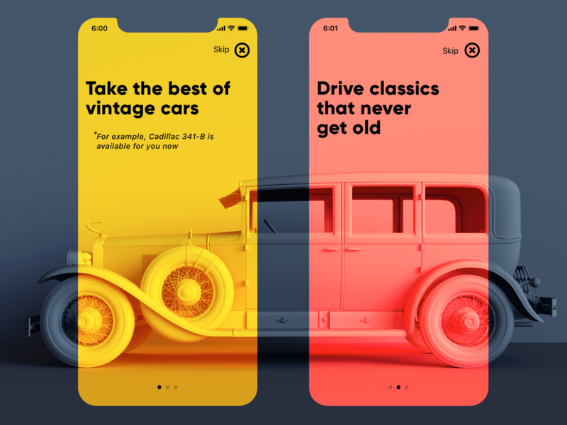
No matter how much time and effort you spent on your onboarding concept, there are always people who are not excited about learning how your app works. They come for the value propositions you offer, the rest they’ll investigate by themselves. As for mobile app onboarding best practices, place the "Skip" button within a thumb zone or let users swipe it off.
Source: Dribbble
3. Show one pop-up tip at a time
Don’t overload users by showing them multiple bubbles with tips on one screen. It leads to poor information processing and reduces the chances of users staying. Let them learn step by step, from one action to another.
Source: Dribbble
4. Show the progress
Add the progress bar or enumerate the stages of completion to show users how long is left to go. Prioritize the experiences and put the most critical at the first stages of onboarding.
Source: Behance
5. Verify input frequently
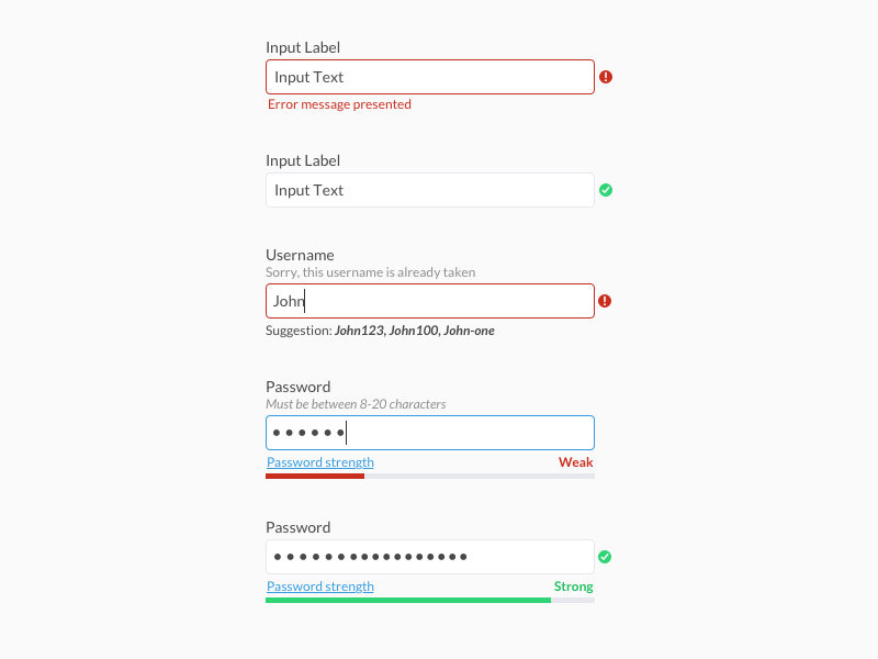
Users who provide incorrect or insufficient information often experience difficulties onboarding and receive irrelevant feedback. That’s why inline validation is a must that ensures all required data is gathered with no mistakes.
Source: Dribbble
6. Apply animation
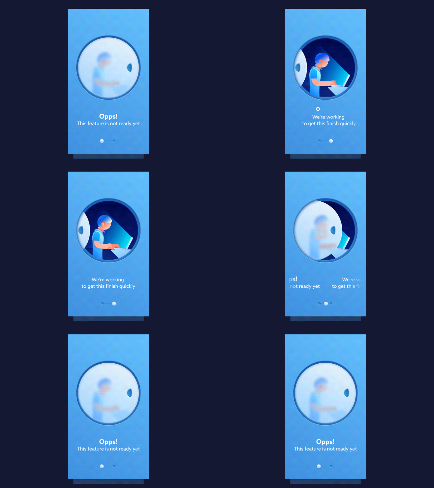
One more way to make the onboarding experience more engaging is to bring it into motion. Animation makes onboarding design more dynamic and highlights important details. However, animation shouldn’t be overused, as it may increase the loading time and Internet traffic.
Source: Dribbble
7. Pay attention to UX writing
Contextual information should be short, straight and to the point. No specific terms, no slang, no jokes or ambiguous phrases. Bear in mind that most of the instructions are forgotten as soon as a user leaves the page, so don’t be wordy or vague.
Source: Dribbble
8. Elaborate on empty states
An empty state is what the user sees when there’s no data on the screen. Any blank spaces in onboarding should be filled with hints, sample data, or error messages to tell users where they are, what to do and what use will they get off it.
Source: Dribbble
9. Announce new features
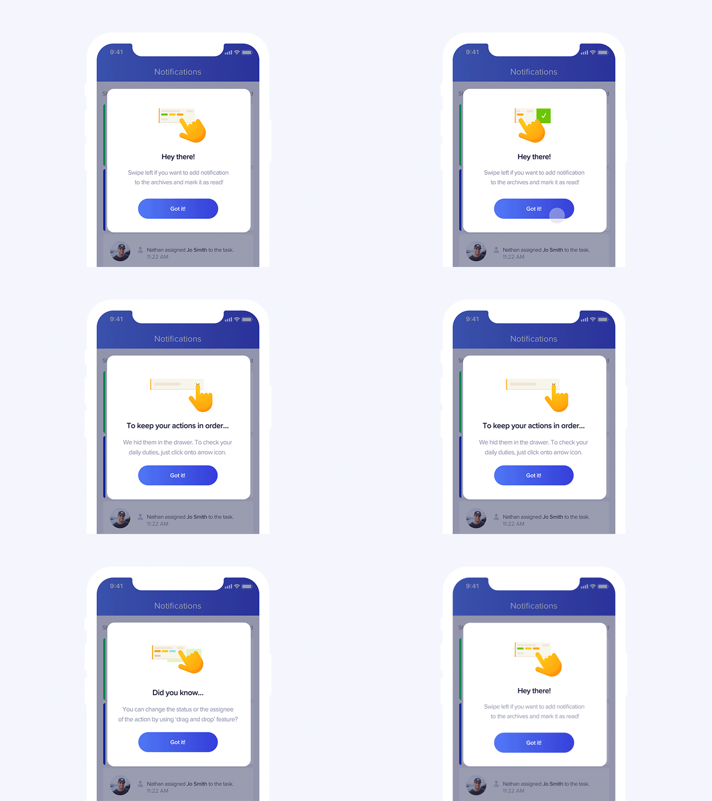
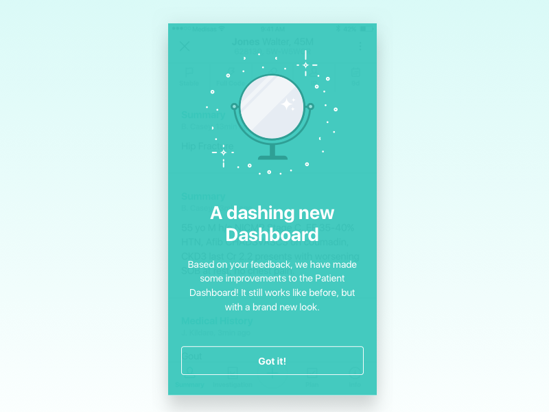
Announcing new features is another part of onboarding users. Even if they know how to deal with your product, they may not be aware that a new feature is out. What is more, it allows users to understand how to work with a new release.
Source: Dribbble
10. Conduct user testing; A/B testing
When designing the perfect UI and content for onboarding experiences, start gathering users’ feedback and analysis early on. With this info at hand, you can decide whether to change the onboarding format or design, the features or interactions to add, and where to place more focus. Implementing all changes at once is unreasonable, and that’s where A/B testing comes into play, allowing you to check what’s good for your customers.
What about onboarding professional interfaces?
As for professional onboarding systems, it might be quite a challenge to design one for at least three reasons:
It’s expensive. Designing multiple tours, contextual hints, tips for hundreds or even thousands of employees cost a lot, especially when releases take place every quarter. Here’s where other tools are more reasonable: newsletters with screenshots, videos, banners, and long-read manuals (yes, some read them).
It’s a long and complicated process to define the required content. While mass interfaces may have two to three roles, like ‘user’, ‘guest’, and ‘admin’, professional ones may have dozens of them.
It’s unclear which tasks should be solved. The number of possible scenarios is immense, and it’s difficult to predict where the hints are in places.
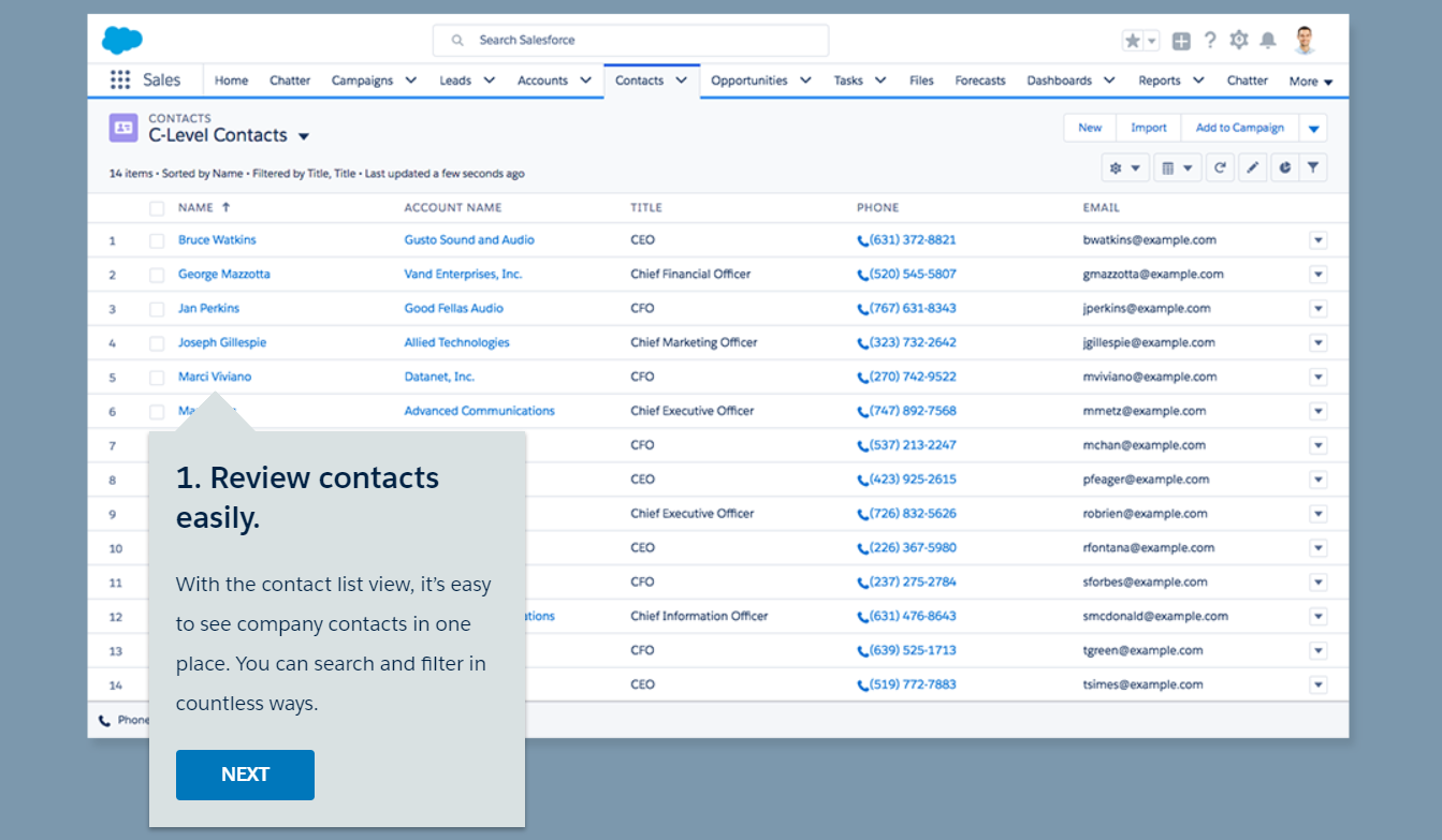
In addition, professional interfaces are fundamentally different to mass ones. The best practices and templates that work so good for a standard app won’t work for a complex system which requires a personal approach, as well as a lot of UX research and design. People should onboard through other means, like a product tour, video conference or a newsletter.
Source: Salesforce
In a nutshell
Creating a trendy onboarding UI is great. But understanding for whom you’re doing it and what makes it successful is even more important.
What do you think about the topic? How do you increase user engagement in onboarding? Let’s discuss in live chat!
Rate this post!
817 ratings, average ratings is 4.6 out of 5
Related Posts

07 January 2024
The UX Audit: A Beginner's Guide For 2024
A user experience audit (UX audit) is a great way to reveal the non-perfect areas causing severe headaches for users, and to get recommendations on how to improve them to make it easier for visitors to reach their goals on the website, thus boosting conversions, improving user engagement, and generating more leads, among other benefits from a UX audit. Let's dig deeper into details in our new article.

05 January 2024
10 Best 404 Error Page Designs for 2024
In our new blog post, we review the best 404 page design examples of 2019 that will never disappoint you even if you meet the dead end on the website.

06 November 2020
How to Perform UX Audit that Will Pay Back x2 | AGENTE
How to perform a successful user experience audit? Why does your company need one? In this article, you'll read about important steps to perform an audit, its cost and deliverables.

20 October 2020
How to Design a Website For Black Friday & Cyber Monday?
In this article, we will talk about how to create an attractive and selling website design for Black Friday and Cyber Monday. Let's take a closer look at each step of creating such a website.

01 October 2020
Your Ultimate Guide to Successful User Experience Research
Your UX Research step-by-step guide to benefits, approaches, methods, tools, conferences, and influencers.
What Is a UX Audit and How Does It Help In Pandemic?
For those businesses that rely heavily on the customers from the internet, it is the time to make sure their brand touchpoint on the internet works well. That’s where the UX audit comes into play because it is one guaranteed way to find out whether the website or app performs at its best.
Let's talk
Is there a challenge your organization or company needs help solving? We’d love to discuss it.

Managing Director, Partner
Andrew Terehin

Thank You!
Your message has been successfully sent.
We will contact you very soon.
