13 April 2018
10 Best eCommerce Product Page Designs Examples To Boost Sales
Did you know that eCommerce sales are skyrocketing and will have increased threefold by 2023?
According to the recent statistics from Statista, we should expect a 246.15% lift in worldwide eCommerce sales, from $1.3 trillion in 2014 to $4.5 trillion in 2021. No wonder ever more eCommerce clients are coming to Agente asking us to make their website more attractive in order to boost sales. Do you know what they mostly care about? A landing page, because it’s the first thing that website visitors come across within their user flow.
But the customer journey doesn’t stop at the very first page, the real sales begin further on, and no success is possible without outstanding product page designs.
After reading this article, you’ll learn e-commerce web design tips concerning the best product page designs and get some inspiration for creating or updating your eCommerce website or POS interface design.

Five elements that a product page cannot do without
No doubt that there’s always room for imagination when creating the concept of a product page design or redesigning an e-commerce website. You can add, remove, or swap design elements of your choice, but the primary goal is to sell your product, so make sure you provide some essentials to meet user expectations and encourage them to buy. Agente suggests starting a product page with the following five elements:
-
Product Title
Product title is an important factor to consider when designing your product pages. A well-written and catchy title can help draw in potential buyers, while a dull or uninteresting title can deter them.
The title should be catchy and descriptive, accurately reflecting what the product is and what it can do. Titles that are too general or vague may not be as effective as titles that are more specific. In addition, the title should be easily searchable on Google and other search engines.
-
Breadcrumb
Breadcrumbs help users orient themselves within the product page and make it easier to find the section they are looking for. They also help users follow a product from start to finish, which can be important for product pages that have a purchase process.
3 . Image

There’s probably no need to explain why images of goods for sale are a must. The time and effort that you invest in capturing your products will pay off through gratitude from your clients and high conversion rates.
Let visitors see the details that each product includes – take care of the high resolution, zoom in/ zoom out option, and take photos of each item from multiple angles.
4. Description

When writing copy within eCommerce product page design, be consistent and don’t overuse buzzwords and marketing tricks. A clear description targeted to your audience is enough.
Keep in mind the mobile-first principle for your website: about 19.3% of consumers bounce because they don’t see the proper description of what you’re selling, according to expert research.
5. Price

Right next to the description comes the price. People are usually sensitive about the cost, so tell them clearly how much the product costs, and never hide shipping prices or mislead them with “ghost” discounts that work only under special conditions without stating these conditions. Make the Priceline bold and noticeable, and highlight it with a separate color or a bigger font.
6. Add-to-cart button

The ultimate call to action for the product page should lead to the check-out with the desired purchases. Place the add-to-cart CTA right under the price line and don’t use ghost buttons, to avoid losing customers.
7. Customer review with a rating

When someone comes to your shop, they expect to see other people’s opinions on products of their interest. So we suggest that you not only add a 1-to-5 star rating and review functionality to each product page, but also a pop-up that encourages shoppers to leave a review after they have purchased.
11 Best eCommerce Product Page Design Examples
Now it’s time to take a look at some eCommerce product page design examples. We picked ten to explore more ideas for your inspiration.
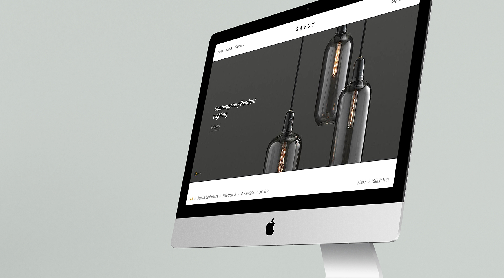
Clear product page
Source: Pinterest
Let’s start from the general and move on to the specific. This is where it all begins - a catalog page with product cards on it. These so-called “covers” that lead to the actual product page should not be overwhelmed with info - the image, price, and name of the product is enough. The page also has a simple but effective layout, and the catalog is not overloaded with info, so the client can focus on the product and its basic characteristics.
Another detail worth noticing - is the discounts and offers are displayed right there to attract the customers with better prices. it’s a smart decision as it will very likely lead people to see the details of the product.
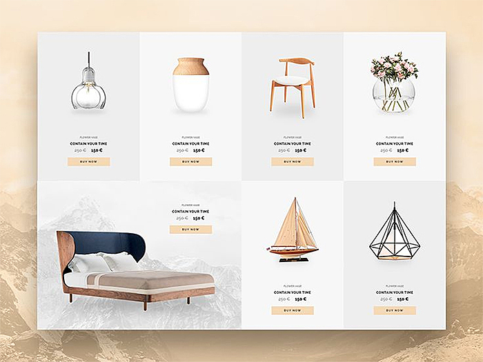
Removing the layout
Source: Dribbble
Removing the background is one of the most popular tricks to design an eCommerce product page. This looks fresh, highlights the content, and makes the page easier to navigate.
When buying products online, you can try them, so it’s very important that the product page provides enough information. In this example, we see high-definition photos of the different parts of the bicycle, allowing us to check the quality of the product. That will definitely increase the chance to sell it! Especially considering, that the Add to card call-to-action button is right there.
The visual balance of the product page
Source: Dribbble
Finding the right balance between images and product description is a big deal. Visual clutter may distract visitors from purchasing, so sometimes minimalism in combination with creativity works better than a classic product page solution.
This example shows us, that sometimes less is more. Big and colorful design elements and creatively displayed high-quality images just drug the eyes to the product, motivating them to get it straight away.
Minimalism
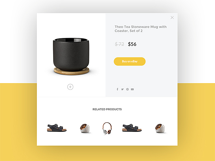
Source: Dribbble
Yes, we confess that we adore minimalism where it is reasonable. Basically, there are three main areas of focus: image, price, and a CTA button. Do you need anything more to buy?
You can also notice the use of the contrast to highlight the necessary elements, for example, the “Buy on eBay” CTA button. Moreover, even the photos are made minimalistic, though remaining a high resolution.
Responsive design
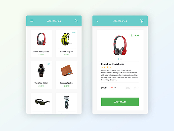
Source: Dribbble
Let’s see how it looks like on a mobile screen. It seems that it has all the same features that you need on the web: it’s image-led, has a big, clear CTA button, and informative copy. The main differences are in the description under the picture, i.e., the drop-down for color and price in the upper corner of the image - all of this saves the space on a mobile screen.
You can also see that this page made without any excessive elements, with specific information shown in a different colours to organise the space, and allow the customer to pick out the price very quickly.
A single product page is also made in the same way, highlighting the “Add to cart” button and offering a few pictures of the product so the buyer can make sure it’s exactly the product he wants.
Hiding the details
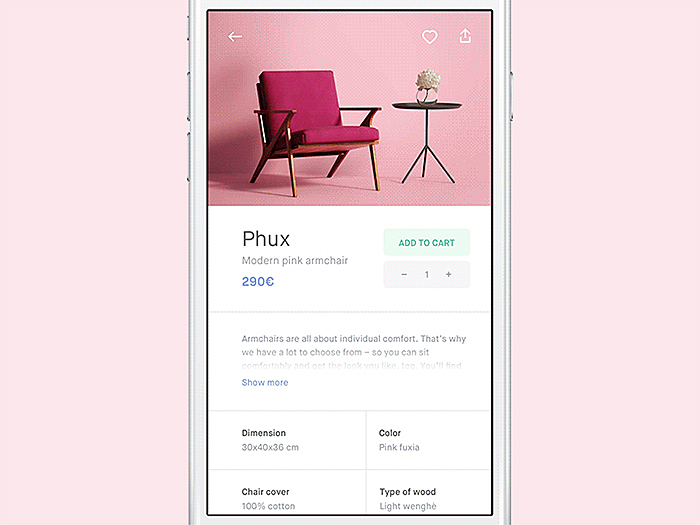
Source: Dribbble
Another nice trick on a mobile product page is hiding below-the-fold text under a show more button. The page also features a lot of white space presented by margins and padding around text columns, which drags focus to each of the sections.
There are many ways to hide the details on product page design. A few popular methods include adding a lightbox or a gallery, hiding the price, and using video or infographics to illustrate the product.
This example is also good for the simplicity of the design element, including fonts. With high-quality creative visuals, the products are shown at their best with important details right next to them, but without overwhelming the screen. The page is user-friendly, making it easy for anyone to understand how to navigate through the page.
Unique way of product representation
Source: Pinterest
This page is one of a few good examples of fashion clothing website designs. They break from the transparent background tradition to add some charm with pastel colors and soft fonts.
So we can see the style and the touch of the brand in each detail. The buyers can customize the color or choose from similar models - everything is on the same page. Another significant point to learn from is the stylistic balance of the details, it’s not classical minimalism, but still neat and clear.
Helpful adds on
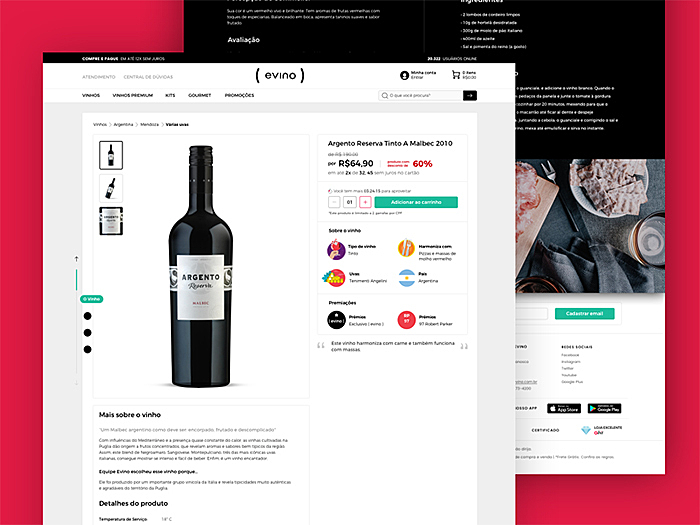
Source: Dribbble
This website for wine lovers is nothing special at first sight. However, the product page stands out with a helpful add-on - custom icons that highlight the type of wine, grapes, country of origin, and products it harmonizes with - which eliminates lots of text in the description, so the page doesn’t become messy and chaotic.
Maybe this product page doesn’t look very exciting, though it provides all the necessary information about the product that really matters, and helps to make a choice while browsing the website.
Micro-interactions
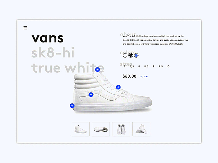
Source: Dribbble
This page is interesting for its user-friendly micro-interactions. It allows for switching colors of various parts of the sneakers by hovering over them to select an item with a custom design.
We can also see a pretty clear layout, that with a very light-colour scheme creates a very pleasant experience for the customers so they can enjoy choosing shoes and customizing them as long as it’s necessary. The CTA here isn’t very visible but situated in a great place - right next to the price.
Be risky
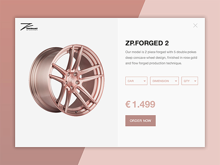
Source: Dribbble
The glamorous and sleek rose gold color scheme reflects the product color to create a homogeneous look. We agree that the solution is a bit controversial from the designer's point of view; however, it reflects the company’s style.
After all, the main purpose is to make the product shine and attract attention. Besides the color scheme, the design is very well-thought-through, with all the necessary elements.
Right on the product page, the customers can customize the solution for their car model, tempted by the offer of a defined CTA.
Optimize everything
The main purpose of the product page design is to make the customer go through a certain user path easily and intuitively. AGENTE followed those principles while working on the Atterley website.
We created a simple product page with the pictures showing the cloth from different sides, so even though you can’t try it, you can have an idea of how it’s going to look. All the additional information is hidden under the drop-down windows. The CTA here is the most outstanding element. Moreover, users can “like” the products, adding them to their favorites collection.
Features that make you more competitive
These seven must-have elements will minimize your eCommerce product page design. However, an average product page includes some more features. Let’s throw some light on the ones that can increase conversion rates and boost your sales.
- Video or 360-degree view
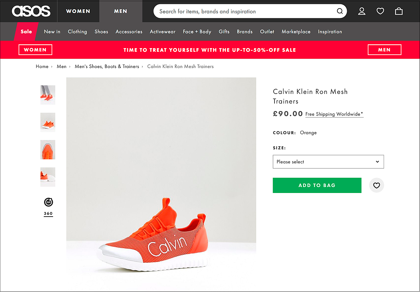
Source: Asos
We had to start with video, as this is the type of content with the fastest-growing popularity. The era of salespeople showing up at your front door or office to show how the product seems to be gone, so video may be a nice and unobtrusive replacement for this.
- Product variations
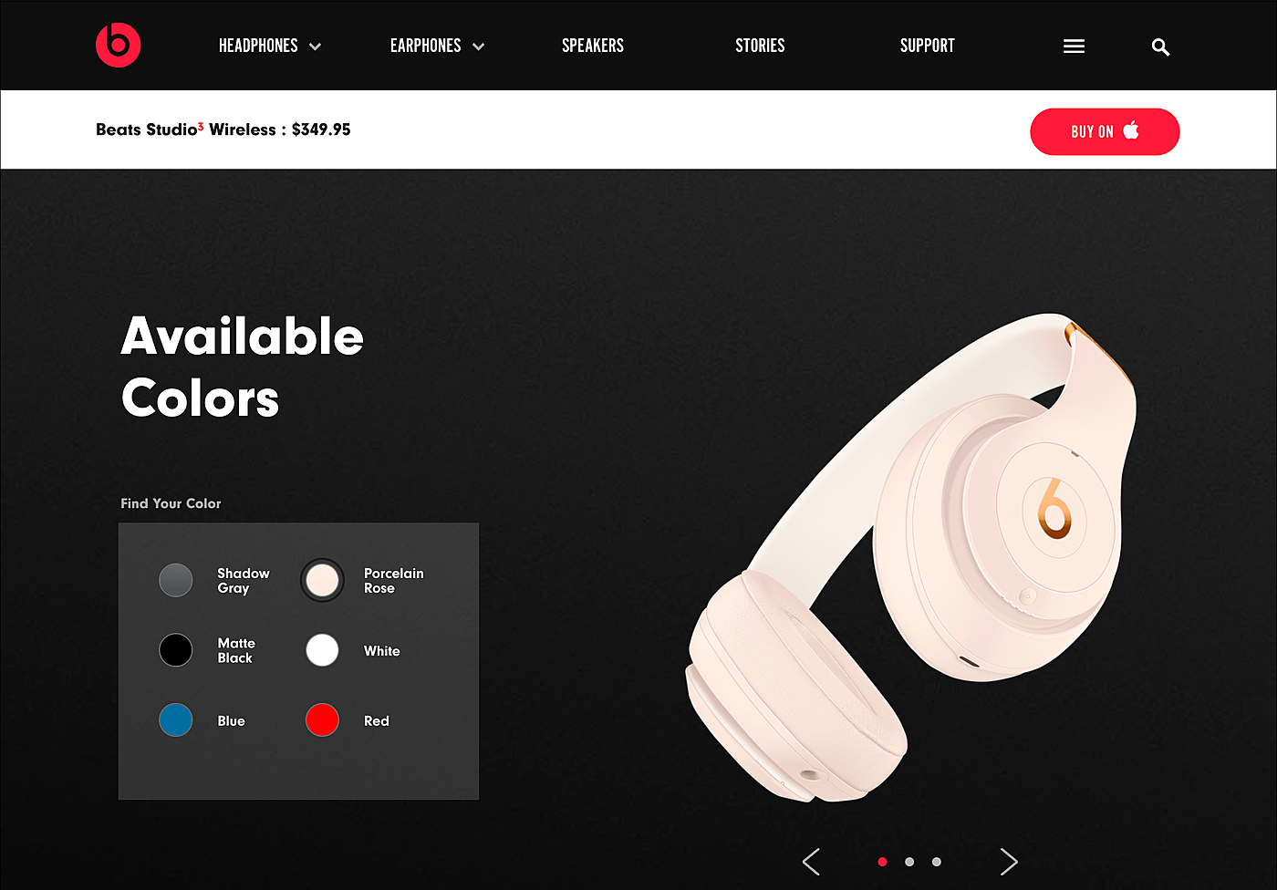
Source: Beatsbydre
If your product comes in various colors, forms or patterns, including all the variations on the same page will positively affect your sales. Make sure that when the user clicks the color they like, the page content updates—this helps to avoid duplication (which is good for SEO), and at the same time allows visitors to stay on the same page.
- Related or recommended items
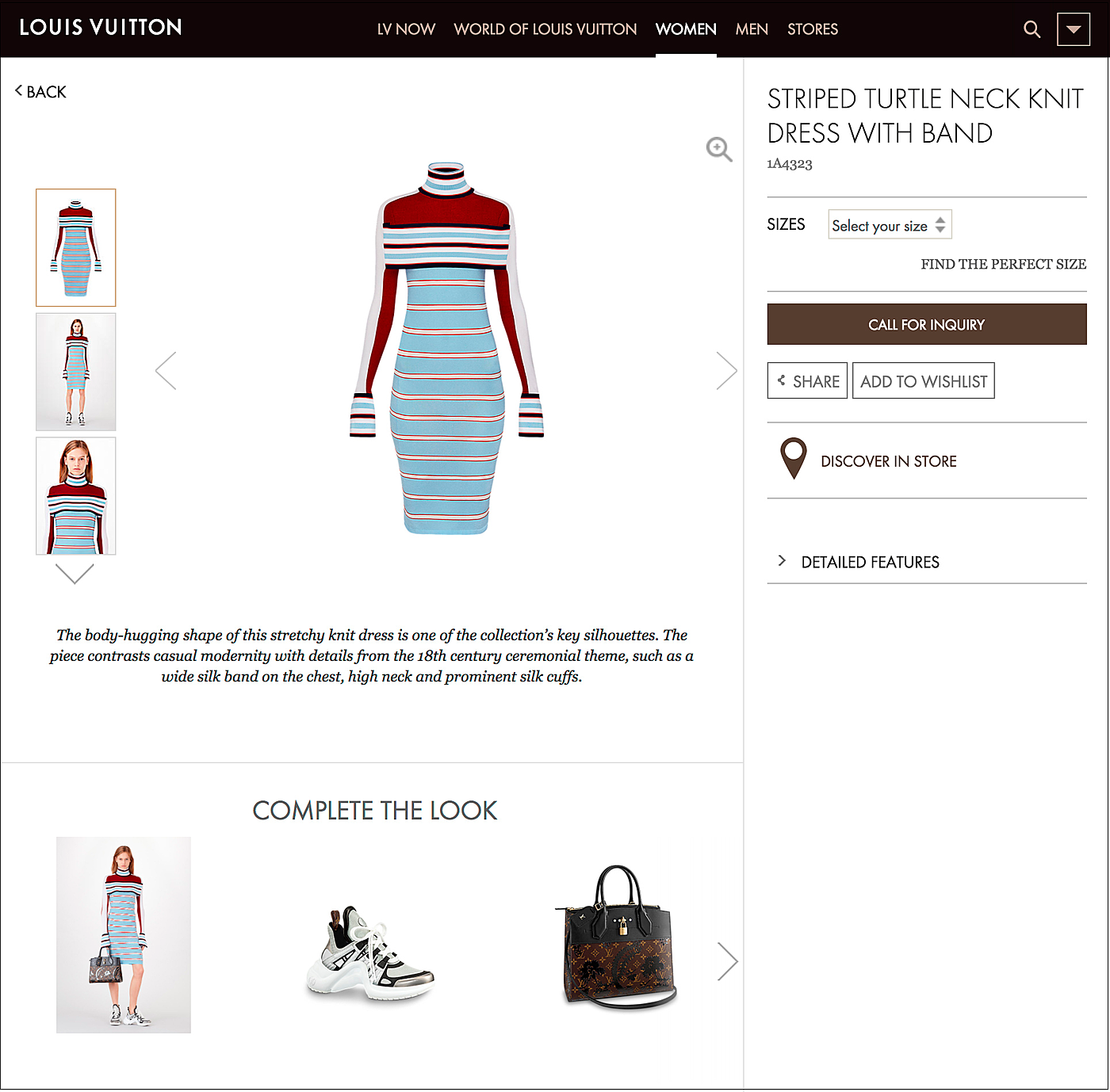
Source: eu.louisvuitton.com
A product page is also a good tool to upsell or cross-sell the other items in your store. Leave the place on your place to show the goods that complement the item of their choice, or those that are similar to it by type, color or model.
- Discount or abandoned cart pop-up
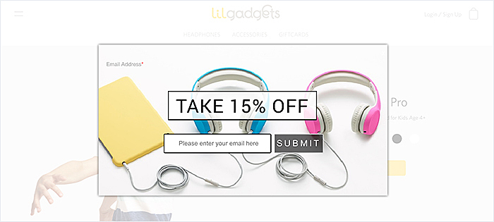
Source: Lilgadgets
Pop-ups might be annoying when they appear out of nowhere any second, stacking up on top of each other. However, when properly used, they may help to convert more users. For example, offer a last minute discount when the visitor leaves the product page or abandons the cart - experts say that smartly designed and perfectly timed pop-ups may win you up to 10% clients.
- Positions in stock
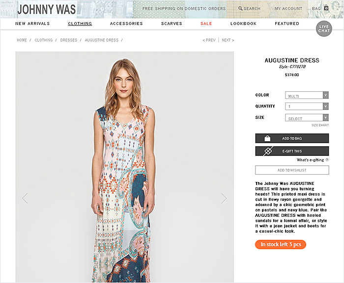
Source: Johnnywas
The effect of scarcity motivates people to make purchasing decisions faster. Place a counter that reflects stock levels, so that people will rush to buy the desired product. However, don’t make your visitors experience the infamous “fear of missing out” - if the position is out of stock, let the shoppers add the missing item to the wishlist, and set up notifications so that they’ll know first when it’s back in stock again.
- Special marks
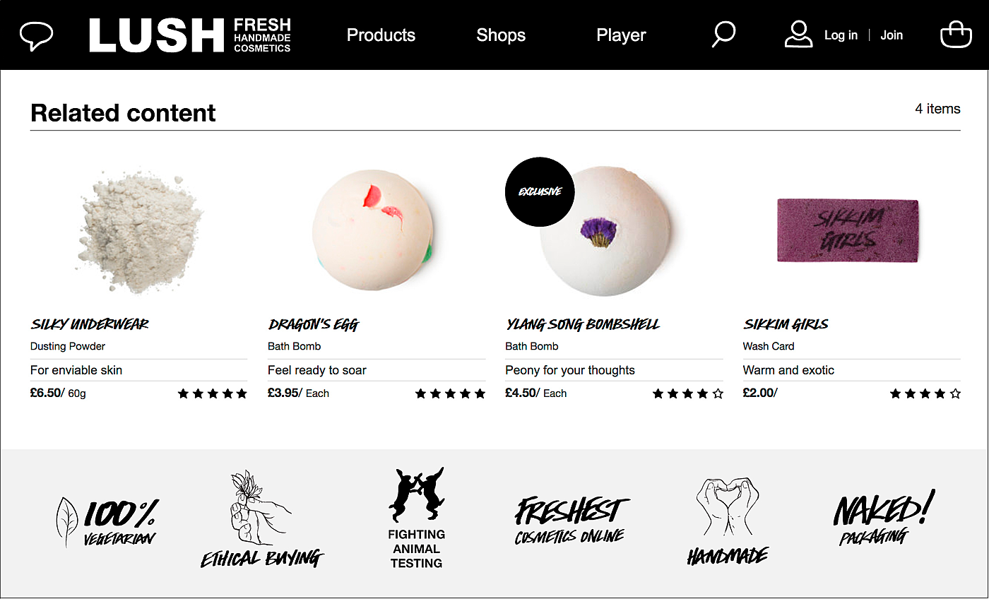
Source: uk.lush.com
Depending on the type of goods, you may also “no animal testing” marks, product awards, or perhaps some tips on garment care etc. Think of what your target audience may expect of you and design some custom icons that indicate special features of some products.
- Cross-selling
When the customer is browsing through your catalog, it means they are interested in your products and maybe to plan on buying something. That’s where the persuasion triggers can do a good job for you, moving those visitors from consideration to the decision making stage of your marketing funnel. By offering complementary products in the engaging way, for example, like Misquided does, you can boost your sales.
- Trust badges
Trust badges build trust in your brand, thanks to their trustworthy nature and transparency. The badges such as the Trusted, verified by Paypal ensure customer trust and perceived quality of your brand. They could be placed as a small footer, next to the customer review section.
- Urgency signals
Trigger customer’s fear-of-missing feeling by adding urgency signals to your product page. You can also use them for special actions and promotions, notifying how many hours or days left until the offer expires. Psychologically, scarcity makes the product more desirable. Overstock items offer a clear visual cue of urgency.
What Not to Do for eCommerce Product Page Design
To ensure that your product page design is effective and optimized for conversions, it's important to know what not to do. Here are some common mistakes made when designing product pages:
Making page too long with too much information
When creating a product page, it is important to keep it concise and easy to read. Long and complicated product descriptions can be overwhelming for the customer and can deter sales.
Not focusing on product images
Product images are the first thing that customers notice when they land on a product page. Poor quality images or lack of them can make customers lose interest in the product. Make sure that your product images are high-resolution and show the product in its best light.
Not optimizing for mobile
Mobile optimization is essential for eCommerce product page design. Mobile devices now account for more than half of all eCommerce traffic, so it's important that your product page is mobile-friendly and optimized for touchscreens.
Not including product descriptions
Product descriptions are important for helping customers understand what a product is and why they should buy it. Make sure that your product descriptions are detailed and easy to read.
Not using customer reviews
Customer reviews are a great way to build trust with potential customers and show them that other people have bought and liked the product. Make sure you include customer reviews on your product page.
Not including customer service information
Providing customers with customer service information is essential for providing a good customer experience. Make sure that your product page includes contact information, FAQs, and other customer service information
eCommerce Product Page Design Cost
Designing a perfect product page is a tedious task. It requires time, money, and effort. The cost of product page design depends on the complexity of the page, the size of the project, and the design elements involved.
The cost of designing a product page can be broken down into three main stages – research and planning, design, and development.
At the most basic level, designing a product page requires a designer to create mockups of the product page, write content, and then convert the design into a working website. This process can take anywhere from a few hours to a few weeks, depending on the complexity and level of customization required.
When creating the design for a product page, the cost will depend on the complexity of the design requirements and the time needed to create the page.
Generally, a basic product page can be designed for around $500-$1000, depending on the complexity of the design and the time needed to create it.
When creating a more complex design, the cost can easily rise to $3000-$5000, depending on the amount of customization needed and the amount of time needed to complete the project.
It’s important to keep in mind that a well-designed product page will be an investment in your eCommerce business. Investing in an experienced designer and taking the time to research and plan the design will pay off in the long run by increasing customer engagement and conversion rates.
Agente Can Help With Your Product Page Design
If you need help designing a great product page, AGENTE can help. We're experts in eCommerce product page design and can help you create a product page that's optimized for conversions. Look at the product page we created for KOEI TECMO. It has minimalistic design and easy navigation while providing all the necessary information and motivating to purchase an item.
At AGENTE, we strive to provide our clients with the best possible product page design for the most reasonable price. We work within your budget and timeframe to produce a stunning product page that will engage customers and increase conversions.
Final takeaway
So, what do we have at the end of the day? We think these examples feature the following characteristics of a decent product page design:
- informative;
- memorable;
- consistent;
- customer-oriented;
- catchy;
- user-friendly.
Product page design optimization is a good way to boost your sales by meeting these characteristics. Agente has enjoyed creating UX/UI designs for our eCommerce clients; we always keep our finger on the pulse of design and development trends. That’s why we can figure out what will work best for each type of online store. Leave us a message and we’ll get back to you with our professional advice
Frequently asked questions
What makes a good product page?
A good product page design should be visually appealing and contain all the necessary information. It should be organized in a way that allows customers to quickly find what they’re looking for. It should be easy to scan and easy to read, with clear headlines and a hierarchy of information.
Product images are essential for showcasing goods, and they should be high-quality and vibrant. They should also be accompanied by detailed descriptions, including size, color and any relevant technical information.
How do I create an eCommerce product page?
To begin, you will need to decide what type of product page you want to create. If you are selling a physical product, you will need to include photos, descriptions, and pricing. If you are selling a digital product, you will need to include screenshots, descriptions, and pricing. This will be the foundation of your product page.
Next, you need to make sure the page is optimized for search engine results. You should also ensure that your product page is visually appealing. Finally, you should take advantage of social media to promote your product page.
What are the product page design trends for 2023?
There are a number of product page design trends for 2023 that will continue to be popular. Some of these include using video content to help sell products, using Instagram-like filters to add a touch of personality to products, and creating interactive features that allow customers to explore products in more depth. Additionally, designers will continue to focus on creating a clean and modern look for product pages, and making it easy for customers to find what they are looking for.
What questions should I ask an eCommerce website designer when hiring?
There are many questions you can ask a designer willing to work on your project. You can start with the following, as they will help you to understand whether this company familiar with the field or no:
What experience do you have with eCommerce websites?
What design and development platforms do you use?
What is your design process?


Rate this post!
589 ratings, average ratings is 4.8 out of 5
Related Posts
How to Launch Your Online Travel Marketplace Platform in 2024?
Learn how to launch your own online travel marketplace platform in 2023 with our comprehensive guide and step-by-step insights.
14 January 2024
Marketplace Website Design and Development in 2024: Features, Tech Stack & Cost
Discover the latest in marketplace website design and development, explore features, technology stacks, and gain insights into cost-effective strategies.

Top eCommerce Website Design Features and Tips in 2024
While creating an online store, it is difficult to orientate quickly and understand how the website should look to create a positive impact on the owner’s income. It determines whether clients remain on store’s page, would they have confidence in the store and would they like to purchase
Ecommerce Website Revamp [The Ultimate Guide]
Learn why you should redesign your e-commerce website and how it can improve your online store's performance, including increasing traffic, engagement, and sales. Get expert tips now.
POS Interface Design Principles
There's hardly a retailer who doesn't have POS software in place or not planning to start using it in the future. In this article, we're going to discuss the Design Principles of POS Interface.
What Is mCommerce and How Your Business Can Benefit from It
Find out about m-commerce advantages and disadvantages, benefits for consumers and future trends in the sector.
Let's talk
Is there a challenge your organization or company needs help solving? We’d love to discuss it.

Managing Director, Partner
Andrew Terehin

Thank You!
Your message has been successfully sent.
We will contact you very soon.