16 November 2017
How to Design User Flow For a Website?
Every day a big number of users interact with your website, and each time they face some challenges with UX, chances are they’ll leave and never come back. That’s why it’s highly important to analyze user behavior, human-computer interaction, and context of usage and bring the results into your UX/UI strategy. In this post, we would like to lead you through the process of creating perfect user flows for websites and share some nice ideas to improve website flow design
What is user flow?
Website user flow is the path that user follows on your website to do the task they came for – buy a product or a service, subscribe to something, find the necessary information. The notion of user flow is often confused with a user, or customer, journey, while they both serve the same goal and are based on the same data. However, website user flow refers to the flow of task completion and possible ways to reach the goal, while user journey goes beyond the task and expands over the context and scenario of usage. To learn more about customer journey maps, one of our previous articles.
So, why does website user flow matter? It helps you analyze the possible routes of user interaction with your website and create a feeling of well-being once a user enters your website while encouraging them to take action.
Steps to create better user flow
1. Analyze where your user comes from
Identify your target audience by determining where they come from and for what. The most popular sources include:
-
Organic search
-
Paid advertising
-
Social media
-
Referrals
-
Emailing
Based on the user’s entry point, try to elaborate on where your users expect find themselves when they click on your ad or link in social media. That’s where your user flow strategy begins. The next step is to understand the routes the user will follow on your website.
2. Build the context of use
How, when, where, and why your website is used affects the user flow your visitors follow through, determines their expectation and shows what they know about you. Try to segment the market – for example, if you have an e-commerce website, some users may come for purchasing goods, the others to place their own items within your platforms or partner with your company – user flow may differ from one person to another, however, you should keep all of them in mind and provide smooth user flows. While concentrating on the user, never forget your business goals and follow the visitors to the places where you can get mutual profit.
Then, how to analyze the context of use? We identify three factors to consider:
- Need – what the user wants to achieve(buy, order, subscribe).
- Interaction – actions taken to achieve the user’s need (click, scroll, drag).
- Emotions – the factor that is often missed – how the user is feeling throughout the journey.
Once you have analyzed all the aspects of user context, it’s time to take some action.
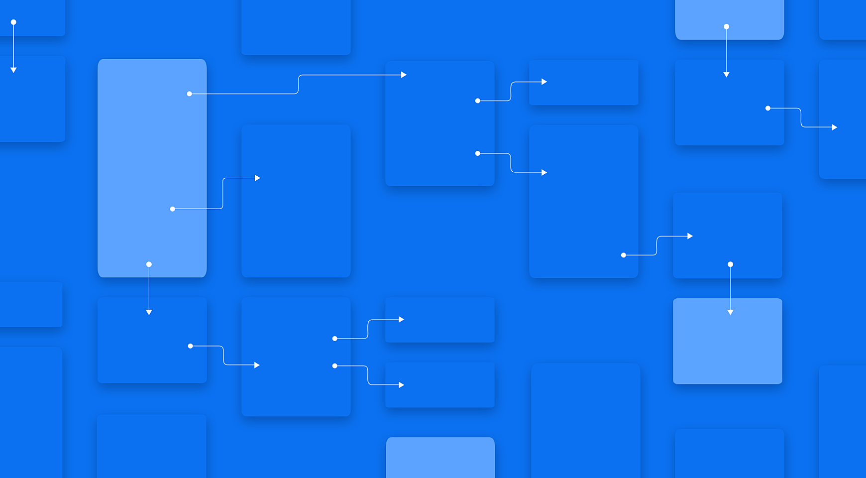
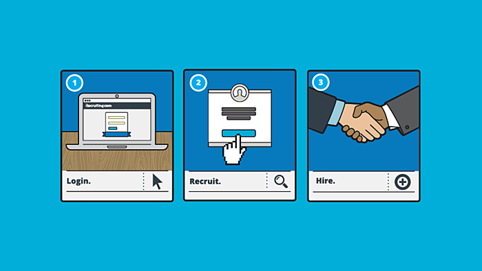
3. Create the user flow
Develop information architecture in a logical way, so that users get exactly what they need and find it in the places that they expect. User flow diagrams are the most popular way to visualize your user flows and create routes using the following scheme:
what the user sees/does → what the user sees/does next → OR what the other option → etc.
The following list of questions may help you design a better user flow for a website:
- What is unique to your business that may attract your users?
- Who will be interested in this or that feature?
- What else will the same group of people need?
- What may prevent them from completing their task?
- What should they want to know about your business? This could be general information, list of products, prices, mission –prioritize them?
- What can you do to encourage users to act?

Source: dribbble.com
On the basis of a flow diagram, you could layout the screens where user interactions will take place (see our article on website sketching and wireframing) and evaluate usability by user acceptance testing.
Mind the responsive design which may change the layout of tabs, buttons and other website elements and user flow in general.
4. Track real-world usage and continuously improve the flow
To make sure that your website user flow really works, ask for immediate feedback from the website owners that state user behavior, website conversion, and other metrics that matter to their business.
Conduct user testing with the real users that correspond to your customer personas and ask them to complete their daily tasks and comment on the pitfalls they has met on the way of reaching their goal. This will help UX/UI designers remove frictions and optimize the website according to the customer experience they have acquired with the new interface.
10 tips to create a better user flow
We’ve all been there when we understand the concept of website user flow but fail to elaborate details. To give you a push to your own ideas, we’ve made up a list of tips that will make your user flow more intuitive and accompanied them with the best examples of user-centered design:
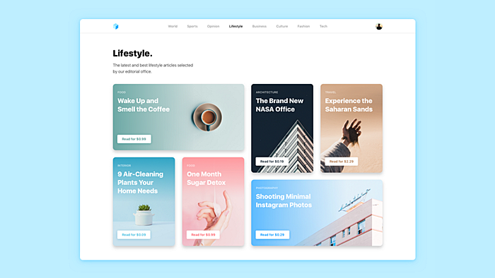
1. Use one column of text to focus user’s attention
The template with one column of main text can increase the usability of your website by focusing your user at this information which they need at the moment. It allows your user not to jump from one place to another distracting their attention to the side materials. What is more, the user won’t miss a call to action which you may place in the bottom.

Source: lanapapier.fr
2. Show users where they are
Keep the user informed by placing scrolling progress bar on the side panel. This will help them better orient on your website as well as faster bounce back to the section they need more.
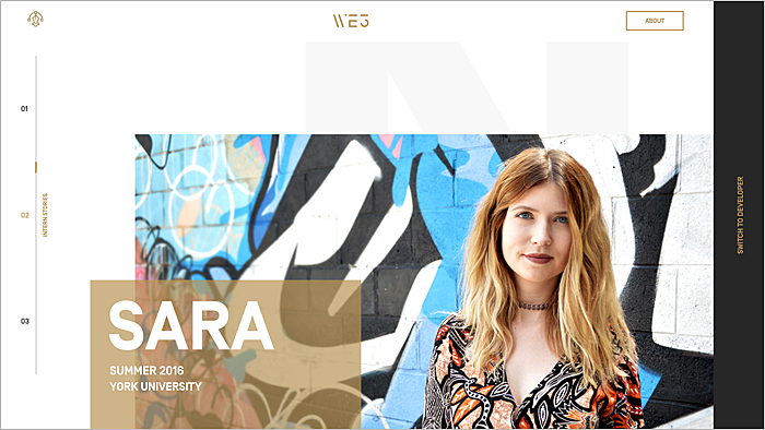
Source: we3.jam3.com
3. Don’t drop your page into very small pieces, unite the similar parameters or links
The most common mistake when creating information architecture is putting several sections with the same meaning expressed in different content. Webmasters use different names for the pages with the similar functions. If you don’t want your users to get lost, try to unite this duplicate-meaning links into one page.

Source: dribbble.com
4. Differentiate clickable elements in comparison with already selected ones to show the user where he is
Visual design means, such as color, relief, contrast are great helpers in improving user navigation on the website. That’s why we suggest you applying different design for different elements (buttons, links, interactive vs. inactive elements). They should be visible to everyone and maintain the same style throughout the whole website.
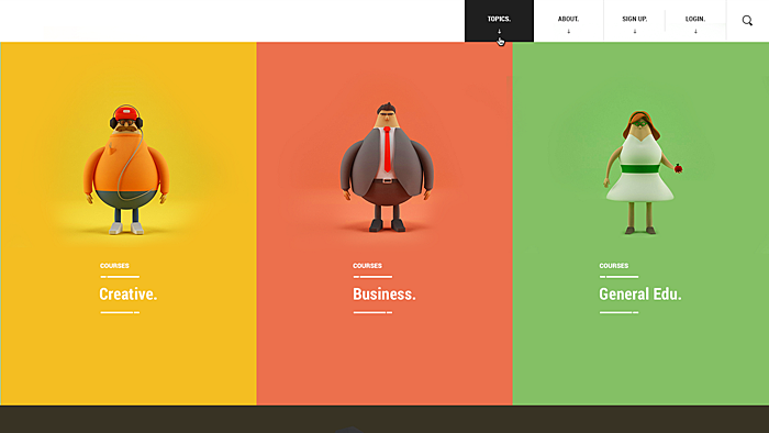
Source: dribbble.com
5. Show recommendations for similar goods or services
Looking for one item on your website, the user may be interested in similar ones but most of them will fail to do that and leave your website. Show them some goods of the same kind somewhere aside from the page and facilitate their choice.
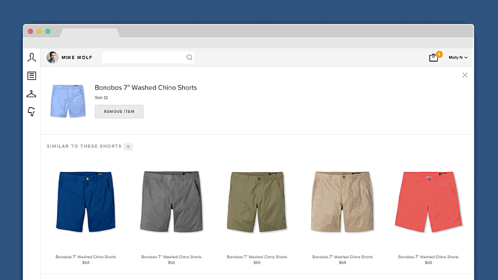
Source: dribbble.com
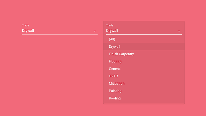
6. Don’t overuse drop-down lists
Each drop-down is a hidden list that requires an additional action to open. If you can’t avoid them (in case it’s a calendar or a “choose your city” form), make them obvious and clear to users.
Source: dribbble.com
7. Don’t rely on a three-clicks rule
While we’re on the topic of links and clicks, it’s important to mention another user flow misconception, the rule of three clicks stating that the user should access any content within 3 clicks. In fact, users don’t need to get faster to their goal, they want to do it easier whatever it takes them – whether by one evident click or small step-by-step clicks which make the flow more targeted.
Source: dribbble.com
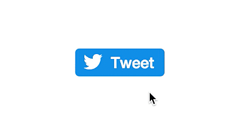
8. Use micro-interactions – the contained product moments that do one small task.
These small details will show your users what they have done or highlight what they supposed to do with micro-menus, animation or hover-overs.
Source: giphy.com
9. Ensure smooth page transitions
Keep them without long loading, not taking out of the previous page context. Your users mustn’t feel like they are being teleported to a same alien place.

Source: dribbble.com
10. Repeat call to action multiple times
Remind your users of why they may come to you, especially if your website is multi-page or very long. There’s nothing bad in repeating the call to action for several times but try not to irritate your visitors.
Source: dribbble.com
Conclusion
Putting your user in a state of flow is one of the top goals that you must follow while creating a website. Thoroughly elaborated user flows make your users focus on the interaction with your products or services and increases the chance they will become your clients. Our post has put your into the user flow design from the first step the user makes on your website to the task completion and feedback. Start with creating your own user flow and hopefully, some of our tips will lead you to higher website conversions, lower bounce rates, and better customer loyalty.
If you still have questions about how to design a user flow or ready to make your site user-friendlier, drop us a line.


Rate this post!
496 ratings, average ratings is 4.0 out of 5

Related Posts

16 January 2024
ChatGPT Plugin Development: Features and Benefits for Business
Explore the process of crafting a ChatGPT plugin tailored precisely to meet your unique business requirements.
09 May 2024
Top 7 Open-Source LLMs for 2024
Here, we break down everything you need to know about open source LLM models: top 7 offerings on the market, their pros, cons, and capabilities.

19 January 2024
AI Model Fine-Tuning: How to Use Your Organization's Data?
Organizations are transitioning from generic solutions to hyper-customized intelligence, seeking AI models designed to address their unique challenges and propel them toward strategic objectives.
This demand has propelled fine-tuning to the forefront of AI development.
07 May 2024
What are large language models: a complete guide
Get your large language model definition straight: in this article, we cover the concept of LLMs, their capabilities, types, and challenges.
Develop Custom Corporate Microlearning Platform
Custom microlearning solutions for corporate training: Discover how to develop a tailored platform for efficient and engaging employee learning

24 January 2024
Employee Training Management Software Development in 2024: Features and Cost
Streamline your employee training with cutting-edge software solutions. Explore the features and costs of employee training management software.
Let's talk
Is there a challenge your organization or company needs help solving? We’d love to discuss it.

Managing Director, Partner
Andrew Terehin

Thank You!
Your message has been successfully sent.
We will contact you very soon.