In one of our previous articles, we touched on mobile app wireframing and outlined three easy steps to design a basis for a mobile interface. Today we’ll tell you how to apply the same scheme to the process of creating wireframes on a website and we review the seven best tools to use in website design wireframing. They help to ensure that the user-centered design principles are being observed.
What is a wireframe in web development?
A wireframe in UX/UI design is a detailed plan of a website that allows you to focus on the structure and design interface on the conceptual level before you start with the graphic implementation of your ideas. A well-thought-out wireframe can be a great basis for a website layout in which your future design will take place.
Each wireframe consists of multiple elements, the number of which is defined by a number of reasons. The type of company, its requirements, and the website owner’s involvement can all place limits on the level at which you need to specify the web design wireframe.
However, there are some basic things that designers typically include in a web page wireframe:
-
boxes for primary graphical elements;
-
headlines and subheadings;
Let’s dig a bit deeper and define a method to arrange these elements in a way that the design built on this wireframe won’t mess up;
-
simple layout structure;
-
calls to action;
-
text blocks.
Steps to create website wireframes

Get some ideas
“Better to see something once than to hear about it a thousand times”, the old proverb says. This is how the website wireframing works. You get a visual presentation of the future website rather than read long specifications, and it helps you to understand the core issues of project design as well as all the bells and whistles that come on top of that. However, don’t rush into drawing complex pictures of detailed pages from the very beginning. The key to wireframing success is 90% thinking and only 10% drawing, so before you start sketching, think of some business analysis, user flow, and other common issues. We suggest you answer the following questions to get more insight into what you are going to do next:
-
What are the user goals when interacting with this page?
-
How can the content be organized to support these goals?
-
What should the user see first when arriving at the page?
-
What is the user flow?
-
What will the user expect to see in the other areas of the page?
-
Where do you put images and what size?
-
What do competitors place on their websites?
As you can see, not only do website elements themselves matter when you design wireframes, but also user experience, which determines the elements that will be approached first, the locations where the visitors visit next, and what they may not need at all.
Draw sketches
What’s next? Well, we wouldn’t call it the next step, rather, this should be a set of iterations of brainstorming and sketching, with each iteration followed by the client’s approval. After the stage of generating ideas comes sketching.
The first way to start designing your wireframes is the simplest one; you take a pencil and paper or a piece of chalk and a blackboard. A sketch is low fidelity but its simplicity gives you a raw overview, and its static character allows you to focus on the user experience and to consider the user flow.
Wireframe everything
When you choose the level of fidelity from iteration to iteration, there’s no correct approach. Depending on the complexity of the system, you can start with sketches and move to a higher fidelity of wireframes using a tool like Adobe Illustator or Sketch, which you can also use to increase the accuracy of mockups. It takes more time to create layouts, tasks and scenarios with these applications but ultimately you’ll receive a more accurate and well-ordered copy. Let’s see the optional but fair scheme of how to wireframe an app or a website:
-
Choose appropriate tools (see our list below).
-
Review the content once again to edit details based on the emerging requirements.
-
Design a grid with layout elements (sections, cards, buttons, tabs etc.).
-
Mind responsiveness/adaptivity issues.
-
Create user flows.
7 best tools to use in website wireframing.
Well, it seems like it’s time to check some tools that’ll help you with the wireframing regardless of the level of fidelity. With plenty of tools available on the market, we selected a bunch that can help you in different cases:
Balsamiq
Source: balsamiq.com
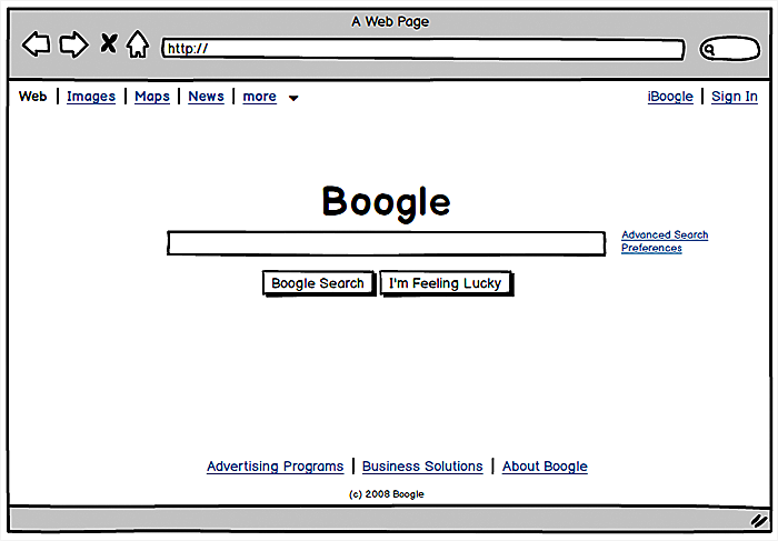
Balsamiq allows you to create wireframes that clearly reflect user flows you expect; the wires look visually distinct enough from final mocks; it is pretty fast and intuitive.The great thing is that it can be a good fit, both for sketching, which conveys a raw variant of design, and for a fully functional click-through prototype that simulates user flow.
However, the tool has some limitations in terms of flexibility when you need to tailor a sitemap in detail, so it is more popular among business analysts or clients than among designers striving to create high-fidelity wireframes.
Axure
Source: axure.com
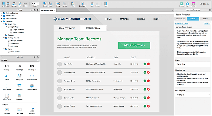
While most of the wireframing tools are overloaded with excessive features, with 70% of them being never used by designers, Axure is a laconic and at the same time exhaustive tool intended for high-fidelity wireframes. Agente prefers it because of its dynamic nature, its support of complex conditional flows, and its adaptive views, as well as the option to test usability on any device.
Adobe Indesign
Source: adobe.com
Adobe Indesign is one of the many well-known tools from Adobe. It allows you to create web, mobile, and even printed projects and integrate them with the other Adobe utilities, such as Illustrator or Photoshop; it is part of Creative Cloud where the other assets of Adobe products can be stored.
UXPin
Source: uxpin.com
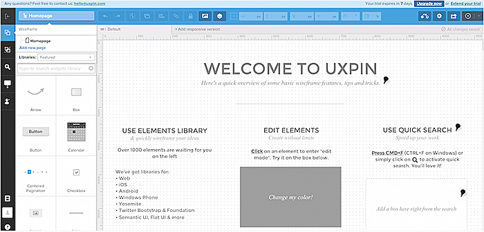
We suggest UXPin for wireframing websites that require lightweight interactions. It supports Photoshop and Sketch files and enables the user to build screens out within the tool itself, with the help of robust UI libraries.
Mockingbird
Source: gomockingbird.com
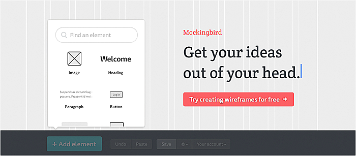
With Mockingbird, you can create projects within a simple drag-and-drop interface. It allows users to quickly design mockups, and is great for high-fidelity mockups thanks to its widgets such as video plugins, volume sliders, map integrations, navigation arrows, and others.
SimpleDiagrams
Source: simplediagrams.com
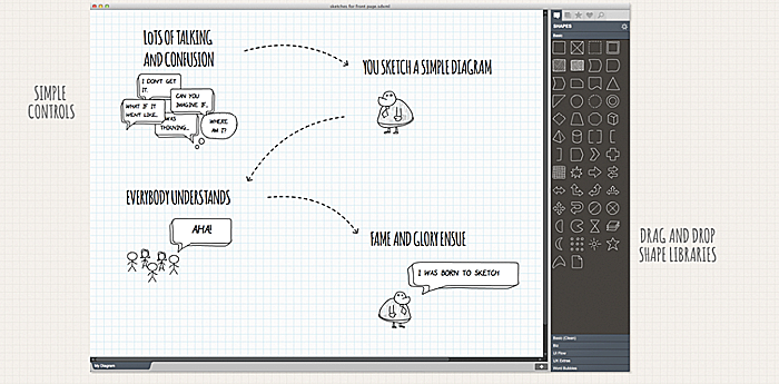
SimpleDiagrams is tailored for sketching and low-fidelity wireframing. While appearing quite primitive, it still supports the import and export of templates, drag & drop, multi-user collaboration, and flowcharts. The tool is very helpful for content'rich websites, for example, when you build an online education platform or create a design for educational website.
WireframeSketcher
Source: wireframesketcher.com
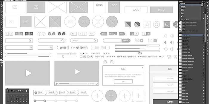
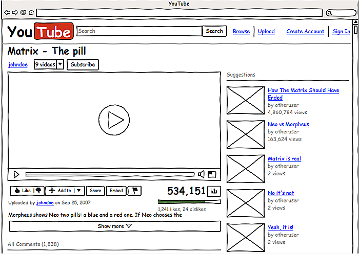
Wireframesketcher is full of handy features that facilitate the wireframing process. The extensive library of ready-made objects and even some web-frameworks, such as Bootstrap, with fast convenience at the top, make the tool the rockstar of our list
Conclusion
The bottom line is: the website design process is not as simple as it seems; it takes a lot of time and effort sketching and wireframing before the actual design process begins. Let’s recap everything we have said and articulate the main lessons from this post:
-
Conduct thorough research before you start drawing sketches.
-
Don’t overload your wireframe with a lot of information, start with low-fidelity mockups.
-
Use tools as a helping hand at each step of wireframing, sometimes you can limit yourself to a pencil and paper.
-
Test assumptions after each iteration and wireframe again.
This approach is particularly crucial when designing a p2p marketplace, where user experience is key to platform success.
Seems like the process is not done after wireframing? Right you are! That’s were prototyping comes into play. Follow our blog to read about prototyping in one of our next articles and drop us a line to learn more about wireframing.
Rate this post!
155 ratings, average ratings is 3.9 out of 5
Related Posts

19 January 2024
AI Model Fine-Tuning: How to Use Your Organization's Data?
Organizations are transitioning from generic solutions to hyper-customized intelligence, seeking AI models designed to address their unique challenges and propel them toward strategic objectives.
This demand has propelled fine-tuning to the forefront of AI development.

09 May 2024
Top 7 Open-Source LLMs for 2024
Here, we break down everything you need to know about open source LLM models: top 7 offerings on the market, their pros, cons, and capabilities.

16 January 2024
ChatGPT Plugin Development: Features and Benefits for Business
Explore the process of crafting a ChatGPT plugin tailored precisely to meet your unique business requirements.

07 May 2024
What are large language models: a complete guide
Get your large language model definition straight: in this article, we cover the concept of LLMs, their capabilities, types, and challenges.

Develop Custom Corporate Microlearning Platform
Custom microlearning solutions for corporate training: Discover how to develop a tailored platform for efficient and engaging employee learning

24 January 2024
Employee Training Management Software Development in 2024: Features and Cost
Streamline your employee training with cutting-edge software solutions. Explore the features and costs of employee training management software.
Let's talk
Is there a challenge your organization or company needs help solving? We’d love to discuss it.

Managing Director, Partner
Andrew Terehin

Thank You!
Your message has been successfully sent.
We will contact you very soon.


