14 December 2017
10 Best Furniture Website Design Examples
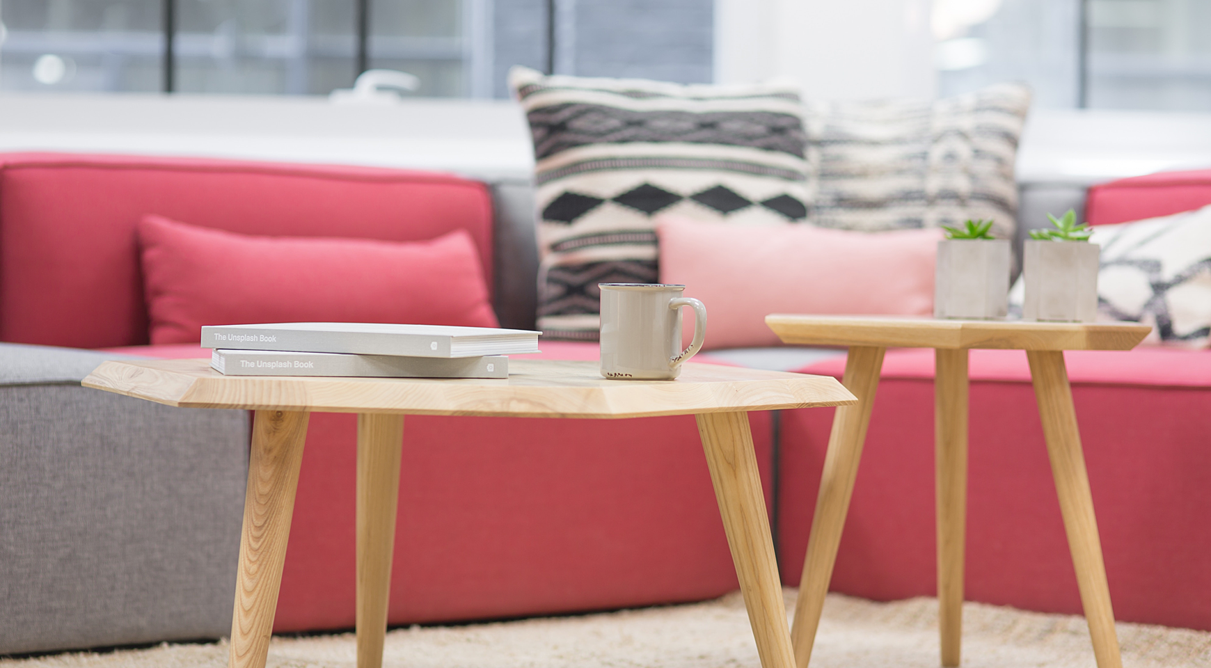
Today, more than 57,7% of small and medium-sized business owners are now concentrating on creating a new website or improving the old one. This is very good news for UX and UI designers because websites of this particular category are always interesting to work with. The narrower the specifics of the website, the more sophisticated its design can be. For example, the design of a furniture website is strongly associated with the interior design or architecture, and the sense of taste associated with the product. In our new blog post, we review the best furniture website design and explore the factors that make them special.
What features does matter in furniture website design?
Before we start looking through the most creative furniture websites, let’s see what you need to consider while working on such a design or e-commerce site redesign. Here are some factors that’ll make your website stand out:
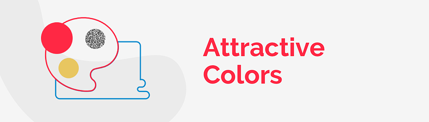
Colors that attract target audience
As we have previously mentioned, people tend to tie your website with your company’s product, so why not amplify this effect and add some credibility to your business image? Furniture website color palette will differ from, let's say, healthtech website design, which is all white and blueish. If you sell wooden furniture, use brown hues and wooden textures, for metal items, a white and silver color palette, and some shiny elements (don’t overdo – it will have an intimidating effect).
When you design a furniture website, make sure that its color palette and identity are consistent throughout the website—this shows that you are scrupulous and reliable.
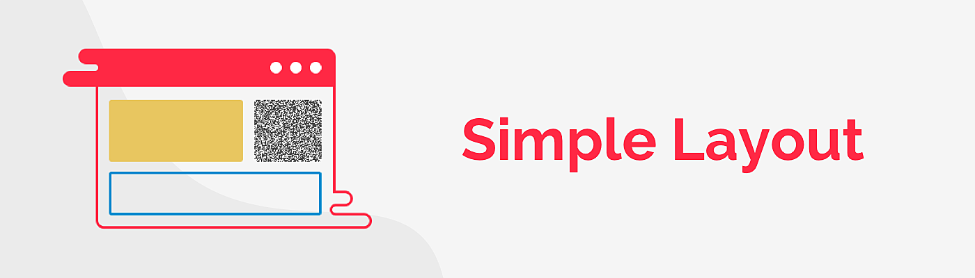
Simple layout
The layout of the furniture store website should take after any online shopping website and have the following structure:
- A header with tabs featuring the most important sections of your website; products, collections of them, “about us” and “contact us”.
- Content expressed in banners with special offers, products, and client testimonials.
- A footer with the content that retains your visitors - see our article for some ideas on what to include here.
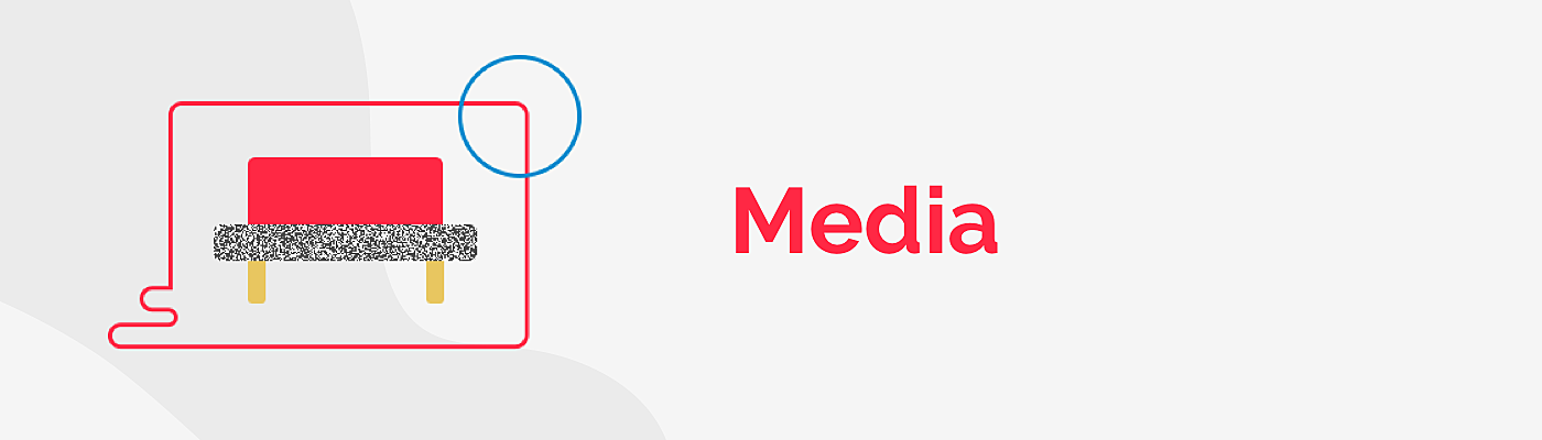
Media
Remember that meaningful media content is a must for online shopping because it makes a website more engaging and personalized. Photos of the furniture should be high quality and taken from multiple angles with the option of zooming. Each of the photos should include a proper file name and alt text description, which adds to the SEO effort. You can also use 3D-views of the room, with clickable elements that lead to the product page. This it will give your customers a sense of being there.
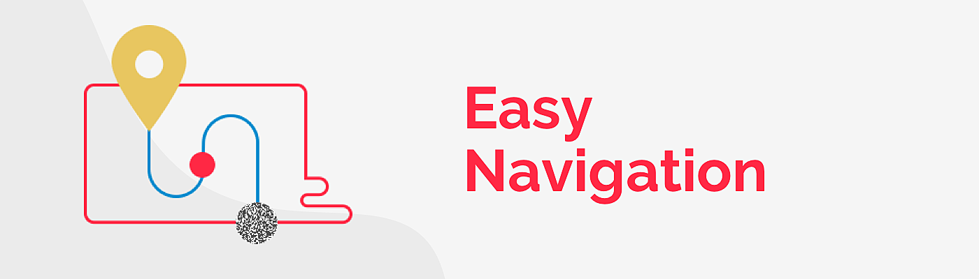
Easy navigation
Website exploration is meaningless without intuitive navigation. Furniture store website design features the same navigation as any other e-commerce store: categorization of goods in header or sidebar, catalog with items filtered by popular parameters - e.g., commercial vs.residential furniture, home vs. street furniture, wood vs. glass - visible contact form, one-click checkout.
To make user flow even smoother, lead them through your website with the help of recommended products or supplementary information on the product page, for example, furniture items that can be combined in the same interior.
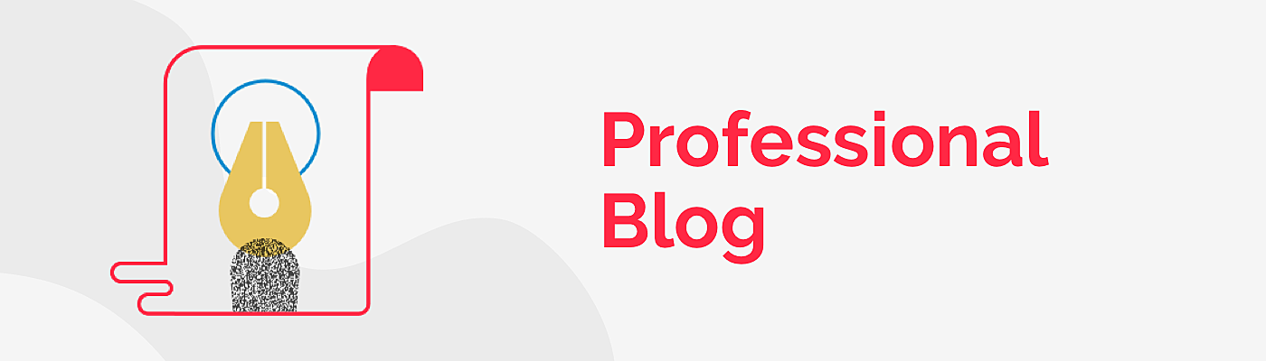
Professional blog
Content is a king in marketing, and a unique blog adds much to the credibility of the organization. Create a separate page with articles, where interior designers give advice on how to use your items in real life.
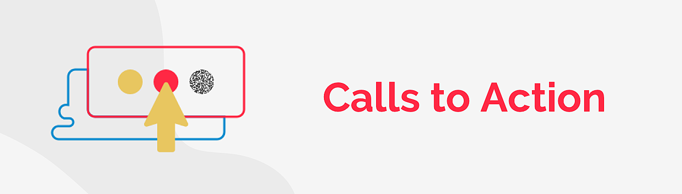
Calls to action
CTAs are a must in online shopping, and a few buttons that ask to subscribe to your newsletter or special offers are indispensable. Another option is to ask shoppers to share the item they like in their social media, this will influence purchasing decisions and raise brand awareness throughout their networks.
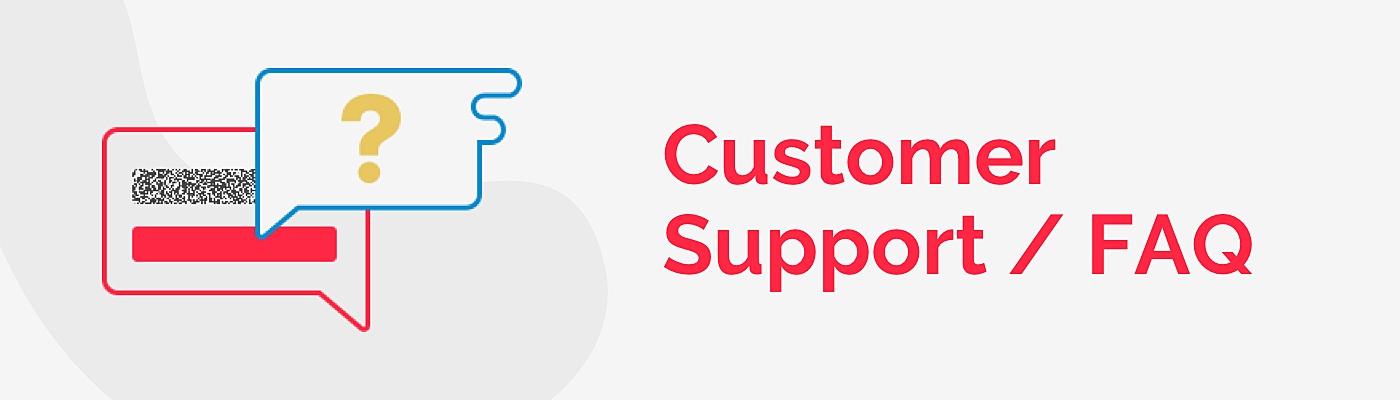
Customer support and FAQ
No matter how good your website UX is, there are still people who don’t know how to order your items, or who want to consult on specific goods or services. People appreciate it if you are always ready to help them via chat, or at least by email. The other way to provide support to your customers is to create an FAQ section where you elaborate on how to use your website, how to buy, and how to order or return your goods.
10 best examples of furniture website design
It’s time to get some furniture website inspiration! We picked out some interesting - from our perspective - examples that will give you some ideas on how to create your own website, or how to improve the existing web design.
1. Bold colors
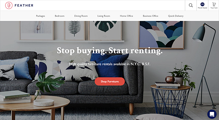
Source: rentfeather.com
This is a great example of a furniture rental website; the goods are divided into clear categories according to the rooms you need to furnish. The banner, with its stylish interior and bold colors increases the attractiveness of the website.
2. Elite and mystery
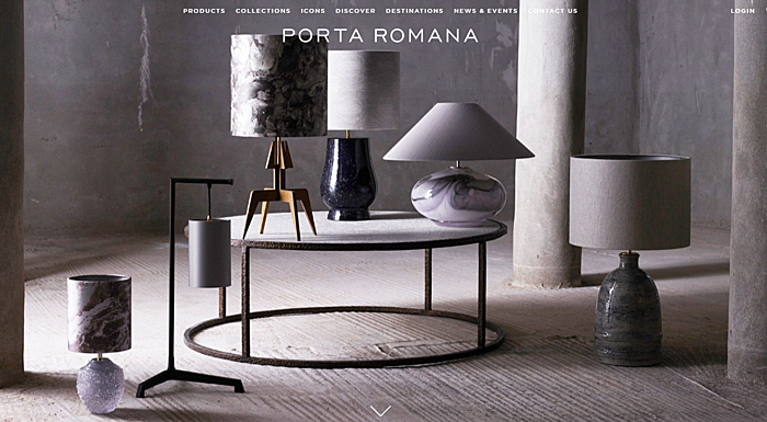
Source: portaromana.com
“Destined for the world’s most beautiful interiors”, says the company slogan. Indeed, their e-commerce website design exudes mystery and sophisticated taste. Large banners with minimalist fonts create an elite image.
3. Cards
Source: agentestudio.com
The home page starts with cards featuring offers with prices and photos. On the white background, users can hover, then they are asked to change the angle of goods by clicking.
4. Concise focus
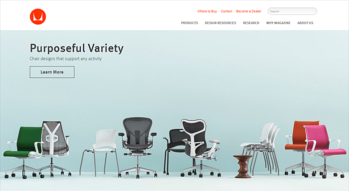
Source: hermanmiller.com
Hermann Miller are famous mostly for their chairs, so the focus is on them. The cards with the other items bear the continuous color scheme.
5. Detalization
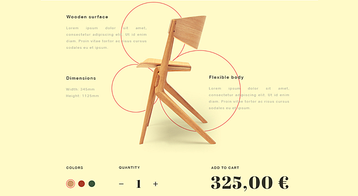
Source: Dribbble
Long and blind text looks boring, so in this example, the text is cut it into pieces to tell the story about the chair. A large, bold price, color range and “add to cart” button keep your users’ attention.
6. Minimalism
Source: pinterest.com
Perfect symmetry, a white background and intuitive icons on the hover-over - seems like a recipe for an ideal website design for the furniture store.
7. Organic colors
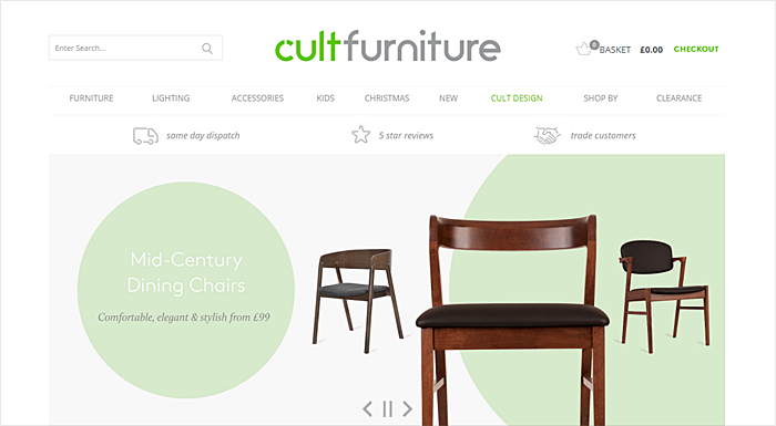
Source: cultfurniture.com
The eco-trend will never go out of fashion. Everyone wants to be fit, eat healthily and buy furniture made from eco-materials. Green and brown hues are a great combination for a company which positions itself as eco-friendly. An interesting solution is a “play” button in the center of a banner that stops he banner playing.
8. Wood
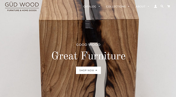
Source: gudwoodfurniture.com
This is exactly what we were talking about previously. A wood print for wooden furniture; add a minimalist logo and three tabs, plus three icons instead of a bulky header and you get the style.
9. Textures
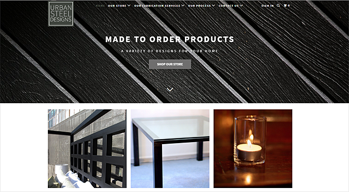
Source: urbansteeldesigns.com
Let’s continue with textures: plastic, glass, and steel - all the materials applied correctly within the website to make people order products.
10. Scandinavian
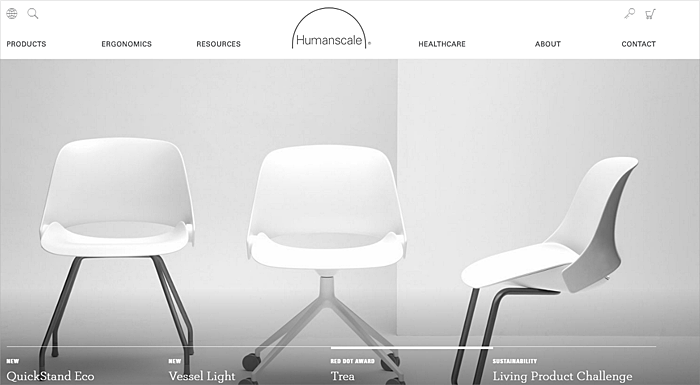
Source: humanscale.com
Scandinavian interior design is gaining popularity as it is associated with light and pureness. White accents on the white background with grey shades make the whole website look classy.
Mistakes in furniture website design that prevent sales
Unstructured content
Lump your wardrobes, tables, beds, and couches together and you’ll never find your target customer. People will leave as soon as they see a mess. Add hierarchy and make sure no item from one category is in any other one. Make sure the product description complies with the filters that users apply while searching.
Information and media overload
Large and detailed photos, clear and concise text, lucrative offers - that’s enough to convince your visitors to buy your furniture. Too many videos or pop-ups may distract your users from what they’ve come for.
Requiring registration in order to buy goods
After a user has put everything in his cart, he expects to review it and order the items as soon as possible. A complex registration process at this stage can make the user bounce from your website; simplify the purchasing process and you’ll get your loyal customers.
Conclusion
In this article, we shed some light on the website design of a specific category, namely furniture stores and furniture rental websites. Like any other SMEs, furniture companies should care about how their website is associated with their activity and their overall business image, and try to facilitate user interaction. We hope you have gained some inspiration to help you start making changes – contact us and we’ll lead you through the fascinating process of making your website better!
Read also: How to make an online course website?


Rate this post!
607 ratings, average ratings is 4.1 out of 5

Related Posts
31 May 2022
10 Best Examples of Website Footer Design
10 website footer design best practices examples for inspiration ⚡ Things that can go in website footers ⚡
26 May 2022
10 Best Examples of Beautiful Blog Design | Agente
In this article, you'll find 10 best examples of beautiful blog design, along with the tips that can help you enchant visitors.
17 January 2019
10 Nonprofit Website Best Practices You Need to Follow | AGENTE
I want to make a non-profit website. Where do I start? In this article, we're touching on the best practices of creating a website for non-profits.
06 December 2018
Top 10 Website Layout Ideas & Examples | Agente
Be cautious when selecting a layout for your site — it can either make it or break it. We took a careful look at the existing strategies for organizing content on a web page and selected top 10 website layout ideas.

24 August 2017
10 Best Medical Website Design Examples
Today the number of Internet users is enormous, and it is still on the rise. According to a study by Pew Research Center, approximately nine out of ten adults use the Internet in the U.S. alone. The Internet has turned into a valuable source of information. For instance, more than 70% of connected adults look online for health information.

08 December 2016
How Much Does it Cost to Redesign a Website?
In general, it’s my “favorite” question from my friends, partners, and clients. Most of the time I’m using simple analogy trying to explain this “simple” question in a simple way.
Let's talk
Is there a challenge your organization or company needs help solving? We’d love to discuss it.

Managing Director, Partner
Andrew Terehin

Thank You!
Your message has been successfully sent.
We will contact you very soon.