16 May 2022
Top Basic Patterns for Mobile Navigation Design
What affects mobile app conversions? Content, relevance, and UX. Since the first two are quite achievable, UX has always been a tricky thing to master.
We’ve already touched on the mobile app UX design best practices in one of our previous articles. Here we stated that poorly-designed layout and mobile app navigation can become a roadblock for SEO and user retention.
In this article, we’ll elaborate on the basic types and principles of mobile navigation design, and provide 10 best practices in making app menus. See more works in our portfolio.
What Is Special About Mobile Navigation?
The limitations of the small screen pose a difficult challenge to designers: they need to make navigation accessible and avoid occupying too much space at the same time. Multiple approaches to mobile navigation sacrifice either content or reachability of a menu. What does a good mobile menu do?
A menu gives visual cues (Where am I?). A user should know where he is. It doesn’t mean the menu should be sticky. Rather, navigation in a mobile app should draw a clear line between main and secondary categories, any of which have unambiguous labels.
It offers the options of where to go next (Where else can I go?). Not only does it provide a user with possible directions, but it also positively affects the app’s discoverability and leads to the landing pages where a user converts.
It provides the value (What will I find when I get there?) Users want to know what they should expect once they have clicked. A good menu never misleads the user and never leaves a feeling of frustration.
Top-Level Mobile Navigation
Before you design mobile navigation, take a look at the information architecture you have developed. Which categories should be displayed first? Which pages are secondary in the hierarchy or less important? Think of the actions that people perform more often and give users a fast and intuitive way to reach their goals.
There are several ways to implement the top-level mobile navigation in an app. Let’s see the most common options.
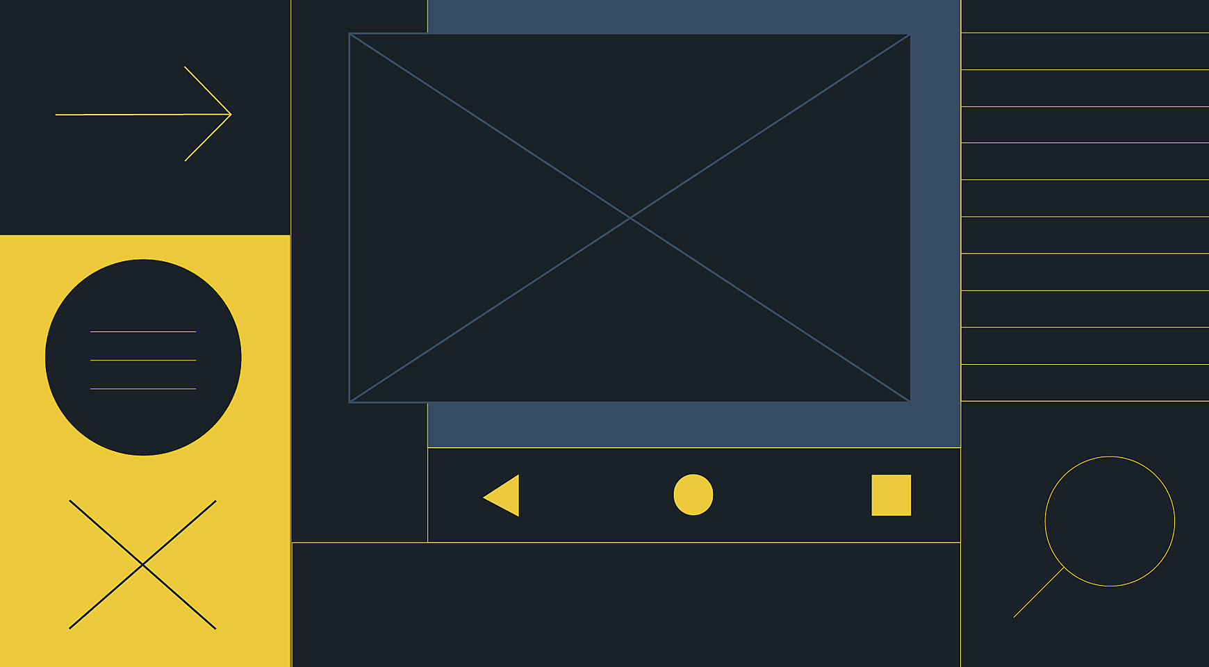
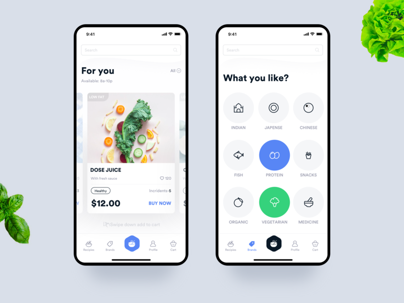
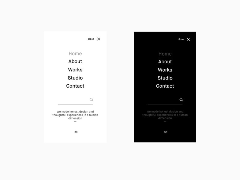
Hamburger menu
Designers’ debates around the hamburger menu usability persist. Some talk about its low discoverability while others claim it can accommodate a large number of categories in a small space. To take either side, you can check out our article about the pros&cons of hamburger menus.
Source: Dribbble
A side drawer is one of the most common patterns of the interface design that is hidden behind the hamburger icon. There are also a number of navigation options that will freshen up the app’s look and feel. However, they fit better in casual mobile apps, like gaming or lifestyle app, and hardly can be used in the best bank website design.
Guillotine

Source: Dribbble
Floating icons
Source: Dribbble
When to use hamburgers:
- more than five top-level categories;
- when the menu has multiple levels of hierarchy;
- content-heavy pages (to save the screen space).
Tabs
Top tabs exist to organize content in categories of equal importance across separate screens. Each one should contain categories which are different from other tabs in a set. There are two types of top tabs:
Fixed tabs work well with no more than five categories in the menu, while scrollable tabs reveal more categories upon swiping.
Source: Dribbble
When to use top tabs:
- the categories at the same level of the hierarchy;
- for quick switching between related categories.
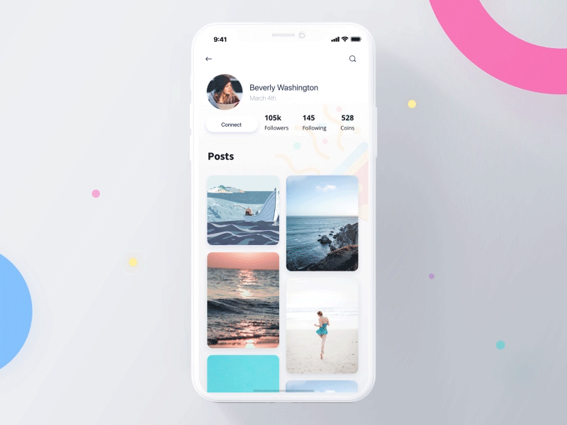
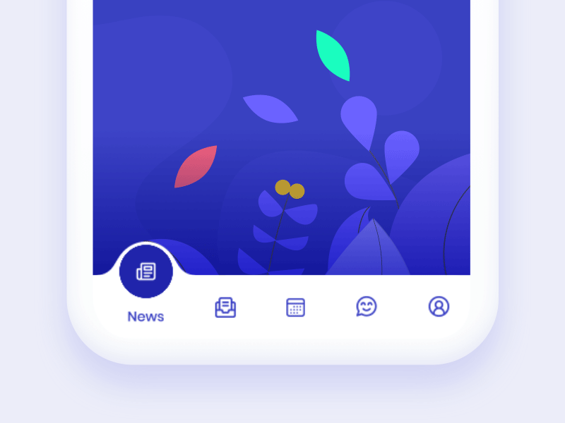
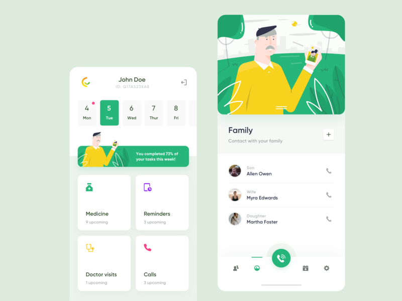
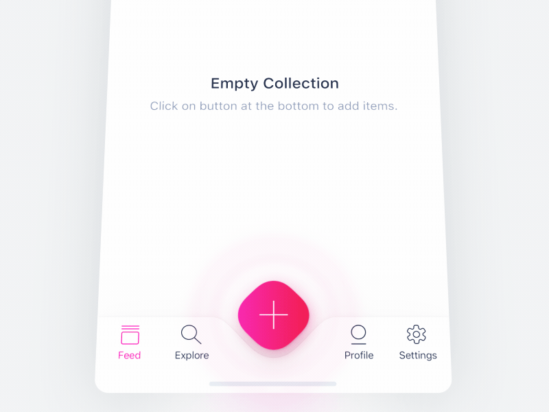
Bottom navigation bar
Tab bars usually contain three to five navigation menu categories stuck to the bottom of the screen. Each of the tabs should always contain an icon, sometimes with a short and consistent text label.
Bearing in mind a thumb zone, the bottom mobile nav is a perfect solution when the device is held in one hand.
Source: Dribbble
When to use tab bars:
- for a menu of three to five items (no more, no fewer);
- for quick access to unrelated categories;
- for categories at the same level of the hierarchy.
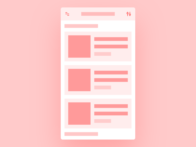
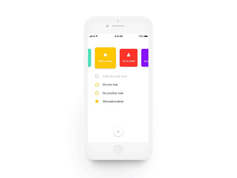
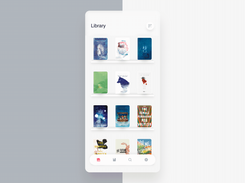
Card-based
Card-based UX navigation patterns are based on the surfaces that display top-level menu content on the home screen. Cards create an organized and consistent system within an app which is easy to scan and interact with. They remove the unnecessary clutter of subcategories which present in a standard side drawer menu.
Source: Dribbble
When to use the card-based menu:
- moving forward between screens at sequential levels of the hierarchy;
- lateral navigation between the screen at the same level of the hierarchy;
- gesture-based interfaces (like Tinder).
These are the most common top-level menu options for a mobile app. One may want to implement some creative solutions instead of the classic ones, however, it may hamper the usability of an app. Make sure your app has gone through 10 steps of usability testing before it goes live.
Subnavigation
Many apps have more than one level of hierarchy in navigation and presenting parent-child relations in a mobile menu poses another challenge for designers.
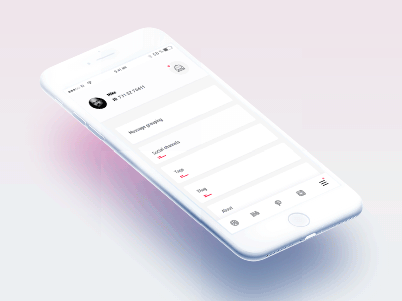
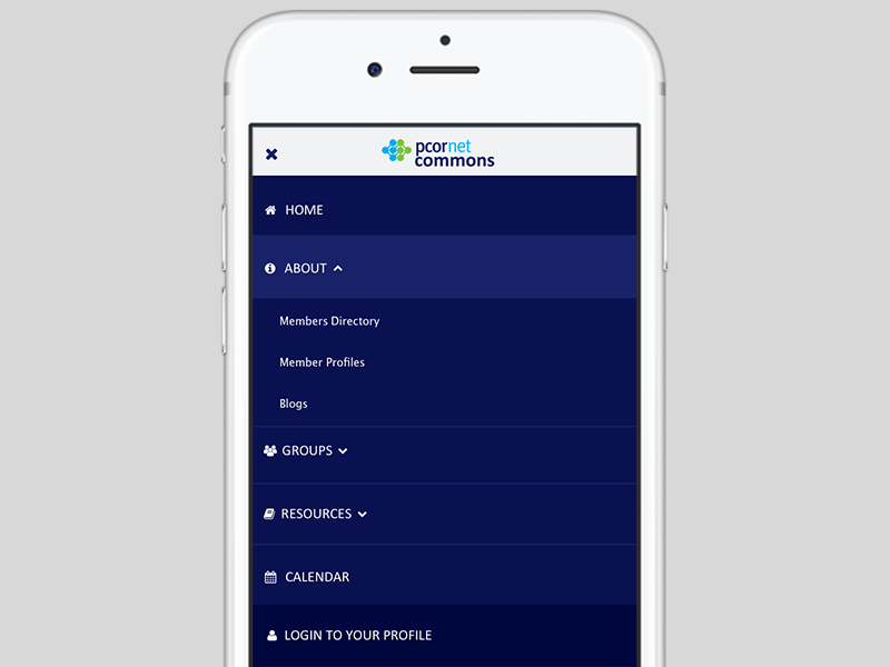
Submenus
Submenus, or dropdowns, are the typical navigation pattern inside a side drawer. They work well with up to six subcategories of a menu. With more than six submenus inside the main category, looking for a necessary section can become frustrating.
Source: Dribbble
Sequential menus
Sequential menus have the following logic: once one of the main categories is open, the main menu is replaced with the submenu of this category. To go back to the main menu, a user should tap a “back”. They are good for menus that have over six main categories.
Source: Dribbble
Categories
Contextual menus aren’t triggered by any UI element, like the hamburger menu. Rather, they belong to specific items in the interface and appear when a user taps and holds a finger.
Source: Dribbble
10 Best Practices of Mobile Navigation
Armed with Google Material Design and Human Interface Guidelines plus our own experience in UX design, we have created a list of 10 best practices for mobile app navigation:
1. Choose proper labels and icons
Menu labels should be brief and meaningful. Try to fit a text label on a single line; otherwise, don’t shrink a text to save space and replace it with an understandable icon.
Source: Dribbble
2. Place important actions at the top
Decide on the most important pages the most common actions taken by app users. This will influence the items that are positioned first in your main menu, and it lets you add links and calls to action to the relevant places.
Source: Dribbble
3. Provide the option to go one step back
Make sure users don’t have to go to the main page and lose all the unsaved info on the abandoned page. Add a back button on each screen that will take the user back one step.
Source: Dribbble
4. Think about fonts and background
To make your navigation text easy to read, choose a font that naturally adds enough space to allow distinguishing between letters and is tall enough to be clearly read in a menu. The way you handle formatting such as bullet styles, capitalization, margins, captioning, and so on should also reflect what’s attractive to your audience and what is comfortable for them to read. Also, align text with sufficient color and size in order to show hierarchy.
Source: Dribbble
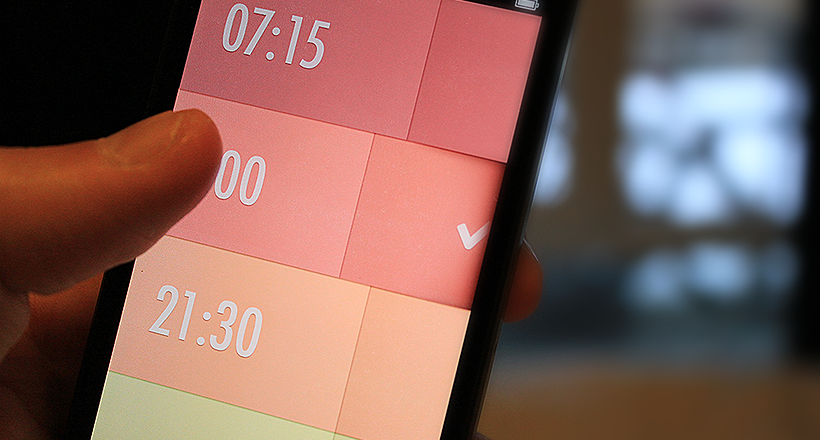
5. Show progress indicators
In scrollable menus, progress indicators are vital in order to display how the correct length of the list of categories or subcategories. They are also helpful in navigation within a single page, to show the length of the process.
Source: Dribbble
6. Be careful with scrolling
Excessive scrolling on a small screen will frustrate users and induce them to bounce. Try to follow a few rules for user-friendly scrolling:
- Hide the top bar when scrolling upwards, reveal top bar when scrolling backward.
- Transform drawers into hamburgers when scrolling.
- Show status indicators (unread messages, notifications) even when the menu is folded.
Source: Dribbble
7. Design for thumb touch
Mobile devices are usually handled with thumb touch, which is why you need to consider the average space required by fingertips when deciding on the size of your menu. Ideally, designers should rely on at least a 44-pixel space (left to right and up to down) to tap on the item of the menu.
Source: Dribbble
8. Reduce breadcrumbs
Breadcrumbs can quickly spread to multiple lines in mobile apps, and take valuable space on the screen. Consider reducing them to the latest few items, so that no multiple lines clutter the display.
Source: Dribbble
9. Stick small menus
The dilemma of sticky vs. dynamic navigation still persists, so here are a couple of tips on menu stickiness: stick menu if the navigation is very important and the app has few equivalent categories. Always stick down tabs (as they conform with the upper rule by default).
Source: Dribbble
10. Add a search box
There are two kinds of users: those who navigate and those who search. Well, probably some people do both. If you don’t have intelligent search in your app, you’ll lose a large number of users.
Source: Dribbble
Afterword
As we live in a user-centered world, user experience matters more than creative interfaces. That’s why designers need to ask themselves:
- What are the goals of the user?
- What is the best way to achieve them?
- Can we afford it?
The answers to each of these questions are key to successful mobile navigation strategy. Need help building such a strategy? Let us know in a live chat.


Rate this post!
570 ratings, average ratings is 4.3 out of 5

Related Posts
Effective Food Delivery App: Key Tips & Best Practices
In this article, we will share our experience in creating a design for a specialized food delivery management software, as well as best practices in designing such an application.

How to Write a Project Brief for Websites & Mobile Apps the Right Way
We are talking about the importance of a project brief in the success of an app and website development There are many reasons for that, but a common one is a discrepancy between what a client had in mind and what was written in the design or app design brief template.
13 June 2018
How to Design a Perfect App Icon?
Icons are small, but they make the first impression; apparently, they are how you get noticed on the market. The first thing you need to understand when you design an app icon is that it’s not just about being original and attractive, but it should also refer to the function of the app and identify your brand in general. Let’s go into more detail in our new article.
13 April 2017
10 Great Examples of Website Navigation Design
What is web navigation? Why is website navigation a top priority for any site? Web-development studio Umbrella IT is here to answer all your questions.
16 December 2016
7 Best Principles of Designing an Interface for a Mobile App in 2022
In mobile app development, the UI/UX play the most significant roles in a mobile app's success. With this blog, you will get to know everything about mobile app UI design principles, from the right color palate to the right images, layouts, icons, and more

09 May 2024
Top 7 Open-Source LLMs for 2024
Here, we break down everything you need to know about open source LLM models: top 7 offerings on the market, their pros, cons, and capabilities.
Let's talk
Is there a challenge your organization or company needs help solving? We’d love to discuss it.

Managing Director, Partner
Andrew Terehin

Thank You!
Your message has been successfully sent.
We will contact you very soon.