15 November 2018
How to Create Mobile App UX That Converts
Day after day, conversion optimization is becoming more sophisticated. What matters most in mobile apps if you want to make money?
Sure, it is measured by clicks to install. Certainly, the click-through rate also affects conversions.
But most importantly, an app should bring value to customers.
In our new article, we’ll shed light on the mobile app UX design mistakes that hamper user acquisition, user retention, and user conversion and give some advice on how to manage this challenge with effective mobile UX design principles.

User acquisition mistakes
Nothing happens until your visitors download an app, so the first thing you need to do is to align your mobile SEO and ASO optimization strategies.
The app is not optimized for search
According to Statista, 20% of US users find new apps in app store search results, and 13% find them in the app store top lists. Many more are googling them from their mobile devices. Hence, it makes perfect sense to align your SEO and ASO activities.
What is to be done? Sure, it’s worth researching keywords and combination and placing them in the fields of Google Play or the App Store description, in the title, and as tags (but don’t overdo!). Also, make sure you get some quality backlinks and installs—they’ll pave your way to Google’s App Packs.
You don’t work properly on visuals
“Open the app store, enter any keyword in the search field and you’ll know what the attack of the clones looks like”—that’s how we referred to the current state of app icons in our recent article.
The other visual assets include app shots and video previews. Think of what can grab a user’s attention. Hint: it’s not a welcome screen:) Show the key features and make sure videos don’t last longer than 12 seconds.
You ignore popular trends
Research what’s popular and turn it into a competitive advantage. Technologies are changing rapidly. Does your app work well on tablets? What about wearables?
These days people love talking into their devices, and many of the apps are activated by voice, how about keeping up with those?
In short, mobile developers should keep a close watch on what’s happening on the market and constantly deliver changes to the apps they already completed.
User retention mistakes
Twenty-one percent of users abandon an app after the first use. The reason is bad mobile app UX design or confusing value propositions. Meanwhile, user retention is a critical issue for you.
If someone downloads your app, enters once and comes back, you must retain them. They are your clients. Let’s see the mistakes you’re likely to make at this stage.
There’s no user onboarding
Once users enter your app, no way they stumble to sign up. Offer them multiple options to register and don’t ask too much data during the account creation process.
Instead, provide them with extensive mobile app onboarding and add pop-up hints or engaging animation to guide a user through the app. Make sure that these hints are actionable, not generic.
This may also to come in handy from the sales standpoint. Show your best paid plans or featured apps while onboarding a user.
Also, respect those who don’t need your walkthrough. Give them the option to skip learning routines.
Check out more UX onboarding best practices here.
Too many features and too much copy
Focus on the elements that your users will deal with every day. Test each feature and see how they affect your conversion rate. If the rates drop, ask yourself a question: is that feature really worthy?
As for copy, clients are becoming keener on photo and video content, interactivity, animation, meaning that lots of text may seem intimidating. Copywriting should also be there, but only when it’s not too long.
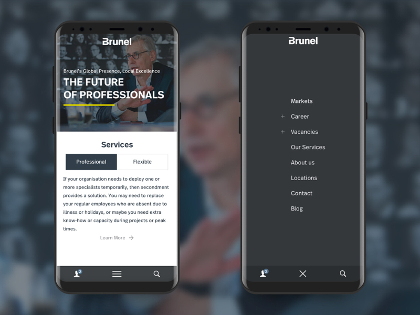
Poorly-designed layout and navigation
You don’t want to confuse visitors about where to click, right? Then think how your customers will use the app. Give special attention to the following mobile app UX patterns for layout and navigation:
- Menu: “hamburgers” are the most common practice for a menu, however, we suggest you limit it to the maximum of seven items. Don’t fancy that? Consider some creative hamburger menu alternatives, such as a swipeable menu, contextual menu or bottom tabs.
- Thumb zone: consider popular mobile screen sizes and place clickable elements within the right-hand thumb’s reach.
- Buttons: they should be placed within the thumb zone and be large enough to click with a thumb.
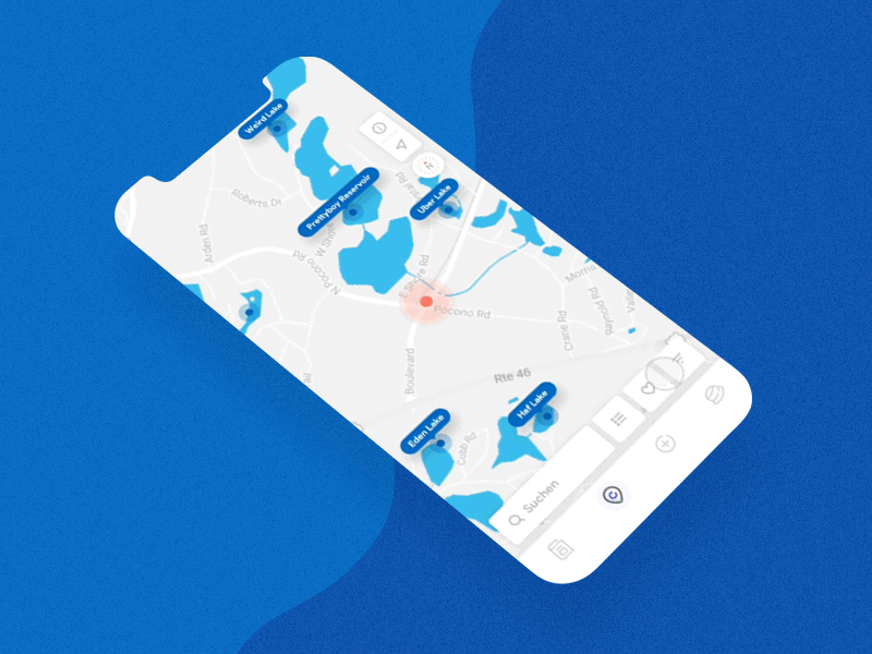
- Scroll: apps with user-generated content, such as listings or social media are better digested with a long scroll functionality. Make it clear that your landing page has a continuation so that users don’t bounce not seeing what they’ve come for.
Source: Dribbble
No notifications
How do you suppose users will remember your app if there are no push notifications? They should be brief, relevant and timely. Remind them of what they’ve done in the app, and of new features or events that are coming soon.
Don’t bother users while they are sleeping. Send the notifications regarding their local timezone. The best time to do that is about 8 p.m.
Ignoring user feedback
Listen to your customers! Only by knowing your audience can you create features that they will hardly resist. Stressing your advantages may not impress a sophisticated user. But giving them something they fear losing can leverage a habit.
Gather user feedback in the app store, in live chats, or forms. Do A|B testing, measure click-through rates, user retention, user engagement and user conversion and iterate to perfection.
User conversion mistakes
Here we come to the conversions themselves. There is no doubt that following the above-mentioned mobile app design guidelines, you’ll improve your conversions, but the final stroke is getting customers to buy from you. What prevents your clients from purchasing your goods or services?
Inappropriate calls to action
The most obvious way to lure customers into purchasing, subscribing or going to an event is a call to action, normally represented by a CTA button. What are the best practices for CTA design?
- Create a decent contrast of background color and font color.
- Keep the font size readable.
- Write in simple words, appealing to emotions.
- Don’t use more than two colors for a button.
- Place the first CTA on the first screen, so that no one scrolls down one or two screens to see it.
No up-sell and cross-sell
In-app purchases are the most evident way to revenue. That’s why it’s critical to guide users to the shopping cart with a call to action and offer them complementary products.
Track a user’s behavior and show them recommendations instead of equal options. Offer extra health in gaming apps, shoes that match a bag in e-commerce apps or offer to remove ads in music streaming services.
10 examples of mobile apps with good UX design:
Here are the shots of the best mobile app UX design. We’ll highlight the elements that make good UX:
Voice search

Source: Dribbble
Skip signup
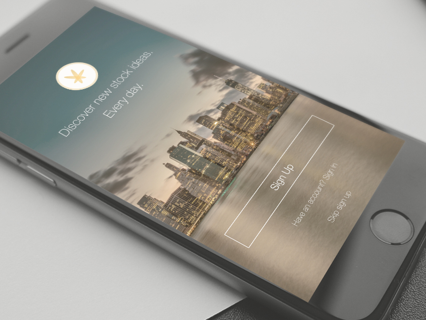
Source: Dribbble
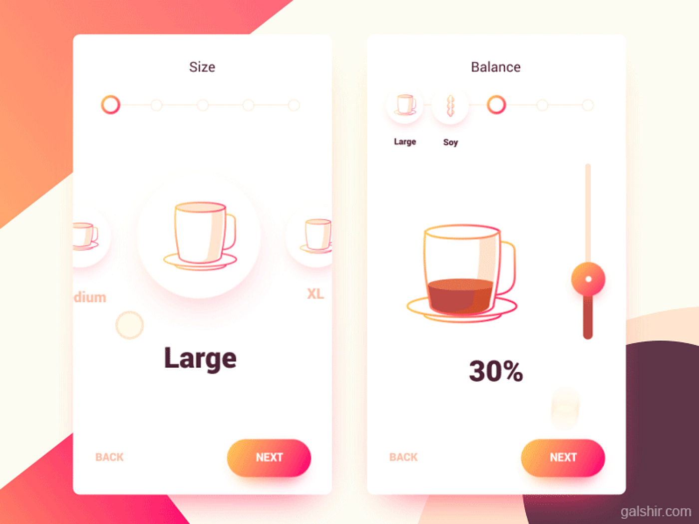
Onboarding
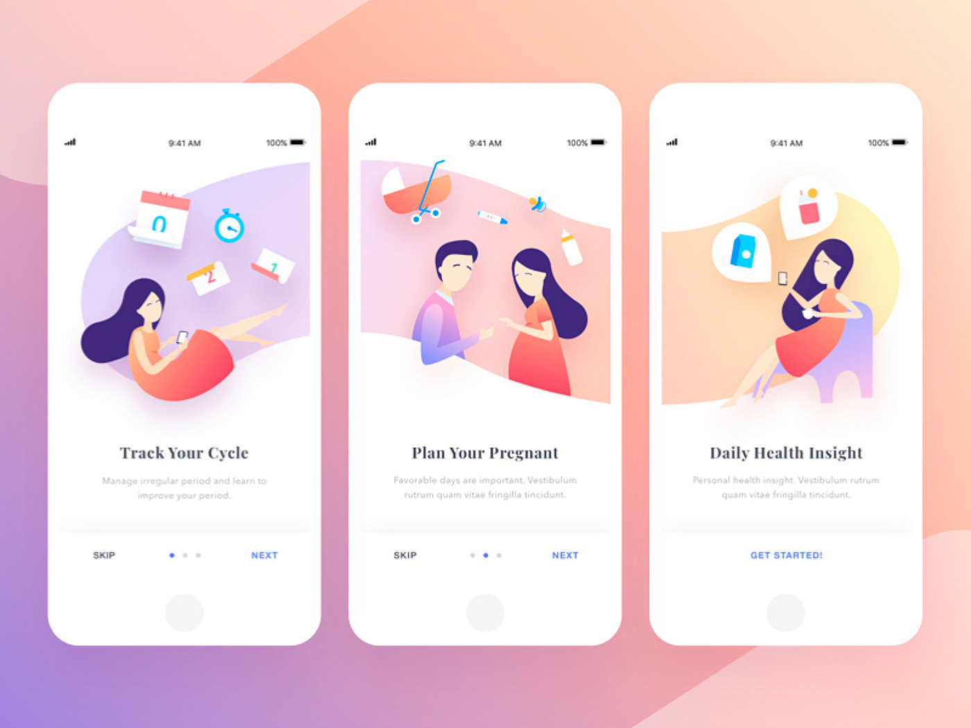
Source: Dribbble
Custom-made illustrations
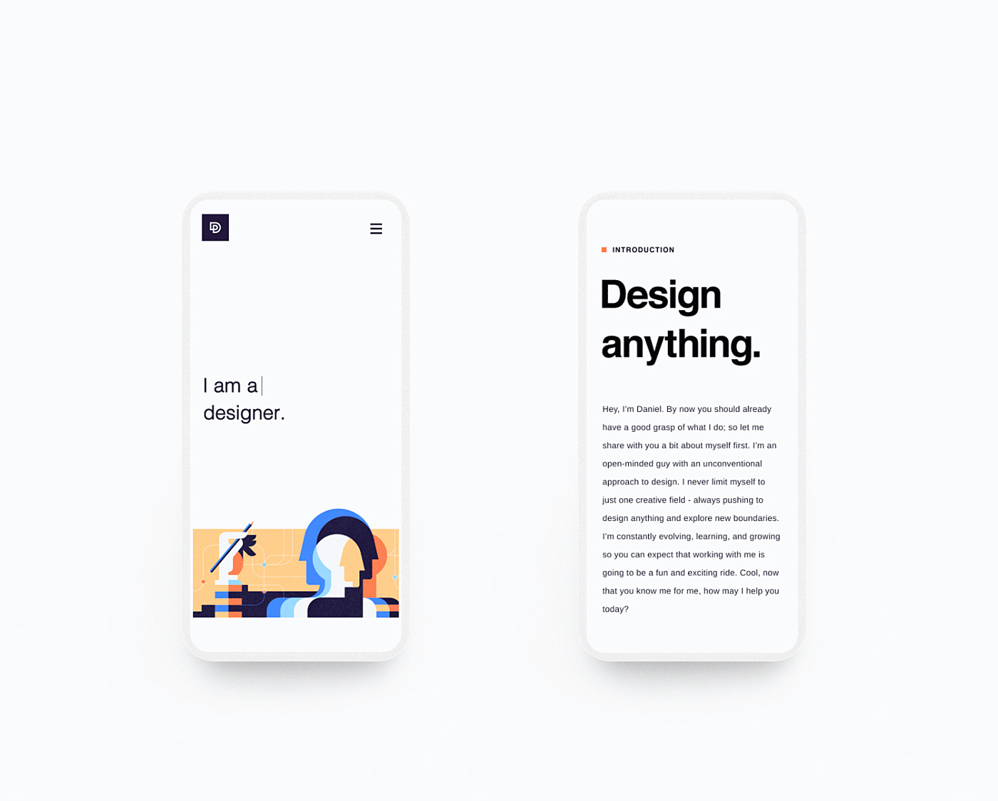
Source: Dribbble
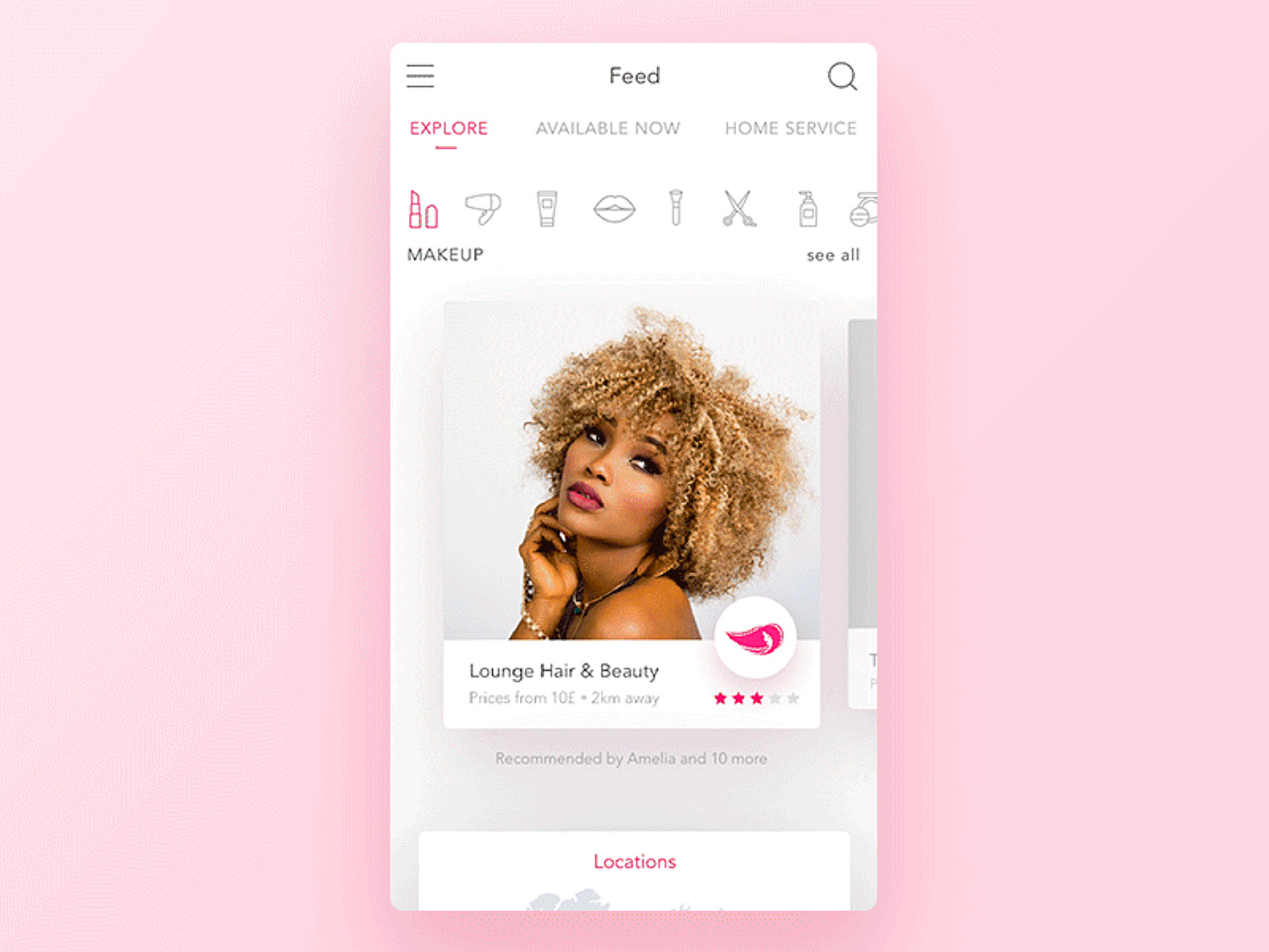
Simple, minimalist interface
Source: Dribbble
Bottom hamburger menu
Source: Dribbble
Custom icons
Source: Dribbble
Comments & engagement
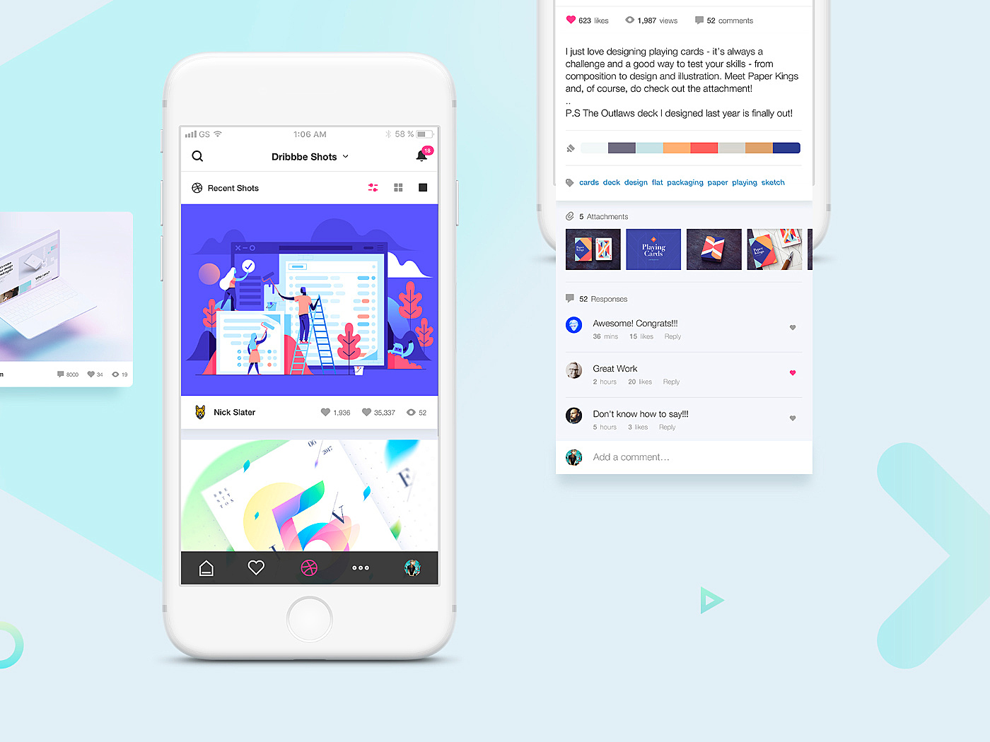
Source: Dribbble
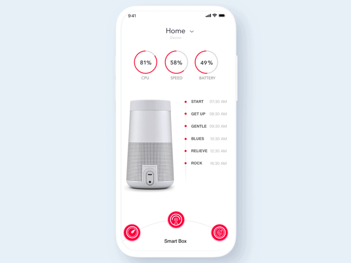
Thumb-zone elements
Source: Dribbble
Visible call to action
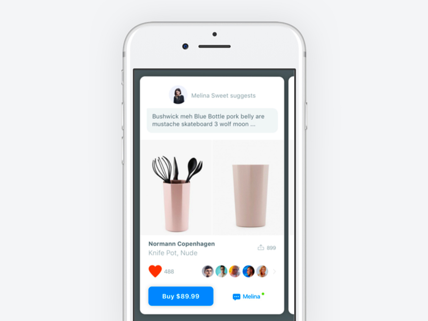
Source: Dribbble
Conclusion
So, what is the mobile app UX design that converts? It’s a combination of features and techniques that hold your users on the way from an app store to purchase, something that makes their journey engaging and intuitive.
By examining examples of gaming websites, we can gain insights into user engagement strategies that can be applied in mobile app UX design.
Remember that UX is made by context, not by a designer. The more convenient your app is for users, the more conversions you get. If your mobile app doesn't perform well, conduct a UX audit to spot the mistakes we listed in this article.
Hope that you liked that article. Share your thoughts about it in our live chat. Contact us for more information about mobile app development at AGENTE.


Rate this post!
929 ratings, average ratings is 4.8 out of 5

Related Posts

05 January 2024
10 Best 404 Error Page Designs for 2024
In our new blog post, we review the best 404 page design examples of 2019 that will never disappoint you even if you meet the dead end on the website.

06 November 2020
How to Perform UX Audit that Will Pay Back x2 | AGENTE
How to perform a successful user experience audit? Why does your company need one? In this article, you'll read about important steps to perform an audit, its cost and deliverables.

20 October 2020
How to Design a Website For Black Friday & Cyber Monday?
In this article, we will talk about how to create an attractive and selling website design for Black Friday and Cyber Monday. Let's take a closer look at each step of creating such a website.

01 October 2020
Your Ultimate Guide to Successful User Experience Research
Your UX Research step-by-step guide to benefits, approaches, methods, tools, conferences, and influencers.

What Is a UX Audit and How Does It Help In Pandemic?
For those businesses that rely heavily on the customers from the internet, it is the time to make sure their brand touchpoint on the internet works well. That’s where the UX audit comes into play because it is one guaranteed way to find out whether the website or app performs at its best.

How to Improve Online Shopping App Design for Better UX | Agente
Dissecting shopping app UX design: how to make your design work and provide a superb user experience.
Let's talk
Is there a challenge your organization or company needs help solving? We’d love to discuss it.

Managing Director, Partner
Andrew Terehin

Thank You!
Your message has been successfully sent.
We will contact you very soon.