
Did you know that 89% of people switch to competitors after a poor user experience? Every time you make a poor design decision, you risk losing leads. We are here to make sure it doesn’t happen to your business. Keep on reading to find out more about website design best practices in 2022 and the trendiest trends on the web.
Why care for web design best practices?
In thirty-something years, website design has evolved from pixelated black screens with symbols and tabulation to 3D animation and beyond. We don’t even have to go as far as the 1980s to see sweeping changes in web trends. From 2011-2015, we witnessed the popularity of magazine-like website layouts with columns and textures. There was also an emphasis on the use of infographics, where information was presented via digital imagery.
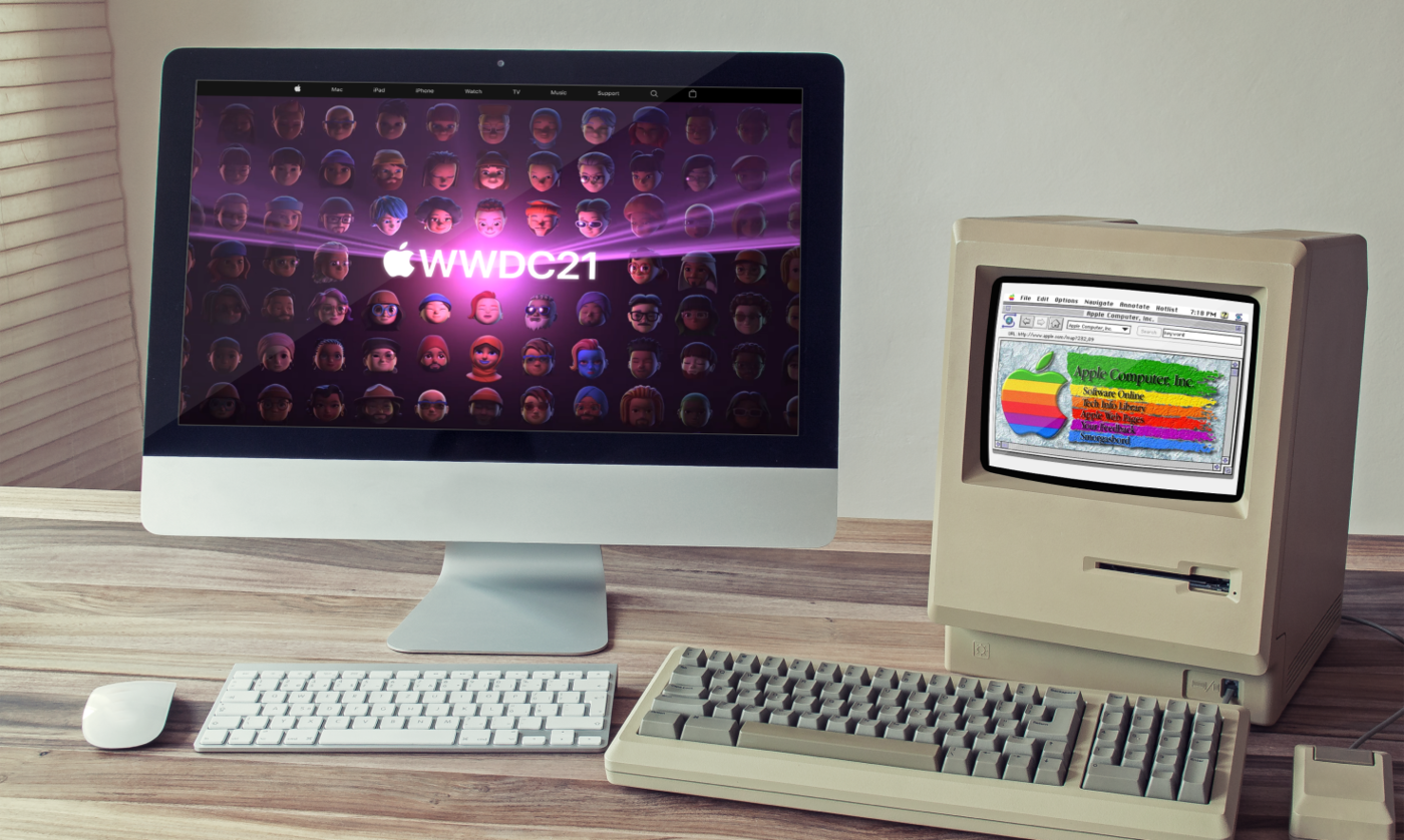
Since 2016, when websites had to adapt to all screen sizes, responsive design has grown in popularity. To accommodate the needs of mobile users, most of the websites today choose a minimalistic design. They feature minimal text, large fonts, intuitive forms, unique navigational panels, and high-resolution images. Best website designs in 2022 don’t fill up your screen with unnecessary information but strive to provide a streamlined user experience and satisfy the needs of visitors.
Although trends change in a snap, there are the all-time classics—best practices for website design. Here are major reasons to follow them:
- Set the first impression. The audience judges your business within seconds. If your website looks unappealing or outdated, he/she will never come back again, considering that there are thousands of competitors online. Thus, you’ll miss out on leads.
- Make your website SEO-friendly. SEO is not only about the written content. For example, quality visuals and clean navigation boost time on site and help crawlers index more quickly, boosting your rankings.
- Create consistency. If your website is not consistent, people will bounce from it to one that looks more professional. Consistency in fonts, styles and layouts across every page keeps leads on your website longer and gets them familiar with your business.
Web design best practices checklist
This handy website design best practices checklist will help you to attract new leads and keep them engaged on your site pages.
- Establish your target audience. Before designing your website, analyze your typical site visitor and collect information such as demographics, income and occupation, buying habits, and pain points. This way, you can understand fundamental components for great customer experience.
- Simplify website navigation. This website design best practice ensures that the customer feels at ease and comfortable on your website. Intuitive navigation prevents visitors from being overwhelmed.
- Compress images on your site. Generally, users expect your website to load within two seconds. When your site doesn’t load quickly because of high-resolution images, you lose leads.
- Design buttons that are clearly visible. People browse through your site to learn more about your products or services and want to learn how to take the next steps. Your CTA button should literally pop off the page so that users want to press it.
- Utilize white space. When you’re building your website, don’t overload it with text and visuals. Crowded pages will leave your audience feeling overwhelmed and confused, and may even lead them to leave your website altogether.
- Minimize text. One of the principles of a good web design is that it’s always better to show instead of tell. Don’t fill your pages with massive blocks of text; use shorter sentences in combination with longer ones to create dynamics in storytelling, and try shorter paragraphs.
- Use branding consistently. Keep branding (logo, iconography, and color scheme) consistent across all of your customer touchpoints is one of the best practices for website design. The same holds true for your brand voice and key messaging.
- Optimize your design for mobile. Ensure that visitors who are accessing your site from mobile devices have an optimal user experience. The design accounts for variable screen sizes, site structure, and load times.
- Create your style guide. Ensures that your website keeps a consistent brand image and is cohesive across the board. The guide normally includes information like website color scheme, font style, image style, and more.
15 Web Design Trends 2022
We’ve collected 15 trends that follow all web design best practices in 2022 and will help your website to make a good first impression with appealing, intuitive, and effective design.
Retro fonts
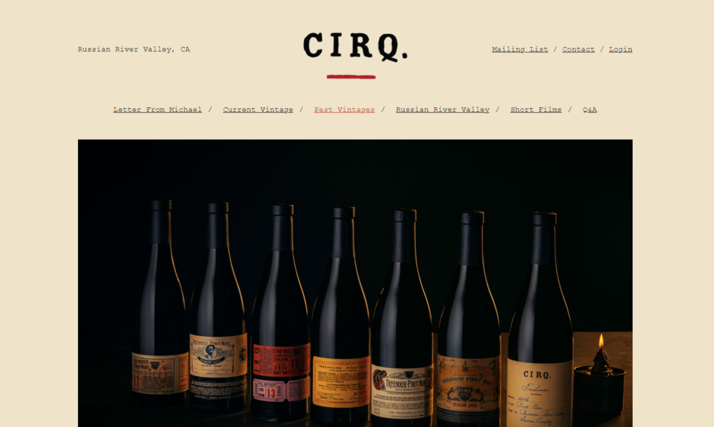
Source: CIRQ
Retro fonts (90s and 2000s) have experienced an upsurge in popularity; however, we don’t see the same old shabby fonts, but rather retro-styled ones with a cool modern spin.
Bold typography
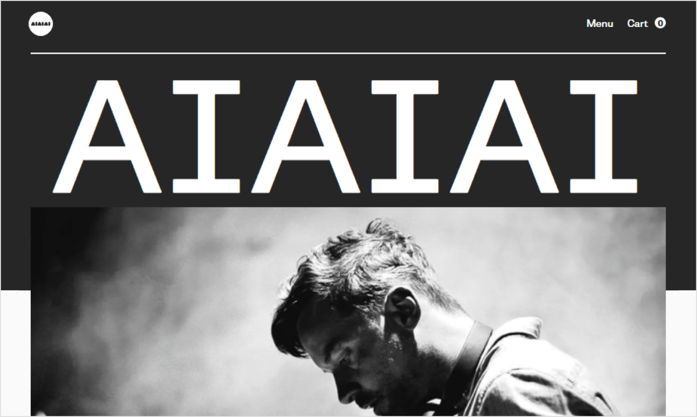
Source: AIAIAI
This is another throwback typography trend and one of the simplest ways for the business to stand out. Oversized, bold typography makes it easy for your website users to see who you are straight away.
Muted colors
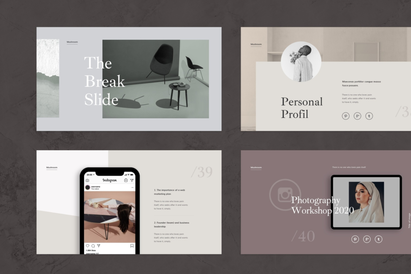
Source: Dribbble
We’ve spent a hell of a long time looking at screens over the past year so, naturally, we want soothing colors that are easy on the eye. Web design strives to provide ocular comfort that is subtle, with simple designs and lots of cool, natural colors that make it easy to keep looking and scrolling for hours.
Human skin tones
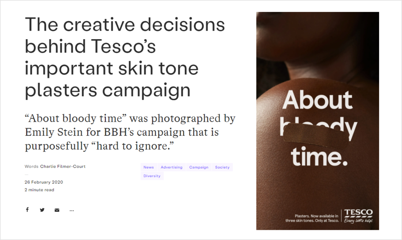
Source: It's Nice That
We all need to be a bit more human, don’t we? Web designers decided to make it the motto of 2022 and use color palettes focused around the beauty of human skin tones. In 2022 and beyond, we are going to see every color of our organic rainbow, frequently making one or more human figures the focal point.
Gaussian blur
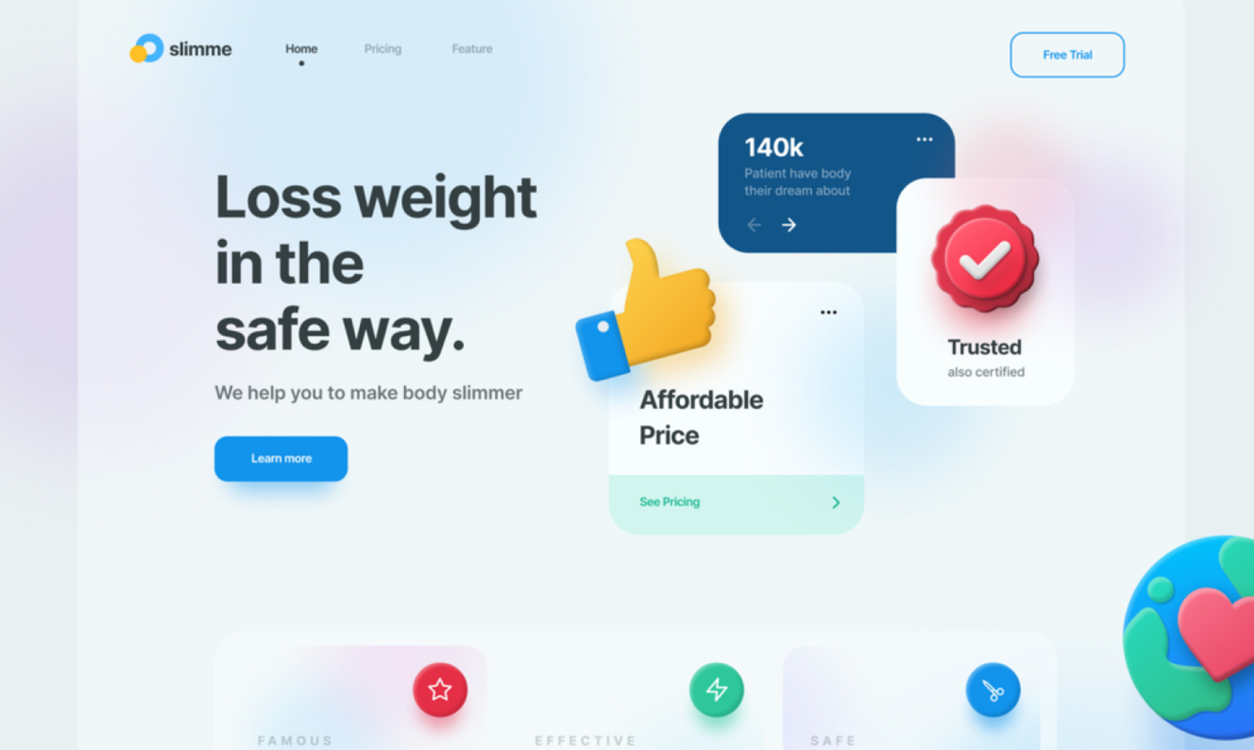
Source: Dribbble
If you are looking for fresh website design concepts, turn to gradients. If you want to provide a swirl of soft focus to images and gradients, use gaussian blur. It adds attention to text overlaying images, and it is often used to provide the same visual impact as a gradient. This effect has been around for a while, but designers have been actively using it in more prominent spaces in web designs.
Dark mode

Source: Ashcroft
The dark mode is a low-light UI that uses a dark color—usually black or a shade of grey—as the primary background color. It’s actually not that new. Do you remember a black background in the Matrix? One of the primary reasons why dark mode became so trendy is that it reduces eye strain, but it’s not the only advantage. It also increases visibility in low-ambient lighting (you reduce your chances of getting a headache working late at night), and saves battery life.
Simple data visualization
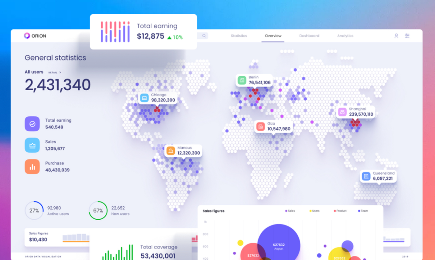
Source: Dribbble
The ultimate goal of any data visualization is to make complex data easy to understand. Nowadays, we are presented with more and more information that can’t be processed without visuals. Simple data visualizations can make communication more effective.
Flat icons and illustrations
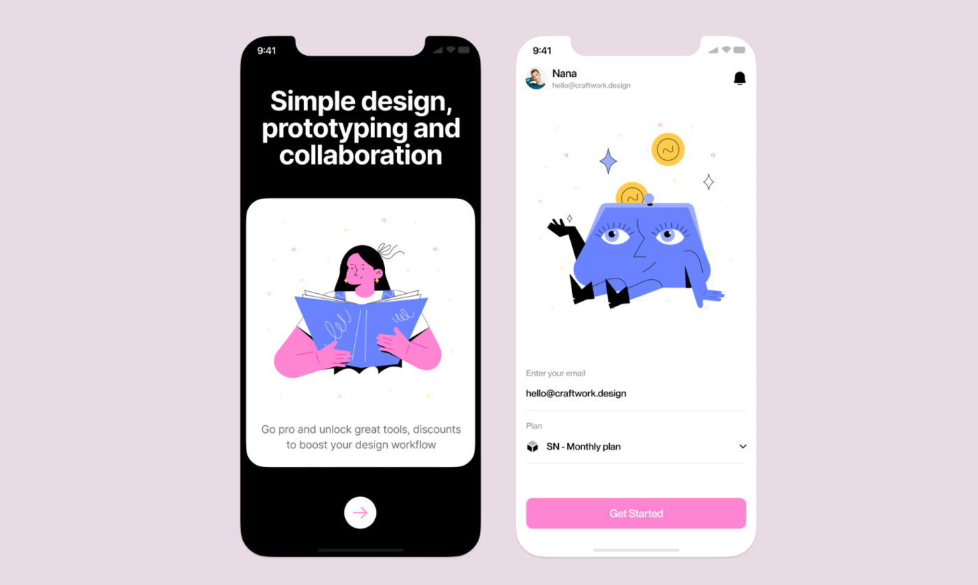
Source: Dribbble
Flat illustrations are simple and humanized. They allow customization, so even if you use an online library of imagery, you can adapt each piece to your project. There are many sub-styles in flat icons and illustrations, so you can choose the one which resonates with your brand the most.
Geometric grids
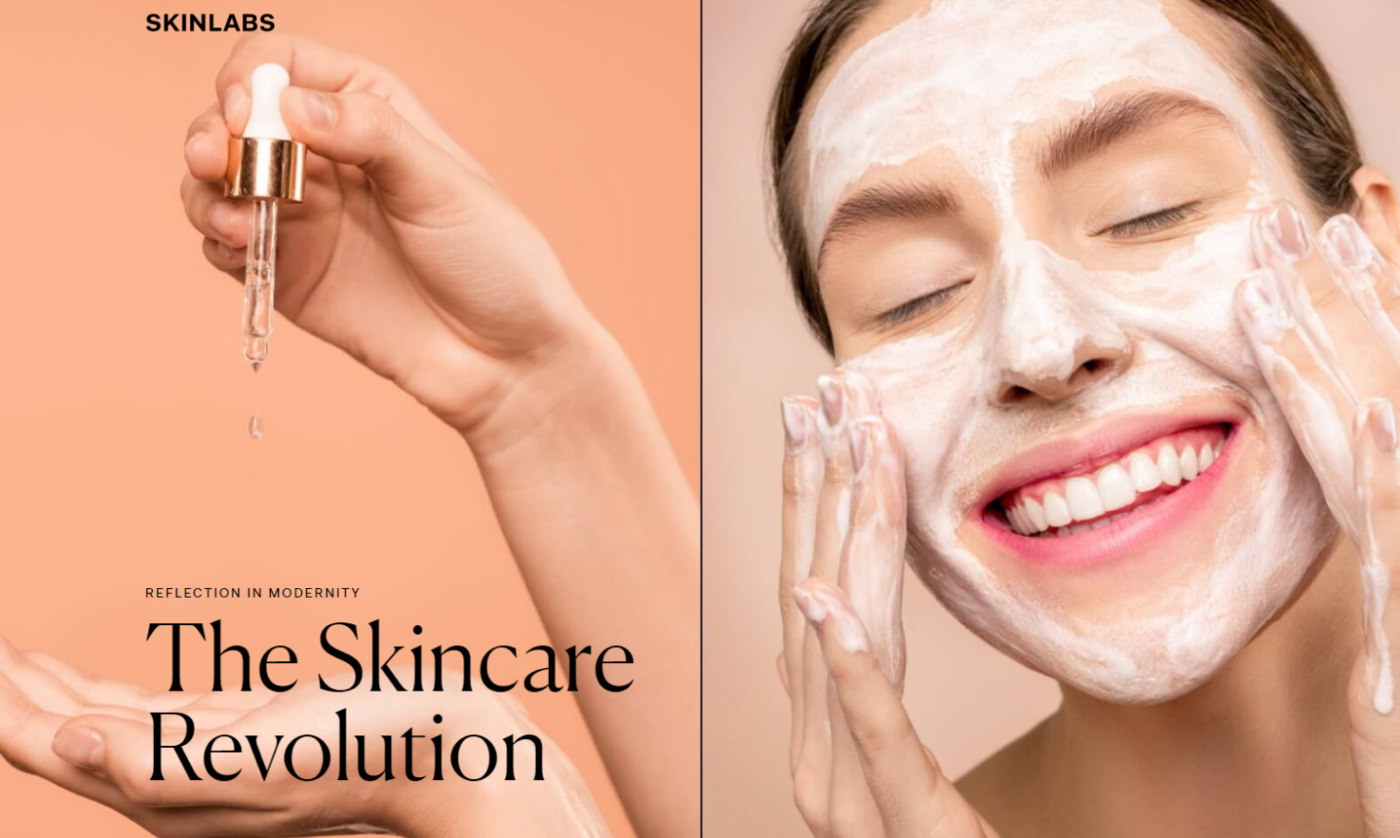
Source: Skin Labs
This trend offers a lot of flexibility when integrating it into your web design. For example, use block for navigation and content. This simple element brings structure into the layout and provides a clean and bold look.
Parallax scrolls
Source: Okalpha
This is one of the 2022 web design trends that has remained on top for a couple of years. However, you have to be careful: too much movement in parallax effects can be harmful to people with vestibular disorders, since the illusion of depth and movement can cause disorientation. Here are some useful tips on how to employ this effect without harming your potential customers:
- Keep the number of parallax effects to a minimum
- Don’t let parallax effects distract from the important information
- Include an option for users to turn off parallax effects
Horizontal scrolling
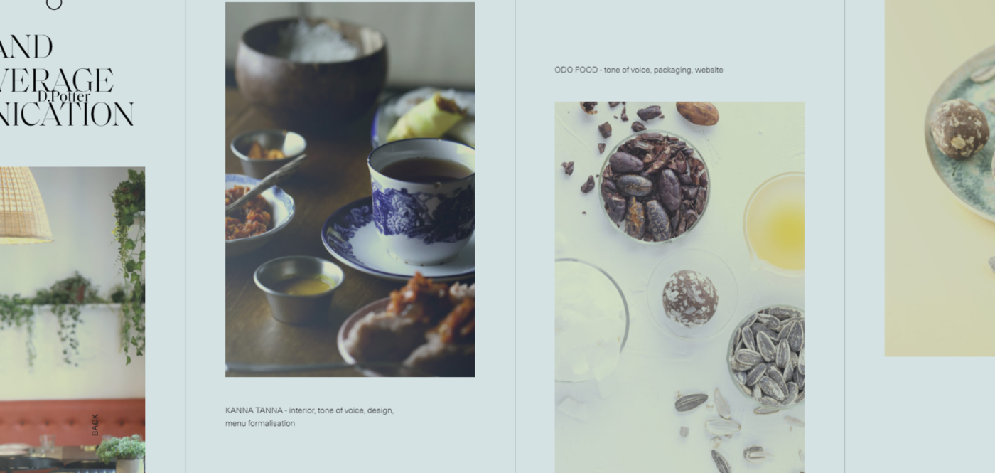
Source: D. Potter Studio
This website design trend is making a comeback, as it helps to disclose secondary information progressively. Keep in mind these considerations:
- Use clear visual cues to indicate where content uses a horizontal scroll.
- Allow alternative ways to navigate, like arrow buttons with clear labels. Don’t force users to scroll horizontally.
- Think about content that would benefit from being displayed in a horizontal scroll, for example, an image gallery.
- Avoid requiring horizontal scroll for a text that needs to be read.
Scrollytelling
Source: Every Last Drop
This is interactive scroll-based storytelling. All you need is to scroll down and see how the story unfolds. Scroll-based interaction is so intuitive that readers don’t have to second-guess what to press, click, or swipe. They see a dynamic interplay of text, imagery, and sound that gives the story an engaging rhythm.
Custom cursors
Source: Square
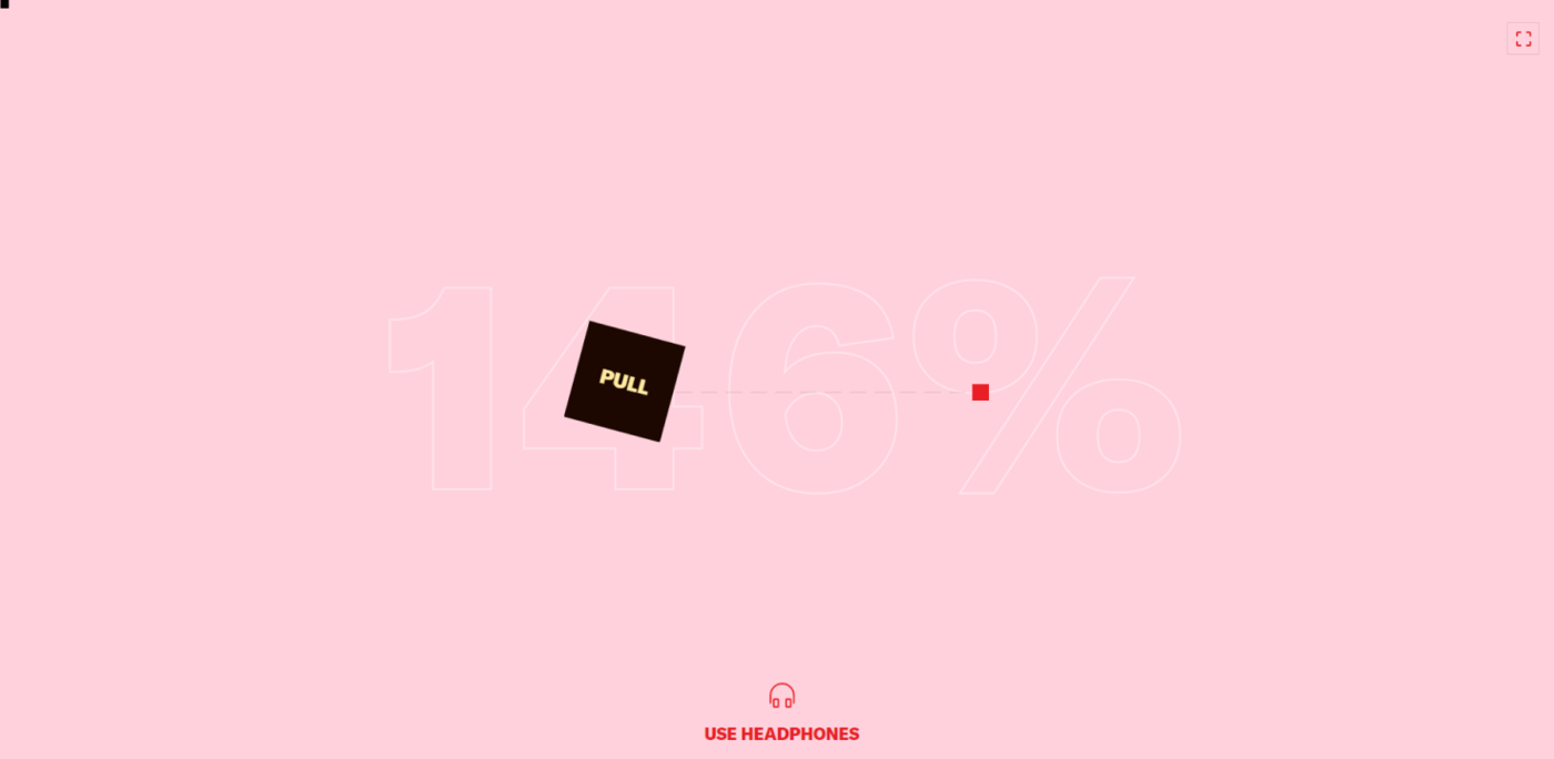
The devil is in the detail. It’s absolutely true to web design, and custom cursors prove this statement. Cursors are probably one of the most overlooked elements, with most of us content with an arrow. However, this tiny detail can make even the most ordinary or simple design cool.
3D visuals
Source: Dribbble
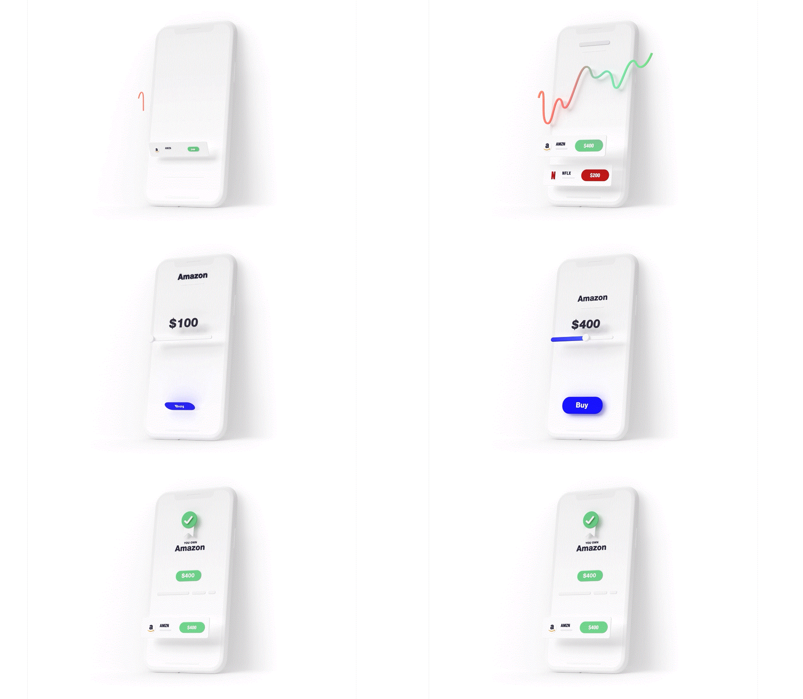
They are everywhere: from icons and diagrams to text and visual effects. Make sure the site loads quickly (in two or fewer seconds) and that the user experience isn’t harmed. In addition, your users are more likely to remain on websites longer to experience 3D graphics, increasing the total session time.
Augmented Reality (AR)
Source: Ikea Place
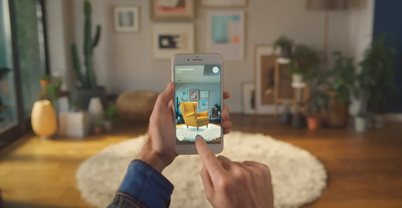
Many consumers are unable to test out a product in person and search out substitutes that will still encourage them to try out a brand and potentially make a purchase. That’s why some B2B companies are using AR to construct virtual environments since they help with data visualization.
Agente experience
You can’t remain on a plateau in the website design domain. You either move forward with trends or lag behind and lose leads. That’s why trendspotting is so important. The Agente UX/UI team is always on the lookout for best web design examples, and we readily incorporate fresh ideas into our projects in education, healthcare, eCommerce, banking, and others.
Dringet
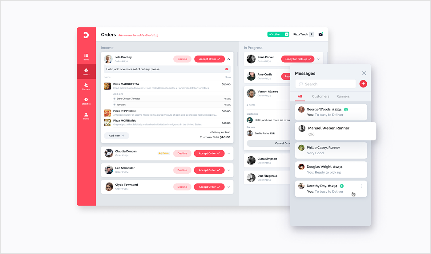
This food ordering app demonstrates how we love flat imagery and simple visualization. Our goal was to create a promotional website with attractive illustrations, catchy visualization of the ordering process, and a detailed FAQ.
Source: Agente case
TKIT
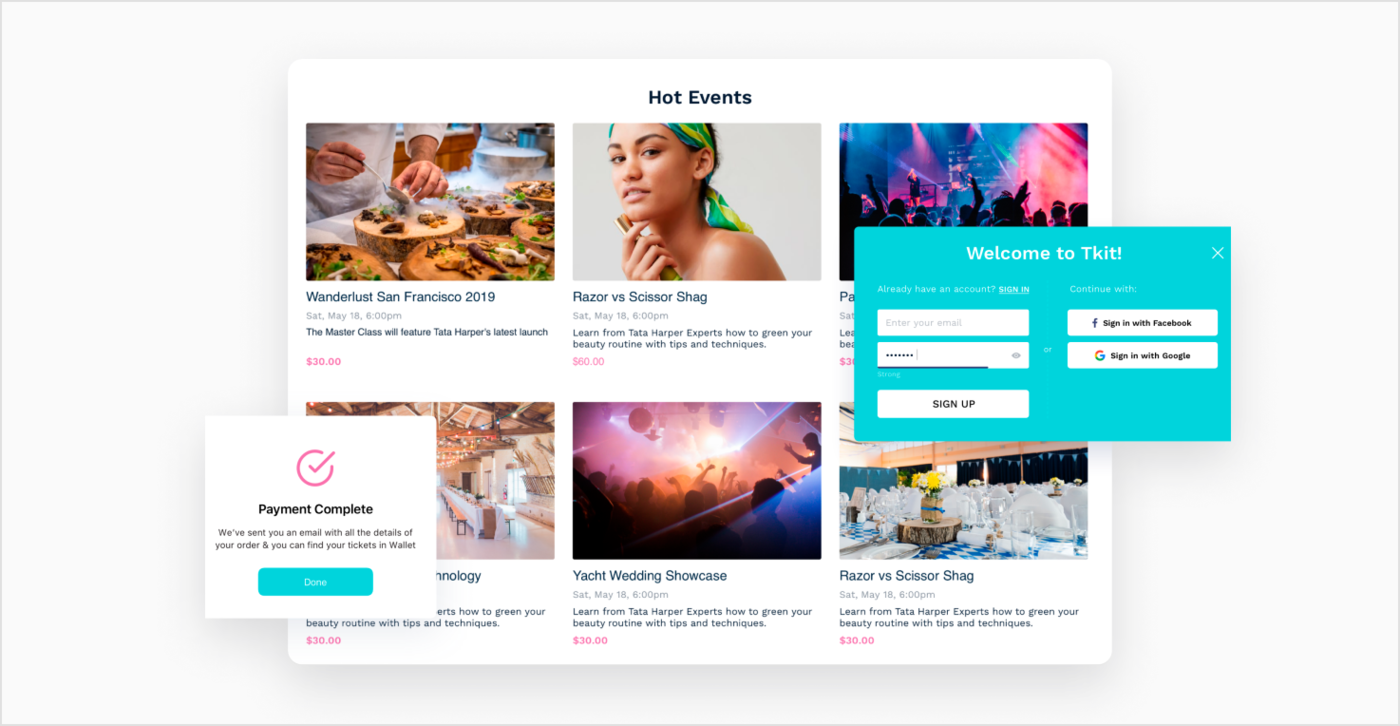
We created an event-booking app and a responsive website that featured information about the events and an admin panel for event holders.
We applied Tkit brand colors, style guides, and a strategy to create an intuitive and user-friendly design. We went with the TkiT brand color theme color and kept the navigation bar as simple as possible.
Source: Agente case
San Francisco Stock Exchange
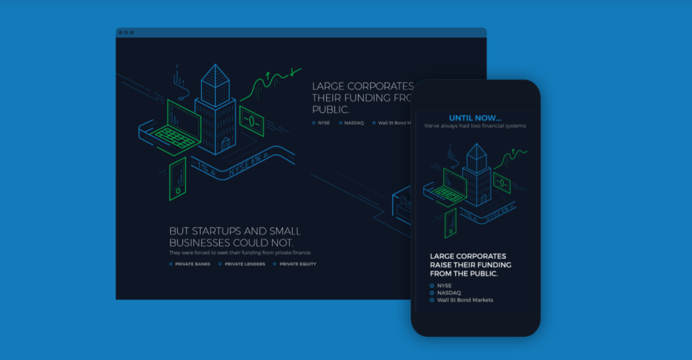
The concept of the product aimed at millennials. That’s why, while working on the UI, we used the gamification approach and added a lot of eye-catching visuals to the app. We decided to go for a dark theme to distinguish the app from the standard financial products.
Source: Agente case
Final thoughts
You’ve probably noticed that no matter what trend we analyze, it is created with best practices for web design in mind. The idea of any business website is not so much to show off, but to provide viewers and potential customers with the best user experience. That’s why it’s important to collaborate with a web design agency that has a deep understanding of UX/UI principles and follows design best practices. We can proudly say that we are such a company. Drop us a line if you want to see your website at the top of 2022 design trends.
Rate this post!
170 ratings, average ratings is 4.7 out of 5
Related Posts

03 January 2024
10 Best Game Website Design Examples: How to Design Yours
Game website design: importance in attracting new players, awesome examples and design tips.
Effective Food Delivery App: Key Tips & Best Practices
In this article, we will share our experience in creating a design for a specialized food delivery management software, as well as best practices in designing such an application.
22 November 2022
10 Best Restaurant Website Designs & Best Design Practices
Restaurant owners always have a lot on their plate, and they are usually focused on the areas that can bring tangible benefits. Websites, unfortunately, are not one of those areas because even the perfect website does not guarantee that the restaurant will be full every evening.
31 May 2022
10 Best Examples of Website Footer Design
10 website footer design best practices examples for inspiration ⚡ Things that can go in website footers ⚡
18 April 2019
How to Craft a Product Design Strategy?
How do you ensure that the design of your upcoming product will be good enough? Of course, by putting a product design strategy to use.
18 September 2018
10 Tips on Typography in Web Design
The main goal of any website is to communicate the message to the end user. Sure, text in the form of web typography is the most obvious means of doing that. This article features 10 tips to refine website typography, a brief overview of current trends and a few ideas to inspire you.
Let's talk
Is there a challenge your organization or company needs help solving? We’d love to discuss it.

Managing Director, Partner
Andrew Terehin

Thank You!
Your message has been successfully sent.
We will contact you very soon.


